Top

Think Like an Artist and Write UX Reports Your Clients Will Love

March 4, 2013

The current less-is-more, agile UX prototyping practices are leaving the humble report further and further behind. Yet there is still so much value in UX report writing that our clients both need and expect. Think like an artist, and you can reinvigorate your reports and presentations. To help you realize that goal, here are a few insights about the way artists down the ages have thought and expressed themselves.

Rethink Document Templates and Your Mental Templates

Remember when you were at school, and your teachers drummed into you that essays had to have an introduction, then some points to build your argument, and finally, a conclusion? How much writing do you read these days that follows that pattern? If you write as part of your UX career today, odds are that you don’t write in that format. But it can be all too easy to fall into similar patterns of writing and thinking. Relying on document templates, while keeping one eye on your timesheet and project budget, can limit the potential value of your written communications to your clients. To help you to refresh and reinvigorate your report writing, I’d like to show you how to emulate the thinking of some great artists.

Champion Advertisement
Continue Reading…

Yes, it’s an amazing time to be in the field of UX design—indeed, in any field of design. It seems like every week there’s a new, latest-and-greatest app, process, or digital trend, and UX professionals are continually touting new movements and ways of thinking. For example, we’ve been hearing a lot about responsive Web design and infographics lately. But behind the trends that steal the limelight are the time-tested practices that helped them get out onto the stage in the first place.

Writing is one such practice that doesn’t get much of our attention—yet it holds so much value for our clients. It’s a big part of our communicating our analytical thinking and our solutions. Yes, there’s nothing like a prototype or a storyboard to show clients what we mean rather than just writing or talking about it. But our clients still need—and expect—the typical instruments of business communication: reports and presentations.

In fact, Paul Bryan’s interviews with three UX strategists mentioned some examples of written deliverables that should be familiar to many and are worthy of our attention:

  • sets of design criteria or design principles—Research informs these, and their purpose is to guide the design team.
  • UX strategy approaches—These frame the business challenge and leverage analytics, market knowledge, and research results.
  • competitive analyses—These written reports provide a hypothesis and a strategy for business change.
  • experience roadmaps—These help businesses to understand how to roll out large pieces of work.

So, to help you realize the potential value that your written documents can provide to your clients, don your artist’s smock, and let’s step into the minds of some great artists.

Embrace the Urge to Be an Artist: Be You, Be True, Be Interesting

Write confidently, with the artist’s urge to unleash what you must make known. Abraham Maslow, famous for his hierarchy of needs, said, “A musician must make music, an artist must paint, a poet must write, if he is to be ultimately at peace with himself.”

Everything you write for a client, team, or senior management is a golden opportunity for you to reflect on who you are as a designer and thinker, communicate your thinking and why it matters to them, and provide solutions for the business challenges at hand.

Being yourself and being true to your clients in what you write and present is important because it’s a big part of persuasion and establishes rapport and trust. So, show courage and personality in what you write and present and communicate in a likable, clear, and compelling way. Lose the weasel words that they’re probably reading elsewhere.

Build Empathy for Customers’ Worlds

I can still remember seeing the Albert Bierstadt painting shown in Figure 1 for the first time, in 1991 at the National Gallery of Art in Washington DC. Its sheer grandeur not only connected with me aesthetically and emotionally, but compelled me to look into why Bierstadt painted what he painted. He wanted to capture the beauty of the land and the native American people in the American West, so others would appreciate them, too, then go to see them for themselves.

Figure 1—Albert Bierstadt’s painting: Yosemite Valley, Yellowstone Park (1868)
Albert Bierstadt’s painting: Yosemite Valley, Yellowstone Park (1868)

As UX researchers, strategists, and designers, we get to bring the world and experiences of customers into our clients’ boardrooms and onto their screens and, thus, provide clients with opportunities to build empathy for their customers.

Deliver Just Enough Writing: Agile Sculpting

Michelangelo Buonarotti took an outside-in approach to sculpting: he revealed the figure that was hidden within a block of marble—a figure that he could always see in his mind's eye. This approach is particularly apparent in his series of bound slaves. The great artist and thinker himself said, “I saw the angel in the marble and carved until I set him free.” Lydia Bates touched on this idea when she wrote about reducing something to its simplest form. But my point isn’t about simplicity—though that’s another great point—but about knowing how and when to stop writing.

In the strategic thinking and report writing of user experience, each new project can feel like a hefty block of marble. It can be daunting just to think about all of your qualitative and quantitative research results, as well as other contextual perspectives that you have to consider and other devices like personas—let alone the time and effort it takes to analyze and formulate a solution or approach.

As early on as possible, try to define or redefine the business challenge as best you can, and let this guide you in focusing on the parts of your report that will provide the most value. If you’re already working in an agile, or agile-ish, process or team, you’re probably not writing much anyway. But if you are, try to adopt the same just-enough approach to determine what needs writing.

It might encourage you to know that many of Michelangelo’s bound slaves were probably unfinished. Nevertheless, he had chiseled away enough to reveal everything that needed to be revealed first. Perhaps knowing this can provide insight into your own writing and presenting.

Be Disruptive and Bring New Meaning

Today, we hear much about disruptive design—especially in the context of encouraging disruptive thinking to stimulate innovation. It is important for UX designers and strategists to embrace our roles as facilitators of disruption. This can extend to our written deliverables, too.

But this has happened before. Back in the days before the world had suffered through two world wars, visual art was dealing with a newfangled upstart: photography. Artists were expressing feeling and atmosphere through Impressionism and Post-Impressionism. But, by the time World War I was over, the art world had exploded into many different movements, in reaction to the horrors they witnessed during the war.

The Dada movement is one such example. As part of its rejection of the prevailing standards of what art was, the Dada movement loved juxtaposition, bringing various elements together in new and unexpected ways to evoke new meanings. Marcel Duchamp’s Fountain, shown in Figure 2, uses a ceramic urinal to express humor and irony.

Figure 2—Marcel Duchamp’s Fountain (1917)
Marcel Duchamp’s Fountain (1917)

Consider enlivening your UX reports with something more expressive than a flowchart and some pullquotes.

Start with What’s Familiar

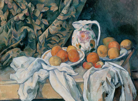
It’s helpful to remember that, even in the art world, change didn’t always occur through disruptive innovation. Paul Cézanne has been credited with being the bridge from 19th-century Impressionism to 20th-century Cubism, but he did this through iteration, not innovation. In his movement to Cubism, he adopted the color treatments of his contemporaries like Camille Pissarro, then applied his own logical thinking about color to traditional subjects like still lifes, as in the example shown in Figure 3, and landscapes. This quotation from him sounds very contemporary: “Get to the heart of what is before you, and continue to express yourself as logically as possible.”

Figure 3—Paul Cézanne’s painting Still Life with a Curtain (circa 1898)
Paul Cézanne’s painting Still Life with a Curtain (circa 1898)

Any seasoned workshop facilitator would agree that everyone participating in a workshop first needs to be in a safe, familiar mental space before they can step out—creatively or otherwise. Similarly, we know that we have a better chance of winning clients and stakeholders over to a particular solution through our writing if we start with what is familiar, then create logical connections to our new approach or solution. Can you reframe something that that is very familiar to your client? Can you present something in a new light?

Show a Sense of Proportion

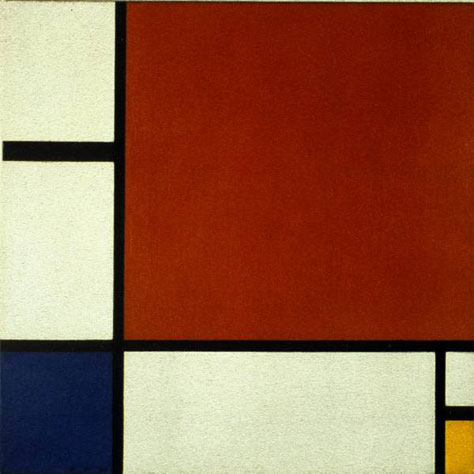
Another artist who took up the Cubism torch at one point in his career was Piet Mondrian. In his paintings, Mondrian iterated toward an abstract style called Neo-Plasticism, which reduced all forms to clean straight black lines and planes of white and primary colors.

Figure 4—Piet Mondrian’s painting Composition II in Red, Blue, and Yellow (1930)
Piet Mondrian’s painting Composition II in Red, Blue, and Yellow (1930)

I think this should act as a reminder for UX professionals to mentally step back from the details of any report to look for the areas it is most important for clients to understand. If we address what is most important to our clients, they’ll be more likely to agree to our solutions and designs. So, if you could reduce your approach to just one idea, what would it be? If your entire report comprised just three specific phrases that you’d want your client stakeholders to be dropping into their own conversations with others, what would they be?

Be Transparent

“My three-year-old daughter could paint that!” Many of us have had the experience of standing in front of a work of art and dismissing it because we just didn’t get it. Or perhaps, not only did we not get it, we couldn’t even see how there would be anything for anyone to get. If you look at works like Kazimir Malevich’s Black Square or the slashed canvas of Lucio Fontana’s Concept Spatiale, it can be easy to dismiss these important works if you don’t know their back story.

This is entirely appropriate for art, but it doesn’t work when it comes to communicating in words! For many people, the field of user experience is just as opaque as art. It also groans under the weight of self-referential, though necessary thinking, as well as proprietary terms and acronyms. (Is anyone up for an evening of IA card sorting, affinity mapping, or sprint planning?) When we want to establish credibility with our clients, it’s important that we don’t confuse our audiences by using too much UX terminology.

When we use esoteric UX terminology, our peers in user experience will understand what we’re saying, but we risk alienating our clients. The last thing you want is for the value of your blazing insights and your game-changing UX strategy to be lost to your client decision makers because it’s hidden behind terminology they don’t understand. When creating reports, it’s best to write in ways that communicate powerfully to both types of audiences.

Let Your Favorite Art Inspire You and Your Work

Michelangelo once said, “A man paints with his brains and not with his hands.” Whenever I leaf through the various art history books on my shelves at home, I always find new ways of applying artists’ thinking to my own work. What about you? Do you have a favorite artist or a favorite work of art? Try doing a bit of UX research on that artist. Delve into what was going on in an artist’s life and how that was reflected in their thinking and expression. What you find may well unlock new areas of your own creativity and thinking that you can apply to user experience. 

Design Educator at Atlassian

Sydney, New South Wales, Australia

Ben CrothersBen has deep experience working with clients in the telecommunications and finance industries, as well as government departments and not-for-profits, enabling them to maximize the value of their online presence and creating digital experiences worth sharing. He enjoys being the communication bridge between management, designers, developers, and business decision makers, helping them to refine their digital strategy, listening to the people for whom we create digital presences, and coming up with deep insights and compelling designs. Ben is passionate about participatory design practices, fostering behavior change through digital media, and the power of design to change lives rather than just the decor. When not dreaming up ways of using his kids’ toys as prototyping tools, he gets into sketchnoting, drawing, and oil painting.  Read More

Other Articles on Deliverables

New on UXmatters