Top

The CSS of Storytelling: The Curtain Rises

Dramatic Impact

Theater and the creative process of design

A column by Traci Lepore
July 24, 2012

You are standing backstage, waiting for the curtain to rise—to start the first performance. A lot of hard work has led up to this moment. Electricity is in the air, your stomach is doing acrobatics, then it happens—the curtain rises, the crowd hushes, and the performance begins.

The feeling that you get is not all that different when you launch a large project, like the one I’ve been working on for the past year. In a previous column, “Implementing the CSS of Design Storytelling: Real-World Theatrics Meets Internet Theater,” I discussed our beginning attempts at a major Web site redesign that would hopefully better address the elements of context, spine, and structure to tell a story for the company that would be engaging and compelling.

We just launched our first-phase redesign last month, and I’d like to share some insights into how we braved the elements to tell a new story.

Champion Advertisement
Continue Reading…

The Context Clarified

Because of the all-important first impression, setting the mood and theme is often one of the most challenging parts of defining the story. We want to make a good first impression, but may get hung up by trying to sell too hard or lay out everything at once.

Our site was no stranger to such issues, but in the redesign, we were able to make some significant improvements, including a new visual design, a new structure that helped set the tone for a particular product, and updated imagery that had a more consistent theme and was more compelling and emotionally satisfying.

Figure 1 shows the before picture of a product page that wasn’t visually compelling and provided no explanation of what the product is. Our Creative Services team had always been capable of achieving better results, but the old site design and structure didn’t allow them to do this successfully. Plus, there was too much wasted space before the content, and the initial content didn’t even clearly define what the product was—posing problems for users trying to get product information.

Figure 1—Product page before the redesign
Product page before the redesign

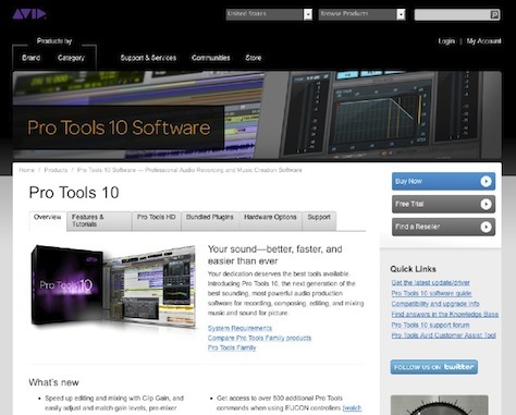
Figure 2 shows the new page with an updated look and feel that is clean and simple. It fully incorporates imagery rather than making it an afterthought. The new page also has a specific place for a product definition—the “What is…” area—and adds an image to help with recognition. A new media carousel delivers the key marketing message and includes an impactful visual.

One of the major problems regarding context that we encountered during usability testing was that users felt strongly that the existing Web experience did not match the exceptional experience of the products themselves. The changes we made during the redesign have created a much more streamlined and effective first impression that helps users to understand what the product is and the key value that it provides, which better matches their expectations. The addition of a media carousel and other modern interactions such as fixed-position navigation that remains visible when a user scrolls the page also helps create the desired mood for a product and a company that delivers modern technology.

Figure 2—Redesigned product page
Redesigned product page

Support That Strengthens the Spine

When it came to the spine of the story, developing clear, strong climaxes was the major issue we had to address. Our site suffered from both hidden calls to action and an excessive number of calls to action. The end result was poor conversion numbers and lots of complaints that users weren’t quite sure where to go or what to do.

In Figure 3, you can see that critical calls to action were buried in the sidebar, lumped in with promos and a random assortment of links. Banner blindness made users overlook these critical elements.

Figure 3—Calls to action before the redesign
Calls to action before the redesign

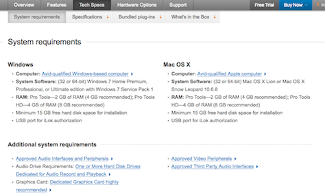
Figure 4 shows how, in the new design, we’ve moved the calls to action to the header, and they are a part of the fixed-position navigation, so even when a user scrolls the page, the calls to action remain visible. In fact, to help keep users focused on the content, we’ve removed the whole sidebar from the design. And we’ve devised an appropriate hierarchy for the content, but I’ll talk about that when I get to structure.

Figure 4—Redesigned calls to action
Redesigned calls to action

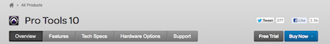
Figure 4 also shows how we cleaned up the outline, or plot, of the story in the redesign. Over the course of a year and many conversations with users, we heard quite clearly that there were separate needs for marketing versus technical information. Taking this into consideration, the new design pulls all of the technical information together into a “Tech Specs” section, with a separate section for “Features” and places in the “Overview” for marketing materials. During testing, initial feedback showed that this was one of the biggest positive changes we had made.

A Structure with Purpose

The biggest wins in our redesign came in the area of structure—both the overall structure of the navigation and the content structure on individual pages. Content now has specific, consistent placements, making it easy for users to move through pages and find what they need. The new design also removed distractions like sidebars and provides sections that have a clear purpose, with a clear hierarchy. Everything on a page now has a home, making it harder to ignore content.

There are patterns in the structure and the visual scheme that make learning the site a no-brainer. These patterns provide the foundation for a new site that feels cohesive rather than every product page’s feeling like a one-off design as on the old site. And, when we tested the new site, users noticed these changes more than anything else.

Figure 5 shows the new secondary navigation and sections on the new “Tech Specs” page. The new long, scrolling pages help to maintain a through-line that is fluid and easy to follow. It also allows more flexibility in content, with new interactions like expanding/collapsing sections.

Figure 5—Redesigned “Tech Specs” page
Redesigned “Tech Specs” page

There were also changes in the infrastructure that made these user interface design changes possible. The development team built new components in the CMS to support the new CSS and allow more complex interactions. The team considered and chose other vendors and tools to help make things like video and audio easier to implement and manage. While users may not recognize these changes, the quality of the implementation has most definitely affected our redesign.

The Immediate Effect

While I’ve described only a few of the changes we made, and it is still too early to tell the true effects of our changes, our usability testing and early analytics have made it clear that we’ve made a positive impact.

Here are some of the positive effects that we’ve seen in the first couple of weeks post launch:

  • movement from family pages to product pages is up
  • movement through tabs on the product page is up
  • customer satisfaction is up
  • bounce and exit rates are down
  • satisfaction with the look and feel is up

When we looked for feedback on social networking sites, we found some positive comments there as well. People were finding things easier, happier with the site’s look, and generally thought the changes were for the better. Since we had made significant changes—which tend to cause some initial upset among users even when they’re for the good—we breathed a sigh of relief.

A New Story

This is far from the final performance, or the end of this story, but I don’t think we could have asked for a better opening review. Stories always iterate and change—even those we have known all our lives—and that is normal. By the time we finish this story, it may be time to start all over again. In the design world, stories change fast, and design for technology continues to evolve in complexity and fluidity all the time.

This means it is important to always evaluate and improve on your design story. The curtain may have just risen on this particular story, but I’m sure there are exciting things still to come. 

Acknowledgment—I would like to thank our amazing team, who made this happen! Great job Melissa Fleck, Jesse Kaddy, Corey Mclaughlin, Jared Hochradel, Ed Zbinski, and Creative Services, Marketing, and Engineering/Production. Thank you for all of your efforts.

Principal User Experience Designer at Oracle

Boston, Massachusetts, USA

Traci LeporeWith over fifteen years of experience as an interaction designer and user researcher, focusing on user-centered design methods, Traci has experienced a broad range of work practices. After ten years of consulting, Traci transitioned to working on staff with product teams at companies such as Avid and Oracle. Through her UXmatters column, Dramatic Impact, Traci shares how she infuses aspects of theatrical theory and practice into her design practice to bring a more empathetic, user-centered focus to her work. Traci holds an M.A. in Theater Education from Emerson and a B.S. in Communications Media from Fitchburg State College. She is a member of the Boston chapters of UXPA and IxDA and has spoken at conferences such as the IA Summit and Big Design. She is also a nominee for the 2016 New Hampshire Theatre Awards in the best supporting actress category.  Read More

Other Columns by Traci Lepore

Other Articles on UX Design

New on UXmatters