Top

Design Dissonance: When Form and Function Collide

February 4, 2013

Dissonance is a musical term. It means things are not in harmony. Design dissonance occurs when a product or service sends out cognitive signals that run counter to the desired effect.

In the strictest sense of the term, design dissonance often relates to usability—when a design somehow pushes a user in the wrong direction, in terms of both understanding and action. But in a broader sense, design dissonance can create disappointment, particularly when it occurs in relation to a service.

Personally, I define user experience as the perceptive sum of a series of interactions. Therefore, my goal in sharing my thoughts on design dissonance is to help you avoid creating negative interactions that would harm the overall experience.

Champion Advertisement
Continue Reading…

First, here is a quick example of design dissonance in its purist form. (Other examples will follow later.)

My growing collection of souvenirs of design dissonance includes a packet of Japanese bath salts, shown in Figure 1. This is the stuff you dump into a hot tub to help you relax, soften your skin, and make you smell good. These bath salts were made with green tea and milk.

Figure 1—Bath salts, not tea to drink
Bath salts, not tea to drink

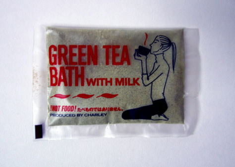
The problem is, the packet actually shows the profile of a woman drinking a cup of tea. From an art director’s point of view, this might be understandable: both tea and milk are things you drink. But hey, these are bath salts! So, the manufacturer has thoughtfully added a disclaimer at the bottom of the packet: !NOT FOOD! The illustration on the packet is a great example of visual design that defies all common logic. Why send out visual signals that create a problem that has the potential to make people very, very sick?

Five Kinds of Design Dissonance

The key word when discussing the effect of design dissonance is misleading. Dissonance can manifest itself in several ways. Here are the basic kinds of design dissonance as I see them:

  • graphic elements that mislead
  • shapes and sizes that mislead
  • words that mislead, or create inappropriate associations
  • actions, colors, or other elements that don’t easily cross cultural boundaries
  • functionality that runs counter to users’ expectations

If you spot any of these in your own work, I urge you to do your best to eliminate them. At best, design dissonance can make your product the butt of a joke; at its worst, it can kill people. Now, I want to share some of my favorite examples of design dissonance.

Everyone Reacts to Design Dissonance

When I was first starting out as a young stage director back in the 1970s, I produced a drama in which a radio played a key role. It was constantly being turned on, turned off, turned up, and turned down by members of the cast. Rather than giving our overworked sound engineer hundreds of extra cues to handle, my solution was to gut the radio, install a better speaker, and install a working volume control knob. Then, the sound engineer could simply switch on the tape of a radio program up in the sound booth and leave it on throughout the show. So that’s exactly what the tech staff did. But there was a catch.

For some incomprehensible reason, if someone wanted to raise the radio’s volume, they had to turn the knob counter-clockwise, which is the exact opposite of how these things work in real life. When I complained to my tech crew, they told me that replacing the potentiometer would be difficult—and no one would notice anyway. I should have put up a fight, but this seemed too minor a point to make a fuss over. Well, I was wrong. Not only did people notice, two newspaper reviews commented on this anomaly—one even making the interesting argument that this subtle reversal was symbolic of how modern society was turning social values on end. But in truth, it was just a dumb design flaw. I’ve since learned to pay attention to these kinds of things because, minor as they may appear, someone always notices. (Don’t believe me? Search for goofs on IMDB.)

This is a classic example of functionality that runs counter to expectations. Not only was it difficult for the actors (our users) to remember how this goofy system worked, it was clear that people observing their actions were also aware of this anomaly.

Misdirection for Fun and Profit

Many examples of design dissonance relate to shape and size. For example, I recently bought a bottle of aspirin. According to the label, there were 100 tablets in the opaque, plastic container. But when I opened the bottle, I saw that it actually had room for 500 or more tablets. Although I knew exactly how many tablets I had purchased, the size of the package had clearly influenced my choice. Because I know from experience how long I can expect a bottle of this size to last in my house, my choice wasn’t based just on the quantitative information on the label, but on qualitative information as well—the bottle’s size. Another design mismatch—in this case, probably a cunningly well-choreographed one on the part of the aspirin company.

In fact, designing large packages for small items has become the norm for many products—from pharmaceuticals and cosmetics to candies and breakfast cereals. (“Warning: contents may settle during shipping.”) Today, potato-chip bags are filled with air to protect the contents. But this technique also makes the bag look as though it holds many more chips. Hence, I appreciate the honesty of Pringles, whose machine-made chips come neatly stacked in a round cardboard tube. No wasted space. Lots to eat. Although I hear from product managers at Pringles that people tend to think that Pringles chips are overpriced. (“Folks expect a big bag for the same price.”) It is sad to think that honesty may not always be the best design policy when it comes to retail packaging.

Language and Labeling

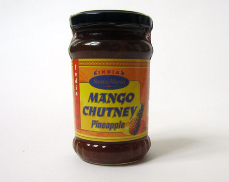
The use of language on product’s labels is another common source of design dissonance. For example, my supermarket sells a mango chutney, shown in Figure 2, that is actually made primarily of pineapple. To be fair, if you read the list of ingredients carefully, you’ll find that there is a bit of mango in the mix. However, thinking in terms of design dissonance, calling a product mango when it is actually made from another fruit is quite odd. Why not just call this product Pineapple Chutney?

Figure 2—A jar of chutney—is it mango or pineapple?
A jar of chutney—is it mango or pineapple?

A quick search of the Internet will present countless examples of badly named products. In most instances, humor arises from an inadvertent foray into the world of design dissonance.

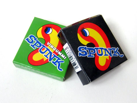
Here’s a fairly harmless example that will undoubtedly cause native English speakers to smile. The Danish candy manufacturer Gajol has created wine gummies called Spunk, shown in Figure 3. Apparently, the company didn’t know that, in English, spunk is slang for semen. The somewhat amoeba-shaped figure on the package is organic enough to be mistaken for spermatozoa by the uninitiated. Both the name and related graphic are especially funny when you think that this is candy for children. Okay, I admit this isn’t a major design flaw, but it certainly is funny.

Figure 3—Spunk?
Spunk?

Danes are proud of their ability with languages, which is perhaps why they so often forget to ask a native speakers of other languages for an evaluation of a new brand name. A case in point: one of their largest dairies, Arla, has tried for years to market a line of products called Cheasy. Check out the definition of cheasy on Urban Dictionary. Not surprisingly, these products don’t do well in English-language markets.

Of course, every country makes similar mistakes, so perhaps it’s unfair to pick on the Danes. Even more frequently, companies forget their business context. The label Forgot password? on the international Alzheimer’s site is a particularly sad example.

Visual Effects That Hinder Rather Than Help

Far too often, companies ask graphic designers to come up with solutions to mundane problems without ensuring that they actually understand how their solution will be implemented. Here are two examples.

My supermarket has some wonderful milk from a small local dairy. It really does taste better than the products that distant cow-milking factories produce in industrial-strength volumes. Incidentally, I recently learned that the further milk needs to be transported in a tanker truck, the more the taste of the milk changes. But I digress…

For reasons that I have never understood, we can open milk cartons only from one side. Yet the graphics on the cartons from this lovely, local dairy, shown in Figure 4, sport a decorative band that suggests the carton should be opened from the wrong side. I’ve been testing this design for several years now, whenever guests stay at my house. In three out of four cases, they’ve opened the milk carton from the wrong side. Design dissonance.

Figure 4—A confusing milk carton
A confusing milk carton

My second story is about a local Danish gossip magazine, Billed Bladet. I get a copy each week—not so much to read about Posh Spice and other pseudo-celebrities, but because the TV program guide is pretty good. Alas, about a year ago, the publisher redesigned the page showing the films on TV for any given day. In Figure 5, you can see that thin, vertical, black lines separate the columns, suggesting that you should read the movie listings by perusing columns rather than by reading across the page. But no. The guide lists movies according to their starting time—just as they have for many years—and you must to read them from left to right, not top to bottom. Again, design dissonance—and a particularly silly problem at that!

Figure 5—TV program guide in Billed Bladet
TV program guide in Billed Bladet

Culture and Design Dissonance

In the Far East, China in particular, there is a tradition of placing a small, mechanical cat, like that shown in Figure 6, in a shop window. The cat waves one of its paws, beckoning potential customers inside. However, for Westerners, its particular movement suggests, Go away.

If you are dealing with an international audience, make sure your designs downplay specific cultural preferences and prejudices. Designers in the Americas and Europe need to be particularly aware of Asian, African, and Middle Eastern cultural issues and taboos. The opportunities to make devastating mistakes are huge, in terms of design dissonance—particularly with regard to the use of the colors red, white, and green. If you are in doubt, make sure to enlist the aid of a local partner to ensure that your project stays on track. I’d like to say more about this, but an exploration of the subject of cultural differences will have to wait for another article.

Figure 6—Mechanical cat in a Chinese shop window
Mechanical cat in a Chinese shop window

Philip Starck, Don Norman, and Kitsch

Years ago, I read a remarkably entertaining, yet surprisingly academic book with the unlikely title Kitsch: The World of Bad Taste, by Gillo Dorfles. Paintings of dogs playing poker are typical kitsch. But Dorfles provided an interesting, alternative definition that went beyond the concept of bad taste. He suggested that any object that pretended to be something other than what it was is kitsch. So, bad paintings that pretend to be art are kitsch. So are miniature Statues of Liberty with thermometers running up the back. And so are Eiffel Tower-shaped pepper mills.

But what about sculpture that masquerades as industrial design? If you accept Dorfles’ definition, which I do, even Le Corbusier’s famous Le Grand Confort armchair from 1929, also called LC3, is kitsch. If you don’t agree, try sitting in this very uncomfortable object for an hour or two. It is no more a chair than a rock on a mountainside is.

So, now that you know where I’m coming from, let’s consider Philippe Starck’s iconic Juicy Salif lemon squeezer—the one on the cover of Don Norman’s superb book, Emotional Design, shown in Figure 7. It is a good lemon squeezer, but only up to a point. Because you get both juice and seeds, you need to strain the juice. It also makes a mess of your work surface. So, I put this squeezer in the category of kitsch, which is closely related to my concept of design dissonance.

Figure 7Juicy Salif lemon squeezer on Don Norman’s book cover
Juicy Salif lemon squeezer on Don Norman’s book cover

In a curious exchange on a listserv some years back, Don Norman initially took great offence to my comments regarding Starck and kitsch. As it turns out, Don has the gold-plated Salif model that cannot tolerate citric acid, so his squeezer decorates his front hall. And that is its proper place, if you ask me. I keep mine in the kitchen, but only as a reminder that, when it comes to cooking, functionality takes precedence over form.

A final note on the cover of Don’s book: The close observer will notice that, while a lemon is being squeezed, the juice in the glass comes from an orange… Dare I say design dissonance?

How Great Expectations Became Bleak House in San Francisco

When I arrived at the rather magnificent Mark Hopkins Hotel at 1 Nob Hill in San Francisco, I didn’t find a simple, chocolate mint on my pillow. Instead, as Figure 8 shows, there was a beribboned box from Bloomingdale’s. Of course, I was paying around 400 bucks for the evening, so I figured they could spring for a bit more luxury than the Ramada Inn.

Figure 8—Beribboned box on my pillow at Mark Hopkins
Beribboned box on my pillow at Mark Hopkins

Imagine my surprise—and disappointment—at discovering that there was no chocolate in this fancy package. Instead, as shown in Figure 9, there was a card that explained: if I took it up to the second floor in Bloomingdale’s and made a purchase, I would get a discount.

Figure 9—What a disappointment!
What a disapointment!

In terms of service design, this example of design dissonance rates about as high on the WTF-scale as you can get. Good service design isn’t about meeting expectations, but exceeding them. While a guest might assume that the Mark Hopkins would get a kickback from Bloomingdale’s, the guest is getting far less than expected. Lose-lose-lose situation, if you ask me. The Mark Hopkins compromised quality for commerce, Bloomingdale’s didn’t deliver the goods, and my sweet tooth remained unsatisfied.

Misfeasance or Murder?

At the beginning of this article, I stated that design dissonance could actually kill people. The definition of misfeasance is to take inappropriate action or intentionally give incorrect advice. In Turin, Italy, back in 1983, design dissonance played a leading role in an incident that left 64 people dead.

The owner of a popular movie house, Cinema Statuto, had decided to take measures to prevent guests in the balcony from helping their friends sneak in through the emergency exits. His solution was to increase the tension on the emergency-exit crash bars, so a single person alone could not open the doors. The doors weren’t actually locked, yet that is the impression they gave. This decision had tragic consequences on the night of February 13, 1983, when a fire broke out. Even though the fire was quickly suppressed, 64 people died as the result of smoke inhalation, primarily in the balcony. Here’s what happened.

The first person to reach the doors found that he couldn’t open them, but did not enlist the aid of more people to force the doors. Instead, the movie patrons did the logical thing and looked for other exits. In other words, due to design dissonance, people took the inappropriate action, because the logical action—going to the emergency exits—didn’t seem to work.

People are still debating how the second part of the misfeasance definition, intentionally giving incorrect advice, applies in the Cinema Statuto case. Here’s why: The seats in the theater were “fire-resistant,” thus providing a sense of security to the theater owner, the fire authorities, and the local building inspectors. However, as any fireman would tell you, most people who die in fires don’t actually burn to death, they suffocate. And in Turin that fateful night, the smoldering, “fire-resistant” seats gave off deadly hydrogen cyanide gas. People didn’t just suffocate; many were poisoned.

From my perspective, giving people in authority a false sense of security is also a design-dissonance problem. Although the seats were indeed fire resistant, their chemical composition actually made them even more deadly. However you look at this, the fact remains: 64 people died. And bad design decisions were responsible for their deaths.

Design dissonance. Keep it in mind. And try not to kill anyone. 

Chairman and CEO at The FatDUX Group

Copenhagen, Denmark

Eric ReissEric’s company, the Copenhagen-based FatDUX Group ApS, designs online and offline interactive experiences and has offices and associates in over a dozen countries worldwide. The author of Practical Information Architecture, Web Dogma '06, and Usable Usability, Eric has also contributed to several other books and publications, including Designing Web Navigation and Pervasive Information Architecture, and has added his commentary to the online Encyclopedia of Human-Computer Interaction. Eric was President of the Information Architecture Institute for two terms and is the current Chair of the European Information Architecture Summit. He is active on the information architecture, usability, user experience, and service design scenes.  Read More

Other Articles on Software User Experiences

New on UXmatters