Top

Designing Intuitive Point-of-Interest and Point-of-Sale Touch Interfaces

August 19, 2013

Touch and multi-touch technologies are everywhere, with Apple and its i-devices leading the way. Legions of designers battle everyday to create user interfaces for POI (point of interest) and POS (point of sale) installations that are unique, provide stylish graphics, and still remain easy to use. At the same time, users are becoming increasingly impatient with touch technology. If the device in front of them does not react to their input as they expect, they will quickly abandon it to find something else. Thus, it is essential to create a user interface that is intuitive and easy to use—for anyone. At Ventuz, we have struggled with this same issue for years and have come up with some best practices for creating effective, engaging, interactive POI and POS installations.

Champion Advertisement
Continue Reading…

Form Follows Function

Touch technology is now the number one focus of developers worldwide, and every new gadget that enters the marketplace sparks huge hype. Motion tracking in 3D space is the current favorite of 2013, first with Kinect, then more recently with Leap Motion. These technologies are extraordinary and open up a wide variety of possibilities for POI and POS systems. But one should choose the interactive technology—for example, touch, multitouch, gesture, or voice—that best fits a particular installation carefully.

For stand-alone POI and POS installations, the best choice of interactive technology is one that visitors can understand most quickly. While the best means of operating a very detailed, multilayered information application is with a highly responsive touchscreen, 3D-motion detection like Kinect’s is appropriate for more playful installations that have less informational value. A good rule of thumb is to look at your content, pick a device, then start programming your user interface. Keep in mind that complex navigation that presents many points of interaction is easier to operate on a touchscreen than via motion-tracking, while Kinect and other motion trackers are perfect for large, swipey gestures.

Figure 1 shows a great example of a presentation that includes both swipe gestures and a detailed touchscreen interface. Pictures That Move created it for the city of Madrid’s Olympic pitch.

Figure 1Olympic pitch for the city of Madrid

Usability is a rallying cry of UX design. Can a person use an application efficiently over long periods of time? With touch and gesture devices for POI and POS, where interactions may be brief, one-time events, an emphasis on usability must be balanced with a focus on rapid learnability and discoverability. Can a user figure out how to perform a specific task without its requiring strong attention, focus, training, ToolTips, or documentation?

Navigation Made Easy

You have only a few seconds to convince users that what your POI or POS installation presents is interesting and worth their time. Only a few seconds during which you need to make both its topic and the touch concept clear. That is why—yet again—less is more. Present users with only a handful of obvious navigation options with clear labels. Nobody has the time or patience to read through a long list of possibilities. If a list is necessary, make sure that it is easily scrollable or implement search functionality.

When it comes to structuring your interactive presentation, don’t make it too complicated. Users should not have to make more than two or three choices before getting to the information they were looking for. Of course, it is always useful to provide a tidbit of information at every level. That way, users more quickly get engaged with your content—although, they might actually take longer to get where they were planning to go.

The agency three monkeys used Ventuz for a touch presentation at the inauguration of KAUST University, shown in Figure 2, which provides a good example of the need for easy navigation. They needed to include a lot of information and did so very cleverly by presenting a bit of information at every step in the navigation. So users could decide whether they already knew enough about a certain topic or needed more—in which case, they could take another step into the content.

Figure 2—Touch user interface for the inauguration of KAUST University on a Holo Info Terminal

When designing buttons or sliders, be sure that users can determine what will happen before they click them. You can best accomplish this by using clear language and well-known icons. Don’t fool yourself that what is obvious to you will be obvious to everyone else. Instead, show your icons and labels to people who know nothing about your presentation, then ask them what they would expect to happen if they clicked a button or dragged a slider. (This is standard practice in usability testing, which too often gets bypassed.)

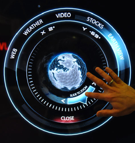
There is a tendency to avoid text in user interface design for multitouch devices—the notion being that it is less elegant. But sometimes labels are necessary for users to feel comfortable with a user interface. For example, as shown in Figure 3, you might need to refer to a slider as Slide to Zoom or a close button might need to read Close. Also, it is essential that you review your content’s information architecture and structure. Make sure that nothing gets lost or remains unseen due to confusing wording or classification.

Figure 3—Labels in a touch user interface for the ISE 2011 Info Terminal
Labels in a touch user interface for the ISE 2011 Info Terminal

Design advanced or nuanced features for discoverability. Such discoverable elements should not be critical to getting to essential content, but can instead provide opportunities for delivering the surprise and delight of enhanced functionality. Each discovery of a new feature or tidbit of information in a user interface acts as a reward that helps to reinforce a personal affinity and an increasing intimacy between the user and the application.

Can’t Touch This?

Today, almost everyone uses touch devices on a daily basis and is familiar with the most common touch gestures. Consequently, people expect certain reactions from touch applications and are disappointed if the outcome differs from what they expect. One thing we always see at exhibitions is that a picture on a touchscreen tempts at least one person to try to scale it up or move it around. While Ventuz provides an incredibly easy way to make images react in that way through its Touch Transformation node, it is not always sensible—let alone necessary—to provide scalable or movable images. In some applications, this could even lead to touch overlaps that result in glitches and unexpected responses.

What users expect and what your application should provide could be two very different things. Therefore, it might be necessary to create your content in such a way that it doesn’t tempt users to try to interact with the parts of the application that are not touchable. There are several ways of accomplishing this. One easy way is to use a design that is similar to common Web site designs, with a navigation bar at the side or at the top. This design is so familiar to all users today that they will quickly understand what to do. But a Web site layout may be too standard an approach for some installations—especially for companies who see sophisticated design as one of their trademarks—so simply not enough. 

If you intend to use a custom user interface design, just be careful that it doesn’t stray too far from what users expect—and that its more innovative elements are not so innovative that users can’t easily discover them. In some cases, it might be necessary to indicate what items users can interact with. You can do this by applying a specific design to all touchable items—such as dimensionality, a certain color, a special highlight, or a thicker frame. Users are usually quick to understand these treatments. An animation—like a moving flare on a frame or a pulsating light—also draws users’ attention. As always, follow UX design best practices and test your application on naive users before releasing it. Watch users interact with it. You will quickly see where your design needs improving.

The example in Figure 4 shows a unique user interface that was created by Pictures That Move and Stereolize, two agencies that are well known for their innovative design work. Although the user interface forges a new path—with the rotation of the table as its central element—well-known icons, clear wording, and hints on how users can operate the user interface make it easy for anyone to engage with the content.

Figure 4Interactive Info Terminal for Barcelo Hotels

The Escape Route

Even if your navigation is simple and the paths through your content are easy to find, it always makes sense to implement an escape route. This usually consists of a button that appears on every page. Tapping this button should bring the user back to the very first page of your content—just as a Home link does on a Web site. Users don’t want to go through the long process of having to click Back again and again.

The escape route also gives users some privacy—especially on a point of sale installation where they might have provided private information. In such cases, it’s always helpful to include a Goodbye screen that clearly shows that all processes have ended, much like a screen that appears once a user signs out. This is especially important if a user has to take off in a hurry. Always try to spark positive emotions, even when a user is leaving your application.

Competing for User Engagement

When designing multitouch POS or POI user interfaces, it is important to keep in mind that there is always competition for users’ attention and engagement—not only from other POS installations, but also from the smartphone in their pocket, the Google Glass they’re wearing, or the electronic billboard on the wall. It is challenging to develop a user experience that can stand out from the crowd, yet still feel immediately familiar and intuitive. The right multitouch software, innovative visual design, and validation testing with users to ensure a solution’s learnability and discoverability provide a solid foundation on which to build. For POS and POI, an infinite number of stunning, interactive user experiences are just around the corner. All we have to do is choose the right device for the job at hand, create a user interface that is easily operable on that device, and follow a few design best practices for multitouch user interfaces. 

Copywriter at Ventuz Technology

Munich, Germany

Katharina GlückKatharina has always been a SciFi-geek and technology buff. Her dream was to walk the Star Trek Holodeck or use the hovering multitouch user interfaces of Iron Man, wanting them to be more than just CGI effects. After an attempt to go into the film industry, she discovered that there were already a few companies out there doing what, until then, had seemed impossible: integrating existing technologies to create elegant, interactive user interfaces and presentations that are as compelling as in any SciFi movie. She joined Marketing at Ventuz Technology, a developer of real-time graphics software solutions for presentations and events. At Ventuz, she has been involved in projects ranging from large interactive video walls, immersive domes, holographic projections, and sophisticated corporate presentations to projection mapping on buildings. She currently works as a freelance copywriter and editor and remains very engaged with Ventuz Technology.  Read More

Other Articles on UX Design

New on UXmatters