Top

Eye Tracking in User Experience Design

September 22, 2014

This is a sample chapter from Jennifer Romano Bergstrom and Andrew Schall’s new book, Eye Tracking in User Experience Design. 2014 Morgan Kaufmann.

Chapter 5: Forms and Surveys

Cover of Eye Tracking in User Experience Design

By Caroline Jarrett and Jennifer Romano Bergstrom

Introduction

Most parts of a Web experience are optional. Forms usually are not.

You want to use a Web service? Register for it—using a form. You want to buy something on the Internet? Select it, then go through the checkout—using a form. Want to insure a car, book a flight, apply for a loan? You will find a form standing as a barrier between you and your goal.

Champion Advertisement
Continue Reading…

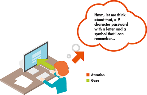
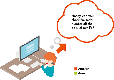
Some surveys are similar. Your response may be required by law, and lack of response may be punished by a fine or worse.

But in some ways, even “mandatory” forms and surveys are optional. When faced with a challenging form, the user may delay, abandon, or incur the cost of asking someone else, such as an accountant or family member, to tackle the form. All of these options increase the burden for the individual and pose potential problems for data quality. As a result, low response rates are now threatening the viability of the ordinary everyday survey, historically a powerful tool for social, academic, and market research. And costs increase—for the user and for the organization that wants the user’s data.

In this chapter, we explore what eye tracking can tell us about the user experience of forms and surveys. We then discuss when eye tracking is appropriate and when it can be misleading.

Our conclusions are:

  • For simple forms and straightforward surveys, eye tracking can guide your design decisions.
  • For more complex examples, consider your eye-tracking data only in light of data from your other usability findings and cognitive interviews.

Forms and Surveys Have a Lot in Common

There are different types of forms, varying in the amount and type of information they ask for. For example, in some, users need merely to enter their username and password. However, in others, they need to enter quite a bit more. The amount of information and the cognitive resources required to complete forms can greatly impact eye-tracking data.

In this chapter, we focus on the form or survey itself (a sequence of questions and places for users to answer) rather than on the entire process of the users’ transactions or the data collection.

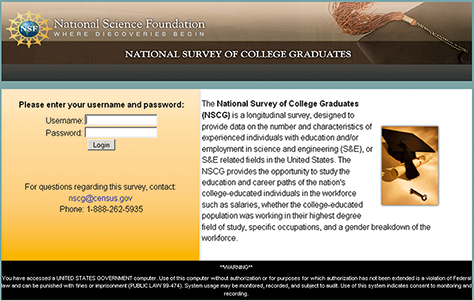
In this narrow sense, what is the difference between a form and a survey? Not very much. Both ask questions and provide ways for users to answer those questions. Broadly, we call something a “survey” if the responses are optional and will be used in aggregate, and a “form” if the responses are compulsory and will be used individually. But there can be overlaps. For example, sometimes a survey begins with a form (Figure 5.1).

Figure 5.1— A form that requires users to provide a username and password to log in to the survey.
A form that requires users to provide a username and password to log in to the survey.

And sometimes a survey asks questions that will be used individually, or are compulsory (Figure 5.2).

Figure 5.2— A survey that requires users to enter household demographics.
A survey that requires users to enter household demographics.

We can talk about the two together in this chapter because whether it is a form or a survey, users interact with it in similar ways.

Some Examples of What We Can Learn from Eye Tracking Forms and Surveys

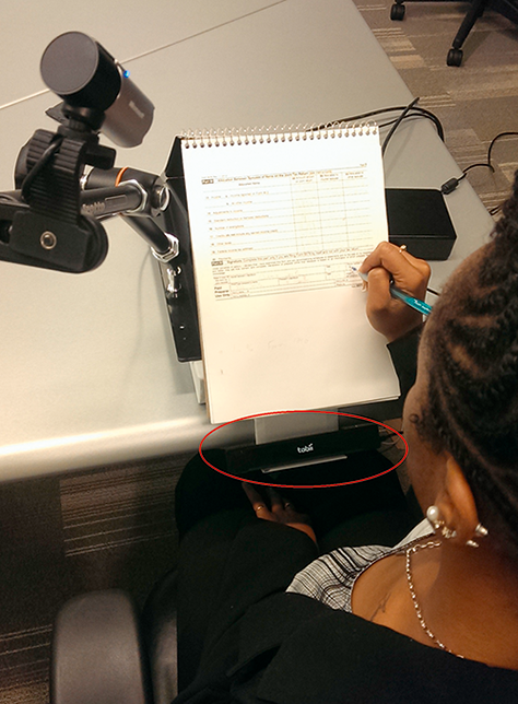
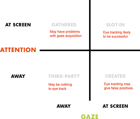
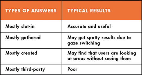
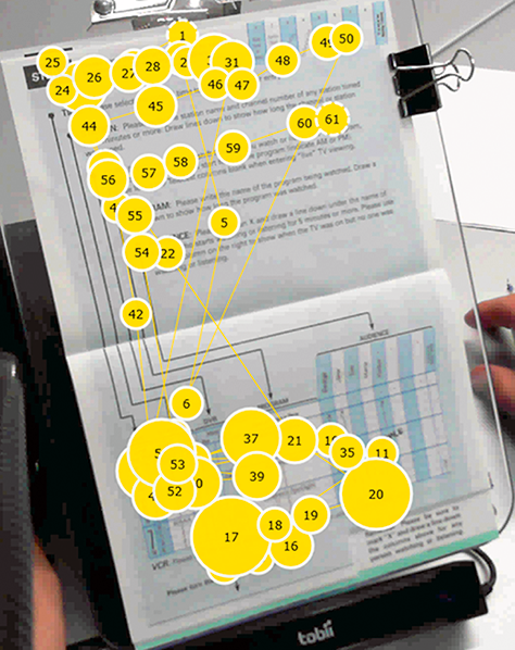
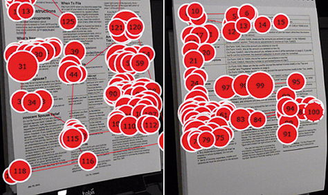
In many ways, eye tracking a form or survey is just like eye tracking anything else. Today we are even able to successfully obtain eye-tracking data from paper by mounting it to a clipboard, as in Figure 5.3. However, the different types of questions and layouts of questions and response options can play a big role in the quality of eye-tracking data. Let’s look at what we can learn about forms and surveys from eye tracking.

Figure 5.3— F-shaped eye track of the block of text at the top of the page; completely different pattern on the questions and answer spaces at the bottom of the page.
F-shaped eye track of the block of text at the top of the page; completely different pattern on the questions and answer spaces at the bottom of the page.

People Read Pages with Questions on Them Differently from Other Pages

You are probably familiar with the idea that “people read Web pages in an F-shaped pattern” (discussed further in Chapter 7). That is, they read the first few sentences, then the first few words of each line, and then a couple of sentences further down the page (perhaps in a new paragraph), and then the first few words of each line below that.

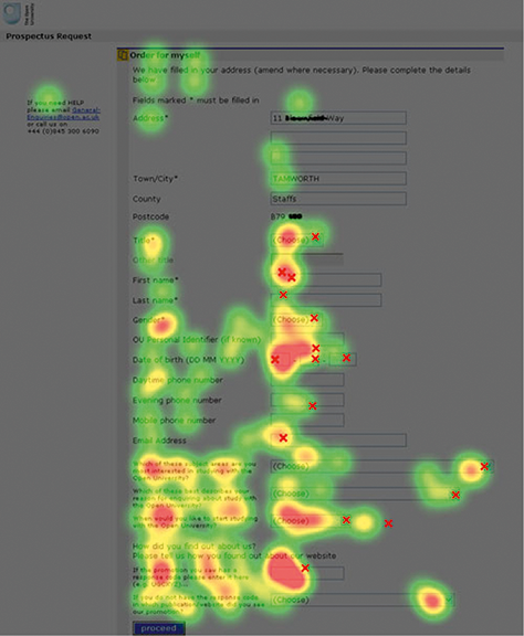
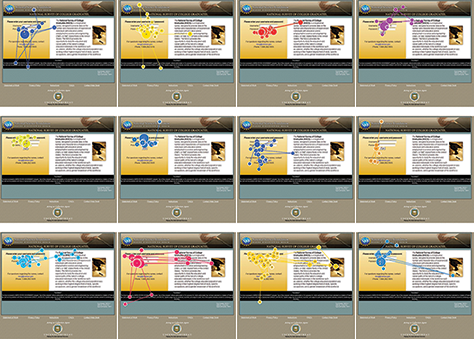
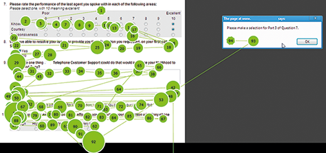
That F-shaped pattern may hold true for some content-heavy pages, but eye tracking reveals that people react entirely differently to pages that are full of questions and answer spaces. These differences are neatly revealed by the contrasting eye-tracking patterns in Figure 5.3.

When testing pages with questions on them, we consistently find that users avoid looking at the instructions. Instead, they focus on the questions.

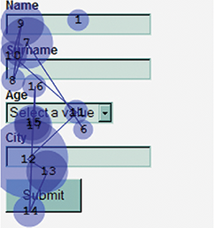
In Figure 5.4, we see a typical example: gaze plots reveal that most people quickly looked for the “slots” to put their information in so they could move rapidly to their goal of finishing.

Figure 5.4— Participants in the usability study did not read the instructions on the right—they went immediately to the actionable slots on the left. (From Romano & Chen, 2011.)
Participants in the usability study did not read the instructions on the right—they went immediately to the actionable slots on the left. (From Romano & Chen, 2011.)

Do people ever read instructions on forms or surveys? Not very often—unless they have a problem with a question. Then they might. Or they might bail out. Figure 5.5 shows a typical pattern for two pages full of instructions; the participant quickly scanned then turned the page to get to the questions.

Figure 5.5— The participant did not read the instructions in their entirety (page 1, left; page 3, right); rather, he skimmed and then moved on to the form where he needed to enter information. Participants in this study flipped back to the instructions only when they needed help completing the form.
The participant did not read the instructions in their entirety (page 1, left; page 3, right); rather, he skimmed and then moved on to the form where he needed to enter information. Participants in this study flipped back to the instructions only when they needed help completing the form.

If your instructions are short, helpful, and placed only where needed, they might keep your users from giving up. If the questions themselves are too long, users may react to them as instructions and skip directly to the response options.

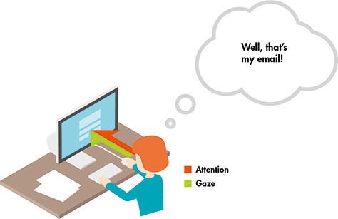
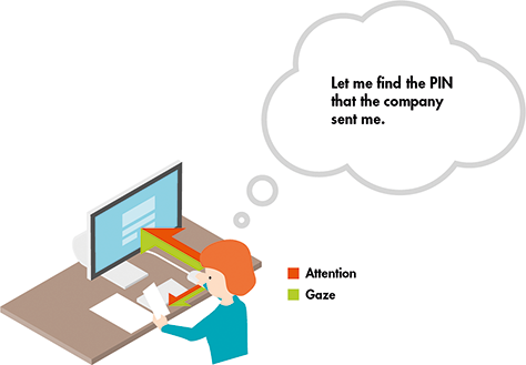
Eye tracking allowed us to identify some respondent behaviors that did not conform to the normative model of survey response. Whereas the model expects a respondent to read the question and then select a response option, we collected eye-tracking data that showed participants skipping questions and going directly to the response options. One thing we learned was that people take any shortcuts possible to finish a questionnaire, even in a laboratory setting. They have lives to live! If they can guess what the question was asking by looking at the response options, they will skip the question. Of course, their guess may not be right, and a design intervention may be needed to ensure that they have read the question. Thus, the results of eye tracking can inform survey design in many ways.—Betty Murphy, formerly Principal Researcher, Human Factors and Usability Group, U.S. Census Bureau (currently Senior Human Factors Researcher, Human Solutions, Inc.)

These eye-tracking results lead to three important guidelines about instructions for forms and surveys:

  • Write your instructions in plain language.
  • Cut instructions that users do not need.
  • Place instructions where users need them.

Write Your Instructions in Plain Language

Many instructions are written by technical specialists who concentrate on the subject matter, not clear writing. It is up to the user experience professional to get the instructions into plain language.

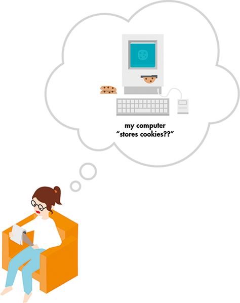
For example, watch the jargon (Redish, 2012). The word “cookie” may be familiar to your users, but are they thinking about the same type of cookie (Figure 5.6)?

Figure 5.6— Users may not understand basic words, like cookies.
Users may not understand basic words, like cookies.

Cut Instructions That Users Do Not Need

Once users have clicked on an online form or survey, they do not want instructions on how to fill in the form. They have passed that point.

Limit yourself to the briefest of statements about what users can achieve by filling in the form. Provide a link back to additional information if you like.

Users do not want to be told that a form or survey will be “easy and quick,” and they do not want claims about how long the form will take.

  • If the form is genuinely easy, the users can just get on with it.
  • If it is not, you have undermined the users’ confidence straight away.
  • Exception: if it is going to be an exceptionally lengthy task, perhaps several hours, then it might be kind to warn users about that. (And definitely, explain to them about the wonderful save-and-resume features you have implemented.)

Place Instructions Where Users Need Them

You may need some instructions on your forms and surveys. Some can actually be quite helpful, such as:

  • A good title that indicates what the form is for
  • A list of anything that users might have to gather to answer the questions
  • Information on how to get help
  • A thank-you message that says what will happen next.

The title and list of things to gather need to go at the beginning, the information about help in the middle, and the thank-you message at the end.

People Look for Buttons Near the Response Boxes

There is a long-running discussion in many organizations about whether the “OK” or “Next” button— properly, the primary action button—should go to the left or right of the “Cancel,” “Back,” or “Previous” buttons—properly, the secondary action buttons.

Eye tracking reveals that users learn where to look for the primary navigation button quite quickly, no matter where it is placed, as in Figure 5.7 (Romano Bergstrom et al., under review). By the time participants reached screen 23, the layout of the buttons no longer affected them.

Figure 5.7— Users learned where to look for the primary navigation button by screen 23. (From Romano Bergstrom et al., under review.)
Users learned where to look for the primary navigation button by screen 23. (From Romano Bergstrom et al., under review.)

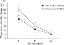
But they do not like it when the Next button is to the left of the Previous button.

In a typical example where participants were asked to complete a survey with ‘Next’ to the left of ‘Previous’, many participants said that it was counterintuitive to have ‘Previous’ on the right. One participant said that she disliked the “buttons being flipped” although she liked the look and size of the buttons. Another participant said that having ‘Next’ on the left “really irritated” him, and another said that the order of the buttons was “opposite of what most people would design.” In contrast, for the version with ‘Previous’ to the left of ‘Next’, no one explicitly claimed that the location of the buttons was problematic. One participant said that the buttons looked “pretty standard, like what you would typically see on Web sites.” Another said the location was “logical.”—Romano and Chen, 2011.

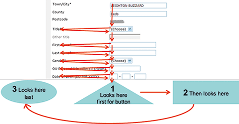
Eye tracking reveals that the important thing to users is not where the buttons are placed relative to each other, it is where the buttons are placed relative to the fields (Jarrett, 2012). Users hunt for their primary action button when they believe they have finished the entries for that page of the form or survey, and they generally look for it first immediately under the entry they have just filled in, as in the schematic in Figure 5.8.

Figure 5.8— Schematic of a typical eye-tracking pattern for hunting for buttons. (Adapted from Jarrett, 2012.)
Schematic of a typical eye-tracking pattern for hunting for buttons. (Adapted from Jarrett, 2012.)

Place Navigation Buttons Near the Entry Boxes

To ensure that users can find your primary action button easily (and preferably before they get to page 23 of your form or survey), place it near the left-hand edge of the column of entry boxes. Then design your secondary action buttons so that they are clearly less visually obvious than the primary button, and placed sensibly, in particular, with Previous toward the left edge of the page.

People Fill in Forms More Quickly if the Labels Are Near the Fields

The schematic in Figure 5.8 also illustrates the typical reading pattern for a form page:

  • Look for the next place to put an answer (a “field), then
  • Look for the question that goes with it (the “label”).

Just as with the placement of the primary action buttons, there is a long-running discussion over where the labels should go relative to the fields. Or at least this topic was discussed greatly until Matteo Penzo (2006) published an eye-tracking study that showed that users fill in forms more quickly if the labels are near the fields.

Penzo claimed that forms are filled in more quickly if the labels are above the boxes, as shown in Figure 5.9. A subsequent study (Das et al., 2008) found no difference in speed of completion, even in a simple form, but there appears to be an advantage for users if the labels are easy to associate with the fields.

For example, if the labels are too far away, as in Figure 5.10, then users’ eyes have to work harder to bridge the gap, and they may associate the wrong label with the field.

Figure 5.9— Saccades are shorter when the label is easy to find compared to the field. (From Penzo, 2006.)
Saccades are shorter when the label is easy to find compared to the field. (From Penzo, 2006.)
Figure 5.10— The radio buttons are far away from the response options.
The radio buttons are far away from the response options.

Place the Label Near the Entry Field

Help users by putting the labels near the fields and making sure that each label is unambiguously associated with the correct field. Whether you decide to place the labels above or below the entry fields, make it easy on the user by being consistent.

Users Get Confused about Whether They Are Supposed to Write Over Existing Text

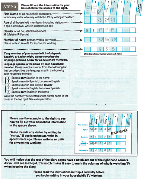
If you were thinking of “helpfully” including a hint—or even worse, the label—in an entry field, think again. When there is text in the entry field, users get confused about whether they are supposed to write or type over the existing text.

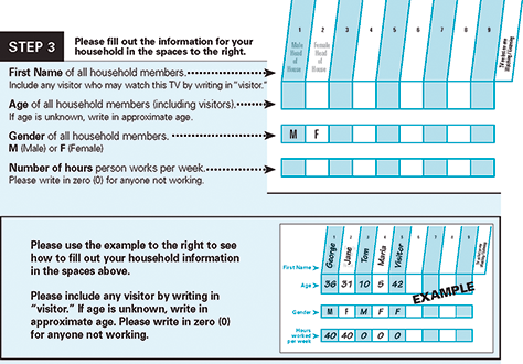
For example, in the form in Figure 5.11, participants consistently skipped over the first two entries and wrote in the names of household members starting in the third entry box, as shown. They did this even though there was an example at the bottom showing them how to use the form. They said things like: “If you want someone to write something in, you shouldn’t have writing in the box,” “I’m not sure if I’m supposed to write in over the lettering,” and “Where am I supposed to write it? On top of this?”

Figure 5.11— The dark font in the entry boxes at the top misinforms users that they are not supposed to write in those boxes.
The dark font in the entry boxes at the top misinforms users that they are not supposed to write in those boxes.

We have many times observed the same behavior in Web and electronic forms and surveys (Jarrett, 2010b).

Do Not Put Any Text Inside the Response Boxes

Do not put anything where users are meant to type or write. Leave the insides of boxes clear of labels, hints, and any other types of clutter so it is clear where they are supposed to write.

Users May Miss Error Messages That Are Too Far from the Error

The best error message is one that never happens, because your questions are so clear and easy to answer that users never make any mistakes. Realistically, some problems will occur: miskeying, misunderstanding, or failing to read part of a question.

When an error occurs, it is important to make sure that an appropriate message appears where users will see it and that it is easy to find the problematic part of the form.

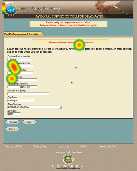
Romano and Chen (2011) tested a survey that had two “overall” error messages: one at the top of the page, and one at the top of the problematic question. The screenshot in Figure 5.12 illustrates the problem: users expect a single overview message, not one that is split into two places. In fact, they rarely or never saw the uppermost part of the message, which explained that the question could be skipped. Although correcting the problem is preferable, skipping the question would be better than dropping out of the survey altogether, and users who did not see the upper message might simply drop out.

Figure 5.12— Users failed to spot one of the two overall error messages on this screen.
Users failed to spot one of the two overall error messages on this screen.

We also often see users have difficulties when the error message is far away from the main part of the survey, as shown in Figure 5.13. This causes the respondent to turn his/her attention away from the main survey to read the error message then look back to the survey to figure out where the error is.

Figure 5.13— The error message on the right is too far from the field that it relates to.
The error message on the right is too far from the field that it relates to.

Put Error Messages Where Users Will See Them

Make it easy on your users. Place the error message near the error so the user does not have to figure out what and where it is. Be sure to phrase the messages in a positive, helpful manner that explains how to fix the errors.

Our recommendations are:

  • Put a helpful message next to each field that is wrong.
  • If there is any risk that the problematic fields might not be visible when the user views the top of the page, then include an overall message that explains what the problem(s) are (and make sure it deals with all of them).

For more information about what error messages should say, see “Avoid Being Embarrassed by Your Error Messages.”—Jarrett, 2010a

Double-Banked Lists of Response Options Appear Shorter

There is a long-running discussion among researchers about what is best for a long list of response options:

  • A long scrolling list or
  • Double-banked (i.e., split in half and displayed side by side)

A benefit of a long scrolling list is that the items visually appear to belong to one group; however, if the list is too long, users will have to scroll up and down to see the complete list, and they may forget items at the top of the list when they read items at the bottom of the list.

With double-banked lists, there is potentially no scrolling, users may see all options at once (if the list is not too long), and the list may appear shorter. But users may not realize that the right-hand half of the list relates to the question.

Romano and Chen (2011) tested two versions of a survey: one had a long scrolling list of response options (shown on the left in Figure 5.14), and one had a double-banked list (shown on right). Participants tended to look at the second half of the list quicker and more often when double banked. Most participants reported that they preferred double-banked lists.

Figure 5.14— A long scrolling list of options (left) and a double-banked list (right). (From Romano & Chen 2011.)
A long scrolling list of options (left) and a double-banked list (right). (From Romano & Chen 2011.)

Avoid Long Lists of Response Options

While eye-tracking data on this topic is still limited, double-banked lists can appear shorter, and shorter forms often seem more appealing to users. If you must present a long list of options, a double-banked display can help, provided the columns are not too far apart so that the two lists are clearly part of the same set of options.

But to be clear: we are talking about a double-banked set of response options within a single question. This is definitely not a recommendation to create forms that have two columns of questions, which is a clearly bad idea because users often fail to notice the right-hand column (e.g., Appleseed, 2011).

However, the challenge of the long list of options neatly illustrates the limitations of a purely visual approach to form and survey design. Better solutions to solve the problem include:

  • Breaking long lists into smaller questions or a series of yes/no questions
  • Running a pilot test, then reducing the list of options to the ones that people actually choose
  • Running a pilot test, then reducing the list options to a small selection of the most popular ones, with a “show me more” option that allows users to choose from a longer list if necessary.

When Eye Tracking of Forms and Surveys Works (and When It Does Not)

Penzo’s 2006 study was on forms that were simple, to the point of being trivial. As he points out, “users very quickly understood the meaning of the input fields.” On such ultra-simple forms, the saccade time might indeed be an important proportion of the overall time to complete.

Instead consider the framework from Jarrett and Gaffney (2008; adapted from Tourangeau et al., 2000). There are four steps to answering a question:

  • Understanding the question
  • Finding the answer
  • Judging the answer
  • Placing the answer on the form or survey.

For most forms and surveys, the saccade time is only a small element of the time for Step 1, and the Penzo (2006) study ignores the times for Steps 3 to 4.

Eye tracking can clearly demonstrate problems with Step 1: Understanding the question. Eye-tracking data can show if users backtrack as they scan and rescan items in an attempt to understand the question. More difficult questions will often show up on a heat map as brighter spots because users will re-read the items, as in Figure 5.15.

Figure 5.15— Eye tracking shows that users re-read the more difficult questions.
Eye tracking shows that users re-read the more difficult questions.

Write Clear Questions That Users Can Answer

The implications of all this? Make sure that your questions are easily understood by the intended audience and understood in the same way that you intended them. Conduct cognitive testing to ensure that your audience understands your questions and that the information you collect is thus valid.

Cognitive interviews enable us to understand the respondents’ thought process as they interpret survey items and determine the answers. In cognitive interviews, participants may think aloud as they come up with their answers to the questions. The interviewer probes about specific items (e.g., questions, response options, labels) and what they mean to the participant. We are able to determine if people understand the items as we have intended, and we are able to make modifications before a survey or form is final. For more on the cognitive interviewing technique, see Willis, 2005.

Gaze and Attention Are Different

In the examples above, we have focused mainly on the visual design of forms and surveys, and how those areas can influence Step 1: Understanding the question. Gaze patterns can give us some insights into what users look at, and how what they look at can influence their thinking (“cognitive processes”).

Eye tracking gave us a way to document where participants were looking while doing tasks during usability testing. Heat maps and gaze patterns offered quite dramatic and undeniable evidence to show designers and survey clients how their layout of questions, response options, instructions, and other elements guided (or misled) the respondent’s cognitive processes of navigating and completing an online questionnaire.—Betty Murphy, formerly Principal Researcher, Human Factors and Usability Group, U.S. Census Bureau (currently Senior Human Factors Researcher, Human Solutions, Inc.)

We use the term “gaze” to mean the direction the user’s eyes are pointing in. Gaze is detectable by eye-tracking equipment as long as the gaze is directed somewhat toward the equipment.

In contrast, we use the term “attention” to mean: the focus of the user’s cognitive processes. Ideally, when we are conducting eye tracking, we want the user’s gaze and attention to both be directed toward the form, as in Figure 5.16.

Figure 5.16— Participant enters her name and date on a paper form while her eyes are tracked (eye tracker circled in red). Attention and gaze are both directed at the form.
Participant enters her name and date on a paper form while her eyes are tracked (eye tracker circled in red). Attention and gaze are both directed at the form.

We sometimes hear the phrase “blank gaze” used when a person’s eyes are directed toward something but their attention is elsewhere, so they are not really taking in whatever their eyes are looking at.

The types of questions and responses affect eye-tracking data. Answering the question can mean at least four different types of answers (Jarrett & Gaffney, 2008):

  • Slot-in, where the user knows the answer
  • Gathered, where the user has to get information from somewhere
  • Created, where the user has to think up the answer
  • Third-party, where the user has to ask someone else

In general, when we are using eye tracking we assume that gaze and attention are in harmony. But for forms and surveys, that is not always true. We will illustrate what we mean in this section, by digging into Step 2: Finding the answer.

Let’s say Jane wants to sign up for a warranty for a new television, and she has to complete an online form to do so. She has to find answers to a variety of questions, and each requires a different strategy, which in turn, affects eye tracking.

Slot-In Answers: Gaze and Attention Together Toward Questions

When dealing with slot-in answers—things like a user’s own name and date of birth—users’ gaze and attention tend to be in the same place: on the screen, as in Figure 5.17. These answers are in their heads, and they are looking for the right place to “slot them in” on the form or survey. It is cognitively simple to find these answers and does not take much attention.

Figure 5.17— Users have slot-in answers in their heads and look for the right place to slot them in to the form or survey. Attention and gaze are both directed at the form.
Users have slot-in answers in their heads and look for the right place to slot them in to the form or survey. Attention and gaze are both directed at the form.

Gathered Answers: Gaze and Attention Split

If users have to find information from somewhere other than the screen, such as from Jane’s television receipt, or from a credit card, or from another screen, their gaze and attention will become split between the boxes on the screen and whatever gathered material they are using (Figure 5.18). They will have to switch back and forth between the two sources of information. For Jane, the sequence might be something like the process in Table 5.1.

Figure 5.18— When users have to gather the required answer from an external source, not in their heads, attention and gaze are split.
When users have to gather the required answer from an external source, not in their heads, attention and gaze are split.
Table 5.1—Mixed Gaze and Attention for a Gathered Answer
  Action Gaze Attention
1.

Jane reads a question on the screen that asks for a code from her receipt.

On the screen

Toward the screen

2.

She realizes that she needs to look at the receipt to get the code.

Still on the screen

Toward her own thoughts: Where is that receipt?

3.

She looks at the receipt.

On the receipt

Mixed: thinking about the form and finding the matching data on the receipt

4.

She finds the code.

On the receipt

Toward her own thoughts, storing the code in short-term memory

5.

Jane looks back at the screen while holding the code in short-term memory.

On the screen

Split: between retrieving the code from short-term memory and finding the box to type into

6.

If Jane forgets part of the code, Steps 2 through 5 will be repeated.

Mixed between screen and receipt

Mixed between screen, receipt, and her thoughts

That gaze switching away from the screen is a challenge for the eye tracker, which must try to acquire and re-acquire the gaze pattern after each switch.

Created Answers: Gaze Toward Questions, Attention Elsewhere

Here are some examples of created answers:

  • Thinking up a password that has complex rules,
  • Writing the message for a gift card, or
  • Providing a response to an open-ended question like “Why do you want this job?”

These typical created answers take a lot more attention. The user’s gaze may still be directed at the screen, but the mind is elsewhere thinking about the answer (Figure 5.19).

Figure 5.19— Users have to create an answer on the spot. Gaze is on the form, but attention is to their thoughts (inward).
Users have to create an answer on the spot. Gaze is on the form, but attention is to their thoughts (inward).

For Jane, it might go something like this:

  • Jane reads a question on the screen that asks her to create a unique password that contains nine characters, a letter, and a symbol (gaze and attention are on screen).
  • Jane thinks hard about a password that meets these criteria and that she can remember (gaze is still on screen, but attention is to her thoughts).
  • Jane creates a password and enters it in the box on the screen (gaze and attention are on screen).
  • If the password does not meet the criteria, Jane will have to think of a new password, and Steps 1 through 3 will be repeated.

That attention switching away from the screen can give “false positives,” where the eye tracker is reporting that some element on the screen is receiving the user’s gaze, but the user is not actually making any cognitive use of that element.

Third-Party Answers: Gaze and Attention Elsewhere

A third-party answer is one where the users have to ask someone else, a third party, for the answer. To find that third-party answer, users are likely to switch both their gaze and their attention toward something else.

For example, when completing a warranty form, Jane might have to call her partner to look up the serial number (Figure 5.20). She is fully removed from the original questions as she obtains the information she needs to complete the form. It might go something like this:

  • Jane reads a question on the screen that asks her for the serial number (gaze and attention are on screen).
  • Jane knows she does not have this information, so she picks up her phone and calls her partner who is at home and can check for the serial number (gaze is on something in the room, and attention is to her phone and partner on the phone).
  • This phone call may last a while, and no eye-tracking data can be collected.
  • Once Jane has the serial number, she enters it in the box on the screen (gaze and attention are on screen).
  • If the phone call took too long, Jane may have gotten kicked out of the form and may have to log back in to proceed.
Figure 5.20— Users have to ask a third party for the answer—they do not know it themselves, but they know someone else who does: attention and gaze are both directed away from the form.
Users have to ask a third party for the answer—they do not know it themselves, but they know someone else who does: attention and gaze are both directed away from the form.

Third-party answers can present the ultimate challenge for an eye tracker: with gaze and attention both elsewhere, there is no gaze available for it to acquire.

For accurate eye tracking, you want users to have their attention and gaze going to the same place:

  • If attention is elsewhere, you can get false readings: it appears the user is looking at something, but not actually seeing it (such as when Jane has to create a complex password).
  • If gaze is elsewhere—or swapping back and forth, such as when Jane looks for the PIN number—you will get intermittent eye-tracking data. Each time the gaze comes back to the screen, the eye tracker has to re-acquire the gaze and make something of it.
  • If both gaze and attention are elsewhere, you have got nothing to eye track!

These challenges are shown together in Figure 5.21.

Figure 5.21— Eye tracking is most likely to be successful on forms and surveys that call for slot-in answers, where both gaze and attention are directed at the screen.
Eye tracking is most likely to be successful on forms and surveys that call for slot-in answers, where both gaze and attention are directed at the screen.

The implications? Eye-tracking success depends on the proportions of the different answers in your form or survey. It may be the case that some data, for example for slot-in responses, is useful, while other data, such as for gathered responses, is not so useful. It is important to consider the type of questions you are asking and the strategy respondents must use to answer as you examine the eye-tracking data (Figure 5.22).

Figure 5.22— Different types of form/survey questions produce different types of eye-tracking results.
Different types of form/survey questions produce different types of eye-tracking results.

How do you find out what types of questions and answers you have? Inspecting the questions is a good start, but you will definitely get a more realistic assessment if you interview users, ideally as a cognitive interview.

And do not forget that the classic observational usability test—watching a participant fill in your form or survey, as naturally as possible—is the single best way of finding out whether it works (Jarrett & Gaffney, 2008).

Conclusion

In this chapter, we have explained that eye-tracking data can help to learn about the visual design of pages with questions on them: forms and surveys.

We have found that eye tracking has been helpful in revealing how users really interact with simple forms, especially:

  • How little they rely on instructions
  • Where they look for buttons
  • How they proceed from box to box when there are many questions.

But we have also found that eye tracking can be unreliable when users encounter more complex questions that take their gaze or attention away from the screen.

To repeat from earlier, our conclusions are:

  • For simple forms and straightforward surveys, eye tracking can guide your design decisions.
  • For more complex examples, consider your eye-tracking data only in light of data from your other usability findings and cognitive interviews. 

Discount for UXmatters Readers—Buy Eye Tracking in User Experience Design and other Morgan Kaufmann titles on the Morgan Kaufmann site, using the discount code PBTY14, and save 25% off the retail price.

Acknowledgments

Thank you to Jon Dang (USA Today) for creating illustrations used in this chapter and to Ginny Redish (Redish and Associates) and Stephanie Rosenbaum (TecEd, Inc.) for helpful feedback on an earlier version of this chapter.

References

Appleseed, J., 2011. “Form Field Usability: Avoid Multi-Column Layouts.” Baymard Institute. Retrieved September 30, 2013.

Das, S., McEwan, T., and Douglas, D., 2008. “Using Eye-tracking to Evaluate Label Alignment in Online Forms.” In Proceedings of the 5th Nordic Conference on Human-Computer Interaction: Building Bridges. ACM Press, Lund, Sweden, pp. 451–454.

Jarrett, Caroline, 2010a. “Avoid Being Embarrassed by Your Error Messages.” UXmatters. Retrieved May 20, 2013.

Jarrett, Caroline, 2010b. “Don’t Put Hints Inside Text Boxes in Web Forms.” UXmatters. Retrieved May 20, 2013.

Jarrett, Caroline, 2012. “Buttons on Forms and Surveys: A Look at Some Research.” Presentation at the Information Design Association Conference, Greenwich, UK. SlideShare. Retrieved May 20, 2013.

Jarrett, Caroline, and Gaffney, Gerry, 2008. Forms That Work: Designing Web Forms for Usability. Elsevier, Amsterdam.

Penzo, Matteo, 2006. “Label Placement in Forms.” UXmatters. Retrieved May 20, 2013.

Redish, Ginny, 2012. Letting Go of the Words. Elsevier, Amsterdam.

Romano, J.C., and Chen, J.M., 2011. “A Usability and Eye-Tracking Evaluation of Four Versions of the Online National Survey for College Graduates (NSCG): Iteration 2.”PDF Statistical Research Division (Study Series SSM2011-01). U.S. Census Bureau.

Romano Bergstrom, J.C., Lakhe, S., and Erdman, C., (under review). “Next Belongs to the Right of Previous in Web-based Surveys: An Experimental Usability Study.”

Tourangeau, R., Rips, L.J., and Rasinski, K.A., 2000. The Psychology of Survey Response. Cambridge University Press, New York.

Willis, G.B., 2005. Cognitive Interviewing: A Tool for Improving Questionnaire Design. Sage Publications, Thousand Oaks, CA.

UX Researcher at Facebook

New York City, New York, USA

Jennifer Romano BergstromJennifer has over 15 years of experience planning, managing, and conducting quantitative and qualitative user-centered research projects, specializing in experimental design, implicit learning, and eyetracking. At Facebook, she leads UX research for Privacy and Safety Check—previously, for Facebook Lite and Videos—conducting and managing UX studies across multiple teams and collaborating across disciplines to understand the user experience. Jennifer co-authored Eye Tracking in User Experience Design with Andrew Schall (Morgan Kaufmann, 2014) and Usability Testing for Survey Research with Emily Geisen (Morgan Kaufmann, 2017) and has published peer-reviewed articles in many journals. She frequently presents research and conducts workshops at local, national, and international events and conferences. Before joining Facebook, she formed the UX Division at Fors Marsh Group (FMG), in Washington, DC, where she designed a state-of-the-art laboratory and recruited, trained, and led a team of UX researchers. Prior to FMG, she taught a team of researchers at the U.S. Census Bureau how to use eyetracking data from usability research to impact designs for web sites, surveys, and forms. She teaches UX Design and Research courses to government agencies, UX professionals, and students. Jennifer is President of the User Experience Professionals’ Association (UXPA) and Past President of both the DC Chapter of the Usability Professionals’ Association (UPA) and the DC Chapter of the American Association for Public Opinion Research. She received her B.A. in Psychology from Central Connecticut State University and her M.A. and PhD in Applied/Experimental Psychology from The Catholic University of America.  Read More

UX Leader at Modernizing Medicine

Miami, Florida, USA

Andrew SchallAndrew has over 10 years of experience as a UX researcher and designer and currently works at SPARK Experience Design, a UX consulting firm outside Washington, DC. He is a PhD candidate in Human-Centered Computing at the University of Maryland, Baltimore County. Andrew has worked with numerous public and private organizations — including Aflac, Fossil, GlaxoSmithKline, NASA, PBS, and the U.S. Department of Energy — doing eyetracking for them as part of their user-centered design process. He is a frequent presenter on eyetracking, speaking at conferences such as Human Computer Interaction International, User Experience Professionals’ Association, and User Focus.  Read More

Other Articles on Sample Chapters

New on UXmatters