This is a sample chapter from Laura Klein’s new book Build Better Products: A Modern Approach to Building Successful User-Centered Products. 2016 Rosenfeld Media.
Chapter 11: Measure Better
Teams get rewarded based on whether they’ve shipped features on time and on budget for a very good reason—it’s easy to measure. It’s trivial to track things like how many new features are in the latest release or whether version 2.0 was shipped when it was promised.
Sometimes companies make a small effort to tie reviews to real performance. They’ll do it by giving everybody a bonus if the company makes its third-quarter revenue targets or if their division meets a certain large goal for releasing a new product.
Unfortunately, both of these tactics are useless for understanding whether or not a team’s work has made a product better for users.
Champion Advertisement
Continue Reading…
If you want to understand if what you’re building is making a positive difference in the lives of your users or the bottom line of your business, you need to measure at a much more granular level. You need to pick smart metrics and then track them obsessively with every change.
Build Metrics in Early
Here’s a fun thing to do. Go up to an engineer and ask them whether the percentage of people who log in to your product is higher this week than last week. Or pick some metric that you need to make a decision.
If the engineer points you to a place where you can get that information yourself or can quickly add something that allows you to look it up in the future, you’re working in a special place with special engineers. Maybe buy them a drink or some pizza. They deserve it.
If you’re working in every other company, the engineer will give you a look and say that it will take several weeks of dedicated engineering time to answer the question if it’s even possible, which it probably isn’t. The engineer isn’t doing this to be difficult. It turns out that adding the ability to collect specific types of data after the fact is hard.
Companies that measure and experiment on a regular basis have to build testing systems in early. This doesn’t mean that you should give up on experimentation if you already have a product. It means that you’re going to have to spend some time building a system that lets you experiment. But you want to think about the things you want to track and test in each feature before you build it.
It may take awhile. It may be hard. Do it anyway. Very little of this stuff works if you can’t measure your results. Sure, you’re more likely to be right when you make decisions based on user research, but you won’t know you’re right if you can’t test to see what the real impact of your decisions is.
Types of Metrics
There are a lot of ways to think about what you want to test, and it’s going to be different depending on your product and your technical capabilities and what you’re trying to learn. Instead of giving you a list of things you need to care about, let’s look at some of the different types of metrics you’ll need to track over time.
Business Metrics
Business metrics are the numbers we talked about way back in Chapter 1, “Defining a Business Need,” and that I refused to stop droning on about in every subsequent chapter. These are the numbers that matter to you, as a company.
These are positive things like how much money you bring in, what the Lifetime Value is of a customer, and how long people stick around. You also need to track the negative side of the business with things like churn rate, cost of goods—if you sell goods—and customer acquisition and retention costs. If you bring in $10 of revenue for every user, but it costs you more than that to acquire and keep them happy, that’s a thing you should know.
These things are still true, even if you work at a nonprofit or in government or education or any other field where revenue isn’t the primary motivator. The fact that you don’t care about revenue does not absolve you from the need to track your business metrics. You still run a business. It’s just that profit is not the primary motivating factor. It’s a little tricky because you have to decide what your key metric is, and it’s more often tied to money than you might want to admit.
I talked to a nonprofit that helped people adopt pets. Obviously, they were not optimizing for revenue. They weren’t even optimizing for most pets adopted. In many cases like this, you’ll have to optimize for whatever metric it is that the people funding you care about. Nonprofits don’t operate without money coming in. It’s just not coming in from the users. In that case, you will need to track donations or grants, and understand the people who make donations and grants as a separate set of customers.
In many ways, these organizations are similar to enterprise software companies. Your customer is not necessarily your user. The customer is the person who writes the check. The user is the person who uses the product. In an enterprise deal, you might be selling millions of dollars of software to a Fortune 500 CIO, while it’s the call center employees who are the users. In a pet adoption nonprofit, you might be trying to convince a wealthy patron to write you a check, while it’s regular families who are using your product or service to find adoptable pets.
In both cases, you need to understand what will motivate the person to write the check, as well as what constitutes a successful interaction for the person who uses the product.
Regardless of which business metrics you’re optimizing for, you should constantly be tracking them, hopefully through some sort of dashboard that is easily accessible and updated on a regular basis.
User Experience and Engineering Metrics
It may seem a little odd to combine user experience and engineering metrics, but they’re more related than you think they are. There is a set of metrics that deeply affect your user’s experience across the entire product. This includes things like:
speed
downtime or failure rate
number of critical bugs or defects
These are all things that affect the user experience, but they are often caused by engineering or manufacturing processes. Take the speed of your product, for example. If you’re building anything that needs to take in information and respond to users, very few things have a bigger effect on your user experience than how fast it works.
This isn’t just Web sites. Think how frustrating it is to open a mobile app and have it lag for 30 seconds. Or to stand there staring at a payment screen at the grocery store while you wonder if your card got read or if you have to swipe it again. Or to push a button on a remote control and get no indication that anything has happened for several seconds, during which time you push the button three or four more times, which means you end up deleting something off your DVR, taking you to a screen you don’t know how to get back from.
Are these life-threatening problems? No. Could they be? Sure, if they happened on a medical device or in your car or with piece of heavy machinery. But even when they’re not terribly serious, they’re still seriously terrible. Things like gradually slowing down your product can greatly reduce your user’s enjoyment or productivity.
Downtime and failure rates are another thing that can cause everything from pain and mild annoyance to serious risk. When Facebook has an outage for a few hours, everybody freaks out. When Nest had an outage for a few hours on its cloud-based baby monitors, people stopped being able to tell whether their babies were safe. These are terrible user experience problems.
The thing is, we rarely track all of these things, which is why a lot of software, specifically, often seems to degrade over time. It gets big and slow and buggy, all of which can drive users away, even if you’re still solving an important problem for them.
Teams don’t track these because they don’t tend to be tied to any single feature or working group. Product managers are judged based on whether they ship a feature. Even in good companies with good incentive structures, they’re judged on the outcome of that specific feature. They’re rarely held accountable for the damage that they do to the engineering infrastructure when the feature gets shipped.
Don’t be that company. You’re not just responsible for your little corner of the product. You’re responsible for the experience the user has with your product. It includes things like speed and bugs and keeping everything working most of the time.
Make sure that you’re specifying in your stories what sorts of trade-offs, if any, you’re willing to accept in terms of performance. Also, make sure to schedule time to fix what you break. But the important thing to remember here is that you’ll never even know you broke anything if you’re not tracking these important but often overlooked metrics.
Health Metrics
Health metrics are interesting, because they can actually be business metrics or user experience metrics or engineering metrics. In fact, they’re a good way to make sure that you’re not destroying the user experience or the business.
These are simply metrics that you have decided you need to track during experiments to make sure they don’t get worse. And you should be pretty explicit about them.
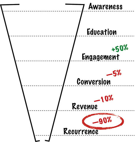
Let me give you an example. Imagine you’ve created a new onboarding system that you expect to improve engagement by 20%. You run the A/B test, and you find that the new onboarding exceeds your expectations. A full 50% more people are making it all the way through and engaging with the product! That’s fantastic! Break out the champagne!
Unless, of course, you notice that, a month later, your retention numbers have plummeted. Pushing more people through your simplified onboarding process meant that, while they technically engaged with the product, they weren’t really prepared to succeed with the rest of your product. You got more people through one step of the funnel, but they were the wrong people, or it set them up to fail later and abandon your product before they paid you.
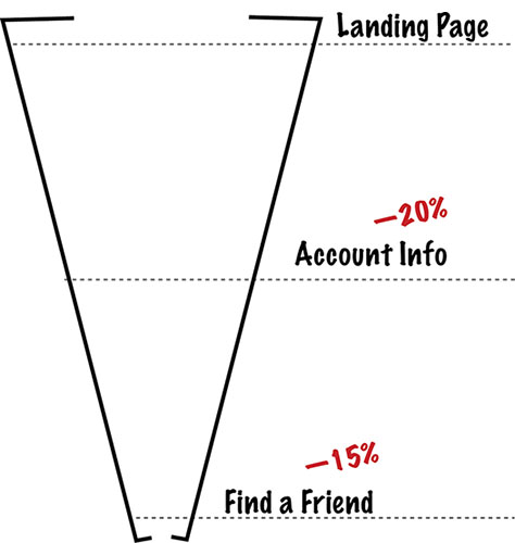
This is why every experiment that you run should list both the metrics you hope will be improved and the metrics that you mustn’t destroy (see Figure 11.1). In terms of business metrics, you should be monitoring everything in your user lifecycle funnel below the metric you’re trying to affect.
Figure 11.1—Measure the whole funnel, not just one metric.
It’s up to you which engineering and user experience metrics you choose to monitor, but I strongly recommend that you work with engineering to determine which systems are most likely to be impacted by any change.
Leading Metrics
It’s important that you understand leading metrics, because the chances are that you will screw them up at some point. Virtually everybody does.
A leading metric is something that you track because you believe it is linked to a metric that you care about that will happen sometime in the future. For example, if you wanted to lose weight, you might start tracking the number of miles you run. Your hypothesis would be that exercising more would affect the number that you actually care about—your weight. It’s something that you can track on a daily basis that will hopefully have a delayed, cumulative effect at some point in the future. The number of miles I run, you think in a hopeful and slightly deluded manner, is entirely under my control.
And sometimes this works. You increase the number of miles you run, and, a few days or weeks later, you start to see some weight loss. Other times, it doesn’t work. Sometimes you increase the number of miles you run and you also increase your calorie intake because you’re really hungry after a long run and damn it you deserve that ice cream, so you end up gaining weight. By you, of course, I mean I.
Anyway, the same thing happens with other leading metrics in your business. The reason we have leading metrics is that some of the things we care about measuring take a really long time to track. For example, 90-day retention is hard to measure in an A/B test, because, by definition, you need to run the experiment for at least 90 days before you start to see results. That’s a long time, especially if you’ve gotten something wrong and need to make a change and run it again. So, instead, you look for things that you think will cause users to be retained long term.
Feature-Specific Metrics
Feature-specific metrics are the kind that you’ll likely deal with on a regular basis. These are the metrics that you measure when you add or change a feature in order to understand how and by whom the feature is being used.
Gathering feature specific metrics, like how often people use a particular feature or what percentage of paying users engage with the feature, can be important for deciding what to do with the feature. There are times when you have to kill pieces of your product. The more features something has, the more complicated it becomes (see Figure 11.2). If you realize something’s only being used by two percent of your user base or is disproportionately being used by nonpaying customers, it’s an excellent candidate for elimination.
Figure 11.2—More is not always better.
Feature specific metrics are critical for helping you understand which 10% of your product is useful to your paying users. Oh, and if all of your users are actively engaged with more than 10% of the product, congratulations. You’re probably destroying your competition.
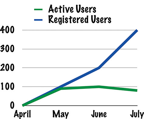
Vanity Metrics
No discussion of metrics would be complete without a mention of vanity metrics. This is a term coined by Eric Ries in The Lean Startup. They are numbers that make us feel good, but don’t mean anything or help us make decisions.
The classic vanity metric is registered users, because it’s a number that literally cannot go anywhere but up and to the right. Once somebody has registered to use your product, they’re a registered user forever, so you can only get more of them. You can have millions of registered users and not a single active or paying user (see Figure 11.3).
Figure 11.3—Registered users look great! Active users, not so much…
You might care a little about how many new users are registering today versus last month or last year, because that might be an indicator of how well your marketing is working, but the raw number of registered users doesn’t matter. There’s nothing you can do with it. There are no decisions that you can make based on it. And most importantly, making it go up doesn’t necessarily lead to things you really care about like profits or long-term retention.
Measure What Matters
That’s a lot of different kinds of metrics. You’re probably wondering how to pick the right thing. The first step is to only measure the things that matter to your business.
Before you ask your team to start measuring a specific metric, ask yourself, “What would I do with this information if I had it?” If the answer is something along the lines of “I’d know more about X,” then you probably don’t need it. Knowing more about random things is not a goal. Would you remove the feature? Would you change it in some way? Would you change your strategy? Would you validate that your strategy was working so you could keep doing it? If understanding some aspect of user behavior could change your actions, you should be tracking it. If it’s just information, don’t worry about it.
EXERCISE: PICK A METRIC
Let’s do a short exercise to help you figure out what’s useful and why. Imagine that you have an app that helps people find new apartments. You add a feature that lets people save apartments to look at later. What do you measure? Take a look at Figure 11.4.
Figure 11.4—What do you measure?
Run the Exercise: Pick a Metric
Time to run: 10 minutes
Materials needed: Critical thinking skills and maybe somewhere to record your answer
People involved: Product managers, designers, researchers, engineers
Exercise goal: Understand which metric indicates useful changes in user behavior.
Show of hands—who said they wanted to measure the number of people who click the Save button? This will have to be on the honor system, since I can’t see your hands. I am in the past.
For those of you who said that’s what they’d measure, now answer this question: “What would you do with that number?”
Not much. There are really only a couple of things to do with that number, and those are a) to use it to figure out if you should kill the feature entirely or b) to understand if you’ve broken something.
For example, if absolutely nobody clicked the Save button, you’d want to know why. Could they not find it? Did they not understand it? Did they not need it? If the answer is the last one, you should kill the feature. If the answer is the first two, you should fix that.
But you should never have shipped a feature in the first place if you hadn’t done some user research to understand whether it would be useful. And you probably should have done some usability testing to make sure that people could find it and understand it. So, keeping track of the number of people who click the Save button is really only useful on an ongoing basis to make sure that you don’t break it in the future. It’s a feature-specific health metric, if you want to think of it that way.
Okay, so if that’s not the most important metric, what is? For that, you have to ask yourself, what was the business goal of the feature? Presumably you had one of those. In this case, it’s stated right in the description of the feature. The Save button allows people to save apartments to look at later.
This is a retention feature. It’s designed to get people to come back and look at the saved apartments.
So measure that. Measure whether people who save apartments come back more often. Measure whether they stay users for longer. Measure their engagement over time. As a side effect of measuring this, you’ll also learn what percentage of people are clicking the Save button, because you’ll want to dig in and understand how widespread the behavior change is going to be, if it even exists, but the key here is that you know that you’re affecting a key metric in your funnel—recurrence.
If this works, and people who save apartments are more likely to come back and continue to use your product over time, you may want to find ways to encourage them to save apartments. You may want to make it a part of the onboarding process. You may want to send them notifications when there are changes to saved apartments. You’ll know whether the outcome of the feature was what you’d planned, and that is helpful in deciding what to do next, because now you’ve validated a very specific way to improve a key metric.
Why Did You Do That Exercise?
Again, this is less of an exercise and more of something you should do all the time. Metrics and analytics are critical to understanding how your changes are affecting your user behavior, but only if you pick them well.
Bad metrics don’t help you understand anything. They just overwhelm you with data and make you feel like you know what you’re doing. Good metrics illustrate the user behavior you care about changing and the impact that the change will have on your business.
Make sure that you’re always thinking critically about what you want to measure and why it’s important to you.
Measurement Methodologies
I keep talking about metrics as if they were simply numbers, but they’re not. Metrics and analytics are the way that we experiment quantitatively. They’re how we understand exactly what is happening with our product. They show us which features have a statistically significant impact on user behavior, both positive and negative. They help us make decisions.
But just looking at them as numbers—for example, revenue was at $1 million this month—is not particularly helpful. Is $1 million good? It sounds good. I’d be very happy with $1 million dollars in revenue for the month. Unless, of course, the previous month I’d made $2 million. Then I’d want to know what had happened.
In fact, every time I’ve made a change to my product, I want to know what happened with my feature-specific metrics and whether my health metrics have been negatively affected. If you want to know those things, and you should, there are a few different types of metrics and analytics you should understand how to use.
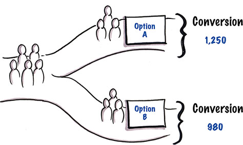
A/B and Multivariate Testing
A/B testing, sometimes called multivariate testing or bucket testing when there are more than two options, is the practice of creating multiple versions of a product, screen, feature, or element and showing one version or the other to each product user in order to see which performs best (see Figure 11.5). This is a solidly quantitative method, and it’s not something that you’re going to do in person. Your goal is to collect data on what different groups of people do, depending on the different version of the product they see.
Figure 11.5—A/B tests measure one version of a product against another.
It’s easiest to explain with an example. Let’s say that you have a great idea for a new onboarding process that will help people get started using your product. Instead of replacing the old onboarding flow with the new one and hoping, you decide to make sure that the new one is really better.
You set up an A/B test where 50% of the new users get the new onboarding process, while the other 50% get the old one. You then measure your key metric—in this case, probably engagement—to see whether more folks in the new onboarding flow engage than in the old onboarding flow. As discussed earlier, you might also want a few health metrics to track, like revenue or early retention, just in case your new onboarding flow is great at getting people onboard, but bad at getting them to come back and pay you.
Once you determine which version is better for moving your key metric, you turn off the experiment and move everybody over to the winning branch.
It is possible to do this with more than two branches at a time, but the more you have, the more users you’ll need to send through the system to get statistically significant results.
Why You Should Use It
A/B testing is the only way to figure out whether a new version of something is better in terms of metrics than the old version. When you release a new feature, you can’t truly understand its impact on the bottom line of your business without running an A/B test. Yes, you can absolutely estimate the impact in various ways. You can certainly get a sense of whether people like the feature or not from qualitative testing and user interviews. You can sometimes guess, based on huge changes in your metrics, that the change you made had an impact. But A/B testing will give you the single best view of what happens when you make a change.
Often, people think that they can get similar information by looking at general trends in metrics. For example, if I release a new feature and suddenly my revenue spikes, that must have been because of the new feature, right? Nope. That’s not how it works.
Let’s say you release a new feature that lets people easily compare prices on your ecommerce Web site. Then you have an enormous day of sales followed by much higher than average revenue for the next six weeks. You might think that price comparison change you made was awesome. Unless, of course, you released it during the week of Thanksgiving, and what you were seeing was the natural increase in sales due to Christmas shopping.
But what if it weren’t the holidays? Couldn’t you tell then? Not perfectly, no. Unless you’re literally the only person releasing features into your product, any one of a number of changes might be causing the improvement. Or maybe it’s that a new group of users have found your product, and their spending habits are different.
When you A/B test, you randomly select people who are naturally coming to your product and either show them one version or another. By doing this, you’re factoring out the kinds of things I mentioned previously. The only real difference between the person in branch a of the experiment and the person in branch b should be what you’re controlling for in the test.
If you have enough users to make a test worthwhile, you should use A/B testing whenever you want to know the actual impact of your changes on your user behavior.
What People Get Wrong
A/B testing has always seemed very straightforward to me, but then, I learned it at a company where it was baked into the culture. Unfortunately, there are still lots of misconceptions people have about A/B tests and things that they get wrong.
Misunderstanding Statistics
If you have 100 users, you’re not going to be able to run an A/B test. I mean, you can run one all you want, but it won’t tell you anything useful. For A/B tests to be informative, you have to have a reasonable number of users in them. This is just basic statistics.
I get a huge number of questions about how to determine how many users you need in order for an A/B test to be statistically significant. I’m not answering that here. There are dozens of statistical significance calculators on the Web that will help you out far more than my sketchy explanation of a t-test. Please go read up on statistics before starting to A/B test.
Another type of statistical mistake people make is treating everything like it’s a pure yes/no answer. In the previous example, we’re assuming there was a clear engagement metric—maybe whether or not people filled out a user profile or completed the onboarding process. People either completed that or they didn’t. It’s a yes/no question.
Other times, we’re looking at how much things change. For example, let’s say your average order size is $56.34 on your ecommerce Web site. You want to see if the changes you’ve made to your product pages make your average order size go up, so you run an A/B test. In one branch, your average order size stays roughly the same: $55.99. In the other branch, your average order size goes up tremendously: $73.43. That’s fantastic!
Except, it might not be. When you’re dealing with numbers like this, you have to be careful of things like outliers and variance. Maybe you had one new customer who spent thousands of dollars and happened to be in that second branch. Of course, if you’re working at Amazon, you have enough data points to smooth that out. But in smaller data sets, even ones that you think will be statistically significant, one or two huge, random outliers can throw off your test.
When you have things that might have wide variance, like the amount spent on an order, you need to factor that into your testing, and you may need a larger data set to reach a reasonable level of comfort that your results are very likely to be true.
The final big statistical mistake I see people making is believing that a statistically significant test result is absolutely true. It’s not. Sorry. Even things that are statistically significant still have a small percentage chance of being false positives or negatives.
There are too many other potential statistical pitfalls you’ll also want to avoid to cover here. If you’re making big decisions based on data, you owe it to yourself and your users to brush up on this stuff by taking a statistics class or by taking a data scientist out for lunch and asking for help.
Failing to Understand the Why
When you get an A/B test result, it’s tempting to celebrate—or mourn—and then roll out the winning branch and get on with your lives. Some of us have other things to do. I mean, I don’t, but I’m optimistic about the rest of you.
The problem with this is that A/B tests don’t give you any insight into why one branch or the other was successful. Sure, you want to believe it was your brilliant new designs, but sometimes it’s chance, and other times it’s something you didn’t expect. I’ve seen tiny, subtle bugs destroy entire experiment branches. When we fixed the bug, the losing branch suddenly became a big sinner.
Another big problem is when you don’t do enough research beforehand to come up with a new design that is grounded in real user needs. I’ve heard people say that most changes that you A/B test will fail. Honestly, I’ve never found that to be true. I occasionally have a failure. I’m not perfect at understanding user needs or at estimating the impact that changes will have on behavior. But most of the things I think will improve metrics do improve those metrics. And if you base your design changes on an excellent understanding of why users do what they do, you’ll likely see similar results, because you’ll be better able to come up with design changes that impact user behavior positively.
A/B tests are great for understanding what’s happening. Make sure that you’re grounding them in qualitative research and spending time doing more qualitative research after they’ve succeeded or failed in order to understand the why.
Only Using It for Optimization
The most common complaint I hear about an A/B test is that it’s “only good for optimization.” In other words, people don’t want to use it because they think that they can only test things like button color or messaging on a single page.
This is nonsense that is grounded in a fundamental misunderstanding of what A/B testing is and is probably caused by all the very simple examples of A/B testing that you see in blog posts. I’m guilty of this as well. It’s really easy to describe A/B testing a button color. It’s almost always useless to actually spend time worrying about the color of your buttons.
You can experiment on virtually anything with A/B testing. You can add new features for some users and not others. You can remove sections of the product for some users. You can change entire flows. You can give people entirely different experiences.
Of course, the more things you change at once, the harder it will be to attribute an improvement in metrics to any specific factor. If you change the visual design or layout of your entire product and then test to see whether it made things better, you won’t know whether the improvement was due to your new typography, the snappy new messaging, or the fantastic alternative to the hamburger menu button. That doesn’t mean you shouldn’t test the new design. After all, even if you’ve done all your research, there’s still a chance that you’re making things worse, not better.
Cohort Analysis
A cohort is simply a group of people who share a particular trait. When you do any sort of cohort analysis, you compare different groups of people to each other (see Figure 11.6). For example, a common form of cohort analysis is to look at the 30-, 60-, or 90-day retention of users by the month they were acquired. Another might be to segment and analyze usage based on the channel through which someone was acquired.
Imagine you decide to start testing some alternate strategies for acquiring users. In addition to the Google Ads you’re already running, you decide to place some ads on very targeted sites and also experiment with writing guest blog posts with links to try out your product.
Obviously, you’ll want to test to see which of these strategies for acquisition works the best. What many people will do is to simply track where visitors are coming from and see which acquisition strategy gives them the most new users. There’s a serious problem with this. Just getting new users isn’t enough. You want new users who will engage, stick around, and hopefully generate revenue. You don’t just want bodies. You want qualified users who are likely to use and pay for your product.
For many products, that might mean tracking the different groups, or cohorts, of users separately over time. How many of the users acquired from the blog posts stuck around and paid you? Was that a larger or smaller percentage than you got from Google Ads or targeted sites or organic search? What if the blog posts only generated a tiny number of users, but every single one of them paid as opposed to Google ads, which might have generated a large number of clicks with very few conversions? The only way to understand that is to look at the different cohorts over time.
Figure 11.6—Where do the best customers come from?
Another example of cohorts might be looking at how your product, in general, is performing over time. Were people who were acquired in the last 30 days more or less likely to pay you than people who were acquired in the previous 30 days? By looking at the cohorts by week, month, or year, you can start to see whether your product is improving over time, which can be extremely useful.
While A/B testing will tell you whether any specific feature performs better than its control, you need something that shows you the cumulative effect of all of your experiments and changes. Cohorts can help you understand this by showing you the key metrics and behaviors of users at different points in time. It can also be very useful for understanding seasonality—for example, whether users acquired on weekends are more or less likely to convert or whether users who were acquired during big sales ever buy again.
Why You Should Use It
Again, use cohorts to tell if your product is getting better or worse over time, but also use it to compare different groups of users to each other. Your needs will vary, but look at all the different ways in which you can segment your users and compare those segments against each other to look for interesting patterns in behavior.
What People Get Wrong
The biggest mistake people use when comparing cohorts is not defining cohorts in a useful way. For some reason, everybody cares about demographics, but demographics are almost always a terrible way to segment your users unless you’re selling children’s toys or something very age specific.
Try segmenting by acquisition date and channel, and then track each cohort’s journey through the User Lifecycle Funnel that you defined in Chapter 1. Then look for other types of segments that might yield interesting or useful patterns to exploit.
Funnel Analysis
I talked a lot about funnels in chapter 1, and I don’t want to go over all that again. The thing to realize here is that the User Lifecycle Funnel isn’t the only way to use funnels. You can use them to measure user progress anywhere in your product that you have a generally linear series of steps.
For example, if you have a three page onboarding flow that gets people to enter some information, you can track the fall off at each step of the flow. That’s a funnel.
Figure 11.7—Use funnels to measure onboarding flow metrics.
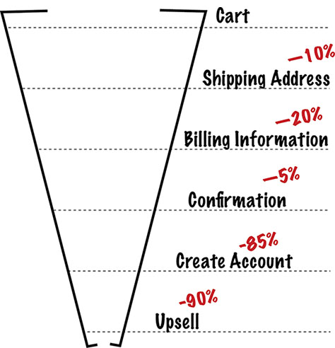
If you have a checkout flow where users have to give payment information and delivery address, you can track to see when users are abandoning their carts. That’s a funnel.
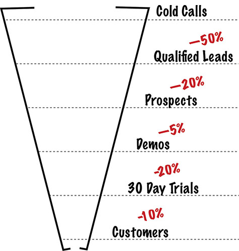
If you have a sales pipeline for your enterprise sales team, you can track how many leads eventually turn into customers. That’s a funnel.
Funnels are everywhere. Use them wisely.
Figure 11.8—Use funnels to measure checkout flow metrics. Figure 11.9—Use funnels to measure sales metrics.
Why You Should Use It
Funnels are a fantastic tool for finding friction points. The question, “If I have a lot of visitors to my product, why is my revenue so low?” can be a tough one to answer. But you can use funnels to narrow down the question and identify the parts of the process where people are failing to pay.
The changes that you make to your product, your marketing, and your sales strategy will vary depending on where people are falling out of the funnel. If they’re taking a look at your product and immediately leaving, maybe it’s your messaging or your branding. If they’re trying your product and then leaving, maybe it’s too hard to use, or it doesn’t solve a serious problem for them. If they’re using the product for awhile but then abandoning it, maybe they’re getting bored or realizing that it doesn’t solve a big enough problem to justify using all the time.
You’ll still have to do some qualitative research to understand the why, but visualizing different interactions as a funnel can help you determine what sorts of research to do and what sorts of experiments to run.
What People Get Wrong
To use funnels, you have to be able to track individuals through using your product. This should be pretty easy if you have logged in users, but it can be tricky if you have a product where people don’t log in or if you’re dealing with consumer goods of any sort.
You also want to be careful how you track people who fall out of the funnel and then re-enter. For example, let’s say that you’re tracking your funnel to see how many people who came in from Facebook ads—that can be a cohort, by the way—made it all the way through the onboarding process for your product. You might have somebody who came in from a Facebook ad and then left. Later, they might come back on their own and complete the onboarding process.
They did fall out of the funnel briefly and then came back, but they’re not really a new person entering the funnel for the first time. They weren’t newly acquired. It’s worth it to know that this person originally came from a Facebook ad, especially if you’re using the funnel to decide whether to run more Facebook ads in the future. There are technical ways to do this in Google Analytics and other analytics platforms, if you have a Web product. It can be tougher for mobile apps or products where users perform different steps of the funnel on different devices. It’s nearly impossible for physical products.
But even when it’s hard, it’s worth digging into with your specific product to see if there are ways you can track this information. The alternative is not having the information, which can make it impossible to make informed decision.
DAU/MAU
You’ve almost certainly run into DAU and MAU, especially if you have a consumer product or anything meant to be used as a habit. DAU is Daily Active Users and MAU is Monthly Active Users. These numbers are useful in determining how sticky your product is or how often people come back and use it on a daily basis.
Both numbers only count unique visitors or users. If someone visits Twitter or an email client or Facebook a dozen times in a day, they’re still only counted as a single user for that time period.
By looking at DAU/MAU—that’s the daily actives divided by the monthly actives—you can estimate user engagement. For example, if you have 1,000,000 active users every month and 200,000 daily active users, that gives you a DAU/MAU of 20%, which means that the average user comes back to your product or app 20% of the days in the month. In a 30-day month, that would be about 6 days.
Why You Should Use It
When a product becomes a habit for users, it means that they’re coming back and engaging with it on a regular schedule without any nagging on your part. That’s good. It means that you don’t rely on things like emails or notifications to get people to keep coming back. It means that the product has become a daily part of their lives, which indicates that they’re more likely to stay customers.
Looking at the trend of your DAU/MAU over time, especially when combined with cohort analysis, can give you an excellent insight into whether your product is becoming more engaging and habit forming. When you add new features, you can look at whether they increase your product’s stickiness. You can also start to see patterns that can predict churn. For example, if your DAU/MAU starts to decline, that may indicate that people are becoming bored with your product or have stopped returning on their own.
What People Get Wrong
This is going to sound a little obvious, but please remember that months have different numbers of days in them. This means that, if you’re just looking at MAU, you’re going to get a little natural fluctuation. May will almost always have more monthly active users than February, because it’s longer. That’s why looking at a ratio like DAU/MAU is more useful than looking at the raw MAU number.
The other thing to keep in mind is that there may be standard scores for healthy DAU/MAU, but it will vary considerably, based on the type of product it is. It’s likely to be much higher in social networking products like Facebook or games than it is in things like ecommerce. You might be able to buy anything in the world at Amazon, but even so, very few people visit it every day.
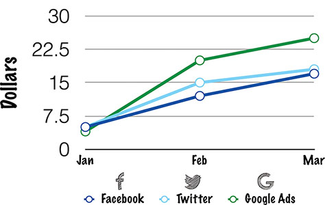
X over X
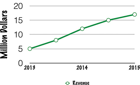
X over X is the most common type of metric that you’ll see, and, after A/B testing, the most commonly screwed up. This is just a generic way of looking at comparisons, like year over year or month over month (see Figure 11.10). In other words, you might look at your year-over-year profits and realize that this year you made 20% more in revenue than last year. Or you might see that this month’s activation rate is 10% lower than last months.
In brick and mortar retail, you’ll often see same store, year-over-year comps, which just means: how each store performed this year compared to how that same store performed last year.
Figure 11.10—See how your sales performed this year versus last year.
Why You Should Use It
It’s a quick shorthand for understanding the general trend of your business. It’s a fairly blunt and easy-to-understand instrument for explaining how much better you’re doing on key metrics.
What People Get Wrong
As with any time-based comparison, people often fail to account for normal things like seasonality or number of days in a month. Month-over-month comparisons are especially useless, both because the days in the month vary and also because some months are naturally going to be better for you than others. Do you have a product that sells things? You’ll probably see an enormous and totally expected difference between December and January. Is your product aimed at kids? You might do better when they’re home from school on summer break.
Month over month has other problems, since months have different numbers of weekends, so if your product is at all sensitive to that, you’re likely to see a lot of variation that isn’t explained by changes to your product. To control for this, and also to get a smoother graph, you may want to look at rolling 30-day numbers rather than month over month. In other words, you’d graph performance of key metric every day for the full previous 30 days. It will help reduce some of the problems with month-over-month comparisons.
The Dangers of Metrics
There are a few more things that people tend to screw up when they’re looking at quantitative data, and I’d like you to avoid them if you can. Feel free to screw up other things and then tell me about them. I like it when people are creative.
Gaming Leading Metrics
At the beginning of the chapter, I talked about leading metrics and how they can help you spot problems and trends before they happen. Instead of waiting six months to see how your six-month retention numbers are doing, if you have a leading metric that happens in the first couple of weeks, you can quickly estimate what will happen with your six-month retention.
We often do this with an engagement or activation metric like Facebook’s make seven friends in ten days number. But let’s look at that number a little more closely. Let’s imagine that you have a new social network called Shmacebook, and you’ve found that people who connect with seven people within the first ten days are very likely to become retained users.
First, let’s look at why someone wouldn’t be likely to connect with seven friends. Maybe none of their friends are on the network yet. This is a pretty typical thing with new social products—it’s called the empty room problem. If you try to join a social network, but there’s nobody for you to be social with, it’s very likely you won’t stick around and become a retained user.
Or it could be that all of their friends are on the network, but the new user can’t figure out how to find or connect with them. If the interface is too confusing for somebody to use it, again, they’re very unlikely to stick around and use the product.
Maybe they just don’t have a burning desire to connect with people online. There are people who prefer engaging with their friends in person or who already have plenty of social outlets or who simply don’t have seven friends. In this case, there’s nothing wrong with the product. It’s just a bad fit for that particular person. They may never be a serious user of the product, because the product doesn’t do anything they need done.
Now, let’s say that your job is to increase your 90-day retention metrics. You want to run some experiments to see what works, but you don’t want to wait 90 days to find out if each one worked, so you’re going to use your 10-day leading metric. You’re going to try to get more people to make seven friends in ten days, because you know that that is likely to cause them to be retained at 90 days.
First, you try making the interface less confusing, so that more people can find their friends who are already on the network. You’re helping people find value in the product more easily. That should increase both your leading metric and your long-term retention metric, because you’ve engaged people who were getting confused and leaving.
Next, maybe you try targeting and onboarding whole communities at once so that, when new visitors join, they immediately find their friends and nobody ends up in an empty room. Again, you’re helping people do the thing that the product does, so it’s very likely to increase the retention number.
Finally, drunk with power and success, you decide you want absolutely everybody who tries your site to find friends immediately. That will really improve your retention numbers, right? In order to do this, you randomly assign every new user seven friends as soon as they join.
What do you think will happen? Well, your short-term, leading metric will look great! Everybody will get to seven friends in one day! The problem, obviously, is that you’re likely to see much, much lower retention at the 90-day mark. You’re probably likely to see much lower retention at the two-day mark, honestly, because you’re breaking the system.
You’ve optimized for the leading metric without caring about what the leading metric is a stand-in for, and by doing so, you’ve broken the correlation between the leading metric and the metric you actually care about. We call this gaming the metrics, and it happens all the time when people are given only one metric to optimize for without a strong understanding of the whole system and what they should really care about.
Using Metrics for Reporting Only
Metrics, analytics, and experimentation have a very important job. They help you make better decisions. This is why I find it so frustrating when people only use them for reporting.
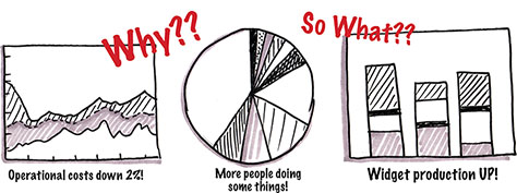
It’s a bad sign when I see product managers putting together a PowerPoint deck full of revenue graphs and new user acquisition numbers and trend lines with no explanation of why that’s happening or what they’re going to do to keep the numbers high or move them higher (see Figure 11.11).
Figure 11.1—Why does any of this matter?
Obviously, I’m all for sharing numbers. I think the whole team should know what their key metrics are at all times so that you can understand what you’re working on and the impact of your changes. I assume you’ve picked up on that bias by this point in the book.
But a bunch of slides presented to senior management once a week—or once a quarter—with a few post-hoc justifications for why the numbers look bad or good is simply not the same as making sure that everybody has the information they need to build great products.
A much better pattern is to make sure that key metrics are always available to anybody through some sort of dashboard or reporting interface. Spending some upfront engineering time on automation will keep PMs from spending half their time running SQL queries and dumping the same data into pivot tables every week. It also makes sure that the numbers aren’t hidden in a series of PowerPoint decks sitting on somebody’s computer.
Whenever you do have to report data, try answering these questions in this order:
What question were you asking that you felt these data would answer?
What did the data tell you?
Why do you believe the data looks the way it does?
What decisions or changes are you making based on this data?
How will you know if you’re right?
By doing this, you’re providing not just a report, but also an understanding of the metrics and a plan for using them. The best part about it is, if you can’t answer these questions, you probably shouldn’t be bothering with reporting on the data.
Bad Data Collection
One of the main themes of this book is that you should be constantly learning, and hopefully learning as quickly as possible. Unfortunately, quickly can often lead to a culture of badly. In some cases, that may be okay. It’s generally impossible to make new products perfect for users, because you often don’t even know what perfect means until you get something out in the world to learn from it.
But you can’t apply that same attitude toward data collection. You can’t learn from bad data. Bad data can ruin the experimentation cycle, and in some cases, it can ruin your product.
Imagine for a moment an A/B testing system that randomly returned the wrong test winner 30% of the time. It would be tough to make decisions based on that information, wouldn’t it? You couldn’t ever trust that you knew which branch of an experiment was winning.
Qualitative research can be just as bad. I can’t tell you how many companies have spent time and money talking to potential customers and then wondered why nobody used their product. Nine times out of ten, they were talking to the wrong people, asking the wrong questions, or using terrible interview techniques.
Some of your product development is going to be a mystery. That’s the nature of building new things. You can’t know exactly what you’re going to be building this time next year in many cases. But, unlike any given feature or piece of code, collecting data is guaranteed to be part of your process for the life of your product.
Here’s the good news: good data actually takes less time to collect than bad data. Sure, you may have to do a little bit of upfront research on the right tools and methods, but once you’ve got those down, you’re going to move a lot faster.
For example, customer development interviews go much more quickly when you’re asking the right questions of the right people. You don’t have to talk to nearly as many users when you know how not to lead them and to interpret their answers well. Observational and usability research becomes much simpler when you know what you’re looking for.
The same is true for quantitative data collection. Your A/B tests won’t seem nearly so random when you’re sure that the information in the system is correct. You won’t have to spend as much time figuring out what’s going on with your experiments if you trust your graphs.
I do want to make one thing perfectly clear: the quest for good data should be more about avoiding bad data than it is about making sure that you have every scrap of information available.
If you don’t have all the data, and you know you don’t have all of it, that’s fine. You can always go out and do more research and testing later. You just don’t want to put yourself into the situation where you have to unlearn things later.
You don’t have to have all the answers. You just have to make sure that you don’t have any wrong answers.
Giving Up
The other big theme in this book is that none of this is easy. I really wish it were. We’d have much nicer stuff and everything would be easier to use.
People give up on experimenting and measuring all the time, and it’s generally for two reasons:
It’s hard to get set up.
It doesn’t always tell you what you want to hear.
I understand that you have things that need to get done, and you probably don’t have a ton of time to go instrument a full experimentation and measurement system. You may get pushback from your engineers telling you that it’s impossible, or it will take months, or you simply can’t have the information you want.
Keep trying. If you already have a product with no metrics, try adding them gradually. Add key metrics to stories in progress. When you build a new feature, make it a part of the feature that you need to be able to measure its effectiveness with specific numbers. You don’t have to go back and retrofit absolutely everything about your product. Yet. Just start insisting on finding ways to get what you need to measure your real progress.
If you’re quitting because you’re not getting all of your assumptions confirmed, or because the big feature you just spent months on is testing poorly, or because you’re afraid of feedback, then please find a way to get over that. If you have to conceal how your product is performing in order to save your job, it’s very possible that you won’t have that job for very long anyway. Startups that ignore reality can go out of business very quickly. Big companies get away with ignoring reality for longer, but when reality hits, it takes more people down with it.
Good experimentation and measurement is hard, but please don’t give up on it. It’s the only way you can know that you’re building better products.
Expert Advice from Avinash Kaushik
Avinash Kaushik is a digital marketing evangelist at Google who has written two best-selling books on digital analytics. Previously, he was the director of research and analytics at Intuit, a company that’s been effectively combining qualitative and quantitative research to build great products for quite some time. His blog, Occam’s Razor, is full of advice and insight about how to measure the effectiveness of marketing and content.
You may be wondering why, in the second to last chapter, we’re suddenly talking about marketing. That hasn’t been much of a focus of the book yet. The reason is that there are a huge number of similarities between measuring the effectiveness of content marketing and measuring the effectiveness of a new feature.
Product managers can learn important lessons by observing how digital marketing experts like Avinash are measuring success. His focus on using data combined with an understanding of the ideal customer is an incredibly helpful way of thinking about the metrics that you use for your products. Besides, it’s always a good thing to understand marketing and growth, since getting more users is a critical element in the success of your product.
Step 1: Understand Your User Segment with See, Think, Do, Care
“Data is less of a problem than we think it is,” Avinash said. “We have more data than God wants anybody to have. The problem is the way people think.” It may seem odd that a digital marketing evangelist is saying that we have more data than we need, but it makes sense. We don’t need more data. We need to use the data we have more wisely by picking the right metrics for the right audience.
That’s where Avinash’s See, Think, Do, Care business framework comes into play. It replaces the traditional market segments with clusters of audiences based on their intent, commercial or otherwise. He groups users into segments based on whether they’ve already bought your product, they’re likely to buy your product immediately, they could be thinking about buying your product, or they might be a part of your largest addressable, qualified audience.
In a lot of ways, the framework is similar to our provisional personas in Chapter 2, “Understand Your User Better,” since it focuses on the behavior and goals of the users rather than the more typical demographic facts. “Demographics and psychographics. I hate them!” Avinash said, “Why should I care how old you are or your race or gender? I don’t give a crap about those things. If we can understand your behavior, we can understand your intent!”
To frame intent, Avinash divides customer behavior into four clusters: See, Think, Do, and Care:
See: These are people who have no current intent to purchase a product like yours, but they could still be in your market. They’re probably interested in the space your product inhabits.
Think: These are people who are thinking about products in your category, but they’re not actively considering buying right now.
Do: These are people who are actively in purchase mode or have just purchased your product.
Care: These are your current most valuable, loyal users.
Let’s look at an example. Imagine that you own a gym, and you’re wondering whom to reach in order to make more revenue. Here are your intent clusters:
See: These are folks who are likely to care about their health and well being.
Think: These are the people who have noticed that they’re putting on a little weight and are thinking about ways to take it off.
Do: People in this cluster are actively looking for a gym and may have even come in to check out your facilities or have used a guest pass to try out some classes.
Care: These people already belong to your gym, come regularly, and tell their friends all about their personal trainers.
Step 2: Build for the Right Audiences
Once you understand the framework, you need to figure out whom you’re trying to reach. What is your largest addressable audience? This isn’t always as obvious as you’d imagine. There may be far more people in the See cluster than in the Do cluster, but are they truly addressable for you? On the other hand, the people in the Care cluster may be very easy to reach and connect with, but there may not be enough of them to build a valuable business. Which audience you build for depends a lot on your resources and the sizes of your clusters.
For example, an established digital camera maker might think that their most important audience is made up of people who are considering buying a digital camera right now. That makes sense. If you can get your particular digital camera in front of people who are already thinking about buying a digital camera, you have a decent chance of selling them one. You just have to convince them that your camera is the best one for them. People who are already looking for a digital camera are in the Do intent cluster.
“But what about people who love to create and capture memories?” Avinash asked. “If you can build a relationship with people who love to create and capture memories, you have massively expanded your audience.” In other words, people who are already creating and capturing memories are exactly the kind of people who may later discover that high-end digital cameras are a great way to do just that, and if you already have a relationship with them, your camera will be the first one that comes to mind. These are people in the See cluster. They’re interested in the general thing that your product does, but they haven’t translated their interest into any purchase intent yet.
When Avinash worked with just this sort of company, he talked to them about the mobile app they were building. It was aimed at people who already had digital cameras. Instead, he suggested making an app that would just help people be better photographers. This would allow them to deliver value to a group of people who might enjoy photography, but who weren’t currently in the market to upgrade their cameras. The bet was that when those users did want to buy cameras, the company wouldn’t have to spend money advertising to them because they already had a preexisting relationship.
Companies that are in the camera business try to sell cameras. Unfortunately, companies that just sell products can end up going out of business when the market moves past them.
Step 3: Measure the Right Thing for Each Cluster
Regardless of which cluster of users you’re addressing, you need to measure how successful your marketing efforts are. But success with one group of users can look very different from success with another group of users.
When you’re measuring your impact within the Do cluster, your metrics are very straightforward. People in this cluster have expressed an intent to buy a product like yours. Your goal should be to get them to choose your product and purchase it. This means you’re looking at easy-to-measure metrics like conversion and loyalty.
People in the See cluster, on the other hand, aren’t in the market for your product yet. You’re going to be reaching out to them and delivering value, but these are not people who are going to be purchasing from you in the immediate future. That’s okay. This is a longer term relationship that you’re building, with the hopes that they will, in the future, purchase your product. In this case you need to measure whether you’re gaining mindshare, not marketshare.
Each cluster has its own metrics that you want to measure in order to judge whether your efforts to reach people are working:
See Metrics:Conversation rate—how much people are talking about you—amplification rate, applause rate, and subscribers. Watch social media to see who’s talking about your product and whether people are sharing the content you’re putting out.
Think Metrics:Click-through rate, page depth, and percent assisted. These are metrics for your marketing Web site or blog or newsletter—however you’re delivering content—that show how deeply people are engaging with the information you’re delivering them and whether that outreach is eventually leading to a purchase.
Do Metrics:Visitor loyalty, checkout/abandonment rate, conversion, and profit. Again, the Do cluster is all about purchasing, so the metrics you care about will be those dealing with whether visitors make it all the way through the purchase process.
Care Metrics:Repeat purchases, likelihood to recommend, and lifetime value. For this cluster, you care about keeping users around for the long haul and getting them excited enough to turn them into brand advocates so that their value to you increases over time.
One big mistake people make is measuring work they’re doing in one cluster with the wrong metrics. Too many companies only track the metrics in the Do cluster. The question they want answered is: “Did the user buy?” But, of course, people don’t always buy on the first visit to your product or Web site. They don’t buy the first time they walk into a store or see an ad.
Potential customers take time to understand their needs and options and to figure out if what you’re offering is right for them. Using hard-sell tactics on somebody who is just kicking the tires is very likely to drive them away rather than make an immediate sale. Instead, learn whether your marketing efforts at each stage of the customer decision-making process are working by measuring whether your efforts are having the intended effect.
Your Twitter account doesn’t need to make sales if it’s keeping people entertained and engaged or encouraging loyal fans with great customer service. Your blog doesn’t need to translate directly into sales if it’s delivering content to people and making them more educated consumers of your product and positioning you as an expert in the space.
Make sure that you’re measuring the right things for the cluster you care about. Or, as Avinash said, “Don’t judge a fish by its ability to climb a tree.”
When you are measuring your conversion rate, you can improve its usefulness by changing one number. Typically, you judge conversion rate by looking at the number of purchases divided by the number of visitors to a Web site or users of a product. For example, if you have 100 visits to a product page and you make one sale, you have a conversion rate of 1%.
For a more accurate and interesting conversion number, try dividing by number of unique visitors, rather than total visits. A merchant shouldn’t care if every engagement with a user is a success or failure every time. If it takes someone six visits to decide to purchase, that’s fine. Those first five aren’t failures, and they shouldn’t bring the conversion metric down.
This is especially true when working in multiplatform interactions. A user might do something like receive an email or notification about a sale, check out prices on a mobile Web site, and make a final purchase on a laptop. People have interactions with products through apps, mobile Web, computers, wearables, and in person. With the rise of the Internet of Things, there will be even more ways to interact with companies, and not all of them will be optimized for conversion.
As Avinash said, “Most people won’t buy things instantaneously. We’re not selling chewing gum.” Don’t hurt your metrics by trying to convert every single interaction into an instant purchase.
Step 4: Pick the Right Cluster for Your Company
If you work for a startup or an innovation lab within a larger company or any organization making a brand new product, you will almost certainly want to focus on the Do cluster until you have found a product market fit. In other words, when you’ve got a brand new product, and you haven’t yet validated whether or not there’s demand for it, you’re going to have a much easier time concentrating on building for people who are already searching for a solution to a specific problem that your product solves.
Concentrating too much on things like social media presence and brand can be deadly in companies that don’t even know if they’re solving the right problem yet. You’ll get faster progress if you focus on finding users who already have a strong intent to solve a specific problem.
For everybody else—people with existing products and customers or people at larger companies with more resources—make sure that you’re focusing your marketing and acquisition strategies on people in the largest addressable market for you. Every interaction doesn’t have to turn into a sale. Sometimes turning an interaction into a relationship can be much more profitable in the long run.
Discount for UXmatters Readers—Buy Build Better Products from Rosenfeld Media, using the discount code uxmattersbbp, and save 20% off the retail price.
Laura fell in love with technology when she saw her first user-research session over 20 years ago. Since then, she’s worked as an engineer, UX designer, and product manager in Silicon Valley for companies of all sizes. Her books, Build Better Products (Rosenfeld Media, 2016) and UX for Lean Startups (O’Reilly Media, 2013), help teams learn more about their users and apply that knowledge to make products people use and love. She advises early-stage startups and consults for companies that want to improve their UX-research and product-development processes. She has a deep and abiding love of business jargon, and her fondest wish is to someday facilitate a synergy or synergize a facilitation. Read More
 Teams get rewarded based on whether they’ve shipped features on time and on budget for a very good reason—it’s easy to measure. It’s trivial to track things like how many new features are in the latest release or whether version 2.0 was shipped when it was promised.