This is a sample chapter from Val Head’s new book Designing Interface Animation: Meaningful Motion for User Experience. 2016 Rosenfeld Media.
Chapter 3: Modern Principles of Interactive Animation
The classic principles of animation teach us so much about creating natural and pleasing animation, but they fall short in guiding us in one particular area: interactive animations. It’s not their fault, of course, because they were written for a different era of animation when interaction wasn’t a thing to consider.
Designing interactive animation—which interface animations often are—requires approaching animation just a little differently and working with a different set of rules for behavior. The way your animations behave during an interaction affects how your users perceive them just as much as how they look. The core of what the 12 principles cover still applies to your work, but you also have to consider the interactive context of your work. Your work won’t just be watched in the classic definition of animation—like feature films and cartoons—it will be interacted with, too. And that means you have to consider factors beyond the classic principles—or any other motion graphics techniques—when designing quality interface animations.
This chapter covers the principles of interactive animation: the factors that ensure that animations work with the expectations that come with interaction, not against them.
Champion Advertisement
Continue Reading…
Interactive animation is judged both on how it behaves or responds as well as how it looks. The following principles of interactive animation are guidelines for designing animations that will always work with your users and never get in their way.
Have a Known Purpose
The very first rule of interface animation is that all interface animations must have a purpose for being there. The purpose of a particular animation might be drawn from the UX issue it’s intended to help solve, such as, to draw the user’s eye to the change in the item’s status. An animation’s purpose can be as simple as to communicate the mood and personality of your brand. The only purpose I’d say isn’t allowed is delight all on its own. Delight isn’t something that can be created by animation alone. An animation that you add solely to increase delight usually does exactly the opposite from the user’s perspective.
All UI animations need to have a defined purpose tied to a design outcome. (Part II of this book covers how to identify an animation’s purpose in detail.) If it can’t be justified in terms of a design goal, it’s probably not worth having there at all.
Don’t Create Obstacles
Animation shouldn’t get in the way of your user accomplishing the task at hand. Of course, you would never intentionally make it more difficult for your users to complete a given task, but it’s easy to get carried away while designing something beautiful. Unfortunately, what you might end up with instead is actually a beautiful obstacle. If at any time your user finds herself waiting unnecessarily for an animation to finish before she can make her next move, there’s a problem.
Loaders and instances where data is being fetched or processed are exempt from this rule, of course. There are times when waiting can’t be avoided. This rule applies to interactions that can reasonably expect a near immediate response. Animations should never belabor these interactions unnecessarily.
Avoid Animation That Becomes an Obstacle
Square’s former site has a fitting example of unintentionally creating obstacles with animation (see Figure 3.1). The main navigation is housed in a full-screen modal, which in itself isn’t necessarily a problem. But this modal also has a multistep animated transition that plays out each time it is opened. A dark blue overlay fades in, the lighter blue navigation container stretches out from the middle, and then the list of navigation options slide-fades into view. (You can see it in action in this video.) That three-step transition takes slightly less than a full second, which doesn’t sound like much. But when you realize that every time a user wants to access the main navigation, he’ll have to wait through that transition before making a selection—then suddenly navigating through this site becomes a very time-consuming task.
The trouble is that the transition adds time to something that will be accessed often, and the effect used actually makes the task take noticeably longer. Navigation isn’t a task that should be slowed down since it’s used so frequently. The showy entrance also provides unnecessary emphasis to the navigation opening. Accessing the main navigation should be quick and easy.
There’s nothing wrong with the way the animation is designed. It’s well done, but a poor match for the content and task at hand. If this same entrance animation were used for something that was accessed more occasionally, like modal windows or a product detail view, it wouldn’t be an issue. The showy entrance would help reinforce the importance of the modal message, and the fact that it would only be seen occasionally would help make the content it introduces feel important.
Figure 3.1—Square’s former main menu design
This three-stage transition to access the main navigation is an example of animation becoming an obstacle in an interface. (The site has since been updated with a redesigned navigation that is much less cumbersome for users.)
What to Aim for: Animation That Stays Out of the Way
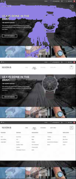
Navigation is a great place to employ animation if it’s done in a way that fits the task of navigating a site. For example, the Nixon Watches site has a large amount of navigation and a lot of animation (see Figure 3.2). However, they’ve used it in a way that doesn’t create obstacles or get in your way as a user.
Figure 3.2—Nixon’s site has a highly animated navigation that avoids creating obstacles by being well-timed and responsive to user input.
Each time you access the navigation, the submenu quickly slides down into place from the top of the screen. It gets out of your way, easily sliding back up to the top of the screen when you’re done with it as well. Even the entrance of new submenus when you select a different top-level menu item is animated with the same snappy slide-in movement. Despite all the animation that’s happening, it’s not creating an obstacle between you and the task you are trying to complete.
When you’re animating something as critical as navigation, you want the animations you design to be more like the ones on Nixon Watches’ menu—animations that pair well with the content at hand and don’t make users wait for them. The animation gets quickly to the point, without extra flourish or taking unnecessary amounts of time.
Keep Animations Flexible
Sometimes animation and interaction find themselves at odds. Animation is generally linear in nature—it has a specific set of states or frames to play through from start to end, and some amount of time must pass for that to happen. Interaction, on the other hand, is nonlinear. Users can click, scroll, swipe, or otherwise offer other sorts of input at any time. Even when an animation is only a fraction of a second long, it’s still possible for some input to occur during that time. And that’s where things can get tricky.
Good interface animations need to be flexible and always feel responsive to a user’s input—even if the animation is currently animating. Think of it like a conversation. The best conversations are ones where you feel as if the other person is listening to you and responding to what you’ve said. If they’re nonresponsive or don’t seem to be paying attention, you’re less likely to trust their responses or continue conversing with them. The same goes for interfaces. If a user starts to realize her input is being skipped or ignored, trust is lost, and the quality of her experience starts to degrade.
An animation that ignores input while it is active is a blocking animation, which means that it blocks the user from using it for its intended task while it’s animating. An animation that responds to input even while it’s actively animating is nonblocking. You should always aim to create nonblocking animation unless there is a compelling reason not to do so, because blocking behavior can make the interface feel broken or slow when it doesn’t respond as expected. The difference between blocking and nonblocking animation is easier to show than describe, so let’s look at an example of each.
The Bad: Blocking Animation
Once you see blocking animation in action, you’ll start noticing it everywhere. It’s quite common on the Web, despite its negative impact on the overall user experience. While their site does many things right, Mammoth Booth’s navigation is a good example of blocking animation (see Figure 3.3). When you select a page from their main navigation, say the FAQ page, the between page transition starts behind the scenes. If you click on a different page, Gallery, for example, before the FAQ page has finished transitioning in, your second click is ignored. The page that transitions into view isn’t the Gallery page, even though that’s the one you’re expecting, because it’s the last navigation item you clicked. Instead, you see the FAQ page, which was the first one you clicked, and the only one of your clicks that the site responded to. All other input was ignored once that page transition was initiated. That’s blocking animation in action.
Figure 3.3—The Mammoth Booth site’s blocking animation behavior: it loads the FAQ page because no user input is accepted during the page transitions.
Sometimes, menu items or buttons are visually disabled while page transitions or other transitions are occurring, in order to reduce logic complexity. But this isn’t actually a better solution. It does prevent the possibility of the user realizing his input is being ignored, but it also exaggerates the blocking behavior of the animation and doesn’t solve the core issue.
The best solution is to design and build your interface animations so they are interruptible and don’t block input—build them to both accept and respond to user input, no matter where in their animated action they currently are. Interruptible animations are nonblocking animations.
In Mammoth Booth’s case, only small changes would be necessary for the animation to be interruptible and nonblocking. The transition to the FAQ page could have been stopped when the Gallery link was clicked and then started the transition to the Gallery page instead. Or, even better, the page transition could have adapted to its new destination of the Gallery page mid-transition. With either solution, you would have gotten the response you expected, and the experience would have been much improved.
What to Aim for: Nonblocking Animation
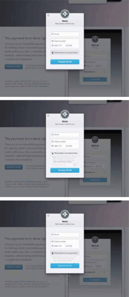
Stripe Checkout has a good example of nonblocking animation in its checkout ow (see Figure 3.4). When you check the Remember me everywhere box, some additional information and a form field fold down into place. When you uncheck the box, they fold right back up out of sight. If you change your mind and deselect the box before the fold-down animation completes, it interrupts itself mid-animation and moves directly into folding back up, reversing its direction in an instant when you change your selection. It doesn’t matter how fast or how many times you check and uncheck that box, the animation is working with you and responding to your input the whole way through. It’s a well-executed nonblocking animation. You never have to wait for it to finish, and it can be interrupted at any time.
This nonblocking animation behavior is what you want to aim for in all the animated interactions you design. It may require a little more programming or design logic on your end, but the benefit to your users will be tenfold. The fact that the animation responds to their input, no matter when they give it, makes the interaction the kind of conversation that they want to continue. It builds trust by always appearing to be listening to them and by never making users feel like they’re being ignored.
Figure 3.4—Stripe Checkout’s form animation always responds to user input, even when it’s mid-animation.
Its nonblocking behavior means it will always respond to user input, no matter what. See the slow-motion video version for a closer look.
TIP: NONBLOCKING IS BEST
All animated interactions should be nonblocking by default.
Be Quick, Be Readable: Timing
The classic principles’ definition of timing still applies to your work with interactive animation, but your timing decisions exist in a very specific and very different context than the sort of animation the principle was written for. Most people using or interacting with the animations in interfaces are trying to get something done. Whether they’re in the midst of completing a specific task or looking for some specific information, they’re on their way to some end goal that’s important to them. Your audience isn’t sitting back and watching your animations tell a long-form story like the ones the classic principles were written for.
You need to take your user’s task-based mindset into consideration when deciding on the timing for your animation work as one additional factor on top of the other timing factors to consider. Often, designers take the context of an interface to mean that all interface animations should always be lightning fast to stay out of the way. Or they look for one specific small number, like 0.30s for example, to use as the duration for all or any interface animations, as a golden rule that can’t ever be deviated from. Both those generalizations oversimplify the problem and won’t result in high-quality animation. Good timing is more an art than a science. Thinking in terms of guidelines, as opposed to hard-and-fast rules, will serve you much better in your design work.
A Good Range for Interface Animations
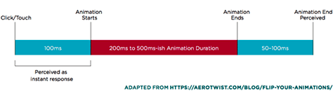
Instead of having one set duration for all your interface animations, aim to keep them within the range of 200ms–500ms (see Figure 3.5). Small UI transitions that involve smaller elements or small amounts of change tend to be on the lower end in the 200ms to 350ms range. Larger motion that covers a lot of ground or motion that uses complex bounce transitions usually ends up on the higher end of this range, around 400ms to 500ms. There can always be exceptions, of course, but if you stick within this range, you’ll be off to a good start.
Figure 3.5—Timing windows for UI animations
The numbers of this range are largely based on research from the Nielsen Norman Group and the Model Human Processor. In their article on the three important limits for response times, [1] the Nielsen Norman Group states that 0.1 seconds, or 100ms, is perceived as instant, and 1 second is considered the upper limit of a user’s ow of thought. Together, these outline a range of 0.1s to 1s for feedback, animated or otherwise, to feel connected to a specific user action or input. From this research, we can conclude that animations should all be more than 0.1s (100ms) to be perceived at all.
Additionally, the Model Human Processor, [2] a methodology of formal Human-Computer Interaction, states that on average it takes a human 230ms to visually perceive something. This is where the start of the suggested range comes from. An animation with a duration of 200ms will be just within range to be perceived by the average person. Any shorter than that, and you risk it not being visually perceived at all, which would defeat the purpose of animating it in the first place.
The Nielsen Norman Group’s response limits article suggests that 1s is the upper limit for animation durations within interfaces. They do note that at 1s, the user will already notice the delay, but still realize the response is connected to the previous action. That’s why it’s the upper limit. You likely won’t have lost your users entirely, but they’re not going to be happy about how long things are taking. You don’t want your interface animations to be perceived as slow or annoying, so that’s why the suggested upper limit for interface animation durations is 500ms, or 0.5s.
More Complex Easing Needs More Time to Be Readable
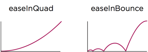
It’s generally easy to notice that large motions or animating big changes need longer durations. Moving a modal box across the screen as it exits from view will obviously need more time to complete its action than a button’s background color animating to show its active state. In the same way, animation that uses complex easing also tends to need longer durations to be readable. The direction changes found in bounce or elastic easing present more visual information to parse, and that takes more time to be read or understood (see Figure 3.6). It may only need 20ms–30ms more, but that can make all the difference between an animation that looks broken and one that looks like it bounces.
Figure 3.6—Visually parsing the more complex motion that will result from the easeInBounce will likely require more time than the more simplistic easeInQuad curve.
(Both these curves and their associated code can be found on easings.net.)
Readability should be your standard for judging the timing of your interface animations, instead of one single duration that’s used for all animation. Stop reducing the duration of an animation for the sake of speed as soon as you hit the point where it no longer communicates what it’s supposed to. If you can no longer tell what the motion is supposed to be, its duration has been made too short.
TIP: READABLE ANIMATION
Interface animations should be as fast as they can be while still being readable.
Focus on How the Animation Feels to Interact With
Keeping with the metaphor of good interactions being a lot like good conversations, interface animations’ timing should always feel good to interact with. The only way to judge this is to try the animation out for yourself. Or even better, have others try it, too. It’s often difficult to judge the timing of your own animation objectively, so an outside opinion can be very helpful.
If an animation feels right, even though it has a duration of 600ms, which is technically outside of the recommended range, go with your gut—or your user research—over the numbers. Designing animations that feel right is more important than following guidelines to a T. Your users will notice how the animations in your interface feel, not any specific numbers of the durations or other factors. They aren’t counting the milliseconds.
The more animation experience you gain, the better your timing instincts will become. You’ll start picking durations that feel right sooner and develop your own rules of thumb for animating. Timing is more of an art than a science. The more you do it, the better you’ll be at it. That’s just one more reason why prototyping and practice is so important for designing interface animations.
TIP: ESTABLISH YOUR TIMING BASELINE
Try looking for animations around the Web whose timing feels right to you and then record their timing. You’ll start to notice a specific range, maybe 300ms–600ms or similar, that feels right to you, and you can use that as your starting point in your own work.
Performance Matters
Performance is not mentioned at all in the classic principles. It’s not something that classic animators had to consider in the same sense that we do, so it never came up. There’s no need to consider how the host technology might impact the experience of your animations when they are all prerendered frames on film. On the Web, however, performance is hugely important. Animations that are slow and sluggish to interact with won’t have a positive impact on the user experience, no matter how well they are designed. Poor performance negates even the most carefully considered experience. That’s why it is so important to consider performance early and often throughout your animation design process.
Sometimes, you intentionally push the limits of your technology, but other times, performance issues come up when you least expect it. There are other books out there that cover this topic in great technical detail—like Lara Hogan’s Designing for Performance—but here is a short list of considerations to help you make the most performant design decisions you can while you’re designing and planning your animation efforts.
Animate the Most Efficient Properties
Whether you are animating in CSS or JavaScript, you’re affecting specific properties of the element you’re animating. Browsers can animate some properties more efficiently than others, based on how many steps need to happen behind the scenes to update said property.
Browsers are particularly efficient at animating opacity, scale, rotation, and position—when done with transforms. See this article from Paul Irish and Paul Lewis for the details on why these are the most performant properties to animate. [3] Conveniently, these are also the most common properties that designers want to animate. There aren’t many animated effects that can’t be pulled off with this list, even though it’s short. Stick to these properties to set your animations up for the best performance results from the start. If you find yourself needing to animate a property outside of this list, check csstriggers.com to find out how much of an additional impact it might have on performance.
TIP: MOST PERFORMANT PROPERTIES
To get the best performance out of CSS animations, stick to these properties:
Opacity
Scale
Rotation
Position—when done with transforms
Use the Tools That Fit What You Need
One of the biggest advantages of the current Web animation landscape is the range of tools we have at our disposal. We can use CSS animations and transitions to add just a dash of interface animation to our work, or go all out with WebGL to create a full 3D experience, all within our browser. Having this huge range of options is wonderful, but it also means you need to be cognizant of what you’re using to get the job done.
Loading in the full weight of a robust JavaScript animation library is overkill if you’re only animating a few small elements here and there. That extra overhead will have an impact on performance. Try to match the complexity of the technology you choose to the complexity of your animation needs to avoid unnecessary performance strain.
For small amounts of animation on the Web, stick to CSS solutions since it’s the lightest option out there. As your animations grow in complexity and the need for deeper logic, move to JavaScript solutions that can accomplish what you need.
Always keep an eye on how much you are loading in versus what you’re actually using. If you’re only employing 10% of your chosen animation library in your work, that’s a good time to look for a lighter more efficient solution or maybe even create a custom solution that only does exactly what you require.
Use Offsets to Lighten the Load of Animating Many Things
Offsets—the concept of having a series of similar movements execute one slightly after the other, creating a wave-like pattern—are a long-held motion graphics trick for creating more interesting and organic motion. Employing this trick of the trade can also be smart for performance. Animating a large number of objects at once can put a strain on the browser’s rendering abilities. Adding delays to offset these animations in time, so they no longer all start at the same time, can impact the rendering performance positively. It’s a happy coincidence that this motion graphics trick can benefit performance, too.
Perceived Performance: Animation Can Make Your Interface Feel Faster
This is the other side of the performance coin, if you will. Making sure that what you design will be performant in the browser is the most common focus of performance conversations, but perceived performance is another aspect of performance where animation can have an impact on your users. Animation alone can’t make your interface faster, but it can help ll in unavoidable gaps and create the perception that things are happening faster. Or at the very least, it can reassure users that something is, in fact, happening behind the scenes.
Discussions of performance are often centered around the goal of attaining 60 frames per second for any animation on-screen. This can be a helpful benchmark for testing and other data-centric investigation, but it’s not a goal your audience will notice specifically. In fact, they don’t care at all what the fps is, as long as nothing looks broken and things feel like they’re working well. Perceived performance is harder to measure because it is less concrete than fps, but it is often the best benchmark to use, because the difference between 50fps and 60fps may not be perceivable to your audiences in the context of your project or the task at hand.
That wraps up the principles of interactive animation. It’s a short list, but an important one. When you combine these with an appreciation for the classic animation principles, you’ll be creating interface animation that is both beautiful and pleasant to interact with. That combination will make your animation work stand out.
Staying on Point
To design animation that is as pleasant to interact with as it is beautiful, remember:
Have a known purpose for every animation in your interface.
Don’t create obstacles with animation.
Keep animations flexible and nonblocking.
Focus on readability above duration.
Animate the most performant CSS properties to set yourself up for good performance from the start.
Discount for UXmatters Readers—Buy Designing Interface Animation from Rosenfeld Media, using the discount code uxmattersdia, and save 20% off the retail price.
Val is a design and Web animation consultant with a talent for inspiring both other designers and developers to explore the power of animation. She is the author of the new Rosenfeld Media book Designing Interface Animation: Meaningful Motion for User Experience, CSS Animations: A Pocket Guide, and the CSS Animation course on lynda.com. She shares her passion for Web animation as the co-host of the Motion and Meaning podcast and the curator of the UI Animation Newsletter. A proud supporter of the Web community, she co-founded the Web Design Day conference and co-runs Pittsburgh’s Girl Develop It chapter. Val leads workshops on motion design for the Web at companies and conferences around the world and loves every minute of it. Read More
 The classic principles of animation teach us so much about creating natural and pleasing animation, but they fall short in guiding us in one particular area: interactive animations. It’s not their fault, of course, because they were written for a different era of animation when interaction wasn’t a thing to consider.