I’m going to open my new column Evolution of XD Principles with a quotation that actually contradicts my position:
“If you do it right, it will last forever.”—Massimo Vignelli
He’s wrong. Massimo is a very well-known, well-respected Italian designer who has impressed the world by successfully innovating products in a variety of disparate product spaces. But he’s wrong.
Design should always accomplish one key thing: demonstrate a thorough understanding of the people who will engage with a solution. A design should accommodate the well-defined mental model of those engaging with an experience. However, a challenge for UX designers is this: mental models represent collections of knowledge—and knowledge is never static. Forever is a fallacy.
With this premise in mind, my goal for this column is to write a series of articles that challenge traditional experience-design principles in a way that explores next-generation—and forgotten, last-generation—experience-design strategies.
Join me, as I explore such topics as why ugly products sometimes succeed, how some companies can dictate rather than accommodate usability patterns, and the hidden value of a user experience with a tinge of dishonesty. I’ll be leading you on a journey that will take us off the beaten path—one on which the only constant is change.
Champion Advertisement
Continue Reading…
Success Factors of Craigslist’s User Experience
Why does Craigslist, a Web site that looks like a tribute to the Web of the ’90s, remain popular in a world that increasingly values well-crafted, beautiful user experiences? My multifaceted answer to this question is that Craigslist leverages several concepts that aren’t generally factors in mainstream product design. These factors include relatable flaws, the freedom to think hard, goal-driven visual nonchalance, effort justification, and social-penetration theory. I’ll discuss each of these in turn.
Relatability
When user experiences ask for trust—particularly experiences that facilitate financial transactions—a lot of folks are naturally hesitant about engaging with overly polished, perfectly crafted experiences for one simple reason: they can lack relatable qualities.
Humans are not perfect. We all have flaws, quirks, and idiosyncrasies. These make us who we are. They make us real. So, naturally, when relating to our environment—whether the people or the user interfaces with which we interact—we feel more at home with imperfection. When someone or something presents itself as perfectly put together, that triggers feelings that force us to question that entity’s authenticity and believability.
When we face a situation that requires our trust—one about which we may feel some uncertainty—we often rely on our gut feelings—primal responses that help us to evaluate the unknown. There are many theories on how we actually make such evaluations, but popular belief is that these primal skills let us instantly assess our ability to relate to someone or something.
This is the reason we tend to like people who present themselves in a real, authentic way and dislike those who appear to be masking their true self with a facade of perfection. It just isn’t natural to be flawless—and we tend to shy away from the unnatural.
The importance of minimizing such knee-jerk reactions to perfection depends on what you are trying to accomplish with a given product. In a transaction-based market such as that of Craigslist, it is very important to design a user experience that minimizes any potential for triggering the user’s doubting Craigslist’s authenticity.
Establishing relatable qualities for your target audience is one of the biggest relationship-building hacks for a service. In that regard, Craigslist’s UX strategy is a success. The site is highly relatable. It makes little effort to be anything other than what it is. Rather, it bleeds functionality, oozing its pure purpose with little cosmetic distraction. Craigslist’s user interface is a quintessential example of a credible user experience. There are no flashing banners, sponsored posts, or giant calls to action to persuade users to take a particular path. Dark patterns are nowhere to be found.
The Freedom to Think Hard
People enjoy their freedom—especially when it comes to making decisions. So why not give users all the freedom in the world? Freedom comes at a cost. After all, one primary responsibility of UX designers is designing user interfaces that influence the choices users make.
When a user interface has a clear visual hierarchy—both at the page level and the sitemap level—this reduces the user’s cognitive load, makes choices easier, and prevents users’ having to think hard. Most UX designers would think achieving all of this would be a huge accomplishment. After all, this is what UX designers are supposed to ensure.
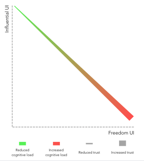
In most cases, this sort of thought process would be valid, but for trust-sensitive, transaction-heavy platforms such as Craigslist, a different approach might actually be better. Thus, as shown in Figure 1, even if a more influential user interface would make it easier to take action, it might also make users feel as though they have less control in evaluating their options when making choices. For trust-sensitive experiences, this probably isn’t the feeling you want to create.
Figure 1—Balancing influence and freedom
If you follow a conventional approach to UX design and try to reduce, as much as possible, the user’s cognitive load, you may also potentially be reducing a product’s ability to build trust. On the other hand, if you maximize users’ freedom and put them fully in control, you may be sacrificing ease of use and assistance in decision making.
So should you maximize either freedom or influence or balance them? You shouldn’t try to make such UX-design choices in a vacuum. Make such decisions after evaluating the level of trust users require for your product to be successful. Craigslist has concluded that the importance of user freedom far outweighs that of reducing cognitive load in this transaction-heavy, trust-sensitive environment.
Craigslist wants to ensure that users feel they have deliberately come to their own conclusions every step of the way—from browsing a horde of loosely organized market categories; to completely relying on seller-created item descriptions, without the addition of any auto-populated, boilerplate product information as on competitive systems such as eBay; to having absolutely no suggested or similar items based on easily trackable user behaviors.
Subjectivity Versus Objectivity
The goal of the UX designers at Craigslist is to take the focus off the system and place it on the items for sale instead. People who are turned off by aggressive salespeople who wear nice suits and slicked-back hair and push their subjective viewpoints [1] will appreciate Craigslist’s supreme nonchalance and objectivity.
On Craigslist, instead of the site’s attempting to woo, persuade, or push people into anything, what they see is what they get. There are no lightning deals, seasonal discounts, or lists of popular or related items. Although browsing the site and deciding what items to explore requires more effort, users are both compelled and free to make their own objective decisions. Craigslist has forsaken the powers of persuasion that are typical of such a marketplace. It’s just buyers and sellers—free to evaluate each other and the products and services for sale on equal ground.
Goal-Driven Visual Nonchalance
Craigslist’s user interface makes absolutely no attempt to capture superficial praise for its features or visual design. The site’s visual design looks almost as though its designers simply created wireframes, then quit before moving on to high-fidelity mockups, leaving the developers to build out the wireframes and call the site done. Is this a bad thing? No! Designers should resist the assumption that a site’s visual design should necessarily be as pretty as possible.
What may separate user-interface (UI) designers from UX designers is how they might respond to Craigslist’s visual design. A UI designer might say, “This site looks really dated and needs some major rework,” while a UX designer might say, “Well, looking at the site from a purely utilitarian viewpoint, this may be a great design strategy for achieving business goals and minimizing users’ painpoints.” I agree with the UX designer. From a business perspective, Craigslist’s goal is to facilitate sales. From a UX perspective, people need to be able to trust buyers and sellers so transactions can actually take place.
Now, the UI designer might ask, “How does Craigslist accomplish either of these things? It’s not pretty. It doesn’t have a review system. It just looks and feels so old!” These are fair points—particularly in regard to the lack of a review system.
But ultimately, thinking about how sales occur, everything comes down to trust—both trust of the system and peer-to-peer trust between buyers and sellers. I’ve already discussed trust-building UX strategies from a system perspective. How can you foster trust-building from a peer-to-peer perspective?
Buyers need to be able to trust that items for sale are as described and that the seller isn’t a psychopath and won’t try to scam them in some unforeseen way. The quickest way to establish trust is through the breadth and depth of the interactions between people. To encourage transactions between people, you need to support two things: frequent communications and vulnerable communication. More on this later.
Streamlining Social Penetration
Craigslist de-emphasizes products and, instead, emphasizes people and the peer-to-peer relationships between them. While it’s essential to make users feel objective, independent, and free, a service’s success—particularly that of a peer-to-peer sales service—is also highly dependent on creating a user experience that provides opportunities for positive peer-to-peer interactions to take place.
So how can you emphasize peer-to-peer interactions and motivate users to engage with one another? There is a lot of literature on how to do this, but it all comes down to social penetration theory, [2] which shows how people can break down formal social barriers by being perceived as vulnerable, making it possible for deeper interactions to take place.
In forming relationships with one another, vulnerability is the quickest route to meaning and value. Meaningless formalities and societal correctness are characteristic of surface-level interactions. The faster people can let their guard down, the sooner they can have real conversations, establish actual trust, and engage in meaningful interactions.
Opening up and exposing one’s inner self isn’t the only way to get closer to someone new, but it is absolutely the fastest way. That said, this insight into how peer-to-peer relationships form is not exclusive to the world of human relationships. On the contrary, digital experiences can capitalize on the same principles, allowing people to more quickly and deeply connect.
Depth of Interaction
When buyers are interested in purchasing an item on Craigslist, they must contact the seller directly. When sellers provide a personal phone number or email address, buyers can immediately engage in deeper interactions with them. The only other option Craigslist provides is to use an email-masking feature that keeps the seller anonymous. But, as you might imagine, that feature mitigates trust building and yields a lower transaction rate. Passive sellers sometimes choose the latter option, but this is by far the least-popular option for motivated sellers. Encouraging users to be vulnerable accelerates the achievement of both the business goal of facilitating sales and the UX goal of building trust.
For sellers who choose to provide their personal email address or phone number, sharing this personal contact information initiates a greater depth of interaction. Plus, breadth of interaction, or repetition, generally ensues as buyers and sellers exchange multiple questions and answers over time. This is exactly what Craigslist wants for its users—for buyers and sellers to be in direct personal contact. Their focus is on the people. The more these people allow themselves to be vulnerable, the quicker their interactions can evolve and the faster transactions can take place.
The Excitement of Danger and the Power of Effort Justification
Now, you might say, “Hey, vulnerability might speed up interactions, but it can also speed people into danger!” That is absolutely correct. This brings me to my last point about the excitement of danger and the power of effort justification. [3]
It is human nature to be excited by the unknown, especially when there is a possibility of danger. With Craigslist, users are unsure of many things. Will the person selling or buying the item be a whack job? Will the item be in the condition the seller described? Is it possible the item was stolen? Lots of scary thoughts come to mind—none of which would actually drive a sale. So why do users take the risk? The answer: effort justification. Deep down, people believe that things worth having will not come easy to them.
To get good grades, students have to study hard. Earning a promotion at work often requires sucking up and working extra hours. Getting a good deal on something a buyer wants to purchase online is no different. Buyers feel they must suffer a little or won’t believe that an opportunity is real. People expect to get good prices only after making the appropriate sacrifices. Otherwise, they simply don’t believe they deserve a bargain.
Craigslist’s user experience capitalizes on these psychological insights. Beyond the look and feel of the user interface, there are so many uncertainties that users must be willing to accept to actually complete a transaction. But, in the end, after users have navigated through a page comprising 20 titles and 100 text links—with no imagery, minimal organization, and a wide array of elements competing for attention in its visual hierarchy—after all the communications between buyers and sellers and, most likely meeting with a stranger in a safe public place to make the exchange, the transaction just feels worth it.
Summary
Craigslist has continued to have success—much to the surprise of many UX designers. The site certainly isn’t pretty, doesn’t try hard to convince users that a particular path or action is better than another, and doesn’t do much to make site exploration or buyer-to-seller communication easy or fun.
However, this is not only okay, but unconventionally brilliant. The famous Mies van der Rohe quotation “less is more” rings very true here. Overly polished, perfectly crafted experiences may have unexpected negative side effects such as their lacking relatable qualities, deemphasizing the human element that users naturally seek in sales-related experiences, and failing to give users the feeling that they’ve independently chosen and earned the experience outcome.
You should, of course, take all of this with a grain of salt. However, I hope this column has provided food for thought to those of you who have practiced product design in a way that always focuses on making experiences better by designing beautiful, effortless digital user interfaces.
Many tenets of Web site or application design—such as creating perfectly polished user interfaces and employing design patterns—are not always necessary ingredients for providing real experiential value. Instead, when appropriate, as for Craigslist, UX designers should consider allowing meaningful user experiences to express what most people would refer to as flaws.
References
[1] Riegelsberger, Jens, M. Angela Sasse, and John D. McCarthy. “Shiny Happy People Building Trust? Photos on eCommerce Web Sites and Consumer Trust.” In CHI ’03: Proceedings of the SIGCHI Conference on Human Factors in Computing Systems. Ft. Lauderdale, Florida: ACM, 2003.
[2] Carpenter, Amanda, and Kathryn Greene. “Social Penetration Theory.” The International Encyclopedia of Interpersonal Communication. San Francisco: John Wiley & Sons, 2016.
[3] Axsom, Danny. “Effort Justification.” In Encyclopedia of Social Psychology, Roy F. Baumeister and Kathleen D. Vohs, editors. Thousand Oaks, CA: SAGE Publications, 2007.
Hey Dash, great post here. It’s very much challenging our unchallenged assumptions. I like your conclusion that the UX ingredients we are used to are not always necessary. Although, I do think Craigslist will eventually do a design change that sticks to the basics and continues to give a basic newspaper classified ads Web site feel.
Great article. I agree about not changing Craigslist on the main page, but the micro-interactions need some serious help. There’s an app called Letgo that is clearly a competitor to Craigslist’s selling section, and that app has access to my photos and camera and can allow me to post something to sell from my smartphone in seconds. Craigslist desperately needs to give the content-creation process some UX love.
Dash designs usable, enjoyable digital experiences that are driven by research and guided by the needs and desires of internal and external stakeholders. In his work, he draws upon his past experience in startups, UX consulting, internships, and freelancing, as well as the wealth of UX knowledge he gained through his journey to earn an MS in HCI. From concept to launch, Dash incorporates Lean and full-cycle UX tools and methods. He is always excited by future opportunities to play his part in delivering innovative digital solutions. Read More