This is a sample chapter from the Second Edition of Chris Ward’s book Jump Start Responsive Web Design. 2017 SitePoint.
Chapter 4: Responsive Text
If Web pages are to be truly responsive, then the content of pages should also flow and change to suit the dimensions of the device a user is viewing it on. While Web pages are becoming more image and media heavy, text is still a crucial component, and there are numerous techniques to help make it as readable as possible, no matter the current device.
To understand better the ways you can represent text on a Web page, it’s best to take a trip into the long history of text.
Champion Advertisement
Continue Reading…
The History of Text
The principles of typography—the arranging and styling of text—have been evolving for as long as people have been printing words on pages. Measurements—such as leading, the space between lines of text; kerning, the space between letters; and tracking, the space between words—have carried over to desktop publishing, and anyone who’s used QuarkXpress, InDesign, shown in Figure 4-1, or their predecessors, will know how they affect text.
Figure 4-1—Text formatting in Adobe InDesign
Manual typesetting was a laborious process, as it involved tweaking the leading, kerning and tracking of every line of text. Desktop publishing, and more recently setting type with CSS, has made it far easier to play with these properties in an attempt to get the perfect text.
CSS typography shares many of the same properties as print typography but has some different names. In fact, it has more descriptive names than the older print version.
In the early days of the Web, the level of typographic control was limited, but CSS3 has helped greatly, giving us more tools to realize our designs.
Responsive Typographical Properties in CSS
There are lots of text-related properties you can set with CSS. Here are some that I consider the most useful for responsive design:
font-size: the size of the font.
line-height: specifies the minimum height of lines within block elements, and the actual line height of inline elements.
font-weight: the weight of the font, or how bold and strong it is.
text-decoration: used to set either underline or strike-through.
text-align: used to set text alignment of left, right, center, or justified—aligned to the left and right margins equally.
text-transform: used to make text display as uppercase, lowercase, or capitalized.
letter-spacing: specifies the spacing between letters, much like leading.
word-spacing: specifies the spacing between words, much like tracking.
It’s common to set some or all of these properties with pixel values. For example, you could add the following to the body selector of the current demo site:
body {
font-size: 18px;
line-height: 22px;
letter-spacing: 4px;
}
This will result in text that looks like that shown in Figure 4-2.
Figure 4-2—A strange text example
Other properties you may find useful in your designs are:
font-style: sets text to italic or oblique. Italic text may not be as readable on small screen as on large screens.
text-indent: sets the indentation mostly of the first line of text in a block of text. With space at a premium on smaller devices, it may be better to indent paragraphs than to set spaces between them.
text-align-last: sets the alignment of the last line of a text block. Again, at different devices sizes, you may want to handle this differently.
white-space: defines the handling of white space and wrapping in a block of text.
word-wrap: specifies if words are allowed to break over lines. This could be useful for optimizing text based on display size.
You may be wondering how setting text at fixed sizes could be responsive. 18px is 18px whether it’s rendered on a desktop computer or a mobile screen. You could use media queries to set different font sizes at various screen sizes, but this would become arduous, and there’s potentially a better method.
CSS allows you to use different units for sizing elements, but especially with text. They fall into two camps: fixed sizing and relative sizing.
Fixed Sizing
Fixed sizing means that the size is always the same. There are seven possible units you can use, but I’ll focus on the two most common, px and pt values.
Pixels
Pixels are those little dots of color that comprise the screens of every device. When you need to set the size of an element in HTML, one CSS pixel equals one device pixel, right? Well, no….
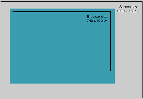
Device pixels—also called screen pixels—are the actual pixels comprising your screen, and traditionally this was the number of pixels in the width by height of a user’s screen. As shown in Figure 4-3, this may not be the same as the size of their browser window, as desktop users frequently resize it, and browsers don't typically operate in full-screen mode.
Figure 4-3—Screen size versus browser size
The newer, high-resolution screens—such as Apple’s Retina displays—complicate matters, as they use a larger number of pixels over the same screen area. Typically, this is achieved by doubling the number of pixels vertically and horizontally—though increasing numbers of screens have four times as many pixels in each direction.
Complicating this further are users who scale or zoom their browser windows for accessibility or other reasons. For example, the screenshot shown in Figure 4-4 is the current demo site zoomed to 125%, where one CSS pixel now covers 1.25 device pixels.
Figure 4-4—A page zoomed to 125%
For these reasons, it’s best to ignore actual device pixels and focus on CSS pixels—the pixel values you set in your CSS file. The CSS pixel value is a more accurate number, which takes into account the factors outlined above. Browsers also handle a lot of the scaling issues for you.
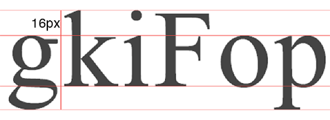
The pixel, or px, sizing unit theoretically represents the size of one pixel of a screen. In relation to text, this means that when setting text to 16px, the length of the lowest point in the text—such as the bottom of a lowercase g—to the highest point—such as the top of a lowercase k—is 16px, as shown in Figure 4-5.
Figure 4-5—Text height includes ascenders and descenders
For other properties, such as letter-spacing, this literally means the number of pixels between characters at their widest point.
Points
As you saw in the earlier screenshot from InDesign, the point, or pt, sizing unit has its heritage in print text and is more confusing to understand. It represents a similar size to the pixels example, but as different operating systems and screens represent pixels to points in different ways, they are best reserved for print styles.
Relative Sizing
Relative sizing is more suited to Web and responsive design, as sizes will change relative to a base size. But it’s useful to understand fixed sizing—at least pixels—to appreciate how these sizing methods work. The most popular units for relative font sizing are the %, em, and rem values.
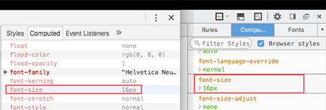
The first important fact to know when using relative sizes is what these sizes are relative to. By default in all browsers, it’s 16px, as shown in Figure 4-6. But if a user has changed this default—for example, to compensate for low vision—relative sizes will still scale up and down proportionally.
Figure 4-6—Default font sizes
Percent
Setting a percentage value for a font size means making it a percentage of the default font size, so if a user has the font size of their browser set at 16px, then font-size: 100%; will still equal 16px, and font-size: 50% will equal 8px.
As an example, let’s try applying percentage sizing to the demo site, again with a mobile first approach, setting the base font size for users of devices with smaller screens.
We’re Assuming a Base Font Size of 16px
For these examples, I’ll assume that the base font size is the default 16px. If it’s different in your browser, then the sizes stated will be different.
Add a base font size to the body element that sets the default font size to 75% of 16px, which is 12px:
body {
font-size: 75%;
}
Then, in the tablet and desktop media queries, add font sizes for the larger screen sizes:
…
@media only screen and (min-width: 768px) {
body {
font-size: 100%;
}
}
@media only screen and (min-width: 992px) {
body {
font-size: 125%;
}
}
This results in a subtly more pixelated font rendering on larger screens than on medium-sized screens.
Em
Despite its recent rise in popularity with Web designers, the em unit is an old typographical unit named after the letter M. The base value of an em unit is equal to the current typeface size in points. For example, one em in a 16-point typeface is 16 points.
In practice, it works in a similar way to percentage sizing, but the units are smaller. So, for example, assuming a default font size of 16px, font-size: 1em will still equal 16px, and font-size: 0.5em will equal 8px.
The unit values are smaller with ems, but it’s easy for styles to result in large font sizes accidentally. For example, consider font-size: 4em: while the number doesn’t look large, it actually equals 64px. Of course, you could set your default font size to something smaller, and then increasing ems won’t result in such large variations.
As an example, let’s try applying em sizing to the demo site, again with a mobile first approach.
Add a base font size to the body element that sets the default font size to .75em of 16px, which is 12px:
body {
font-size: 0.75em;
}
Then, in the tablet and desktop media queries, add font sizes for the larger screen sizes:
@media only screen and (min-width: 768px) {
body {
font-size: 1em;
}
}
@media only screen and (min-width: 992px) {
body {
font-size: 1.25em;
}
}
I won’t add screenshots, as the results should look exactly the same as with the percentage examples.
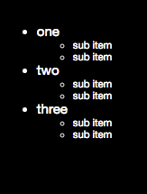
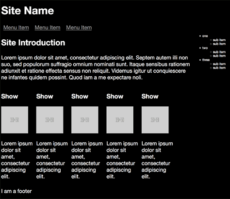
One neat trick with ems is that the relative sizing cascades down nested elements, as shown in Figure 4-7. For example, modify the page’s aside element to have some nested list items:
<aside class="left">
<ul>
<li>one
<ul>
<li>sub item</li>
<li>sub item</li>
</ul>
</li>
<li>two
<ul>
<li>sub item</li>
<li>sub item</li>
</ul>
</li>
<li>three
<ul>
<li>sub item</li>
<li>sub item</li>
</ul>
</li>
</ul>
</aside>
Then add the following style:
aside ul {
font-size: 0.75em;
}
Figure 4-7—Em cascade example
You’ll see that the font size for the outer ul is .75em, or 15px, of the current default size—in the screenshot, this is 20px—and the inner ul is .75em of that size, or 11.25px. While this technique allows for a fantastic shorthand way of creating responsive text sizes that can cascade through your page structure, it requires careful planning, as an element several levels deep may end up smaller or larger than you expect.
Rem
The rem unit stands for root em, and the sizing representation of the unit is the same. But root implies that the relative sizing is calculated from one base element—which is the html element—rather than the immediate containing element. This gives you a more predictable alternative to ems, as it’s easier to tell what the size is relative to.
As an example, let’s try applying rem sizing to the demo site, as shown in Figure 4-8.
Add a base font size to the html of 12px, assuming a default of 16px:
html {
font-size: 75%;
}
Then inside the tablet and desktop media queries, add font sizes for the larger screen sizes:
@media only screen and (min-width: 768px) {
html {
font-size: 1rem;
}
}
@media only screen and (min-width: 992px) {
html {
font-size: 1.25rem;
}
}
Not much changes when applied to the demo site, as it’s effectively the same sizing. Now add the following styles to the nested list example from above:
aside ul {
font-size: 0.75rem;
}
Now the sizing is 3/4 of the current base font size.
Figure 4-8—Rem cascade example
Other Relative Sizes
Sizes based on percentages, ems and rems are not the only options available to you. There are actually nine in total. Some are quite obscure, or not really necessary, but others are more useful after an initial learning curve. Take, for example, the vw and vh units, which are a percentage of the width and height of the viewport respectively.
There is also vmin—based on which is smallest of the viewport height and width—and vmax—based on which is largest of the viewport height and width. These are amazingly flexible, as the size will automatically react to the size of the viewport, but you can lose track of what sizes fonts actually are.
Take a viewport that’s 1000px wide and 800px high:
1vw is 1% of the total width, i.e. 10px
100vw is 100% of the width, i.e. 1000px
50vw is 50% of the width, i.e. 500px
1vh is 1% of the height, i.e. 8px
1vmin is 1% of the smallest of the two sizes, i.e. 1% of 800px, which is 8px
1vmax is 1% of the largest of the two sizes, i.e. 1% of 1000px, which is 10px
Try adding the following to the body element:
body {
font-size: 1.5vw;
}
Your base font size will now be 1.5% of your body width, which will depend on the width of your browser window.
At first, it looks like viewport sizing is the answer to your responsive dreams, but you’ll notice that, as you shrink the browser window, the font size becomes unreadable, as 1.5% of a small viewport width is a tiny font size.
Of course, you could fix this with breakpoints, but then that defeats the purpose of using this sizing unit in the first place. There’s a clever workaround for this, thanks to Zell Liew and Mike Riethmuller:
body {
font-size: calc(16px + 0.25vw);
}
/* The above won’t work in Safari, but the below does */
body {
font-size: calc(100% + 0.25vw)
}
This works by using the CSS3 calc function to calculate a base font size—16px or 100%—and then adding 0.25% of the viewport width to it, reducing the amount of variation between sizes as the viewport dimensions change. You’re free to change both the values in the calculation to suit your needs.
For the remainder of this chapter, I’ll use the em unit, but before refactoring the demo site text, let’s return to typography and optimizing it for the Web.
Creating Readable Text
You can use all the typographical properties outlined earlier in this chapter in conjunction with the sizing units also discussed, allowing for fine-grained tweaking of text to make it the most readable on any device.
There are, of course, many schools of thought on what good text looks like, and it depends on how much text your pages show and how important it is to those pages. The example site in this book has a small amount of text, so it’s relatively easy to make it readable. Text-heavy sites such as a blog will need more thought and consideration.
You should consider what font faces, styles, sizes, and layouts suit various screen sizes and resolutions and balance this with any style guides your project may have.
Let’s start overhauling the text of the demo site by tweaking the base text properties:
body {
font-size: 1em;
}
As shown in Figure 4-9, this sets the default font size to be the browser default, likely 16px, as discussed earlier.
Figure 4-9—Setting the font size
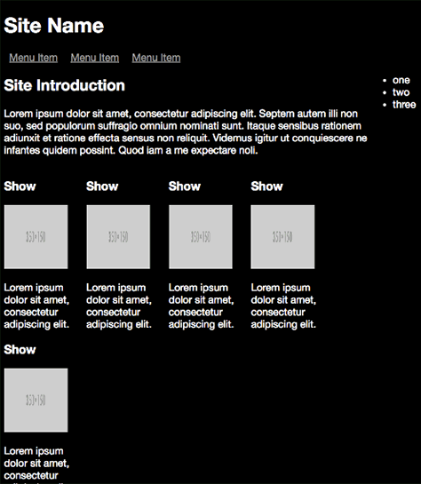
For the small-screen version of the page—that is, the default styles—the show description text is actually hidden, as shown in Figure 4-10, so we needn’t worry about formatting it. However, the main site description is taking up way too much space when screen real estate is limited, so use a :not pseudo-class to reduce the default font size and exclude the show descriptions:
section.showslisting p:not(.showdescription) {
font-size: 0.8em;
}
Figure 4-10—The site’s intro text resized
As the screen size grows, apart from watching the videos, the show descriptions are likely what people want to access, so let’s make the text slightly bigger to stand out more, as shown in Figure 4-11. With this medium screen size, still only a text summary is shown, so this is enough to make it more readable:
@media only screen and (min-width: 768px) {
.showdescription {
font-size: 1.2em;
}
}
Figure 4-11—Show descriptions are now larger
As the screen gets larger, let’s increase the text size and tighten the line spacing, as shown in Figure 4-12, especially as people may now be reading these descriptions from across the room as they settle in for an evening of entertainment.
/* Medium devices and desktops */
@media only screen and (min-width: 992px) {
.showdescription {
font-size: 1.3em;
line-height: 1.1em;
}
}
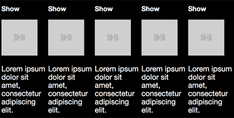
Figure 4-12—The full description text
Read On
In this chapter, I’ve introduced typographical concepts that are relevant to responsive design, and I’ve shown how they are represented in CSS. I’ve also covered the different sizing units that you can use to set these properties, and how to make important text on your pages readable. In the next chapter, I’ll look at how to do the same with the rest of your page content, such as images and videos.
After 15 years working as a developer, Chris realized that his greatest skill lies in helping people to understand technical subjects. He achieves this goal through technical writing, blogging, journalism, networking, and educating people through presentations and workshops. Chris writes for some of the most popular sites on the Internet and startups that have won international awards. He has presented at events in every corner of the World. He is the author of the SitePoint book Jump Start Responsive Web Design, Second edition. He earned a Bachelor of Science in Multimedia Computing from the University of Westminster. Read More
 If Web pages are to be truly responsive, then the content of pages should also flow and change to suit the dimensions of the device a user is viewing it on. While Web pages are becoming more image and media heavy, text is still a crucial component, and there are numerous techniques to help make it as readable as possible, no matter the current device.
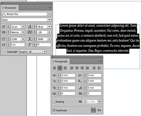