This is an excerpt from Scott Jehl’s book Responsible Responsive Design. 2014, A Book Apart.
Chapter 1: Responsible Design
“My love for responsive centers around the idea that my Web site will meet you wherever you are—from mobile to full-blown desktop and anywhere in between.”—Trent Walton, “Fit to Scale”
Responsive design’s core tenets—fluid grids, fluid images, and media queries—go a long way toward providing a holistic package for cross-device interface design. But responsive design itself relies on features that may not work as expected—or at all. Our sites need to react to unexpected user behaviors, network conditions, and unique support scenarios.
In this chapter, we’ll dig into two responsible tenets: usability and accessibility. We’ll cover higher-level considerations before getting into nitty-gritty code you can implement now and expect to last. To start, let’s talk design.
Champion Advertisement
Continue Reading…
Designing for Usability
When we consider usability in responsive design, we think about how to present a design’s content and features across a range of screen sizes and devices. Do the interface components yield to the content when screen real estate is tight? Do the components function intuitively in response to various input modes? Are the content and hierarchy easy to parse? Do the line lengths foster readability across screen sizes?
Get into the Browser Quickly
“Let’s change the phrase designing in the browser to deciding in the browser.”—Dan Mall, The Pastry Box Project
At Filament Group, we start most of our projects in Adobe Illustrator, where we iterate on high-level visual design concepts. We then try to move to code as soon as possible. At this stage, we aim to design the fewest number of interface variations that communicate a plan for layout and interactivity across viewports—mere suggestions for how the site will look and feel on any given device. Decisions about how features react to different input mechanisms and browser capabilities, as well as the particular viewport sizes that should receive each layout variation, remain to be determined. The goal is to move into the browser as quickly as we can to make design and interaction decisions in context, which translates to more informed recommendations for our clients.
Find Your Breakpoints
The viewport sizes at which we change from one fluid layout to another using media queries are called breakpoints. Here are two examples:
/* first breakpoint */
@media (min-width: 520px){
…styles for 520px widths and up go here!
}
/* second breakpoint */
@media (min-width: 735px){
…styles for 735px widths and up go here!
}
While it’s tempting to choose breakpoints early in the design process, perhaps based on the dimensions of popular devices we know we need to support, the truth is that we shouldn’t choose breakpoints at all. Instead, we should find them, using our content as a guide.
“Start with the small screen first, then expand until it looks like shit. TIME FOR A BREAKPOINT!”—Stephen Hay
A layout’s design and content should shape and inform a layout’s breakpoints. As Hay notes, the easiest way to find breakpoints is simply to resize the browser viewport until the content becomes awkward—that’s the technical term—to use or read—and presto, a breakpoint.
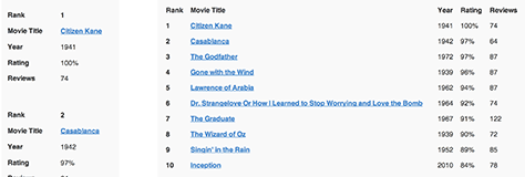
In addition to a gut check, you might opt for a slightly more objective guideline. Per Richard Rutter’s homage to Robert Bringhurst, The Elements of Typographic Style Applied to the Web, an optimal measure—the number of characters per line in a column of text—for immersive reading is widely thought to fall between 45 and 75 characters, including spaces, as shown in Figure 1.1. If you’re resizing a layout outward, watch for when a column of text approaches that range: it’s probably a good place to adjust your layout.
Figure 1.1—A 70-character line length makes for comfortable reading
As you work with complex responsive designs, you’ll find that breakpoints often occur at different times for different portions of a layout, and that some are more significant than others. Major breakpoints mark big shifts, usually to add columns or dramatically change the presentation of more than one component; minor breakpoints involve smaller design tweaks—such as changing a component’s font-size to prevent text wrapping—that take full advantage of the spaces between the major breakpoints. In general, I find that major layout breakpoints are decided early in development, while minor ones act as finishing touches. The fewer breakpoints we use, the easier a responsive design will be to maintain.
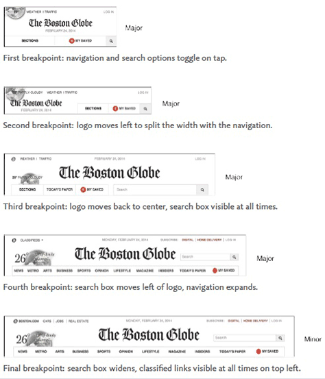
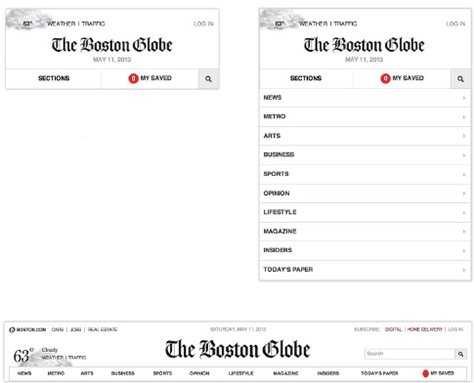
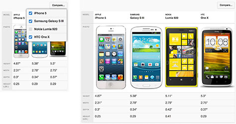
Let’s look at an example. On the Boston Globe Web site, we have two or three major layout breakpoints, but the more complicated components break more often. The site’s masthead component has four major breakpoints, as well as some minor ones for slight adjustments to prevent text wrapping, as shown in Figure 1.2.
Figure 1.2—Major and minor breakpoints of Boston Globe’s masthead
Design Modularly
As in the masthead example, I find it helpful to compile the multiple configurations of each modular component in isolation; that way, I can test its usability and document its variations in one place. Developer Dave Rupert of Paravel explored this concept in his post “Responsive Deliverables”. “Responsive deliverables should look a lot like fully functioning Twitter Bootstrap-style systems custom tailored for your clients’ needs,” Rupert writes. In other words, we should build and document our components from the inside out, as standalone pieces that play nicely with others.
Same Content, Reduced Noise
You’ve figured out how to find horizontal breakpoints across a range of viewport sizes. How do you fit all that content on small screens without making things noisy? Responsive design has undeservedly received a bad rap because of sites that attempt to avoid messy situations by hiding parts of the content from users—denying access to content that was ostensibly important enough to include in the first place. Remember, if it’s useful to some people, it’s likely useful to everyone. As Luke Wroblewski’s book Mobile First instructs, rather than hide content that’s inconvenient to display, it’s best to reorganize the design to retain usability on smaller viewports.
Fortunately, we have many design patterns that work around small-screen constraints in interesting, intuitive, and responsible ways.
Progressive Disclosure
One such pattern is progressive disclosure, a fancy term for showing content on demand. To be clear, not all hiding is bad; it’s only bad if the user has no way to access the hidden content. The idea behind progressive disclosure is simple: hide portions of content, but provide interface cues so that users can view it when they wish. As shown in Figure 1.3, Boston Globe’s navigation uses progressive disclosure on small viewports.
Figure 1.3—Boston Globe’s navigation with progressive disclosure
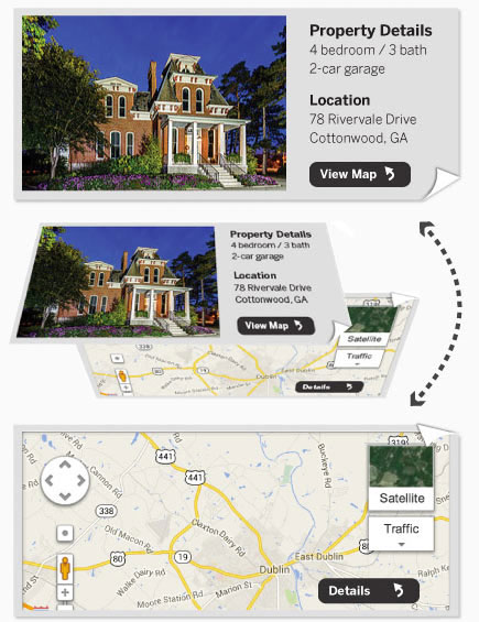
Progressive disclosure is most often a simple show-and-hide like the example in Figure 1.3, but we have plenty of ways to visually toggle content. For instance, this property listing component does a 3D flip upon tap or click to reveal additional information about a property, such as its address and location on a map, as shown in Figure 1.4. For browsers without 3D CSS animation support, users can toggle to the map without an animated transition, while basic browsers display the map at all times, just beneath the property information.
Figure 1.4—3D flip of progressively disclosed content
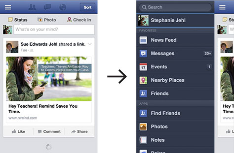
Off-canvas layout, a term coined by Luke Wroblewski in his article “Off-Canvas Multi-Device Layouts,” describes another notable approach to minimizing complexity on small screens. Wroblewski documents several patterns for positioning lower-priority interface components offscreen until users cue them by tapping a menu icon or similar item; the formerly offscreen content then enters the viewport, overlapping or pushing aside the primary content. As shown in Figure 1.5, tapping the menu icon reveals Facebook’s off-canvas navigation from the screen’s left edge. This on-demand approach is becoming common in small-screen layouts.
Figure 1.5—Tapping the menu icon reveals the off-canvas navigation
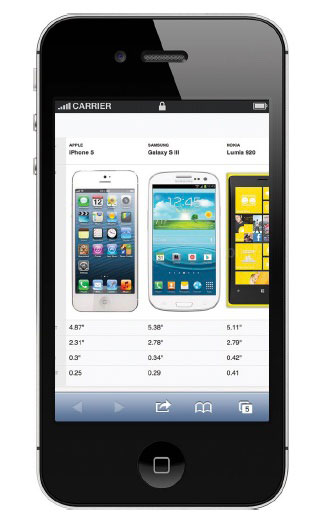
Responsive Tables
Tabular data is one of the toughest content types to present on a small screen. It’s often essential that the user see column and row headers associated with a table cell, and yet we can only fit so many rows and columns on screen, as in Figure 1.6.
Figure 1.6—Large tables can cause usability trouble on small screens
At Filament, we experimented a lot and found a couple of patterns that worked well enough to include in the jQuery Mobile framework. The first pattern, Reflow, reformats the table from a multi-column view to a list view; each cell becomes its own row, with a row header to its left. Figure 1.7 shows an example of the jQuery Mobile Reflow table pattern, with the same table shown at narrow and wide widths.
Figure 1.7—jQuery Mobile Reflow table pattern
To pull this off, Reflow uses CSS to set each cell in the table to display: block, creating a new row, and JavaScript to grab each of the table’s column headers and insert them in each cell to serve as the labels, while hiding the additional labels from screen readers. Reflow suits simple tables that act like formatted lists, but its small-screen presentation falls short when you need to compare data points across rows.
The Column Toggle pattern picks up that slack. It works by selectively showing columns in a table as horizontal space allows. If there isn’t room, CSS hides the column data, but a menu offers users the chance to override the CSS and display the column anyway, eventually causing the table to expand wide enough to warrant horizontal scrolling. Figure1.8 shows an example of the jQuery mobile Column Toggle table pattern, with the same table shown at narrow and wide widths.
Figure 1.8—jQuery mobile Column Toggle table pattern
These are only two of the numerous potential patterns for responsibly presenting tabular content. For more examples, check out Brad Frost’s project Responsive Patterns. You’ll find everything from horizontal navigation components that collapse into menus when space is tight to CSS-Flexbox-driven grids for complex page layouts.
Designing for Touch—and Everything Else
A responsive layout is but one step. Even if your site flows beautifully from one screen size to the next, you’re not doing your job if someone can’t use it. Touch isn’t only the domain of small screens; many devices offer touch alongside other input mechanisms. But as the number of people on touch devices surges, we must add touch to our arsenal of common interactions like mouse, focus, and keyboard. While the intricacies of touch can be daunting, we don’t need to completely overhaul our designs to be touch-friendly. Far from it: one of the joys of responsible design is how it builds on our everyday tool set. Two basic measures pack a wallop on the usability of an existing, mouse-based interface:
Make sure any content that offers mouse-centric interactivity—such as hover—is also accessible in browsers where a mouse pointer may not exist.
Don’t assume touch will be used, but design as if it will be. Let’s see how these play out with the following considerations.
Save Hover for Shortcuts
The absence of mouseover or hover interactions is one of the biggest changes when learning to support touch. In fact, the lack of mouseover support on many touch devices is a primary reason that many sites designed for the desktop Web falter in touch contexts, resulting in usability problems that prevent users from accessing certain features. You can’t rely on mouseover for vital design interactions, but you can use it as a nice-to-have, alternate way to reach otherwise accessible content.
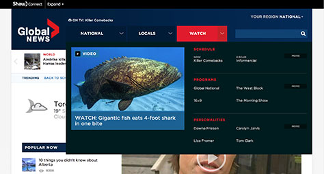
One example is the navigation for the Global News Canada Web site, designed by Upstatement and developed by the Filament Group team. As shown in Figure 1.9, the split-button menus on GlobalNews.ca work for touch and mouseover. The global navigation links users to National, Locals, and Watch section home pages when clicked or tapped. These links also feature split-button drop menus that toggle between sections on hover. On a touch screen, one tap directly sends users to that section’s homepage, so we came up with an alternative mechanism to toggle between menus and account for all breakpoints. The split buttons with arrows next to each navigation link do just that, offering tap or click access to the drop menus.
Figure 1.9—Split-button menus on GlobalNews.ca
Keep in Touch
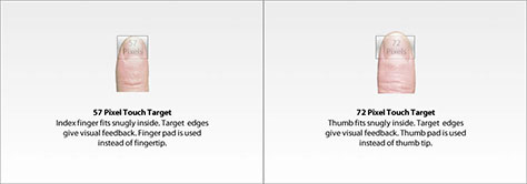
One rule of thumbs: the devices accessing your site may or may not have touch screens, but always design as if they will. Fingers aren’t precise, so we need to enlarge button and link target areas to make them easier to tap. How much bigger is an open discussion, though Apple’s guidelines suggest 44 × 44 pixels as the minimum size for usable buttons. Based on findings from MIT’s Touch Lab, the Smashing Magazine article “Finger-Friendly Design: Ideal Mobile Touchscreen Target Sizes” by author Anthony T suggests slightly larger targets at 45-57 pixels, and 72 pixels for buttons for thumb use, like the ones located near the bottom of a handheld device’s screen, shown in Figure 1.10.
Figure 1.10—Illustrations from Smashing Magazine’s article
Don’t forget your white space! Equally important as the size of touchable elements is the space around those elements. A smaller button surrounded by dead space can be as easy to use as a larger element, so the size of the button within its tappable footprint becomes a question of visual emphasis.
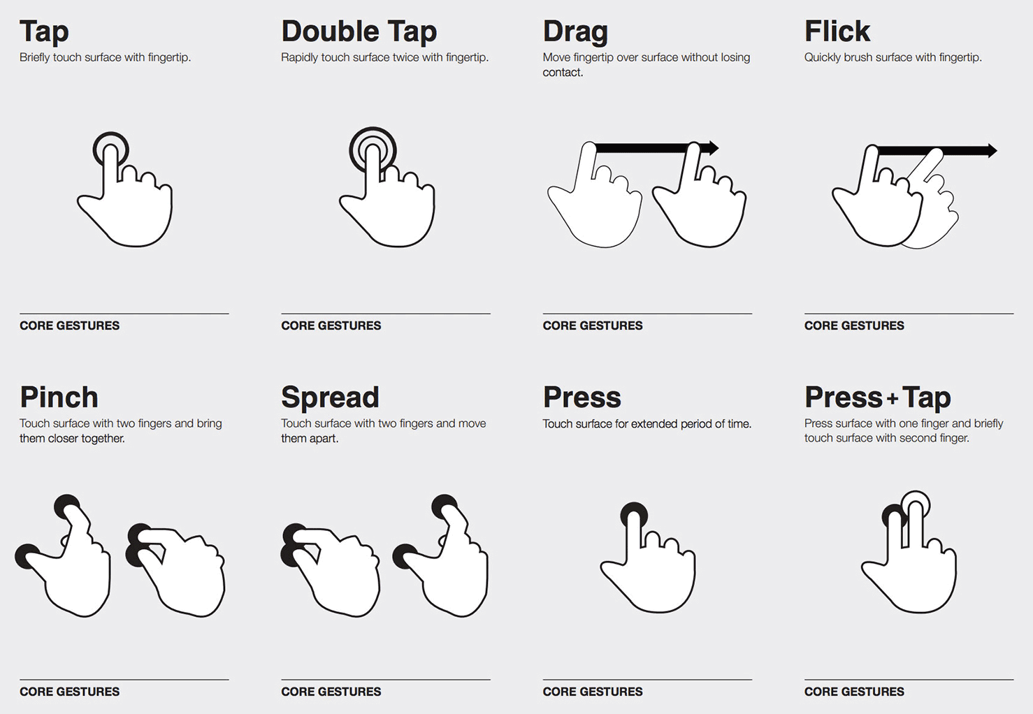
The Usual Gestures
Touch screens offer the potential for richer interactions than tap alone—many touch gestures have become commonplace, particularly in native apps. The diagram in Figure 1.11, by Craig Villamor, Dan Willis, and Luke Wroblewski, demonstrates some popular gestures in touch interaction.
You’re probably familiar with most of these gestures, which are used by operating systems on several devices, including iOS. Within browsers, these gestures are often paired with convenient default behavior that varies from device to device; some gestures share the same behavior. For example, a double tap or pinch or spread in iOS Safari causes the browser to zoom in or out on a particular region. Dragging or flicking in any direction causes the page to scroll; and a press, or touch-hold, often exposes a context menu akin to what you’d see when right-clicking with a mouse.
Native gestures like these have all sorts of implications for how we can responsibly develop for touch. Users form expectations about their devices’ native features, so we don’t want to disable or repurpose a feature like touch-hold if we can avoid it. While browsers do let us use touch events like touchstart, touchmove, and touchend—or the new standard pointer events such as pointerdown, pointermove, pointerup—to specify gestures with JavaScript, how can we do so without conflicting with native touch behavior?
Web-Safe Gestures: Do They Exist?
Let’s compile a list of Web-safe gestures we can use in our sites. (Spoiler: it’s short.) Based on the native gestures in today’s popular devices, we have tap, two-finger tap, horizontal drag, and horizontal flick. Yet within this small list, we still have potential for conflict. For instance, Chrome on iOS and Android allows users to horizontally swipe to switch between open tabs, while iOS Safari uses the same gesture to go back or forward in browser history, which means our use of those gestures can lead to unexpected behavior. Horizontal drag gestures can also introduce issues even in touch browsers that don’t use them for native navigation. For example, if a page’s content stretches wider than the browser’s viewport, which often happens after zooming in, a horizontal touch-drag is typically used to scroll the page right or left, so we have to be careful that our custom touch gestures don’t interfere.
Keep in mind that I’ve deemed these gestures safe only because I’m unaware of any touch-based browsers that use them—yet. The moment iOS implements two-finger tap, anything we’ve built may conflict with native behavior, and that’s not future-friendly at all. This doesn’t mean we should avoid building custom gestures, but it highlights the importance of developing for many input modes. If one fails for any reason, we’ll have alternate ways to access our content.
In practice, this means ensuring there’s always a click-and-keyboard-based interface for interaction. For example, the carousel of magazine covers on the Boston Globe site has several interactive options, as shown in Figure 1.12. You can click the arrows beneath the carousel, click the covers to the right or left of the featured image, use the right and left arrow keys on your keyboard, or touch-drag the carousel on a touch device. Think of touch gestures as a nice-to-have enhancement on top of broadly supported input modes.
Figure 1.12—Multiple-input-mode carousels on the Boston Globe site
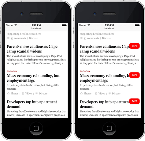
Perhaps a bigger problem with touch gestures is discovery, as touch gestures often lack any visual interface to hint at their presence. We ran into this dilemma when building the Boston Globe’s saved articles feature, which allows you to save articles to your account so you can read them later. On small screens, the Save buttons hide by default but can be toggled into view with a two-finger tap. Figure 1.13 shows the Boston Globe’s Save buttons. Of course, there is no easy way to know that unless you visit the help section and read the instructions!
Figure 1.13—Boston Globe Save buttons visible with a 2-finger tap
Scripting Touch Interactivity
Touch-screen browsers are typically capable of using components designed for mouse input, so outside of accommodating touch from a design perspective, you may not need to do anything special with JavaScript to ensure touch support. However, touch-specific events do exist, and the advantage of scripting with them is often a matter of richness and enhancement. When developing components, for example, it’s particularly nice to write code that listens for touch events because they respond immediately to touch interaction. By comparison, in many touch browsers, mouse events like click and mouseup typically fire 300 milliseconds or more after a user taps the screen—the device waits to make sure that a double tap isn’t happening before it handles the click—so any site that’s coded to respond to mouse events alone will suffer minor but noticeable delays. That said, scripting touch gestures can be tricky because most browsers that support touch emit both mouse and touch events whenever a touch occurs. Further complicating things, browsers sometimes use different touch-event names such as the widely used touchstart rather than the emerging standard, pointerdown.
Whatever touch-screen optimizations we make, it’s crucial not to hinder people’s ability to interact with content using non-touch input mechanisms like the mouse and keyboard. A common, responsible approach to ensure that touch interactions work as fast as possible is to set up event listeners for both mouse and touch events. During a particular interaction, the logic would handle whichever event type happens first and ignore the other to prevent the possibility of running any scripting twice. Sounds straightforward, but it’s not. That’s why I recommend using a well-tested, open-source JavaScript library to do the hard work for you. I use Tappy.js, a script I created to allow you to listen for a custom tap event when writing jQuery code. Here’s Tappy in play:
$( ".myBtn" ).bind( "tap", function(){
alert( "tap!" );
});
Behind the scenes, that tap event is listening for touch, keyboard, or mouse clicks to perform a specific behavior. (In this case, it throws an alert that says, “tap!” I’m sure you can find better uses for it, of course.)
For a library that offers a more advanced set of touch features, check out FastClick, which was created and is maintained by the talented team at Financial Times.
Scott works alongside the bright folks at Filament Group, whose clients include The Boston Globe, LEGO Systems, Global News Canada, and eBay. In 2010, he cowrote Designing with Progressive Enhancement. Scott has spoken at conferences such as An Event Apart, Breaking Development, and Mobilism. He is an active participant in the open-source community, releasing projects on GitHub that focus on accessible, sustainable, and performance-oriented practices for cross-device development. Read More
 Responsive design’s core tenets—fluid grids, fluid images, and media queries—go a long way toward providing a holistic package for cross-device interface design. But responsive design itself relies on features that may not work as expected—or at all. Our sites need to react to unexpected user behaviors, network conditions, and unique support scenarios.
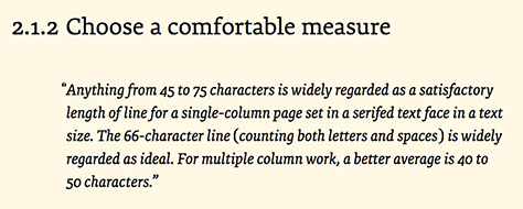
