Are you worried about bounce rates on your ecommerce site? Do you wonder what’s stopping your site’s visitors from converting to customers?
While there are many factors that contribute to high bounce rates, a poor user experience is certainly one of the most common. But, once you know what your customers want, you’ll be able to align your ecommerce site with their expectations and boost your sales effortlessly. To help you achieve this goal, here are seven tips on how to improve your user experience and drive your ecommerce sales:
Provide usable navigation and smart search
Offer real-time support on all touchpoints
Optimize product pages for conversions
Support smart visual searches
Provide product filters
Ensure a smooth checkout experience
Optimize your mobile-store user experience
Champion Advertisement
Continue Reading…
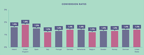
According to a recent report from Smart Insights, ecommerce conversion rates in the US hovered at 1.4%, as shown in Figure 1. In other words, over 98 percent of potential customers left ecommerce Web sites without making a purchase.
Ecommerce site navigation is absolutely fundamental to your Web site’s success. If customers can’t find what they’re looking for, there’s no way they’ll be able to buy it. Therefore, keeping your user personas in mind while designing your site is essential to creating a seamless user experience and a profitable business.
To ensure a better user experience, refrain from trying to reinvent the wheel. Instead, present visitors with a familiar user interface for your site’s navigation system. Segment your products into categories according to type, design, usage, or any other relevant parameters so your visitors can easily find what they’re looking for. When you’re designing the navigation system, place subcategories under multiple categories, as is logical and appropriate, to ensure users don’t miss them.
You should also make it easy for users to search for products on your site. Adopt artificial intelligence (AI) to enable smart searches on your site. The Pinterest Web site provides an example of this. Pinterest updated its Chrome extension in 2017, allowing users to select an object in any online image and ask Pinterest to find similar objects using image-recognition software.
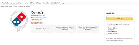
It’s also possible to create a custom Alexa skill. This lets you open up a new sales channel by enabling users to purchase products simply by uttering a few words rather than their having to visit your Web site. For example, as Figure 2 shows, customers can easily use Domino’s Alexa skill, which lets them order pizza with their Echo device.
Figure 2—Domino’s Pizza Alexa skill
2. Offer Real-Time Support on All Touchpoints
Have you ever wondered what people like most about bricks-and-mortar stores? It often comes down to having a willing salesperson who can help find the right pair of shoes or a favorite dress in a different color.
But what happens when shoppers browse your Web site? They may not be willing to search deeply if they can’t find what they’re looking for right away. In such cases, switching to a competitor’s Web site might seem easier than calling customer care for help. But you could deploy a chatbot to initiate conversations with your customers and ask whether they need any help—just as a salesperson in a store would. A live-chat button on your site can connect customers with support instantly.
By facilitating real-time conversations through live chat, you can guide customers to the products they need, offer alternatives such cross-sells and upsells, and reduce their urge to comparison shop by keeping them engaged throughout the shopping process. Integrating live chat with your Web site not only improves the customer experience but also boosts conversions.
In addition to integrating live chat with your product pages, offer live chat during the checkout process to help users understand shipping or delivery costs and guide them seamlessly through the payment process.
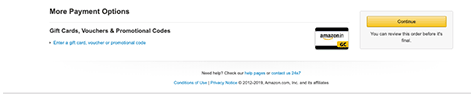
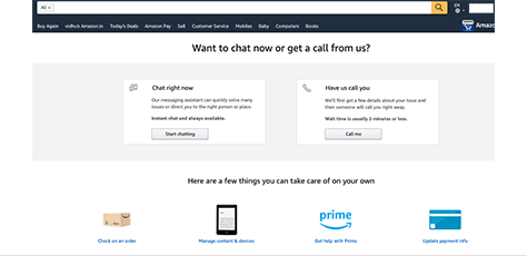
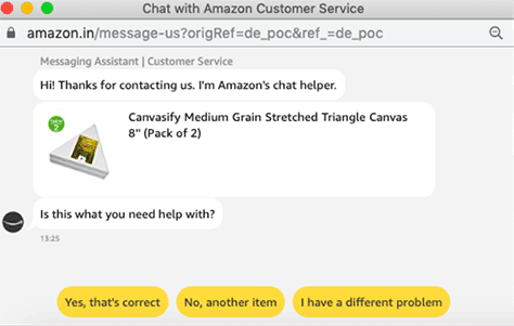
For example, Amazon provides a Contact Us 24x7 option at the bottom of their payment page, as shown in Figure 3. Once the customer clicks this button, Amazon offers the choice to either chat with a support agent or receive a voice call on the customer’s registered mobile number, as shown in Figure 4. Thus, Amazon makes it extremely convenient for customers to get help instantly during checkout, improving the user experience immensely. Figure 5 shows the chat window that appears when a customer chooses live chat.
Figure 3—Support link on the Amazon payment page Figure 4—Amazon’s support options during checkout Figure 5—Amazon live chat
3. Optimize Product Pages for Conversions
Generating traffic on your Web site is not enough. You must optimize your Web site so visitors convert to paying customers. Steven Hoober has provided some tips on how to improve your product pages’ user experience and convert more visitors:
Use professional photos. Multiple, high-quality images showing a product from various angles help visitors make their purchase decision with confidence. Provide a zoom feature that lets users see products in detail and, thus, help them to feel more comfortable about purchasing products.
Write original, appealing copy. Sometimes fewer words can create more impact, so write short, sweet descriptions, highlighting products’ best qualities. Improve searchability by defining keywords, adding headings, and using bullet points. This makes it easier for both search engines and visitors to scan the content.
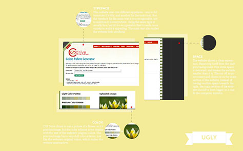
Choose a good color palette. Ensure that text is legible by providing adequate value contrast between the background color and the text. Bad color choices like those in Figure 6 can be a real turn-off for customers, causing you to lose sales and revenue.
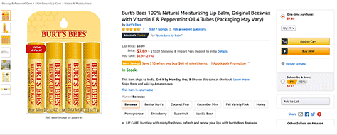
Tell users what to do. A prominently placed call-to-action (CTA) button creates a smoother shopping experience and reduces distractions by making it clear to users what to do, as Figure 7 shows.
Figure 6 shows an example of inadequate contrast because of the use of a light font on a light background, which renders the text unreadable.
In Figure 7, an example product page on Amazon provides clear calls to action. At the right, two prominent buttons tell customers what to do—either click Add to Cart to add the product to their cart and continue shopping or click Buy Now for instant checkout. It is also possible to subscribe to the product and earn a discount.
Figure 7—Amazon CTA button
4. Support Smart Visual Searches
Earlier, I described Pinterest’s feature that lets users select images on the Web and find similar images. In 2017, Pinterest upgraded its visual-search capability by introducing Pinterest Lens, allowing users to take photos with their camera and find related pins on their platform. For ecommerce sites, such visual searches offer a lot of potential for creating an enjoyable, quick, multichannel shopping experience. Shoppers can take a picture of a product they want to buy, upload it to a visual search engine, and immediately see similar items for sale.
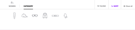
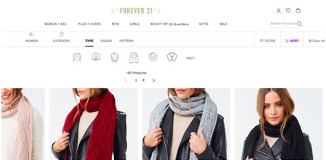
The fashion brand Forever21 introduced a visual search tool in 2018 that boosted its sales by 20 percent. Their style-finder tool lets users search for products without entering any keywords by instead clicking a category, then a subcategory of garment, as shown in Figures 8 and 9; and finally, by selecting a garment’s desired attributes such as color or pattern, as shown in Figure 10.
You can also use machine learning to drive product recommendations, which Amazon does by using collaborative filtering and next-in-sequence models to analyze consumer-purchase behavior and determine what product a customer might need next. Amazon’s voice assistant, Alexa, makes use of another intelligent technology, natural language processing, to process voice commands, which is perfect for driving repeat orders and impulse purchases.
5. Provide Product Filters
Product filters facilitate quick searches, creating a more convenient product-browsing experience. But what if your filters aren’t working correctly or are hidden where users can’t find them? And what if a user selects the wrong filter, and there’s no way to deselect it without losing all the search results?
To improve your ecommerce experience, monitor your filters closely and ensure that they are working correctly. To optimize your filters, do the following:
Allow users to select multiple filters for greater choice.
Let users set manual filters when necessary, as when selecting a price range.
Use logical filter groupings to guide users to the right filter combinations for each product category.
Support progressive disclosure of filter groupings that users can expand as necessary—especially for smaller screens.
It’s always best to display the applied filters above the search results, so users can quickly check the various combinations and make selections.
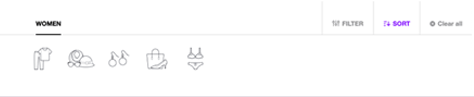
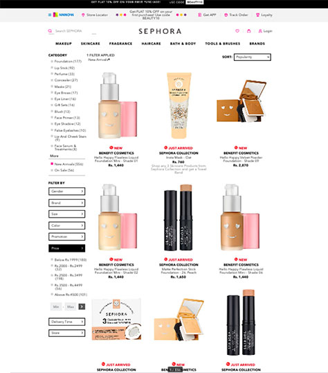
In Figure 11, you can see how Sephora lets users sort products by category. It’s also possible to filter products by gender, brand, price, and delivery time. There are preset categories for price range, as well as an option to define a customized price range. In the upper-right corner of the page, there is sort option that lets users sort products by filters in common use, making it much easier for users to navigate the search results.
Figure 11—Sephora product filters
6. Ensure a Smooth Checkout Experience
Nobody likes overly complicated checkout forms. They make online shopping feel like a chore. According to the Baymard Institute, 23% of US buyers abandoned their cart in 2019 because of a too long or complicated checkout process.
Don’t lose customers at the last hurdle. To create a seamless checkout process, you can make simple changes such as speeding up the process by implementing auto-fill forms, offering a broader range of payment options, providing clearer shipping information, or including the right CTA in a prominent location. Adding a risk reducer such as a 15-day return policy is also helpful in encouraging successful checkouts. Be sure to offer a guest checkout option so customers don’t have to create an account before purchasing unless they want to. Once the checkout process is complete, you can offer to create a new account using the information the user has already provided and just ask the user to create a password.
Keeping your checkout page clutter free is essential, so put ample thought into your page design, making sure to give all essential elements prominent placement. To ensure the best user experience, continue testing different layouts and payment options to see what works best for your site’s users.
7. Optimize Your Mobile Store User Experience
Retail mobile-commerce sales are expected to reach $37.96 billion by 2020 and constitute nearly 50% of the $79.41 billion total ecommerce sales. Therefore, if you want to drive sales and keep users happy, optimizing your Web site for mobile is no longer a choice, but a necessity. In 2018, Google recognized users’ growing preference for mobile commerce by announcing a mobile-first indexing update.
To optimize your store for mobile, start by investing in a responsive Web site whose layout automatically adjusts to fit your users’ screens. Make sure your Web site loads quickly, its fonts are clear and easy to read on mobile devices, and tappable elements are sufficiently large touch targets. You could also consider developing a native mobile app for your ecommerce store to improve the user experience and provide faster checkouts.
Conclusion: Good User Experiences Mean Good Performance
Your customers determine the success of your business. Designing ecommerce stores that match customers’ expectations makes it easier to increase conversions and outshine your competitors. A simple, responsive, user-friendly ecommerce site, with clear images, engaging copy, and a smooth checkout process gives your customers what they want and can boost sales tremendously.
Are you ready to increase your ecommerce sales and delight your customers? Then, follow the tips in this article to improve your ecommerce experience, drive sales, and increase your profits.
Make sure your pages load and render quickly. No one likes a site that’s slow, especially on mobile. Without this experience going well, there will be no other experiences.
9. Remove any doubt. Whatever it might be, work to mitigate doubt. “Doubt is a deal breaker.” For example, if your customer expects you to be on Twitter, then get a Twitter account, and make sure that icon is on the site. “Oh. We don’t do Twitter” isn’t reasonable if your customers do Twitter and they expect you to get there as well.
10. Give me a minute…I’ll come up with something. :)
At Acquire, Dhruv provides digital-marketing solutions. He has managed on-page and off-page search-engine optimization (SEO) activities. Dhruv earned his International Master in Marketing, Communication, & New Media from Bologna Business School, in Italy, as well as an MBA in Marketing in India. Read More