With luck, the ads that are promoting your app will reach out and grab people’s attention. Hopefully, once visitors are on its landing page, they’ll appreciate your app’s value proposition and immediately download it. Then, once people download your app, with luck, they’ll fly through your onboarding process. What do all of the steps in this scenario have in common? Luck. Plus, they’re part of a process in which visual salience determines whether your app gets ignored or people download and adopt it.
If users don’t notice what matters, our design work fails. Instead of relying on luck, it’s important to design for attention. By using the right techniques, you can control what users notice—and the order in which they notice things. In this article, I’ll look at how to design to command user attention. Specifically, I’ll cover visual hierarchy and salience and discuss how to blend these concepts with color psychology. By better understanding these techniques, you’ll be more empowered to design intuitive processes, clear page content, and persuasive technology.
Champion Advertisement
Continue Reading…
Visual Hierarchy
Visual hierarchy is the order in which you want a visitor to notice the elements on a page of a Web site or app. For example, if a landing page has a call to action (CTA) and an image, the visual hierarchy determines which element users see first.
Whether or not you have deliberately designed the visual hierarchy, your pages do have one. When you take control of your visual hierarchy, you can purposefully direct the visitor’s attention, which has a massive impact on the user experience.
But if UX designers don’t understand how to use visual hierarchy, things can go down the tubes pretty quickly. Here are some common visual-hierarchy failures:
If UX designers don’t get it, they create navigation systems that confuse users.
If advertisers don’t get it, they create ads that audiences don’t notice.
If behavioral designers don’t get it, they write content that nudges nobody.
If you cannot command users’ attention, you have little hope of impacting comprehension, emotion, trust, or behavior. Failing to command users’ attention guarantees that your site or app will fail to make an impact. Their functionality and content would pretty much be dead on arrival.
There is an adage: the primary goal of UX design is to ensure that your users always know what to do next. Hopefully, this won’t sound absurdly obvious, but if your users don’t notice what they’re supposed to do next, they won’t know what to do next—and chances are that they won’t act.
Visual hierarchies help us to penetrate the minds of our audience. However, if you want to build a visual hierarchy, you’ll first need to build design systems from components that are appropriately salient.
What Is Salience?
Salience describes how much something stands out. It is the term psychologists and neuroscientists use to describe the features of a thing that make it more noticeable—or less noticeable.
It is a huge mistake to think that interactive design is about building pretty pages. While aesthetics is one factor, functionality is another important factor and brand recognition still another. Other factors include intuitiveness, persuasiveness, instant comprehension, and personality.
Interactive design is about striking the right balance between contradictory demands while building digital products that are intuitive, on brand, and persuasive. It’s about satisfying many competing demands, with the fewest number of actions. It’s about brilliant tradeoffs.
Controlling user attention is a critical first step in interactive design. If you get people to focus on something, this takes you closer to the second step: entering their short-term memory, then triggering comprehension.
If you’re an interactive design master, you have a knack for directing user attention, by tweaking the salience of user-interface (UI) components, visual content, and overall site structures. If you’re a behavioral design master, you’ll persuade users to think about your ideas—to the point where you’re planting messages in their long-term memory. You’re framing their world view. If you’re a master at UX design, you’ll use visual hierarchy to ensure that your users always have a sense of where they are, what their options are, and what they’re supposed to do next.
So, how can you control the salience of page-design elements? Here are five design elements you can easily modify:
Size—Align content size with its importance, so the most important content stands out more.
Contrast—Create greater contrast for higher-priority information.
Placement—Place more important elements higher up on the page.
Whitespace—Create more whitespace around important elements.
Color—Use your most salient colors for the most important elements.
You can build visual hierarchies by combining various design rules, making some page elements more salient and others less salient. In other words, making various user-interface elements and content more noticeable or less noticeable.
There are many page-design elements that you can modify to control salience. Color is just one of many of these factors, but it’s an important one.
The Salience of Business Objectives
If you have not clearly defined your technology’s business goals, there is a good chance that your content and functionality will be a mess. In other words, you won’t know which design elements you should make most salient and which should be least salient—or removed altogether.
When you don’t know your business priorities, you’re more susceptible to being pushed around by bad advice and organizational politics rather than user and business needs. Maybe you’ve ended up in subjective design purgatory before: “Make it pink. No red. Wait, bigger. Maybe a bit smaller. No, no… way smaller.”
As a UX designer, what happens if you act on everyone’s color preferences? Chance are, you’ll create a design mess, by creating a color scheme with no visual hierarchy, causing cognitive strain and confusion. The way out of this mess is to define your users’ needs and business goals.
The concept of stakeholder-centered design is replacing the old concept of user-centered design. Stakeholder-centered design is the idea that your internal users are just as important as external users, making it your job as a designer–diplomat to set priorities that satisfy most of the stakeholders, most of the time. If you survive the politics and manage to define a clear set of business priorities—which rarely happens—you can get back to design.
At this point, you should fuse those business priorities with your site’s visual hierarchy. Remember, color is a key factor. When you use color well, it helps you establish a clear visual hierarchy that commands the right level of attention.
For managers, the discussion shifts to whether the various business initiatives are properly represented with the right salience. In other words, will users notice marketing campaign X, CEO speech Y, or onboarding process Z?
For designers, the discussion shifts to whether to use an H2 or H3 tag, whether you need to use light- versus dark-gray text, or whether a particular accent color would draw too much or too little attention.
It is in such nitty-gritty, visual-hierarchy design choices that the rubber meets the road, where business priorities are expressed in a visual hierarchy, and all content is either elevated or demoted relative to other competing priorities.
On every page, your visual hierarchy must tell users where they are, what to look at, and what to do next. If your visual hierarchy does not communicate this, your technology will be frustrating for people to use. If your visual hierarchy conveys all of this, your platform will feel intuitive to use. Users will know what to do and what to read, without much conscious effort.
Choosing Salient Colors
Once you have well-defined business objectives, it’s time to build a color palette that expresses those priorities. In other words, it’s time to choose specific colors to use—not purely on the basis of aesthetics, but on the basis of functional criteria, too.
So which colors are most salient? Or to put it another way, which colors pop and arrest users’ attention? Or put in extreme terms, which colors are so insanely salient that it’s impossible not to notice them?
To start, you can easily establish the visual hierarchy of any color palette by modifying the saturation and shade or tint of each hue. Thus, you can structure and tweak any combination of colors in building a visual hierarchy.
For example, with the right design tweaks, blue can dominate red. Tweak the blue in another way and red dominates blue. It’s up to you to construct a color palette that expresses a clear visual hierarchy.
It’s easy to manipulate the salience of each color by changing qualities such as saturation and tint. However, you can also leverage the native qualities of each color and, without any manipulation, certain colors dominate others.
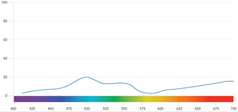
To help you understand color and salience tendencies, Figure 1 provides a bigger-picture view of color and salience.
Figure 1—The salience of colors in contrast to other colors
Specifically, it shows the relative salience of each color, running from the lowest to the highest wavelength in nanometers. This helps you get a rough sense of how much each color dominates others, in most situations.
The data in Figure 1 came from the thesis of Nilgün Camgoz, which extrapolated on and mapped a color psychology guide that Rena Cugelman and I created. Figure 1 includes only spectral colors, otherwise known as the colors of the rainbow. You can use this chart to better judge the ballpark salience level of each color relative to the others.
By knowing which colors tend to attract the eye more or less, you’ll be better equipped to find colors that express your priorities, whether at the level of your broader information architecture or each individual UI element.
Quite often, interactive design comes down to making numerous tradeoffs between competing demands. For your visual hierarchy, this means making numerous micro tweaks, or adjustments, to your UI elements, cranking up component X and turning down component Y. Business priorities help you decide how high or low on a page to feature particular content, but your color system also helps you express that hierarchy.
The trend line in Figure 1 is a great guide for quickly establishing visual-hierarchy rules, but you should never follow it as a dogmatic truth. Color is an important factor in establishing salience, but there are many factors that all blend together, forming the final effect.
Looking at the bigger picture, this research can help you rough out your visual hierarchy extremely quickly. Next, you’ll need to micro-calibrate your visual hierarchy by following your perceptual judgment. In other words, use the color map to develop a broad hierarchy, then fine tune it using your perceptual judgment.
It takes a while to calibrate your personal salience radar, but with practice, you’ll start to form an intuitive feel for which elements pop most or least.
Also, keep in mind that context is everything in visual perception. This means the most dominant colors are dominant only in a particular context. Change the context, and the most salient color could become the least.
Practical Applications
You can apply these principles to many different types of projects. Beyond their use in pure UX design, these principles also apply to digital marketing, conversion design, pricing strategies, and many other areas where UX approaches make sense.
Here are a few ways in which you can use these principles:
winning brand attention—Create a color palette for your brand that grabs more attention than your competitors’ brand and logo colors.
navigation systems—Build navigation systems in which users always know where they are and can easily find what they want.
page priorities—When laying out pages, signal content priorities to users so they notice the parts that matter most.
pricing psychology—When presenting commercial offers, user color to strike the right balance between the anchor price, the sale price, and savings.
conversion design—For everything action oriented, build CTAs, links, and process buttons, so users always know what to do next.
These are just a few applications, and there are plenty more.
Conclusions
Color psychology isn’t a magic solution that you can apply on its own. It’s a powerful design factor that you can use to establish your visual hierarchy and express your business and product priorities.
Science gives us broad guidelines that we need to calibrate using our own perceptual judgment. Get color right, and your users will know what matters most. They’ll have a clearer sense of where they are and how to get where they’re going. Really get it right, and you’ll be better able to fire up user passions with less effort, while providing digital products that are more intuitive and delightful.
The better you understand what matters, the better you can communicate what matters to your audience. Though there’s a lot to commanding users’ attention, a clear visual hierarchy with a dash of color psychology can take your products far.
Brian specializes in applying psychology and data science to digital products. Thousands of students have completed his training on how to use psychology in building Web sites, apps, and digital campaigns. His students come from companies such as Samsung, Microsoft, Apple, Google, Facebook, Salesforce, and more. He earned his PhD in Online Social Marketing (Social Sciences and Marketing Communications) from the University of Wolverhampton, where he isolated the psychological design factors that behavior-change technologies use. You’ll find Brian’s behavioral-science research in top scientific journals, United Nations reports, and behavioral impact studies. Brian has been invited to speak at MIT, the University of Toronto, Johns Hopkins, and more. He often speaks at conferences, did his token TEDx talk, and loves grassroots community events. Read More