This is an sample chapter from Josh Clark’s book Designing for Touch. 2015, A Book Apart.
Chapter 4: Gestures
Hands are wonderfully expressive. We talk with our hands all the time: they ask questions, show intent, command attention, reveal emotion. A backhanded wave dismisses an idea; a jab of the finger accuses; a thumbs-up enthuses. If hands are excellent at communicating with people, they’re even more effective at communicating with objects. From the delicate operation of tying a shoelace to the blunt-force strength of opening a pickle jar, our hands and fingers constantly improvise in grip, pressure, position, and sensitivity.
How can we bring similar expression to manipulating digital information? Touchscreens put data literally in the user’s hands, and it’s the designer’s job to enable and interpret that interaction. Unfortunately, while our hands have a robust vocabulary for speaking to people and objects, we’re still in the grammar-school stages of a gestural language for touchscreens. A richer lexicon lies ahead, but it will take time for a more sophisticated range of touchscreen gestures to become common knowledge.
Champion Advertisement
Continue Reading…
This chapter explores the possibilities. We’ll begin by looking at the handful of gestures that are already well understood. We’ll see why traditional interface elements like buttons and tabs fall short of touch’s expressive potential—and what makes for better alternatives. Along the way, we’ll sidestep the gotchas of gesture design, and we’ll wrap up with the techniques and headaches of coding gestures in the browser. But first, the fundamentals.
The Basic Gesture Vocabulary
A smattering of core gestures runs across platforms. These are the gestures that you can rely on people to understand and discover on their own. They’re your gestural building blocks.
Tap
This is the click of the touch universe, the all-purpose action to interact with any screen element. Tap signals, “I want to learn more about this” or “I want to activate this.” As discussed in Chapter 1, tap is also the best proxy for hover in a touch environment: use a tap to peek into an object, previewing info without opening a detail view; use a second tap to activate it.
Swipe
Like tap, swipe is so familiar that its uses seem both obvious and limited: swipe to scroll or switch between views. But subtler uses have crept in. Swipe reveals hidden panels, for example, like the cross-platform pattern to swipe from top for status-bar notifications, or the Windows edge gestures to slide out control panels. As we saw in the last chapter, swipe is also a crucial move in defensive design, preventing people from triggering actions they might later regret: swipe to unlock the phone, answer a call, or delete.
Long Press
Akin to the right-click, the long press conjures a contextual menu of related actions or info about the touched item. This holds in spirit across all touch platforms, but the specifics vary:
Windows—A long press here acts most like a mouse’s right-click; it summons a contextual menu. (You can also trigger this menu in Windows with a two-finger tap: press with one finger and do a quick second tap with another.)
Android—A long press on a list item brings up Android’s contextual action bar, which lets you select additional items from the list, then take action on all of them at once—for example, delete, move.
Web—Most touch browsers use the long tap to trigger contextual menus for links and images–for actions such as save, copy, share. That means if a Web app wants to use the long press, it has to override default browser behavior—almost always bad for usability.
iOS—iOS apps deploy the long press less consistently than these other platforms, though it still invokes a contextual menu or summary content. Its uneven use, however, means that the long press is typically discovered only by expert or curious users, so it’s best to treat it as a shortcut alternative to visiting a detail screen.
Long Press and Drag
On all platforms, this triggers drag and drop behavior. A long press on a draggable item signals your intent to move it, and the drag carries it to its destination.
Pinch and Spread
This duo typically shrinks and enlarges images, maps, and Web pages. It’s a pleasingly immediate interaction that lets you grab an object and then crunch or stretch it.
This literal zoom effect is supplemented in a growing number of applications by a more metaphorical version called semantic zoom—an emerging convention thanks to its widespread use in Windows. There, semantic zoom zips between two views: a close-up and a bird’s-eye perspective on the high-level organization. For example, in the Zappos shopping app for Windows, the zoomed view shows all the departments with their product categories: hats, gloves, and so on, in Accessories, as shown in Figure 4.1. Pinch the browsing view of the Zappos app to trigger semantic zoom in Windows for a more visual overview of the store’s departments. For faster scanning, pinch that view to pull back to a simplified list of the same departments without their categories. Spread or tap a department to zoom back in.
Figure 4.1—Pinching the browsing view triggers semantic zoom
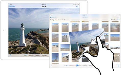
Other approaches extend semantic zoom to navigate more deeply into the information hierarchy. For example, Photos for iPad offers pinch and spread as an alternative way to navigate between an album and individual photos, as shown in Figure 4.2. Pinch a photo in iPad’s Photos app to close it and return to the parent album’s thumbnail view. The gesture provides an alternative to tapping the Moments back button at the upper left. When you’re admiring one of your pictures, you can tap the back button to return to a thumbnail view of all the photos in the album. But you can also pinch the screen to return to that thumbnail album view. Here semantic zoom is deployed to let you move up and down the app’s organizational levels. Pinch a detail view—the photo—to close it and return to the level above—the album—or from the album view, spread a thumbnail image to open it to its detail view.
Figure 4.2—Pinching a photo in iPad’s Photos app closes it
Double-tap
Like pinch and spread, double-tap zooms in and out. (Android adds nuance to double-tap zooming with double-tap and slide. When you slide up and down after a double-tap in Android, you can control the precise amount to zoom; sliding up zooms out and sliding down zooms in.) Double-tap has few conventional uses beyond zooming, however, making it ripe for experimentation in other contexts. BostonGlobe.com, for example, lets subscribers double-tap a headline to save the article for later reading.
You can count on your audience to understand these six gestures without additional help. But while reliable, this kit remains primitive—it simply ports existing mouse-and-cursor interactions to the touchscreen. These gestures are exactly as expressive as a mouse cursor, reducing the hand’s subtlety to a single jabbing finger. As a result, they tend to reinforce old, troubled desktop metaphors.
The Trouble with Buttons
Buttons have served us well in both the physical and digital worlds, but their translation to touchscreens is more unwieldy: buttons take effort, add complexity, and insert an abstract layer between you and the content. Touch has the potential to sweep away the abundance of buttons, menus, folders, tabs, and administrative debris we’ve accumulated over decades of desktop computing. A new choreography of gestures can and should replace those timeworn controls to let us work directly with content.
Buttons Take Effort
Physical interfaces require physical effort. For small touchscreens, that effort is modest, usually only the sweep of a thumb. As screens get larger, however, the effort increases. Roaming the screen means shifting your whole hand, or even your arm, to work the controls. I know, I know—how hard is it to flip your hands across a screen? But fatigue sets in with time and repetition. A few years ago, I judged a digital magazine competition, poring over hundreds of iPad apps. After several hours of bad ergonomic designs, no kidding, my arms were sore from reaching over and over into the screen for basic navigation tasks. Call it iPad elbow.
Consider the Back button in the top left of many iPad apps. We’re asked to hit it all the time—to go back, to browse an app’s hierarchy, and so on. The button is in the thumb zone, but it still takes a moment of concentration and effort to hit it. Despite the sweeping expanse of a tablet screen, this tiny patch of pixels demands constant attention.
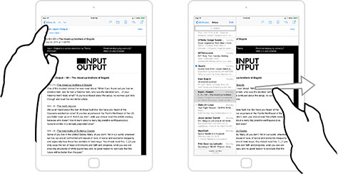
On larger screens like tablets, favor coarse gestures over fine-tuned pecking. Let people paw at the whole screen for basic actions like simple navigation. In iPad’s Mail app, shown in Figure 4.3, for example, the Inbox back button on the left requires a slight reach to open the message drawer, but you can also pull it open by swiping left to right anywhere on the screen, which lets you access the same content no matter where your hands sit. The entire screen becomes the control—no special trip to the back button required.
Figure 4.3—Swiping left to right opens the message drawer
Coarse gestures help reduce errors and improve accessibility. When Boeing designers asked me how they might make touch interfaces more forgiving of pilots’ errant fingers during turbulence, I suggested using coarse gestures—for example, a swipe, full-hand pinch, and so on—to let pilots slap at the screen instead of requiring careful button presses. The same advice holds for seniors, children, or others with limited motor control. Likewise, these gestures provide no-look control for those who have limited vision of the screen—like drivers and cyclists.
Big gestures also tend to develop into reflexes. Traditional interfaces rely on visual memory, asking us to scan buttons and labels to absorb their meaning. Touch interfaces ask some of the same, but blend in muscle memory—a subconscious knowledge of the interface that seems to spring right out of our hands and fingers. Like playing an instrument or typing a keyboard, the repetitive actions of working a touchscreen settle into instinct. Touchscreens depart from physical interfaces in an important way, though: their glass surfaces don’t provide the physical feedback of an instrument’s strings or a keyboard’s buttons. Fine controls slow us down by demanding we look at the screen. Coarse gestures, however, quickly embed into muscle memory and require little visual processing; users of laptop trackpads think nothing of the two-finger gesture for scrolling, for example. Broad expressive actions make the best touch interfaces more like playing an instrument than using a push-button tool.
Buttons Add Complexity
We’ve all been baffled by the dense undergrowth of buttons that blanket our cars, home appliances, remote controls, and other everyday machinery. On a recent summer trip, my family counted over eighty buttons in our Citroën rental car; it took us ten minutes to figure out how to get the thing moving. (The Citroën C4 has a steering wheel with thirteen buttons and four scroll wheels—scroll wheels!) This complexity of common interfaces mirrors the growing complexity of the associated device, creating a familiar design challenge: more features seem to call for more controls. But if you’re not careful, buttons start sprouting like mushrooms all over your interface.
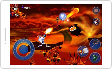
Take a lesson from console gaming. What began as a single-button joystick in the first Atari games has evolved into elaborate, button-addled controllers. A standard Xbox One controller features eleven buttons, two triggers, two joysticks, and a D-pad. As shown in Figure 4.4, the first generation of iPhone games in 2008 ported over this button-based system, with awkward results. Onscreen buttons took up valuable space, obscured gameplay, and locked fingers and thumbs in place. The game Earthworm Jim ported console-style controls to small-screen phones, choking out the actual gameplay. The buttons were hard to use too: since fingers skid across glass, virtual buttons lack the reassuring no-look feel of their physical counterparts. The buttons backfired.
Figure 4.4—Console-style controls choked out the actual gameplay
Game designers needed a new model—so they ditched buttons. With fewer controls, game designers pared down features. Simple but satisfying games like Angry Birds ruled touchscreens with one or two gestures. The nature of the game adapted to the nature of the input. As gesture gaming found success, more sophisticated games developed to rival cinematic console games. Some, like the fantasy action game Infinity Blade, used gestures to drive familiar hack-and-slash games. Others took an even more novel approach, creating gameplay purpose-built for the touchscreen. Games like République or Monument Valley invite you to tap inside the game environment to move the game’s hero. Instead of depending on complex button-based puppetry, they draw you in by interacting directly with the game world. It’s a shift in perspective that delivers the complex experience of a console game without the need for correspondingly complex controls.
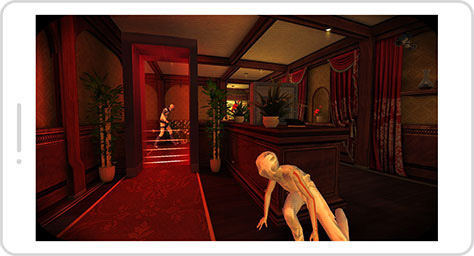
In République, shown in Figure 4.5, you’re a hacker who guides the hero to escape from a mysterious facility. You view the world through surveillance cameras and tell her where to go and when to move. Most actions involve tapping on cameras to take them over, and then tapping on locations to tell the escapee where to go. The world itself is the control, no buttons required.
Figure 4.5—In République, the world is the control
All software genres should explore a similar perspective shift, embracing more direct interaction and fewer buttons and controls. It’s worth acknowledging that touching a button is a kind of direct interaction. The trouble is that this connection is with a button, not the information you seek to manipulate. Or, put another way…
Buttons Are a Hack
Don’t get me wrong: hacks—and buttons—aren’t all bad. We invented electrical switches and buttons over a century ago to control objects at a distance. These switches were designed as messengers to carry our intent—for example, turn on the lights—to its destination—the light bulb. While convenient, this interaction is also indirect, completely disconnected from the thing we want to affect. A light switch here for a light bulb over there isn’t obvious; it has to be discovered, learned. When I’m in a new hotel room, it takes me a minute or two of trying switches to figure out how to turn on that one light. But that’s far better than stumbling into a dark room with a ladder and climbing up to screw in a bulb. The light switch is an inspired hack. When it’s not convenient to interact with the primary object, adding a control to work it from a distance is ingenious.
Buttons are workarounds for moments direct interaction isn’t possible. It’s a similar story for buttons in virtual interfaces. We created buttons and tabs and sliders as skeuomorphic intermediaries to work with digital information and actions that were beyond reach or easy representation. Buttons still have their place, and their obvious labels and clear calls to action make them especially useful. Embrace them as needed, but recognize that they remain workarounds. Every time you add a button to your layout, challenge yourself: can I find a way to manipulate content more directly?
Information as Physical Object
Every digital interface is an illusion, a thin layer of magic atop a churn of ones and zeros. For the first time, though, touchscreens present the opportunity to create the illusion that there is no illusion, that there’s nothing between you and the content. This book has stressed the importance of physical interaction; to complete the illusion, let’s now apply that same thinking to the data itself.
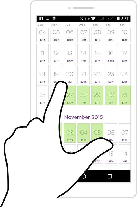
Reimagine your information as a physical object. Ask this of every element of your interface: “What could I do with this piece of data if I could slide, stretch, and poke at it under glass?” Semantic zoom—bestowing pinch-to-zoom physicality on the underlying information architecture—is one example. Now consider how you might select a date range. A typical design uses two calendar-style date pickers, a solution that does use physical metaphor by riffing on paper calendars. But that doesn’t imbue data with physical properties and direct interaction. Instead, as shown in Figure 4.6, you can imagine the date range itself as an object with mass and elasticity—a rubber band whose endpoints you can squeeze or stretch to whatever size you want.
Figure 4.6—Squeezing or stretching endpoints of an elastic date range
Make Content the Control
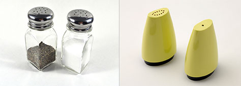
This reimagining helps clear away as much interface as possible between the user and the content. All UI is social convention, and those conventions run into trouble when they’re not evenly understood. In his book Living with Complexity, designer Don Norman notes the holes that distinguish salt and pepper shakers—and how people have decidedly mixed opinions on whether a single hole denotes salt or pepper. Norman points out that it doesn’t really matter which is correct. What matters is what the person who fills them believes. That would be fine if everyone understood the system the same way, but that’s not the case. Even if I’m certain that salt should be in the shaker with one hole, I can’t trust that others share that view; when I’m at a restaurant, I test by shaking a little into my hand first. I don’t have confidence in the system.
As designers, we’re the ones filling the shakers. Our job is to give users confidence. To do so, we often fall back to explicit labels for Salt and Pepper. But that still requires visual processing and command of English to decipher each shaker. You know what’s better? Glass bottles that let us see the salt and pepper inside, as shown in Figure 4.7, no reading or scanning of labels necessary, just grab what we need.
Figure 4.7—Guess which set of shakers is faster to figure out?
Touchscreen photo galleries are nearly perfect examples of this. They’re very dense interfaces, yet with almost no controls. It’s all content: tap a photo to make it bigger, then swipe through the collection. Interaction is tied entirely to the content; the information itself is the interface. Marshall McLuhan famously said, “The medium is the message.” When we create the illusion of direct interaction with information, we can finally say that the message is the medium.
So what does interaction look like when we press this message under two-dimensional glass? In the physical world, we have a word for individual pieces of flat content; we call them cards. That’s why all the major touch operating systems use cards—or tiles or panels—as their core metaphor for representing direct-interaction content.
The Power of the Card Metaphor
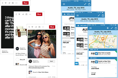
Cards have become a popular way to represent individual data objects: a photo on Facebook, a flight from TripIt, a contact, a coupon, a Yelp review, a Google Now reminder, tweets on Twitter, a game level, and so on. A variety of services embed cards as tiny multimedia canvases into apps, Web pages, social streams, notification windows, and more. Figure 4.8 shows cards containing pins on Pinterest, on the left; on TripIt, on the right.
Figure 4.8—Pinterest and TripIt cards
Until recently, we settled on sharing those chunks of information via URLs in email or text. Now, data cards provide a snack-sized, portable format that shuffles neatly into interlocking modules in big-screen responsive Web sites, or as the main event in small-screen apps. Plus, cards are fun: when we represent data objects like trading cards, business cards, or paper coupons, we have a natural and even nostalgic impulse to share and exchange them in the same way—collect ’em all!
Cards also suggest lots of physical interactions. The most basic and familiar, of course, is flipping. On phones, screens are stacked just like a deck of cards. You swipe back and forth through your browser history, flicking with your thumb as if you were dealing cards at your weekly canasta game—it’s effortless, a wonderful coarse gesture.
Swap cards for pages, and you get the Web’s longstanding metaphor. But even the first generations of touchscreen browsers forced you to flip through these pages by tapping a button, confusing the metaphor. When was the last time you turned a paper page by hitting a button? Most touchscreen browsers now do the right thing, letting you swipe through page history. After decades of using a physical metaphor—the page—to describe the Web, we’ve finally arrived at a physical interaction to match.
This reconciliation is the crucial work of touchscreen interaction design. Embrace the verbs that obviously match your interface’s nouns. Consider everything you can do to a card in the real world: flip, fold, shuffle, stack, turn over, stretch, sort, crumple, dog-ear, throw aside. All those physical actions are available as a springboard for your interface metaphor. What does it mean to flip over a data object, to stretch it, to crumple it?
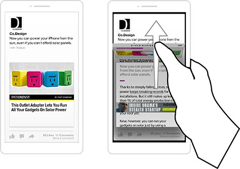
Facebook created an app called Paper to play on this card-like physicality, revealing a uniquely touch-friendly way to explore the Facebook timeline. Facebook Paper imagines its data as a physical card, where every physical action has a corresponding data action. Web-headline cover cards unfold to reveal their interactive insides. Everything is represented as a card. The app is organized into feeds, represented as decks that you can sort, shuffle, or discard to create new collections. Each item in a feed is a card that you can flip through. When a card features a Web article, you swipe up to unfold it like a newspaper and start reading, as shown in Figure4.9.
Figure 4.9—Facebook Paper imagines its data as a physical card
The gestures in Facebook Paper have a natural logic once discovered, but they’re not always obvious to the newcomer. Helping your audience find, learn, and adapt to these new gestures is a major challenge—one we’ll tackle in the next chapter. That said, when gestures hinge on simple interactions based on the physical world, you may not have to do much education. As we embark on designing interactions beyond the basics, let’s begin by looking around us for inspiration.
Let the Real World Be Your Guide
To make sense of the world, we put our trust in a mix of physical laws and human conventions. Gravity has proven to be awfully reliable, for one, and so have many of our own social constructions—salt and pepper shakers notwithstanding. Screws turn clockwise, the pages of Western books proceed from left to right, a checkmark signifies a completed task, and red means stop. These things set our expectations and shape our behaviors as we move through the physical world. Apply those expectations and behaviors to your touchscreen interface, and you give your users a familiar and predictable experience. Here are a few strategies to do so.
Borrow One-to-One Interactions
The most no-nonsense approach is to interact with the screen exactly as we interact with another real-world object. Sketchpads are a straightforward example, creating the illusion—again!—that the touchscreen is interchangeable with a piece of paper. (There’s a reason we call these things pads and tablets.) Take Paper—an iPad drawing app not to be confused with Facebook Paper—which has gone to remarkable technical lengths to recreate ink on paper. Choose among pencils, pens, or nibs and draw with a stylus or your finger. Freeform painting becomes the app’s primary gestural interaction—the same action that works in the real world also works on the tablet—simple.
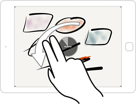
Often, though, you can borrow a familiar physical interaction without copying the entire original artifact. You know how a knob or dial works: cranking clockwise means more or forward; counter-clockwise means less or backward. But if you want to use that crank motion, you don’t have to add an actual knob to your interface. Instead, use the action as inspiration for a gestural equivalent. The Paper app does this well: cranking two fingers counter-clockwise anywhere onscreen performs the undo action, traveling back in time to remove strokes from your drawing. Change your mind? Crank clockwise to redraw your strokes, as shown in Figure 4.10. As you borrow from the real world, remember that it’s the physical action you seek to import, not the original object; it’s about the crank, not the knob.
Figure 4.10—Want to undo? Crank to rewind in Paper
Lean on Established Symbols or Notation
As we translate physical cranking motions to screen gesture, we transform them into notations, a meaningful shorthand. These symbols are human inventions—clockwise and counter-clockwise doodles have no inherent meaning in nature. But again, all user interface is social construction; lifting from well-known conventions makes your interface feel instantly familiar, intuitive.
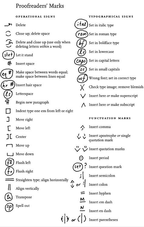
Sometimes entire notation systems can be borrowed whole cloth. The specialized set of proofreaders’ marks, for example, is at once expressive of complex ideas and universally understood among editors, as in Figure 4.11. An application aimed at that audience might adapt that notation into shorthand gestures to delete, move, or insert new paragraphs.
Figure 4.11—The Chicago Manual of Style’s proofreaders’ marks
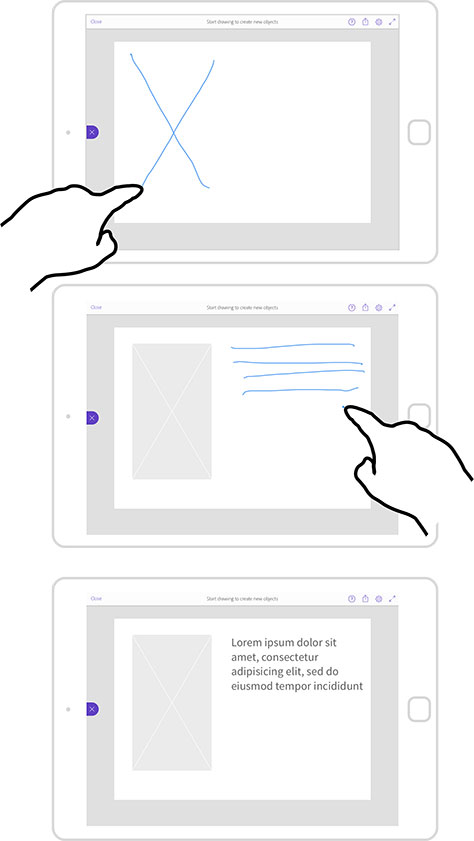
Adobe Comp is a wireframing app for iPad. Its touch-friendly interface piggybacks on common wireframe symbols, borrowing the sketch notation of wireframing. In Figure 4.12, drawing a big X adds an image placeholder and scrawling a stack of lines inserts a column of text. Erase an element by scribbling it out. The app converts these symbols into wireframe components and, when you’re done, exports to InDesign, Illustrator, or Photoshop—casual whiteboard-style input transformed into formal wireframe output. Now, this may not be any more efficient than producing a wireframe with Microsoft Visio or OmniGraffle on a desktop, but it’s the quickest way to do it on a touchscreen. These fluid, sketch-like gestures create layouts much faster than a marathon of taps through a series of desktop-style control panels.
Figure 4.12—X for an image placeholder; a stack of lines for text
Apply Physics to Digital Objects
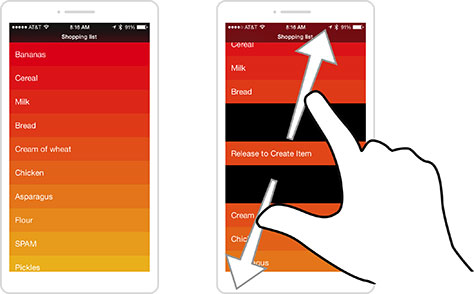
Adobe Comp borrows directly from how we work a familiar interface—paper—but you don’t have to be so literal. You can also apply real-world physics to digital objects by giving them a sense of mass, of physical presence. For instance, pinch-to-zoom lends squeeze-n-stretch physicality to photos or maps. The way a scrolling screen bounces when you slam into the end of content adds solidity to intangible data. The iPhone app Clear, shown in Figure 4.13, has an all-gesture interface that relies on simple physicality. To insert a list item, spread two items apart to make room. Clear treats to-do-list items like physical building blocks that you can squeeze, slide, or nudge aside, and those actions have semantic meaning for the data:
Insert a new list item by spreading your fingers between two other items to make room.
Mark an item complete by pushing it aside with a swipe.
Pinch a list to close it.
These are simple gestures for simple physical actions, mapping naturally to how you might rearrange list items if they were arranged physically on your desk. When virtual elements behave with such familiar physicality, our brains flow naturally into the interaction.
Figure 4.13—Clear’s all-gesture interface
Honor Physical Constraints
If things we can do in the physical world inspire gestural interactions, so too do things we can’t. TouchUp is an iPad app that draws filters or effects on photos. The simplest example is painting a color on the photo, using your finger as a brush. But what if you want to change the brush size? That’s easy, right? After all, desktop apps always address this by offering either a slider or a brush palette to choose a new brush size. Thing is, you already have a brush—your finger—and it doesn’t change size. Changing the size of your finger’s impression on the screen to anything other than the size of your fingertip introduces uncertainty. You have no idea how large a mark you’ll leave. You shift from direct interaction to abstract guesswork.
So TouchUp doesn’t let you change brush size. Instead, you change the canvas size: pinch to zoom out and spread to zoom in. Your finger brush is always the same size onscreen, but because you’re drawing on a super-zoomed photo, the result is a fine line on the image.
It seems obvious when you see it in action, but it turns the traditional desktop approach on its head. When you deal with the physicality of touch, you have to rethink familiar solutions. With every solution, ask yourself: does the old way still make sense, or does direct interaction demand a new approach?
When you use the real world as your guide, you create interfaces that are instantly understandable. Some actions, however, are freighted with more meaning or complexity than can be easily packed into a simple physical action; they may require more abstract gestures. Those advanced power moves have a parallel in traditional computing.
Gestures as the Keyboard Shortcuts of Touch
Quick-to-discover gestures, combined with well-labeled traditional controls, should always form the foundation of your interface. Always make it easy to figure out your application’s basic actions. But don’t shy from deploying more abstract gesture shortcuts as alternatives alongside standard controls, like keyboard shortcuts on the desktop. Earlier, for example, I mentioned that the iPad Mail app supplements the back button with a coarse swipe. Or, from Chapter 3, take Vimeo, where a gesture inside a list view saves a trip to the detail page: swipe left or right across a video to share or favorite it. In both cases, the slow way is still available, but gestures are expert power moves.
These speedy shortcuts aren’t restricted to swipes and taps. More fingers multiply the possibilities. A five-finger touch might toggle between views of Sent mail and the Inbox. In a newspaper app, a two-finger swipe could fast-forward to the next section, not just the next page. A future of multifinger gestures promises a richer interaction language, where abstract gestures help shoulder complex actions.
The Unrealized Potential of Multifinger Gestures
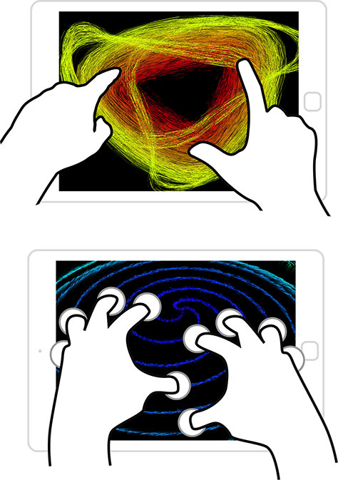
The iPad app Uzu is “a kinetic particle visualizer,” but your first impression of it might be more like a toy to hypnotize stoners, an interactive lava lamp. In Uzu, different finger counts trigger different animations and actions, as shown in Figure 4.14. Touch the screen with one finger and sparks shoot off like fireworks. Add a second and sparks swirl between the two, while a third finger creates a vortex among all three. Change the hue and particle size by touching the screen with all ten fingers and swiping up and down, or left and right. As you get the hang of it, your fingers fly and dance across the screen, and it feels like playing a kind of Technicolor visual keyboard—more instrument than tool.
Figure 4.14—Touch the screen with different numbers of fingers
At first blush, this might not seem relevant to that financial services intranet app that you have to build, but Uzu offers useful lessons for all kinds of touch interfaces. In particular, this multifinger approach recalls the role of Alt, Command, or Function keys; ten fingers afford ten modes or actions. Fingers become function keys. Just as expert typists fly through words, or power users deploy keyboard shortcuts to fly through tasks, multitouch gestures likewise help us to move effortlessly through touch interfaces. These gestures, while abstract, allow power users to accomplish tasks more economically.
If multifinger commands possess such powerful potential, why don’t we have more of them? While phones have supported multitouch for years, they’re not great at it. One-handed grips and small screens have encouraged us to tap away with a single finger or thumb instead. Larger screens hold more promise. The size and weight of larger tablets requires you to use two hands or rest the tablet on your lap, so you always have at least one hand free—with a screen big enough to invite multiple touches at once. The same goes for hybrids and laptops.
Obstacles exist, though. Accessibility is a major one: not everyone has full mobility of hands and fingers—or even all their fingers, for that matter. For certain disabilities, a five-finger pinch is a non-starter. Discoverability is another stumbling block. How are we supposed to know when abstract actions like a three-finger swipe or a five-finger touch are even available? We’ll turn to strategies for revealing gestures in Chapter 5, but consider it best to treat these more abstract multitouch gestures as alternatives—expressive supplements to buttons and other traditional interactions. People should still be able to accomplish any action with simple taps and swipes, though it may take longer.
Navigating Heavy Gesture Traffic
As you layer more and more gestures into your interface to supplement or replace traditional controls, those gestures start to get crowded. For one, the operating systems and browsers claim key gestures so that your app or Web site has to scrabble among the leftovers; for another, gestures—especially coarse gestures—eat up lots of room and jostle for space on the screen.
Make Way for System and Browser Gestures
As a designer, you have to jockey with browsers and operating systems for key gestures—and if the system gets there first, it wins. Remember Android’s screen-bottom system buttons in Chapter 1? The operating system has first claim, so app designers must make way, taking their controls to the top of the screen. The same goes for system gestures; app designers have to work around the operating environment to avoid gesture conflicts.
iOS for iPad, for example, offers coarse gestures to move between apps. Swipe left or right with four or five fingers to switch among recent apps, or pinch with four or five fingers to close an app and zip out to the home screen. You can just slap at the whole screen to navigate apps—exactly the kind of coarse gestures that a tablet OS should embrace. I’m a huge fan of the spirit of these gestures, but I’m not wild on the execution. If only Apple had followed the interaction already adopted by other platforms, like Windows and more than a few defunct touch operating systems, including Symbian, BlackBerry PlayBook, and Palm’s WebOS. They all use edge gestures, a technique that is both more internally consistent and more deferential to individual apps. Edge gestures start on the frame, or bezel, of the device and swipe into the canvas. When used for app switching, this creates the illusion of knocking screens aside by shoving them at the edge.
Edge gestures match physical action with the conceptual metaphor of the OS. If you consider apps as the front-and-center canvas of the device, then the operating system is the frame that supports that canvas. When OS-level gestures start from the bezel, action matches expectation: this gesture works outside the current app. You’re working on the frame—the operating system—both physically and metaphorically.
In contrast, iPad’s app-switching actions work within the canvas itself, territory that should be dedicated to the current app. This creates confusing competition with app interaction: Will this gesture apply at the app level or at the operating-system level? Apple could have avoided this ambiguity by anchoring its gestures at the edge. By putting them inside the canvas, Apple swiped some great gestures from designers’ arsenals.
Browsers also claim a hefty share of useful gestures for themselves. Pinch, double-tap, swipe, long-press… These core gestures already have meaning in browsers, taking them off the table for Web designers. You could override those gestures by capturing their touch events and hijacking them for your own purposes—to make a long press trigger a custom behavior instead of showing a contextual menu, for example. But breaking a browser feature is almost never a good idea. Making browser gestures work inconsistently across Web sites undermines user confidence when we still need to shore up gestural interactions and establish standards. Let browsers have their gestures and work with what’s left.
Give Your Gestures Elbow Room
Managing gesture density means more than avoiding browser and OS conflicts; you also need to consider the physical space these gestures occupy, or they begin to overlap and collide. When gestures pile up, so do user errors. Consider a photo gallery that lets you swipe back and forth through photos inside a single Web page. On small screens, these swipes easily run afoul of browsers’ edge gestures; mobile Safari, for example, reserves edge-swiping left or right to cruise through your browser history. In our photo hypothetical, a wide accidental swipe while browsing the gallery would jump you out of the experience entirely, dumping you into another page from your history. Previous versions of Chrome for Android sidestepped this problem by limiting gesture real estate. A left or right swipe from the edge used to change tabs, but people kept switching them by accident while swiping within the page. So Chrome’s developers limited the tab-hopping gesture to a swipe across the address bar, instead of anywhere on the page. The move gave space and freedom to gesture-wielding Web designers. (Chrome finally gave up on tabs altogether in Android 5.0 Lollipop.)
Ease risky gesture density by anticipating it. That swiping gallery might use the HTML5 history API to update the browser history with each swipe. An accidental edge swipe backward in that scenario would return you to the previous slide—the same result as a regular swipe in the gallery.
Radial Menus Reduce Gesture Density
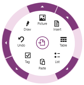
Sometimes old techniques resurface to solve new problems. The radial menu rolled out half a century ago but may have finally found its moment as a way to sidestep gesture conflicts. A radial menu is a set of options that spin out like spokes from a wheel. Microsoft’s note-taking app OneNote, for example, features a radial menu as a kind of right-click contextual menu, as shown in Figure 4.15. Tap the app’s ever-present menu icon, and out pops a wheel of actions to apply to your current selection. Drag your finger to the one you want and release.
Figure 4.15—OneNote’s radial contextual menu
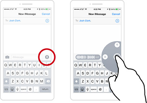
At first glance, these menus might seem more complicated than a plain toolbar, full of visual information to process. At their core, though, radial menus are gesture-based: touch-swipe-release. That’s why some call radial menus marking menus: it’s like making a mark on the screen. Swiping to two o’clock has one meaning, and swiping to six o’clock another. You get faster over time, because radial menus take advantage of muscle memory in a way that list-based menus cannot. In iOS Messages, for instance, you trigger radial menus to text an audio clip, photo, or video, as shown in Figure 4.16. It’s a fluid motion that quickly becomes a habit. Tap and hold the microphone icon, and a radial menu pops up as the app starts recording; flick up to send the audio; flick left to delete; or let go to pause.
Figure 4.16—In iOS Messages, trigger radial menus to text media
Another benefit is that radial menus keep their gestures very compact. They start from a specific point on the screen—ideally on the content that you seek to manipulate, though often on a menu button or other trigger instead. This fixed anchor point reduces errors by demanding extra care; it asks you to press on the element you want to affect before launching into the gesture. Radial menus are more precise and help bring order to otherwise crowded gesture interfaces.
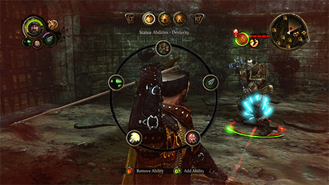
Radial menus have been around since the late 1960s but until recently never got much traction in traditional mainstream interfaces, with one exception: games. Combat-based games use radial menus for speedy access to inventory or combat options, as in the kind-of-awesomely-named Game of Thrones: The Game, which uses a radial menu to control the action, as shown in Figure 4.17. It makes good sense that trigger-finger games have adopted the radial menu over a more typical list. In games, limiting interruptions is essential to the experience, and radial menus are more efficient than other selection tools.
Figure 4.17—Game of Thrones: The Game uses a radial menu
The research on this has been in the can for over twenty-five years. A 1988 study did the comparison and found that for a specific test of eight-item lists, users were faster with radial menus than linear lists. And it turns out that speed only improves. That was borne out in a 1994 study by Bill Buxton and Gordon Kurtenbach, who tested radial-menu speed with a stylus. Over time, they found that expert users stopped looking at the menu at all, marking the screen with no-look gestures instead of pecking at buttons. Once they made that transition, selection became three times faster.
Like any technique, however, radial menus have their limitations too. Keep in mind the following caveats:
They demand precision. \ While a radial menu’s fixed anchor point reduces gesture density, this is also at odds with the benefits of screen-roaming coarse gestures. Coarse gestures are ideal for navigation and basic controls, while radial menus are better suited for quick actions and tools.
They don’t scale. You can only cram so many items around a circle. Eight seems to be the reasonable maximum. On smaller screens like phones, a radial menu gobbles up an especially big share of pixels, so it’s typically limited to three or four options.
First use might be awkward. Despite the speed boost that comes with experience, we’re more at ease scanning down a list than around a circle. But that comfort level may not be so important when you look at actual use. “The effects of organization disappear with practice,” Buxton found in 1994. “Even when menu items have a natural linear ordering, selection using a radial menu is still faster and less error-prone than selection using a linear menu.” This fact, however, relies on rolling with one last constraint:
Radial menus must be consistent. If you change the order or content of a radial menu dynamically, people fall back to visual selection, and you lose out on the muscle-memory speed boost.
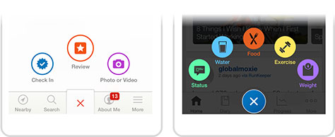
On the whole, these limitations are modest—and actually help shape good use cases for radial menus, like primary navigation or consistent contextual menus. That’s exactly the role they’ve come to play in parts of Android, Windows, and iOS, as well as menu navigation for many popular apps—such as the iPhone apps for Yelp, on the left, and My Fitness Pal, on the right, in Figure 4.18.
Figure 4.18—Yelp and My Fitness Pal use radial menus for navigation
Radial menus have been slower to arrive on the Web than those system and app environments, even though they’re well suited to both the medium and browser capabilities. Existing Web examples include the occasional jQuery plugin or a CSS3 clone of the Path app’s radial menu. Why aren’t we seeing more of these experiments? Truth is, it’s still painful to develop gestures in the browser. Let’s look at why.
The Heartache of Gestures on the Web
Some structural problems make designing browser-based gestures vexing, though not impossible. Browsers aren’t yet very good at meeting the interaction expectations that touchscreen devices have created, thanks to a couple of reasons in particular.
First, as we saw earlier, browsers already claim so many useful gestures for themselves. These gesture conflicts leave little to the designer beyond tap and swipe. (This is also why radial menus are a good fit for the Web: their tap-swipe interaction neatly uses the available combo.)
Second, JavaScript gives front-end developers only the most basic touch events: touchstart, touchend, and touchmove. It’s easy enough to detect a tap or maybe a swipe, but anything trickier gets complicated fast. Have fun coding a crank gesture, a two-finger rotation, or a multifinger swipe. Ideally, we’d have events for common gestures on any DOM element: pinch, long tap, swipe, rotate, and more. (Microsoft models this in its framework for building native Windows apps with HTML5, perhaps suggesting a way forward.) For now, we have to build them ourselves from scratch—or better, use a library like the excellent Hammer.js, which provides events for tap, double-tap, swipe, drag, pinch, and rotate.
Tools and techniques are emerging to help designers cope. Swipes are a particularly good place to start. They’re relatively easy to implement, and many sites already embrace swipe for next/previous navigation. For instance, you can swipe through Flickr’s photo galleries, next/previous articles at the New York Times, Google’s image search, and lots more.
You can venture beyond swipe, of course, but it’s harder work. Let’s examine what’s involved. The rest of this chapter introduces how browsers wrangle touch events and how you can use JavaScript and/or CSS to construct a few simple gestures. While we won’t sink into the gritty details—this isn’t a JavaScript tome—it’s important for designers to understand what’s realistic when coding for touch. Because coding touch events is never trivial, let’s start with when you don’t need them.
Stick with Click
As noted, most touchscreen browsers offer touchstart, touchmove, and touchend events. Tapping the screen also triggers good old-fashioned click, which allows swaths of mouse-focused code in legacy sites to get their jobs done in a touch environment. You can salvage your sanity by focusing on that single interaction model.
Whenever possible, stick with click. Despite the availability of more complex touch events, you don’t need to replace click events in your JavaScript unless you’re after something fancier than a tap. While we colloquially associate click with the mouse, it’s not strictly a mouse event. Instead, consider it a generic action: “I want to activate this element.” In most cases, if you want to trigger something when a user taps, capturing click does the trick. Skip the touch events and proceed as if you were coding for mouse.
Sticking with click has the added benefit of working across inputs. Despite its mouse-derived name, click is likely to remain the key action for Web browsers whether they’re driven by keyboard, speech, Kinect-style air gesture, or perhaps even a virtual-reality head twitch. Click is not only backward compatible; it’s future compatible too.
But click isn’t perfect. Much of this chapter has made the case that touch demands new approaches. Touch interactions vary in ways both obvious and subtle from mouse or trackpad events. Not least is the number of pointers to contend with. Mouse interfaces never have more than one cursor clicking away; with touch, you get the possibility of ten fingers—or even more with the help of friends—or toes. If you need to track more than one finger at once, click won’t cut it. Use click when you can, but switch to touch events when you need to do any of these:
Track multiple touches—pinch, rotate, or two-finger swipe
Take action while the finger is pressed to the screen—a touch-flavored mouseover
Track finger motion—a swipe or drag
On this last item, you sometimes get some wiggle room. No-frills CSS has you covered for the most common swiping use case—galleries and carousels—so let’s begin there.
Use CSS for Gallery and Carousel Swiping
Sites often rely on complex JavaScript to create carousels and their associated swipes, but that over-engineers a surprisingly simple solution. If you instead use overflow:scroll in CSS, all modern touchscreen browsers will give you hardware-accelerated panning; swiping comes for free, no JavaScript required.
Consider a list of images:
<ul class="carousel">
<li>
<img src="image1.png" alt="unicorn">
</li>
<li>
<img src="image2.png" alt="rainbow">
</li>
<li>
<img src="image3.png" alt="sparkles">
</li>
</ul>
Use CSS to display the list items inline in a horizontal strip, all set to a specific size:
.carousel {
white-space:nowrap;
}
.carousel li {
display: inline-block;
padding: 0;
margin: 0;
}
.carousel img {
width: 400px;
height: 300px;
}
And here’s the magic. Set the height and width of the containing ul list, and set its horizontal overflow—that is, overflow-x—to scroll. This tells browsers to scroll the images when they can’t all fit the available width. The result: touchscreen browsers display a horizontally swipeable carousel of images like that in Figure 4.19.
.carousel {
white-space:nowrap;
overflow-x: scroll;
overflow-y: hidden;
width: 100%;
height: 300px;
/* add momentum scrolling for mobile Safari */
-webkit-overflow-scrolling: touch;
}
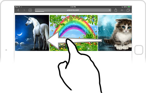
Who needs JavaScript? CSS and HTML are all you need to create a swiping carousel.
Figure 4.19—Use CSS and HTML to create a swiping carousel
The last rule of the .carousel styles tells iOS to apply fancy momentum scrolling:
-webkit-overflow-scrolling: touch;
Now, a flick of the finger sends the page scrolling and it continues under its own momentum, easing to a stop for an effect that mimics natural physical behavior. Without -webkit-overflow-scrolling, the carousel would move only when you dragged it, with a hard stop, for a clunky, artificial interaction. Other modern touch browsers don’t need this hint and include momentum scrolling with no extra help.
A caveat: many older mobile browsers don’t handle overflow:scroll properly and instead treat it like overflow:hidden, which lops off any content that doesn’t fit. Instead of a zippy carousel, you’re left with one that won’t budge, putting any overflow out of reach. Happily, Filament Group has a fix: Overthrow is a JavaScript library that nudges these browsers to do the right thing, and throws in momentum scrolling to boot.
Add Snap Points to the Carousel
We now have a free-spinning carousel, which is great except that it can come to rest midway between images. Make the carousel snap to one of its panels when it stops scrolling by adding scroll-snap rules:
The scroll-snap-points-x rule tells the carousel to snap at the start of the first image—at 0px of the carousel’s width—then snap to every 400px from there, the width of every following image. At this writing, only Internet Explorer 10+ supports scroll-snap, and other browsers ignore it, scrolling fast and free without snapping. scroll-snap is on the standards track, however, so more browsers may adopt it in the future.
Tidy the Desktop Experience with Progressive Enhancement
On mobile and tablet browsers, elements with overflow:scroll are visually uncluttered. On desktop, though, these elements sprout scroll bars. Scroll bars are a fine starting point; they allow people to access your content, with a clear visual cue that more content is available. But scroll bars on mid-page carousels sure make for clunky visuals. Apply some carefully crafted JavaScript to enhance the experience. Use JavaScript to detect if the browser has touch or pointer objects and, if not, set the carousel to overflow:hidden and add next/previous buttons to move the .carousel contents left and right. I leave the details of coding this desktop carousel as an exercise for the reader, but first, a few notes. As we discussed in Chapter 1, detecting touch is not foolproof. For this specific widget, though, this is enough for a strictly aesthetic upgrade:
if ( ! 'ontouchstart' in window ||
! window.navigator.MaxTouchPoints ||
! window.navigator.msMaxTouchPoints )
{
// no touch, build next/previous buttons for desktop
}
Because this touch detection isn’t airtight, this approach will inevitably give some touch browsers the next/previous buttons instead of swiping. Don’t fret. It will be a small minority of browsers, your content will still be accessible, and with chunky next/previous buttons, it will stay touch-friendly.
Touch Events in the Browser
As you’ve seen, a savvy mix of CSS and JavaScript click events can handle tap and swipe. If that’s all you need, our work is done; feel free to hop over to the next chapter. But if you need more complex gestures—multitouch, drag and drop, crank, rotate, and so on—it’s time to buckle up, put on your crash helmet, and code touch events. We won’t go far down the coding rabbit hole, but here’s a high-level overview of how touch events work.
The iPhone was the first popular platform to build JavaScript touch events into the browser, and other browser vendors quickly followed suit to provide compatibility with iOS. This approach became a W3C standard, and it’s now supported by nearly all modern touch browsers—except Internet Explorer, which has its own competing pointer model that may itself become a separate standard. We’ll look at that in a moment.
The prevailing touch-event model lets developers detect three events: touchstart, touchend, and touchmove. You may be familiar with their desktop cousins mousedown, mouseup, and mousemove, and these touch events work similarly: developers can detect when a touch begins, ends, or changes, and then trigger corresponding actions on the page. These events, like all JavaScript events, create an event data object that developers can access to get more information about the touch. Touch-event objects include three lists of touches, data objects that each refer to a finger or stylus currently touching the screen:
event.touches—a list of all touch objects on the screen, not just the DOM element for this event
event.targetTouches—a focused list of touch objects that includes only the touches on the current DOM element
event.changedTouches—a list of the touch objects involved in the current event. In touchmove, for example, this list tells you which touches actually moved. Say that you’re pinching with your finger and thumb, but only your thumb moves. Then only that touch would be included here.
Each of the touch objects in these three lists in turn contains information about the coordinates of the touch and the target element that triggered the event. (If you touch a link, for example, the target element is that link’s <a> DOM element.) These event and touch objects enable developers to track the presence, position, and motion of fingers on the screen. For an introduction, check out the tutorial by Boris Smus, “Developing for Multi-Touch Web Browsers.”
Untangling Mouse and Touch Events
Earlier we covered how touch triggers a click event for backward compatibility, but that touch triggers a whole range of other mouse events too. Every time you touch and lift your finger to the screen, the browser fires off all of these events, in this order: touchstart; touchmove, if applicable; touchend, mouseover; mousemove, if applicable; mousedown, mouseup, click. This behavior is intended to make sure that sites coded for mouse-and-cursor interaction will continue to work on touchscreens, which is a good thing. However, a few tricky elements are worth calling out:
Mouse events all happen in a flurry after the finger lifts off the screen. So touchmove doesn’t happen at the same time as mousemove, and mouseover is triggered when the finger isn’t even on the screen anymore. While mouse events remain available, in other words, they don’t match touch behavior one to one.
Because a touch triggers both touch and mouse events, take care when defining separate actions on both mouse and touch events so that you don’t double up. Use event.preventDefault() inside touch event handlers to keep the browser from firing the corresponding mouse events, too. (This has some repercussions, which we’ll discuss.) For example, if you want to do something on touchstart for touch and mousedown for mouse, you need to tell the browser not to process any other touch events when touchstart is triggered or it will do the mousedown action too:
event.preventDefault(); // don’t trigger more events for this touch
// your code for the touchstart event goes here
}, false);
>
There’s a 300-millisecond delay after touchend, so click and all other simulated mouse events fire a full third of a second after you lift your finger off the screen. (This also means that only one mousemove event occurs for any given touch, while touchmove updates as you move your finger.) We’ll see why this delay happens and how you can eliminate it in a bit.
You lose the semantic meaning of mouse events like mouseout, which is triggered on the touched element only after another page element is touched, not when you lift your finger, as you might expect.
In many cases, the differences between touch and mouse dictate that you work out separate interaction styles for each, supporting each input independently. To magnify an element, for example, you might add pinch and spread detection for touch events while switching to button-driven zooming for mouse events. But it gets more complicated when you consider the growing number of devices and browsers that let you switch back and forth between mouse, keyboard, and touch. Your interface must be prepared to accept any available style of input and interaction. If you’re a JavaScript developer, get used to writing separate code for clicks and for touches, which fast becomes a heavy burden.
The Responsibility of Taking over Touch Events
As mentioned above, you have to use preventDefault() in touch event handlers to stop the browser from triggering corresponding mouse events too. Simple enough, but it has a major side effect: in addition to canceling mouse events for that touch, it tells the browser not to follow any of its usual default behavior on the element—no scrolling, no clicks, and so on. When you trap a touch event with preventDefault(), you effectively tell the browser that you’ll take it from here and handle everything related to that touch. Is the user trying to tap, scroll, swipe, double-tap? You have to sort that out and provide that behavior yourself. For example, when you use preventDefault() in a touchstart or touchmove event handler, you cancel scrolling for that touch. Either you code your own scrolling behavior or that part of the page becomes a no-scroll zone.
Handling low-level interactions like this gets complicated in a hurry, and you don’t want to plunge down this path lightly. If you do start the trek—and you have to if you want any kind of complex gesture—consider limiting your custom touchend handlers to a small number of buttons or links. In particular, avoid adding touch handlers to scrolling elements so that you don’t inadvertently disable the browser’s usual scrolling behavior.
Again, if you can make do with the click event, you’ll save yourself one hundred kinds of pain. Unfortunately, even our reliable friend click has its eccentricities when it comes to touch. Topmost is the noticeable delay between when you touch the screen and when a touch is triggered.
Managing the 300-Millisecond Delay
Until very recently, every touch-based mobile browser imposed a 300 ms delay before registering a click after you tapped the screen. That’s a third of a second, enough to make touchscreen Web sites feel sluggish compared to apps. The culprit is the double-tap gesture touch browsers use for zooming in and out of a page. When you tap the screen once, the browser waits a few beats—300 ms!—to respond, to ensure you’re not in the middle of a double-tap. If it weren’t for that one-two tap, browsers could proceed without delay.
Most browsers reserve the double-tap for zooming only, so Chrome and Firefox for Android try something crafty: they won’t wait for a double-tap if the designer disables zooming on the page from the get-go. Problem is, preventing page zoom nixes not only double-tap but also pinch-to-zoom, a function many need to be able to read your site. For them, disabling zoom effectively breaks your site—a crummy thing to do for accessibility.
In 2013, Chrome took a more useful step, throwing out double-tap zooming when a page fixes its width to device-width, like so:
If you’re designing a responsive or mobile-only site, you should be using that tag anyway, so it’s an easy win that skips the 300 ms delay without extra effort. Bonus: pinch zooming remains available. Other browsers may eventually follow Chrome’s example, but some cannot. Mobile Safari, for instance, scrolls the page when you double-tap at the top or bottom of the screen. It’s unlikely to disable the gesture anytime soon, as the double-tap does more than zoom.
Internet Explorer lets you turn off double-tap zooming with CSS. Using the touch-action property, you can tell IE 10+ whether to permit default touch behavior on individual elements. For example, to disable double-taps on an element while still allowing pinches, add this CSS rule:
-ms-touch-action: manipulation;
touch-action: manipulation;
It’s a cinch. To sum up, get fast, no-wait taps in Chrome and Internet Explorer like so:
Set the viewport to device-width.
Use the touch-action CSS rule.
Other browsers will still slouch along with a delay, but if you really need to speed things up, a pair of JavaScript libraries can help. FastClick, by FT Labs, uses touch events to trigger fast clicks, and it removes the double-tap gesture. It also takes on the hard work of differentiating scrolls, swipes, and taps for you. Tappy, by Filament Group’s Scott Jehl, papers over the differences among touch, mouse, and keyboard click events by creating a single tap event that works for all three, eliminating the 300 ms delay in the process.
The Pain and Promise of Pointer Events
So here I am, suggesting a JavaScript library to unify clicks and touches as one event. Or telling you to use click wherever possible. I’ve been dancing around it, but oh careful reader, you’ve no doubt detected an earnest desire for a single codebase that works for both mouse and touch—at least for straightforward interactions. Different inputs will always demand different interactions, so separate code is sometimes necessary. But for the basics such as clicks, scrolling, drag and drop, and so on, the interactions are so similar, we shouldn’t have to treat them separately. That’s the idea behind pointer events.
Microsoft introduced pointer events in Internet Explorer 10 as a competing alternative to touch events. Pointer events merge events for mouse, touch, and stylus, and possibly even things like Kinect-style air gestures—anything that points. They show promise, but unfortunately, they work only in Internet Explorer. That may change; the W3C has created a pointer-events standard, which other browsers might adopt. (At this writing, Chrome and Firefox say they will, and Safari says it won’t.) While this browser intrigue plays out, JavaScript libraries like Hand.js from Microsoft fill the gap and let you use pointer events immediately for unified event handling in all browsers. In any case, designers are obliged to support touch events and pointer events and mouse events. Oof.
Here’s a quick review of how the pointer system works. Pointers trigger varied events and, unlike mouse actions, they can happen simultaneously—for example, when you touch several fingers to the screen). For compatibility, mouse events still get called, so as with touch events, make sure you don’t process both pointer and mouse events—event.preventDefault() is your friend, with the caveats mentioned earlier.
Because Microsoft released Internet Explorer 10 ahead of the W3C’s standard, the company used vendor prefixes to name their own pointer events. Now that the standard’s complete, these prefixed names are no longer supported, starting in IE 11. In other words, to cover all versions, you need to attach both the prefixed and non-prefixed names of pointer events and objects. It gets wordy. The key pointer events are:
pointerdown, or MSPointerDown for IE 10—a mouse button is pressed, or a finger or stylus makes contact with the screen. Similar to mousedown and touchstart.
pointerup, or MSPointerUp—a mouse button is released, or a finger or stylus is lifted. Similar to mouseup and touchend.
pointermove, or MSPointerMove—an active pointer is in motion. Similar to mousemove and touchmove.
pointerover, or MSPointerOver—start of hover; for devices that don’t support hover, this event is fired immediately before pointerdown. Similar to mouseover.
pointerout, or MSPointerOut—end of hover; for non-hovering gadgets, this event is fired immediately after pointerup. Similar to mouseout.
The pointer-event object gives you all the information that a mouse event would—that is, event.clientX and event.clientY for screen coordinates, event.target for the target element, and so on. But the object also reveals the kind of pointer you received—that is, event.pointerType—or even how much pressure a stylus is exerting—that is, event.pressure. For full details about working with pointer-event objects, check out Microsoft’s Pointer Events documentation.
All Together Now: Supporting Pointer, Touch, and Click
Whew, now we’re juggling a jackpot of event types: keyboard, mouse, touch, pointer, and Microsoft’s prefixed pointer names. How do you wrangle your JavaScript? First set up pointer events for browsers that support them and, for the rest, set up mouse and touch events separately. Then give all browsers keyboard and click events. Here’s the rundown:
if ('PointerEvent' in window) {
// bind to pointer events
}
else if ('MSPointerEvent' in window) {
// bind to MS-prefixed pointer events
}
else {
// bind to mouse events
if ('ontouchstart' in window) {
// bind to touch events;
// use event.preventDefault() to avoid processing both touch
// and mouse events
}
}
// bind to keyboard events
// bind to click events
Pointer events have terrific potential to gather interaction events under one umbrella, but in the interim, they add yet another scenario for designers to manage—along with the associated code bloat and performance cost of including this extra code. Your best tack? Simplify where you can and lean on the common click event—or tap from the Tappy library.
Playing Catch-Up with Gestures
Touchscreens create interaction expectations that browsers aren’t yet adept at. For better or worse—simple or complex—this is how we build gestures on the Web. Because the touch model in browsers is so messy, native apps are likely to remain the real interaction sandbox for the near future. Those proprietary environments are where most innovation will happen until standards catch up, which they no doubt eventually will. In the meantime, even with these touch-event headaches, it’s worth the effort to make touch and gesture work in the browser. You know the refrain by now: a new medium requires new interactions, and this chapter has tried to show you what they might look like. But designing and building gestures is only half the battle.
Now that you’ve figured out the gestures for your interface, you have to sort out how people will find them. That’s up next.
Josh is the founder of Big Medium, a design agency specializing in connected devices, mobile experiences, and responsive Web design for the world’s most forward-thinking companies. Josh has written five books, including Tapworthy: Designing Great iPhone Apps for O’Reilly and Designing for Touch for A Book Apart. He speaks around the globe on what’s next for digital interfaces. In 1996, Josh created an entirely different kind of user interface: the Couch-to-5K (C25K) running schedule, which has helped millions of skeptical exercisers take up jogging. His motto is the same for fitness as it is for designing software user experiences: no pain, no pain. Read More
 Hands are wonderfully expressive. We talk with our hands all the time: they ask questions, show intent, command attention, reveal emotion. A backhanded wave dismisses an idea; a jab of the finger accuses; a thumbs-up enthuses. If hands are excellent at communicating with people, they’re even more effective at communicating with objects. From the delicate operation of tying a shoelace to the blunt-force strength of opening a pickle jar, our hands and fingers constantly improvise in grip, pressure, position, and sensitivity.
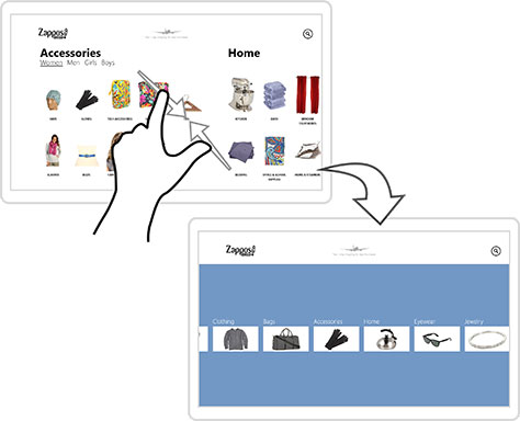