This is an excerpt from Amy Bucher’s book Engaged: Designing for Behavior Change. 2020, Rosenfeld Media.
Chapter 4: Weapon of Choice: Make Decisions Easier
In this chapter, you’ll learn how to structure [users’ meaningful choices on their behavior-change journey] so that it’s easier for people to select good options that ultimately support their goals.
The fact is, people aren’t great at making decisions in real life. They have limited brainpower and short attention spans that make it hard to sift through information and make sense of it. The shortcuts the brain has developed to cope with this issue aren’t perfect and lead people to a predictable pattern of mistakes in judgment. People may also find themselves in a struggle between heart and mind, when what they most want to do isn’t what they think they should do to reach their goals. Decisions aren’t just logical. They affect feelings, too.
Champion Advertisement
Continue Reading…
To make matters worse, some designers deliberately take advantage of the flaws in human decision making to push people toward certain courses of action. Whether it’s offering a too-good-to-be-true introductory rate with the expensive monthly subscription buried in the fine print, or deliberately stacking one choice with positive language that biases decision-makers, designers have all kinds of tricks to nudge their users down one decision path. For effective behavior change that sticks even when people stop using your product, trickery is not the answer!
Instead, you can design an experience that both gives people accurate information about their choices and helps them pick one that aligns with their goals. Once you understand why good choices are hard for people, you can use your designs to make decisions easier.
In the process, you’ll be doing your users a lot of good. Guiding people to better choices can make them happier. Research shows that happiness is at least partly determined by what people pay attention to. If they focus on life’s positives, they’re more likely to feel happy. Designers can build a focus on the good into the choice architectures they create to infuse behavior change with a little more happiness, while leading people toward their behavior change goals.
Why Choices Are Hard
You know that giving people choices helps them commit to long-lasting behavior change. But, simply giving them a buffet of options tends to backfire. People need some guidance and structure in order to arrive at a good decision. Designing an experience that offers people the opportunity to choose and makes it easy for them to make a good choice requires understanding the reasons why people are so lousy at decisions in the first place.
What Is a Good Decision?
When I use the term good decision, I mean three things. A good decision:
Helps the person get closer to their goal
Was made with the most relevant available information
Is based on priorities that the person cares about
A good decision can be made without considering 100% of the relevant information, if the person has access to the right subset of information to satisfy their priorities. A good decision can be based on logic, or it could be the result of a gut instinct. What matters is that the person making the decision feels satisfied with the reason for the decision.
However, it is entirely possible that a good decision is not necessarily the one you would choose for your user or for yourself.
The Paralysis of Analysis
Variety is the spice of life, right? Not always. Too many options can make it hard for people to make a decision. More decisions mean more data to mentally crunch and more risk of picking the wrong option. So people freeze up. That state of indecision in the face of lots of options is sometimes called analysis paralysis or the paradox of choice.
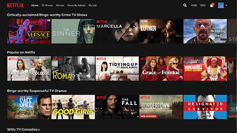
In hundreds of studies, researchers have seen that when there were more options to choose from, people had a harder time making any decision at all. A digital version of option overload that may be familiar is Netflix. The streaming options on Netflix seem endless, as you can see in Figure 4.1, which actually makes it harder to choose something to watch. Sometimes it takes longer to find something to watch than it does to watch it.
Figure 4.1—Endless streaming options on Netflix
So while it may seem counterintuitive, it is helpful for users to have fewer options rather than more when they are being asked to make a decision about their behavior change process. Too many choices can overwhelm people; they may feel like they don’t have control, or that they have to pick the perfect option from thousands. These feelings are the opposite of autonomy support. The job of the designer is to help people break down complex decisions into meaningful choices.
Disorganized Data
People are pretty good at making decisions when they have equivalent data on a few options. For example, it’s not a problem to pick between these three options:
A one-month subscription for $10
A three-month subscription for $28
A six-month subscription for $50
There are only two variables, duration and cost of the subscription. People can consider how long they might want to use the product and how much they can afford to pay and use those two factors to make a decision. Easy.
But as you well know, most real-world decisions aren’t nearly so simple. Consider the decision to purchase a smart scale. One person might be interested in buying a scale that integrates with her favorite fitness app. Another person really wants one that can assess body fat and water weight in addition to just weight. Each of these people might be willing to concede some of their desired features for the right price or if there were an attractive alternative feature they hadn’t thought about.
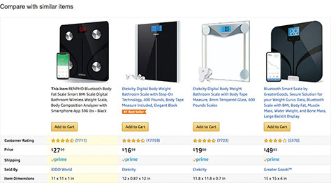
Both people take to Amazon to see if they can find the smart scale of their dreams and see the chart shown in Figure 4.2, comparing top recommended options. The person who wants to use her app can see that two of the scales integrate with an app, but not which app or if there are multiple app options. So she ends up clicking into all four descriptions and hunting for the information. The second person also needs to do some investigating to verify which scales do and don’t work for him. Does the RENPHO include water weight in that body composition feature? And that first Etekcity scale looks pretty high tech—could it do body composition, too?
Figure 4.2—A product comparison chart on Amazon
Amazon devotes some of its limited real estate in the comparison chart to the physical dimensions of the scale, but none to the specific technology integrations each scale offers.
Hunting this information is time consuming, makes the decision more difficult, and may ultimately dissuade people from making any decision at all.
Sometimes the data disorganization is a deliberate ploy by designers to influence people to pick the most profitable option. The design might strategically highlight or withhold information so that one option appears superior to others. Or information might deliberately be presented in a confusing way so that people default to a familiar choice.
While using design to nudge people toward good choices can be a helpful strategy, it’s important not to do it from self-serving motivations. Try not to deliberately make comparisons difficult for people. Some designs either withhold information about some options to make another one look better, or have information organized so it’s difficult to compare options accurately. This is dark side type of stuff.
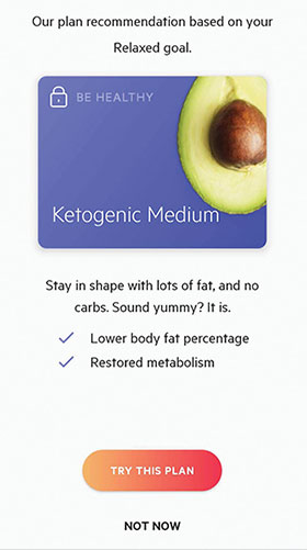
The example from Lifesum in Figure 4.3, recommending a ketogenic diet, leaves out key information that would help users decide whether they should follow that advice. It highlights benefits and teases the appealing outcomes of a lower body fat percentage and restored metabolism without having assessed whether the diet is appropriate for a given user. Worse, it doesn’t give users any prompts to make that assessment themselves.
Figure 4.3—Lifesum
By providing only benefits with no drawbacks or selection criteria, Lifesum probably increases the number of users who say yes to trying a ketogenic diet, but to what end?
Confusing Complexity
Sometimes the problem is not nefarious designers, but truly complicated decisions. Consider someone who’s looking at medical options to treat a health condition. Unless the patient is also a doctor, there will be unfamiliar terminology, misunderstood trade-offs, and probably uncertainty about which option is best. A situation many people experience is selecting health insurance coverage or retirement plans, but who really understands in detail all of the factors that go into each option? Many consumer and behavior change experiences ask people to make a decision with far-reaching consequences, without the deep understanding that would help them truly optimize.
These problems of complexity are compounded by literacy issues. Health literacy is people’s ability to obtain, process, and understand health-related information. The National Institute of Health estimates that about 90 million American adults have poor health literacy. Then there’s numeracy, the ability to apply simple mathematical concepts and understand quantitative information. The statistics for numeracy are even worse in the U.S. than for health literacy. If people don’t have the basic skills to comprehend health information or numbers, then they are at a huge disadvantage in making complex decisions that affect their well-being.
Complexity affects behavior change domains beyond health. From deciding how to prepare for retirement to evaluating career training options, some of the most meaningful behavior change journeys people take require them to choose from complex options. Far too often, people are not equipped with the skills or support to do that well.
Opportunity Costs
People are lousy at considering opportunity costs associated with the choices they make. Every course of action requires people to spend resources: time, energy, and possibly money. Every resource spent on one action is no longer available to spend somewhere else. Even the few seconds it takes people to become aware of a reminder pulls their attention away from other tasks.
Almost always, deciding to take one course of action means not taking alternatives. People may not fully think through the implications of the choices they make and find themselves surprised that saving money toward a down payment means not having the cash for Friday cocktails.
The Science Behind
Most of us know willpower as something we wish we had more of. Willpower gets portrayed as a transfixed quality that can make people bad-ass doers if they have it or lame wannabes if they don’t. But willpower is not a personality characteristic like a sense of humor. Science shows it’s more like a muscle.
Successfully building muscle requires working out to fatigue the muscle and then taking a rest so the muscle can repair itself. Over time, the muscle becomes stronger from this cycle of work and rest. Similarly, willpower can be depleted from being overused. And, it can be recharged through periods of rest. If the use and the rest are done strategically, a person’s store of willpower can become greater over time, just like a muscle gets stronger.
What sorts of things are willpower workouts? Making choices! Having to decide between multiple options is an emotionally and mentally stressful situation. Give someone too many choices, and eventually they won’t have the focus to make good ones. People’s minds can suffer from decision fatigue.
Think about what it’s like to be on a diet and have to turn down the tempting unhealthy options at every meal. It’s not so bad at breakfast and lunch, but by late afternoon, those decisions get really hard. (Being physically hungry doesn’t help either! It’s a willpower best practice to take good care of your physical self so it doesn’t distract from your decision-making chops.)
Fatigue can occur even within a single flow. That’s why it can be a good idea to put hard survey questions first, when people will have more willpower to process them, or to simplify checkout after people have done the hard work of selecting a product.
When you make decisions easier for your users, you’re helping them preserve their willpower to use in the situations where they need it most.
Your Brain Is Biased
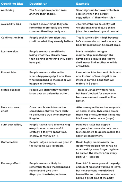
Unfortunately, the human brain is not a perfect logic machine. It comes preloaded with cognitive bias software that shortcuts the decision-making process, but makes a predictable series of errors in doing so. By some counts, there are over 180 cognitive biases that color the way people interpret information and make decisions.
Not every cognitive bias will come into play for your users and product, so there’s no need to try to learn all 180 of them. Figure 4.4 summarizes some of the more commonly encountered biases so you can be aware of them.
Figure 4.4—Common biases experienced in making behavior changes
These are some of the more common biases your users may experience as they work through behavior change.
No Choice Is a Choice
One of the cognitive biases in Figure 4.4 is the status quo bias, where people actively prefer the current state over an unknown alternative. Some people may end up sticking with the same old choices, not because they actively want to, but because they’re avoiding making any other choice.
There are many reasons why people might make no choice at all when presented with an opportunity to try something different. People avoid making decisions that are difficult or confusing, especially if they don’t see a clear purpose in taking action. If the actual choosing process looks time-consuming or troublesome, people might give up on it. Unfortunately, no choice often is a choice to remain with the status quo, whether it’s desired or not.
When Good Choices Are Bad
People are sensitive to information that tells them how well they’re performing. One consequence of that is that people are vulnerable to what’s called the social desirability bias. People have a sense of what the right or good course of action might be, and will sometimes do that instead of what they really want so that others think more highly of them.
People are most susceptible to the social desirability bias when a situation has a lot of demand characteristics that signal what they should do. For example, if people know their data is being monitored, they’re more likely to do what they think others want instead of what they want themselves.
People opting into good behaviors for the wrong reasons may not seem like a problem until you remember that having ownership over a decision is crucial for withstanding challenges. When you’re talking behavior change that needs to happen over time, it’s important that people opt in for personally meaningful reasons. Otherwise, they’re more likely to revert to their old ways the first time the new ones get too tough.
Making Choices Easier
Designers can make it easier for users to make choices. By creating choice architectures that work with, not against, the way people’s brains handle decisions, designers can facilitate feelings of ownership, empowerment, and capability in their users. Here are some tactics for designing effective choice architectures.
Constrain the Choice
The behavior change designer is also a curator. For every target behavior, there are a universe of options that could help someone perform it. The designer should select a well-vetted subset of that universe of options to present to their users.
The trick to curating options is: only offer good choices. If a choice will take users astray of their goals, why tempt them into taking it? Use your subject matter expertise about the target behavior to identify a handful of good options for users to consider—the most practical, promising, or engaging ones you have.
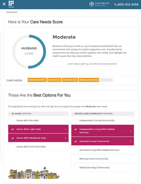
Roobrik is a decision-support tool for people considering assisted living options for themselves or loved ones. After users provide information about the person requiring care, Roobrik summarizes the person’s needs and offers a limited number of options to pursue. As shown in Figure 4.5, Roobrik selects a small number of care options based on information the user has shared and then guides the user in researching each one. By curating the options for users—and providing a clear rationale for why those options rose to the top—Roobrik helps to simplify the complex and emotionally fraught experience of choosing long-term care options.
Figure 4.5—Roobrik, a decision-support tool
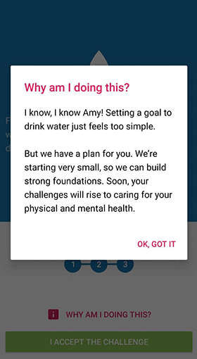
Another way to constrain choices is to sequence them. Instead of having a user lay out their entire behavior change plan on Day 1, ask them to make an initial choice and take some action. As they progress, you can offer them additional choices to make. In the Fabulous app for healthy rituals, shown in Figure 4.6, the first decision is simply whether or not to drink more water for the first three days. The designers use that first simple choice to build confidence and introduce the program structure so that later choices make more sense to users.
Figure 4.6—Fabulous
As Figure 4.6 shows, Fabulous users make one simple choice after onboarding to up their water intake for three days. Once they accomplish that easy goal, they’ll be asked to make meatier choices.
Create Symmetry
Compare apples to apples! Organize information so that people can compare options more easily on the most important dimensions. Distill the essential factors that people need to know to make a choice and focus only on those. Provide the same information for all options so that people can make an even comparison. Clear and consistent labels can help people navigate their options and compare like items, especially if information is presented across multiple pages.
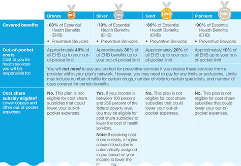
On their site, Aflac helps people select a health insurance plan by comparing four options on important criteria, like how much it will cost to have that plan. As Figure 4.7 shows, Aflac presents insurance options in a grid that permits easy comparison on the characteristics shoppers are likely to care about. Clearly, they have not included all features of these plans in the comparison grids. Instead, Aflac focused on some of the key factors people consider in choosing a plan. Interested shoppers can go a level deeper to investigate additional details.
Figure 4.7—Aflac presents insurance options in a grid
Expose Just Enough Detail
Think about what level of detail to include in each option. If people are experts on a topic or have a reason to care about details, then a lot of information will be helpful. If they’re not equipped to parse through that detail, it will feel overwhelming instead of empowering. Imagine you need a medical procedure. You may want to pick your surgeon and have some input into where the incision will be, but almost no one cares what brand of sutures are used.
A beautiful thing about digital experiences is that you can personalize the level of detail so that more advanced or knowledgeable users get more complex choices, while newbies get simplified ones. If you don’t have the data to present users with the right level of complexity, ask them whether they’re interested in a basic, intermediate, or advanced experience. You can also design an experience that works for the people with the least knowledge, while offering more advanced users opportunities to dig deeper. For example, knowledgeable investors can look under the hood of the personal values-based investment funds offered by Stash that were in the last chapter, as seen in Figure 4.8, but novices can put money in them without perusing the detail. Thus, Stash allows novice investors to pick funds based on a few high-level characteristics, while more seasoned investors can comb through the details.
Figure 4.8—Choosing funds on Stash
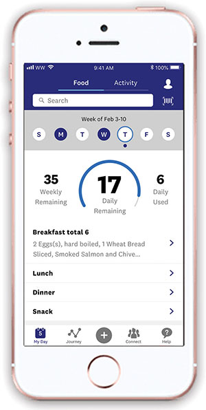
You can also create bundles that combine many choices into one or two key decisions. This allows users to decide on themes or top qualities they want in a choice without having to repeat the process over and over. Weight Watchers does this for calorie counting. Their points system, which you can see in Figure 4.9, allows users to track just one simplified metric, in points, instead of many. The Weight Watchers point system lets users track the points in food items against their daily bank. This is often easier than counting calories or other nutritional factors.
Figure 4.9—Using the Weight Watchers app to track points
Provide Structure
The way that you structure tasks and the decisions they involve for your users can help with navigating them successfully. Simple organizational tools like checklists or outlines can be extremely effective at moving people through multiple complex steps. Checklists of all of the steps involved in complicated tasks like surgeries or landing planes on aircraft carriers have been shown to increase reliability and decrease errors by a large margin. Giving your users a series of explicit steps to follow goes a long way in guiding them through behavior change.
A checklist or other structure can help with decision-making because it assigns the decision to a particular point in time, with the activities already completed and the ones yet to come clearly indicated. Checklists provide context and set expectations that help users make better choices.
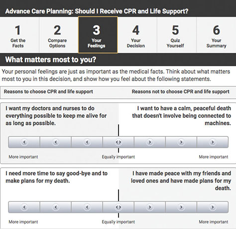
Shared decision-making tools are one type of modified checklist being used in healthcare to guide doctor-patient discussions about treatment options. The example from Healthwise in Figure 4.10 helps patients decide about whether they want to receive CPR and life support if needed. After patients complete a step-by-step process, the tool generates a summary they can then use to talk to their doctor and make their desired arrangements.
Figure 4.10—Healthwise decision tool
Patients use Healthwise’s decision tool walk through a checklist of steps to make a choice. The tool provides them with summary information they can share with their medical professionals.
In the previous chapter, you learned that personally meaningful choices are more likely to lead to long-term change. Research suggests that when people use these sorts of decision-making tools for their health decisions, they end up with an option that supports their values better. Making choices easy can help make them meaningful, too.
Talk About Trade-Offs
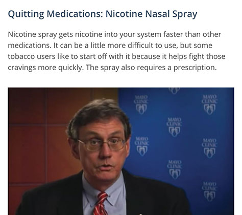
People aren’t good at understanding the trade-offs associated with their decisions. Your designs can make some of those trade-offs explicit so that it’s easier for users to include them in the choice process. Consider this example from BecomeAnEx.org, a smoking cessation program developed by the Truth Foundation. As Figure 4.11 shows, BecomeAnEx.org provides information to help users make a decision about what quitting aids to use based on their advantages and drawbacks. They’ve created short videos about different nicotine replacement therapies that talk about the pros and cons of each one. Users can decide for themselves which ones to try, with full awareness of the trade-offs they might experience.
Figure 4.11—BecomeAnEx.org, a smoking cessation program
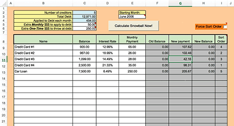
Another way to make trade-offs clear is to help users see if–then consequences of their options. Framing choices in terms of future consequences can cut through the vagaries of technical details to help people focus on what they care most about. The debt snowball is a technique for paying off multiple debts—hello, student loans!—efficiently. There are downloadable spreadsheets, which you can see in Figure 4.12, that help users enter the details of each of their debts, including interest rates and minimum payment amounts, and then experiment with allocating their monthly budget differently among the accounts to see which method yields the best results. Some people like to pay off the largest or highest interest debts first; others have more success if they can knock off a few smaller accounts and have fewer total payments to make. Being able to see how each option affects the overall money available for payments and the timing of becoming debt-free helps people make decisions.
Figure 4.12—Snowball debt calculator
Users can play around with different payment strategies in the snowball debt calculator to determine how they’d most like to tackle their debt.
Recharge the Batteries
People can make better choices when their physical and emotional needs are met. Being tired, hungry, or cranky makes it much harder to work on behavior change. That’s why some behavior change apps will encourage users to indulge in self-care like eating regularly and well or sleeping consistently, even if the behavior in question is not specifically related to those activities.
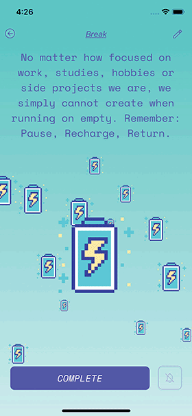
There are also some apps that focus only on self-care in order to support other behavior change endeavors. AloeBud, shown in Figure 4.13, is an app dedicated to getting people to care for themselves so they’re better prepared to tackle professional or creative projects. AloeBud reminds users who may see self-care as a distraction that it’s actually an enabler of high performance.
Figure 4.13—AloeBud
Work with Bias
People have a predictable set of cognitive biases that color their decisions. You can leverage those patterns to increase the likelihood that users make choices that get them closer to behavior change goals.
For example, you can use the anchoring bias to encourage more generous behavior. When New York City taxis began offering passengers the ability to pay by credit card instead of cash, the average tip amount jumped dramatically. It wasn’t just that people’s generosity was no longer limited by the contents of their wallet. Research found it had to do with the suggested tip amounts that displayed on the screen during the credit card transaction. The smallest suggested amount was larger than the at-that-time average tip. Even though people had the ability to type in any amount they wanted, the suggested amount triggered the anchoring bias and people used it as a guideline for their tip. Lyft, Uber, and other ridesharing services have borrowed this design to boost their drivers’ tips. As Figure 4.14 shows, Ride share services and electronic taxi payment systems anchor users’ expectations of an adequate tip at a higher price point than is common among people tipping with cash.
Figure 4.14—Tipping in ridesharing services
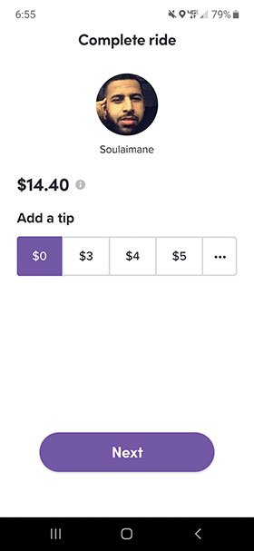
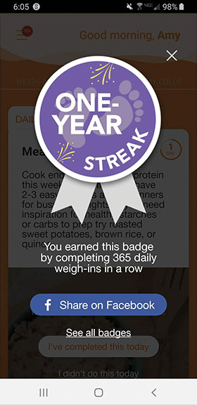
A design technique that taps into both loss aversion and the sunk cost fallacy is the acknowledgment of streaks, or patterns of positive behaviors over time. One way to reward a streak is with a badge on a user’s account profile. If the user doesn’t maintain the behavior, the badge could begin to fade or display a countdown to its disappearance, a technique known as withering. Or a streak could be rewarded by displaying its duration, as shown in Figure 4.15. This design makes it implicitly clear that the streak will be lost if the person skips the behavior. Both designs stir up users’ negative emotions of losing something and remind them of the effort they’ve invested that will be lost if they don’t maintain the streak.
Figure 4.15—Rewarding a streak of weigh-ins
After a whole year of weighing themselves daily, what user is going to casually break this streak?
A Spoonful of Sugar
Behavior change design is not about forcing a certain set of choices on someone. It’s fair game to try to sweeten the deal by highlighting the positive aspects of behavior change-supporting options as long as you aren’t being deceptive or coercive to your users.
One tactic is to make the right choice more fun than the alternative. Volkswagen Sweden and DDB Stockholm worked together to see if they could use fun to get more people to take the stairs instead of the escalator in a Stockholm subway station. Their concept was a staircase painted like a piano keyboard that played music when people stepped on it. The piano stairs, shown in Figure 4.16, resulted in a 66% increase in people choosing the stairs.
Figure 4.16—Using fun to motivate good behaviors
To get people to take the stairs, forget messaging them about health; just make it more fun to do.
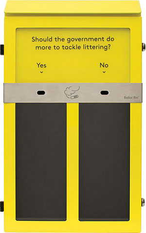
One behavior a lot of people would like to see change is smokers tossing cigarette butts on the pavement instead of into a disposal bin. A UK company called Ballot Bin used the concept of fun choices to help accomplish this. They manufacture outdoor ashtrays that have two compartments and clear glass fronts so people can see how many butts have been tossed into each, as shown in Figure 4.17. The ashtray can be customized with a poll question like “Do you use an Oxford comma?” and then the compartments are each labeled with an answer option—in this case, yes for people on the right side of history and no for the monsters. In areas where these Ballot Bins are installed, there’s a 46% reduction in cigarette litter.
Figure 4.17—Ballot Bin ashtray
When people can use their cigarette butt to vote in a poll, they’re less likely to toss it on the ground.
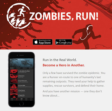
A digital program that couples fun with running is Zombies, Run!, which is shown in Figure 4.18. The app lets users choose a narrative to listen to while they run that coaches them to escape a horde of imaginary zombies chasing them. Instead of focusing on the running itself, Zombies, Run! users can put their attention toward the game. Working out is suddenly much more fun. Zombies, Run! users are participating in a fitness program, but the primary focus is on escaping zombies by outrunning them.
Figure 4.18—Zombies, Run!
So Good Looking
If you can’t make the right choice fun, you may at least be able to make it look more appealing. In digital design, you might see right choices are presented in more eye-catching ways. Very often, this choice is whether or not to pay for an upgraded subscription to a program where users receive additional bells and whistles to support their behavior change.
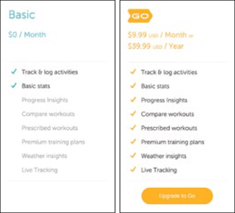
Consider the example from Fabulous, shown in Figure 4.19, where several elements of the design subtly nudge users toward the annual plan, which coincidentally is also the option more likely to generate revenue for its creators. Someone on a monthly plan may cancel after a month or two, whereas an annual plan member is locked in for twelve months. And, if the subscription is set to auto-renew, people on an annual plan are less likely to remember to cancel on time compared to people on a monthly plan. After all, the former group has twelve whole months to forget.
Figure 4.19—Choosing a Fabulous plan
The annual subscription option is designed so that its savings over the monthly plan are emphasized three different times: in the header, in the feature list, and on the call-to-action button itself. These design choices are likely to make users consider the annual option more seriously.
Similarly, RunKeeper orients people toward its paid plan over the free one in how the subscription options are designed. As shown in Figure 4.20, RunKeeper shows people the benefits of one choice over the other through design elements. The paid features are listed in the free account benefits column, but grayed out so that it’s clear a user selecting free is missing out.
Figure 4.20—RunKeeper
Design for Evil?
Products that guide users toward choices that result in a financial benefit for the company may seem like they’re using design for evil. They probably aren’t.
First, they aren’t deceiving users into making a choice that they may not have otherwise made. These examples and similar ones from reputable companies clearly state what the user is buying and what the cancellation conditions are. Presumably, they honor these promises and make cancellation easy if the user requests it.
Second, if there’s a good faith reason to encourage users to upgrade their subscription—so they can have a better experience and better results—then encouraging the upgrade isn’t evil. Of course, this assumes that the people making and marketing the product believe in it. Even better is if the people behind the app have done testing that suggests the upgrade is beneficial.
To gauge whether you’re using this type of design nudge ethically, give yourself the red-face test. Describe your design to someone who doesn’t work with you, including how you encourage users down one decision path. If you feel any blush of embarrassment, or your audience reacts like you should, then revisit your design.
Give Permission to Be Bad
Since people are sensitive to cues that suggest what the right option might be, try to avoid using those sorts of cues in your design unless there’s a valid reason to recommend a particular choice. You can reduce social desirability cues by:
Emphasizing your users’ privacy. In the example from Happify in the last chapter, users can opt into having extra privacy at the expense of receiving community encouragement. Offering them this option may facilitate more authentic progress through the program, which deals with the sensitive topic of emotional well-being.
Reminding users that their choice is personal, and whichever paths they select are acceptable—which you know is true since you’ve curated their options to be good ones!
Letting users know that what works for someone else might not work for them; behavior change journeys need to be tailored to individual needs, preferences, and life contexts to be their most effective.
You can use microcopy within your product to reinforce that any choice the user makes is okay. Describe options in equally positive terms—or try for value-neutral language. Once a user has made a choice, acknowledge it positively—“Great! Good choice!” Seize opportunities to be supportive of users’ choices, whether or not they’re the ones you’d have made yourself. In this example from Fitbit, shown in Figure 4.21, users who bypass a specific fitness goal and say they’re “just curious” receive positive feedback on their choice.
Figure 4.21—Fitbit
Just curious may not be a behavior change goal, but Fitbit’s designers recognized that people who choose it may just need some encouragement to stick around so they can decide what they want to do.
At Mad*Pow, a purpose-driven, strategic design agency in Boston, Amy focuses on crafting engaging, motivating experiences to help people change their behaviors, contributing to their physical, mental, and financial health and well-being. Before joining Mad*Pow in 2016, Amy worked on behavior-change products in house at CVS Health and Johnson & Johnson. Amy received her A.B. from Harvard University, and her M.A. and PhD. in organizational psychology from the University of Michigan, Ann Arbor. She’s a frequent speaker at behavior change and UX conferences where she talks about motivation, engagement, and product design. She is the author of the Rosenfeld Media book Engaged: Designing for Behavior Change. Read More

 In this chapter, you’ll learn how to structure [users’ meaningful choices on their behavior-change journey] so that it’s easier for people to select good options that ultimately support their goals.