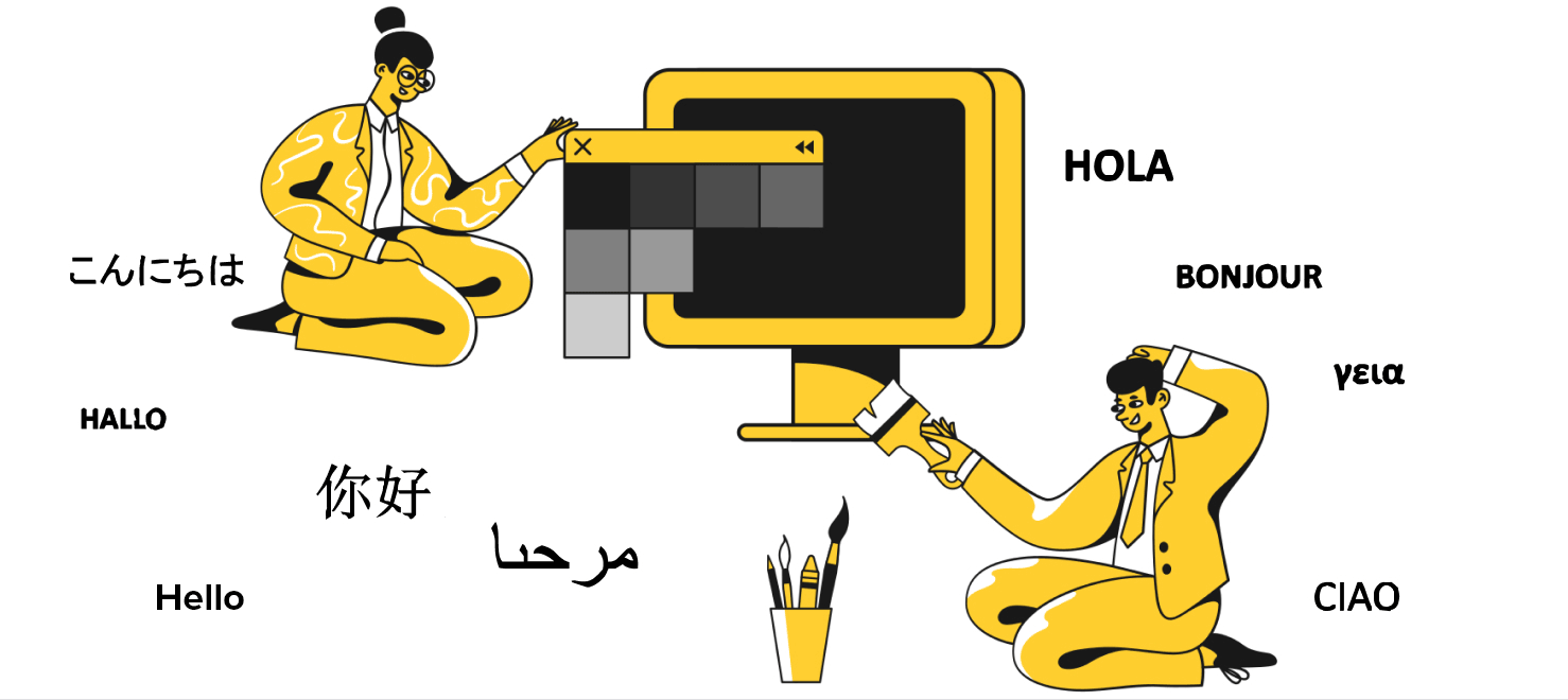
The definition of design is continually changing and evolving—at least in the public’s perception. But design will forever remain a problem-solving process. As a design community, we have always designed for a global audience, for which English is their first language. But, today, we must think about designing for the next billion people. As we progressively focus more and more on inclusive design and diverse cultures, we must accept that 98% of the population are not native English speakers. Designing for this broader audience has become an imperative.
For designers, communication is a key facet of everything we create. The entire design process is predicated on systems requiring clear communication between clients, stakeholders, teams, and users. The language barrier seems bigger than ever when we’re designing for an audience with whom we don’t share a common language. In this column, I’ll discuss some common challenges that you’ll confront when designing for an audience of users who aren’t proficient in English. I’ll also share my tried-and-tested strategies for solving this problem.
Champion Advertisement
Continue Reading…
Challenges of Designing for an Audience of Non-native English Speakers
I’ve already broadly framed the challenge of designing for non-native English speakers, but this, in fact, involves a combination of challenges, making this a seemingly insurmountable issue. Let’s look at just a few of the difficulties that can arise when designing for an audience of non-native English speakers, as depicted in Figure 1:
Conveying signals, messages, instructions, feedback, and system status to people who are not proficient in the language
Conducting user interviews that achieve any significant degree of clarity and detail, then being unable to interpret users’ feedback accurately
Having difficulty expressing one’s design ideas fully or having to find workarounds or quick-fixes rather than creating complete design solutions
Time constraints that are exacerbated by the need to take extra steps in completing what would otherwise be simple tasks
Figure 1—Design challenges
Useful Strategies for Designing for an Audience of Non-native English Speakers
Here are my tried-and-tested strategies for designing for an audience of non-native English speakers. By leveraging these strategies, you can not only ease your design process but also enhance the quality of your final product design, by making it much more accessible to a broadly diverse audience.
Use Familiar Iconography
First, when designing for non-native speakers, leverage the familiarity of past designs that users are likely to have encountered. The use of common iconography can act as a lingua franca for you and your users, as you can see in Figure 2. The language of technology and modern design have permeated far more diverse pockets of society than the English language has, making it possible for diverse audiences to benefit from the use of a common visual language.
Figure 2—Familiarity
Icons for such common functionality as Power On / Off, Upload / Download, Like, Share, Comment, and many more functions have become universal, so most people immediately understand them solely on the basis of what they represent visually. Furthermore, these icons have the added benefit of providing plenty of context to the user—context that can contribute to users better understanding of an app or Web site. For example, placing Like, Share, and Comment buttons near one another enables users to detect a social element to an app, providing another layer of context for the rest of their actions. However, it’s important to show restraint and avoid relying too heavily on icons. It’s all too easy to use visuals that you, as a designer, recognize, but your users would be unlikely to understand.
Use Animations During Onboarding
Similar to my first point, you can use other visuals to overcome gaps in understanding that result from users’ lack of proficiency in English. Onboarding is such a vital part of any design solution that it can single-handedly make or break the rest of a user experience. If you can onboard your users effectively, the chances are that users would have fewer misunderstandings and make less mistakes throughout the remainder of their journey. Designers have created many modern onboarding processes using visuals and text—which works great for those fluent in English, but not so much for users who are non-native English speakers.
What is the workaround for this problem? You can use animations to convey the functionality instead! Not only would using animations transcend the language barrier but, in some cases, they might help native English speakers to gain a better understanding of the concepts you’re introducing, too. Animations don’t require any knowledge of language and can convey plenty of information to a diverse audience entirely through the use of visuals.
In fact, the usefulness of animations can stretch far beyond the onboarding process. You could use micro-animations throughout your user interface to support or even replace text, further easing the cognitive burden of non-native English speakers when interacting with your design solutions. Conveying information such as error states through micro-interactions doesn’t require any text and enables a broad range of users to understand that there’s an issue. You can apply this same strategy to numerous other scenarios.
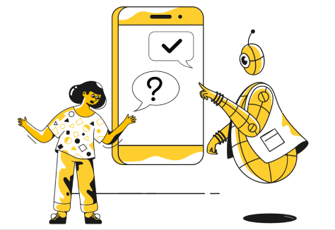
Rely on Translators During Interviews and Other User Research
For designers, the importance of easing user input cannot be overstated. We approach every aspect of the design process, from ideation to prototyping, with the user in mind.
But it’s important to recognize that the design process itself is bookended by user interactions—beginning with user interviews and culminating in usability testing. It’s easy to understand how much of a hindrance not being able to communicate with your users efficiently could be, as Figure 3 depicts.
Figure 3—Translate
Utilizing a translator during these crucial moments can be far more effective than you might imagine. The ability to communicate clearly with your users during user interviews and usability testing lets you not only construct a stronger foundation on which to build your designs but also to improve upon them far more effectively throughout iterative design.
Nevertheless, translation can be a tough process, and you can lose a lot of meaning when switching between languages, so be aware that the language you’re receiving and that which a translator is transmitting might be far from perfect.
Conclusion
Designing for an audience with whom you have no common language can seem like a frustrating experience. However, if you dig a bit deeper, you can find unique and tantalizing opportunities in the challenges of designing for this audience—challenges that push your problem-solving skills to the limit.
The strategies I’ve provided in this column are just the beginning. Communicating with users visually instead of with words would undoubtedly take a lot more creativity, and each unique scenario would require custom solutions. Plus, it goes without saying that you must be able to speak with and hear from a broad range of users, irrespective of their background or the languages they speak. Our design process is capable of encompassing such rich diversity.
Manik was introduced to design when he was building Placesso, a ride-sharing platform based on Facebook’s social graph. While they never launched the platform, the experience taught Manik a lot about design and development. Since then, he has stayed with design. He and his friends began spending a lot of time discussing the designs of newly launched apps, exploring ways to improve their user experience. They felt really badly about people using poor designs so, in 2014, launched Ketchup Designs Studio. In 2015, they changed the name to Onething Design. Since then, they’ve helped a lot of businesses design products people love to use. Read More