With the increasing use of mobile devices and social-media platforms, it’s evident that businesses need Web sites with more engaging designs and content that takes less time to load. Single-page Web sites comprise just one HTML page, and their content and functionality load on a single page with a more navigable and fluid user experience. Plus, these Web sites represent your content cleanly and comprehensibly and remove extra clutter from the user interface, making it easy for people to use.
According to one study, a single-page Web site converts better than a multipage Web-site design, with 37 percent more users converting than on the equivalent multipage Web site, which is exceptional. The quick navigational experience and rapid content consumption of a single-page Web site prevent users from becoming distracted by extra page elements.
Champion Advertisement
Continue Reading…
But, before designing a single-page Web site, you must understand its purpose and know what image your brand or business wants to project to the target market. It’s also important to know whether a single-page Web site is enough to deliver the message you want your customers to understand. So UX designers must understand whether the goal is, for example, to generate sales or leads, then decide what kind of user experience would be suitable. This also enables you to create optimal content that supports the purpose of users’ accomplishing these goals.
6 UX Design Trends for Single-Page Web Sites
First, let’s take a look at some design ideas that are currently trending in the design of single-page Web sites.
Trend 1: Simplicity
An elegant design for a single-page Web site calls for simple navigation and scrolling instead of menus. Furthermore, since the Web site’s purpose is to display content to users and direct them to a specific call to action (CTA), the page should be easy to use. Provide just the necessary information in appropriate content and sections—not too little, not too much.
Trend 2: Minimalistic Design
Minimalism is currently a design trend for all aspects of design, be it interior design or Web-site design. So designers of single-page Web sites should try to achieve minimalism. When adopting minimalistic design, it is advisable to keep your color scheme in harmony with the page’s background color because some displays might distort the hues. This could change the overall quality of the Web page or reduce the legibility of its fonts. Figure 1 shows an amazing template for a clean, minimalist single-page design. This template would work best for small businesses, portfolios, or digital-marketing agencies.
On a single-page Web site, you could have a big canvas and a lot of space for huge images that increase user engagement and make your site look great. But you can make this single-page Web site accessible on all devices, especially when it’s greatly optimized for responsiveness. So a single-page Web site can combine two excellent Web design trends: big spaces for graphics and mobile-friendly design.
Trend 4: Content Blocks
Make sure that users can find important information such as a business’s contact information effortlessly. Putting this information at the bottom of the page would make users scroll down the page, which could be an inefficient, unappealing experience. I recommend placing contact information and links to social-media platforms at the top of the page instead, where they’re easier for users to locate.
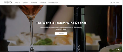
Figure 2 shows how Apero Wine has represented such information without using much text. Using the page shown in Figure 2 is effortless, and a couple of videos make it highly informative. Notice the elegant color scheme they’ve used to represent their brand in a way that matches their luxury products.
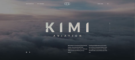
Instead of using just text, enrich your Web site with engaging media such as videos or animations. In addition to engaging users, this conveys your unique brand identity and provides clarity on your products or services. In Figure 3, see how KIMI Aviation’s one-page Web site uses elegant media to represent different sections of the Web site.
Unlike traditional Web sites, a single-page Web site doesn’t have a header section or navigation bar with links to other Web pages. But you still need to provide navigation links to enable users to visit the essential sections of your Web site and eliminate excessive scrolling. Web developers can reduce scroll time either by using an internal navigation system or with the help of add-on navigation elements or menu widgets.
See how well the design for the single-page Web site shown in Figure 4 has employed autoscrolling for better navigation. Clicking the menu items automatically redirects users to the respective blocks on the page.
Now, let’s consider eleven cool tips for designing single-page Web sites, including some tips for beautifying your Web site and making it more user friendly.
Tip 1: Pay attention to the background.
To ensure that you don’t distract users’ attention from the main content, use a pastel-toned or gray-shaded image. I don’t recommend making an animation the first thing users see. This would not make a good impression on users because animations take more time to load and might not be compatible with all browsers.
Tip 2: Use visual hierarchy.
It is essential that you structure your single-page Web site optimally to emphasize the right information and give the page an engaging appearance. You can create an appealing visual hierarchy by breaking the content into specific headers, design elements, backgrounds, and other visual elements. Then leverage this visual hierarchy based on the importance of each section.
Here are some types of design principles to consider in building a visual hierarchy for your page’s content:
size and scale
color and contrast
typographic hierarchy
spacing
proximity
negative space
alignment
rule of odds
repetition
leading
rule of thirds
perspective
As Figure 5 shows, the exemplary design of the Gyrofocus Web site provides simple navigation and spirit-lifting design elements that impress every user who visits the Web site.
In Figure 6, you can see the visually enriched, single-page Burn the tickets game Web site, which is known for its design and usability and uses an elegant color scheme and design hierarchy.
A direct call to action, or CTA, tells users what to do to elicit the expected response from the Web site or business. Therefore, the effective placement of a CTA and the elements that represent it could determine whether the business can achieve an increasing sales rates and good business revenues.
Let’s take a look at some examples of CTAs and consider what makes them noticeable. The CTA on Apple’s Web site that is shown in Figure 7 is surrounded by whitespace, making the CTA more visible. If other graphic elements and text surrounded the CTA, they would distract and confuse users.
Another example of a CTA, shown in Figure 8, is from Stripe’s page. It follows a good visual hierarchy that highlights the primary CTA, making it stand out from the page’s background. It actually includes two alternative calls to action: Start now, which is the primary action Stripe wants users to perform and redirects users to create a Stripe account, and Contact sales.
On your single-page Web site, your CTA should do the following:
Be concise and logical.
Promote a single action that users should perform—such as buying, subscribing, or registering.
Be visually appealing and stand out from the background color theme, fonts, and other graphic elements.
Get users to pay attention to its text—for example, by emphasizing a product or service’s value to the user.
Include verified statistical data that can win prospects’ trust.
Reflect the user’s purpose and respect personal boundaries.
Tip 4: Select the right professionals for your team.
If you’ve decided to create a single-page Web-site design, you might think you need to learn the necessary technical skills to build it or choose to build the Web site using tools such as WordPress. But it’s not necessary for you to do this by yourself. Hiring the right UX design and development professionals can make a real difference in the online presence of your business. When selecting these people for your team, raise questions about setting the necessary budget and deadlines and what design and development tools team members should know how to use. Before considering these aspects, make sure you have all the necessary knowledge to design a single-page Web site and go ahead with your project.
Tip 5: Place text blocks appropriately.
Just as the placement of CTAs impacts conversions, laying out text blocks in the right locations also matters for a single-page Web site. To optimize the text and make it as useful as possible, keep the information precise. Don’t bombard users with too much information. Nevertheless, since it is a one-page Web site, users need all the information necessary to lead them to an appropriate CTA. For some sections that require more information, you could redirect users by placing a link to a separate Web site within a content block.
Tip 6: Understand user interactions.
By using Web-analytics tools such as heatmaps, you can analyze user interactions that depend on both intuition and logical thinking. Logical thinking requires that users seriously consider whether to take an action, while intuition requires that user-interface elements be easy to find and use so they make interactions easy.
Analyze different sections of your single-page Web site and see how users interact with them. Make improvements, then compare your changes to the original page using A/B testing. Balancing elements of logic and intuition ensures that you’ll achieve the user experience you want for your target audience.
As Figure 9 shows, Daesk—a Web site that uses parallax scrolling, vibrant colors, and an appealing background—has an attention-drawing, interactive call to action that makes user interactions more enjoyable.
Figure 9—A Web site that employs parallax scrolling
Since single-page Web sites don’t comprise multiple Web pages that are loaded with information and essential keywords, your page needs to meet other ranking criteria as much as possible to rank highly on Web search-engine results pages (SERPs). One key criterion for ranking the Web site is that it load quickly and, thus, provide a better user experience. Optimize your page speed using tools such as PageSpeed Insights, which can analyze the performance of your single-page site on desktop and mobile devices and indicate areas for improvement.
Tip 8: Optimize for SEO.
Again, for a single-page design, you have only one page that you can optimize for ranking keywords in search engines. So search-engine optimization (SEO) requires that you make sure your single page is ranking well for important keywords. Start by optimizing each section of the page by considering it as a separate page. Consider H1 tags, focus keywords, and related keywords, and make sure that you define each section well and give it a clear heading tag.
Tip 9: Focus on the relevance of content.
When you’re focusing on SEO for your single-page Web site, one of the main considerations is the page’s content. Make sure it’s relevant to your target audience, and keep it updated and fresh. Check out the latest updates to Google’s search algorithms and ensure that your content reflects the appropriate criteria to ensure it’s featured on SERPs.
Tip 10: Keep the page responsive.
If you are designing a single-page Web site from scratch, design it in a way that is responsive and scales automatically to fit on a variety of mobile devices. Check the responsiveness of your single-page site on many different devices. Too often, business’s Web sites display well on desktop computers, but don’t scale well on mobile devices, which results in the loss of conversions. Of course, if you build your Web site using WordPress or an other modern CMS platform, you won’t need to worry about issues of responsiveness.
Tip 11: Never overlook the user experience.
Analyze user demographics using analytics tools, then target them when setting priorities for making changes to your Web site. Determine what metrics you need to track. Use tools such as Google Tag Manager to track users’ activities on your Web site, then make improvements accordingly.
Conclusion: UX Expert Guidance
The design trends and tips for single-page Web-site design that I’ve provided in this article can help you create your desired platform, while targeting the right people. Although there are multiple options for designing and developing single-page Web sites, I recommend that you design and develop your Web site from scratch, using standard design practices and leveraging the latest trends. The ready-made templates that are available on the Web are unlikely to be as flexible as your business would require in the long run. Plus, making even the smallest customizations to them could cost extra. Explore your options for creating usable, useful single-page Web designs.
Hardik has spent the last ten years helping startups define technology-product roadmaps and building highly scalable, high-performing technology stacks from the ground up to as many 200 million users. He leads large-scale mobility programs, covering platforms, solutions, governance, standardization, and best practices. He earned a Master’s of Science degree from University of Florida. Read More