For an ecommerce business, conversions are critical. Without sales conversions, your business won’t have cash flow. However, for ecommerce Web sites in the US, only 2.3% of visits convert into purchases. Therefore, designing an ecommerce Web site to achieve higher conversion rates is not a choice, but a necessity.
What strategy should you adopt in designing an enhanced ecommerce user experience? Before deciding, you should conduct a UX needs analysis that is based on your customers’ demands and painpoints. In this article, I’ll describe twelve ecommerce UX strategies that could help improve your ecommerce site’s conversions.
Champion Advertisement
Continue Reading…
Top Tips for Designing an eCommerce Home Page
Most ecommerce businesses try to master user experience, but fail for a variety of reasons such as poor product categorization, a lack of product recommendations, or poor image optimization.
How can you improve your ecommerce site’s conversion rates? Consider the following statement: “The first impression is the last impression.” This holds true for an ecommerce Web site! You must design an ecommerce Web site’s home page to deliver a long-lasting impression.
1. Show the value proposition.
When it comes to attracting customers, seeing is believing! Customers need to see the value your Web site provides. If the home page of your ecommerce Web site does not offer value, converting customer visits to sales would be a mammoth task! Therefore, showcasing your value proposition on the home page is crucial and should be an important part of any ecommerce UX strategy.
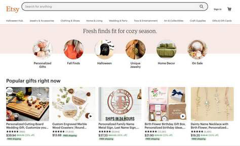
Figure 1 shows Etsy’s home page, which gives customers an overview of the latest trends and available product categories right at the top. When a customer visits the home page, the trending products and sale items are just a click away.
Plus, the most popular product recommendations are visible right on the home page, which can drive instant conversions. The design language of Etsy’s Web site is in sync with its branding and the message of offering jewelry and personalized products. Any ecommerce business must communicate the value they offer on the home page—on their first interaction with users.
2. Reduce the time to get to a product page.
Framing your Web site around its search capability makes your products easily accessible from the home page. An advanced search feature is essential to reduce the distance between the first interaction and checkout.
Building an advanced search engine for your ecommerce Web site can help users easily find the products they want. You can improve an ecommerce Web-site search experience by adding the following key features:
Faceted search allows users to define specific searches using filters. For example, a user who is searching for shoes could use filters for men’s and sports shoes.
Product ranking uses indexing techniques in ranking products. When a user searches for specific key phrases, this capability works similarly to a Web-search engine.
Semantic search breaks a user’s query into different phrases, then uses natural language processing (NLP) to find products across categories. This feature is particularly handy for voice ecommerce strategies.
However, when creating complex features such as advanced search, you must consider the ecommerce Web-site cost. The best practice for developing advanced search, while optimizing cost is to design a simple site that requires less development effort for other features, making it a cost-effective site.
3. Practice mobile-first design.
The best aspect of mobile-first design is responsiveness. A user experience is seamless when you’ve created a highly responsive design. A mobile-first ecommerce Web site provides a responsive experience and ensures that there are no performance lags.
Creating a mobile-first experience is a higher priority than building an application for your ecommerce Web site. According to Google, 50% of users are more likely to make purchases using a brand’s mobile Web site rather than downloading an application.
Thus, creating a mobile-first ecommerce site offers a better user experience and improves conversion rates. A mobile-first UX strategy can deliver higher engagement, better conversions, and improved sales.
4. Stick with Hick’s law to prevent choice paralysis.
Hick’s law helps us understand the time that is necessary for a person to make the right decision among multiple choices. According to Hick’s law, the more options that are available, the more time it takes to make a decision. Therefore, if you want to improve an ecommerce user experience, it is essential that you minimize the number of possibilities you present to your customer. Hick’s law uses the following formula to calculate the time necessary to make a decision: RT= a+b log2(n). In this formula:
RT is reaction time.
a is the time that is not involved in decision-making.
b is a constant that you derive empirically for the time necessary to process each option cognitively (According to empirical studies, b=0.155 seconds.)
n is the number of possible alternatives
Employing Hick’s law can help you create a better user experience for an ecommerce Web site by reducing the time necessary for a person to choose a product. The first step in reducing the time users need to make a decision is designing menu navigation that has a minimal number of submenus. Keeping the design simple is essential to optimizing the navigation system.
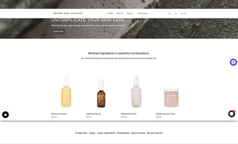
Figure 2 shows the minimal design that the company Brown and Coconut uses, which is based on Hick’s law. It offers four major product options on the home page, so does not tax the audience by providing too many choices. Plus, the home page’s simple design makes it easy to navigate and, thus, improves the user experience.
High-speed loading of Web pages is essential for an ecommerce business and impacts the user experience significantly. You could create the best design using Hick’s law, keep the navigation simple, and build aesthetic appeal, but with a slow-loading home page, all would be in vain!
According to Unbounce, 70% of customers reported that page-load speeds impact their decisions on whether to buy from an ecommerce retailer. Thus, improving page-load speeds is a critical factor in improving the user experience of your ecommerce site.
But how can you measure these speeds? There are many tools for measuring Web-site performance and page-load speeds, including the following:
Google Search Console
PageSpeed Insights
Lighthouse
Chrome DevTools
Chrome UX Report
Web Vital Extension
6. Leverage social-media platforms.
Social-media platforms are powerful, and you can leverage them in applying the concept of social proof. For an ecommerce business, word-of-mouth promotion is important to bringing in more customers. Social proof is a similar concept. Once customers use your product, they’ll inspire others to do the same.
More than 59% of the world’s population is using social-media platforms for more than two hours and 29 minutes daily. An ecommerce business can leverage social-media platforms to engage customers and inspire others to use their services.
Figure 3 shows how the ecommerce furniture brand Made.com encourages its customers to shop from Instagram on its home page. Similarly, you can integrate social-sharing features on your ecommerce home page and leverage social proof for better conversions.
Effective calls to action, or CTAs, are essential to improving sales. They encourage users to take the actions that the business wants them to take. Clicking a CTA such as Buy Now or Add to Cart initiates an ecommerce checkout process.
The placement of a CTA can greatly affect ecommerce conversions. The more visible a CTA is to users, the better conversions are.
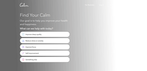
In Figure 4, you can observe the placement of CTAs on Calm. The entire page presents CTAs that prompt specific actions relating to each of the service’s key features. Thus, users who want to improve sleep quality can click the first CTA: Improve sleep quality. Similarly, there are CTAs for users who want to reduce stress, improve their focus, or engage in self-improvement.
Placement is an important factor in the success of a CTA. Placing a CTA above the fold improves conversions, as does improving a CTA’s visibility to users by placing it on the home page.
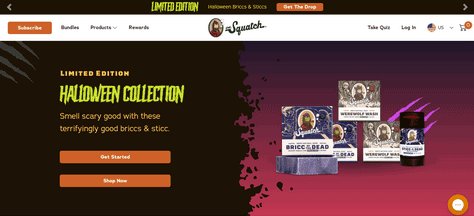
Figure 5 shows how Dr. Squatch has used this popular UX strategy by placing their CTA above the fold. Users can access their limited-edition collection right from the top of the home page, without scrolling down. The same example demonstrates another popular ecommerce UX strategy: Urgency.
Figure 5—Prominent CTAs
8. Use color to convey urgency.
Dr. Squatch uses the color yellow to show urgency. You can use bright colors to convey urgency along with words such as Limited Edition, Limited Stock, or Last Few Available.
Using colors that contrast with your brand style conveys urgency, and they’ll pop on the screen. A customer takes only about 50 milliseconds to form an opinion about your Web site, so it is important to use different colors to showcase what they might be missing!
9. Employ attractive popups.
Well-designed popups can enhance an ecommerce site’s entire user experience and improve sales. Therefore, one of the most important ecommerce UX strategies is designing popups that are in sync with the brand vision.
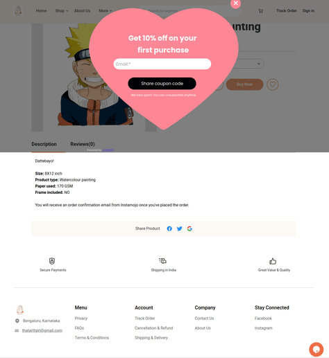
Figure 6 shows how ThatArtGirl leverages popups to convert more customers, in a way that does not hamper the user experience. The message in a heart-shaped popup for first-time customers shows some love for new customers. Using such popups is an excellent way of improving conversions, and this is one of the most effective ecommerce UX strategies.
Figure 6—An attractive offer for first-time customers
Providing shortcuts helps customers understand different navigational pathways. For ecommerce Web sites, it is especially important to offer customers information about different product categories and navigational menus.
You can also place an advanced search bar and other navigational elements on the home-page header, along with other shortcuts. This design emphasizes easy navigation and accessibility to users. You can add shortcuts to the checkout page as well to make navigation quicker.
Every checkout process comprises several steps that lead to customers making a purchase. Placing a shortcut on the first page of this user flow reduces effort because customers can access the payment page directly from the home page.
11. Leverage the power of visuals.
Visuals are a great way of attracting customers. Therefore, not making images part of your UX strategy could be a mistake. For example, a hero image on an ecommerce Web site can be an effective call to action. A featured image helps attract customers to new products and collections.
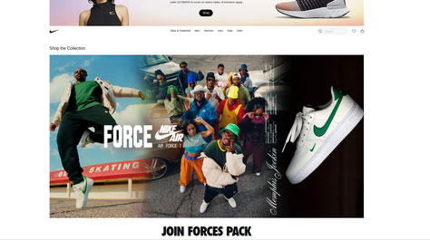
In Figure 7, you can see how Nike’s home page uses hero images to showcase their latest collection of shoes. The user can just click the image to go to the collection. Thus, the image acts as a call to action for Nike customers. You can build an ecommerce UX strategy around hero images and use these visuals as CTAs.
Scannable content enables customers to have a seamless experience with your ecommerce Web site. A simple example would be a carousel on your home page, showing different categories of products and collections. The carousel would let your customers easily access different categories of products on your Web site, without spending time looking for each of them.
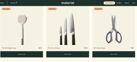
In Figure 8, you can see how Material Kitchen uses a product carousel to show different products on its home page. This improves product visibility, reduces the time it takes to search for products, and makes the content scannable. Similar sliders and carousels can improve product visibility on any ecommerce home page.
Figure 8—Carousel on Material Kitchen
Conclusion
User experience drives businesses worldwide. So, when customers make a purchase on your ecommerce Web site, the site should offer the same high-quality user experience as the product does. To implement an ecommerce UX strategy with the mindset of improving sales, you must consider several factors, including defining design requirements, the optimal placement of CTAs, and the effective categorization of products.
You must also consider the actual costs of designing and developing an ecommerce Web site before devising a UX strategy to ensure a better return on investment (ROI). In this article, I’ve discussed some great ecommerce UX strategies, as well as design tips for implementing them. But which of these tips you should implement depends on your business needs.
Hardik has spent the last ten years helping startups define technology-product roadmaps and building highly scalable, high-performing technology stacks from the ground up to as many 200 million users. He leads large-scale mobility programs, covering platforms, solutions, governance, standardization, and best practices. He earned a Master’s of Science degree from University of Florida. Read More