If you think of yourself as a logical, rational being, you are only half right. Peter confirmed this idea when he purchased a piano just because it looks similar to the one his beloved grandpa had; Janisse, by buying a chocolate bar because of its eye-catching wrapper. Maybe you also know some people whose emotions drive them when they’re making decisions, just as Peter and Janisse were. I’ll bet you’re nodding your head now.
Emotions frequently drive the behavior of human beings, but they’re logical only from time to time. In fact, according to Herbert Simon, the American Nobel Laureate scientist, most people’s day-to-day decisions are not only influenced but entirely determined by their emotions. Is this somehow bad? Not at all!
Champion Advertisement
Continue Reading…
Despite the tremendous impact our emotions have on our decision-making mechanism, there are still two kinds of things going on in the brain—the cognitive and the emotional. The former is always alert, trying to understand the world and weighing all the pros and cons.
But this article focuses on people’s emotional reactions within the digital world, helping designers create better user experiences and form long-lasting bonds with their target audiences. In this article, you’ll learn how to master the design of user experiences that evoke emotions; how certain digital products make users feel; and how to use emotions to drive customers to action. So buckle up, and let’s get going!
First Things First: What Is Emotional Design?
Before going any deeper into this topic, I want to explain what emotional design is. Basically, it’s the concept of creating designs that spark people’s emotions, whether positive or negative. Sounds easy, right?
Eliciting positive emotions is best for building customer loyalty and driving clients to act. But never underrate the impact of negative emotions. They can be helpful, too. Just think of the chilling thrills that horror movies evoke. Negative emotions aren’t inherently bad or useless, especially when it comes to evoking people’s curiosity or grabbing their attention.
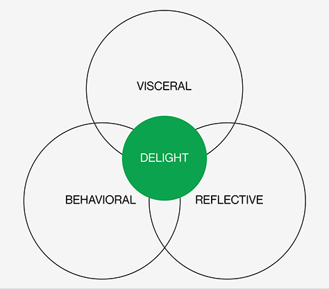
The rule of thumb is: people always think, perceive, and react. So try to address all their cognitive responses when designing something. According to Don Norman, a key researcher of emotional design, there are three such responses:
Visceral—Love at first sight happens at this most basic level of emotional response. If the user’s first encounter with a product is successful, these visceral reactions create a positive context for all subsequent interactions.
Behavioral—This is about how people use something and whether they like it. In terms of design, the behavioral level is responsible for enabling users to evaluate a product’s usability. How easy is it to find the necessary solution? Does the user interface look cluttered or clean? Positive behavioral reactions encourage trust and reliability.
Reflective—This highest cognitive level is responsible for the conscious reactions of users when evaluating the meaning of a product—although their emotions still influence them. Users form their overall impressions at this stage.
Every cognitive level is of high importance. When a design satisfies all three of them, this produces delight and can build a long-lasting emotional connection between the audience and the product—whether it’s an application, a Web site, or anything in between.
Figure 1—Human cognitive responses
How to Nail Emotional Design in UX
Next, let’s consider some of the most popular ways of applying emotional design in creating user experiences and how to address each cognitive level. Ready? Let’s cut to the chase!
A Bit Funny Never Killed Anybody
Humor is king when it comes to tickling users’ fancy and providing a pleasurable user experience. Of course, you shouldn’t add hilarious jokes or witty remarks to all design scenarios—this is all about the smart application of humor. But sometimes even serious Web sites need a bit of wittiness to maintain a perfect balance. When you use humor right, it can be the bait that tempts users, evoking a sense of joy, getting users to perform a desired action, or simply prolonging their session durations.
A Bad Experience—Not Yet a Verdict
Web sites, just like people, can mess up, and that’s okay as long as UX designers can turn a lousy user experience into something more tolerable. The most common example is the dinosaur game that Google Chrome offers to users with a poor Internet connection. What a cool way to spend time waiting for the Internet to get up and running again, huh?
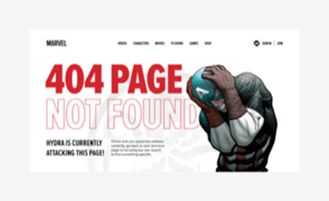
As a UX designer, you’d better consider adding some interactions to a 404 page. It always hurts when there is no such page or a service isn’t functioning. To avoid making users even more depressed when this occurs, turn up your creativity to the fullest. This is a case in which you can apply humor without risking its being inappropriate.
Figure 2—A 404 page
Instead of displaying a tedious ERROR message, offer users a small reward that reduces their tension. This could be a short, yet helpful guide or an ebook on a topic relating to the Web site. The reward could also be a video or voice message wishing the user a good day or a mascot looking confused, but cute, elevating the negative user experience. Let’s look at mascots next.
A Mascot Adds Just a Bit of Cuteness
Why do you need that design if there is no little kitten, hilarious monkey, or awkward who-is-that-guy creature in it? Dunno. This is a rhetorical question.
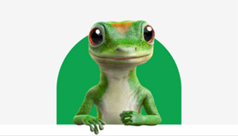
Okay, not every brand needs a mascot. But it’s always good to consider having one to engage users and make their experience funnier, more personal, and more delightful. Mascots aim to build a stronger connection between a client and a product, evoking customers’ empathy for an organization. Think of M&Ds, Michelin Man, Mr. Clean by Procter & Gamble, Julio Pringles, or the Geico Gecko, shown in Figure 3. They aren’t just aesthetically pleasing, but give an organization a signature personality and elicit a positive user reaction.
Figure 3—A mascot
Although introducing a mascot might sound like a fun, safe thing to do, there is one tiny thing to keep in mind: steer clear of any sort of bias when creating a mascot, especially racial or gender stereotypes.
Microinteractions Establish Connections
When working on a design, think about adding microinteractions that delight the user, boost engagement, and add a human touch to the whole experience.
Microinteractions are events relating to one particular task on a Web site or within an application—for example, swipes that eliminate tapping and offer interactivity, animated buttons, unusual tutorials, emojis, or sounds—anything that makes the user experience more personable and welcoming.
We can’t leave this topic without giving some attention to the Apple screen that shakes when the user enters an incorrect password, mimicking the human gesture of rejecting something and building a strong connection with the user.
Designing for Emotion: UkrainianPower Case Study
Let’s continue exploring design and emotions, by focusing on the real-life case study of UkrainianPower—an eight-time, award-winning Web site promoting the Lazarev.Agency, a partnership between Ukrainian creatives and global firms.
After a full-scale Russian invasion of Ukraine, creatives lost many of their local clients as businesses started shutting down and cutting costs. Ukrainian agencies had no other choice but to enter the global market, looking for new customers and more sources of livelihood.
To encourage international companies to partner with Ukrainian creatives, Lazarev.Agency designed their site’s experience to combine emotional storytelling and rational understanding. Want to know exactly how we attained outstanding performance results by evoking the right emotions? Then keep on reading, and we’ll dive deeper into emotional-design strategies by analyzing our UkrainianPower case study.
Storytelling: Telling a Memorable Story
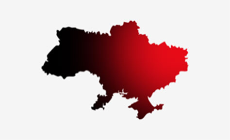
Once upon a time, the nasty, terroristic country Russia, invaded the small, but spectacularly brave country Ukraine, shown in Figure 4. Russia had planned to occupy Ukraine in just three days, but this didn’t happen as expected. The Ukrainian people were ready to defend their land and started fighting—some on the battlefield, others in the rear, supporting the army, refugees, and the country’s economy.
Figure 4—Ukraine
Creatives were ready to do whatever it takes to help Ukraine, donate to the cause, and bring victory day closer. But the Russian invasion made it difficult to benefit financially from the local market. So we created the UkrainianPower Web site with one clear goal in mind: to help Ukrainian creative agencies reach out to new markets and showcase their expertise.
As you can see, a terrible, yet very motivating story about brave people who don’t know how to give up, but are wholly committed to fighting for their country drives the whole idea behind this Web site. The storytelling line moves users throughout the whole Web site, guiding them beyond war anxiety to business stability. The narrative connects with the international community on an emotional level and shapes their minds around partnership.
To create a memorable story for a brand, stick to a few simple rules:
Introduce a conflict. If your story has none, you’re probably not telling a story. There is no need to be over dramatic. Just think about the target audience’s problems and provide a solution.
Structure your story. To create a good structure, let your narrative answer three questions: What? And then what? So what’s the point? The first part should introduce the problem, while the last one brings results and conclusions into the game.
Trigger the right emotional motivations. The most powerful motivations are a desire to succeed, feel secure, and be confident about the future; freely choose how to live; and avoid stress and health problems.
Storytelling is an effective instrument, and our case study proves this. Launching at the end of June 2022, UkrainianPower gained a lot of publicity all over the world, shaking up things at Cannes and being covered by more than ten Ukrainian and international media, including Adweek. Statistics report that the Web site received more than ten thousand visits over one month. It was nominated for highly prestigious awards such as FWA, Awwwards, and RedDot.
Colors and Emotions: How They Relate
When you use colors correctly, they can make people feel happy or sad, anxious or relaxed. These reactions are culturally imprinted and rooted in colors’ psychological effects.
In the UkrainianPower design, we added red accents to text blocks to deliver the emotional drivers behind the Ukrainians' desire to fight for work and survive. The green palette we used at the bottom of the page relieves emotional pressure and highlights the benefits of partnerships between Ukrainian and international agencies.
Figure 5—Color on the UkrainianPower site
Choose your color palette wisely when delivering messages and driving users to take action. For instance, leverage the power of pastel colors such as lilac, mint, or baby blue to calm and relax users. Or go for muted, cool colors to express sadness and grief.
Impressing Users with Details
As Leonardo Da Vinci once said, “Details make perfection, and perfection is not a detail.” Who are we to argue with Leo?
As I mentioned earlier, such small things as swipes or animated buttons can make a difference to your design’s ability to evoke emotions.
Returning to the UkrainianPower case, the details make the user experience more personal and interactive. For example, we added hover effects on the awards blocks to create a playful vibe. The Web site’s interactivity engages people and extends their Web sessions.
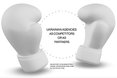
As Figure 6 shows, there are also animated circles with 3D elements. They make people stop and decide whether they want to see Ukrainian agencies as their competitors or equal partners. We added a blur hover effect to show that the pursuit of partnership is the main purpose of this site.
Figure 6—UkrainianPower
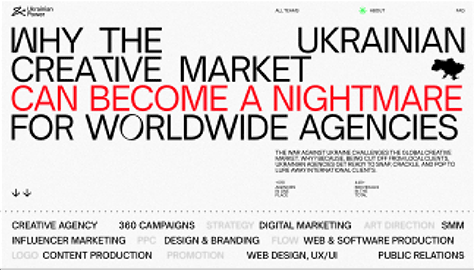
The site’s use of typography is another thing that highlights the emotional stress that the war has caused. The font is rather sharp and straight. Plus, the density of text in the layout is quite high, which demonstrates the tension of the situation. Using a large font size and stretching it to cover the entire site creates the right accents. It looks pretty much like a scream, emphasizing the incredibly unfair situation of the war.
The Lazarev.Agency designers also decided to attract users’ attention to the problem by using an irregular structural layout. The site looks new and unusual, arousing interest and highlighting the issue that the Web site describes.
Speaking of details, we can’t overlook the Web site’s background, which isn’t pure white, but contains some noise. The grainy veil in the background impacts users’ mood, making them focus on the chaos and devastation that the war is causing.
Adding Motion to Elicit Emotion
It is said that “A picture is worth a thousand words,” which resonates with us. However, we’d like to add a small, yet important note to this: you can double the effect of a picture by making it move. In simple words, adding motion to design is a handy way of engaging users and delivering messages more efficiently.
In the UkrainianPower case, we needed an instant attention-grabber that could inform visitors about the situation in Ukraine. We understood that atrocities such as invading another country, killing its civilians, bombing hospitals and schools, and destroying entire cities with relentless bombardments by missiles are difficult concepts for civilized people to comprehend. We’re living in a time when people usually resolve things in a diplomatic way. That’s why we added a powerful video to the site. Instead of telling visitors how horrible the war is and how much grief it’s bringing to peoples’ lives, we showed it.
Figure 7—The message
We also created videos to introduce each of the agencies that we present on the Web site. Instead of telling the world how cool they are, we encouraged these creative teams to tell their own stories in a more dynamic and engaging way through video.
Don’t underestimate the power of motion in your designs. It’s often the best way to tell stories, describe complex concepts, and instantly convey your brand’s message.
Wrapping Up
Phew! What a long, yet informative journey through the world of emotional design. Now let’s summarize: You can address three cognitive levels through emotional design: the visceral, behavioral, and reflective. By putting a premium on each of these, you can add value to a product and create a truly delightful user experience that customers will love.
Remember, emotions certainly matter, but a product’s functionality is important, too. So, before considering the delightfulness of a design, make sure that it solves the users’ painpoints and passes the usability test.
Kyrylo started his business seven years ago and went from working on his notebook computer to a design agency of more than 60 people. His team at Lazarev.Agency has created digital products that are in use at Fortune 500 companies and completed half a dozen projects for the Ukrainian government, creating properties that thousands of Ukrainians use. Kyrylo has managed not only to save the business during the war in Ukraine but has hired more than 20 new employees and earned more than 50 international design awards in one year. Kyrylo has transitioned from being sales rep, art director, and project manager to the CEO of an established design agency. Kyrylo writes articles and case studies, gives lectures, and mentors others. His goal is to help more worldwide businesses grow. Read More