We know that a robust UX design can help a business build a digital platform that efficiently and transparently communicates with its audience and drives results. Right? But the need for good UX design goes beyond companies. Charity foundations need good UX design, too. It’s crucial to convey the essence of their work and earn people’s trust. You can achieve these goals through powerful visual communication and design solutions.
These are the tools that Lazarev.agency utilized when we were working on a volunteer project: a Web-site redesign for one of the biggest nonprofits in Ukraine, Serhiy Prytula Charity Foundation. This nonprofit focuses on collecting donations, strengthening the Defense Forces of Ukraine, and providing aid to civilians.
What challenges did we solve, what approach did our team take, and how did everything turn out? Through this case study, you can discover the outcomes of this project.
Champion Advertisement
Continue Reading…
The Project’s Tasks and Challenges
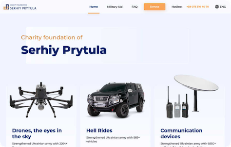
The original version of the Foundation’s Web site, shown in Figure 1, served as a platform where people could donate or request aid by filling out an application form. However, the old site lacked clear information about the Foundation itself, its core activities, and its projects.
Figure 1—Serhiy Prytula Charity Foundation’s original Web site
The Web site’s FAQ section included basic information that was far from enough to cover visitors’ specific questions. So when people faced problems, they usually reached out to the Foundation’s call center or the organization and its founder on social media. As a result, the calls overloaded the hotline.
Overall, the Foundation focuses on two main areas of work: military and humanitarian aid. However, on the original site, the Web pages for each type of aid were in separate domains with completely different visual styles and, thus, they were far from providing a convenient, consistent user experience. As a result, the site’s problems snowballed into one serious problem: despite the Serhiy Prytula Charity Foundation’s impeccable reputation, some people still distrusted the organization and, therefore, donated less.
In redesigning the Foundation’s online presence, Lazarev.agency took on the following tasks:
Design a Web site that would become the hub where people could find all the necessary information about the Foundation and its processes, discover its news, and view detailed reports.
Implement military- and humanitarian-aid sections on a single Web domain.
Enhance users’ interactions with the Foundation’s Web site to encourage people both in Ukraine and abroad to donate.
Now, let’s move on to design research.
Conducting Up-front UX Research
The Lazarev.agency design process is flexible, but UX research is always part of the process that shapes our next steps.
A Usability Audit
On this project, we conducted an analysis of the original Web site to outline a strategy for improving the site’s user experience. For instance, our team discovered that blocks with payment details lacked a clear structure and hierarchy, making it difficult for users to view the information.
Another problem we discovered was that the menu didn’t adapt to various screen sizes, resulting in its blending in with the Web page’s background and degrading the user experience.
Our Redesign
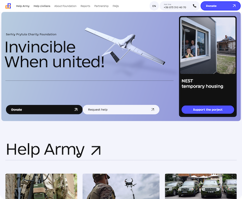
Figures 2 and 3 show the redesigned Web site for the Serhiy Prytula Charity Foundation.
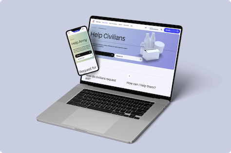
Figure 2—Serhiy Prytula Charity Foundation’s redesigned Web site Figure 3—Serhiy Prytula Charity Foundation’s redesigned Web site
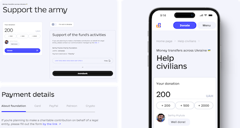
Figure 4 shows the responsive design for the Donations page on the Serhiy Prytula Charity Foundation’s redesigned Web site.
Figure 4—Donations page on the Foundation’s redesigned site
The Lazarev.agency team also dove into Web-site analytics. Plus, we analyzed the Foundation’s social media and the comments people left on its posts. Our analysis helped us discover valuable insights about the problems that users faced when interacting with the site. For example, we learned that people struggled to find the request form for getting aid. We discovered that it was hidden within the Donations page and blended in with the rest of the text.
Plus, our team got in touch with the Foundations’ call center to learn firsthand what questions people ask most often. We added these questions and their answers to the site’s new and improved FAQ section.
Competitive Analysis
The work of the Serhiy Prytula Charity Foundation is unique. Because the Foundation provides military aid, there aren’t many similar organizations. The Foundation’s main competitors are other Ukrainian foundations: Come Back Alive and United24. But, to reveal more in-depth insights, we also covered some indirect competitors such as KOLO, Volonterska, and Donor.ua.
Our competitive analysis helped us outline how to enhance the Foundation’s transparency and detailed reporting to gain users’ trust. Having gathered data and valuable insights, we mapped our hypotheses, then validated them with people.
Surveys and User Interviews
Utilizing surveys and in-depth user interviews, we engaged with military personnel, volunteers, businesses that are interested in partnering with the Foundation, and Ukrainians who donate.
Our goals were to understand how each segment of the Foundation’s audience interacts with charity foundations and discover its problems, needs, and behavior patterns. For instance, we learned that volunteers found it difficult and time consuming to fill out aid applications. To streamline the whole application flow, we added the request forms shown in Figure 5, as well as a guide that walks people through the Foundation’s main areas of work, describes the help they provide, and explains how to get help.
Figure 5—Redesigned applications for humanitarian and military aid
“With the military, we used various methods of communication to make it convenient for everyone. We asked those who couldn’t participate in the interview to fill out a survey. Also, one of the challenges of this project was that we were dealing with military information and, therefore, some data remained confidential.”—Volodymyr Khliupin, Head of User Experience
Our design team turned all this information into ideas about how to make users’ interactions with the Foundation as simple as possible and encourage more donations.
Let’s see how we implemented these ideas in our design solution.
Building the User Experience
First and foremost, the brand-new Web site is now a platform that unites the Foundation’s two core areas of work: military aid and humanitarian aid.
The home page welcomes users with a 3D model of a drone, for which people donated funds, and bold call-to-action (CTA) buttons that let visitors donate, apply for aid, or support the organization’s ongoing charity projects.
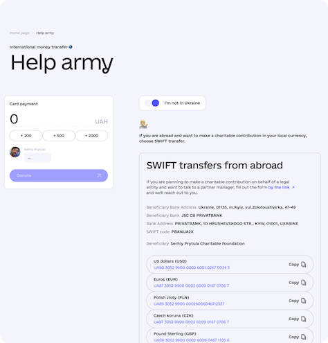
Devising a New and Improved Way to Donate
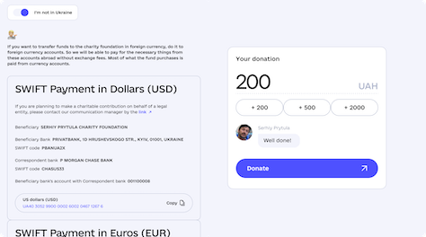
One challenge the Foundations’ team had with the design of the previous version of the Web site was that people struggled to find payment details when donating in currencies such as USD or EUR. Therefore, supporters living abroad often made contributions to Ukrainian hryvnia cards, so the Foundation lost part of each donation to the currency conversion. Our solution was to design a switch that lets users transfer money to the fund’s international bank accounts.
Figure 6 shows the star of the Donations Web page: the interactive donations widget, which lets users switch between Ukrainian and international bank accounts. We designed the widget to streamline the payment process and encourage people to support the Foundation’s charity initiatives. What’s so special about it? The widget responds with phrases from the Foundation’s founder, Serhiy Prytula, every time a user enters any sum of money in the donation field.
Figure 6—The interactive donations widget
This solution proved to be efficient and effective. At the end of February, we launched the Web site, and two weeks later, the Foundation’s team started getting more donations via the widget than through bank transfers. Here are some early results: the average engagement time has increased from 14 seconds in January and February to 26 seconds in March and April. Also, because of the gamification of the Donation page, the average interaction time nearly doubled, increasing from 10 seconds to 18 seconds. Plus, the drop-off rate has decreased by 18%.
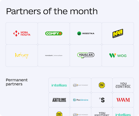
Revamping the Partnership Page to Amplify the Foundation’s Support
We updated the Partnership page design to encourage businesses to collaborate with the Foundation and support its charity projects. Both companies and individuals can now easily discover the types of partnerships that are available within the organization, ways to start collaborating, and the materials they need.
Figure 7—Design for the Partnership page
Leveraging a Comprehensive Knowledge Base
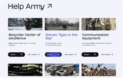
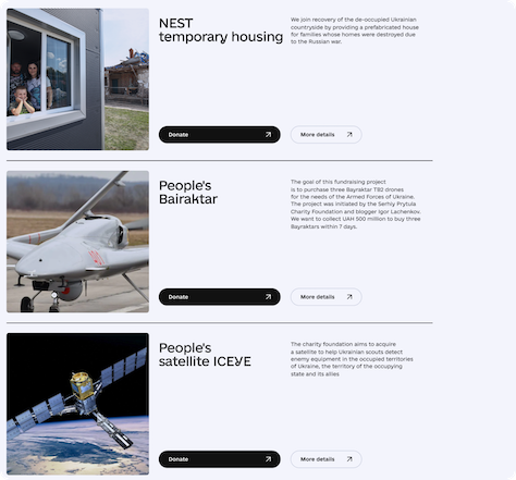
One of the core goals of this project was to make the Web site a transparent information hub. Now, users can learn all about the Foundation’s work processes and projects, both ongoing and archived, and view detailed reporting about them. Figure 8 shows some of the projects to which people can donate.
Figure 8—Design for the Projects page
“When working on this project, our team aimed to deliver a brand-new Web-site design that would make every single touchpoint with users an efficient, clear, and transparent experience.”—Oleksandr Holovko, UX Designer
Delivering the News
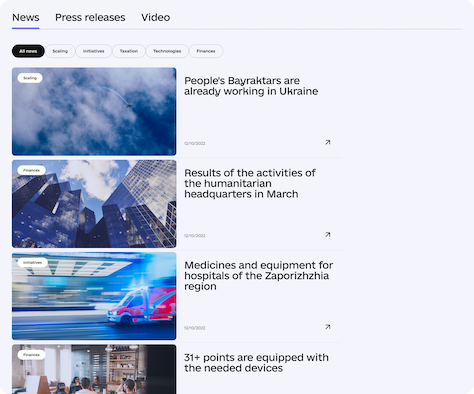
Working with the Foundation’s team, we decided to add a News section, with press releases and updates, as shown in Figure 9. This helps inform people about the organization’s activities and maintains the transparency of the Foundation’s work.
Figure 9—Design for the News section
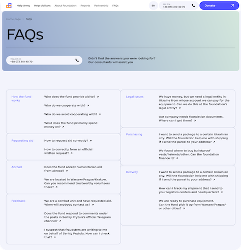
Providing FAQs
As I’ve already mentioned, visitors of the Foundation’s Web site have many questions, so to ensure that they can find the answers, our team designed a digital library in which people can look for information. Also, as shown in Figure 10, our team created a Web page for each question, on which users can find related topics and contact information if they need more details.
Figure 10—Design for the FAQs section
What About the UI?
We based our approach to visual Web-site design on accessibility and simplicity. This requires that the content must balance being structured, readable, and visually satisfying. Also, it was vital to ensure that the Web site loads as fast as possible over Internet connections of differing levels of quality, on any device. This is crucial because many of the people who need to contact the Foundation are military personnel or volunteers who may be in areas with poor connectivity.
So we included only the necessary content rather than lots of rich images, animations, and other elements that could overload the Web site. However, this doesn’t mean we added none. As shown in Figure 11, our team designed customized 3D models for Web-site sections such as military and humanitarian aid, partnerships, and reporting.
Figure 11—3D model for the Web site
“When working on the 3D models, we aimed to enhance the Web site’s aesthetics without overwhelming it.”—Anna Demianenko, Lead Product Designer
Creating a Grid Layout
Last, but not least, we designed and built the Web site’s grid layout, which can comprise three or four columns. The Donations page shown in Figure 12 uses this grid layout. Therefore, visitors see a module with a call to donate right from the first screen that accompanies them throughout the Web site. Such a solution helps boost conversions—in our case, donations.
Figure 12—Design for the Donations page, which employs a grid layout
Once the design was ready, we passed the baton to our partners—the development team Brights.
“Every task that we perform at the Foundation, from purchasing armored vehicles to posting on social media, is aimed at helping the Defense Forces of Ukraine, as well as civilians in the deoccupied and front-line territories. For this, it’s necessary to maintain the level of trust in the organization, accumulate donations, and attract partners.”
The Web site should enable the Serhiy Prytula Charity Foundation to accomplish all these goals.
The Lazarev.agency and Brights teams have done a tremendous job of analyzing the Foundation’s specific challenges and developing solutions that help them to report to donors and fund raise for their next purchases.
“We’re grateful to both companies for their work on the updated Web site of the Serhiy Prytula Foundation. And an additional thank you for doing it pro bono. This helped us save a significant portion of the fund’s separate operating budget.”—Anna Hvozdiar, Director of the Serhiy Prytula Charity Foundation
The Story Continues…
Working on this Lazarev.agency project was a fascinating, meaningful, and challenging journey. We needed to consider a lot of variables to design and deliver the new Web-site design for the Serhiy Prytula Charity Foundation and create a transparent platform that communicates simplicity and the Foundation’s readiness to help those who are in need during such a difficult time.
Kyrylo started his business seven years ago and went from working on his notebook computer to a design agency of more than 60 people. His team at Lazarev.Agency has created digital products that are in use at Fortune 500 companies and completed half a dozen projects for the Ukrainian government, creating properties that thousands of Ukrainians use. Kyrylo has managed not only to save the business during the war in Ukraine but has hired more than 20 new employees and earned more than 50 international design awards in one year. Kyrylo has transitioned from being sales rep, art director, and project manager to the CEO of an established design agency. Kyrylo writes articles and case studies, gives lectures, and mentors others. His goal is to help more worldwide businesses grow. Read More