In Part 1 of this series, “Measuring the ROI for UX in an Enterprise Organization,” JD and her colleagues discussed their enterprise UX team’s journey in developing a UX-measurement plan. Their objective for this plan was to identify a measurable connection between user-centered design (UCD) efforts and company performance metrics.
Now, in Part 2 of this story, we’ll discuss how two enterprises in vastly different industries—a Fortune-500 human capital–management (HCM) company and a healthcare-technology company—have modeled the impact of employing a user-centered design process on financial metrics. We’ll also suggest some key questions to consider as you embark upon your own UX-measurement initiative at your organization.
Champion Advertisement
Continue Reading…
How Does Usability Impact Business Metrics?
When people talk about the return on investment (ROI) of user-experience efforts, the question they usually want to answer is: How much does design impact the bottom line? While it is possible to answer this question by calculating a detailed financial ROI, we’ve discovered a simpler, but equally revealing approach. Understanding how users perceive your product and how their perceptions of its usability influence their actions can be easier to calculate than ROI and more valuable in helping a company to make future business decisions.
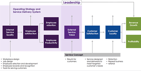
Models of how a company’s actions impact business metrics have been around for more than 25 years. The most popular of these is the Service-Profit Chain, which Len Schlesinger and his colleagues published in 1994. This model, shown in Figure 1, demonstrates how various key factors of a business influence other factors. Over 518 different studies have validated the statistical relationships that the Service-Profit Chain describes. As UX professionals, we focus primarily on the External Service Value block in the model, of which usability is a part.
Figure 1—The Service-Profit Chain
The foundation of user-centered design is the premise that delivering a high-quality, usable, satisfying user experience—whether a software or service experience—has a significant impact on a company’s key performance metrics.
While most UX professionals agree with this assertion, very few companies have been able to demonstrate a statistically significant correlation between their products’ usability and the company’s performance.
We’ve reproduced and verified this Service-Profit Chain model using statistical models at each of our companies. Although we’ve approached our research design in slightly different ways, we’ve found overall statistical support for this model at both companies. We believe this model can provide value to other companies as well, as they strategize on how best to demonstrate that UX teams and a user-centered design process can positively influence a company's bottom line.
Measuring the Value of a UCD Process for an HCM and Payroll Company
In Part 1 of this series, JD and her team discussed their UX-measurement initiative for their human capital–management (HCM) company’s enterprise payroll-compliance application, which meant first identifying users’ highest-priority tasks. The team then established a baseline for the current user experience by benchmarking at regular intervals, measuring differences in users’ attitudes, behaviors, and processes, while attempting to accomplish those key tasks.
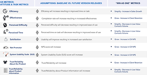
Collecting several measurable metrics—both after each task and at the end of every benchmark study—has yielded informative insights over the course of several studies. Figure 2 depicts a sample of the metrics the team employed in this multimetric approach, which has allowed them to examine both task-level and overall metrics and gauge the impact of subsequent design iterations and releases on the user experience.
A common question JD has heard when presenting this approach—both internally to her organization and externally—is: Why collect so many UX metrics? Shouldn’t one or two be enough? We’ve come to think of these efforts to measure our software user experience as similar to measuring a virtual experience economy. Much like those economic indicators, our indices of UX metrics can sometimes be leading, lagging, or coincident indicators of the users’ experience, as follows:
leading UX metrics—Metrics such as success / failure or task ease / perceived difficulty can be early indicators. For example, they might provide a sense of how and why specific features do not provide the intended improvement in supporting users’ most important tasks.
lagging indicators—Metrics such as Net Promoter Score (NPS), overall satisfaction, System Usability Scale (SUS), and Standardized User Experience Percentile Rank Questionnaire (SUPR-Q), which includes trust and credibility, may help us to better understand users’ sense of increasing value or frustration with the user experience over time.
coincident indicators—Metrics such as task satisfaction and time on task provide immediate measures of our users’ actual versus perceived experience.
In the same way as for measuring economic indicators, by compiling several UX metrics into indices, we can minimize some of the volatility and confusion that are associated with individual indicators and provide a more reliable measure.
Initially, we had hypothesized that measurable connections between the UX teams’ efforts and the company’s key performance indicators (KPIs) would reflect correlations in similar UX metrics. We assumed that standard UX metrics such as improvements in task time and satisfaction would have the greatest influence on customer KPIs such as NPS, as well as on customer-support contacts. However, while improvements in the users’ experience do seem to impact the company’s performance metrics, JD’s team discovered that the connection is more complex than they had originally anticipated.
While running a series of statistical analyses—including linear regression, logistic regression, and analysis of variance—to uncover significant correlations between numerous metrics, a surprising model emerged. What did it reveal? There is a measurable correlation between a high-quality user experience and customer referrals. The team was excited to discover that task-level metrics such as task success and task ease had the strongest correlation to UX metrics such as SUS and overall satisfaction, as well as to the product’s NPS.
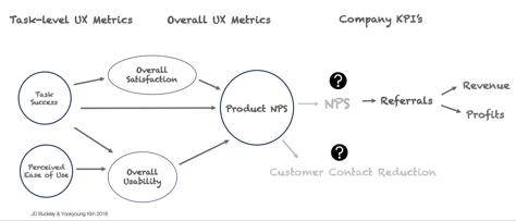
As the team continued to search the data for statistically significant connections between task-level and overall UX metrics and company KPIs, across several comparison studies, they started to think of these connections in terms of the model shown in Figure 3.
Figure 3—A proposed model, correlating UX metrics to company KPIs
To summarize, new releases of the user experience first had to better support users’ ability to complete their top tasks successfully, end to end. Second, if those top tasks felt easier to complete, users were more likely to rate the experience as more satisfying and learnable. Finally, if an experience met these first two conditions, users were more likely to give the product a higher NPS rating.
Research suggests a strong relationship between NPS, revenue, and profits. However, service quality can dramatically impact NPS scores—especially at enterprise organizations where the quality of customer service can play a significant role in the end-to-end user experience. While the UX team has discovered a statistically significant correlation between the task user experience and the NPS for the post-task product experience, it will be necessary to conduct additional research to validate suggested correlations between the NPS for the user experience and that for the company—and, in turn, revenue and profits.
Modeling the Relationship Between User Surveys and Business Metrics at athenahealth
At athenahealth, beginning in January 2016, Aaron’s team conducted monthly perception surveys with users. Having completed more than 50,000 surveys over a two-year period, they combined their data with business metrics and established a clear, statistically significant, positive relationship between users’ perceptions of usability and two business metrics: retention and referrals.
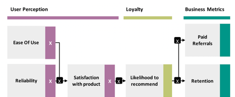
The basic model focused on the same areas as the Service-Profit Chain. The goal is to see whether certain product characteristics such as ease of use can impact the business. However, as shown in the Service-Profit Chain, this is not a direct relationship. The product has many aspects, all of which together create the users’ perception of the product.
The team asked questions about both the ease of use and reliability of the product. The users comment on both of these frequently, so the team hypothesized that these were drivers of users’ overall satisfaction with the product. The statistical model supported this—that is, users’ perceptions of individual aspects of the product—such as ease of use and reliability—in combination predict their overall satisfaction with the product.
The team validated this model statistically, using several regression models—such as multiple linear regression and logistic regression—in combination with mediation analysis. The results of using all of these models were statistically significant, with p<.000001—in part because of the large size of the base datasets. In the model shown in Figure 4, specific numbers from their analyses—including correlation coefficients, R squared, and odds ratios— have been replaced with an X.
Figure 4—athenahealth’s model correlates UX metrics to company KPIs
To be able to see the relationship between user experience and attrition versus retention, it is critical to reduce the amount of noise by modeling multiple steps. For example, individual users’ ratings of ease of use would not directly predict referrals in a statistical model because there is so much more that goes into someone’s decision to make a referral than just ease of use. Thus, breaking the model into multiple steps helps isolate and remove some of the noise arising from all the other factors that the model doesn’t include—for example, customer support.
athenahealth has used this foundational model to help support strategic decision-making regarding user experience—for example, to prioritize where the company should invest more effort, to validate related metrics, and to understand what users perceive as the company’s biggest opportunities.
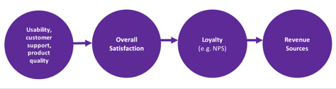
Adapting This Model to Your Business
Many other companies could adapt the model that we’ve described in this article to their own needs—perhaps by generalizing it slightly or by simplifying it. Our four-step model, which we’re calling the UX-Revenue Chain, and is shown in Figure 5, breaks down the way users think about and make decisions into measurements of four key areas, allowing you to use statistical modeling to explain how user experience impacts business metrics.
Figure 5—Our UX-Revenue Chain model
Both of the enterprise companies for which we work have found the insights that have surfaced encouraging—not only for our respective UX teams but also for the potential strategic opportunities it has revealed across the entire organization. We’ve derived this model from our collective discoveries. It has inspired discussions across organizational silos, regarding the importance of establishing who a product’s primary users are—as well as their top tasks and workflows—as an essential design and business-strategy approach.
Given both the benefits and challenges inherent in developing a UX-measurement initiative and achieving the expected results, it is important to answer a few initial questions before attempting to employ this approach. The answers to the following questions can help you to determine whether your enterprise—or even a consumer organization—is ready to undertake this kind of initiative:
What is your organization’s level of UX maturity? What is its data maturity?
Does your executive leadership support a UX-measurement initiative? How strong is that support?
Keeping in mind the longitudinal nature of this research, is your executive leadership willing to provide the time and budget for tools and resources to support this kind of strategic initiative?
Does your UX team currently have the skills, tools, and resources for this kind of endeavor?
Does your UX team have access to reliable past and current, raw, KPI data to support analysis?
Does leadership understand how to best utilize the insights from this kind of model in support of strategic decision-making?
What is the best approach for communicating results across your organization to support actionable implementation and strategic execution?
While considering some of these questions before you even embark upon your UX-measurement journey can seem overwhelming, it is essential that you gain alignment and support—both early and at regular intervals—to ensure the ongoing success of the effort.
One final note: Jeff Sauro, founding principal of the quantitative research firm MeasuringU states:
“Making a case for ROI is a good thing to help justify methods that should help the user and ultimately the organization’s bottom line. But don’t overstate or oversell your case. Understand the limits of your data. Both the metrics and methods affect the strength of your case for a return on investment.”
References
Derfuss, Klaus, Jens Hogreve, Anja Iseke, and Tonnjes Eller, “The Service-Profit Chain: A Meta-Analytic Test of a Comprehensive Theoretical Framework.” Journal of Marketing, May 2017.
Heskett, James L., Thomas O. Jones, Gary W. Loveman, W. Earl Sasser, Jr., and Leonard A. Schlesinger. “Putting the Service-Profit Chain to Work.” July-August 2008. Retrieved December 28, 2018.
Principal, UX Strategy & Research at ADP Innovation Center
Adjunct Assistant Professor at Art Center College of Design
Pasadena, California, USA
For more than 15 years, JD has successfully led the introduction of user-centered research initiatives for a variety of entertainment, automotive, and medical products, working for both disruptive startups and enterprise organizations, including Yahoo, Disney, Idealab, DirecTV, Kelley Blue Book, Kaiser Permanente, and Daqri. She is a passionate advocate of collaborative, cross-functional design, multimethod user research, and data triangulation. Her work inspires and informs innovative solutions. Read More
Senior Manager, Experience Measurement at athenahealth
Watertown, Massachusetts, USA
At athenahealth, Aaron’s Experience Measurement team is using data science and statistical analysis to support hundreds of user-research projects each year, delivering higher-quality findings about users and helping their agile UX design team to move more quickly. Aaron has previously worked at companies such as MathWorks and iRobot. Before he decided to specialize in quantitative UX work, he was a UX generalist for many years. Read More