Committing to Web accessibility can shift the outlook of your entire business. When you design your Web site while keeping accessibility in mind, you not only benefit users with disabilities but also help in building a better experience for all your users and consequently improving brand perception.
So, if you want to develop a new Web site for your business, you must build a team that is proficient in making Web sites that are fully accessible for all users. In this article, I’ll describe accessible design elements and how to incorporate them into your Web site to make it easily accessible to all.
Champion Advertisement
Continue Reading…
What Is an Accessible Web Site?
To build an accessible Web site, you must rely on certain design principles and features that make using the Web site convenient for all visitors, regardless of any disabilities, impairments, or limitations. In simple terms, the more accessible your Web site is, the more usable it is for everyone. Accessibility is fundamentally a feature of a Web site that supports usability.
To make your Web site accessible, it should abide by all accessibility standards. The Web Accessibility Initiative (WIP) of the World Wide Web Consortium (W3C) governs all of these standards. The members of this initiative provide the Web Content Accessibility Guidelines (WCAG) documentation. Your business or organization should observe these guidelines throughout its Web-development process.
The main accessibility traits that these standards help you to implement include the following:
perceivable—Enables users to easily recognize content and user-interface (UI) components.
operable—Lets users employ various user-interface (UI) components and navigation systems.
understandable—Helps users to understand UI operations.
robust—Allows users to interpret various UI components reliably, using assistive technologies.
Implementing accessibility best practices ensures that your Web site is accessible and provides a better user experience for all your customers. Plus, these Web accessibility traits explicitly observe the desideratum of different users’ disabilities, including visual, auditory, speech, cognitive, neurological, and physical disabilities, ensuring that they can access your Web site with ease.
Why Should Making Your Site Accessible Be a Priority?
A Web site offers a big opportunity for companies and organizations to show off their branding. Web sites can use different layouts, user interfaces, colors, and text formatting, as well as different navigation and menu systems to attract visitors. A Web site’s various workflows provide good reasons for branding.
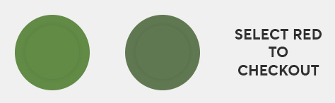
But let’s consider this from the user’s point of view. Suppose you’ve built a Web site that requires the user to click a red button to check out, as in Figure 1.
Figure 1—What a user with red/green color blindness would see
Do you find this difficult? This is what a user with color-deficient vision would see when visiting the Web site. Statistically, there are around 300 million people with color-deficient vision in the world—a number that is equivalent to the total population of the USA!
Color blindness is just one type of disability among many. According to estimates, one in five people in the world has some form of disability. Plus, visitors who find it difficult to access your Web site inevitably increase your bounce rates and indirectly affect your business’s return on investment (ROI). Do you know what the average lifespan of a Web site is? According to research, a Web site’s average lifespan is just two years and seven months. If you think your Web site design has become obsolete and may be negatively impacting your business’s ROI, you should redesign your Web site to attract more customers and improve its ROI.
Plus, many Web sites have received demand letters or had lawsuits filed against them because of their Web site’s lack of accessibility. To avoid these negative consequences, companies and organizations must abide by regulations and policies governing Web site accessibility under Title III of the ADA. This act strictly prohibits public Web sites from discriminating against people with disabilities.
In February 2022, 96.8% of home pages experienced accessibility failures, according to the Web Content Accessibility Guidelines (WCAG2)!
For any Web site, usability and accessibility go hand in hand. They both have the same goal: making a Web site easy to use. This is not just about disabled users being able to access your Web site. It’s about everyone being able to access your Web site.
Moreover, from an ethical perspective, all human beings deserve equal access to all the information and resources that are available on the Internet.
How Can You Design an Accessible Web Site?
Every Web site has distinct components that are responsible for factors such as approachability, appearance, and most importantly, usability. There are two aspects to designing an accessible Web site:
Appearance—How the Web site looks and how users with disabilities can perceive and read it properly.
Usability—How the Web site has been developed, enabling any user with disabilities to use it.
Let’s consider seven accessibility best practices that cover both of these aspects of designing an accessible Web site.
1. Color Contrast and Font Size
Some elderly users and users with low vision or cognitive and learning disabilities are more dependent on your site having a clear layout and design. It can be difficult for them to visualize and perceive a Web site’s design elements and fonts. According to the WebAIM accessibility evaluation in February 2022, this is the most common error that developers of Web sites make. In evaluating Web site’s home pages, they discovered that 83.9% made this error.
To improve the accessibility of your Web site and make it convenient for disabled users, without compromising your site’s design, ensure that you observe the following guidelines.
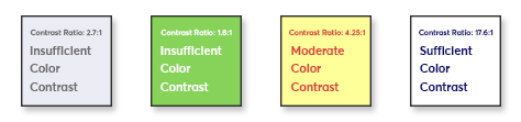
Provide sufficient contrast between foreground and background.
Ideally, you should maintain a contrast ratio of at least 4.5:1 to ensure the clear visual representation of text and images, as demonstrated in Figure 2.
Figure 2—Levels of value contrast
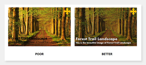
Use solid backgrounds.
It is difficult to read text that has a busy background, as shown in Figure 3, especially when it does not have sufficient contrast. Selecting a solid background color can make reading more convenient.
Figure 3—Busy backgrounds that make text difficult to read
Use text or other visual cues as well as colors.
Ensure that the information you convey through the use of color is also communicated through text. Users who are unable to visualize colors can look, listen, or even touch text cues, as Figure 4 demonstrates.
Figure 4—Communicating through color and other visual cues
Avoid using font styles to convey meaning.
Some particular styles are considered inaccessible. Here are some important issues to remember when choosing typefaces:
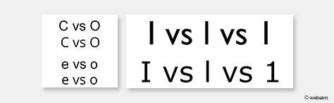
character ambiguity—Avoid typefaces whose characters are too similar to one another. This can cause ambiguity in character recognition, decreasing the understandability of your text, as Figure 5 shows.
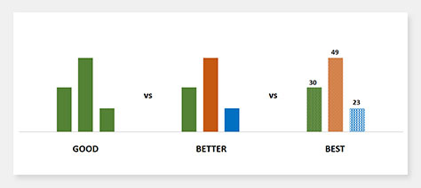
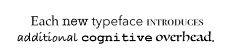
too many text styles—Limit the number of typefaces, fonts, and font variations that you use in your text. Too many changes in font styles require cognitive effort to process. Figure 6 shows an extreme example.
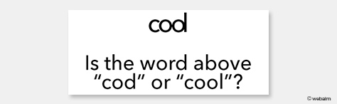
inconsistent character spacing and font weight—Characters that are very close to one another and, thus, too dense can negatively affect their perceivability and readability, which can confuse users.
An alt tag explains what an image is about. Without an alt tag, many screen readers just read the image’s file name. For example, if your media file’s name were AB654321.jpg, the screen reader would just read “A B 6 5 4 3 2 1 dot j p g.” This text does not provide any useful information about the image to users who are accessing it through a screen reader. When adding an image to an HTML file, you could easily specify alt text for the image by adding [ALT="value goes here"]
within the <img> tag. Figure 8 and the subsequent sample code provide an appetizing example. Figure 8—Defining alt text
An okay example:
<img src="brownies.jpg" alt="brownie"/>
A better example:
<img src="brownies.jpg" alt="Chocolate brownie with strawberries on the side"/>
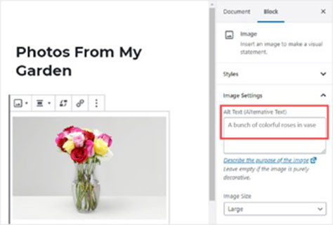
Modern content-management systems (CMSs) such as WordPress and others let you define alt text using their visual tools, so do not require you to add any HTML code. Figure 9 shows an example of such as CMS.
Figure 9—Using a CMS to define alt text
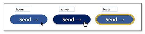
3. Designing Focus States
Focus states let disabled people who can use a keyboard navigate a Web site using the Tab key. The appearance of a link selected by using the Tab key lets the user know exactly where he is on the Web site.
Sometimes designers neglect to specify the focus state when designing a site because people who use a mouse or touch pad for navigation rarely use focus. However, it is important to implement focus to make a Web site accessible to keyboard-only users.
Using CSS, HTML, and XHTML, you can easily change the presentation of links and other interactive elements by using focus to highlight them. For example, you might use the CSS shown in the following sample code to implement focus, as shown in Figure 10.
<style>
button:hover { background-color:lightblue; }
button:active { background-color: #070ae6; }
button:focus { border-color: yellow; }
</style>
Figure 10—Implementation of focus
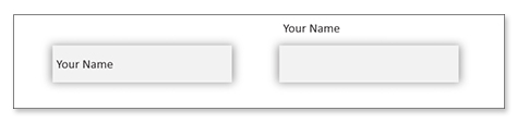
4. Labeling Fields
There is a huge difference between a label and placeholder text. Some UX designers use placeholder text inside form fields to make the design of a form more minimalistic. But people who use screen readers to read Web sites won’t know the purpose of such a form field because screen readers don’t read placeholder text.
Because Web site readers can read only the form labels, they are very important for people who can’t otherwise see or hear what field they are on. To add a label instead, replace this code:
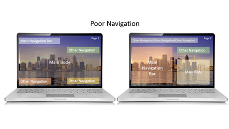
Web-site navigation is an important aspect of Web development because the navigation system portrays the overall user experience of the Web site. A Web-site developer should be sure to develop a Web site using correct markup that determines how the Web site can guide the user to a better user experience. This requires that repeated navigation components be in the same relative order each time they appear on a Web site to prevent users from becoming distracted by inconsistencies in the appearance and behavior of the site, as on the site shown in Figure 12.
Figure 12—Poor navigation
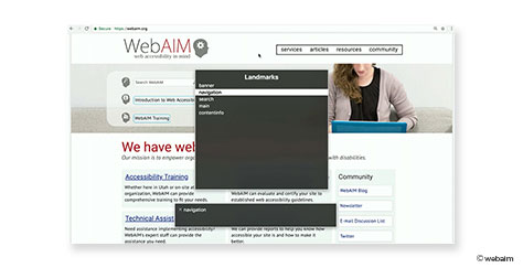
6. Creating Landmarks
Some elements or distinct groupings of information function as hotspots, or landmarks, on Web pages. Anyone using a screen reader can jump to these elements to navigate a Web page. Such landmarks make it easier to scan and understand the structure of a page through the styling of headings. Reducing clutter and using whitespace and proximity can make the relationships between blocks of content more apparent. Some important landmarks include the following HTML elements:
<h1> … <h6>
<main>
<nav>
<footer>
As Figure 13 shows, the use of landmarks is beneficial when a Web page is full of links and anchors. Otherwise, moving around on a page requires tabbing. A Web page should instead use these key elements to facilitate navigation because it is convenient for screen readers to locate them. Therefore, it is important to consider the role of every header between <h1> to <h6>.
Sometimes Web developers face a situation in which there is no existing element for what they are trying to build—such as a tab element or an expandable tree widget in HTML. This requires that they build custom controls. This is the sort of scenario in which ARIA (Accessible Rich Internet Applications) comes into play.
ARIA allows you to add semantics to a control, actually changing what a screen reader announces to users. Understand that ARIA does not add completely new behavior, but it does let you fill in the missing pieces to build an accessibility tree. Let’s look at an example in which ARIA makes a difference to Web site accessibility:
<div id="myCheckbox" class="checkbox" tabindex="0"> checked role = "checkbox" aria-checked="true"> </div>
<script>...</script>
</body>
The following HTML code implements a check-box behavior that a screen reader can read as “group”.
<head>...</head>
<body>
<div id="myCheckbox" class="checkbox" tabindex="0"> checked role = "checkbox" aria-checked="true"> </div>
<script>...</script>
</body>
Adding this attribute enables the screen reader to read “checked checkbox”. This makes a huge difference for users who are relying on the use of a screen reader.
All of these modifications lead to one key outcome: Web-site accessibility.
Tools for Checking Your Site’s Accessibility
Since Web-site accessibility is a subset of Web-site usability, it is important to check whether your Web site meets all of these standards. Let’s look at some tools that you can use to check the accessibility of your Web site thoroughly and make sure that everyone can enjoy your content.
WAVE: Web Accessibility Evaluation Tool
WAVE, which originally launched in 2001, is a free community service from WebAIM that is shown in Figure 14. It strictly follows Web Content Accessibility Guidelines (WCAG) to check Web accessibility and identify any errors that are hindering a site’s accessibility for disabled users.
If you are looking for a tool that is handy for checking password-protected, locally hosted, or highly dynamic page testing, you can directly check your Web site in your Web browser—Chrome, Firefox, or Edge.
Figure 14—WAVE
Pa11y
Pa11y is a developer-focused accessibility-testing resource and is shown in Figure 15. It provides several tools that handle accessibility testing for your Web site, including a command-line user interface, a test for multiple URLs, and a smart dashboard. This tool requires a developer to set it up, but even if you are not a developer, it provides a useful alternative. Koa11y is a desktop app that runs the pa11y command-line interface under the hood. It is available for macOS, Windows, and Linux.
Figure 15—Pa11y
Axe
Axe is a developer-focused tool that is shown in Figure 16, with an extension that you can add to the developer tools in your browser. Being an integral part of Deque Systems Inc., axe Devtools is one of the most powerful, accurate accessibility toolkits and claims to let you achieve at least 80% coverage of issues during Web development.
Figure 16—Axe
Other Accessibility Tools
Additional tools that facilitate Web-site accessibility for particular disabilities include the following:
Funkify—Addresses vision impairments, trembling, dyslexia, hyperactivity, and keyboard-only control.
To make your Web site accessible for all of your users, it is critical that you be aware that some users operate a variety of supplementary devices or tools such as screen magnifiers or screen readers to access your Web site. Understanding how these tools work makes accessible Web-site development much easier.
Wrapping Up
From choosing accessible font styles to making navigation easy for everyone, there is a lot to consider in building a Web site that is accessible to all. Get started now to ensure that your Web site is accessibility compliant and mitigate your organization’s risk of being hit with a lawsuit.
Manager of Digital Marketing at Ace Infoway Pvt. Ltd.
Ahmedabad, Gujarat, India
At Ace Infoway Pvt. Ltd., a leading Web and mobile-app development company with offices in Los Angeles and India, Rajat is a full-stack marketer whose focus is UX design, conversion optimization, and disciplined creativity, while implementing growth strategies to attain our organizational goals. Read More