Top

Design Patterns for Mobile Faceted Search: Part II

Search Matters

Creating the ultimate finding experience

A column by Greg Nudelman
May 3, 2010

In Part I of “Design Patterns for Mobile Faceted Search,” I looked at the challenges and opportunities of mobile faceted search. To address the well-known challenge of limited screen real estate on mobile devices, I covered the Four Corners, Modal Overlay, Watermark, and Full-Page Refinement Options design patterns, which maximize the real estate available for search results on a mobile device. This month’s column covers strategies for making people more aware of the filtering options that are available to them, as well as methods of improving transitions between the various states a user encounters in a search user interface.

Champion Advertisement
Continue Reading…

Teaser Mobile Design Pattern

Teasers are nothing new on mobile phones. Most mobile user interfaces implement this pattern in some manner or another. Consider, for example, the Yelp iPhone application, shown in Figure 1.

Figure 1—Teaser design pattern in Yelp’s mobile app
Teaser design pattern in Yelp’s mobile app

Yelp displays five complete search results, plus a teaser at the bottom of the page that shows a partial view of the next result set. The Teaser design pattern is very useful in showing that there are more search results below the fold. As I mentioned in a previous column, “Choosing the Right Search Results Page Layout: Make the Most of Your Width,” my usability testing has shown that Amazon is an absolute master of this pattern. Regardless of a screen’s resolution, they always display partial product descriptions and pictures just above the fold. Showing part of what is at the fold is a very effective means of inviting visitors to scroll down and see more content.

Recently, when Microsoft came out with Windows 7 Mobile, they extended the Teaser pattern well beyond just showing the availability of search results below the fold. In Figure 2, an excellent video from Luke Wroblewski’s blog entry “Windows Phone: User Interface Teases & Transitions” effectively demonstrates this concept. As you can see, Windows 7 Mobile shows there is more content available on the left, right, above, and below what’s currently visible on the screen.

Figure 2—Teasers and transitions in Windows 7 Mobile (Compiled by Luke Wroblewski)

In its implementation of the Teaser pattern, Windows 7 Mobile uses lots of very obvious cues, including screen titles that are cut off in midword, partially visible screen widgets, image fragments, and abundant use of animated transitions.

A teaser is a specific application of the more general design principle: fixing imperfection, in which a design immediately engages people by having them fix something that is intentionally not quite right with a user interface or object. In the process of fixing an imperfection, people learn the user interface’s interaction model. Studies have shown that this process of fixing imperfection, or seeking symmetry, is very natural to humans and quite immersive, even to the point of alleviating anxiety and pain in burn trauma.

The problem some may see with the Windows 7 Mobile design is that people cannot win at this particular game of fixing imperfection. There is absolutely no way to fix the user interface to simultaneously show all of a title, widget, or image that exceeds the size of the screen. It’s kind of like a blanket that is intentionally made too small: if you cover your legs, your chest is exposed; pull the blanket up to your chin and your legs get cold. As UX designers, we often seek a kind of minimalistic, authentic beauty and symmetry in our designs, so some designers might find this kind of user interface profoundly disturbing. However, one cannot argue against the effectiveness of this design approach.

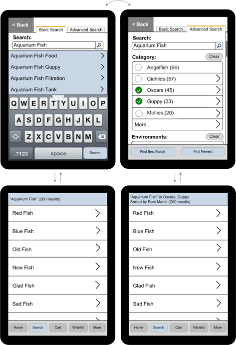
The wireframe shown in Figure 3 takes advantage of the Teaser design pattern to show a partial view of some faceted search filters on the right and, thus, expand the available virtual screen real estate.

Figure 3—Teaser design pattern facilitates the discovery of faceted search filters
Teaser design pattern facilitates the discovery of faceted search filters

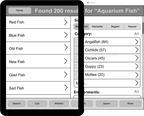
The search results are on the left in this wireframe; filters, on the right. Following a basic convention of mobile user interfaces, buttons on the right let people drill down deeper into the application’s information architecture (IA) space, while tapping buttons on the left moves them closer to the top of the IA or to the home page. In this example of what Microsoft calls panoramic applications, the mobile device acts as a sort of viewfinder that displays only a small part of a much larger virtual space.

The Teaser design pattern very effectively facilitates discovery through its use of partially exposed screen elements—in my example, faceted search results filters. This pattern also enables people to make rapid transitions from looking at search results to narrowing down the search results, so it is highly suitable for applications in which it is advantageous for people to discover a set of filters quickly and use them often.

Basic/Advanced Parallel Architecture Pattern

Another good design pattern for efficient discovery and use of filters is the Basic/Advanced Parallel Architecture design pattern, depicted in Figure 4. This design pattern is especially effective in applications that offer a fixed set of filters—for instance, booking air travel.

Figure 4—Basic/Advanced Parallel Architecture design pattern
Basic/Advanced Parallel Architecture design pattern

The idea behind the Basic/Advanced Parallel Architecture design pattern is that there are two modes of interacting with filters: basic and advanced. The basic mode lets customers easily engage with your application and dramatically shortens their learning curve. However, people who want an advanced mode of filtering can easily obtain this functionality—in the example shown in Figure 4, by returning to the filter page and tapping the Advanced Search tab.

The parallel architecture part of this pattern comes in when a customer needs to adjust the filter values. For customers who started their query from the Basic Search tab, tapping Back returns them to that tab. For customers who started from the Advanced Search tab, tapping Back returns them to that tab, where they can adjust the expanded set of filters. While the relationships between these three contexts—Basic Search, Advanced Search, and Search Results—are a bit difficult to explain, they offer a very natural interaction model that most people have found very intuitive to use during testing.

The Basic/Advanced Parallel Architecture design pattern offers the added advantage of a flatter architecture. Instead of an advanced mode that requires people to go deeper into an application’s IA, the advanced flow sits in parallel with the basic flow, so both are equally accessible with a single tap.

It is important to note that, in both cases, the search results page has a persistent status bar across the top of the screen, displaying an entire search query, plus any applied filters. Recall that a persistent status bar was one of the features I described in Part I of “Design Patterns for Mobile Faceted Search.

One application that successfully implements the Basic/Advanced Parallel Architecture design pattern is the Thirsty Pocket iPhone app, shown in Figure 5.

Figure 5—Basic/Advanced Parallel Architecture design pattern in Thirsty Pocket
Basic/Advanced Parallel Architecture design pattern in Thirsty Pocket

Notice that, instead of labeling this feature Advanced, Thirsty Pocket uses the label More Search Options. In Thirsty Pocket, the purpose of the advanced search page is to provide options for searching outside the device’s current GPS location, as well as narrowing a search by price. Most people would not use the location filter, and the price filter might, in fact, severely limit the effectiveness of search by too frequently narrowing a search to zero search results. The price filter is a great example of the “ejector seat lever” Alan Cooper so eloquently describes in his book About Face 3. Therefore, this price filter is best hidden on a separate page. In the Thirsty Pocket app, the label More Search Options describes the purpose of the advanced search page perfectly and has the added bonus of being less intimidating.

In another variation on the Basic/Advanced Parallel Architecture design pattern, instead of Basic Search and Advanced Search tabs, Thirsty Pocket presents two buttons on its home page: a prominent Search Near Me button for basic search and a de-emphasized More Search Options button for advanced search options. Tapping More Search Options lets you set filters, then tap Advanced Search to see the filtered search results. Nevertheless, the Thirsty Pocket user interface still preserves the essential features of this pattern, because tapping Modify Search on the search results page takes you back to the appropriate search page—basic or advanced—depending on how you initiated a search.

In Conclusion

A lot of people have asked me about these design patterns and the best ways to use them. Thank you all for your questions. Unfortunately, the answer would go well beyond the scope of even a two-part article. The best recommendation I can make is that you learn as many design patterns as possible; understand why these patterns have emerged, what customer and business goals they support, and what limitations they have. Then, once you understand the unique goals of your own customers and business leaders, you can either choose the right design pattern or combination of patterns or develop your own design patterns that fit the task at hand. Our understanding of user interfaces is still evolving—and for mobile design, still in its infancy. Mobile design patterns and paradigms are just beginning to emerge, but they represent the beginning of something magnificent. 

Read more

Design Patterns for Mobile Faceted Search: Part I

References

Bucolo, Sam et al. “The Design of a Tangible Interaction Device to Alleviate Anxiety and Pain in Pediatric Burns Patients.” CHI ’06 Extended Abstracts on Human Factors in Computing Systems, Montreal, Quebec, Canada, April 22–27, 2006.

Cooper, Alan, Robert Reimann, and David Cronin. About Face 3: The Essentials of Interaction Design. 3rd ed. Indianapolis, IN: John Wiley & Sons, Inc., 2007.

Nudelman, Greg. “Design Caffeine for Search and Browse UI.” Information Architecture Summit 2010, Phoenix, Arizona, April 9–11, 2010. Retrieved April 30, 2010.

—— “Experience Design for a Viral Mobile Community.” Net Squared Conference, San Jose, CA, May 2009. Retrieved April 30, 2010.

—— “Choosing the Right Search Results Page Layout: Make the Most of Your Width.” UXmatters, March 9, 2009. Retrieved April 30, 2010.

Wroblewski, Luke. “Windows Phone: User Interface Teases & Transitions.” LukeW Ideation + Design, February 17, 2010. Retrieved April 30, 2010.

Head of UX Research / Senior Director of User Experience

Principal at DesignCaffeine Inc.

Pleasanton, California, USA

Greg NudelmanFounder of the San Francisco Bay Area UX design consultancy DesignCaffeine, Greg is widely recognized as an experience design and user research expert, specializing in search, social networking, business dashboards, and process redesign for mobile and Web platforms. Greg has published over 30 articles and speaks regularly to audiences around the world about how to design intuitive and elegant systems that improve the quality of people’s lives while creating abundant ROI. He has led design projects for Fortune 500 companies and creative startups.  Read More

Other Columns by Greg Nudelman

Other Articles on Mobile UX Design

New on UXmatters