When people visit your Web site, there’s a good chance they’ll give you only 15 seconds of their time. They want what they want, when they want it, with as little effort as possible. Getting their sustained attention is a victory. Mobile readers especially have come to expect casual flirtations with online content that delivers instant gratification. Don’t burden these experts in multitasking by making them tap or click your content. If your content requires too much effort to consume, people won’t read it. They’re easily distracted, and their attention spans are shorter than ever.
This is the reality that purveyors of Web sites and mobile apps confront. It’s a little disheartening, isn’t it? Regardless of your industry, you’re competing for the attention of people whose senses are dulled—impatient people with unwieldy expectations. Today, people don’t want to have to consume a full-course meal to get value out of your content. They want that value now. People want snackable content.
Champion Advertisement
Continue Reading…
How We Got Here
Thank smartphones—and now watches—for driving your readers’ desire for instant gratification. Thank social media. Thank texting and push notifications. Thank Amazon Prime’s unlimited, free, two-day shipping. Thank instant purchases and downloads. Thank sensationalized, click-bait headlines.
Now, there’s a new verb, phubbing (phone + snubbing), for behavior that is getting blamed for increased divorce rates. Digitization and ubiquitous availability have made everything around us feel disposable. The music industry has felt this impact big time for a while now. (See Trent Reznor’s vinyl mission statement.) But the currency of instant gratification now extends into just about every industry.
The altered psyche of today’s users affects all of us who design Web sites and mobile apps for a living. My design domain is the world of industrial automation, whose primary users are maintenance engineers, operators, and system integrators. But even these workers are not immune to this new mindset—and that should tell you something. Even in a mostly offline manufacturing domain, we’re now designing content that is less verbose.
Our users don’t live in a vacuum. Once they leave their workstations at the end of their workday, on their commute and at home, they check Facebook, Instagram, and Twitter—just like everyone else does. They have their own personal smartphones. They’re living in the same world as the rest of us—a world that is predicated on brevity, easy consumption, and instant gratification.
I don’t like this state of affairs. I worry about the long-term effects of the ubiquitous instant gratification on people. According to Nicholas Carr, author of The Shallows: What the Internet Is Doing to Our Brains, multitasking and skimming content on the Web are actually depriving people of their capacity for deep concentration. Nevertheless, I still have to design for this behavior—and so do you.
Today, we have to design content for snackability. Being verbose is no longer an option. But snackable content doesn’t mean disposable content. Snackable content should support efficient, effective, satisfying reading. Snackable content should add value.
How to Create Snackable Content
Concise writing takes extra time and effort. Being concise is challenging. Minimalism in graphic design takes extra effort to achieve, too. But both are worth the effort if your goal is to create snackable content. Concision and minimalism affect design, usability, performance, and everything else that affects a user’s experience. So, ask yourself—is your writing too verbose? Are your images models of simplicity? Are your screens too busy? How much effort and cognitive load are you transferring to the user? How much of the user’s time are you consuming? Why aren’t you taking responsibility for this?
Here is a recipe for making any content feel snackable:
Whet the appetite.
Ensure that content satisfies.
Don’t skimp on presentation.
Whet the Appetite
Don’t lead with the entrée. That would be the equivalent of stuffing someone to the gills before they’ve decided what they want to eat. Give people a chance to decide whether your content has value for them. Let them begin with just a taste. A snack isn’t the end game. It leads to other valuable content that’s waiting in the wings. The key is to encourage people to ask for additional content—if they want it.
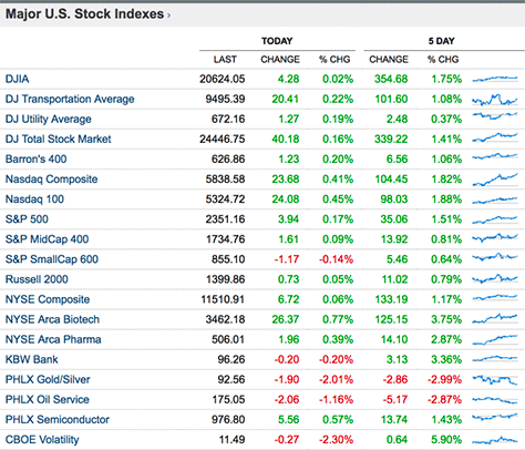
To whet people’s appetite, figure out what is the most valuable content they need to see and offer them a taste of it up front. Figure 1 shows bite-sized sparklines on the Market Data page of The Wall Street Journal. A sparkline is a simplified version of the more complex trend line and provides enough information to satisfy most readers. The WSJ site doesn’t attempt to cram trend lines into that table. Why? Because there are other important pieces of content they need to surface to the reader as well.
Figure 1—A bite-sized sparkline on The Wall Street Journal site
Dominating the page with full-blown trend lines wouldn’t be an efficient use of space. But the snackable sparkline delivers value to the reader at a glance. Sparklines convey how each index is performing without asking readers to dig deeply into more immersive content to find out. They gives them just a taste. Readers want to get an overview of the content before digging into something specific that’s of interest to them. The WSJ site indulges this desire.
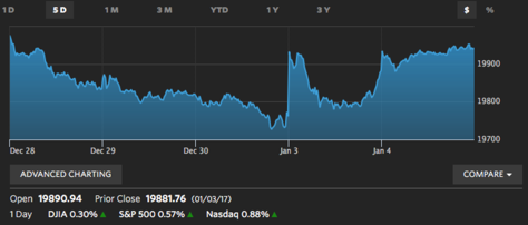
But the snackable sparkline isn’t the end game. Clicking it leads to the view shown in Figure 2, an actual trend line. Once the reader has clicked a sparkline to ask for more detail, it’s time to offer the bigger entrée.
Figure 2—A more detailed trend line on The Wall Street Journal site
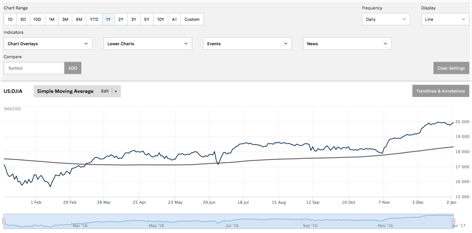
But wait, there’s more! Perhaps the reader is now ready for a full-course meal. If that’s the case, the reader can click the ADVANCED CHARTING button beneath the trend line, in Figure 2, to view the options for power users that are shown in Figure 3.
Figure 3—The Wall Street Journal site’s Advanced Charting page
For readers who have just a casual interest in how stock-market indexes are performing, the sparklines on The Wall Street Journal site provide plenty of value up front. Readers don’t have to click to satisfy their appetite for information. They can graze and get an overview of the basic state of things without delving deeper.
Key Takeaway
Snackable content is just that—a snack. You don’t need to force feed an entire course to the reader up front. Mobility has altered the digital landscape—in many ways, for the positive. Do you remember the axiom of the early 2000’s that told us to keep everything important above the fold in a desktop Web experience? Then, every stakeholder wanted their content above the fold.
But now, scrolling is more acceptable than ever. Or, alternatively, the user can choose to expand an area of a page to see additional content. Take advantage of this paradigm shift.
Ensure That Content Satisfies
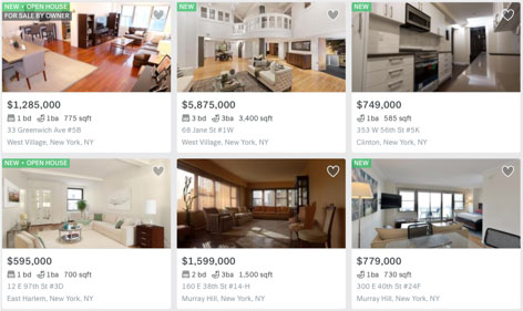
Many Web sites and mobile apps that let people search for a home have become experts at surfacing valuable content up front. A good example is the Trulia Web site, shown in Figure 4. Their search results are downright snackable because they satisfy casual user interest.
Trulia understand their market and the desires of their users, so present key information to the user in their search results—a home’s listing price, number of bedrooms, number of bathrooms, square footage, address, and status—for example, New. The company knows these are the pieces of information that yield the most value to users. Better still, users can favorite properties to curate content for themselves. Trulia places all of these important morsels of information on a card. This concise format satisfies users because it conveys the key information about each property in a snackable format and prevents the user from having to click to view the full property-listing page.
Figure 4—Search results as snackable cards on Trulia
Key Takeaway
Trulia’s card design pattern isn’t new by any means, but it’s very effective because it lets your ever-distracted users browse efficiently. So give users some valuable information in a snackable format. Don’t try to bait users with copy or images that provide no value and might as well be fast food.
Don’t Skimp on Presentation
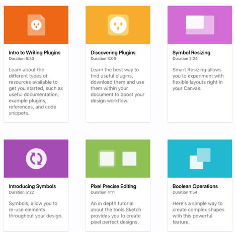
Presentation isn’t everything when it comes to snackable content, but it is a key ingredient. For content to offer value to the user up front, it needs to be appetizing, right? The Sketch App learning tutorial Web page, shown in Figure 5, provides a great example of using cards to convey useful information.
Figure 5—Sketch uses a snackable pattern
Let’s consider the elements that make Sketch’s design effective.
purposeful aesthetics—The use of vibrant colors helps draw the user’s attention. But the cards don’t rely only on color to differentiate them, because not everyone sees color in the same way. Simple, flat illustrations assist the user’s comprehension of the video content that the user interface represents.
concise copy—There’s no fluff here. Each card constrains the length of the copy, which must get its point across in a single sentence. By making the content concise, Sketch is owning the effort so the user doesn’t have to. Plus, the copy is in a warm, friendly, human voice. There’s no need for the user to consume a lot of jargon.
clear information hierarchy—Each card has a clear hierarchy of information. The elements don’t compete with each other. The eye-catching primary element on each card is an icon on a color-keyed background. It’s size, color, and supporting iconography draw the user’s attention. The secondary element is the heading just below it. The tertiary elements comprise the muted, gray supporting duration information and copy. The card’s hierarchy of information obvious. In contrast, when things are too much alike, the user has to work harder to parse what information should get their attention first.
the spread—It’s easy to consume each individual card, but it’s also easy to consume the cards collectively. Because the design of the cards is consistent, they feel like a system. There’s a generous amount of negative space surrounding and separating the cards. Snackable content doesn’t exist in a vacuum. Context matters, as well as what’s happening—or not happening—around the cards.
value—The cards clearly enunciate their value to the user. The timestamp below each bold heading is a great example of valuable information. Users appreciate knowing the time they’ll need to complete a lesson up front, before navigating to another page.
Key Takeaway
Cards are just one vehicle for delivering snackable content, so please don’t associate snackability with the card craze. It’s more than that one pattern. You can present anything in a snackable way. Ask yourself whether you are being intentional in your use of aesthetic elements? Are you being concise, but also using a human voice? Are you conveying a clear information hierarchy? Are you taking context into account and considering what’s happening around the content? Finally, does snackability add value, while saving the user a click?
Conclusion
While creating snackable content is challenging, it ensures that information is concise and provides an efficient, effective, satisfying user experience. If the UX designer owns the responsibility for boiling the content down to its most essential elements, the user won’t experience friction when consuming it. Snackable content must be palatable and add value. While users are becoming oblivious to clickbait, snackable content cuts through the noise rather than adding to it.
Director of User Experience at Rockwell Automation
Cleveland, Ohio, USA
Jon has a degree in Visual Communication Design from the University of Dayton, as well as experience in Web development, interaction design, user interface design, user research, and copywriting. He spent eight years at Progressive Insurance, where his design and development skills helped shape the #1 insurance Web site in the country, progressive.com. Jon’s passion for user experience fueled his desire to make it his full-time profession. Jon joined Rockwell Automation in 2013, where he designs software products for some of the most challenging environments in the world. Jon became User Experience Team Lead at Rockwell in 2020, balancing design work with managing a cross-functional team of UX professionals, then became a full-time User Experience Manager in 2021. In 2022, Jon was promoted to Director of User Experience at Rockwell. Read More