Do a Web search for UX best practices, and you’ll find well-written articles and blog posts about designing Web sites and mobile applications. They’ll be chock full of helpful examples and screenshots depicting ecommerce Web sites, social-media applications, and slick interaction paradigms. But you’ll be hard pressed to find any examples from industrial automation—especially near the top of the search results—because industrial-automation software is not consumer facing and sits well outside the consciousness of modern software users and designers alike. Those who are familiar with industrial-automation software commonly view this as a domain of control systems, processes, computers, and machines—things that aren’t human.
But industrial-automation software is more human facing than you might think. Think about the sheets you slept on last night. The soap you used in the shower this morning. The car you drove to work. The beer you plan to nurse on the front porch tonight. The diaper you’ll wrestle onto your toddler before putting her to bed. The roller coaster that will make you scream at the top of your lungs this weekend. People design the software that runs the machines and processes that mass produce these human-facing products for people. People are still a big part of the processes for manufacturing these goods.
Champion Advertisement
Continue Reading…
Despite the advent of artificial intelligence that the term automation suggests, human factors still matter in the industrial environment. A high-quality user experience is critical because it enables human users who work with control systems and machines to produce consumer-facing products in a more effective and efficient way. However, the domain of industrial automation is fraught with its own host of challenges—many of which might apply to your design domain. In this article, which is Part 1 in a series of three parts, I’ll share a common obstacle that UX designers must overcome in designing effective human experiences for the industrial-automation domain: the work environment.
The Work Environment
On a visit to a major tobacco producer last year, I couldn’t help but notice the poor lighting conditions throughout most of the plant. There were also plenty of potential hazards about: slippery piles of tobacco on the floor, tow-motors zipping around corners at alarming speeds, and potentially dangerous machinery in constant motion. In industrial automation, the work environment has a major influence on UX design decisions. But the plant floor is just one such environment. Another common environment an industrial-automation UX designer must address is the control room. Now, I’ll describe how the plant floor differs from the control room, then share how you can use the same design principles to empower users in both of these environments.
The Plant Floor
The lighting conditions on the tobacco producer’s plant floor weren’t ideal. Sodium light fixtures cast a dusky yellow haze down onto the production space, making for poor visibility. Distractions are everywhere in most plant-floor environments. Bustle and noise compete for the attention of an operator monitoring the production of a machine or process, who is perpetually context switching. These conditions conspire to impede her ability to focus. The potential stressors of dangerous machinery in motion nearby, dismal lighting, atmospheric temperature—which may be uncomfortably hot or cold—could also contribute to her divided attention or lack of focus. Therefore, it’s necessary to design human-machine interfaces in such a way that they don’t exacerbate the problems.
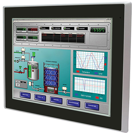
In the context of industrial-automation software, a human-machine interface (HMI) is a graphic user interface (GUI) that presents a visualization depicting the state of a process or machine. A typical HMI for use on the plant floor, like that shown in Figure 1, features a visualization of the machine or process it’s monitoring and provides information on its overall status. It usually appears on an operator terminal, which is a small display that is affixed near the machine or process it’s monitoring, on the plant floor. Depending on the goals, tasks, and responsibilities of the user, buttons and other actions are sometimes available as well—and these buttons may be either digital or analog.
A good HMI design for use on the plant floor focuses on the specific machine or process it’s monitoring and presents contextual information—not just data. Visualizations of data are often better than raw alphanumeric values, because they’re easier to understand at a glance and are less taxing on the operator’s cognitive load, which refers to the total amount of mental work a human must do to understand something. A good HMI design reduces cognitive load rather than adding to it.
Distractions are one issue, but physical constraints exist on the plant floor as well. On a case by case basis, Personal Protection Equipment (PPE) may be necessary, depending on a customer’s plant-floor requirements, but it’s best to design for such limitations. Many users must wear gloves, safety glasses, hard hats, and protective footwear. As you might guess, gloves are the chief offender in terms of limiting HMI interactions. While not all plants use capacitive touch interfaces or give operators the ability to perform actions at an HMI terminal, industrial-automation UX designers should ensure that well-afforded interactive elements have hit zones that account for imprecise fingers.
The Control Room
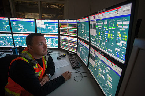
A centralized control room presents its own host of challenges because operators must monitor a much broader swath of production from their workstation, as shown in Figure 2. It’s not uncommon for a single user to monitor six or more large HMI displays simultaneously. While the control room is a more controlled environment than that on the plant floor, many challenges exist. While an HMI for use on the plant floor should focus on the machine or process it’s monitoring—and allow more imprecise interaction—control-room HMIs must be more comprehensive. Users in the control room must have more of a bird’s-eye view of several processes or machine lines at once. Thus, it’s crucial to have a clear information hierarchy so things that need to draw users’ attention—such as problem states—are apparent at a glance. Users in control rooms don’t context switch as much as those on the plant floor, but eye fatigue can be a major issue for anyone looking at large digital displays throughout an eight- to twelve-hour shift.
Figure 2—Control-room operator monitoring production
While the plant floor and the control room offer different contexts, goals, and challenges, there are several HMI design principles that can make information easier to consume in both of these environments. Here are some key principles for an effective HMI design regardless of the user’s environment:
Censor Graphic Violence
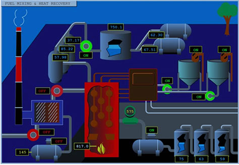
While visualizations might be better than alphanumeric data, that doesn’t mean they should be photo-realistic or skeuomorphic depictions of the actual production environment—a common characteristic of many poorly designed HMIs. Anything that doesn’t add value should not appear on the screen. This rule applies to any context. It’s important to avoid saturated colors, gradients, 3D effects, animations, and anything else that vies for the user’s attention. Figure 3 shows an example of a poorly designed HMI. Do the licking flames in the furnace, the cheery little tree in the upper right-hand corner, or the violently jagged edges of the burst vessels help users to understand the status of the process it depicts? What is the primary focus of this screen? Who can tell? Design trivialities add up to unnecessary complexity and visual noise, and they steal the user’s focus away from what’s most important—the information. If everything on the screen appears to have focus, nothing has focus.
Figure 3—A poorly designed HMI that adds to the user’s cognitive load
Designers should be ruthless about removing extraneous design elements that neither provide useful information nor help the user understand that information. If something is not informative, it’s simply decoration that risks taxing the user’s cognitive load. Many user interfaces feature background colors, containers, and lines that aren’t necessary to assist a user’s comprehension of the information. A display that has unnecessary visual elements drains the user’s mental battery faster than a display that’s more intentional, showing only truly valuable information. To help the user get through the long haul, designers must nix the unnecessary.
Wield Contrast and Intensity with Care
An effective design helps the user stay productive by reducing eye fatigue, as the user’s eyes continually focus and refocus. You can ease the burden on the user’s eyes by reducing contrast between foreground and background elements and restraining your use of saturated colors. This is especially critical in a control-room environment where the user is viewing multiple HMI visualizations. You may think that the HMI shown in Figure 4 is a bit ho-hum, but it’s ideal for use over an eight- to twelve-hour shift when performance, uptime, and human safety are on the line. The mostly grayscale gauges and data values are well afforded, despite the user interface’s minimal use of color. The use of color is limited to outlining problem states, as shown in the upper right in Figure 4, with square shapes that outline information groupings that represent problem areas. The color values themselves are intentional as well. Because yellow, purple, and red differ in intensity, they differentiate states even for color-deficient users. Finally, the neutral gray background helps the colors stand out. While using a bright, white background is common in many consumer-facing user interfaces today, this creates luminance contrast issues for colors with lighter values and intensity—for example, yellow on a white background.
Figure 4—The use of color only for calling attention to issues
The use of color is one of the most challenging issues that industrial-automation UX designers face. Color draws the user’s subconscious attention, so is distracting. Therefore, you should use color only for things that must immediately stand out on the screen—such as an alarm condition or a problem state. Plus, the best design solutions redundantly code colored components with a label or an icon so their meaning is obvious—especially for use in suboptimal lighting conditions. Not everyone can reliably see the full color spectrum—one in twelve males have color-deficient vision. That’s 8% of all males on the planet. The ratio is more benign for women—just one in 200—but you get the point. When designers rely solely on colors of similar intensities, they unintentionally make users’ lives more difficult, especially when a problem state exists. Heavy use of color for elements that are unnecessary to the user’s comprehension taxes her cognitive load.
Use Gestalt Principles
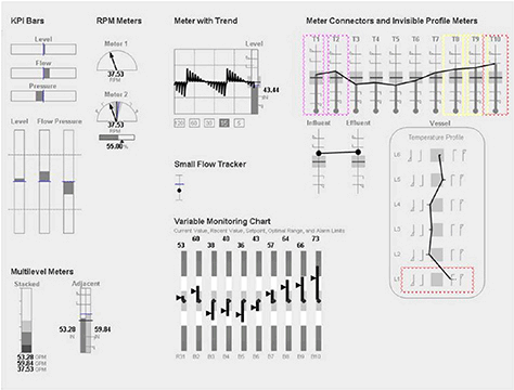
According to Gestalt principles, designers should spatially group related objects and elements to allow the user to perceive the whole as a single unit of information. In Figure 5, logical spatial groupings of related data help make the information design apparent. You can also achieve Gestalt grouping through similarity—for example, by using consistent fonts and sizes for labels and values so the user can mentally associate them. Again, while it’s important to cut out uninformative user-interface elements, another simple way of conveying relationship is the principle of closure—for example, enclosing a grouping of elements inside a border or a box. As Figure 5 shows, the borders help reinforce informational relationships. In this example, spatial grouping of elements alone would not be sufficient to make their relationships apparent. Without the boxes, the various groupings of gauges and labels would run together on the screen, taxing the user’s cognitive load. While designers sometimes use closure to group related elements whose relationship would be apparent from spatial grouping alone, in this case, closure adds value because it’s informative and reduces cognitive load. Separating the various groupings of information doesn’t place any strain on the user.
Figure 5—Gestalt principles show informational relationships
The HMI shown in Figure 5 doesn’t comprise photo-realistic tanks, pipes, and flames, but communicates effectively using graphic information. The user interface is simpler, but simpler doesn’t necessarily mean more white space. It’s simplicity comes from using vertical gauges, horizontal gauges, trend lines, and radial gauges to communicate the contextualized information. As I previously mentioned, graphic elements are often more impactful than a listing of alphanumeric values. However, that doesn’t mean using literal graphic depictions of the real-world environment. By visualizing information in the most appropriate way, you can contextualize information that helps the operator understand how it’s doing, how it’s been, and how it will be. For example, using a vertical gauge to represent temperature maps to most users’ existing mental model of how a thermometer works and why it has a vertical orientation.
Key Takeaways
The aim of many of these key design principles is to make content more comprehensible to the operator in the work environment. But users working in industrial automation typically view highly nuanced information, so the visualizations that users such as operators, maintenance engineers, and plant managers consume often exist outside the influence of UX professionals. Plus, there’s a tendency for the many HMI designers who aren’t UX professionals to design from a system point of view rather than leveraging the user’s mental model. I’ll cover this in greater detail in Part 3.
Design work usually occurs in office cubicles. It’s important to map your design choices to the user’s target environment because it’s different from your own. Optimize your product experience for the target environment and be ruthless about removing unnecessary user-interface elements that don’t add value. Be aware of what elements compete for users’ attention when they’re using your product. Information isn’t the same as data, and more white space isn’t the same as simplification. Be aware that the overuse of color—especially for information that doesn’t need to stand out—can make the user’s life more difficult because color draws subconscious attention and is distracting. Above all, censor graphic violence. If everything on the screen appears to have focus, nothing has focus.
Conclusion
For people who work in industrial automation, the environment itself presents obstacles, but these are just a few of the many obstacles in this domain. In Part 2 of this series, I’ll share some methods that industrial-automation UX designers can use to combat the challenges of designing for isolated customer sites, as well as the challenges of localizing information for global users.
Pedantic, but I think important regarding: “These buttons may be either digital or analog.” I suspect you mean mechanical buttons or on-screen buttons. At least ambiguous, but also inaccurate because, these days, mechanical buttons are still digital in pretty nontrivial ways. Designing industrial controls myself, the buttons have keyscan at not-especially-fast refresh rates, so things like press-and-hold or double tap need to be carefully designed to work correctly.
Sadly, I have friends who are robotics/automation programmers, and they never, ever, ever work with any designers at all. This appears to be the norm, as I’ve learned from reading industry publications, when I design factory-programmed HMIs, to reading accident reports involving SCADA systems. How do we get the principles of UX design and the value of UX designers into industry?
I couldn’t agree more with your sentiments on the state of UX in the industrial environment. Unfortunately, as you allude to, this domain has lagged behind others. Many facilities and their lines, machines, and software products seem frozen in time, reflective of their last major upgrade. As they say, “If it ain’t broke, don’t fix it.” Why bother getting a UX designer involved?
My brief mention of digital and analog buttons was simply to illustrate that the environment is rife with physical pushbuttons, nobs, and controls, as well as their digital, on-screen counterparts. Perhaps the word physical would have been a better characterization. That’s an interesting point about refresh rate with physical buttons. I haven’t delved deeply into interactions specific to physical-button latency and feedback, which I assume is what you’re referring to. Please share if there are books or articles on the topic you’ve read that you’ve found useful.
Director of User Experience at Rockwell Automation
Cleveland, Ohio, USA
Jon has a degree in Visual Communication Design from the University of Dayton, as well as experience in Web development, interaction design, user interface design, user research, and copywriting. He spent eight years at Progressive Insurance, where his design and development skills helped shape the #1 insurance Web site in the country, progressive.com. Jon’s passion for user experience fueled his desire to make it his full-time profession. Jon joined Rockwell Automation in 2013, where he designs software products for some of the most challenging environments in the world. Jon became User Experience Team Lead at Rockwell in 2020, balancing design work with managing a cross-functional team of UX professionals, then became a full-time User Experience Manager in 2021. In 2022, Jon was promoted to Director of User Experience at Rockwell. Read More

