In Part 1 of this three-part series on designing user experiences for the industrial environment, I explained that industrial automation is more human facing than you might think. Then, I discussed how the industrial environment itself presents difficult challenges for UX designers to overcome when designing software for human-machine interfaces (HMIs), covering both plant-floor and control-room environments. Finally, I shared some key principles of effective HMI design that apply to both environments.
The chaotic plant-floor environment impedes users’ ability to focus. Plus, the necessity of using personal protective equipment (PPE) affects their ability to perform actions on an HMI terminal. The control-room environment poses its own set of unique challenges. For example, in a control room, users must monitor several large HMI displays over an eight-to-twelve-hour shift, which can result in eye fatigue.
Now, in Part 2, I’ll explain some methods that industrial-automation UX designers can use to combat challenges relating to the design of isolated customer sites and to localizing information for global users.
Champion Advertisement
Continue Reading…
Summary of Key Principles of Effective HMI Design
Here are some key principles of effective HMI design that I covered in detail in Part 1. These principles apply to both plant-floor and control-room environments:
Censor graphic violence. Photo-realistic or skeuomorphic graphics steal users’ focus away from what’s most important—the information.
Cut, cut, cut. Remove unnecessary design elements. If an element is not informative, it is simply decoration that risks taxing users’ cognitive load.
Wield contrast and intensity with care. An effective design helps users remain productive by taking measures to reduce eye fatigue, which occurs because the eyes must continually focus and refocus.
Use color responsibly. Heavy reliance on the use of color that is unnecessary to users’ comprehension of the information taxes their cognitive load.
Use gestalt principles. Users should easily be able to understand the informational relationships between elements.
Do more with less. Simpler doesn’t just mean more whitespace. Achieve simplicity by contextualizing information in the most appropriate, concise way.
Overcoming Isolation
Industrial-automation UX designers must take the island scenario into account, in which workers may use an application at a remote site—for example, in Alaska. Sometimes the island is literal—for example, a stationary oil rig in the Gulf of Mexico. Internet connectivity is not a given in most industrial environments. There are security risks, so industrial manufacturers almost always hedge their bets by creating self-contained, secure networks. Let’s look at some common ways in which isolation influences UX design decisions.
Help Content
Of course, there’s no replacement for an easy-to-understand user interface, but it’s unrealistic to expect a design to account for every possible scenario. Working in isolation, a user is unlikely simply to be able to Google a specific solution for an issue he’s encountering on the plant floor. Good Help content is key, so a well-designed industrial application provides convenient links to Help topics.
UX designers working in the industrial-automation domain work closely with information developers to craft pertinent instructions for the use of each feature of an application. The best solution is for Help content to inhabit any parts of the user interface that may have confusing workflows or cause errors. For example, place concise Help text beside any input field that may trigger an error if the user enters the data improperly. This saves users’ time by maintaining their context. If it isn’t feasible to place contextual Help within the user interface itself, the next-best solution is to provide a clear icon or link to relevant Help documentation that’s packaged with the installed application.
Onboarding
For Web sites or consumer-facing applications, onboarding usually means getting users comfortable with the user interface so they can be productive right away. But onboarding can be trickier for isolated industrial applications—some of which include their own headless hardware and can function offline. An onboarding workflow, or out-of-box experience (OOBE), for an isolated industrial application might need to include steps to determine certain data—such as the user’s language, the date and time, or security requirements—because the application is ignorant of the larger system or network.
We’ve all installed applications on our personal computers, tablets, and smartphones. But installing industrial applications is far more complicated—potentially impacting millions of dollars of infrastructure—and it’s far from convenient. A user in an industrial environment might have to use a secure lab space or workstation to complete the steps of an onboarding workflow, then transfer the configured device to the plant floor, potentially interrupting a running process. Therefore, the user needs to be confident that the onboarding workflow is efficient and will get him up and running as quickly as possible—and his concerns will extend to other parts of the system as well. Here are some key principles for designing a good onboarding experience:
Clearly enunciate the steps that are necessary to complete a workflow. Users should not have to guess how much effort it will take to set up a system. Help users to visualize the progression of steps by providing a progress bar or similar feature that lets them visualize the entire workflow and where they currently are within it. This can also help users to prepare mentally for what’s next.
Give users an easy way to go back. Mistakes happen, so an effective workflow must be just as forgiving as it is efficient.
Ensure the consistent placement of buttons. Users should not have to reacquire a navigational target each time they want to proceed to the next step. The logical placement for navigation buttons is near the bottom of a window or screen, where users’ eyes arrive once they have entered the pertinent information. The Next button that lets users advance to the next screen should be on the right, while the Previous button that goes back to the previous screen should be on the left. This is especially important with a left-to-right progress meter because users expect all navigation to follow the meter’s established direction.
Capitalize on flow. Placing a step in the middle of a workflow that forces users to go hunting for an obscure piece of information kills the momentum of a workflow. Let users provide the easy information first, saving any potentially difficult steps for later. Confidence and momentum go hand in hand.
Make each step concise. Defining concise steps keeps data entry focused, relevant, and attainable. It’s best to avoid combining steps—for example, pairing security requirements with time zone or other unrelated pieces of information. Presenting a lengthy form to users hurts their confidence.
Provide instant validation and feedback. Users should not have to click Next to find out something went wrong. It’s best to validate data in line immediately, so users can correct errors before switching their context. Again, flow is key. Plus, making the progress meter double as a feedback mechanism—for example, by displaying a checkmark for completed steps—helps reassure users they have successfully completed all preceding steps. Finally, make the Next button unavailable until the user has provided all the requisite information.
Responsibly design forms. Place labels above their respective input fields. This is usually better than horizontal layouts of labels and fields—which I’ll get to later. Often, designers make all form fields equal in width. This makes the form layout look cleaner, but provides no clues about the type or length of the data users must provide. Users can more readily decipher the purpose of an input field whose width conforms to the length of its data. This design nuance can act as an accelerator, as can the design decision to provide smart default values within fields whenever appropriate.
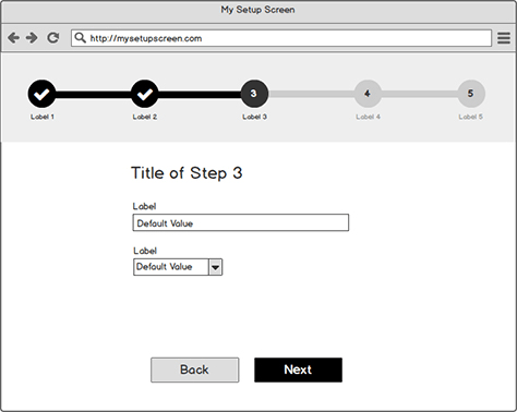
Figure 1 shows a basic mockup of an onboarding experience. This user interface clearly indicates the steps of the process, using a progress indicator. The consistent placement of the Back button at the bottom of the window provides an easy way to go back, while the Next button lets the user progress to the next step. The user interface avoids distractions that would disrupt flow and presents concise steps, providing instant validation and feedback. The layout of form fields communicates their purpose.
Figure 1—Basic mockup of an onboarding user interface
Version Control
Keeping users on the latest version of the software can be a challenge when their client computer or device isn’t connected to the Internet—a realistic scenario in industrial environments. It may be necessary to schedule updates and shut down machines, so the impact of updating software on a system could be severe. This can give plant managers major heartburn.
Sometimes industrial-automation UX designers must take into account workflows that make them cringe—for example, providing features and instructions for a manual method of downloading the latest software from a connected computer, then transferring it to the offline computer running the software. This is not pretty, but it’s a necessary evil with isolated systems. You can reduce the friction of a manual update process by providing clear, concise instructions in the proper context—when and where the instructions are most relevant. While an industrial users are probably systems thinkers, like anyone else, they won’t want to deal with nebulous workflows that leave them feeling uncertain.
Telemetry
There is no Google Analytics—or, for that matter, any tracking method that would require a constant Internet connection. Therefore, UX designers must have a plan for how they’ll gather telemetry information, so they’ll have a way of understanding how users use the product before sending it off into the wild. Tools such as Mixpanel can help you track offline scenarios. But such tools still require the occasional online sync, so they can send data to the cloud.
Key Takeaways
While you may design experiences that are completely dependent on having an Internet connection, pretend for a moment that your user interface were somehow still available when not connected. If you severed your application from its Internet lifeline, what would the experience be like if users could still interact with the user interface?
Users’ knowing what they can and cannot do is critical, so you must make features that won’t work offline unavailable. Don’t put users in a scenario in which they would expect something to work, then allow them spend time going down unhappy paths that leave them stranded or uncertain. If you afford an action that’s not functional offline, users perceive that function is still functional. To ensure data fidelity, notify users that content may not be current and provide a timestamp, indicating the last time the system synced the data. But, if data is out of date, display it with care. Many UX designers believe that providing the last data available is always better than displaying a blank page or screen or an error message. Unfortunately, this isn’t always the case. For example, in the industrial-automation domain, showing invalid or out-of-date information in an application could be catastrophic if the data represents a running machine or a critical process. In such scenarios, using a more exaggerated approach that shows something is obviously wrong can be a better and safer solution.
Your onboarding experience may simply be a learning workflow that lets users get to know your application or Web site. But how efficient is this workflow? Are you inundating users with too much information up front? Again, flow is key. Something like a tutorial overlay that displays text and arrows pointing to elements on the screen interrupts users and kills flow. Modern users—even those in industrial environments—are intolerant of delays, so consider contextual onboarding and provide tips when and where they matter most.
Localization
If you design applications for global users, you’re probably familiar with some of the obstacles that can detract from any well-intentioned design choice. Industrial automation is highly global by nature, and the design of such systems rarely caters to a single language, culture, or locale. Here are some techniques that industrial-automation UX designers can use in addressing localization issues.
Use a Vertical Layout
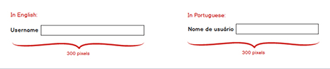
Place labels above input fields. Not only does this help optimize the use of screen real estate on small displays, it’s usually a more tolerant way of handling labels with unknown character lengths. Even though there might be a great reason for using a horizontal layout—placing labels to the left of input fields—unexpected scenarios can occur when switching languages. As Figure 2 shows, a language such as Portuguese can cause layout issues. If a user interface is confined to a fixed screen width, something will have to give. Either you must make the input fields narrower in width, providing less space for data entry—or use a smaller font for labels or truncate labels, making them harder to read.
Figure 2—Localization can result in suboptimal layouts
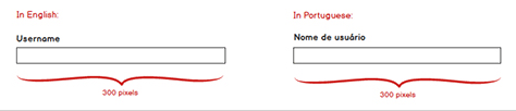
Conversely, as Figure 3 shows, a user interface with a vertical layout—with labels above the input fields—can better accommodate labels of an indeterminate length—even lengthy labels—while ensuring input fields remain well afforded.
Figure 4—Vertical layouts accommodate unknown character lengths
Use Icons with Care
An overreliance on icons—especially icons without labels—can be detrimental to localization. However, the responsible use of icons can help reduce localization complexities. Plus, icons typically offer generous touch targets. While some icons are universally recognizable—for example, the symbols for Save, Cancel, OK, Search, and Pause—many icons are not. Such actions as suppressing or shelving industrial alarms are difficult to represent in an icon. Plus, they’re domain specific, so wouldn’t benefit from broader standardization. This is where things get murky. Not all industrial-automation vendors adhere to the same sets of icons, icon libraries, and standards. Therefore, industrial-automation UX designers may need to consider labeling all icons for the sake of clarity and consistency. The icon with the most obscure meaning should set the pattern for the rest.
Bring in the Experts
Certain words have unfortunate meanings in other cultures—or they simply don’t fit the same mental model as they do for English speakers. Designers who create global solutions must work closely with terminologists and localization experts to ensure all copy, icons, and anything else that communicates avoids sending the wrong message to the target local user. It’s important to get terminology experts involved sooner rather than later to ensure product launches don’t get delayed because of an avoidable language gaffe that you must correct at the last moment.
Use Redundant Coding
Red means something different to Asia-Pacific users than it does for western users. Most westerners associate green with good or on and red with a problem condition or stop. However, in China, red typically means happy or good luck.
But such problems aren’t just cultural. No two plants are identical. Even different plants in the same city, state, or country could follow different sets of rules because of the standards they’ve adopted. Consider this scenario: On Plant A’s factory floor, green may mean that a machine is running, so workers should not enter the workspace. In this case, red could mean the machine is stopped or in a faulted state, so it’s okay for workers to enter the workspace to repair it. Conversely, in Plant B, green could mean it’s okay to enter the workspace because the machine is stopped, so it’s safe to enter. Red might mean the machine is running and danger exists, so the user should stay out. Dangerous scenarios can occur if workers have pre-existing assumptions based on color alone.
Making matters worse, 99% of all users with color-deficient vision suffer from red-green color blindness. The twisted irony here is that it’s common to represent the most potentially destructive actions through the relationship between these two colors. On an HMI screen, redundant coding is necessary, which means pairing each color with an icon or concise label that also communicates its meaning.
Key Takeaways
While you may not design applications that are specifically for users in other countries, it’s still important to know the countries and contexts in which people will use your user interface. Check your assumptions at the door, empathize with users, and consider their needs first to create a design that creates real value.
Plus, even though it may not be necessary for you to design your text labels and field values to accommodate any number of languages, stacking labels and fields vertically is usually better than using a horizontal layout. Not only does this make it easier to fit content within the viewable area of a small screen, it also avoids the outdated taboo that discourages designers from placing any important content below the fold. Modern user-interface paradigms have made it more acceptable than ever to leverage scrolling.
Finally, don’t rely solely on color to communicate meaning. Color issues extend beyond accommodating users with color-deficient vision. They may also relate to culture, locale, and customer-specific standards.
Conclusion
Isolated environments don’t afford industrial-automation users with many of the conveniences most UX designers take for granted. Internet connectivity is more likely the exception than the norm, so onboarding or updating an application can have serious business impacts when these processes affect millions of dollars of infrastructure. Most plant managers are reluctant to take down a machine, production line, or process. Therefore, industrial-automation UX designers must take such issues into account to design effective, efficient workflows for users.
With regard to localization, industrial-automation UX designers must be intentional in their design choices, so users of all languages, cultures, and locales can be productive and safe. It isn’t enough to cater to English speakers and call it a day. Nor should designers assume that the meanings of certain colors or iconographic systems are universally understood or accepted—even by users across the same customer’s various plant locations.
The industrial environment, which I covered in Part 1, and designing for isolation and localization are just a few of the common obstacles that industrial-automation UX designers encounter. In Part 3, I’ll share some methods industrial-automation UX designers can use to overcome challenges relating to
designing for designers
getting access to users
handling the complexities of competitor or legacy products
Director of User Experience at Rockwell Automation
Cleveland, Ohio, USA
Jon has a degree in Visual Communication Design from the University of Dayton, as well as experience in Web development, interaction design, user interface design, user research, and copywriting. He spent eight years at Progressive Insurance, where his design and development skills helped shape the #1 insurance Web site in the country, progressive.com. Jon’s passion for user experience fueled his desire to make it his full-time profession. Jon joined Rockwell Automation in 2013, where he designs software products for some of the most challenging environments in the world. Jon became User Experience Team Lead at Rockwell in 2020, balancing design work with managing a cross-functional team of UX professionals, then became a full-time User Experience Manager in 2021. In 2022, Jon was promoted to Director of User Experience at Rockwell. Read More