Today, we’re experiencing a growing torrent of big data. Data for our retail purchases, Internet searches, social-media posts, and even our commutes to work reside somewhere. Not only do we cast a shadow on the ground when we walk in the sunlight, we all have data doppelgängers that show both our current state and the history of our lives. Our own data interacts with the data of other people—such as those who buy the same books on Amazon that we do or our friends on social media. All of this data interacts with the companies with whose products and services we engage.
Through machine learning and artificial intelligence, organizations can use big data to predict our next actions—sometimes even better than we can predict them ourselves. The implications of big data are enormous—enabling us to view suggested products while on a retailer’s Web site, receive recommendations to connect with people who we might know on social-media sites, and benefit from smart IoT devices that gather data from us and those who are similar to us, then act accordingly. Organizations in the healthcare and financial arenas use big-data systems to spot potential adverse events, while also pinpointing scenarios that can bring increased profits and positive outcomes.
Champion Advertisement
Continue Reading…
Big-data systems allow us to step back and see the big picture—a much more expansive picture than one person can see on their own. As the sensors and bandwidth for transmitting data decrease in price, our everyday activities will produce even more data. Because the imprint of our digital lives in the cloud, there are ethical, security, and quality issues surrounding big data, but those concerns are beyond the scope of this article.
In this article, I’ll focus on how the clever use of big data can lead to customized products and experiences for consumers, as well as larger profits for companies. How can we achieve all of this effectively and efficiently? Through good UX design. A great user experience is a necessary component of any powerful big-data system that not only uses and analyzes these massive stores of data, but must also communicate the resulting information effectively to the people who need it.
Big Retail’s Big Data
Big data can help retailers sell more products by suggesting products other consumers have bought in addition to the items they are currently viewing. This is the Internet’s version of “Would you like fries with that?” and it is a very effective marketing approach.
In CNBC’s documentary “The New Age of Walmart” and the New York Times article “What Wal-Mart Knows About Customers” Habits,” Walmart turned some heads when they discussed their data-analysis center, which tracks every one of their customer transactions and finds interesting correlations between the products they’ve sold and data about things like geographic locations and weather conditions. For example, they discovered a very profitable correlation between big increases in their sales of strawberry Pop-Tarts and beer—plus necessities like bottled water and batteries—at stores in the path of a hurricane. So, when the weather forecast shows a tropical system brewing, Walmart sends trucks full of strawberry Pop-Tarts, beer, batteries, and bottled water to all stores in the projected storm path. The outcomes of predictive big-data analysis are win-wins for both the companies that increase their profits and the consumers who get the products they need just in time.
Thanks to big-data technologies such as Hadoop, companies have a practical way of accessing, processing, and analyzing big data that they’ve stored in a distributed fashion, across multiple systems. Think SETI@home. Many big-data systems now also process in-memory data, which results in very fast solutions, especially in comparison to systems that process only data on disk drives.
Since the aforementioned CNBC and New York Times stories, Walmart has improved their big-data systems. The video in Figure 1 provides a sneak peek at their Data Café. In the SAP article “HANA Powers Walmart’s Data Café,” you’ll find an interesting discussion about Walmart’s use of SAP’s HANA technology. Using this system, which developers built with speed in mind, Walmart analyzes about 250 million transactions each week. The product team committed to adhering to the eight-second rule, which states that a system must answer any query—regardless of its complexity—within eight seconds. Considering the sheer amount of real-time data and the system’s ability to support thousands of simultaneous data-analysis users, this is no small feat. Walmart connects their big-data agility to their bottom line: they can now solve problems in an hour that used to take days, and this means increased profits for more days each year.
Figure 1—Walmart’s “Big Data, Big Opportunities” video
Significant aspects of big-data systems are their machine-learning or artificial-intelligence (AI) capabilities, which can learn and evolve on their own as they work with big data and make unexpected, purposeful observations. While any further discussion of this topic is out of scope for this article, you can learn more from SAS’s “Machine Learning: What It Is and Why It Matters,” as well as their video “Machine Learning and AI,” shown in Figure 2.
Figure 2—SAS’s “Machine Learning and AI” video
The Role of UX Design in Big Data
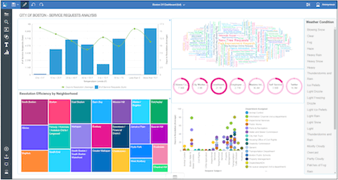
First, let’s consider why we practice UX design: to increase the value of a product or service—for both users and the company that provides it—by creating more effective ways of interacting with it. Since today’s big data is constantly changing and its scope is ever increasing, UX designers must ensure that a product or service can cope with change well and scale as the amount of data it must handle increases. Figures 3 and 4 show two typical big-data dashboards: SAP’s real-time inventory and IBM’s Watson Analytics, which leverages data from multiple sources. Such dashboards can be more or less interactive. Some dashboards show the same types of data for different time periods, while others let users zoom in to view more detailed information. Others are completely static, showing all the relevant information in one place—in a sense, automatically generating an infographic.
Typically, statistics drive data science. However, because data science often models human behavior, it is important to apply basic psychology when designing the analysis and querying of that data. Human beings are exceptional pattern matchers. Big-data tools can restore the human element to its equations by applying their intelligence to enormous sets of data. In any domain that is leveraging big data, there are experts—for example, people who analyze financial data, retail trends, or city management; or physicians, who can heal physical ailments only if they can determine their cause.
As UX designers, we must keep these experts at the forefront of our mind when designing the big-data systems that give them superpowers, enabling them to apply their expertise on a scale they could not attain on their own. Big data is now a huge factor in many domains. If we can improve the user experience of big-data systems, we can truly help the world to be a better place. As my expert panel discussed in the Ask UXmatters column “Making the World a Better Place Through User Experience,” our work as UX designers can have far-reaching impacts. Nevertheless, as you continue this important work, remember always to consider business concerns, not just UX design concepts. If a design solution would not be profitable for a company, it is impractical and unlikely to come to fruition.
Data Visualization
As I mentioned earlier, human beings are amazing pattern matchers and, of course, a picture is worth a thousand words. The need for data visualization is especially important for complex structures such as those found in big data. Data visualizations may represent a single complex structure for a big data set or multiple structures that result from processing this data considering many different variables—much as a CAT scan can capture multiple image slices. As we unlock and use big data, we will discover ever more ways of using and analyzing this data. We must ensure that these systems are easy to update, so we can take advantage our learnings.
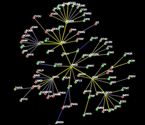
Big data is ripe for high-quality, automated, data-visualization techniques. These visualizations could be the key to understanding big data and, in turn, to understanding the future. In these automatically generated visualizations, we will discover both expected and unexpected structures. In the example shown in Figure 5, Impactopia displays a four-level correlation tree for the price of Google stock. Stocks that go up when Google stock goes up appear in green, while those that go down when Google stock goes up appear in red. In this visualization, a toggle button displays a table view that shows more details about the strength of each correlation. As Figure 6 shows, AT&T’s Graphviz tool makes it possible to interactively traverse data in 3D.
Figure 5—Visualization of stock-price correlations
Figure 6—Traveling through a 3D model in AT&T’s Graphviz tool
The visualizations shown in Figures 5 and 6 depict static data that does not change. Of course, much big data is dynamic. Figure 7 shows a video of Corey Goldberg’s animated visualization of the history of Python. All three of the visualizations shown in Figures 5-7 are automatically generated by graph-drawing algorithms. The creation of such algorithms is a fascinating field that has its roots in graph theory and computational geometry.
Figure 7—Visualization of the history of Python
The Future of Interactions with Big Data
While the visualizations I’ve shown so far are certainly very nice and fulfill the goal of creating a picture that is worth a thousand words, our interactions with big data can become even better! For example, check out AT&T Lab’s work on interacting with data visualizations using a Kinect camera, in Figure 8.
Figure 8—Using a Kinect camera to interact with data visualizations
As shown in Figure 9, MIT Media Lab’s inFORM Dynamic Shape Display let users actually hold; touch, and interact with the data! In ten years, we will be visualizing and interacting with data in ways we have not yet envisioned.
Figure 9—MIT Media Lab’s inFORM
A Framework for Approaching UX Design for Big Data
Now, let’s consider how a UX designer can create a strong design solution for a big-data product. First, to have the biggest impact possible on the resulting product, get involved in the project very early in the development lifecycle. Again, remember that business concerns must come first, so you should understand both the business and the user needs that a product addresses before creating your design solution.
Of course, you’ll probably need to iterate a design to meet those needs optimally. Using agile or Lean methods, create a minimum viable prototype (MVP)—and whatever you do, do not allow yourself to fall in love with your design. As Greg Nudelman says in “Lean UX for Wearables,” “You won’t spend a lot of time creating stuff that takes you down the wrong path, then fall in love with the prototype because you’ve invested so much time and effort in it. Instead, you can pivot very quickly and just say. ‘Well, that didn’t quite work. Let’s see what we should try next.’”
To ensure that you create a product design that meets the needs of both users and the business—and that the team can build within the time, technical, budgetary, and other business constraints—follow a process that includes a high level of feedback and enables rapid, iterative cycles:
Learn about users’ goals and tasks, as well as other stakeholders’ goals and measures of success.
Identify any bad qualities of the current product solution—if one exists.
Understand the consequences of those bad qualities.
Design to create desire in users.
While it is important to perform high-quality user research to support the first three steps, it is essential to get to your first MVP quickly.
Applying Shneiderman’s “Eight Golden Rules of Interface Design” to Big Data
When creating your design solutions, I highly recommend that you follow Ben Shneiderman’s “Eight Golden Rules of Interface Design.” I often mention these golden rules in my articles because so many UX designers still do not use them! For many well-understood product domains, if UX designers simply holds to these rules, they will be well on their way to creating a strong, reliable design. In summary, these “Eight Golden Rules” are as follows:
Strive for consistency.
Seek universal usability.
Offer informative feedback. Feedback becomes especially important as we enable users to interact with big data in multiple ways.
Design dialog boxes to yield closure.
Prevent errors.
Permit easy reversal of actions.
Keep users in control. Ensuring user control is essential to enable the experts using a system to interact with a larger-than-usual data set. Remember, you’re giving users a superpower that lets them feel like a superhero!
Reduce short-term memory load.
Designing Big-Data Applications
In big-data applications, the real star of the show is the data itself. Keep in mind that, as your designs facilitate more powerful applications of big data, you are empowering both the expert users who analyze and interact with big data and the people who ultimately receive the benefits of the applications of their data analysis.
UX professionals like to tell stories about users, their goals, and their tasks. What story is the data telling you? Make sure your design highlights that story.
Of course, your designs should have all the qualities of a superb product—but, first and foremost, they must spotlight the big data itself and facilitate useful interactions with that data. What data a product is displaying is even more important than the manner in which it renders the data. There are systems in place for processing and displaying some data, so leverage those capabilities in creating your designs.
Innovative data-visualization techniques and interactive visualizations can have great impact on the strength of your design solutions for big data. In these data visualizations, not only is there often a very large set of data with which users can interact, that data may change dynamically as it updates or as users interact with it, so it can become more complex in real time. Despite this complexity, users expect to be able to interact with big data quickly and effectively.
As big-data analysts work with the data, they will discover new ways of interacting with it and evaluating it—ways you did not expect or envision. Your designs need to provide flexible capabilities that facilitate their working with the data in any way they see fit. Plus, you must format data visualizations to make them easily digestible by business teams. Thus, your designs must take into account the big data itself, the data analysts, and the business teams that need to digest their data analyses and make decisions based on them.
Iterate your designs until you’ve created a useful product that enables big-data analysts to quickly interact with the data and evolve their techniques in ever more powerful ways. A solid UX design can enable big-data experts to become superhuman pattern matchers!
Dr. Janet M. Six helps companies design easier-to-use products within their financial, time, and technical constraints. For her research in information visualization, Janet was awarded the University of Texas at Dallas Jonsson School of Engineering Computer Science Dissertation of the Year Award. She was also awarded the prestigious IEEE Dallas Section 2003 Outstanding Young Engineer Award. Her work has appeared in the Journal of Graph Algorithms and Applications and the Kluwer International Series in Engineering and Computer Science. The proceedings of conferences on Graph Drawing, Information Visualization, and Algorithm Engineering and Experiments have also included the results of her research. Read More