Wearables are becoming increasingly pervasive devices with a growing array of apps—yet, somehow, the user experience for many of these devices is lacking. What is the best way to design for this new class of devices? In Part 2 of my interview with Greg Nudelman—who is a mobile and tablet experience strategist and a leader in the emerging arena of UX design for wearables—we’ll continue our conversation about a better approach to UX design for wearables. If you missed Part 1, you might want to read it first.
Applying Lean UX to Wearables
Janet: How does Lean UX for wearables differ from Lean UX in other contexts?
Greg: That is a great question. Basically, you follow the same principles. You need a measurable experiment and to spend as little time and money as possible in creating something people can actually put to use. The idea that I find compelling is the minimum viable prototype, or MVP. While most people interpret MVP as minimum viable product, thinking about a minimum viable prototype lets you focus on creating the cheapest, crudest, yet plausible prototype that lets you communicate your idea to a customer.
Champion Advertisement
Continue Reading…
This approach is valuable for two reasons: The first is speed. Creating a minimum viable prototype saves you time and effort. If you haven’t yet created a product that is of interest to your client, that the market needs or wants, or that is sufficiently easy to use, a minimum viable prototype lets you accomplish that quickly, then iterate. The cost of the prototype is virtually zero. The main idea behind my book The $1 Prototype is that the cost of failure approaches zero, so you can iterate rapidly with very little labor and at a very low cost. I call this iteration at the speed of thought. In this approach, your designs are your prototypes. The approach works well for both mobile and wearable user interfaces.
The second value of this approach is the disposability of the prototypes. Because the prototypes are so crude, this keeps you from falling in love with them. And it keeps your customers from falling in love with them, too. So you and a customer can interact in a space where empathy and customer needs come first. The user interface or any kind of slickness in the product comes second. The prototype is simply the conduit for the empathy that is flowing freely between you. The rougher the prototype, the more open and unformed the conduit. It’s not a complete solution, but an invitation to connect.
This crude prototype brings you and your customer together, with the customer a full-fledged participant in the design process. The two of you can work side by side, try new ideas, and discover novel solutions. It is truly participatory design from the get-go, with the customer at the core of the design process. That is really what I think of when I think about Lean UX.
When you apply this process to wearables, the customer gets to be a full-fledged actor in the drama of actually using a wearable device. So, once you reduce the wearable prototype to a pack of sticky notes, it becomes very easy to slip it onto their watchband and have them actually act out what they would do if they had the application running on their device.
For example, at the O’Reilly Design Conference, one memorable use case that one of the attendees brought to the workshop was being able to open a door with your watch. The smartwatch app she envisioned would help someone open their door and activate all of the house systems when they walked in. At the workshop, we were able to act out what it would be like to actually open the door without scanning or tapping anything or reaching for your keys, so we could experience what that would actually look and feel like first hand. It was quite a magical experience. All of that is available to you through this very simple, little sticky-note prototype.
The other use case we tried at the O’Reilly workshop was finding a bathroom near you. Imagine you’re pushing your toddler along in a stroller, and he needs to go to the bathroom. Obviously, this need could be quite urgent and, depending on how potty-trained your toddler is, you might want to plan your walk for easy access to the bathrooms. With two kids myself, I thought this was an excellent use case and could totally relate to that situation. Being able to act out the use case of actually pushing a stroller, pretending the kid is in the stroller, seeing what your hand positions are would be illuminating. Can you see the screen that could indicate where the nearest bathrooms are located, operate the app’s various user-interface controls one handed, track how long it’s been since the kid peed, and estimate when he would need to go again?
There are so many UX possibilities that you can play with. All of that is open to you in designing a wearable experience that perfectly fits into someone’s life. Wearable user experience is a wide-open space, and designing solutions for it is enabled by 20 cents worth of sticky notes and a person’s imagination.
Potential customers really get into the wearable prototype experience and can help you to understand hidden requirements that you would never have uncovered had you not engaged them in this empathetic, hands-on fashion. If you instead had a fully formed app, the interaction would be very different. The customer would say: “I like this.” “I don’t like that.” “I don’t like gray. It should be blue.” “It should be red.” This won’t help you to get answers to the kinds of questions you need to answer during UX research. But, because the user interface is so simplistic, you end up focusing a lot more on the things you really care about like customer goals, hand positions, and location and movement awareness. Having a sticky-notes prototype on your wrist really lets people act naturally. So you can see exactly how potential customers would interact with an embodiment of your idea.
A minimum viable prototype made of a pack of sticky notes is an extremely valuable research tool for rapid, iterative testing and evaluation (RITE). This approach is underused in the industry. but I think it is coming into its own very quickly. I am really hoping that my Lean UX for Wearables course is going to enable people adopt this very accessible technique as part of their toolkit. You really are limited only by your dedication to the craft and your imagination. It’s a very easy way to jump into the deep end of UX research and learn a lot in a very limited amount of time, without spending a lot of money or effort. A sticky-notes prototype is at once extremely compact and very powerful.
Janet: As you were just saying, you can go deeper because you are able to iterate through these prototypes so quickly. Because the prototypes are not beautiful, a designer won’t say, “Oh, I don’t want to change that because we’ve done so much work on it already.”
Greg: Exactly. I think Apple has fallen into that trap. Because their mobile user interfaces are so beautiful, they try to do the same things on their watch—instead of looking at the utility of answering the phone. “Well those buttons are so gorgeous! Can’t we just add those two round buttons? We need two round buttons. I love the colors. They are so beautiful!” I think things went kind of downhill from there. So people that get the watch are saying, “Yeah, these buttons look really great.” But never mind trying to drive the car and answer the phone at the same time.
Janet: With this approach, we aren’t marrying the interface; we’re just dating it. We’re not committed!
Greg: Yes. When your involvement in creating a user interface is reduced to about five minutes and, by then, you’ve basically finished your first mockup, the ideas and testing become much more important. You have all this time left in your day. You used to spend eight hours working on wireframes. Then you spent another eight hours trying to communicate what those wireframes mean to the developers who would create the prototype and put it on the watch. Then you spent three days trying to get your customers to come into your lab because that’s the only way they could actually experience the prototype. The next thing you knew, you’d spent a couple of weeks just churning out this one idea of having two buttons to answer a call.
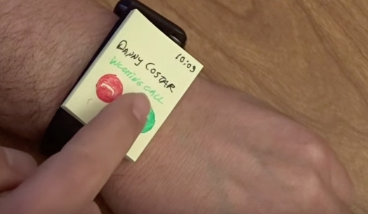
Now, with Lean UX, you can sketch a prototype in five minutes, then immediately go downstairs to a coffee shop and ask someone to stick this on their watchband and try to answer their phone, as shown in Figure 1. You’ll immediately learn a ton—for example, that this user interface is not working. So, for the next person, you can create a new interface that works right then and there at the coffee shop. This works in a doctor’s office or a store or wherever else your free-range customers are. You don’t need to bring them to your lab.
Figure 1—Lean UX wearable prototype
You won’t spend a lot of time creating stuff that takes you down the wrong path, then fall in love with the prototype because you’ve invested so much time and effort in it. Instead, you can pivot very quickly and just say. “Well, that didn’t quite work. Let’s see what we should try next.” Rapid iteration and direct interaction with customers become the focus, bringing the cost of failure down to zero.
Check out Greg’s video, “Lean UX for Wearables: Lesson 1: Simple Wearable Prototype,” in Figure 2, which shows a user interacting with this prototype.
Figure 2—Lean UX for Wearables: Lesson 1: Simple Wearable Prototype
Janet: Many product teams just want to get to implementation. They might ask, “Can’t you just skip the storyboarding?”
Greg: The storyboard is so important. Every time we didn’t do a storyboard, we just ended up having to go back and redo a bunch of stuff. Being able to envision the user experience is key, and that goes double for wearables. For wearables, creating a storyboard is very important to nail down what you are trying to do. Leave the how—that is, the exact design implementation—to the minimum viable prototype, or experiment. A storyboard needs to be loose enough. It shouldn’t be prescriptive as to how you are going to implement your vision. I call this the difference between the what and the how.
To put this another way, documenting the vision provides the necessary constraints. This allows you to iterate rapidly, taking various design approaches. As we discussed earlier, when we explored different ideas for a user interface to answer a phone in a car, in just a few minutes, we could come up with five or six ideas. When you create a storyboard, you have your North Star and understand what you are trying to do. First, everyone needs to agree on what you are building—the kind of experience your team wants your customers to have—then the what represents the key use cases. As long as you’ve got that down, you’re in good shape.
Storyboarding is very important, and it’s a big part of both my class and my book The $1 Prototype: A Modern Approach to Mobile UX Design and Rapid Innovation, but it’s not the final prototype. It’s critical to capture and document the vision aspect of the design process in a storyboard. After that, you can play with the how—the exact design implementation—freely. It is important to note that the vision can, of course, change. Nevertheless, it is important to document it. The number one mistake is giving into the temptation to just jump into prototyping without a vision of what a successful interaction should look like.
Entering the Wearables UX Arena
Janet: What is the best way to enter the Lean UX for wearables arena?
Greg: Well, of course, I would say the best way is to take one of my workshops or my online course “Practical Lean UX for Wearables.” I recently made my fourth consecutive speaking appearance at SXSW, speaking on this topic. I’ve also spoken about this at HCI International in Toronto and UX Alive in Istanbul. Look for future events on my Design Caffeine Web site.
Which Is More Important: Wearables or Mobile?
Janet: Which is the most important, designing a wearable app or its companion app on a mobile device?
Greg: More and more, wearables are the new, interesting frontier. People who are skilled in wearables-first thinking are going to get first dibs on some really interesting projects in the wearable, mobile, AR/VR (Augmented Reality/Virtual Reality), and IoT (Internet of Things) space. That is where the future growth will be in 2016 and for the next five years. I think we are just beginning to scratch the surface. What, today, we are calling wearables is actually a huge arena full of all sorts of interesting smart devices and novel UX-design possibilities.
For example, I have a friend who is developing an in-pool monitoring system, and the companion user interface is an IoT application that lets a swimmer see the pool’s pH level, chlorine, and so on, which are monitored by a small gadget floating in the pool that automatically releases certain chemicals into the water, depending on what the sensors show. Things are heating up in the autonomous smart–devices segment. There is now a mobile monitoring device that has received a lot of press lately. It is basically an early version of a futuristic Robocop, except that it can’t deploy any weapons—though I’m sure that is coming.
One arena that we are forgetting about is the car, which is often the missing piece. The car’s user interface is going to interact with both your wearable and your mobile phone in some unforeseen ways that will deliver a safe, satisfying user experience, but we’re definitely not there yet. Android has made huge strides with the in-car experience, but Apple has yet to even enter that arena. We are finally starting to understand that the key is the overall ecosystem, including the massive infrastructure that we’ll need to implement for the self-driving car to become a reality. It’s about the overall in-car experience, not a particular gadget. And thanks to companies like Tesla, Uber, Google, and Baidu, the car user experience is going to be a very interesting space to play in for the next five years.
To elaborate on the point I made about the importance of looking at the entire ecosystem, it’s important to consider that your customer may have multiple touchpoints along a specific experience arc. For example, if you are making a large purchase like buying a new refrigerator, you may start the process on your phone, visit a store, use an in-store kiosk, or go online on your notebook computer and compare different models. You may search on Google and go to different sites like Sears or Consumer Reports, then go back to your phone to make an appointment to have a conversation with an actual salesperson. Once you’ve narrowed down the specific model you want, you may try to find the best deal on it. The consumers of today are adept at traversing different devices, so we need to take that into account when we design for wearables.
If your company does not currently offer a wearable solution, you need to think about what, if any, processes a wearable device could enhance and what new experiences are possible. So, we could say that wearable is the new mobile. It’s the new frontier where you simply must have a wearable app for certain solutions. So I would not say that mobile is more important than the wearable or vice versa. It depends on the application. But we must not forget the cars and smart refrigerators that are going to be here in the next five years. We need to start thinking about those right now, so we’ll have those experience ideas ready to go when the technology becomes available.
Janet: I was very intrigued by what you said in your commercial about our needing to think of a wearable as an accessory to a mobile device, but your expecting that situation to flip.
Greg: Yes, I absolutely expect that. Certain applications are going to require wearable-first design. For example, this has already happened for fitness and notifications. I’m going to predict that it is going to happen for music and many others things going forward. This is a completely different way of looking at the space, and it’s important that the companies that are going to shape this space in the future should already be thinking this way. Otherwise, they’ll all be playing catch up. This is very much like when mobile first happened. For a long time, many companies thought of mobile as a kind of nice-to-have capability—an additional accessory for the desktop.
Because many companies failed to grasp the importance of mobile technology, they’ve not been able to adopt the ideas of mobile-first design or mobile-first interaction quickly enough. So, today, we have exactly the same situation with wearables. If you look at the science fiction–imagined future, most people do not have two devices. They just have something on their wrist that can project a keyboard or can simply interact through intelligent conversation between the user and the system and the use of real-time sensemaking of the user’s environment.
Today, we are still a long way off from that, but I think this is a useful North Star to help us re-imagine how our company’s products and services could interact with a customer, using a wearable device as the core of the experience. Just try a few wearable-first ideas and see if they work. Most ideas won’t work right away, if ever. But if just one idea resonates with your customers, you’ll have a tremendous opportunity you can take advantage of right now, because wearables are out there, are extremely capable, and are getting better all the time.
It’s important that you not limit yourself to just a couple of wearable-device models. Just because Apple and Android are currently the leading contenders does not mean that there is no space in the market for things like Fitbit or other specialized fitness trackers or specialized wristbands for lifestyle, meditation, awareness, and many other things. For example, I can picture special adaptations that will help people who are visually impaired to navigate. Maybe one wearable device is not enough. Maybe they could have two wristbands and that would help them navigate reliably. So we really need to think out of the box—and not just for people with special needs, but for just about anyone.
There are so many potential new business models in this space right now. To give you just one example of an alternative interface, there is the Samsung Gear S2. I think its user interface is so much better, but the device itself is not getting much attention in the marketplace because, at least for now, the app ecosystem is somewhat limited. But, in my opinion, the Samsung Gear S2 actually has a much better user-interface design than either Apple Watch or Android Wear.
Unlike the Apple Watch, which has the digital crown on the side, Gear S2 features a much bigger, full-sized, spinning dial right on top of the watch, providing a much more natural way of interacting with the device. Because it is much bigger, it gets away from the problems of little buttons and extremely small, awkward touch controls. Gear S2 takes advantage of time-tested ergonomics that let you use a spinning dial similar to that on top of the old Swiss Army watches that let the user set the timer—a design that dates back to the 1950s. You can even operate Gear S2 with gloves on, something that is impossible with Apple Watch. This is just one example of a divergent user experience that is completely different from anything else that is on the market. So don’t blindly follow Apple or Android. There are many other opportunities for innovation—Fitbit and Samsung Gear S2 are just a couple of them. I suspect we are going to see some really interesting stuff coming out in the very near future, and I’m certainly hoping to contribute to that.
Janet: Who can use your Lean UX approach? What about engineers, managers, stockholders, and marketing team members who usually do not take part in the design process?
Greg: Just like Steve Krug, I believe that anyone and everyone can and should do Lean UX mobile and wearable prototyping and employ rapid, iterative testing and evaluation, interacting directly with potential customers in the field. Steve is kind of a godfather to the whole customer-first–usability testing movement, and he deserves all of the credit for that part of my approach. Anything that does not work with my approach is all on me.
As Steve wrote in his book Don't Make Me Think, “Anyone and everyone should be doing their own usability testing.” Similarly, I believe anyone and everyone should be using my $1 Prototype technique. It’s really cheap and doesn’t require any special equipment or much training. All it requires is very basic sketching skills. If you can draw a circle and a box and write some button labels on a sticky note, you are good to go. The rest is really just a desire to engage with your customers in a way that will lead to rapid progress.
Not only should you being doing Lean UX, you can’t afford not to do it. If that kills a few sacred cows—and, in the process, helps your team come up with really quick ways to innovate and satisfy the needs of the marketplace—I think that’s fantastic. Ideally, the process should be led by a UX researcher or designer, but everyone on a product team should be involved and fully invested in Lean UX. You need to bring along your developers, product managers, and marketers and get your entire team to participate. Even a couple of visits with customers are going to help a great deal.
There is no excuse for not doing this because it is so inexpensive, and it doesn’t require a lot of specialized training, just a desire to innovate. Lean UX in general and my $1 Prototype method in particular, eliminates a lot of the distinctions between different team members. It puts the customer at the core of the design process. I want to credit Whitney Hess for saying, in her closing keynote at the IA Summit a few years back, how in love we UX professionals are with our artifacts and deliverables. In contrast, the Lean UX approach puts the emphasis on the product. I’m fond of saying the product is the product, not your deliverables. Rather than focusing on wireframes or comps or even on code, Lean UX puts the product or service in the hands of the customer.
To find out more about Greg’s “Practical Lean UX for Wearables” course, vis the Lean UX Academy.
Dr. Janet M. Six helps companies design easier-to-use products within their financial, time, and technical constraints. For her research in information visualization, Janet was awarded the University of Texas at Dallas Jonsson School of Engineering Computer Science Dissertation of the Year Award. She was also awarded the prestigious IEEE Dallas Section 2003 Outstanding Young Engineer Award. Her work has appeared in the Journal of Graph Algorithms and Applications and the Kluwer International Series in Engineering and Computer Science. The proceedings of conferences on Graph Drawing, Information Visualization, and Algorithm Engineering and Experiments have also included the results of her research. Read More