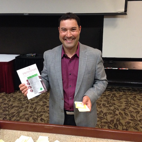
Greg Nudelman recently published a new book: $1 Prototype: A Modern Approach to Mobile UX Design and Rapid Innovation. Shown in Figure 1 with his book, Greg is a mobile and tablet experience strategist, Fortune 500 advisor, author, speaker, and the CEO of Design Caffeine, Inc. In addition to this new book, Greg has authored three other UX books:
Android Design Patterns: Interaction Design Solutions for Developers
Smashing Mobile Book, with co-authors
Designing Search: UX Strategies for eCommerce Success, a UXmatters book, with Contributing Editor Pabini Gabriel-Petit
He is also the author of the popular UXmatters column Search Matters.
Champion Advertisement
Continue Reading…
Figure 1—Greg Nudelman, holding his book $1 Prototype and a sticky-note smartphone
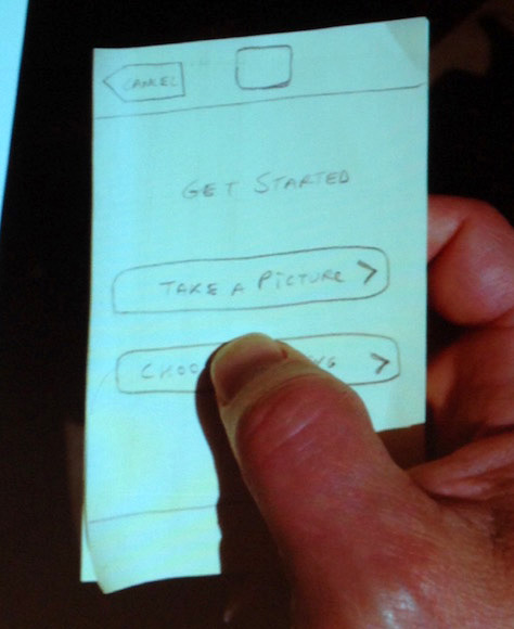
In $1 Prototype, Greg shows how to rapidly create and test prototypes to discover the best product design. He began his book by telling a story: He usually sketched ideas in his Moleskine notebook, but one day he forgot to take it to a meeting. So, when he was discussing a design with the CEO of a client company and needed to sketch an idea, he grabbed the first paper he could find—a stack of sticky notes. He drew the basic design for a mobile app on the sticky notes and the CEO—who was usually quite reserved—jumped up, grabbed the sticky notes, started using the notepad as though it were a smartphone, and exclaimed, “See! This is exactly what I mean!” The $1 Prototype was born! See Figure 2 for an example of a sticky-note smartphone.
Figure 2—A sticky-note smartphone
The $1 Prototype focuses on how to design mobile apps. Greg’s book is written in an easy-to-digest, question-and-answer format and includes several case studies. Greg also provides links to several live-action videos that walk the reader through the prototyping process. His intention for the book was that someone could read it on a flight from SFO to JFK, disembarking with many ideas that could be implemented immediately. Greg’a use of humor is a big plus. It made his writing so relatable that I felt as though I were having coffee with him and discussing UX design.
The Method
The $1 Prototype takes a Lean approach that you can apply to any product-design process—whether in an agile or a waterfall development context—and comprises four phases that occur in a rapid, iterative loop:
envision
prototype
test
collaborate
This method is inexpensive to implement, with just a minimal investment in sticky notes and the little time it takes to draw the designs and test them. It also keeps the focus on design effectiveness rather than on spending a great deal of time developing deliverables such as wireframes or prototypes—only to discover that the design concept is lacking.
Greg proclaims that the essence of the $1 Prototype is about creating the final product—not the deliverables—and institutionalizing failing fast. By quickly and cheaply bringing a design to life, a design team can quickly rule out less than optimal design concepts and create a better design solution on the next iteration. When a team hasn’t made the greater investment of creating a digital wireframe or prototype, it is much easier for them to let go of a design and create a better one. Another benefit of using a sketchy, less polished prototype is that people are more likely to recommend changes because it appears that the design is still evolving.
Envision
Greg implores his readers not to skip the envisioning step. While it might be very tempting to save time and money at the start of a project by going directly to design and development, skipping the envisioning step often leads to missed opportunities and increased costs that result from the necessity of redoing a design that did not achieve customer objectives.
You can use five to eight 3x3-inch sticky notes to create a storyboard for your product. Start with a real-world scene that sets up the situation in which a person would use your product—for example, an office building, house, restaurant, or park. Then sketch the interactions among the people using the product, as well as their interactions with their mobile device. You can show these interactions using dialogue and thought balloons. Don’t use captions, which can often sound like a commercial. Avoid more formal images. Use humor and have fun, creating camaraderie and empathy for the user. Greg insists on our not showing much detail on the mobile device, but instead, focusing on the interactions.
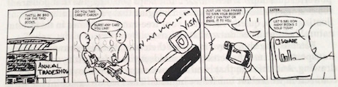
End the storyboard with a panel that demonstrates a reasonable benefit of using your product. For example, as shown in Figure 3, you might depict a store owner reviewing his sales at the end of the day rather than a person doing a cartwheel after paying his bills online. Whatever benefit you show, it must be believable! If it’s not, the believability of the entire storyboard can be called into question.
Figure 3—A sample storyboard
Using sticky notes not only lets you update or rearrange your storyboard as necessary, it also lets you reuse a sticky note at any other point in the design process without your having to redraw it. This method often employs reuse.
Prototype
Greg recommends discarding “the over-bloated, marketing-laden mess that most Web sites have become, and starting over, from the very core of the experience, targeting that feeling of empowerment, simplicity, and sophistication.” Where to start? The home page. It can be as simple as the popular List of Links design pattern. However, you must use a realistic—albeit sketchy—design. Greg encourages his readers never to use Lorem ipsum text anywhere in a prototype. You must use realistic text and icons to get realistic data from testing. But, remember, realistic does not mean polished, but rather meaningful.
The $1-prototype method involves drawing a minimal viable prototype (MVP) on a series of 3x5-inch sticky notes to simulate a mobile app on a smartphone. You can use different sizes of sticky notes to represent different sizes of smartphones or tablets. Start with the home page and create a new sketch for each page that a user would view while completing a task.
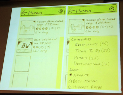
There’s no need to show every single detail that will appear in the final design. For example, if an app lists nearby restaurants, your sketch could show the full details for just one or two restaurants, not all the listings. Use a separate, smaller sticky note to represent the keyboard that slides up at the bottom of the screen or a drawer that comes in from the side. See Figures 4 and 5 for examples of a page with an added keyboard or drawer. In Figure 5, on the left is a prototype of an app page on which a yellow bar represents a drawer. The sketch on the right shows the activation of that drawer.
Figure 4—A sticky-note keyboard Figure 5—Interaction with a drawer
A small, circular, color-coded label can represent a Floating Action Button (FAB). It is important that such dynamic elements be represented separately, so you can add or remove them during testing to create a realistic simulation. You may be able to use some elements multiple times on the same project and maybe beyond. In his book, Greg shows multiple examples of such prototypes, with plenty of pictures, demonstrating this method step-by-step.
Greg advises that, in creating your prototype, you should be specific, but not make it overly complicated. He cautions that you not spend so much time creating your prototype that you fall in love with your design, then find it difficult to recognize its failings. Rapidly create and test your prototype, iterating to create the best design for your product.
Test
Next, Greg guides you in how to use your handy prototype for testing. He cautions his readers that, while many large companies perform usability testing only as a formality late in the design process, this approach does not help them achieve a strong UX design.
By creating a meaningful prototype quickly, you can test and iterate often, which enables you to get to the best design. You must find appropriate participants who have the necessary skills to use the app. Fortunately, most people use mobile apps, so you can find participants almost anywhere.
One of Greg's favorite places to find participants is in a coffee-shop line during the morning rush. In a humorous way, Greg explains that decaffeinated people make great test participants because they are a bit cranky and very straightforward with their feedback. He offers people a free coffee in return for their giving feedback on his prototype. In just a few hours, you can do usability testing with about 15 people, for only about $50.
For most mobile apps, you can do usability testing in an environment where people would actually use the app. Throughout the book, Greg reminds readers that by failing quickly and often, you can iterate to a better prototype.
He recommends starting a usability test with a stack of plain sticky notes with just the home page on top—so its weight feels similar to a smartphone. Then add or remove sticky notes as the user navigates through the app, performing a task you’ve asked them to do.
Of course, moderating a usability test is an art, and there are many considerations you must take into account. Greg recommends that you say little and avoid leading the participant to certain conclusions or to performing specific actions. Ask participants to perform a task, then observe them. Let them continue, even if they are failing. In fact, these moments of frustration—for both participant and moderator—may be the most instructive moments for improving the app design.
Of course, people will ask questions such as “What do I do next?” or “How do I do this?” Greg recommends answering such questions with another question—for example, “What would you do if I weren't here?” This simulates how a confused user would work with a real app in real life—when the project team is not at hand. Greg emphasizes that it is not what participants say that is most important; it is what they do. While participants’ words may differ, behavioral data will often be very consistent across a set of participants. Greg has provided several videos showing examples of usability testing.
Collaborate
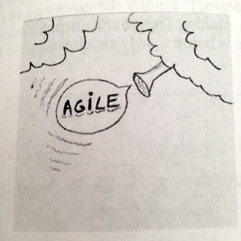
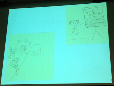
The $1 Prototype method is a particularly good fit for agile development. I almost fell out of my chair laughing when I saw Greg’s description of what passes for agile development in many companies. I think he really nailed it! As depicted in Figure 6, a C-level executive declares from above that, from now on, the company will be an agile shop, and it will take much less time to launch products.
However, the company still has the same kind of design meetings—in which somebody stands at the front with a PowerPoint and disengaged people hide behind their smartphones, wishing the meeting would end already. Then, when management declares that it needs time estimates based on those few PowerPoint slides, the designers and developers freak out. Figure 7 shows Greg’s representation of such meetings. This just doesn’t work. But companies make this same mistake all the time!
Figure 6—We are an agile shop now! Figure 7—The future is bright with agile development—well, not really
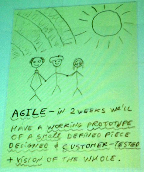
So, what is a better way to approach agile design for a mobile app project? First, have a kick-off meeting, involving the entire team, in which you create storyboards for key user stories. It is vital that each team member be highly involved in creating these storyboards, as well as the overall design. Even people who swear they can’t draw should be involved. The drawings may be cheesy, but that’s just fine.
Remember, the focus is on the product, not the deliverables. Management and design and development teams can work together to quickly create a well-defined piece of the whole product. For the moment, forget about each person’s title and role. Just focus on creating great storyboards for a great prototype. Create your minimal viable prototype on sticky notes, then do usability testing. As shown in Figure 8, the goal is to quickly create a working prototype of a just piece of the product.
Figure 8—Working together to prototype the product
Greg discusses how to work with team members who are more comfortable with waterfall design or who disagree with the rest of the team about the direction the project should take. Since you can create these prototypes so quickly, it is possible to prototype multiple possibilities, then do usability testing on each of the designs. Sometimes, you’ll make very interesting discoveries through testing these divergent designs. Greg goes into great detail on how to encourage a team to design together, then later create good documentation. He repeatedly emphasizes that your focus should be on the product, not deliverables such as wireframes or other documentation.
Greg’s Day-Long Workshop
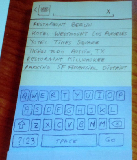
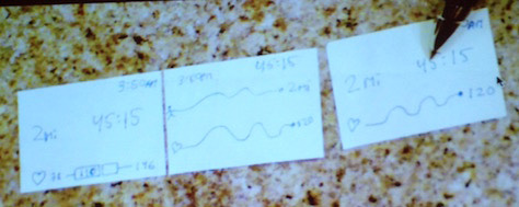
I had the good fortune of attending Greg’s “$1 Prototype” workshop at the Big (D)esign conference. In this workshop, we covered much of the book’s content and worked on storyboards and paper prototypes. Several participants presented their storyboards and designs, and we discussed what they might do next on those projects. We also explored how to apply the $1 Prototype technique to wearables. Guess what? They make sticky notes in the right size for those, too! See Figure 9 for an example prototype of an app for a wearable device.
Figure 9—A app prototype for a wearable device
Greg led his workshop with expertise and a healthy sense of humor. This made both Greg and his prototyping method seem very approachable. He was glad to answer our questions during and after the workshop. Throughout the day, our collaborative effort enabled us to learn and apply the $1 Prototype technique. Despite our being in a large auditorium, it felt like we were sitting around a large table, having a fruitful discussion. At the end of the workshop, I felt that I could immediately apply the $1 Prototype approach to my work. It was a day well spent.
This is a really detailed breakdown of the book. Definitely going to check it out. Thanks so much for putting this review together! We’ve shared it on our Twitter page.
Thank you SO much! Really enjoyed having you at the workshop. I’m glad you found it useful and productive!
Right now, I am making a special pilot of the online version of the Lean UX for Wearables course available for 25 people.
I included the Lesson 1 video—a demo of how to create your own wearable prototype in just 5 minutes. I hope to see you and everyone interested in Lean UX for Wearables at the online course.
Dr. Janet M. Six helps companies design easier-to-use products within their financial, time, and technical constraints. For her research in information visualization, Janet was awarded the University of Texas at Dallas Jonsson School of Engineering Computer Science Dissertation of the Year Award. She was also awarded the prestigious IEEE Dallas Section 2003 Outstanding Young Engineer Award. Her work has appeared in the Journal of Graph Algorithms and Applications and the Kluwer International Series in Engineering and Computer Science. The proceedings of conferences on Graph Drawing, Information Visualization, and Algorithm Engineering and Experiments have also included the results of her research. Read More