During my years as an interface designer, I’ve worked with lots of different development teams. From big companies to small startups, the interactions between me—the product designer—and developers have been pretty consistent. We work through what interactions and features are possible given our timeframe and resources. We discuss edge cases and clarify how specific interactions should work. We debate product strategy, information architecture, target audience, front-end technologies, and more. We also frequently encounter the same issue: the need to consider what’s not there.
The way we get there is always the same. I work with the product team to balance user goals, business requirements, and technical considerations to create a product design. That design gets vetted, iterated, and ultimately documented.
Because I mostly work with fast-paced Web companies, I frequently have to create my design documentation under aggressive timelines. This means there is not a lot of time for creating detailed design specifications. Nor is there an opportunity for me to provide templates in HTML and CSS for every part of an application. So I turn over mockups and workflows—in the form of stories or task diagrams—to the development team. What I frequently get back is half of the design.
Champion Advertisement
Continue Reading…
By half of the design I mean that all of the features, content, and functions are there, and they are working as designed. So what’s missing? Isn’t that the complete product design?
What’s missing is what’s invisible: alignment and whitespace.
Often, user interface elements are not aligned. What’s centered in the design doesn’t appear that way in what’s implemented. What was vertically or horizontally aligned in the design appears ragged.
Padding, or whitespace, often fares worse. In some places, padding is gone; in others, there is too much. Padding is set to different values, leading to columns and rows of varying widths. Changes in padding and alignment can negatively impact readability and obscure visual relationships that clarify how to use an interface.
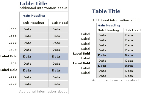
Figures 1 and 2 show examples of problems with alignment and padding in the implementations of designs. The original design appears on the left; the implementation, on the right.
Figure 1—Do you see the differences between these examples?Figure 2—Example showing differences in padding and alignment
Why is this the case? It’s not that the developers deliberately modified the design. It’s not that they necessarily consider alignment and whitespace to be unimportant. It’s just that these elements in the user interface are often invisible to them.
Development teams are responsible for putting interactive features and content into a product. Empty space is neither feature nor content. Therefore, it is not a requirement. For a designer, however, whitespace is often just as important as the content.
As a designer, I spend a lot of time adjusting whitespace to enable effective scanning of content. I also spend a lot of time refining alignment and padding to establish the right prioritization between user interface elements. I utilize both of these design elements to guide users through the interactions on a page. I use them to communicate what’s most important, what’s related, and what needs attention. For designers, these are key requirements of effective communication. And yes, there’s a lot of evidence that shows what’s invisible does make a difference.
Now before you decide I am a whiny designer just getting on the case of user interface engineers for not building exactly what I designed, let me say that I know what the engineering team does in bridging the gap between a product design and an actual product is invaluable.
But just like designers should know what is possible with HTML and CSS—or whatever happens to be their medium—and how to make their designs bulletproof, development teams should recognize that the space between and around user interface elements and the alignment of those elements may be just as important as the elements themselves.
I’d love to see more developers bring the skills and craft they apply to the construction of the visible to the construction of the invisible: padding and alignment. Once they learn to look for these things in a design specification or mockup, they’ll have a better sense of the designer’s intent. A shared understanding of what’s being built—whether visible or invisible—goes a long way toward making products that our users can understand.
I’ll admit, I’m a little shocked at this article. I don’t think you’re a whiny designer at all!! In fact, it sounds more like you are describing the woes of working with, to put it bluntly, mediocre developers. Do good developers interpret page designs so haphazardly that the whitespaces and alignments come out so different from the designer’s intent? Or, to put it another way, is the work of visual designers really treated with such low regard that being sloppy with fundamental design elements like whitespace and alignment is considered normal?
Good developers deliver HTML/CSS that matches the visual designer’s intention as exactly as possible given the technology, down to the pixel. The best ones improve on the design details, anticipating issues the designer didn’t think of. Let’s not tiptoe on eggshells here: anything less than this is simply sloppy development work.
Of course, you could be describing a situation in which a UI goes right from a wireframe to coded HTML with no fully visually designed comp produced in the interim. I realize that this is often unavoidable, but in this case, a simple visual design style guide would at least be helpful, where a designer builds a comp or two showing how most common text styles, table styles, form layouts, and other common page elements work visually. This guide can then be used by the developer to interpolate hundreds of wireframed pages that call for these elements.
If you skip both visual design comps and style guides… that is, if you skip visual design almost completely… then your last hope would be to have developers with great graphic design skills.
As a developer who has to work on Web sites with tight schedules and layouts delivered by designers in a variety of formats, what normally happens is features take priority over layout when the deadline hits.
Often a developer’s deadline is quite different from a designer’s deadline, and it is likely that the developer sees the designer as a target for performing cleanup. It is often much more time consuming for a developer to perform layout correction ( it isn’t what they do everyday ) than it is for the designer.
What would benefit the project most is having an explicit delineation between the time that a developer spends implementing functionality and the time that a developer spends designing and correcting layout.
Indeed, letting a ham-fisted developer loose on your design without proper oversight is unprofessional. Sure, some developers can do both, but in general, developers aren’t designers, otherwise they would be doing the design work.
The actual role of performing cleanup seems like an excellent job for a junior designer. What better way for them to learn about the shortcomings of developers, and the intentions of designers?
Excellent article, and I understand completely. As both an interface designer and implementer, I know that a lot of times there are several reasons the two don’t look the same. Most of the time, it is time. If I’m on a development schedule, I want to spend that extra twenty minutes unit testing rather than gaining 1 pixel of whitespace.
But as an interface designer I get pissed when it doesn’t look like I drew it. And, often times I am pissed at myself. Whitespace is definitely key to a valuable user experience and is much too often overshadowed by functionality and time.
I feel your pain. I’m the designer for our company, working with two developers. Often times I’ll write the markup and css, but every now and then I’m too swamped, and I’ll pass the duty (and my comp) along to one of the developers. Most times it comes back minus entire graphical elements, and almost always with default browser whitespace. Now, they do amazing code work, and I’m always grateful that they can make my hairbrained effects work, but it’s aggravating to watch a new page go live that looks almost nothing like what I gave them (and then trying to explain to the boss why it looks like that).
Speaking as a guy who’s often implementing interfaces (I’ve even worked with you Luke—hiya!) I believe there’s got to be some give-and-take. I agree with and believe that a misuse of whitespace cannot only make a design ugly, but actually damage a design’s ability to guide a user—I’ve seen too many people lost in what should be simple tasks too many times.
On the other hand, over-designing a system (or rather, over-customizing) can be just as detrimental to the user experience when designers try too hard to make customers jump through hoops in a different way—though I seriously doubt this is still on-topic with your article (^_^) . One thing I hate about the Web is the grand inconsistency of basic Web forms. Every user interaction seems so tied down to the design of the site itself rather than allowing a user to have a consistent experience across their task. Be it shopping or submitting a complaint, there is too much inconsistency in the design patterns across the Web, let alone the design elements themselves. That’s why I really applaud Yahoo! for its developer library. By declaring good design patterns and encouraging the reuse of predefined widgets, companies and individuals can get down to the real reason they use the net.
My biggest problem is less that implementors cannot see the white space and other such design elements and more that they don’t WANT to see them. They really would rather not have anything to do with what seems to them too close to painting. There’s a reason they’ve taken refuge behind their keyboards, and it’s not because keyboards are the best tools for visual expression. From talking with them over the years, I get the impression they are so phobic of art that they would rather deliberately practice negligence than be perceived as having made an effort, because that would expose them to risk of failure, which they have never in the past found to be rewarding. In addition, bug databases relegate these kinds of issues to the “cosmetic” category, where “cosmetic” in conversations involving prioritization by management is nearly always preceded by “only” or “just” or “merely”. To me, a cosmetic bug is about intending to implement a design, but committing a logic error in good faith resulting in some unpleasant splotch on the screen, but the kind of bug you are describing here comes from a lack of intent, which really merits as fierce a spanking as any other bug. The few implementors I have run across who tend to get these things right almost always turn out to be musicians in their off-hours. Go figure.
I follow the general drift of your argument, but am not quite clear on the examples. If I understand correctly, the ones on the left are yours and the ones on the right are what actually got implemented.
On the first one, I believe that somewhere in between would do well. The data seems to float in the cells for the left example. But the right one is a bit too compressed.
It’s the same for the second. The gap after the headings is a bit too large on the left and a bit too tight on the right. However the right has a more uniform spacing.
I understand your point about whitespace, but I’ve found that if I can preempt the next in line in design a bit, I can squeeze out a bit more whitespace than would otherwise get through. If I make it a big deal then, as the designer, I typically lose.
As the sole UI person in a company with 9 (and growing!) developers, I’ve been trying to pound this particular point home. Till I found this article, though, I haven’t had a good resource to point my coworkers to.
So, on behalf of my sanity and our company’s products… thanks :)
Ain’t that the truth. Well, for me it is. But hey, I am friends or on good terms with the developers I work with, so I do not take it personally. Matter of fact, we have worked out a deal. They add the functionality to my design, and then I come in at the end and clean things up. I learned this from my family’s landscaping business. The site construction personnel usually ruin anything the landscapers do, so they come in at the end and tidy things up.
Recently, yet again, I’ve experienced this with the spacing needed between unrelated action buttons.
Developers see three buttons on a screen and think that if they have the three buttons on the screen and the functionality behind them complete that that is enough. Wrong! In my case, two of the buttons were related while one needed a little visual white space to separate it from the other two. They were all equally spaced when development was finished.
The good news? We were able to have the additional white space added back in…
I have to admit, I’m surprised that developers aren’t able to match your designs, it is so easy these days with CSS.
On the other side, many designers don’t account for the fact that form elements are rendered differently across different browsers and operating systems. Again, CSS comes to the rescue for certain elements, but not others.
Another thing to consider is that pixel perfection often breaks accessibility unless designed and developed specifically with that in mind.
The most helpful suggestion when working with rushed or substandard developers, is to add a layer to your PSD file that marks the various alignments and spacing that are important to maintain. Either that or sit down and talk with them and explain your concerns. I think most people are reasonable enough understand and comply with such a basic request.
Without passing judgment about what the appropriate level of adherence is, I gotta say you’re pretty lucky if your biggest problem is a little whitespace mismanagement. In my experience, the differences between developer input and output layouts are usually far more severe. Call me part of the problem, but in the examples you cite, the before and after look pretty damn close. Given the number of functional/documentation/testing/etc. issues that I typically face as a developer, I can hardly imagine worrying about a few pixels here and there. Unless I’m living on the far end of the bell curve, your developer cohorts are exemplary, not “mediocre”. Incidentally, I think it’s often a mistake to judge the quality of a software professional just by looking at his work. Ours is a profession where external constraints are ridiculously variable from one job to the next. For example, I’d say that E.T. was not too shabby a game for a six week effort…
Talking about alignment, how about justifying your paragraphs? Would this not make it more readable?
Well, I’m with you. Great interfaces make great programs. So the more perfect interface the is, the better it is. Although this is not the developer’s problem, but the designer’s. They aren’t paid to adjust table paddings.
I agree with the thrust of this article. A lot of developers find the attention to detail of alignment to be ‘fussing round the edges’. They simply don’t think it’s that important—particularly when they have loads of functionality and stability work to do that they consider (validly) to be more important.
That said, I think you’re lucky to be working with developers who get as close to your idea as they seem to. I’ve worked with developers who pay absolutely no attention to alignment and can’t see how much more difficult it makes a set of controls to work with when they’re badly aligned.
It’s an ongoing education process—and one that requires constant niggling away and being the pain in the backside that we’d rather not be.
Thanks for the great comments. To chime in on a few threads, I don’t think it is just poor implementation on the part of development teams. As Jon wrote, the skills required to see and appreciate the details of a design are what makes a designer a designer. As a result, it is entirely valid for developers to not be as intimate with the nuances of a product design.
From my perspective, that’s why I wrote this article: to get developers to see layouts from the design side of things. As several of you mentioned, features and functions have priority and need to get done first, so layout tends to get second billing (if not third or fourth).
If alignment and whitespace are addressed during development (the first time through), there’s a much greater chance they’ll make it into the final product design and not end up as P4 bugs :)
And, of course, over-designing and not accounting for the variety of delivery platforms that a digital product lives on are things designers should be called out on. It is entirely reasonable (if not expected) that a developer questions how a design will flex, scale, and adapt to different content and presentation variables. Designers need to take responsibility for thinking through these scernarios. In fact, I could write a similar article from a developer’s point of view: “designers rarely think through what hapens to a layout when font size changes, when language changes, when content increase or decreases, etc.. But if we, as designers, accept accountablity for these variations, it makes sense for development teams to take responsibilty for maintaining the alignment and whitespace that make product designs usable and professional.
Great article. It sounds like you’re missing a front-end developer on your team; albeit there are usually overlaps for that role. The front-end developer should be the person that appreciates the design elements and is able to implement the design. He/she can act as a mediator between the designer and the backend developers.
Mediation is inappropriate, because Engineering is always wrong. I say this only half-jokingly, since I am one of those overlap people of whom you speak—designer and front-end implementor—and yes, lately, a musician in my off hours, but I realized this before I started that. I have little patience for anyone reluctant to invest a couple hours tweaking whitespace before shipping. It just isn’t very difficult. All that’s required is that one be willing to engage the issue. The time takes care of itself—unless your priority during work hours is not working. Stuck in a teleconference? Mute it and get clicking, boyo.
And, it’s not just whitespace. Why I can’t get two pages to look exactly the same. We design one page for all types of different items, but we build many different pages depending upon some breakout in those items that differentiate them. But, why can’t all those built pages still have the exact same layout? Why, if a new breakout is introduced, do we have to recreate the entire page from scratch again? Inconsistencies in the flow of pages is distracting and makes it difficult for the user to follow and find information.
As a designer who’s done his share of construction, let me be among those to firmly assert that the problem is not developers. Stated more accurately, we won’t solve the problem by concerning ourselves with whether developers are, can, or should be more sensitive to matters of whitespace or any of a dozen other levels of design.
At the superficial and immediate level, the problem is one of asking for something that is extremely specific, yet asking for it implicitly instead of explicitly. I’ve done it and been burned exactly as in Luke’s scenario.
Yes, it was a junior developer. Does that mean that the solution is senior developers? No.
Yes, it was a backend developer unwillingly enlisted to do the presentation layer. Does that mean the solution is that all suffering projects will hire a CSS guy? No.
Yes, it was indeed an algorithmic guy with no aspirations to do HTML engineering. Does that mean that more intelligent staffing will solve the problem? Don’t hold your breath.
I accept now that the mistake was mine. It was a learning experience.
As others have mentioned, style guide documents, patterns, and training are inevitable components in the solution. And putting explicit disclaimers right into the mockups is the likely short-term cure. But at its core, this is one of many industry problems spawned mostly by immature tools. HTML—no matter how many technologies are duct-taped onto it—sucks for software construction, whether applications or content-centric work. Focusing on developers just drives the wedge deeper between us.
Only when the tools have what one might call "task-normalized"—that is, perfectly efficient and regimented—functionality will the problem go away. For the competent and self-motivated developer who has a clearly defined front-end focus, CSS might appear to solve the problem, but from the wider, industry perspective, Web stylizing is closer to witchcraft than machine-shop work. By this, I mean it is completely free-form and creative on every project. When, instead, every project starts—even as early as the design phase—with a controlled hierarchy of style elements and tools to regiment the cascading and inheritance, only then will the situation improve. It won’t solve all positioning problems—that’s why the design job exists—but it will solve all of those that can be algorithmized, and that will be enough.
Does anyone have references, links, or books on how to teach developers to understand and respect the design as an absolutely important and professional part of the project that has been studied, researched, reviewed, and corrected before being submitted to them? My biggest problem is that they think the designer only makes things look cute. Consequently, they feel no obligation to follow the whole layout. I am living a designer’s nightmare. Help!
You can tell people design matters all you want, but until they see it in action, they won’t believe it for themselves. Measure the outcomes of your design changes and use the data to make your case. Show how design has a postivie impact on the user needs and business goals of your product and people will come around.
Before joining Google, Luke was CEO and cofounder of Polar and Chief Product Officer and cofounder of Bagcheck. He is the author of three popular Web-design books—Mobile First, Web Form Design, and Site-Seeing: A Visual Approach to Web Usability—in addition to many articles about digital-product design and strategy. He was also the founder of LukeW Ideation & Design, a product strategy and design consultancy. Luke is a top-rated speaker at conferences and companies around the world, and was a cofounder and former board member of the Interaction Design Association (IxDA). Read More