Symbols and icons can be both friend and enemy to UX designers. They can convey a great deal of information in the span of just a few pixels or utterly confuse users, depending on the context. The careful application of icons, however, can greatly enhance software, enabling quick access to a feature or function, using a minimal amount of screen real estate.
Of the many choices for icons, the arrow falls into that small group of supposedly universal symbols that we can expect most people using a Web site or application to understand intuitively. (Others include the X, plus (+) and minus (–) signs, and—maybe—the stop sign.)
The arrow and its brethren are everywhere on our computer screens. For example, a quick examination of the Firefox 3.0 browser, shown in Figure 1 in its standard configuration, yields eight examples of arrows—Forward, Back, and Reload buttons, scroll bar controls, and drop-down menus that reveal search engine, history, and bookmark choices.
Champion Advertisement
Continue Reading…
Figure 1—Firefox 3.0 has eight arrow controls
How can we attribute all of these different behaviors to one symbol that—despite its many variations—is essentially just a line that meets two other lines where they form the vertex of a less-than-90-degree angle? What makes this symbol so useful to designers? Where did it come from? And how does it keep finding its way into modern user interface design patterns? Let’s take a closer look at the arrow and its derivative brethren—from triangles to carets to the mouse pointer—as a critical symbol in user experience design.
The History of the Arrow Symbol (More or Less)
From its origins in cave drawings and primitive art, to engravings and sign posts, to complex building wayfinding systems and now the pixels of the digital age, the arrow has survived and thrived as a symbol that is useful for enhancing human communication.
For ancient human cultures, the arrow represented both a weapon and the male gender. For the Greeks, in particular, it was a symbol of Ares, the god of war. And Cupid’s arrow piercing a heart continues to represent love and infatuation to people even today. However, it is the compass rose, first used by 14th century cartographers that helped associate the arrow with the concepts of direction and wayfinding. From its use on the compass rose, the arrow made its way onto signage, indicating the path to a specific location, serving as a substitute for the symbol of the pointing finger.
UX design owes much to cartography as an information design practice. We borrow liberally from its terminology—creating site maps of virtual territories and building navigation to negotiate the pages on a Web site. UX designers follow in the footsteps of cartographers when we create abstractions of the real, physical world in another medium. For cartographers, the contours of the landscape became lines of ink on a page. For UX designers, human interaction with text, art, and video data becomes pixels held together by code.
The Arrow, Its Brethren, and the User Interface
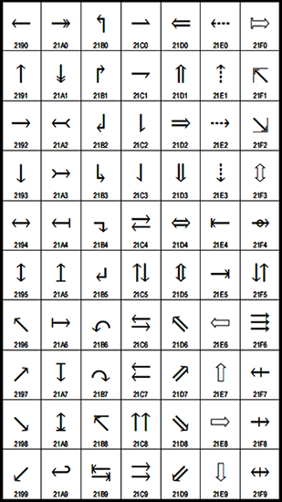
In user experience design, the arrow can play multiple roles, depending on the circumstances, and it has a variety of meanings. It can focus our attention on a specific point, demonstrate action, indicate flow, and connect objects and information. The arrow appears in interface design through a host of related symbols, including the cursor, the triangle, greater than and less than signs, and the caret. As Figure 2 shows, the Unicode character set includes many arrows.
Figure 2—Arrows in the Unicode character set
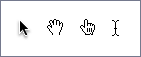
In UX symbology, the most important use of the arrow is for the pointer that substitutes for a person’s pointing finger. (See some typical pointers in Figure 3.) In a graphic user interface, the pointer is the primary tool for virtual interaction—an extension of the pointing finger through the mouse or the track pad. The pointer serves as our intermediary with a computer system, allowing us, among other things, to choose drop-down menu items, select files, start programs, and interact with virtual environments. In the digital world, the arrow represents the user and provides its primary method for user input. For newer users who are unfamiliar with applications’ keyboard shortcuts, the pointer may be the only way of directing the software. Although, with the ascendancy of touch-screen technology, this device may soon become deprecated.
Figure 3—Representing user interaction with the pointer, the hand, the pointing hand, and the insertion bar
Evolving Usage and New Interface Design Patterns
It seems like, from the very beginning, the arrow has appeared in graphic user interface design patterns across both desktop and Web software. The greater than symbol (>), has long appeared as a command-line prompt for text-based user interfaces, telling users where to direct their attention and type. This symbol is also in common use on the Web—separating the links that make up breadcrumbs or indicating there’s more content. And we’re all familiar with the use of the arrow as a symbol for the Play function in an audio or video player. As the vocabulary of interface design has become richer and user interactions have become more complex, the arrow symbol has become increasingly important.
Speech Bubbles with Arrows
For speech bubbles—like those in comic books and graphic novels—an arrow serves to connect words to the speaker or comments to their author. For example, in online discussion forums, a speech bubble’s arrow serves as a visual method of attribution, showing authorship of user-generated content.
Contextual Overlays with Arrows
Contextual menus and other overlays are becoming an increasingly popular method of revealing task-appropriate information to users. For contextual overlays, menus, and Help popups, an arrow can again serve as a connector to the elements to which they refer.
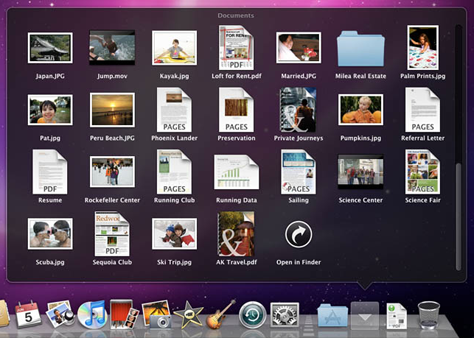
For example, as Figure 4 shows, in the new Mac OS X Snow Leopard operating system, users can view the entire contents of a folder like the Documents folder without leaving the dock. The arrow at the bottom of the overlay panel orients the user to the source of the content.
Figure 4—Viewing the Documents folder’s contents in Snow Leopard
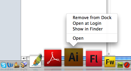
Similarly, Mac OS X reveals a pop-up menu for an application when a user control-clicks its icon in the dock. Once again, an arrow visually connects the menu to the application icon, as shown in Figure 5.
Figure 5—Pop-up menu provides application functionality in the dock
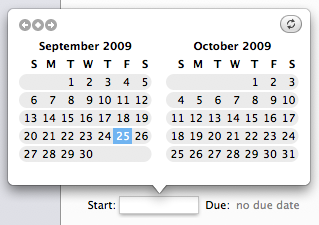
Other creative examples of overlay menus appear in The Hit List, a daily task management application for the Mac, in which clicking a date box reveals a two-month calendar, shown in Figure 6. This calendar overlay is similar to the pop-up calendars that are common in online reservations systems.
Figure 6—The Hit List’s calendar overlay
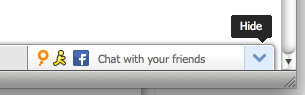
The addition of an arrowhead to an overlay leaves no doubt about what its floating, otherwise disconnected information refers to. Figure 7 shows a hint overlay on the community menu bar on Mashable.com.
Figure 7—A hint overlay on Mashable
Visual Assignment in Navigation Systems
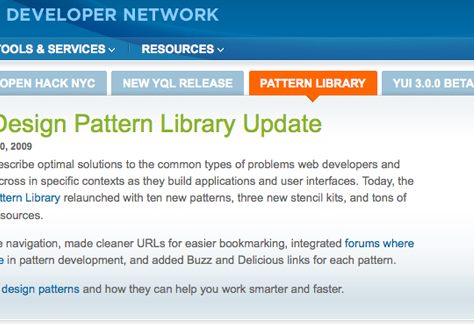
You can also incorporate the arrow into navigation schemes, as a simple, lightweight method of demonstrating that certain content is related to a selected item. Tabbed navigation on the Yahoo! Developer Network site uses an arrow to point to and emphasize related content, as shown in Figure 8.
Figure 8—Tabbed navigation on the Yahoo! Developer Network site
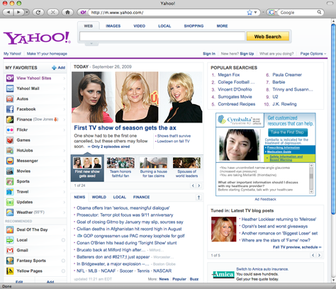
On the Yahoo! home page in Figure 9, an arrow helps users to visually relate the thumbnail beneath the slide show to the photo above. Yahoo! uses this arrow device in navigation systems throughout the company’s Web site and shares the relevant design patterns in their Design Pattern Library.
Figure 9—Yahoo! home page uses an arrow to indicate the selected thumbnail
These are only a few examples of the modern design patterns using the arrow.
Understanding the Ever-Evolving Arrow Symbol
So what does this mean for UX designers? Is the arrow indeed the universal controller? The aesthetic differences between the many types and uses of arrows provide us with enough contrast to ascertain their meaning. No one would confuse a Back button with a bread crumb separator or a mouse pointer with a scroll bar control.
William Lidwell, Kritina Holden, and Jill Butler, the authors of Universal Principles of Design, provide us with a framework for understanding icons at various levels of abstraction. They divide icons into four categories: Similar, Example, Symbolic, and Arbitrary.
On the simplest level, Similar icons are visually analogous to their real-world counterparts—for example, an illustration of a curve on a road sign represents an approaching curve in the road. Example icons, the next level of abstraction, “use images of things that are commonly associated with an action, object, or concept,” such as using an airplane to represent an airport. Continuing in the authors’ own words:
“Symbolic icons use images that represent an action, object, or concept at a higher level of abstraction. They are effective when actions, objects, or concepts involve well-established and easily recognizable objects. For example, a door lock control on a car door uses an image of a padlock to indicate its function, even though the padlock looks nothing like the actual control.
“Arbitrary icons use images that bear little or no relationship to the action, object, or concept—[that is,] the relationship has to be learned.”—William Lidwell, Kritina Holden, and Jill Butler in Universal Principles of Design
According to this framework, the arrow icon in UX design is no longer either Similar or an Example, but rather Symbolic or Arbitrary. This means UX designers who are in the process of innovating new patterns may very well be creating new meanings for the all-important arrow symbol.
Of course, the arrow has already evolved way beyond its ancient meaning as a weapon or a representation of the male gender to become the definitive direction icon.
In the digital realm, the use of the symbol continues to evolve. It now indicates action (the pointer), direction through time (the Play button), direction through digital real estate (scrolling controls), and visual attribution and organization (overlays and speech bubbles).
The use of the arrow is evolving as our visual vocabulary and user interface metaphors and patterns expand and mature, following a trend toward more complex interactions. Where it points, for now, remains to be seen.
I personally found out that using the arrow is the visual indicator of the important or current item or content on the page. Arrows are spatially intriguing for a user’s behavior on a Web page. Just my two-cents.
Oh, by the way, there is an arrow indicator on Twitter, too! If you are logged in, you will see the arrow indicating that you are on Twitter—pointing toward the Twitter logo.
At GoInvo, a healthcare design and innovation firm, Jon leads the company’s emerging technologies practice, working with clients such as Partners HealthCare, the Personal Genome Project, and Walgreens. Articles in The Atlantic, Forbes, The Huffington Post, and WIRED have featured his work. Jon has written or contributed to half a dozen non-fiction books on design, technology, and popular culture. He was the editor for O’Reilly Media’s Designing for Emerging Technologies, which came out in 2014. One of the first UX books of its kind, the work offers a glimpse into what future interactions and user experiences may be for rapidly developing technologies such as genomics, nano printers, or workforce robotics. Jon’s articles on UX and information design have been translated into Russian, Chinese, Spanish, Polish, and Portuguese. Jon has also coauthored a series of alt-culture books on UFOs and millennial madness and coauthored a science-fiction novel for young readers with New York Times bestselling author Matthew Holm, Marvin and the Moths, which Scholastic published in 2016. Jon holds a Bachelor’s degree in Advertising, with an English Minor, from Boston University. Read More
