In my column, On Good Behavior, I’ll explore the essentials of good interaction design. This first column provides a brief introduction to interaction design—defining the scope this column will cover—then explores some key design principles. What is interaction design? Here’s the definition I wrote for the UXmatters Glossary:
“Interaction design defines workflows that support users’ goals and tasks, the affordances through which digital products and services communicate their functionality and interactivity to users, the ways in which users can interact with those affordances, products’ behaviors in response to user interactions, and the methods by which products indicate state changes. Good interaction design facilitates people’s tasks and ensures that digital products are both learnable and usable by reducing complexity as much as possible, preventing user error, adhering to standards when appropriate, and through consistency across an entire product or product line. Typical interaction design deliverables include specifications, wireframes, usage scenarios, and prototypes.”
As you can see, interaction design is a complex design discipline that must take many different factors into account to solve a wide range of design problems. So, how do interaction designers get their heads around wicked design problems?
Champion Advertisement
Continue Reading…
“Design depends largely on constraints. … Here is one of the few effective keys to the design problem—the ability of the designer to recognize as many of the constraints as possible—his willingness and enthusiasm for working within these constraints….”—Charles Eames
Many different kinds of constraints bound our solutions to interaction design problems, including
users’ physical and cognitive abilities
design principles and guidelines
the amount of space available for a feature
technical constraints
business goals
Being able to make the necessary tradeoffs between conflicting constraints takes skill. I’ve always viewed constraints as my friends. They make me more creative. By thoroughly understanding the limitations that constrain a design solution, I can make the right tradeoffs and come up with the best design solution possible under those constraints. Plus, balancing different constraints often forces me to think outside the box, so inspires innovative design solutions.
Whether you are designing interactions for desktop, Web, or mobile applications, there are some foundational design principles you should always follow. In The Humane Interface, Jef Raskin gave us his first and second laws of interface design:
“A computer shall not harm your work, or through inaction, allow your work to come to harm. … A computer shall not waste your time or require you to do more work than is strictly necessary.”—Jeff Raskin
In this column, I’ll cover some basic design principles whose violation either interferes with users’ work, resulting in frustration for users, or actually harms their work. Unfortunately, users encounter egregious violations of these principles every day—and these are the sorts of design errors that become users’ pet peeves.
Give Users a Sense of Being in Control
Users need to feel that they are in control, so should generally initiate interactions. Almost every collection of user interface design principles includes this important tenet.
“Allow the user, not the computer, to initiate and control actions. Some applications attempt to assist the user by offering only those alternatives deemed good for the user or by protecting the user from having to make detailed decisions. Because this approach puts the computer, not the user, in control, it is best confined to parts of the user interface aimed at novice users. Provide the level of user control that is appropriate for your audience.”—Apple Human Interface Guidelines
“An important principle of user interface design is that the user should always feel in control of the software rather than feeling controlled by the software. … You can automate tasks, but implement the automation in a way that allows the user to choose or control it.”—Microsoft Windows User Experience
“Experienced operators strongly desire the sense that they are in charge of the system and that the system responds to their actions. Design the system to make users the initiators of actions rather than the responders.”—Ben Shneiderman’s “Eight Golden Rules of Interface Design,” from Designing the User Interface: Strategies for Effective Human-Computer Interaction
“Users prefer to feel a sense of mastery and control over any tool at their disposal, and the computer is no exception. The designer should be sensitive to this and present a tool-like interface.”—Deborah J. Mayhew’s “General Principles of User Interface Design,” from Principles and Guidelines in Software User Interface Design
“Allow users to be in control of the interface. Don’t limit users by artificially restricting their choices to your notion of the ‘correct’ sequence of steps needed to accomplish a task. … Allow users to establish and maintain a working context, or frame of reference, from within which they can perform actions. … This contextual framework contributes to the feeling of stability.”—IBM, “Design Principles for Tomorrow”
Now, let’s look at some examples of behaviors designers should avoid to ensure they leave control in users’ hands.
Window Behaviors Beyond Users’ Control
Many computer operations unnecessarily wrest control from users, interrupting their work and, in some cases, even preventing them from doing anything at all. For example, when a user opens an application like a Web browser that requires reopening a lot of windows from the user’s prior work session, the browser insists on bringing newly opened windows to the front. This is a huge and frequent time-waster for users. During such out-of-control interactions, a user’s attempting to do useful work results in an extremely unstable user experience, with the application repeatedly taking control from the user. Why in the world should a user have to monitor everything the browser does while it automatically opens all of those windows? A user should instead be able to work in another application, while the browser opens those windows in the background. If a user clicks a window to bring it to the front, the assumption should be it’s the window the user wants, so should remain in front. This is a problem that computer operating system design should solve.
Popup ads provide an obnoxious example of abrogating user control, forcing users to both view information they didn’t ask to see and close the windows in which the ads appear, wasting users’ time. While Netflix has a well-designed Web site, the company is one of the worst offenders when it comes to popup ads, which is damaging to the company’s credibility. Figure 1 shows a Netflix popup ad.
Figure 1—A Netflix popup ad
Unnecessarily Modal Dialog Boxes
Modal dialog boxes limit users’ possible interactions, because they require users to either complete or cancel an interaction and close a dialog box before they can do anything else. You should avoid designing modal dialog boxes unless they are absolutely necessary—that is, when an application needs more information before it can complete a user’s current task and it’s important to restrict user interactions to a certain order. Avoid modal dialog boxes for frequent interactions.
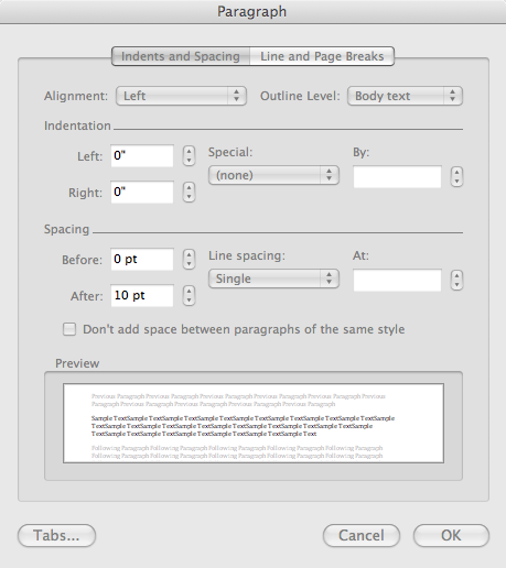
Figure 2 shows the modal Paragraph dialog box in Microsoft Word for Mac OS X. There is no reason for this dialog box to be modal. If it were modeless, a user could successively select different paragraphs and make changes to their formatting, making a repetitious task more efficient.
Figure 2—Modal Paragraph dialog box in Word
Generally, modal dialog boxes should be movable to ensure users can see any content that affects what they need to do within a dialog box. This is true for both dialog boxes in desktop applications and dialog boxes in Ajax Web applications. It’s extremely frustrating for users when a dialog box obscures information in the window beneath it that is essential to successfully completing a task.
Not Letting Users Cancel Time-Consuming Processes
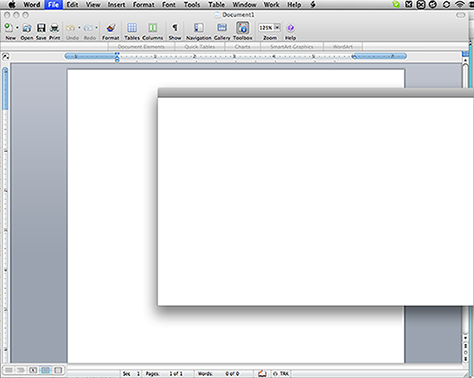
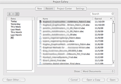
Always allow users to cancel time-consuming processes occurring in modal dialog boxes or progress message boxes. If users don’t want to wait for a lengthy operation to complete, they need to be able to change their minds and do something else instead. In Microsoft Word for Mac OS X, if a user chooses File > Open Recent > More, it takes forever for the resulting dialog box to appear. While a spinning progress indicator churned away—giving no indication of how long Word might take to display the data—and the Project Gallery dialog box displayed no Cancel button, I counted slowly to 95 before any content appeared in the dialog box, which Figures 3 and 4 show.
Figure 3—No content appeared for a very long while Figure 4—The Project Gallery dialog box’s content finally appeared!
If the designer had instead specified that all controls should appear in the Project Gallery dialog box before populating the dialog box with any file data, a user would be able to either click Cancel to escape the wait altogether or click one of the filters on the left, then have to wait for only a subset of the data to load.
Overlays That Interrupt Users’ Flow
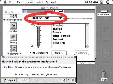
The first time I encountered a user interface that presented overlaid information to users on rollover was with Mac OS System 7.0’s Balloon Help. Its balloons provided descriptions of onscreen items such as file icons, menu commands, and controls in windows and dialog boxes, as shown in Figure 5. Because this feature incorporated no delay before its balloons appeared on the screen, balloons appeared willy-nilly whenever a user moved the pointer across the screen. Users hated Balloon Help, because they found its balloons distracting.
Figure 5—Apple Balloon Help
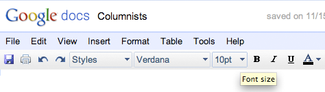
Microsoft Windows’ implementation of ToolTips and balloon tips has been more successful, because it incorporates a 500-millisecond delay. ToolTips and balloon tips appear only after the pointer has hovered over a control for 500 milliseconds. The use of ToolTips is now prevalent in Web applications like Google Docs as well, as shown in Figure 6.
Figure 6—A ToolTip in Google Docs
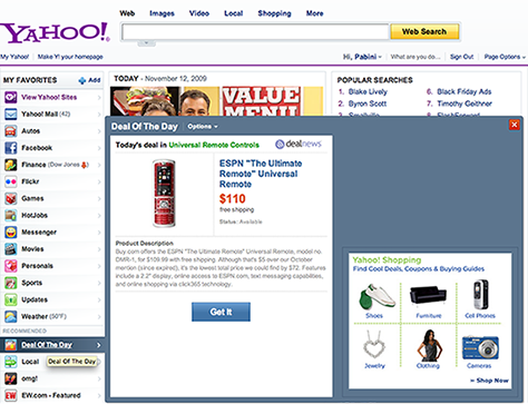
Today, users encounter the same problem we saw with Balloon Help in many Web applications. When large overlays and drop-down menus appear on rollover, they interrupt users’ flow. For example, on the new Yahoo! home page, a massive overlay appears immediately whenever a user’s pointer wanders into My Favorites, as shown in Figure 7. The appearance of these overlays is extremely disruptive to users’ completing their goals, because they are modal and getting rid of them requires users to click the close box in the upper-right corner of an overlay. The behavior of these overlays is particularly disconcerting, because a large part of Yahoo!’s motivation for displaying them seems to be the opportunity to include more display ads on the home page. They should instead appear only when a user clicks them.
Figure 7—Overlay on Yahoo! home page
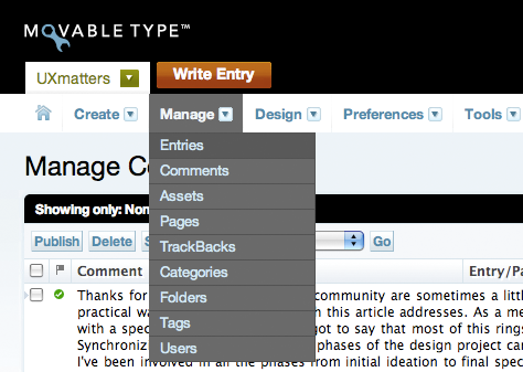
Drop-down menus that appear with no delay provide another example of overlays whose appearance can interrupt users’ work, especially if there are other controls above a menu bar that a user might want to click. For example, in Movable Type, the menus on its menu bar, shown in Figure 8, appear without any delay, so sometimes appear when a user doesn’t intend them to. In this case, a drop-down menu on the UXmatters tab and the Create drop-down menu are stacked, one above the other, so if a user wants to view the UXmatters drop-down menu, it’s likely the Create drop-down menu will appear as the pointer traverses it. And when a user wants to click the frequently used Write Entry button, the Manage drop-down menu will probably appear as the pointer moves across it. Drop-down menus in Web applications should preferably appear only when a user clicks them, replicating the behavior of menus in desktop applications.
Figure 8—Drop-down menu in Movable Type
When designing interactions, be sure to keep this principle is mind: Users’ goals are paramount. An application should do nothing to impede users’ attainment of their goals. Whenever applications display overlays users don’t want to see, they interrupt the flow of the users’ work. So, if overlays of any type obscure other elements in a window, do your users a favor and display them only after a 500-millisecond delay.
Playback That Interferes with What Users Want to Do
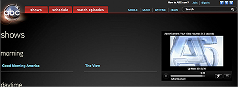
Have you ever restarted your browser and found yourself inundated by a cascade of various waves of sound emanating from God knows where? Were you perhaps trying to talk on Skype or another VoIP (Voice over Internet Protocol) application at the time? This kind of scenario sets users scrambling, trying to figure how to turn off every audio source except the one they’re using. On ABC’s Web site, when a user navigates to the directory of all ABC shows, shown in Figure 9, a video ad immediately starts playing, which then segues to a video clip from a show. At least there’s an easy way to pause the video—that is, once the user finds the window and tab from which the audio is emanating. Not always easy to do.
Figure 9—ABC Shows page
Audio and video recordings should never play automatically when a Web page loads. Instead, provide a Play button that a user can click to play them. ABC gets it right on their home page, shown in Figure 10. Videos play only when a user clicks a play button.
Figure 10—ABC home page
Even worse are looping audio tracks that play automatically when users navigate to Web sites. In a particularly obnoxious example, a Flash Web site plays music continuously, as long as a user remains on the site. As shown in Figure 11, the only way to get rid of the music is to click a poorly labeled music link, which is at the very bottom of the page, below the fold! Not the best use of a link affordance either.
Figure 11—The music link below the fold
Carousels with Unexpected Behaviors
Many carousels provide examples of taking control away from users. Either they automatically whisk something away just as a user is about to click it or the user inadvertently changes their display. The latter occurs when a carousel’s view changes on rollover rather than click and, while a user is reading the opener for an article,the user inadvertently moves the pointer over another selector, displaying different content. At that point, the user either has to figure out how to navigate back to the content that was of interest or give up entirely.
The news carousel on the former Yahoo! home page was the variety that automatically whisked content away; that on the new Yahoo! home page, shown in Figure 12, is the type that changes when a user points to a different selector, whether the user’s movement of the pointer is intentional or not. Changing a carousel’s view on rollover rather than on a click can introduce instability.
Figure 12—Yahoo! home page news carousel
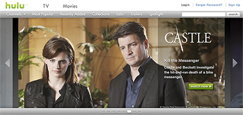
There are many examples of automatic carousels on news, magazine, and video sites. While carousels that display a lot of text can be problematic if their behavior is not specified properly, those on video sites generally are not, as long as they don’t cycle too quickly. For example, Figure 13 shows a carousel on hulu that cycles slowly and is very navigable. In addition to using the arrows to move forward or backward, a user can click the control beneath the carousel to navigate to any view.
Figure 13—hulu carousel
One problem with automatic carousels—whisking something away when a user is about to click it—can be overcome if a designer specifies that the display should not change if the pointer is within the display region like that on CNET, shown in Figure 14.
Figure 14—CNET carousel
Overly Controlling Help Systems
Help systems should restrict neither users’ access to information nor what users can do at any given moment. In Mac OS System 7.5, Apple Guide spoon fed Help for a task to users one step at a time, using red coach marks to encircle pertinent features on the screen, as shown in Figure 15. Too bad if a user wanted to do something unexpected in the midst of a task. This overly controlling approach to Help made it difficult for users to get an overview of a task, so had a negative impact on learning. While coach marks could be helpful to novice users who just wanted Help to walk them through a task, while using an unfamiliar user interface, they weren’t so helpful to more experienced users who perhaps needed just one bit of information to successfully complete a task. Apple did not incorporate Apple Guide in Mac OS X.
Figure 15—Apple Guide
Recently, I heard about a very similar Help system being designed at Google. As Sir Winston Churchill once said, “Those who fail to learn from history are doomed to repeat it.”
Always Safeguard Users’ Data
The most egregious instances of poor interaction design—whether through errors of commission or omission—are those that result in users’ losing their data, including the following:
not recovering users’ data when an application crashes or hangs
placing Delete or other destructive commands in locations where users may slip and click them inadvertently
not confirming destructive operations before completing them
not remembering users’ settings during a work session
not saving users’ settings across work sessions
In The Humane Interface, Jef Raskin wrote, “The system should treat all user input as sacred.” That’s the standard interaction designers should always work to achieve.
Don’t Destroy Users’ Data
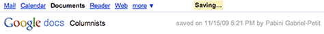
Design for recoverability. Since most major applications today tend to crash or hang with annoying frequency, it’s essential that you include a failsafe mechanism for saving users’ data in your UX requirements. Of all the desktop applications I use most frequently, only Microsoft Word does a good job of recovering my data when it crashes—not perfect, but quite good. When users reopen Word after a crash, it displays all of the files they were working on, including most of their changes since their last save. Both Google Sites and Google Docs save users work automatically, though perhaps not quite as frequently as they should. Figure 16 shows Google Docs automatically saving a document. The Saving… status message is transitory, but the saved on [date][time] by [author] status display always appears at the top of the page, so users can reassure themselves that their documents have been saved.
Figure 16—Goggle Docs autosave
Unfortunately, when Dreamweaver or Photoshop crash or hang—not uncommon occurrences—I lose all of the work I’ve done since I last saved. At the prices Adobe charges for its applications, they should be more stable and implement features that prevent users’ data from being lost when they do crash.
If you include an autosave feature in an application, be sure to specify that autosaves should occur in the background, so they don’t prevent users from proceeding with their work.
Prevent Destructive Errors
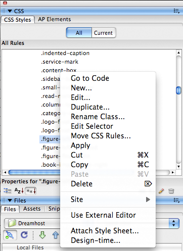
Do not place Delete or other potentially destructive commands or buttons in close proximity to other controls. If you place such controls too close together, users are likely to slip occasionally, inadvertently clicking the wrong control. Figure 17 shows the popup menu that appears in Dreamweaver when a user Ctrl-clicks a CSS style. In this popup menu, the Cut command is immediately below the frequently used Apply command, with no intervening separator bar, making it all too easy for a user to make a catastrophic slip and wipe out a CSS style that may have taken hours to create and debug. And, of course, because it’s a Cut command, not a Delete command, no confirmation box appears. Thus, if a user doesn’t immediately realize what has happened, the user’s work is destroyed.
Figure 17—Dreamweaver popup menu for CSS Styles
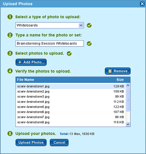
Figure 18 shows the Upload Photos dialog box I designed for scanR, in which the Remove button is well segregated from other controls.
Figure 18—scanR Upload Photos dialog box
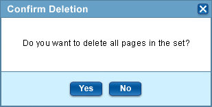
When a user chooses a command that can destroy the user’s data, always display a confirmation message box similar to that shown in Figure 19.
Figure 19—scanR Confirm Deletion message box
Remember Users’ Settings
Since it’s not unlikely that an application might crash or hang, it’s essential to specify that an application should save settings when a user changes them, not when the user quits the application. Dreamweaver for Mac OS X provides a case in point. Somehow or other, it gets into a state where it no longer displays the Files tab in the Files panel on the right, as shown in Figure 20. To get the Files tab back, a user must choose Window > Workspace Layout > Default, then resize all of the windows and close all unwanted tabs and panels. Quite a rigmarole to go through. But Dreamweaver doesn’t save the user’s changes until the user quits the application, so if it crashes in the meantime, the user will have to go through the whole rigmarole all over again.
Figure 20—Dreamweaver Files panel with no Files tab
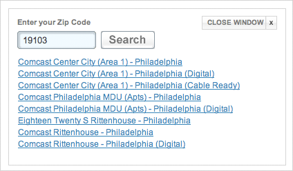
Comcast’s Fancast Browse TV Listings page, shown in Figure 21, does a poor job of saving users’ settings both within and across sessions. For example, if a user chooses a time on the Time drop-down menu, then chooses a different day, Fancast resets the time to the current time.
Figure 21—Menus on the Fancast Browse TV Listings page
The site also fails to consistently retain a user’s ZIP code across work sessions, which is necessary to display TV listings for the proper channels. About a year ago the site went through a major reimplementation. At that time, lots of things that used to work perfectly ceased working, including the site’s favorites feature, which wasn’t included at all. After a major uproar from users, Comcast apologized for removing the feature and brought it back about a month later. When a cable system offers over 200 channels, it’s not a trivial effort to go through all of them to determine which ones to favorite and, thus, move to the top of the listings. When the favorites feature came back, the users’ favorites data didn’t. After a site had destroyed your data once, would you trust it not to do it again and go to the trouble of recreating your favorites? Never violate your users’ trust by destroying their data or failing to save their settings.
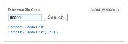
Addendum—Like the proverbial engine noise that refuses to manifest itself when you take your car into the repair shop, my ZIP code selection in Fancast remained functional while I was working on this column, so I wasn’t able to take screenshots showing the problem. But today, that feature melted down even worse than usual—a JavaScript malfunction I’m sure. When I selected a new day, the application requested my ZIP code, as shown in Figure 22, despite the fact that the page was still clearly displaying the correct ZIP code and the listings that went with it—just as shown in Figure 21—albeit not for today. How it came to assume I was in Philadelphia I’ll never know. Once I’d provided my ZIP code, the dialog box appeared as shown in Figure 23. I clicked the link for my Comcast service, but to no avail. It just asked me for my ZIP code again, so back to Figure 22.
Figure 22—Fancast ZIP code selector, assuming I’m in Philadelphia Figure 23—Fancast Comcast service selector
This application has been in this buggy state for almost a year now. As UX professionals, part of our responsibility is to ensure applications don’t get released when their reliability is so poor. If they do for some reason, it then becomes important for us to make sure bugs that result in such a bad user experience get fixed.
In Conclusion
Interaction designers are also users, so it shouldn’t be a big stretch for us to feel empathy for users when considering the kinds of design errors I’ve described in this column. Always put yourself in your users’ place. What are the gotchas in the applications you’re designing that could cause your users unnecessary pain or risk destroying their data? Do everything you can to remedy such problems. Are there other examples of such fundamental design errors you’ve encountered that you’d like to share in the comments? By sharing our own interaction design pet peeves, perhaps we can prevent our peers from making mistakes that are similar to those that plague us and our users.
Mayhew, Deborah J. Principles and Guidelines in Software User Interface Design. Upper Saddle River, NJ: Prentice-Hall, 1992
Microsoft. Microsoft Windows User Experience: Official Guidelines for User Interface Developers and Designers. Redmond, WA: Microsoft Press, 1999.
Neuhart, John, Marilyn Neuhart, and Ray Eames. Eames Design: The Work of the Office of Charles and Ray Eames. Harry N. Abrams: New York, 1989.
Raskins, Jef. The Humane Interface: New Directions for Designing Interactive Systems. Reading, MA: Addison-Wesley Professional, 2000.
Shneiderman, Ben, and Catherine Plaisant. Designing the User Interface: Strategies for Effective Human-Computer Interaction. 5th Edition. Reading, MA: Addison-Wesley, 2009.
Pabini, I have one question. In “Prevent Destructive Errors,” you point out how important it is to save users from inadvertently clicking the wrong controls. In the scanR screenshots, aren’t Cancel and No buttons that should not get in the way?
That also reminded me of an article on the dangers of confirmation dialogs, I think by Aza Raskin, “Never use a warning when you mean undo.” Do you have any recommendation on the choice between confirmation dialogs and the ability to undo?
By the way, and while this is related to your post, it’s actually to the makers of Typepad that this complaint is addressed: UXmatters, for all it’s worth, provides a terrible experience for people who’d like to comment. I’ve been thrown at blank error pages with unstyled messages four times before I could finally sign in. While I finally gave up on signing in with my Facebook account, even the basic signin form failed twice.
From that, we can draw two conclusions: (1) your article was really worth the pain of going through that trial-and-error process, so thank you very much, (2) Typepad makers should subscribe to this column.
Thanks for your questions, Régis. A user could decide to cancel a destructive command for any of a number of reasons:
Choosing the command may have been a simple slip.
Completing the command could result in an unintended destructive error—for example, the user might realize he’s selected the wrong file, then clicked Delete.
A user might change his mind about taking the action that corresponds to the command.
In the examples you mentioned, clicking Cancel or No is one of two actions a user might want to take to complete an interaction—perhaps the least likely of the two actions, but nevertheless, these buttons provide essential alternatives. In neither case, are the buttons so close together a user might physically slip and click the wrong button.
However, it is possible that a user might click the wrong button by mistake. Through habitual use, users expect buttons that complete or cancel actions to be in particular locations in relation to one another. Unfortunately, button placement is not consistent across platforms. In Windows, the button that completes an action is on the left; in the Mac OS, on the right. That inconsistency, no doubt, results in errors. Since Windows is much the dominant platform, I follow the Windows standards for button placement when designing Web applications, in an effort to reduce errors that would result from habit.
Some Web application designers have chosen to use links in lieu of Cancel buttons to downplay them visually and make them clearly distinguishable from buttons that complete actions. In my opinion, that is not appropriate, because it introduces other inconsistencies. Since before the Web existed, the purpose of a hyperlink has been to allow users to navigate to another page or another location on the same page. In all GUI operating systems, the purpose of a button is to initiate, confirm, or cancel an action. Using links in lieu of buttons introduces confusion about the purposes of both hyperlinks and buttons. Plus, to allow users to leverage their knowledge of desktop applications in using Web applications, the basic affordances and behaviors Web applications should be consistent with those of desktop applications—unless innovating a new interaction model provides a significant benefit.
There’s never any need for a confirmation message box for actions users can undo, but it’s essential to give users an opportunity to cancel destructive actions they cannot undo. Like any modal dialog box, confirmation message boxes limit what users can do and disrupt their workflow, so they should appear only to prevent possible errors from which a user cannot recover.
For simple, nondestructive changes users make, it’s always best to provide robust undo capabilities that support many levels of undo. In the early 90s, I designed an innovative random-access, multilevel undo system that let users select and undo earlier changes, without destroying their subsequent work.
I agree that the Typepad signin user experience sucks—especially the first time. Though, once you’ve successfully signed in on a computer, you’ll remain signed in. Unfortunately, we’d been getting so much comment spam, the alternatives were either to use Typepad or turn off commenting altogether. We’re currently trying to determine whether there are better ways of preventing comment spam in Movable Type, but most of our effort goes into producing the content for the magazine. If anyone knows how to implement a better solution for comments, please let us know!
Thanks a lot for all your explanations, Pabini. I had the feeling that using links for Cancel was not ideal. Indeed, it’s great I was not mistaken :-)
Not having received formal education in this area, there is something I find really hard to judge: When should you follow OS user interface standards and when should you innovate?
If I had to follow my instinct, there seems to be pattern when people want to cancel their actions—at least from your examples—that is, at some point they become conscious they need to hunt for the button that will get them back to a normal state. I would go as far as saying that it is somewhat illogical to find the Cancel button at the end of a form. Why would someone click Cancel after having everything filled in?
For the OK button, I think it’s the opposite. Filling in a form seems to me a step-by-step process, and the OK button is just the final step of that process. You can’t stop in the middle of the process and think Hey, I’m done! Where’s the OK button?
I hope I’ve made my point clear, but to paraphrase what’s in my mind, Cancel is a random action, while OK is a predictible one. Therefore, I find it startling they sit one next to each other. For me, Cancel needs to stay out of the way, somewhere it can easily be targeted no matter when people want to.
I would love to hear your opinion about this, but anyway, thank you very, very much for sharing your experience.
Régis: You’re very welcome. Regarding innovating versus following guidelines, we recently discussed this issue in Janet Six’s column Ask UXmatters, “Effective UX in a Corporate Environment: Part II,” under “Consistency Versus Innovation.” In that column, I said: “When it comes to interaction design, only a big improvement warrants making users change the way they do things. If an innovation would clearly benefit users, it’s worthwhile change, but a very minor improvement that disrupts users’ work habits probably isn’t.” That pretty well sums up what’s at stake in the decision to follow guidelines or innovate. If you can’t deliver a significantly improved interaction model, it’s best to follow guidelines.
Your earlier questions got me curious about what user research findings relating to form design I might find on the Web. Here are the findings from some interesting studies:
“Primary & Secondary Actions in Web Forms,” by Luke Wroblewski and Etre, which confirms that the optimal solution uses a pair of left-aligned buttons, both having the same appearance.
As Etre’s study shows, separating the buttons that complete and cancel actions confuses users, who are accustomed to seeing them together. As a pair, these buttons do represent a binary choice, so I wouldn’t call cancelling “a random action.” It’s just the least likely of two possible choices.
For long forms that would require scrolling to view the buttons that either submit the form or cancel, some sites place identical button bars both above and below the form. This is a good solution, because it obviates the need for a user to scroll to cancel a form the user does not want to fill out. Plus, if a designer has grouped all required fields above the fold, it may also be unnecessary for a user to scroll to fill out the form—once a user knows the form—unless the user wants to fill out some of the optional fields.
Founder, Publisher, and Editor in Chief of UXmatters
Silicon Valley, California, USA
With more than 20 years working in User Experience at companies such as Google, Cisco, WebEx, Apple, and many startups, Pabini now provides UX strategy and design consulting services through her Silicon Valley company, Strategic UX. Her past UX leadership roles include Head of UX for Sales & Marketing IT at Intel, Senior Director of UX and Design at Apttus, Principal UX Architect at BMC Software, VP of User Experience at scanR, and Manager of User Experience at WebEx. Pabini has led UX strategy, design, and user research for Web, mobile, and desktop applications for consumers, small businesses, and enterprises, in diverse product domains. Working collaboratively with business executives, multidisciplinary product teams, and UX teams, she has envisioned and realized holistic UX design solutions for innovative, award-winning products that delighted users, achieved success in the marketplace, and delivered business value. As a UX leader, she has facilitated conceptual modeling and ideation sessions; written user stories; prioritized product and usability requirements; established corporate design frameworks, standards, and guidelines; and integrated lean UX activities into agile development processes. Pabini is a strategic thinker, and the diversity of her experience enables her to synthesize innovative solutions for challenging strategy and design problems. She is passionate about creating great user experiences that meet users’ needs and get business results. A thought leader in the UX community, Pabini was a Founding Director of the Interaction Design Association (IxDA). Read More


