Top

4 Tips for a Great First-Use Experience

May 5, 2013

It’s impossible to understate the importance of a great first-use experience of your product or service. No matter how amazing your product’s capabilities are, if using it feels like a struggle the first time users try your product, you’ll have a hard time wooing them back.

What Is First Use?

Some people interpret first use very literally—meaning the experience starts the first time a person uses a system. While that’s certainly true, there’s more to it. In my view, first use starts with a user’s initial introduction to a product or service, continues as the user learns about what the product offers and signs up for an account or downloads the product, and concludes with the user’s actually using it for the first time. Your brand and how you want people to perceive it is also part of first use. For example, walking into an Apple Store is part of a first-use experience. If it weren’t, Apple could sell products off the back of a truck and save a bunch of money.

Champion Advertisement
Continue Reading…

Why Is First Use Important?

The success of any product depends upon many things, but these three factors play pivotal roles:

  1. Potential customers must understand what you are selling and why it’s worth their time and money.
  2. Your customers must be able to get up and running quickly and easily.
  3. You must deliver sustained value if your business is going to last.

I know this is basic stuff, but these factors build upon each other: Miss #1 and you can’t get to #2—never mind having the good fortune to be in a position to deliver #3. That’s why I like to think of first use as the first time a potential customer encounters your business.

Consider these four tips when crafting your first-use experience:

  1. Be very clear about what it is that you are selling and why people would want it.
  2. Make it drop-dead easy to sign up—or better yet, make signup an integral part of first use.
  3. Incorporate step-by-step guidance, videos, and tips into the user interface.
  4. Do usability testing.

Tip 1: Be very clear about what it is that you are selling and why people would want it.

If, after looking at your Web site or marketing collateral for 5 to 10 seconds, a potential customer can’t repeat back to you what it is that you offer, there’s a problem. I often use Five Second Test to try out various homepage designs. It’s easy to run a study: You upload some screenshots and add a couple of questions that you want to ask users. Each user has five seconds to review your page and answer the questions. Then you get a nice little report at the end. It’s cheap, and it’s low overhead. You could do it today.

If you are still struggling with your design after a number of iterations, you might want to do the exercise shown in Figure 1, from Geoffrey Moore’s Crossing the Chasm.

Figure 1—“Template for a Product Vision”
Template for a Product Vision

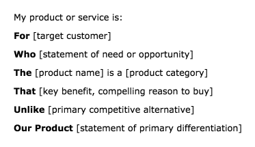
Forget jargon-laden mission statements. Take just a few seconds to state these parameters clearly and concisely, and you’ll be in good shape.

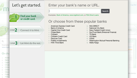
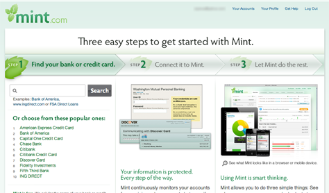
Tip 2: Make it drop-dead easy to sign up—or better yet, make signup an integral part of first use.

The most engaging sign-up experiences are those during which users are actually getting something done, as opposed to doing busy work—that is, filling out a form. There are many great examples, but here are a couple that stand out for me: Mindmeister lets users try a live demo and actually create something, then sign up afterward. Letting people use your product first is an effective strategy because, once users have invested their time, they can see your product’s value, and you’ve pretty much got them hooked. The same goes for Gliffy, where users start by creating a diagram. Only when they click Save does the site request their sign-up information.

There are some good resources that provide guidelines you can follow when creating your sign-up form. I recommend your reading Luke Wroblewski’s Web Form Design: Filling in the Blanks. It’s a quick and easy read, and you’ll get practical advice for improving your sign-up form.

One guideline that I’d like to stress: please don’t ask for any information you don’t really need. The goal is to close the deal, not gather demographic information. You can ask for that later if you really must.

Another piece of advice I’d like to offer relates to the layout of your sign-up form: If there are only a few fields—which means you have a nice, concise form, way to go!—place labels above the fields instead of at their left. This is cleaner visually, and users can easily scan the form. Placing labels within fields is becoming more prevalent and may work okay if a sign-up form is very short and the label/value pairs are familiar—as for name, email address, and password. However, because a field’s label disappears once a user clicks the field and the field is in focus, I advise against taking this approach for longer forms.

Finally, your email confirmation message should do the following:

  1. Reassure users that they’ve been successful.
  2. Give users a place to go if they have questions.
  3. Give users a clear call to action—Get started now! or some such.

Tip 3: Incorporate step-by-step guidance, videos, and tips into the user interface.

Okay, so you’ve hooked your fish. What you don’t want to do at this point is dump users into your product and leave them feeling like Alice in Wonderland. One technique for getting users started is to bring them into a workflow right after they’ve completed signup. Mint.com provides a good example of this approach, as shown in Figure 2. The Let’s get started page is the first thing users see after clicking Sign Up. There’s nothing left to the imagination here. Users won’t be falling into any rabbit holes. They can follow the three steps in this wizard to add an account. Plain and simple. What I like about this design in particular is that, if a user closes this window, the same three steps are behind it on the Welcome screen, as shown in Figure 3.

Figure 2—Mint.com’s Let’s get started wizard
Mint.com’s Let’s get started wizard
Figure 3—Mint.com’s Three easy steps on the welcome page
Mint.com’s Three easy steps on the welcome page

Another approach is to provide a getting-started video of some sort. Asana displays the video shown in Figure 4 immediately after a user has successfully signed up. Most important, they let users know that watching the video is going to take only 2 minutes out of their life—and it will probably save them a bunch of time in the long run.

Figure 4—Asana’s Learn how in 2 minutes video
Asana’s Learn how in 2 minutes video

Lastly, providing tips to help users get oriented with a user interface is a nice, warm, and fuzzy technique that I like to employ. Docracy does a nice job of incorporating tips into their design, as shown in Figure 5. The tips work well visually, and users can either continue moving on to the next tip or click the close box to stop viewing them.

Figure 5—Tips on Docracy
Tips on Docracy

The main questions to address when designing tips are: How long do the tips stick around? Once a user dismisses them, are they gone forever? Is there some way to bring them back? Do they stop appearing after a certain number of visits? There are all things to consider.

Tip 4: Do usability testing.

I could write a whole article just on usability testing, so I’ll focus on just a few basics and explain why doing usability testing helps first use.

When I conducted my first usability study in 1999, it involved two-way mirrors and lots of machinery. Participants had to take time out of their day to come to our lab for a study. Of course, there are advantages to having participants sitting next to you, and I sometimes still do face-to-face studies, but overall, lab studies are not a lightweight approach. These days, we usually want to move quickly: test, iterate a design, and test again.

For usability testing, the main considerations are

  1. in person or remote
  2. moderated or unmoderated

Over the years, I have become a big fan of remote usability testing. There are now powerful, but inexpensive online tools that make the job easier. (I’ll talk about those in a minute.)

Regarding whether to moderate test sessions, here’s my advice: If you need data about why users are doing something and you want to get into their head, do a moderated study. You’ll be able to inquire about what they’re doing and why.

On the other hand, if the kind of data you need is more like Did users find the link within x seconds? doing an unmoderated study will probably be sufficient. You still have the opportunity for inquiry through questionnaires. There’s just no back-and-forth dialogue.

There is quite a range of tools out there, but here are my favorites:

  • For remote, moderated usability testing—I use WebEx or GoToMeeting. Their main benefit is that you have a way to share your screen and can give the participant control of it. The moderator and participant can converse while the participant performs the tasks on the shared screen. Works like a charm.
  • For remote, unmoderated usability testing—I have used UserZoom, which is a very robust tool, but at the expensive end of the pricing spectrum; and TryMyUI, which is at the cheaper end. I used TryMyUI recently to test a service that I launched, called PortfolioSpring. Within a half hour, I had a study set up. Within two hours, I had feedback from six participants that was invaluable to me.

I recommend starting small with a tool like TryMyUI, then moving up to more robust tools as your needs change. One thing to keep in mind regarding some of the cheaper tools: participants probably won’t belong to your targeted user group. So, if your goal is to get feedback only from hipsters, aged 25 to 32, who are living in Brooklyn and working in a non-profit, you’ll probably have to upgrade to a more full-featured system.

So, why is usability testing important to designing first-use experiences? In general, doing usability testing gets you and your team out of your own heads for a while. You may or may not like what you learn, but you’ll get to see your design from someone else’s perspective—someone who doesn’t live your product day to day, who can offer a fresh point of view, and can tell you whether what you’re selling makes sense. Because your product is new to participants in usability studies, they are precisely the right people to give you first-use feedback.

In Summary

What I love about designing for first use is that it’s a focused design problem. Solving this problem is all about clearly communicating your product’s value, getting people to buy into it, and making them feel comfortable when they enter your world. I hope these tips have been helpful. They are just a few of the things you should consider when designing for first use, but can help you greatly in getting your team laser focused on creating a great experience. 

Principal UX Designer at Staples, Inc.

Principal at Warren Croce Design

Boston, Massachusetts, USA

Warren CroceWarren gets great satisfaction from knowing that he can help people through design. He believes customer empathy and a desire to simplify are two of the most important traits that a designer must possess. Warren received his BFA in Communication Design from Pratt Institute in 1990 and has been designing professionally ever since. He spent over twelve years at Intuit, most recently as Principal Designer and Team Manager for a team of eleven designers, usability engineers, and writers. Warren joined Gazelle in 2014, where he is responsible for the user experience of both the Trade-In and Direct Store sites. Previously, he worked as an independent consultant for two years. Warren has recently begun offering free, in-person, UX-design mentoring to small groups. He is also a fine artist with a studio in Boston.  Read More

Other Articles on Software User Experiences

New on UXmatters