Top

Design for Kids: Digital Products for Playing and Learning

July 21, 2014

This is a sample chapter from the new Rosenfeld Media book Design for Kids: Digital Products for Playing and Learning. ©2013 Rosenfeld Media.

Chapter 2: Playing and Learning

Design for Kids Cover

At a 4-year-old’s birthday party, I had an interesting conversation with two different parents about their children’s iPad use versus their TV watching. I asked about the rules these parents had in place regarding screen time for their kids. One mother strongly objected to any “playing” on the iPad for her child. Instead, she let her son—a very intelligent, developmentally sophisticated 4-year-old—use age-appropriate reading and math apps for about an hour a day, and then allowed him to watch two TV shows before bedtime.

Champion Advertisement
Continue Reading…

The other parent let her 3-year-old daughter play games and watch videos on the iPad whenever she wanted. Her favorite game was Angry Birds. She explained how her little girl was frustrated in the beginning because she could only launch the birds backward, but that she had finally figured out how to turn the slingshot around and launch the birds toward the targets. This mother talked about how excited her daughter was when she knocked over the pigs and was able to really “play” the game as intended. The mother also noticed significant progress in her daughter’s hand-eye coordination. At the time, the other mother of the boy shook her head in disapproval, clearly disagreeing with playtime or watching videos on an iPad.

So Which Is It? Playing or Learning?

Is one of these parents right and the other wrong? Maybe. Despite a multitude of studies done about kids and screen time, no one really knows what effects TV and interactive media will have on their development. What we do know, however, is that both kids described in the previous example are playing and learning. Whether they’re learning reading and math through traditional teaching principles, or physics and hand-eye coordination through games, they’re learning concepts, skills, and strategies that will ultimately serve them in life. They’re also developing new schema for interpreting the world around them.

It’s easy to lose sight of the fact that kids learn and communicate through play. As a designer, you’re responsible for understanding your audience and creating experiences based on the way that people prefer to complete tasks. However, as a designer for kids, you’re responsible for understanding that kids prefer to complete their tasks, such as learning, through play.

Unfortunately, education systems in many countries throughout the world have taught us that playing and learning are separate activities—one is conducted in a classroom setting, and the other on a playground. In fact, every time designers mention the importance of play when designing for kids, they usually counter it with this thought, “But I want to create something educational, to help kids learn. I don’t want to make just another game.”

In actuality, the most successful kids’ sites and games do have learning at their core. Games like Angry Birds and Where’s My Water teach complex physics principles to children as young as age 5. Sites like Webkinz and Club Penguin teach currency, philanthropy,2 and money management. And apps such as Toca Band and Baby Piano teach the basics of music composition. The key difference between these experiences and more traditional “learning” games is that they put play front and center. The educational aspect, even though it’s the primary goal, takes almost a backseat for kids as they strive to master the complex machinations of the game.

Designing for Kids vs. Designing for Adults

You now know that designing for kids is different from designing for adults. But how is it different? Actually, the differences are much more subtle and nuanced than people thought just a few years ago. When you are designing for adults—even when designing games for adults—the goal is to help them cross the finish line. When you are designing for children, the finish line is just a small part of the story. Here are some key differences to consider:

  • Challenge
  • Feedback
  • Trust
  • Change

Challenge

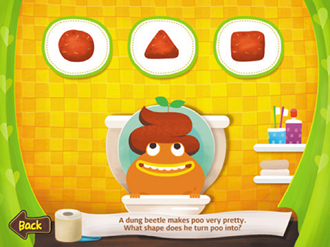
Kids delight in challenge and conflict, regardless of their goals. Adults, when they are trying to accomplish routine tasks like checking their account balances or reading email, don’t. Toca Boca, a Swedish company that makes wonderful apps for preschool and elementary-aged kids, nails this concept with its Toca House iPad game (see Figure 2.1). In this game, kids have to clean a rug by swiping a vacuum cleaner over it. Instead of making the dirt disappear after a single swipe, the Toca Boca design team created a more challenging interaction, where the dirt fades slowly with each swipe. While this ongoing friction would drive adults nuts, kids love it. According to Toca Boca company cofounder Emil Ovemar, profiled at the end of Chapter 4, the added challenge makes the accomplishment more significant for kids, and also makes the app feel more exciting and fun.

Conflict is important for adults, too, but at a more macro level. Conflict in movies and in games for adult audiences helps move the story along, but for kids, little micro-conflicts, like cleaning up a dirty rug, help them resolve their own inner conflicts. LEGO did an interesting study on “conflict play” where it determined that conflict helps “…youngsters develop skills such as:

  • Predicting how others are likely to react to their behavior
  • Controlling their own emotions
  • Communicating clearly
  • Seeing other people’s points of view
  • Creatively resolving disagreements”
Figure 2.1Toca House offers the right level of “conflict” to keep kids engaged.
Toca House offers the right level of “conflict” to keep kids engaged.

Feedback

Kids love visual and auditory feedback whenever they do anything in a digital space. If you open any site or app that is designed for kids, you’ll see that every interaction produces some sort of response or reaction. On the other hand, adults like to get feedback at the point of success, or when they do something wrong. Unlike kids, adults tend to get annoyed when every movement of the mouse or every gesture on a mobile device results in a sound or animation. Imagine if you were trying to balance your checkbook online, and every time you entered a number or clicked the “return” key, you heard applause and saw a little animation. You’d be pretty annoyed, right? Not kids. They like to be rewarded for everything they do.

Trust

Kids are much more trusting than adults, generally speaking, because they are unable to see or understand the ramifications of their actions ahead of time. Kids can be taught not to talk to strangers online or give out personal data to people they don’t know, but unless something bad happens as a result, they can’t fully anticipate the results of what they do online. This behavior continues through the teenage years, and it explains the risky behavior of teens both on- and offline.

In 2007, Laurence Steinberg, PhD, of Temple University, concluded that the slow maturation of the cognitive-control system, which is responsible for impulse control, could lead to risky behavior in kids between puberty and adulthood.4 While apps like Facebook, which allow kids 13 and older to participate, don’t actively encourage risk-taking, they do very little to prevent trusting children from “friending” people they don’t know. As designers, you are responsible for understanding this trust issue and build safeguards to protect your young users (see Chapter 6 for more information).

Change

As anyone knows, kids change pretty quickly, so when you design for a 3-year-old, you know that the app you’re designing probably won’t work for a 6-year-old. Consequently this book is broken into two-year age increments, so you’ll be able to understand these differences and the implications they present for design.

I was once asked to design a website for kids ages 6-11, which is a ridiculously large age range. I ended up designing levels, not to limit children’s play but to allow them to access content and activities appropriate for them. It worked, but my preference would have been to focus on a much smaller age range to increase usage and appeal.

Adults, on the other hand, are generally pretty consistent in terms of cognitive capacity, so they aren’t apt to change as frequently as children.

The Similarities Between Kids and Adults

Even with these differences, it’s important to note that there are quite a few similarities between designing for kids and designing for adults. These include the following:

  • Consistency
  • Purpose
  • Surprise
  • Lagniappe

Consistency

When designing apps, make sure that your design patterns are consistent. Both kids and adults get annoyed by design elements that seem random and unnecessary. A common misperception about designing for kids is that they like everything on the screen to do something cool. In fact, it’s quite the opposite. Children like items on a screen to do cool stuff as long as there is a method to the proverbial madness.

Elements that get in the way or animate spontaneously or don’t contribute to the overall goal can frustrate kids and adults alike, and cause them to abandon a game or an app entirely. In addition, if everything on the screen moves, is brightly colored, or makes noise on the same level, kids and adults become confused about what is interactive and what isn’t, and this makes it very hard for them to use the site or app. A common design principle for adults is to keep interactions and feedback consistent so that users will be able to learn how use the site or app quickly. The same is true for kids.

Purpose

Kids, like adults, need a reason to use a site or an app, and they need this reason to be evident right from the start. While kids will be more open to exploring and learning than adults, they’ll get bored quickly if they are not immediately engaged in the goals and purpose.

For example, if it’s a game, will it be fun? If it’s a tool, what will it help them do or learn? They need to know what’s in it for them before they’re willing to fully engage. This doesn’t necessarily mean that you have to create detailed explanations or how-to videos, but it does mean that you have to communicate clearly what your app is and how it works before users have time to decide they’re not interested.

Surprise

Both kids and adults develop expectations around how a site or app will behave, and they like to have those expectations met. Neither kids nor adults are particularly interested in being surprised, or in having an experience deviate from how they expect it to work.

As an adult making a purchase online, after you submit your payment, you expect to see a message confirming your purchase, not a pop-up ad with a video trying to sell you something else. As a kid adding gems to a box in a game, you expect to be able to open the box where the gems are stored to see them all, not to have to open the box, pull out drawers, and hunt for the stuff you thought was in there.

Lagniappe

I first heard the word lagniappe from my editor, Marta. A lagniappe is a little something extra—an “Easter egg”—thrown in to delight users or customers, and both adults and kids enjoy these small, unexpected interactions that enhance their experience with a site or app. For example, Twitter’s mobile “pull down to refresh” option shows a nice little animation, letting users know their feed is being updated. If kids leave the Talking Carl app open for a few minutes without interacting with it, it sings softly to itself to get their attention. It’s important to note that there is a difference between a “surprise” and an “unexpected delight,” however. A “surprise” is when the jack-in-the-box jumps out and scares the crap out of you. Lagniappes are the frozen grapes the hotel passes out while you’re overheating by the pool.

You’ll want to be aware of these differences and similarities when designing for kids. Remember that designing for children isn’t just a matter of taking content, images, and interactions meant for adult audiences and “dumbing them down.” You’ll need to make a conscious effort to understand where your users are cognitively, physically, and emotionally and make sure that your designs map to them appropriately. Conversely, if you look at designing for kids as completely different from designing for adults, you’ll lose sight of some of the key conventions and patterns that are hallmarks of good digital design.

A Framework for Digital Design

While the overall process of designing for kids is similar to designing for adults, you’ll still need to conduct user research, analyze your findings, design your product, and test it out. However, you’ll conduct the activities in very different ways. I call this process the “4 As” of designing for kids: absorb, analyze, architect, and assess. You’ll recognize a lot of the steps listed below, but the things you’ll look for and the way you’ll measure success are quite different.

Absorb

As a user-experience designer, you really might be tempted to open a sketchbook and start sketching ideas for the next big site or app. You have a great idea in mind, and you want to start playing around with it to see what it might look like. When you are designing for adult audiences, this may sometimes work, as you probably already have an understanding of what your audience wants and expects, but with kids, especially younger ones, you have to observe them in order to truly understand them. I’ve heard designers say, “I remember what it was like to be a kid, so I’m probably okay without conducting observational research, right?” or “I have kids the same age as our target audience, so I can just use what I know about them to do the design.” Not the case. As explained earlier, these digital natives are much different than we were when we were kids, and they are changing constantly in terms of behaviors, needs, and expectations, so be sure you always do some level of absorbing, even if it’s with a small number of children.

The first step is to spend lots of time watching kids and absorbing everything about them—how they play, communicate, manipulate objects, and interact with items in their environment. As you’ll quickly discover, kids lack the deductive reasoning that adults have, and as a result, they cannot make the cognitive leap between an intangible idea and an actual interface. They are also not great at expressing themselves verbally yet. In order to understand what they want, or what makes them tick, you need to conduct observational research. And it’s more than just observation, it’s truly absorbing all of the rich data that children provide with everything they do and say.

Fortunately, observational research is relatively easy to conduct. You don’t need an elaborate test script or a fancy lab with state-of-the art technology or a complicated recruitment screener. You need a room with a bunch of age-appropriate toys and games, or, better yet, some kids whose homes you can visit to observe them in their everyday surroundings. You do need to be clear before conducting this research on what you want to learn from the research and how you will use the data. For example, if you want to learn how 6-year-old girls approach collaborative construction activities to inform the design of a coding game, you’ll need to make sure you have the appropriate objects on hand, the right number of girls participating in the research, and enough time for the kids to get to know each other and create something together.

We’ll talk a lot about actual design research in Chapter 9, but for now, the main thing to remember is to focus on observing and absorbing how kids play. Children communicate volumes simply by how they play, what they choose to play with, how long they choose to play with it, and when they decide to play with something else.

It’s important to choose specific types of play that relate to the app or site you want to create. For example, if you’re designing a game that lets kids make their own music, have the children show you their favorite instruments and watch how they use them. For example, younger kids will tend to bang on a toy xylophone, but older children may actually attempt to tap out a melody.

If you’re designing a site about cars and trucks, give kids toy vehicles and see what they do with them. For instance, you’ll probably notice that boys like to line up cars in rows or race them down ramps. Girls, on the other hand, like to assign personalities to the vehicles and have them “talk” to each other, as they would with dolls or toy animals.

You’ll also want to pay special attention to how kids interact with the objects in their environment. Some kids, especially younger ones, are very “toy-oriented,” meaning they prefer to play with physical objects, as opposed to inventing their own games or playing pretend. That behavior typically occurs because younger kids are still figuring out how they fit into the world around them, and they need to establish a connection to, and separation from, the objects in their space. Watch how closely kids “play by the rules”—for example, do they put the toy pilot into the cockpit of the plane and play airline, or do they turn the airplane upside down and put animals and crayons and trucks in it?

You’ll probably see a mix. This will help you determine how constrained you want the rules of your site or app to be. If kids are consistently associating non-traditional behaviors to the objects you’ve given them, you’ll want to make your app less about the objects themselves and more about all the cool things kids can do with them. If kids are staying true to the nature of the objects, you’ll want to focus more on these unique attributes of the objects themselves. You’ll probably notice some age discrepancy here. Nothing’s more fun to a 3-year-old than doing crazy things with common objects. A 6-year-old, on the other hand, will prefer to play it safe and use the object as intended.

Analyze

Now that you’ve done all this observation, you’ll need to figure out what it all means for your content and design. I tend to start with flows and then do some grouping and categorizing of activities to make sure that I’ve correctly identified the patterns. Then I hash out the general design direction for whatever it is I’m creating. Other folks skip the flows altogether and focus on the individual interactions, jotting down patterns and trends and figuring out what these might look like and how they might work. If you’re working as part of a team, you may want to first compare notes on what you saw, talk about what these mean for your design, and iteratively flow and sketch, correcting and modifying as you go.

The first thing I do, either during or soon after the observation sessions, is flow each individual session into a high-level flowchart.

Figure 2.2— A sample observation flowchart
A sample observation flowchart

It usually looks something like Figure 2.2. You’ll notice that Michael, age 3, picked up the truck as an action, then moved on to his Little People, played pretend activities that related to his typical day (grocery store, playground, and so on), then switched over to a board game, and finally finished up by “reading” a book.

Next, I jot down the various objects, actions, themes, and insights onto sticky notes or index cards. Then I group them, regroup them, and regroup them again. This technique is called affinity diagramming,5 and helps me understand the kids’ most important actions, assumptions, and ideas (see Figure 2.3). It also shows me how I might leverage these when designing my site or app. You’ll want to identify a “sweet spot” for your app, say, 3-year-olds, so you can create a baseline for interpretation. Then, using what you know about 3-year-olds (see Chapter 3 on development and cognition), you’ll be able to interpret the themes and actions based on this cognitive stage.

Figure 2.3— Using affinity diagramming
Using affinity diagramming

At this point, I create a sort of dictionary of themes and patterns to use when thinking through features and functionality, which helps kick off the ideating stage. I usually do some high-level flows for the main tasks or games to make sure they make sense, and then build out the “cool stuff” from there. Basically, I get everything I need ready to start the “architect” process.

However, if you’re working at a company as part of a large, cross-functional team, it’s a good idea to schedule ideation workshops as part of the “analyze” step. If your team members observed your absorption sessions, or even if they haven’t, chances are they’ll help you think about your data in ways that you hadn’t considered. You can involve them in affinity diagramming, or just share what you saw and have them help you figure out what it means to the site or app you’re creating.

Architect

“Architecting” simply means that you’re creating the structure and function of your system. If I’m working with kids over the age of 7, I like to start with some sort of participatory design activity, where I share the basic theme of the app with the kids—as well as some of the trends identified during analysis—and let them come up with their own design prototype. (Catalina Naranjo-Bock gives some great ideas on how to conduct participatory design sessions in her interview at the end of Chapter 9.)

Letting kids “design” their version of your site or app will help you understand the types of interactions they expect to have with your design and how they would like it to function (see Figure 2.4). These sessions have the added benefit of helping you further understand your users’ cognitive abilities and expectations around content and flow as well. A cautionary note: Rarely will you take these actual designs from these sessions and implement them. However, you will learn a lot about how kids interpret your initial concepts by doing this type of activity. Just remember that you have to be really clear with kids at the beginning that their ideas may not end up in the final site or app, or else you will end up with some disappointed kids.

Figure 2.4— With participatory design, kids work together to create designs for a site or an app.
With participatory design, kids work together to create designs for a site or an app.

When you are designing for kids, a critical piece is to architect some sort of working prototype on which to build the future app. These early prototypes can take a variety of different forms. For example, the team at Toca Boca takes the notion of architecting literally and builds prototypes from physical objects, such as string on cardboard or pictures cut out of magazines, before they start developing or hashing out all the requirements. It’s important to make some sort of interactive experience at this stage, because you get to work through your flows in a hands-on manner. You’ll find that it’s easier to evolve and flesh out your ideas with a tool that actually works, rather than working with static images on a screen. If I have the opportunity, I sit with a developer and architect the interactions and flows together with that person—two heads are usually better than one.

Once you have an experience that you’re relatively sure meets the needs of kids, you’re ready to test it out.

Assess

You’ll want to do an iterative assessment process when designing for kids, where you create something, evaluate it, and then re-architect it as needed. I guarantee that your first design will fall flat in some areas, simply because, like with adult users, what kids want and what they say they want (and what they do and what they say they do) are often quite different. The point of testing at this stage is just to get your prototype in front of kids and watch them use it. You can ask them to complete specific tasks with your prototype, or you can just ask them to play with it and see what they do. You will want to eventually conduct testing with either a functioning digital prototype or an early iteration of a coded site or app as well, to make sure you’ve properly addressed all the feedback.

It’s imperative that you get parental buy-in at this stage. When designing for kids, you’re in a bit of a unique situation, in that the user and the customer are not one and the same. Remember the tagline for Kix cereal, “Kid Tested, Mother Approved?” That’s a great summary for the goal of this phase. You want kids to test your design to make sure they like it and can use it, but you also want parents to approve of what you designed so that they’ll be willing to buy or download it for their kids. And there is a lot of crap (literally) out there that parents do not approve of.

At a workshop I taught recently, a participant (a designer and developer) summed up this phenomenon beautifully. She has three daughters, all of whom love games, she said, “with poop flying, vomit, mucus, and diarrhea everywhere.” But, she said, she thinks these games are “disgusting” and refuses to download them from the app store for her kids. She was wondering, as a designer, how to cater to kids’ desires without completely alienating parents, who ultimately call the shots in terms of their kids’ app consumption. I call this recognizing the “PTR” or the “Parental Threshold for the Revolting.” For example, an app that may cross the PTR is “Why Kids Poo” (see Figure 2.5).

Figure 2.5— “Why Kids Poo” may cross the PTR—or not, depending on the child and the parents.
“Why Kids Poo” may cross the PTR—or not, depending on the child and the parents.

My 4-year-old would love this app. Unfortunately for her, she will not have the opportunity to play with it, because I find it disgusting. When testing your creation with kids, ask parents to spend a few minutes with it individually as well, and see if you can identify their PTR. This is tricky, because you don’t want to ask the basic question, “Do you find this revolting?” This question will only give you a yes/no answer. Instead, try to develop a script that will reveal the PTR over a few questions. In my experience, the following three questions will surface the PTR pretty quickly:

  • What do you like best about this app? What do you think your child will like best? Why?
  • What do you like least? How would this influence your decision on whether or not to let your child play with it?
  • What, if anything, do you think we should change about it? Why?

You’ll know that you’ve crossed the threshold by the expression on their faces. Some will laugh, and in an effort to appear cool, will tell you they’d allow their kids to play with your app despite the fact that they find the content revolting. Don’t believe them. Tone it down. It’s hard to say how many parent interviews it will take for you to identify the PTR accurately, as parents have different sensibilities, but you should start seeing patterns among parents of kids the same age after interviewing about seven of them.

It’s important to note that the PTR shifts up and down as kids get older. In my experience, parents of 6-9-year-olds have a higher PTR than parents of any other age group, both younger and older. I suspect this is because kids between 6 and 9 are infatuated with all things disgusting, and parents of kids in this age group have become desensitized. 

Buy Design for Kids Using Your UXmatters Discount

To learn more about designing digital products for children, get your own copy of Design for Kids: Digital Products for Playing and Learning. For a 20% discount on this and other Rosenfeld Media books, purchase them on the Rosenfeld Media Web site, using the discount code: UXMATTERSDFK.

AVP, Digital Design & User Experience at AT&T

Dallas/Fort Worth, Texas, USA

Debra GelmanA UX researcher, designer, and strategist in the field of interactive children’s media, Debra creates Web sites, apps, and virtual worlds for her clients, including PBS Kids Sprout, Scholastic, Crayola, Pepperidge Farm, Campbell’s Soup, and Georgia Public Television. She led research and design for Planet Orange—a Web site that teaches first through sixth graders financial literacy—which won a USA Today Education Best Bet award. Debra holds undergraduate degrees in Visual Media and Psychology from American University and a Masters in Information Design and Technology from Georgia Tech. She is author of the Rosenfeld Media book Designing for Kids: Digital Products for Playing and Learning.  Read More

Other Articles on Sample Chapters

New on UXmatters