Top

Parallax Scrolling: Attention Getter or Headache?

November 17, 2014

Parallax scrolling is a popular Web design trend, but is it worthy of all the positive attention that it’s getting? While parallax scrolling can be visually stunning and make a great first impression, it is also unexpectedly user hostile. And the metrics for the most popular WordPress themes on Template Monster indicate that parallax scrolling isn’t as popular as one might expect. Let’s take a serious look at the pros and cons of parallax scrolling.

Champion Advertisement
Continue Reading…

What Is Parallax Scrolling?

Parallax scrolling is a visual effect that mimics depth by making the foreground and background elements on a Web page scroll at different speeds. This effect was popularized by video games in which the foreground elements moved at a much faster pace than background scenes, making them seem to pop off the screen. This effect made imagery feel less flat and more three dimensional.

In Web design, parallax scrolling has a similar effect: as a user scrolls down a page, the images in the background move more slowly than the content in the foreground. This gives the page depth.

When Is Parallax Scrolling Effective?

Parallax scrolling is useful for quickly capturing visitors’ attention. If you want to wow your audience, no other design trick quite compares with parallax. Plus, parallax scrolling is very effective in guided storytelling. For example, you can use the parallax effect to help sell your product or service by guiding users through a scrolling story or guide.

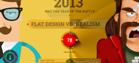
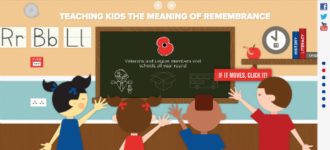
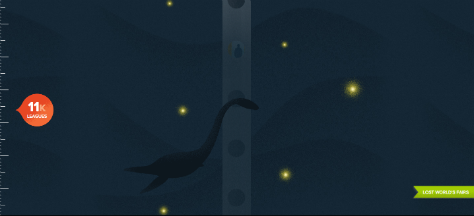
Figures 1-3 show some great examples of effective parallax scrolling. You can check out these sites on the Web to see parallax scrolling in action.

Figure 1—Flat Design Vs. Realism 2013
Flat Design Vs. Realism 2013
Figure 2—British Legion Poppy Spend
British Legion Poppy Spend
Figure 3—Lost World’s Fairs Atlantis
Lost World's Fairs Atlantis

When Is Parallax Scrolling the Wrong Approach?

For just about everything else. With few exceptions, parallax scrolling is just a flashy gimmick from a user experience perspective. Its primary usefulness is to show off how cools a designer is.

There’s been a lot of discussion on the topic of parallax scrolling and how it affects user experience. The pro-parallax camp feels that the stunning visual nature of this effect improves the user experience. Parallax can guide and delight users. On the other hand, the anti-parallax camp feels that parallax scrolling stunts the effectiveness of Web sites. These sites suffer from all of the problems that typically affect single-page Web sites:

  • no search-engine optimization (SEO)
  • a lack of internal linking
  • the inability to optimize the use of keywords effectively

Plus, using the parallax effect on an article or other content page can be distracting. A major problem of parallax scrolling is that it is not responsive, as I’ll discuss in detail later on.

In the age-old debate between beauty and function, parallax scrolling wins the beauty pageant, but fails miserably in terms of function.

Why is this such a big deal? Let’s look at user experience as a parallax construct: Visual appeal is in the foreground; content and ease of access is in the background. Both must work together to create an effective Web page experience. If one of these elements outweighs the other, the user experience suffers. Of course, no one wants a content-rich page that’s ugly to look at, but no one’s going to stay on a beautiful Web page unless there’s good content to read or interesting elements with which to interact.

Now, let’s consider the reasons why parallax scrolling can become a problem for users and look at what steps you can take to resolve these problems.

Problem #1: The Need for Speed

Parallax Web sites are often single-page sites, so Web developers must throw everything into that one page. The result? Slow load times. For Web sites, slow performance is a death blow. With each second that passes while a page loads, fewer users stick around. In fact, 47% of users expect a Web page to load within two seconds. If a page hasn’t loaded within three seconds, 57% of users will leave the site. This is a consequence of human psychology: We have an eight-second attention span. (That’s shorter than the attention span of a goldfish.) If your site—no matter how gorgeous—takes eight seconds to load, no one’s going to stick around to see it.

The high-quality images and back-end elements that are necessary to create a flawless parallax effect slow down page loads. If a parallax site includes video, as is common, it becomes even slower.

Many designers use a progress indicator to compensate for the page-loading problem. Although this at least shows users that something’s coming, the same short attention span applies. Designers should not expect users to stare at a progress indicator for 10 seconds—even five seconds is pushing it.

Problem #2: Parallax and SEO

SEO is an elusive unicorn for which we’re all searching. If you’re on that trek, parallax is not the best method of getting there. Although SEO is not impossible with parallax scrolling, it is difficult. For one thing, search engine rankings such as Google’s are complex. It’s not just about ranking for keywords; it’s also about ranking for speed. As you read under Problem #1, slow load times are inherent in parallax pages.

Again, because sites with parallax pages are often single-page sites, it’s hard to optimize for keywords because designers often opt to use anchor links instead of creating separate pages with different URLs for each menu link. On parallax Web sites that do have separate pages, you can optimize the sites for specific keywords.

Another problem with parallax sites is their lack of internal links. Single-page, parallax-scrolling sites have higher bounce rates because there’s nowhere else to go.

Problem #3: Parallax Isn’t Responsive

Have you ever tried to view a parallax site on a mobile device? The effect falls flat. It seems dimensional only on a computer. What makes this so devastating is that an increasing number of people are mobile-only users. Approximately 30% of all Internet traffic comes from mobile devices, and around 31% of American mobile-phone owners use only their smartphones to go online. These numbers are rising steadily, as more and more people adopt a wireless lifestyle.

A site that isn’t interesting on a mobile device defeats the mobile user experience. You can and should create a responsive site that looks great on mobile devices. But, if there’s no parallax on mobile, what’s the point of creating a parallax site at all?

So, What’s the Solution to These Problems?

Parallax pages are great when they’re just one of many design elements on a Web site. So the best remedy for the parallax headache is to feature parallax on the homepage and link to non-parallax pages that support it instead of creating a single-page Web site. You can then optimize keywords for each page, and the non-parallax pages can contain the bulk of your content. That solves the problems with both SEO and page-loading times.

As for the non-responsiveness of parallax-scrolling pages, use parallax only if it propels your story forward. Don’t use parallax effects just to wow other designers or win awards. Ultimately, parallax scrolling is a narrative device that is effective only on computers. So, if the bulk of your traffic comes from mobile devices, you may want to rethink your parallax design strategy—or at least include a more mobile-friendly design for other devices.

Some Final Words

Although this article may seem to be a scathing denunciation of the usefulness of parallax scrolling, it’s not all bad news for parallax lovers. If you use parallax in moderation and stay within the bounds of these sophisticated optimization strategies, parallax scrolling actually has the potential to delight users, thus improving a Web site’s user experience. 

Content Strategist at Audience Ops

Oak Hill, West Virginia, USA

Jacqueline Kyo ThomasAn award-winning writer and brand authority, Jacqueline writes high-quality, fresh, well-researched content that is completely original and compels, inspires, and sells. Her articles spark conversations. She has written articles on Web design, social media, and the latest technology trends for both print and digital media. For clients, Jacqueline also proofreads, edits, and does rewrites. She loves words! Jacqueline won her first award for writing at age 9. Since then, her collected works have reached over 2 million unique readers.  Read More

Other Articles on Visual Interface Design

New on UXmatters