As a researcher, I want to understand how technology changes people’s lives, not wade through a bunch of data. Like a lot of people, I think in stories rather than numbers; in the tangible rather than the abstract. So, when I made it a goal to understand all of the data about the experiences people have with technology—not just the kinds of data that I was comfortable with—there were some big gaps in my knowledge.
First Steps
First, I had to cross the threshold of my number aversion. This wasn’t too hard because, even though I love to dive into messy questions, I’m not thrilled with messy answers. I’m still relearning statistics—thanks to Khan Academy and The Cartoon Guide to Statistics—getting more confident with Excel, and gaining some basic skills in Tableau.
Champion Advertisement
Continue Reading…
I’ve since encountered many blog posts and articles about the downsides of using data for design. In conversations, colleagues have reminded me that data does not automatically produce insights. When I speak at UX conferences, I’m often sandwiched between other talks about data, whose speakers are telling I’ve-been-burned stories. Awkward. I’ve made my peace with all of that, because UX professionals and data scientists are by nature curious and skeptical. The nagging question of whether to trust your gut or your data does not have an either/or, but a yes, and… answer.
Finally, I came up with some working principles that I could use in working with data and solving real problems. So, I developed the following guidelines to help me—and you, I hope—think about designing with data.
1. Start with a Question
Even though there is no shortage of data, it’s essential to start with a question rather than just pour over numbers or play with visualizations, hoping that insight will strike. Before diving into existing data from analytics too deeply—and definitely before framing a new study—the first step is defining the problem.
Understand the Assumptions
Start with what you think you already know. You need to examine the assumptions, or the givens, first. This might be a big-picture assumption. For example, a strategic assumption might be that people want to watch a video only as a way of learning about an organization. A tactical assumption might be that people understand the word menu within the context of a Web site.
Mind the Gaps
Next, move on to the gaps—that is, the things that you know you don’t know. Maybe you don’t have a clear sense of how another site or application is setting people’s expectations—whether it’s a close competitor or not. Maybe you don’t know how ease of use relates to future desirable behaviors such as returning or sharing. There are many unknowns, but keeping your focus as narrow as possible increases your chances of success in working with data.
Create a Hypothesis
It’s often a good idea to transform your question into a hypothesis. Some make a big deal of creating a perfect hypothesis, but hypothesizing is really not that complicated. You have a question, you have a theory about the answer, and you have some variables to test. That’s a good start.
An example question: Why are people starting one video after another without watching any of them all the way through? The hypothesis might be: More new site visitors than return visitors watch the first ten seconds of several videos in a row. Alternatively, you can use the if, then format most of us learned when studying science in junior high school. In that case, the hypothesis might be: If people are new to the site, it is likely that they might watch the first parts of several videos. There may be a theory about the because part of that hypothesis, too—for example, because they are trying to figure out what the site is about or because the videos are poorly labeled.
2. Think in Degrees and Probabilities
Now that you have a hypothesis, the big question is not usually a yes or no question. It’s more likely a by how much question. This is where Bayes comes in. Bayes Rule is the underpinning of current thinking in data science, and we don’t really need to do fancy math to apply it.
Besides helping us to win big in Las Vegas, as in the movie 21, Bayes enables us to keep learning through data, without the data taking over. It’s essentially about making decisions under uncertainty and how we should update our theories as new evidence emerges. That’s promising. Technology is all about uncertainty, right?
This is a bit different from what you might learn in Statistics 101, where you’d calculate data, then project a frequency. Bayesian thinking considers not just what the data has to say, but what your expertise tells you. You don’t want to throw your knowledge away and turn to data to answer everything. You just want to use data to help adjust your thinking a bit.
There Is No Such Thing as 100% Confidence
With Bayes, you constantly adjust your beliefs when you encounter new data. You never say that you are absolutely certain, because then you wouldn’t be able to revise your beliefs in light of new information. You can keep adding information and become more confident, but you can never get all the way to 100% confidence.
Let’s face it. You may not even get to that magical 95% confidence interval, which simply means that the likelihood of your getting the results that you got by chance is less than 5%. That’s okay. You just want to be sure that the number is not so low that the results are likely a product of chance.
3. Pull Data from Multiple Sources
Once you have a question and are thinking about probabilities, you can finally start looking at the data. You could certainly run studies to answer some of your questions, but even if you take a lean or guerrilla approach to research, it’s still expensive and time consuming. So it’s best to start with whatever data you have on hand that may add a new dimension to answering your question.
Look at People’s Behaviors and Words
The two main types of data that you’re likely to have are about what people do and what people say—behaviors or words. Analytics, A/B test results, and clickmaps are behavioral data sources. Social-media analytics, customer-service logs, and study verbatims are data sources comprising words. Physical responses—from biometrics to brainwaves to heart rates—might potentially be a third category of data, but that’s not the sort of data that most teams have on hand—at least, not for now.
Start with Analytics
Google Analytics is typically accessible to many team members, so it’s a good place to start. With Google Analytics, you can answer questions like these: How many people clicked videos? How much time did they spend on the site? What is the ratio of new to returning visitors? You could even segment new and returning visitors and see patterns in their interactions.
Marketing and sales may see the data and say, “Good, they see the videos and they are clicking through. Our KPI (Key Performance Indicator) for more views is showing a 2% increase in views per month. We are on track.” But as UX professionals, we likely wonder: “They’re clicking, but what does that really mean? Is that what they meant to do? What did they do after they clicked the video? Was the time they spent watching the video a positive or negative experience? Are they even paying attention to the video? Where are they focusing their attention? Did the video increase their engagement?”
First, calculate the impact that new data has on your initial hypothesis. In our example, we started out 60% certain that new visitors were clicking one video after another more frequently than returning visitors. After looking at analytics for each audience segment, we might say that we’re 90% certain. But we’re missing the because part of the hypothesis. It’s time to bring in data from another source to see what we can find out.
Add More Data
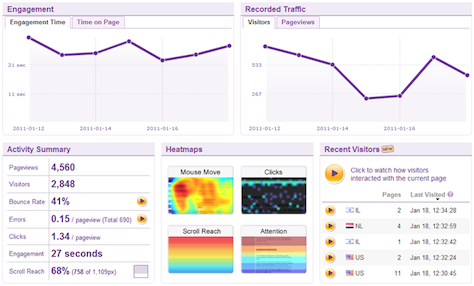
Adding more data sources adds dimension to your data. The current trend in data science is not to shy away from complexity, but to try to understand it. First, I’d typically look at specialized analytics from a tool like Clicktale, which lets you play back screen recordings of people interacting with key pages, or Crazy Egg, which shows a click heatmap that lets you get a page-level view. There are many different types of specialized analytics tools. Most combine the types of features you would find in Google Analytics with their own different spin on behavioral data.
I would also take a look at social-media analytics to get a sense of people’s attitudes, feelings, or anything else that elaborates on their experience. Free tools such as Topsy and Social Mention can sometimes fill in the gaps by letting you look at a brand or hashtag.
Adding data from clickmaps, you might see that videos featuring well-known celebrities are getting more attention than others. From social media, you might find out that people are curious about celebrities, without getting a sense of the reason why. The because part of the hypothesis adds a new dimension that can help you in design.
4. Analyze Data in a Few Different Ways
Once you have some data, you need to get a better understanding of what it means to the user experience. As for many people, including data scientists, having a picture makes it easier for me to see patterns and understand their implications.
Visualize the Overview and Details
The first thing you need is an overview that lets you see the overall shape of an experience. This helps you to get a sense of typical paths or interaction patterns. But some types of charts can be a little abstract, so I lean toward those that everyone can easily understand: bar or line graphs or pie charts.
Figure 2—Example of a Clicktale dashboard
Then, you should look at page-level details. It’s great to see screen recordings if a tool captures them, but for the sake of time, it’s often easier to view the key measures as an overlay on a page. Some analytics tools provide in-page analytics, showing the percentage of clicks for each text or image link. Instead of looking at clicks, you might choose other metrics such as length of play time for each video.
Select Key Metrics to Track
Now that you have some data that has helped you to adjust your beliefs to a certain degree, you can start tracking it. When looking at numbers, you’ll compare them to other numbers. In themselves, numbers are neither good nor bad. For example, 1,000 clicks would be a good number for a video only if it were more than last month’s number. Or it might be great for your personal YouTube channel, but terrible for a major TV network’s Web site.
Deciding what to track is not that hard. The numbers should relate to the problem you’re trying to solve and be actionable. For our video example, we’d need to see how adjusting the design would impact engagement. That might mean looking at the length of time users played each video and how many videos they played. This data could map to a pattern where people are actually watching the video and taking the desired action.
Account for Bias
Bringing in more sources of data can reduce bias, but all data has some kind of bias. Quantitative data is not free from bias. Massive datasets feel abstract, giving us a sense that they are objective. But humans design datasets, so they can be biased in many of the same ways that studies can be biased. There can also be signal bias, when data represents some people or communities, but not others.
There is no perfect data. You always have to ask where data comes from, what methods were used to gather and analyze it, and what cognitive biases you might bring to its interpretation. Then, you need to adjust how you use the data accordingly and determine what importance you should assign it.
5. Conclude with More Questions
Once you’ve looked at the data, you should always end by asking Why? and So what? and What else? Designing with data is more of a process than a verdict. Both the iterative process of UX design and our natural impulse to balance our expertise with the use of data is consistent with current thinking in data science.
Pamela is founder of Change Sciences, a UX research and strategy firm for Fortune 500s, startups, and other smart companies. She’s got credentials—an MS in Information Science from the University of Michigan—and has worked with lots of big brands, including Ally, Corcoran, Digitas, eMusic, NBC Universal, McGarry Bowen, PNC, Prudential, VEVO, Verizon, and Wiley. Plus, Pamela has UX street cred: She’s logged thousands of hours in the field, trying to better understand how people use technology, and has run hundreds of UX studies on almost every type of site or application you could imagine. When she’s not talking to strangers about their experiences online or sifting through messy data looking for patterns, she’s busy writing and speaking about how to create better user experiences using data of all shapes and sizes. Read More
