User research is cool. User-research deliverables can even be cool. But sadly, to many people, analysis isn’t cool. Clients and project team members get excited by the idea of user research, they like being able to say they did user research, and they like to show off impressive user-research deliverables. But the unsung hero who does much of the heavy lifting is analysis. Unfortunately, analysis remains underappreciated and is often overlooked.
There are plenty of books, articles, and presentations about user-research techniques and deliverables, but they seldom discuss analysis—the process that transforms research data into deliverables. To some, it may even seem that you come out of research with a fully formed understanding of users and their tasks and immediately begin creating personas, diagrams, and presentations.
Champion Advertisement
Continue Reading…
Clients and project teams are often anxious to see research findings, but rarely have any idea about what analysis involves or how long it should take. Perhaps analysis gets overlooked because it isn’t an observable event that gets scheduled like user-research sessions, and it isn’t a tangible document like research deliverables. As a result, there is rarely enough time for analysis.
In this column, my goal is to illuminate what analysis involves, to provide a better perspective on the significance of analysis, and to stress the importance of providing the time necessary to do analysis right.
What Is Analysis?
User-research sessions birth a messy tangle of notes, photos, recordings, and artifacts from multiple participants. Analysis involves examining research data, grouping related items, organizing the data to discover patterns and themes in the findings, making conclusions, and deciding on recommendations. Only once analysis is complete are you ready to create the deliverables that convey your findings and recommendations to others.
Some people make a further distinction between analysis, breaking the data into small parts for careful study, and synthesis, bringing the parts together and combining them in a new way. Merriam-Webster defines these terms as follows:
analysis—“A careful study of something to learn about its parts, what they do, and how they are related to each other; an explanation of the nature and meaning of something.”
synthesis—“Something that is made by combining different things—such as ideas, styles.”
In this column, I’ll combine these two concepts into one process called analysis.
The Process of Analysis
Over the years, I’ve noticed that everyone seems to have a slightly different way of analyzing user-research data. There is no single, correct approach. So in this column, I’ll describe my own approach to analysis.
Analysis Begins Before the Official Analysis Phase
The official Analysis Phase occurs between the last research session and the date on which the research deliverable is due, but the informal analysis process actually begins as you think about what you’re learning during research sessions. As you observe and talk with participants, you’re constantly thinking about the information you’re taking in, making comparisons with other things you’ve seen and heard during previous sessions, coming up with insights, and forming tentative hypotheses. As you take notes, review your notes, and discuss your observations with others on your team, you begin to make sense out of the data.
Organizing the Data
At the conclusion of your research, your notes and recordings are organized by session, or participant. You’ve logged each individual participant’s actions, comments, opinions, and problems together in notes and recordings; so each participant’s data is separate from the others. To compare similar items across participants, you need to free the data from participant-centric logs and recordings and organize it in a way that allows you to see all the data together, so you can begin recognizing patterns.
Two common ways of organizing research data are to type up and organize your notes digitally or to create affinity diagrams using Post-it Notes. Affinity diagrams are ideal for group analysis, but when you’re doing an analysis alone, either method can work well, so it becomes a matter of personal preference.
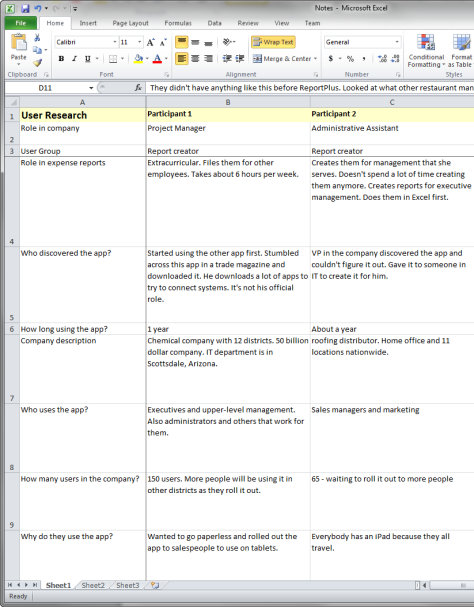
When I analyze data alone, I usually organize my notes digitally, in an Excel spreadsheet, because it’s a good format for comparing data across participants. In my analysis spreadsheet, shown in Figure 1, each participant has a column. The rows show, for example, all the actions participants took in performing particular tasks, the common problems they experienced, their answers to specific questions, and pithy quotations or anything else that is relevant to particular issues. When the spreadsheet is complete, I have a set of notes that I’ve organized into specific issues, problems, and quotations. I can look across a row’s columns to see how many participants experienced each problem, as well as their specific actions and quotations relating to that problem. I can also look down the columns to see all of my notes for particular participants.
Figure 1—My analysis spreadsheet
Reviewing Recordings
When I have time, especially for complex contextual inquiries, I review the recordings of research sessions and type up my notes directly into the spreadsheet. Reviewing entire recordings is extremely time consuming, but recordings are much more accurate than handwritten notes. Plus, you get to experience the sessions a second time, and typing up your notes helps you to think more deeply about what you’re seeing and hearing and how to organize that information with what you’d noted previously.
Organizing the Data Again in a Word Document
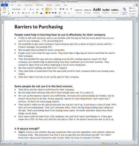
Even once I’ve typed up my notes in a well-organized Excel spreadsheet, I usually find that I need to refine my groupings and do some reorganization. For example, there may be issues and examples that are related, which I can group into higher-level categories. Perhaps doing this is overkill, but I find it useful to next take the spreadsheet data and put it in a Microsoft Word document, summarizing the issues in the spreadsheet as themes, as shown in Figure 2.
Figure 2—Organizing the findings into themes in a Microsoft Word document
Creating a Word document makes it easier to rearrange the issues into various levels of categories and subcategories. Again, the act of taking data from the spreadsheet, pasting it into the Word document, and reorganizing the data is another method of analysis. Doing this requires me to think about the data, how the issues relate to each other, and how I should organize them. By this time, I’ve gone through the information so many times that it’s really ingrained in my mind.
Making Recommendations
If the purpose of your research was to identify problems, once you’ve finished your analysis, you can make recommendations for solving those problems. Sometimes a recommendation is obvious. At other times, you’ll find it difficult to solve more challenging problems. You may need to do more research to find a solution, or coming up with a solution may require iterative design and research.
Creating Deliverables
Your analysis continues as you create deliverables to formalize and communicate the knowledge you’ve gained from the research. Part of the purpose of creating personas, scenarios, customer-journey maps, and other diagrams is to make sense of what you’ve learned. So analysis is a process that occurs throughout research, beginning when you first meet with users and continuing throughout the creation of research and user-centered design deliverables.
Group Analysis
When multiple people attend the research sessions, it makes sense to analyze the resulting data together as a group. Group analysis takes advantage of each person’s unique perspective. Just as observing research firsthand gives people a better appreciation and empathy for users, involving them in analysis further ingrains that information in their minds. By contributing to the analysis, they become more invested in the findings and recommendations.
Group Analysis Activities
Organizing data in an Excel spreadsheet doesn’t work well for a group. For effective group analysis, people need to be able to work together at the same time, combining their individual notes into a model that everyone can easily view, adjust, and discuss as a group.
Affinity Diagramming
For a group, affinity diagramming is the best method of organizing notes into common issues and themes. To create an affinity diagram, each person transfers their notes to Post-it Notes, indicating the participant to which the note refers. (This lets you distinguish between multiple participants who experienced the same issue.) A typical Post-it Note might contain an observation such as, “When entering his time for the week, he referred to a list of project codes on a piece of paper tacked to his cube wall.” When creating notes, it’s important for the group to first decide the right level of granularity for each note.
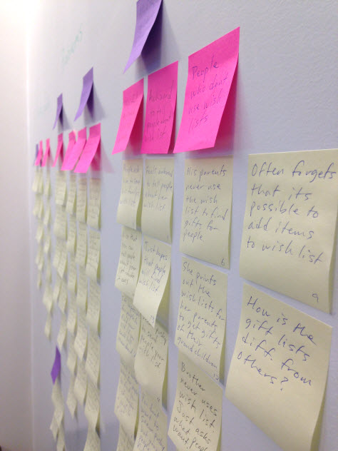
The team then arranges their Post-it Notes on a wall, as shown in Figure 3, grouping similar items, and creating categories and subcategories. As the team adds more notes, they can continue to change the groupings and categories until everyone feels they make sense. The groups and subgroups reveal themes, issues, and problems, which you can summarize in a Word document or use in creating other deliverables such as personas.
Figure 3—An affinity diagram
Process Mapping
While affinity diagrams are useful in generating themes, issues, and problems; sometimes you also need to map out workflows, processes, and tasks. Process mapping is a group activity whose goal is to illustrate the steps in a process. It’s especially useful when you’ve observed people performing the same tasks in slightly different ways or when you want to visualize how the ways in which several different participants have performed tasks fit together into a larger workflow.
To create a process map, the group goes through the notes for each participant, writing each step of their process on a yellow Post-it Note and including the role of the person who performs each step. For example, on one Post-it you might write, “Operations Administrator: Prints out the employee list.”
Arrange these Post-it Notes on a wall, in the order in which the steps occur. As you go through the notes from each participant, make changes or additions to the process as necessary, and show how other tasks intersect with the process.
You then place Post-it Notes of other colors next to these steps, indicating issues that occurred during the process. For example, you could use red notes to indicate problems or difficulties, green to indicate issues in the user’s environment, blue to indicate people or organizational issues, and pink to indicate the tools or technology that participants used.
You might eventually turn this process map into a deliverable. But the advantage of first mapping it out on a wall with Post-it Notes is that it allows the entire group to make sense of the tasks and processes they’ve observed across multiple participants, as well as to discuss the problems they’ve identified and share their insights.
Analysis Takes a Long Time
When analysis does get noticed, it’s often because it’s holding up the delivery of findings and recommendations. Thorough analysis can take a long time, depending on the following factors:
number of participants
length of the sessions
complexity of the subject matter
formality of the deliverables
type of research activity
whether you need to listen to the recordings
whether you’ve been typing up your notes as you go along or you’ve waited until the end of research to begin typing them
Yet, There’s Rarely Enough Time for Analysis
It’s rare for you to have as much time as you’d like to analyze your research data. Some of the reasons for that are the following:
Often, clients and your project team don’t realize what analysis involves or how long it takes.
To get user research included in a project, you must often shorten the time you allot to analysis to avoid adding too much time and cost to the schedule.
Recruiting and scheduling participants is often difficult and can introduce delays. So projects are often behind schedule by the time analysis begins, and people are anxious to get the results and move on to the Design Phase.
How Can You Speed Up Analysis?
The best way to complete analysis more quickly is to begin while you’re conducting the research sessions. Instead of waiting until the official Analysis Phase begins, type up your notes or work on your affinity diagram at the end of each day’s sessions. By doing this, you can clarify your notes and move forward with your analysis while everything is fresh in your mind and, thus, avoid having a huge set of notes to wade through at the end of the research. However, when you have a packed research schedule, this can be difficult to do. Often, you’ll have little energy left at the end of the day to deal with your notes.
Another time-saving option is to have your recordings professionally transcribed. You’ll save the time it would take you to review the recordings and can begin analysis using the transcripts.
Preparing a High-Level Analysis
While this is not ideal, when you have very little time for analysis, you can rely on your memory to do a high-level analysis. You risk missing important details, so be sure to provide a disclaimer to your audience, indicating that you’re providing a high-level analysis without closely reviewing the data, so the analysis does not account for all of the details.
To do a high-level analysis, I look through the questions and tasks in my discussion guide and answer each question from my memory of what I’ve observed overall. For example, after doing usability testing, you’ll usually remember whether most participants succeeded or failed in performing a task, the main problems participants encountered, and their general, overall opinions. You can also quickly flip through your notes to refresh your memory, as necessary.
This method is more effective with highly structured research such as usability testing, because participants go through predefined tasks and questions. But it doesn’t work as well for more complicated, highly variable research such as field studies.
Tide Your Audience Over with an Appetizer
If your audience is anxious to get your findings and recommendations, that’s a good sign that they’re highly interested in your research. A good analogy for analyzing data and preparing deliverables is that it’s like preparing a gourmet meal for a hungry audience. Because they’re hungry, you give them an appetizer to hold them over until you’re ready to bring out the main course. So, a few days after the research sessions end, give your audience a high-level preview of your findings, without any recommendations. You can use the high-level analysis method that I just described to quickly produce this summary of your findings. Be clear that you’re just providing preliminary findings, which might change once you’ve analyzed the details.
Analysis Is Cool
By this point, I hope you’ll agree with me that analysis really is cool. For those of us who like to do user research, the most interesting part of the process is seeing all of the information coalesce into patterns and insights. While analysis will probably never seem cool to some people, those of us who know better realize that this is where all of the exciting stuff really happens.
References
Merriam-Webster. “Analysis.” Merriam-Webster. Retrieved on May 22, 2014.
Merriam-Webster. “Synthesis.” Merriam-Webster. Retrieved on May 22, 2014.
Read your article and recognized and practice all of it. I teach students to do user studies of all kinds, and find the analysis part is the most difficult one: it takes time, they are never sure they’re doing it right, they hesitate to draw conclusions because they could be wrong, and so on. I guess even seasoned researchers experience the same thing once in a while.
Anyway, thanks for the column. It made me realize once again that I’m not the only one struggling with the issue. :-)
First, reading it helps me not to feel that alone in the design-researcher world! ;-) (Even after 10 years of practice, to be honest, I really still feel, at least in Switzerland, on a single island in terms of the appreciation for design-research, or ux-research! ;-) But that is another story.
In my 10 years’ research experience, all the points you mentioned have happened to me as well. Specific aspects I always underestimate are the ramp-up into the topic or domain in order to write the research script—that is, questionnaires or tasks—and the recruiting. And, of course, the analysis, where there never is enough time to really go as deep as I would like to. ;-)
One thing I’d like to share with you is my way of handling a group analysis. I call this co-analysis, and it is a step before the actual ideation—that is, developing solutions that are informed by the research findings.
Together with the group, we go through each summary of the findings—that is, the result of the horizontal comparison over all candidates—in the spreadsheet or other text presentation.
Each participant in the co-analysis looks at the findings with a different viewpoint—you could also call these different hats, glasses, or binoculars. One participant looks especially for chances, another for facts or risks, and so on. Then, each discusses his view and interpretation with the group. At the end of each discussion, we write down one or more Post-its with that specific analysis result.
The views’ names can always be adapted to the specific context, topic, or group. Each type of view is on a Post-it of a specific color. In the end, the group has produced a large number of these Post-its that we can then cluster into themes and patterns. Usually, I insist on deciding on a meta-name, or title, for the individual clusters or groups. This meta-name is crucial to see if the group has a common understanding of and interpretation for that cluster.
The clusters’ names can be especially useful in a requirements-engineering process because they already provide the meta-structure for the requirements.
From the clusters, it is then possible to derive specific solution ideas that include a user story. I call them service modules. They are part of the final solution. But this depends a lot on the envisioned target and output: the project goal to create a real or digital service or tool.
This way of co-analysis can be done in a team of between four to eight participants, ideally with various backgrounds such as technical, business, or human interface to come up with a broad spectrum of results. Moderation is crucial in this process, especially if there are dominant, alpha people in the group or to prevent any premature judging of the results—especially ideas!—but also to focus on taking every user seriously. (Sometimes some participants laugh about specific findings to undermine them, for various reasons.)
As you can imagine, this process can be time consuming, and the risk is that it will be one of the first process steps to be cleared from a cost calculation and offer. Therefore, I appreciate your metaphor of the cook offering some snacks for the starving clients before the meal. ;-) I will consider that for my next research job!
Thanks for describing your co-analysis process, Daniel. That sounds like a good method for group analysis. It’s interesting to hear how other people approach analysis.
I’m not sure if your method would scale for us: my teams run daily sessions. That is, there are one or two research sessions each day, with varying content—whatever is the interview topic we would like to discuss, which market segment does the user belong to…
Last, but not least: testing materials change between sessions. They are in constant flux as new information pours in, prototypea are modified, stepped up to new platforms, and so on.
When we did session-based user research—a big one a month—it was easy: one day of research, second day of analysis—usually affinity sorting.
As we went to this more continuous model—so we don’t have to wait days or weeks for validation—this ordered system of research gets hard to collect because questions vary, but patterns do emerge.
We are evaluating OptimalWorkShop Reframer and Atlas.TI for the job, but we don’t know where we’d end up with, because analysis needs to be a regular, but short exercise—like, an hour or two each week to see whether any patterns have started to form.
Adam—Yes, that sounds like a challenge. I haven’t used Reframer or Atlas.TI, so I’m not sure how well those would work for you.
If you’re looking for patterns that go across research sessions, even though the topic and questions might change, an affinity diagram might still be useful to see patterns across research projects. At the end of each week, the researchers could translate their notes to Post-it Notes and add them to the affinity diagram. This could be an overall affinity diagram that can change and gets added to at the end of each week. After many weeks, you might see common themes across all the weeks of research.
Or you could divide it into several different affinity diagrams, each pertaining to a certain type of topic, each of which you add to at the end of each week.
Jim, great article! I currently do most of your steps, which is great reassurance since I’ve been officially doing user research for only 1 1/2 years.
Your advice on group analysis was really insightful. I think this is one area I’m going to explore more. At my company, there is always a rush to deliver research findings, and I think analyzing the data as a group would be really beneficial.
I think my biggest problem today is, when I present my findings, there is just a 50:50 chance that people will act on them or even take them into consideration. This is both frustrating and disheartening. I know they appreciate the time I’ve spent uncovering the issues, but they’re not always pressing enough to stop or slow down their timeline.
Thanks, Meghan. Yes, that’s a problem—getting people to act on your recommendations. I wrote an article about that a few years ago in UXmatters, “Why Don’t Usability Problems Get Fixed?” You might want to check that out.
Jim has spent most of the 21st Century researching and designing intuitive and satisfying user experiences. As a UX consultant, he has worked on Web sites, mobile apps, intranets, Web applications, software, and business applications for financial, pharmaceutical, medical, entertainment, retail, technology, and government clients. He has a Masters of Science degree in Human-Computer Interaction from DePaul University. Read More