When I had children, I became acutely aware of the challenges children have interacting with the world, as most parents do. Some of these issues stem from the fact that most of the world is not designed for children. But I had seldom considered these issues because my work had rarely focused on that part of the population. While I have always been passionate about accessibility issues, I naively figured that was good enough. Since then, I have done my best to ensure that, when I design for users, I take developmental issues into consideration. So my designs for children begin with design guidelines.
What Are Design Guidelines?
When beginning work on any sort of design, you have to understand the objectives of the design, as well as the principles or guidelines you should follow. You can determine these through user research, stakeholder interviews, best practices, or most likely, a mix of some or all of these. Once you understand what design guidelines you should follow, your design solutions emerge naturally.
Champion Advertisement
Continue Reading…
Most UX design work targets people over the age of 18, so we design most interactions for this group. While these people use technology the most, they are not the only ones who do. As most people with toddlers know, sometimes parents just give up and let their kids play with their iPhone for a couple of minutes.
Designing for Kids
Creating design guidelines for products whose users include kids requires an evolution in our thinking beyond the guidelines we typically follow. The users, content, and context dictate the appropriate design guidelines. For kids, you might start with the type of product. The following are examples of guidelines for different types of products for kids:
entertainment—Focus on constantly engaging the user.
education—Balance engagement and education.
arts and crafts—Engage users, then let their creativity take over.
These are some very high-level guidelines for specific categories of products. Next, let’s take a look at children’s different age groups.
Developmental Categories
These developmental categories are from Debra Gelman’s fantastic book Design for Kids, which discusses Jean Piaget’s stages of cognitive development and breaks some of them down a bit further. In Table 1, let’s look at Piaget’s stages of development.
Table 1—Piaget’s stages of development
sensimotor stage
preoperational stage
concrete operational stage
formal operations stage
From birth to toddler (~age 2)
Toddler (~age 3) to elementary (~age 6)
Elementary (~age 7) to preadolescence (~age 11)
Early adolescence (~age 12) to adulthood
These kids are just experiencing the world and figuring it out. If something shakes or is sparkly, it’s awesome! It’s all about the shapes and how everything connects back to them.
While sparkly things are attractive to them, they can play pretend and have a sense of self. In fact, they’re narcissistic egomaniacs who can communicate! Look out world. It’s all about them!
This is when humans begin to understand symbols and meaning, but don’t yet have abstract thought. They are aware of the world, but not necessarily all of the cues that adults take for granted.
The age of reason? Well, logic, abstract thought, and problem solving at any rate. I’m betting this is your stage of life. So, hopefully, you understand this—as much as any of us understand ourselves.
Table 2 shows some design guidelines for these developmental categories from Debra Levin Gelman’s Design For Kids.
Table 2—Design guidelines for developmental categories
2–4 year olds
4–6 year olds
7–9 year olds
10–12 year olds
Highlight only things with which a child can interact.
Break up instructions into manageable chunks.
Clearly show goals and purpose.
Provide contextual Help after a failure.
Use few colors.
Allow invention and self-expression.
Offer a clear set of rules, with opportunities to interpret and expand them.
Emphasize self-expression and accomplishment.
Use icons that are highly representational.
Provide immediate positive feedback.
Let kids earn and collect awards.
Invite silliness or irreverence.
With all of the different needs of children at various stages of development, how can we expect design guidelines to fit all of them?
Evolving Design Guidelines
Let’s examine these guidelines from a slightly different perspective. On a recent project for the formal-operations crowd, the desired user experience needed to
have a low barrier to entry—steering clear of personal questions up front
allow users to navigate their selected path
establish trust in the information, so users would be willing to share more
In Table 3, let’s take a look at how these requirements might need to change if the product had to address various age groups.
Table 3—Requirements for developmental categories
2–4 year olds
4–6 year olds
7–9 year olds
10–12 year olds
Have a low barrier to entry, highlighting areas for the user.
Have a low barrier to entry, providing very simple, step-by-step, silly instructions.
Have a low barrier to entry, showing the objectives of the process in a silly manner.
Have a low barrier to entry, encouraging silliness up front.
Use a limited number of colors, guiding users by highlighting their path.
Encourage navigation by providing positive feedback along the path.
Establish rules for the experience.
Allow the navigation of a user-selected path, providing contextual Help where necessary.
Establish trust by highlighting sections, so users are willing to interact more.
Establish trust through chunked instructions, so users are willing to interact more.
Allow the navigation of a user-selected path, collecting awards along the way.
Establish trust in the information, so users are willing to express themselves more.
—
Establish trust in the information through awards and achievements, so users are willing to engage more.
—
—
This example shows how guidelines can evolve to match the needs of specific age groups.
How well do products that are currently on the market address the needs of these developmental groups?
Some Hypothetical Design Guidelines
Now, let’s look at a game, an app, and a toy. We’ll determine some hypothetical design guidelines from a high-level description of each product, then compare these guidelines to the actual product and see how well it does.
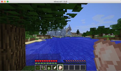
Game: Minecraft
Minecraft, shown in Figure 1, is a hugely popular game among the younger crowd. It’s a first person–player game in a world that allows users to build anything they want from the materials they find. It’s like having unlimited numbers of different types of Lego blocks. While some parents let their 6 year olds play the game, it’s supposed to be for older kids—how old depends on the regional rating system in force. The Entertainment Software Rating Board (ESRB) says Minecraft is for children who are 10 and up, while the Pan European Game Information (PEGI) says it’s for children who are 7 and older.
Figure 1—Minecraft 1.8.8
My understanding is that Minecraft was designed to emulate other first-person games, but with a more open-ended environment allowing greater creativity. Minecraft has evolved from that initial idea, but the fundamental activities are still building things and discovering how others build things. Game mechanics can become very complex, so let's keep our quick analysis at a very high level.
Given this understanding, our hypothetical guidelines would be as follows:
Introduce the world through clear instructions and provide simple, discernible goals.
Offer rewards for completing constructions.
Allow for silliness in constructions.
Provide contextual Help if a construction doesn’t work.
Minecraft does not do a great job of giving instructions. It throws users into the deep end, assumes they know how to operate a first-person game, and makes them figure out how to play the game on their own. While Minecraft does allow users to learn outside the multiplayer environment, instructions and contextual Help are not really part of the game. Yet, it is an extremely successful game for kids. Of course, plenty of products have been successful despite bad user experiences.
What the game does exceedingly well is allowing silliness—in constructs, behavior, and general gameplay. Since Minecraft provides an open world in which users can build things, its strengths are clearly in promoting creativity. Rewards for completing constructions come into play only once they’re complete. The game offers no rewards in advance, beyond the possibility of peer acknowledgment.
Since Minecraft did not do a great job of meeting these guidelines, it could definitely be improved upon in the future.
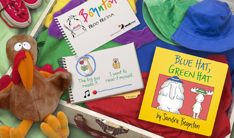
App: Blue Hat, Green Hat
Boynton books are extremely well established in the toddler universe. Their apps are perhaps less well known, but they generally get favorable reviews. Boynton Moo Media produces them in conjunction with Loud Crow Interactive. These books are “Rated 4+, Made for Ages 5 and Under.” While that confusing statement would likely make anyone think it’s only for 4 and 5 year olds, the subject matter is clearly for kids 2 and over. With this in mind, let’s speculate about the design guidelines that should have applied in making the Blue Hat, Green Hat app, which is shown in Figure 3.
Figure 3—Blue Hat, Green Hat opening
So, what is this app? It's an entertainment and education app for 2–6 year olds. It’s an interactive book that children can read—or just play with if they haven’t yet learned to read. Thus, our hypothetical design guidelines that the design needs to address are the following:
Balance engagement and education.
Provide clear, manageable, chunked instructions with icons that guide the user into the book
Highlight areas with which the user can interact, including page turns.
Provide a familiar experience that is similar to the book.
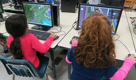
How does the actual Blue Hat, Green Hat app, shown in Figure 4, check out?
Figure 4—2 year old using the Blue Hat, Green Hat app
The app’s initial screen can be a little confusing to users. The main interactivity is the user’s deciding whether the app should read the book aloud. The icons for this are pretty good—a bear reading a book aloud or silently. But after that, the app does really well. The digital book looks almost exactly like the physical book, but provides interactivity by highlighting what word it’s reading—thus, capturing the user’s attention, while educating—or through slight animations throughout all pages.
Blue Hat, Green Hat did pretty well in satisfying our hypothetical guidelines. The one thing that’s missing is chunked instructions. But, in this case, familiarity with the material might compensate for that lack.
Toy: The Boogie Board
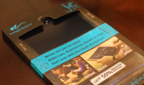
The other objects I’ve examined have digital interfaces. The Boogie Board is a pseudo tablet that has an LCD screen and a stylus for drawing. A user can draw on it, then tap a button to clear what’s on the tablet. The product’s packaging, shown in Figure 5, doesn’t say it’s for kids, but the images on it show kids using the tablet.
Figure 5—Boogie Board packaging
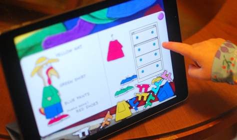
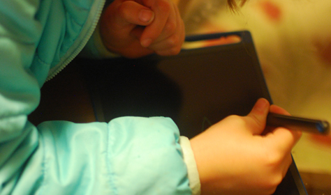
How should we categorize this toy? It fits the bill for arts and crafts, and any person who can hold a stylus could use it, as shown in Figure 6. So the design needs to address the following requirements:
Engage the user and enable creativity.
Provide a clear visual indicator for erasing.
Let the user work with simple, easily discernible colors.
Support drawing and clearly display the image the user creates.
Figure 6—A 5 year old using the Boogie Board
So, how did the Boogie Board do? The simplicity of the device, which looks similar to a tablet, engages users and encourages them to draw. While users can draw in only one color, the color leaps off the pad. The lack of color options keeps the user interface simple. On the other hand, while there is only one button, there is no indication of what that button does.
The Boogie Board met the guidelines pretty well, but the eraser button would certainly benefit from an icon. There is a fine balance between imitating a popular product and creating the user experience that is best for users.
Getting Design Guidelines Right
While getting your design guidelines right can be tricky, it’s hugely important because guidelines are the springboard to successful product design. To ensure that a user experience accommodates all potential users, take a step back and make sure your design guidelines address the needs of users at different developmental stages—and with different cognitive abilities, but that’s an article for another day. Applying design guidelines can be tricky, as these examples have demonstrated. That’s why testing and iterating your designs is always a good idea. Designing for children just requires a little extra thought—and you don’t actually have to have kids to give it a try!
Senior Interaction Designer & UX Researcher at BlinkUX
Seattle, Washington, USA
Jonathan follows his passions for interaction design and cognitive psychology to build connections between user research and user-centered design (UCD), especially research and design with a focus on children. At Ignite Seattle, he spoke about the inapplicability of UX principles to children. He continues to be active in this field of study. Prior to joining Blink in 2012, Jonathan worked on projects for diverse organizations, including Autodesk, Classmates.com, BP, CBS, the FBI, Sony, University of Melbourne’s Trinity College, and the University of Virginia (UVA). While at UVA, he received a Master of Science in Systems and Information Engineering, focusing on Human Factors. His thesis explored the removal of errors in audio-book recordings for blind and dyslexic people, mostly children. He received his Bachelor of Arts in Psychology from Swarthmore College. When not at work, Jonathan goofs around with his wife, gets pounced on by his two daughters, and gets walked by his pup. Read More