From a design perspective, the TV remote control presents an interesting problem. What other technology is in such wide use, but so disliked? Every living room in Western civilization has at least two of them. With so many remote controls from so many manufacturers, you would think a best design pattern would have emerged by now. But particular remote controls may demonstrate three different types of simplicity:
Engineering simplicity
Conceptual simplicity
Aesthetic simplicity
Champion Advertisement
Continue Reading…
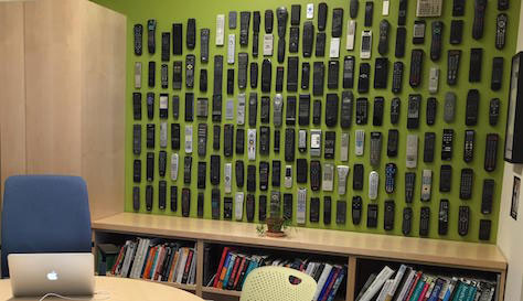
When people visit my office, it’s hard to miss the wall of remote controls, shown in Figure 1. It was fun collecting them, but they also help to engage people who are new to design. Even if people don’t think of themselves as designers, everyone has an opinion on the design of remote controls.
Figure 1—My wall of remote controls
In this article, I’ll tell you a story about the design of three different remote controls:
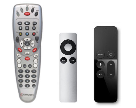
A classic remote control—an example of engineering simplicity
Apple TV Remote—which demonstrates navigation simplicity
Siri Remote—an example of aesthetic simplicity
I’ll also provide some principles and guidelines that apply to the design of remote controls.
A Brief History of Remote Controls
Let’s take a moment to look at the history of remote controls—one of the most popular hand-held electronic devices. Just the sheer number and variety of remotes makes them worthy of review.
The remote control was created to solve the basic human desire to remain sitting on the couch. Early remotes had a clear hierarchy that was based on the things people wanted to do most—primarily changing the channel and muting the audio. The era of 100 buttons was far in the future.
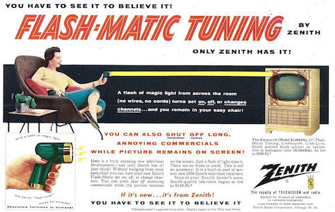
Zenith marketed their Flash-Matic tuner, shown in Figure 2, as “Absolutely harmless to humans.” Clearly, they didn’t take the risk of obesity from sedentary habits into account back then.
Figure 2—Ad for an early remote from Zenith
Figure 3 shows one of the earliest remote controls, Zenith’s Space Commander. The button mechanically hit a tuning fork, earning it the name the clicker.
Figure 3—Zenith’s Space Commander
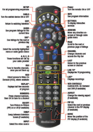
The classic remote was designed for engineering simplicity. Therefore, as companies added features and buttons over time, their remotes became more and more complex—like the one shown in Figure 4.
Figure 4—A complicated remote control
How Did Remotes Get This Way?
Over 30 years, remote controls converged on a single basic design. Unfortunately, nobody really likes any of its variants, for a few reasons:
Remotes tend to evolve from previous versions, adding new features, but taking nothing away. Complexity is the result.
Since classic remotes were designed to operate without the use of on-screen menus, each function required a separate button.
People do not choose remotes on their own merits. They come with an electronic product or cable service. Manufacturers see them as a cost rather than a profit center.
Electrical engineers generally design remotes, tend to see them as a circuit problem rather than as a user interface, and design them for simple engineering, not usability. If they need to add a new feature, they add a button.
Despite these reasons—and given the incredible amount of time people spend using their TVs—you’d think companies would recognize a ripe opportunity for innovation in this human-computer interface.
Remotes Are Clearly a Problem
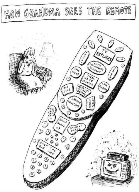
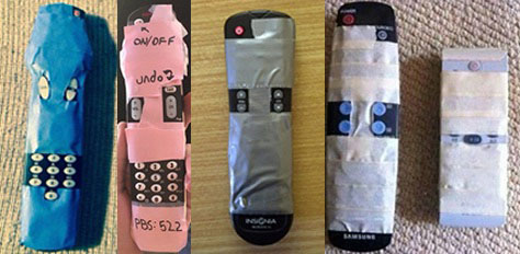
The explosion of buttons on remotes has had strong negative impacts on users. When cartoons like the one shown in Figure 5 and Internet memes lampoon such designs, it’s time for a change. Figure 6 shows some users’ attempts at simplification.
While modern software design has embraced progressive disclosure, the design of remote controls has yet to catch up. Most of today’s TV remotes have lots of buttons and manipulate on-screen menus.
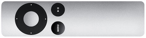
However, one example bucks this trend: The first-generation Apple TV Remote, shown in Figure 7, was a classic example of a company using design to differentiate itself. It’s a lovely device and made the radical step of moving most functions on screen, instead of having a separate button for each feature. The Apple TV Remote was designed for conceptual simplicity. It represents not a technological innovation, but a rethinking of the user experience.
Its silver color made it easy to distinguish from all the other remotes, and it is easy to see in the dark.
On the wall in my office, the obvious simplicity of the Apple TV Remote amidst the others demonstrates the benefits of distinguishing your product through design. Who wouldn’t want to stand out like that!
Too Much Simplicity? Or the Wrong Kind?
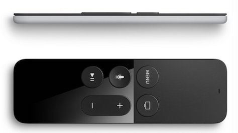
When the fourth-generation Apple TV launched a year ago, I was excited to see the new Siri Remote, shown in Figure 8. Apple was finally getting serious about this product.
The Siri Remote is a gorgeous object. Visually simple, it contains powerful technology that we have not previously seen in a remote, including a trackpad and voice control. The remote also functions as a game controller and includes an accelerometer to capture gestures, similar to the Nintendo Wii.
Considering Apple’s investment, it was a huge surprise when the device turned out to be harder to use than the original Apple TV Remote. Talk to any owner, and you will hear similar complaints. What happened?
Let’s take a look at some basic design principles.
When Form Fights Function, Users Lose
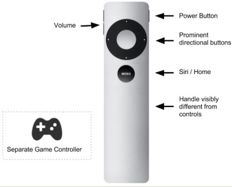
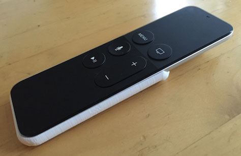
A basic design principle is that users should immediately know how to orient themselves to a product. The most common complaint you’ll hear about the Siri Remote is that people routinely pick up the remote and try to click with the handle. I do it at least once a night. It’s easy to see why. As shown in Figure 9, the flat trackpad looks identical to the remote’s flat handle.
The Siri Remote was designed for aesthetic simplicity, and its design clearly prioritizes visual form over function. Everything is aligned and symmetrical. Physical buttons are in the center of the remote, making both sides look even more similar.
This excessive similarity extends to something as basic as the color of the remote. The white or silver Apple TV Remotes really stand out. This is a benefit when you’re watching TV in a darkened room. The Siri Remote is black, with black buttons. This is a basic accessibility mistake that makes the remote harder to use for everyone.
Perhaps Jony Ive, shown in Figure 10, lives in an all-white world, where black remotes are easy to spot?
Creating a clear hierarchy of elements is another core principle of good design. On the worst-designed remotes, the least- and most-used buttons are the same size and are scattered around the surface.
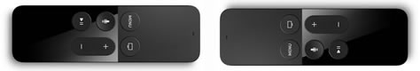
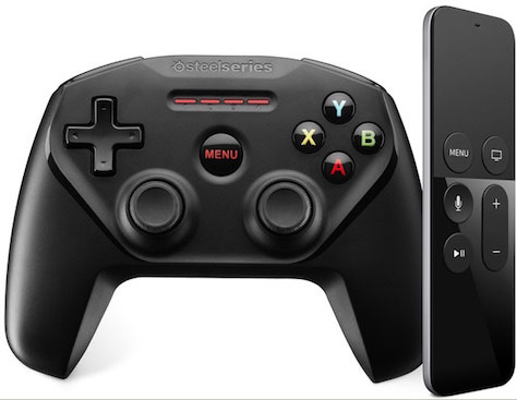
The classic remote, on the left in Figure 11, has multiple, conflicting visual hierarchies. The Apple TV Remote, in the middle, has a clear, central Select button that is surrounded by four directional buttons.
Every design should make its most important features obvious. On the Siri Remote, on the right, the most important button isn’t recognizable as a button at all—it’s a flat trackpad surface. Other key functions such as volume have physical buttons, but they exist in an undifferentiated visual grouping. The buttons are so similar that it isn’t even obvious when you’re holding the device backwards.
One of the odd design choices was not providing a physical Power button, which surely is one of the most frequently used functions. While the Siri Remote includes a power on/off capability, there is, unfortunately, no visible affordance for it. Instead, turning the device on or off requires a long press of another button. The resulting lack of discoverability ensures that most people will have to use their TV remote as well—the very thing the Apple TV Remote is supposed to prevent.
Discoverability Is a Key Priority for User Experience
While a mobile phone has many jobs, a remote control is just for fun. People designing complex software can reasonably expect that people may need some training to become expert users. But every user watching TV expects to be an expert right away.
Hiding complexity is not the same thing as achieving simplicity. Hidden or unlabeled features seem to be endemic across all new Apple products. For example, to get to an app selector menu, click the Home button twice— but don’t hold it down because that would put the Apple TV to sleep.
In the course of writing this article, I learned that the Play/Pause button also deletes apps. By the time you read this, I probably will have forgotten this because it makes no sense. Requiring people to remember features to avoid adding menus or buttons puts form over function.
Leverage Existing User Behaviors and Design Patterns
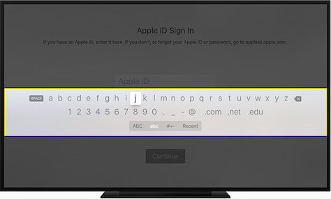
Text entry is a core feature on any modern smart TV. Apple has come up with a completely new method of doing this for the new Apple TV, but one that’s worse, as you can see in Figure 12. To enter text, you must scroll back and forth across a row comprising all the letters of the alphabet. Imagine entering a complex password with this user interface! Apple has basically built the fake Apple product from a 2009 Onion article. Go ahead and watch the video.
This poor design isn’t the result of hardware limitations. Plenty of good design solutions exist to solve the problem of text entry, including that for the previous version of the Apple TV. Perhaps the Apple TV designers prioritized making a distinctive design statement over using a tried-and-true design pattern.
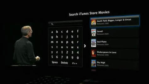
Figure 13 shows Steve Jobs demonstrating the original Apple TV user interface for text entry. While using the grid of letters was slow, it was much faster than with the new linear layout.
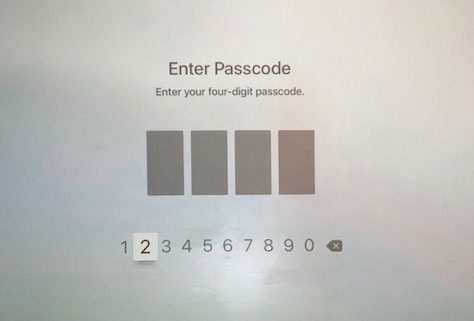
From personal experience, I’ve learned that this new design also has a security weakness. As Figure 14 shows, when you’re slowly scrolling back and forth, the kids on the couch next to you can easily learn your passcodes, defeating the point of having a passcode on an Apple TV.
Measure simplicity by how easy a product is to use, not by how few buttons it has.
It seems that Apple has designed the Siri Remote to use all the new technology available—from accelerometers to touchpads. But the touchpad was an odd choice for a remote. The user interface doesn’t take advantage of the ability to swipe, so navigation buttons would have worked just as well.
There may have been a requirement to sell the Apple TV as a gaming machine, but the Siri Remote is not a good game controller. It is hard to hold, confusing to use, and does not build on users’ prior experience with game controllers. As with the classic toaster-fridge, jamming two products together makes each worse. Offering a special gaming remote would make each product better.
One bit of trivia helps to explain the limited number of games on the Apple TV: Apple originally required that every game app must work with the basic Apple Remote. That limited the types of games available, which led to there being less interest in it as a gaming platform. Apple removed this requirement last year. The headline “Apple TV Games Will No Longer Be Crippled by the Siri Remote” made it obvious that the design has issues.
Use a Design Language Across Your Designs
By creating a design language, in which forms and objects have a consistent meaning, we empower the user to build on their existing knowledge.
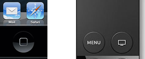
As shown in Figure 16, there is a Home button on each device, but with a different design, location, function, and icon. Abstract icons are a common example of placing form over function. Affordances are not decoration!
While the remote is called the Siri Remote, the user’s knowing how to invoke Siri on the more common iPhone—with a long press, then release of the Home button—is no help. There is a separate button for invoking Siri using the Apple TV Remote, which the user must keep pressed while talking. Likewise, Power and Volume buttons are in a consistent location on all Apple hand-held devices, except the Siri Remote.
Applying the Design Principles
Apple has earned its reputation as a powerhouse design firm. They have resisted calls for features that would add complexity to a user interface. However, the Siri Remote shows the risk of taking minimalism too far and leaving the user behind.
If we applied the basic design principles I described earlier, how might they guide the design of the new remote control shown in Figure 17?
Test different design options to avoid tunnel vision.
Employ a clear visual hierarchy with discoverable buttons.
Focus on the remote’s main use case to avoid frankendesigns. For example, create a separate game controller.
Use consistent locations for controls across products, establishing a clear product-line language. For example, always provide a single Home/Siri button.
Don’t just hide complexity, solve it. For example, show less-used features in on-screen menus rather overloading buttons with unlabeled functions that the user invokes with a long press.
Figure 17—Reimagined Apple TV Remote
Now, you may be saying, “Hey, you just Photoshopped the Apple TV Remote”—and you would be right. The original design was very effective. Building on its design language across devices would be a smart strategy. The one addition I’ve made is the Siri/Home button, whose prominence matches that on all the other devices in the system.
Usability Testing Improves Designs
The most surprising aspect of the design problems with the Siri Remote is how quickly people discover them. These are not edge-case oddities. They’re issues with basic functions. A brief survey of users suggests that the typical user holds the Siri Remote backwards one or two times an evening! The touchpad is cool, but it’s too easily activated. Accidentally brushing it with a leg can pause or fast forward video playback.
The best way to prevent bad design is to include real people in the design process. They remind us that implementing creative ideas without getting user feedback is not UX design. Without usability testing, it’s all too easy to recreate the same design flaws, just as the Kickstarter remote shown in Figure 18 does.
Easy Is Harder Than Simple, but the Effort Is Worth It
By considering these three remotes, we’ve seen the design of remote controls evolve from engineering simplicity, to navigation simplicity, to aesthetic simplicity.
Designers have spent the last 20 years trying to grow beyond being mere stylists. The Siri Remote shows how extreme minimalism can give design a bad name. Minimalism may work for the physical iPhone, where all the action is on the screen, but not for a device that you pick up off the couch in the dark.
If ultimate minimalism was the goal, perhaps the best design would be no physical remote at all—just a great voice app. But let’s not lose touch with the joys of a well-crafted physical tool that you can learn simply.
For those of us who are still clicking the handle of the Siri Remote, I’ve designed a grip that helps, shown in Figure 19. You can download the free file and 3D-print it.