“Any sufficiently advanced technology is indistinguishable from magic.”—Arthur C. Clarke
People usually interpret Clarke’s quotation as a positive recognition of the power of technology. The new user interfaces (UIs) of gestures, voice, and chat aspire to magic, enabling people to control technology without any apparent, screen-based user interface. For some designers, this quotation also represents the future of user interfaces. Imran Chaudhri, UI designer for Apple’s iPhone has said:
“I see a natural progression from knobs and dials, to clicks and taps, to swipes and gestures, to voice and emotion.”
Magic is powerful, but as we all know, it also has a dark side. Could today’s trend toward magical user experiences that rely on gestures, voice, and chat spell doom for users? In this article, I’ll take you on a “Magical Mystery Tour” of these new user interfaces.
Champion Advertisement
Continue Reading…
The User Experience of Magic
The appeal of magic is power—the ability to do something others can’t or to do it more easily. Why scrub the floor when you can enchant a mop to do it for you, as Figure 1 shows? The power of the modern mobile phone, with its ability to summon a cab for you and do so many other things, make it a clear descendant of a magic wand.
Figure 1—Mickey Mouse conjuring brooms, from Fantasia
It might seem odd to talk about the user experience of magic, but if books and movies are to be believed, magic is a technology like any other, and people must control technology in some way. If spells are apps and the magic wand is your mobile device, those who create the spells are the UX professionals of magic. (One wonders how to do usability testing in the world of magic.)
Typically, a master magician can create amazing works with their bare hands, as shown in Figure 2.
But it is rare to see someone learning the gestures of magic. As shown in Figure 3, they look an awful lot like someone just waving his hands around. How does one know how to turn gestures into commands?
All computer users have experienced the frustration of knowing that a particular feature or function is possible, but not being able to discover how to use it. In the old days of computing, the solution was to tell people to “read the [friendly] manual.”
However, the magical community understands that the power of magic does not come intuitively; it must be taught. In Harry Potter, children go to school to learn magic. For example, when Harry and his friends are learning The Levitation Charm—Wingardium Leviosa—slight mispronunciations make all the difference, as shown in Figure 4. Luckily, at school, there are people who can set the kids straight.
Figure 4—Hermione Granger correcting the pronunciation of a charm
But how does a novice learn to control the powers of our world? From the proverbial ancient book of spells that Figures 5 and 6 depict, the user must extract the documented knowledge of the truly wise.
Figure 5—Mickey Mouse swept away on a book of spells, in Fantasia
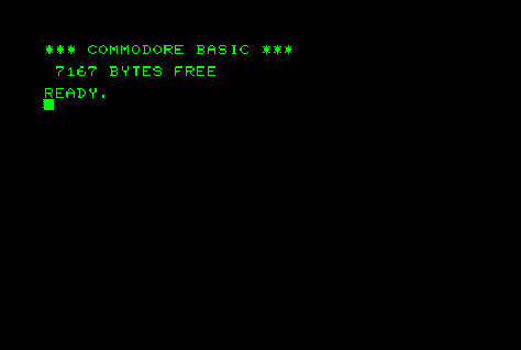
For early computers, product manuals were essential because the computers offered little in the way of user guidance. On command-line interfaces, the cursor just blinked interminably, as shown in Figure 7. Few users were able to provide the magic words.
Figure 7—Command-line interface
If there is one rule of UX design, it is that the user should not need a manual to perform an application’s primary functions—just as for most physical tools, which are designed so it’s obvious how to hold and use them. But the new generation of user interfaces that rely on gesture, voice, and chat have one obvious similarity to the command-line interface: they lack affordances—cues such as buttons, links, or menus that help users know what they can do next.
The loss of affordances in applications risks our returning to the bad, old days of personal computing, when the user was responsible for somehow divining how to use an application.
Gestures
Nothing seems more magical than making things happen by waving your hands around, as you can see Mickey Mouse doing in Figure 8. Today, gestures are one of the biggest movements, if you will, in user-interface design. When interacting with a modern touch phone, the user is not restricted to simple button presses. The phone can detect whether the user is pinching or swiping with their fingers. In many cases, this experience is delightful—for example, if the user appears to be physically manipulating a digital map.
But gestures also have a dark side. In most gestural user interfaces, there are no cues that indicate to the user what functionality is available. Plus, gestures are implemented inconsistently from app to app.
The iPhone X provides an excellent case study because Apple’s designers have notably removed what has historically been the iPhone’s most prominent control: the Home button. Instead, the iPhone X user interface relies on gestures. While extending the use of gestures on the iPhone X was an interesting idea, its many unresolved design compromises mean users are still dealing with confusion. Let’s look at some of the gestures on the iPhone X.
Swiping Left and Right
The Safari browser app has a longstanding gesture, as shown in Figure 9: swiping from left to right goes back a page; right to left, forward a page. However, on the iPhone X, unintentionally swiping less than a centimeter down switches the user between apps, as shown in Figure 10.
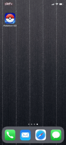
On the iPhone, the main function of the Home button is to view the app screen, while on the iPhone X, swiping up takes the user to the home screen. Nice, except when you’re trying to use a drop-down menu or play Pokémon Go, for example, and swiping up accidentally triggers the home gesture. Figures 11 and 12 show two common iPhone X swipe-up errors.
Figure 11—In Orbitz, swiping up in a drop-down menu exits the app
3D touch was Apple’s attempt to add a new gesture by sensing how hard a user is pressing the screen. Unfortunately, the feature has never taken off—probably because most people can’t tell the difference between a hard press and a long press. Try it. Now try to explain the interaction to someone else. The latest iPhones seem to be doing away with this gesture, but it is unlikely to be missed.
Shake to Undo
Another example of a less-than-successful gesture is shake to undo. According to John Gruber:
“[The] shake gesture is dreadful—impossible to discover through exploration of the on-screen UI, bad for accessibility, and risks your phone flying out of your hand. How many iOS users even know about Shake to Undo?”
If people are still complaining about a UX-design choice ten years later, it probably needs improvement. For UX designers, the real risk is the assumption that the user understands all these subtle, gestural-UI concepts so there is no need for additional cues. The reason for this design choice appears to have been to hide features and preserve a clean look. The iPad keyboard displays the undo action as a button.
One example of the downside of depending on gestures to invoke invisible features is the iPhone X iMessage effects feature. It requires a 3D touch on a regular button to display it, which means few people ever discover this feature.
Some gestures are perfectly natural—for example, pinching to zoom out and spreading your fingers apart to zoom in, as shown in Figure 14. The key justification for gestures is that the user is manipulating an item on the screen, not issuing an abstract gestural command.
Traditional magic usually requires the spoken incantation of spells. Today’s technology—including Siri, Cortana, Google Voice, and Alexa, shown in Figure 15—follows that pattern.
Given the amount of press voice user interfaces (VUIs) have received, you would think they’ve become the dominant user interfaces of our age. However, most people seem to be using their phones and computers just as they always have. Reportedly, people are using voice devices primarily to play music or as kitchen timers and ignoring most of the other commands. (Who knew there was such an underserved need for kitchen timers?)
Figure 15—Amazon Alexa, embodied in an Echo Dot
But is anyone who studies users surprised that people aren’t mastering voice user interfaces? There are implicit limitations to voice user interfaces. Spoken language is imprecise—often by choice. When language is precise, speech is usually slow. We’ve all suffered through PowerPoint presentations with the presenter reading out every word on every slide. People read approximately twice as fast as they can speak. Keep the phrase “Pictures are worth a thousand words” in mind when people try to convince you that voice is the future of user interfaces.
By far the biggest issue with voice user interfaces is that they recreate the problem of the command-line interface: users don’t know what they can and cannot do.
Let’s consider Siri on the iPhone. As shown in Figure 16, Siri prompts the user, asking how she can help, then helpfully makes some suggestions regarding what she can do for the user. This is an improvement over the initial version of Siri, but it’s still not totally clear why the user would want to use this feature.
Most examples of voice interactions could be accomplished more quickly by tapping elements on the screen rather than using verbal commands. The example shown in Figure 17, “book a table for four in Palo Alto,” demonstrates the tradeoffs.
Figure 17—Booking a table at a restaurant with Siri
To make it appear that this voice interaction is useful, Apple had to take a number of shortcuts.
Apple chose the time.
Apple chose four restaurants.
Apple chose the reservation network.
Apple doesn’t even acknowledge that there are restaurants that take reservations on the phone.
The point is that real life is complicated. While voice assistants may aspire to replace a person, the necessary compromises make this prospect seem doubtful. It’s not a question of artificial intelligence; it’s the voice user interface itself that is limiting. Changing the details of time and place for a reservation is just so much easier on a screen than doing it verbally. Imagine trying to figure out the usual balancing of restaurant style, location, and availability. Voice lets you say only one thing at a time and only one person can be speaking at a time. This voice-as-command-line user experience is so limited that it’s hard to see how it can ever move beyond being a toy.
And let us not forget that interactive voice response (IVR) systems have been common on phones for decades, but people still consider using them a frustrating, slow experience. Despite their generally being good at using the phone’s physical affordances—for example, “Press 1 for sales, press 2 for service” or even “Why don’t you say the name of the movie?” the slow nature of voice communication is a fundamental challenge for voice as a user interface.
From a design perspective, voice user interfaces may even be a step backward from graphic user interfaces. The creators of VUIs seem to expect that users should be able to formulate their requests to meet the requirements of the machine. I’m sure VUIs will get better as the computing power of mobile devices increases, but an over-reliance on voice interactions is a limitation, not an enhancement. While some believe that this is because computers were originally designed to be visual, it’s also because human beings have really good visual perception. In an attempt to solve the problem of choosing verbal instead of visual interactions, Amazon has come up with a revolutionary idea: the Echo Show—a VUI device with a screen!
This is not to say that voice interactions don’t have a role in modern user interfaces. They’re pretty handy for hands-free use cases—such as sending a text saying, “I’ll be ten minutes late” while driving. But the ideology that believes “voice is the future” is sometimes causing today’s UX designers to make poor design choices.
Affordances
A benefit of visible affordances that designers rarely discuss is that they let people know what they can do in an app. Users don’t generally expect features for which there are no affordances. For example, even though the iPhone has a Stocks app, people don’t expect to use it to trade stocks because its user interface lacks any buttons that would allow the user to do that. The app has not promised to provide that capability.
In contrast, voice user interfaces’ lack of affordances implicitly promises that they can do anything. If there are no obvious limitations, people expect apps to do everything and will be disappointed.
At the same time, users have no way of knowing what they can actually do. I’ve observed people trying out a few requests, then giving up altogether or learning just a small subset of common features. With voice assistants, people typically use only one or two skills—basic things such as playing music or setting a kitchen timer.
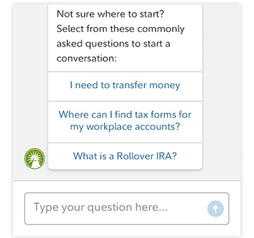
Chatbots, such as the one shown in Figure 18, are another example where a lack of guidance makes it difficult for users to know how to use them. So bots often end up sneaking affordances back in, displaying options to tap, which is not really chatting anymore!
Figure 18—Fidelity chatbot
Search user experiences are the best example of enabling the user to accomplish an open-ended task verbally, but mainly because the UX model is simple: Web search does not use a structured language of commands such as SQL, but instead lets the user type a few words to query a search engine and find content on the Web.
Beware of Dark Magic!
In every fairytale, unwary people fall into magic unawares. One day, I accidentally summoned dark magic while driving on the highway by triggering the Emergency SOS feature on my phone when trying to silence a persistent caller. The very loud Emergency SOS almost caused me to get in an accident!
I’m sure this feature is a good idea, but hiding it and expecting users to invoke it using an obscure gesture means users might accidentally trigger it and have no idea what has happened or why. It’s like a loaded UX bomb that apparently strikes when people are trying to reboot or take a screenshot! After playing the loud alarm, the feature automatically calls 911. How many accidental calls to 911 are these designers responsible for?
Design Languages Are Languages
User experience is a language and language evolves. We create new words to describe new ideas. However, the evolution of language is not a linear process, nor is it purely functional. Slang evolves faster than formal language because it is driven by a need for novelty and the experience of knowing something other people don’t know or wanting to be ahead of the curve. The incorporation of most truly successful words—such as OK—into a language happens so quickly it is almost imperceptible.
User interfaces also evolve—and also have their own slang and trends. Experiments such 3D touch and virtual reality come and go. But, just as with language, their rate of change can leave people behind. People are forced to keep up with ever-evolving technology. Not everyone wants to spend time keeping up with each release of iOS or Android. Believe it or not, most people don’t really care what version they’re using. They just want to take care of their basic tasks.
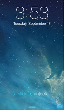
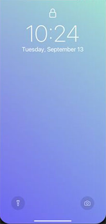
Sometimes an evolution is a simplification of a visual interface. For example, the lock screen on the iPhone is a basic function that has evolved from the obvious to the abstract, as shown in Figures 20–22.
Figure 20—Obvious affordances on the iPhone lock screen Figure 21—More abstract affordances on the iPhone lock screen Figure 22—Increasingly abstract affordances on the iPhone lock screen
Tension exists between UX designers who are continually trying to advance the user experience and those who want to maintain consistency for existing users. While it’s great when designers make meaningful design improvements, they need to be wary of changing things just for stylistic reasons such as flat design or minimalism—especially if they’re attempting to achieve minimalism by making functions invisible.
Skeuomorphism got a bad rap, but it did help people to recognize a calendar or notepad on their screen. The trend toward flat design has had a tendency to make every app look the same, which makes it harder for users to recognize their current context.
The original iPhone was so successful because the user could simply touch an element on the screen to do something, and they could always get home again. The Home button was the only button on the front of the phone. There seems to be a new generation of UX designers who think basic UX-design standards are boring and are constantly seeking the next big thing.
The use of gestures can become a crutch—similar to the urge to push all decisions to the settings screen. The biggest sin in design is denial: hiding complexity instead of solving it.
“People who understand the system can take advantage of it, but people that don’t—the people that don’t even change their ringtone, suffer from this sort of thing.”
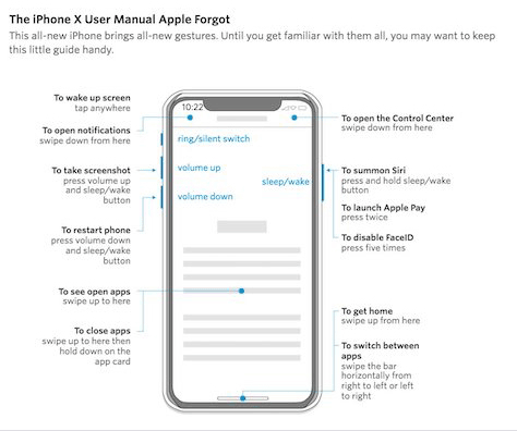
As Figure 23 demonstrates, its invisible affordances require some documentation.
Figure 23—Joanna Stern’s “iPhone User Manual Apple Forgot”
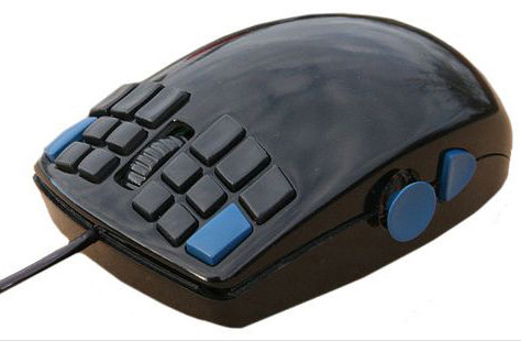
The dream of magical user interfaces is to be more like movies—complexity that’s easy to navigate and effortless. Design is all about tradeoffs. Steve Jobs was famously against adding a second mouse button because he wanted to keep the device simple. Clearly, the mouse shown in Figure 24 is too complex for novice users. Nevertheless, the scroll wheel has been a useful addition to computing.
Figure 24—A multi-button mouse
Microsoft has a long history of teaching people how to use computers. They offer the useful concept of keyboard accelerators, which are shortcuts that they present alongside the most discoverable way of performing an action—for example, Control-S tips and context menus.
Gestures can also be accelerators. But for the average user, there should be an obvious affordance for every action. For example, iOS Mail’s swipe to delete a message from an email list is a great example of an accelerator. But if users don’t know it’s there, they can just as easily tap each email message, then tap its Delete icon. iOS mail also hides its search bar under a swipe-down gesture. The only design compromise necessary to give search a visible affordance would be the addition of an icon—and let’s be honest, there is space for one, as you can see in Figure 25. Such small affordances do not block users and could help them become more proficient with their applications.
Figure 25—iOS Mail
However, an example of the wrong way to educate users was the camera icon on iOS 6’s lock screen. There used to be a Camera button on the lock screen. The designers then changed the action to a swipe up. They could simply have made tapping the icon work, but they instead chose to display a passive-aggressive animation that communicated: “I know what you want to do, but I’m going to forcibly teach you how I want you to do it.”
Figure 26—Camera icon on the iOS 6 lock screen
Conclusion
For voice user interfaces to become truly powerful, we need to understand their limitations and evolve past the ideological demand that we do everything verbally. Imagine a restaurant-booking experience that showed the user’s request on the screen and allowed the user to edit it using both touch interactions and verbal commands.
While “like magic” might be the highest compliment a UX designer can get, fooling with magic can have dire consequences. If we don’t acknowledge the powers of the technologies that we summon, UX designers risk sending users back in time by recreating the same problems that users encountered in the old, impenetrable command-line user interfaces. But by incorporating the new gestural, voice, and chat user interfaces as accelerators rather than over-relying on them and, thus, creating unintended barriers, we can create advanced user experiences that are indistinguishable from magic!


