In Part 5.1 of this two-parter within my larger series on applied UX strategy, I covered the benefits of using a shared language between business and design, then began my discussion of a three-stage model for solving business problems through design that progresses through the following three stages:
Stage 1: Helping product teams identify and solve user problems—which I covered in Part 5.1
Stage 2: Evaluating maximal outcomes for problem solutions
Stage 3: Moving from problem solving to innovation
When product designers keep in mind why a company chooses to solve particular user problems and how their solutions will impact the business—at every stage in this model—the focus of their work shifts from creating design deliverables to defining product strategy. Design becomes a strategic role whose goals are to increase key business metrics and drive innovation.
Now, in Part 5.2, I’ll delve further into this transformation of the product designer’s role, covering Stages 2 and 3 in depth.
Champion Advertisement
Continue Reading…
Stage 2: Evaluating Maximal Outcomes for Problem Solutions
Whenever a Design team helps a product manager identify unsolved user problems and product solutions to address them, they should track whether their product enhancements find their way onto a product roadmap. If they do, Design should also determine whether they’ve actually solved the problems.
However, a product team can’t remedy all of a product’s problems, bugs, and imperfections. Bug fixing is an endless process that diverts resources from new feature development, so there are always tradeoffs. Together, Design and Product Management should assess what changes would offer maximal benefit to both the business and users.
Looking at a company as a business, the big picture that emerges shows where it’s heading and what problems it’s likely to encounter. Beyond understanding the key ideas that guide business leadership and Product Management, a Design team can propose new product directions and contribute to the evolution of existing products. In Part 1 of this series on applied UX strategy, I described a company’s priorities at each stage of maturity in the company’s lifecycle, when the company confronts different problems, tasks, and needs, as follows:
seeking an appropriate market, a product for that market, or a business model to monetize it—A product ought to change and pivot often—maybe even dramatically—to enable the company to survive.
growing the customer base and/or profits—The product gets new features or distribution models.
customer retention—It’s important to differentiate your product from those of competitors by becoming more customer oriented, expanding its feature list, optimizing your product for key usage scenarios, and strengthening your brand.
efficiency of product-portfolio management—Once a company has multiple products, it becomes more important to launch and improve products faster and make design activities easier.
getting your product out of a crisis when its customer base, profits, or market share is shrinking—There are two possible scenarios: making gradual improvements or making radical changes.
In Part 1, I also outlined the different ways in which product designers can contribute in addressing each of these priorities, by taking on different roles or using different toolkits and methods.
Each of these contexts has its own health indicators for a company and its products. If product designers can improve them, they’ll increase the perceived value of Design. When product designers can help identify opportunities for a company to grow—in addition to solving current business problems—they’ll garner even greater trust and respect.
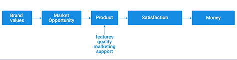
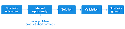
When product managers and designers have a shared language, they’ll better understand how to tie design changes to business value. Problem → solution → validation becomes:
target business metrics → market opportunities—based on user problems or product shortcomings → solution → validation → business growth
In addition to considering a company’s stage in its lifecycle, it is important to understand the product strategy, including the following:
business model—for example, direct sales, subscription, freemium, open source, ads, partner club, brokerage, franchise, crowdsourcing, auction or reverse auction, or leasing
level of competition
market type—Business to Consumer (B2C), Business to Business (B2B), business to government or nonprofit
market condition—existing, new, local clone
market segmentation—by price or by segment
All of these factors greatly affect a product’s distribution and marketing and require the appropriate set of key metrics. Considering all of these factors helps a product team to focus on specific user and business problems and determines the value a company expects from a design team.
Key Product and Business Metrics
There are many metrics for assessing the health of products and businesses. Product metrics indicate whether a product has problems a product team needs to solve. Business metrics show the current state and help a business to assess its growth outlook. A metric is any quantifiable measure that enables a business to track the performance of a product or business over time. The right metrics indicate what is happening, while analysis tells you why it is happening.
Metrics can relate to either an entire user base or named market segments. A key element of a shared language between designers and product managers is understanding the percentage and absolute number of users whose problem a new feature or an enhancement to an existing feature will solve. Vague improvements for abstract people are hard to sell.
I’ll discuss five general types of product and business metrics:
money metrics
user-sentiment metrics
product work-quality metrics
market-opportunity metrics
brand-value metrics
1. Money Metrics
Metrics relating to money provide the best barometer of a for-profit product’s success. Depending on the company’s lifecycle stage, a product’s business model, and the overall product strategy, you can measure money earned, spent, and saved—for example:
Lifetime Value (LTV), or Customer Lifetime Value (CLV or CLTV)—The total net profit a company makes from any given customer, throughout the company’s entire future relationship with that customer.
conversion—The percentage of purchases, subscriptions, or other key actions that the customer has completed successfully.
advertising revenue—The performance of display, contextual, and native ads.
user-acquisition costs—The cost of distributing a product to each acquired user.
saved costs—These include savings on user support or shortening of key task times.
The calculation of these metrics is a topic for another article. However, I touched on some of them in my UXmatters article “How to Calculate the ROI of UX Using Metrics.” Although design solutions often influence money metrics only indirectly, you should always keep them in mind.
2. User-Sentiment Metrics
User sentiment is often an implicit measure, but it reflects user’s attitudes toward a company and its products. If you track changes in user sentiment, you can forecast money metrics, too.
retention rate—The number of users who continue using a product during a given time period—usually 7 or 30 days.
churn rate—The number of users who stop using a product during a given time period.
active users—Monthly Active Users (MAU) and Daily Active Users (DAU)—The number of registered users who use a product in a day or a month.
user satisfaction—The degree to which users are satisfied with a product.
Net Promoter Score (NPS)—Users’ willingness to recommend a product.
user loyalty—A combined measurement of users’ attitudes toward a brand. This can consider user retention, repurchase rate, increases in the Average Revenue Per User (ARPU), and users’ willingness to recommend a product. Plus, there is a survey named the Customer Loyalty Index (CLI).
engagement—Users’ level of interaction with a product or a feature—for example, the amount of user-generated content; numbers of social interactions, page-scrolling funnels, and pageviews per user; and virality—that is, how much and how quickly users share content.
brand awareness—The ability of customers to recall or recognize a brand when making a purchase decision. There are two types of brand awareness: brand recall and brand recognition, which includes a sub-metric called top-of-mind awareness.
Because user satisfaction is tracked with a delay, it is a stronger indicator of long-term product health, while engagement and retention are more dynamic, so they’re well suited for analyzing users’ reaction to product enhancements:
Engagement is more of an umbrella term for a broad group of metrics that are unique to a given product. For many famous products, their activity indicators led to long-term use. Oleg Yakubenkov describes several good examples:
“A Facebook user will be an active user with a higher probability if they add 10 friends in first 7 days. For a Twitter user, a similar behavior pattern is 30 followers. For a Dropbox user—at least one file uploaded. If you'll finish registration at one of those services, you'll see that they intentionally guide you through the steps of adding friends or followers during onboarding. These are small investments that motivate you to go back; they let a developer to create triggers to return you back.
“Yammer product managers did an interesting experiment. Seemingly, we should maximize number of users who get through the end of a goal if we simplify the process. Yes, it is, but the maximum number of registered users doesn't guarantee that they'll keep using product. Experimenting with a registration process, they discovered that deleting unnecessary steps where users made their first small investments increases onboarding conversion, but worsens product usage metrics in mid- and long-term.”
Invesp states that 44% of companies have a greater focus on customer acquisition versus 18% that focus on retention. It costs five times as much to attract a new customer as to keep an existing customer, so this is a good reminder to designers to focus on the right things. Samuel Hulick has described how to onboard users effectively for better retention. Growth-hacking experts’ advice is to focus on the analysis of users who continued using a product rather than on those who left. This provides a hint about which values and usage scenarios you should evolve and make more visible.
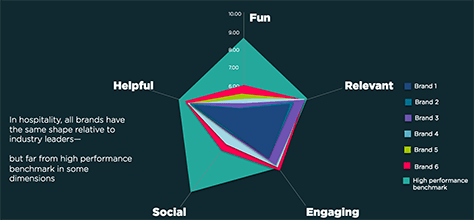
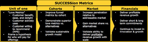
Among other interesting examples is Fjord’s Love index, shown in Figure 1, which lets you measure five dimensions of FRESH brand attitudes: Fun, Relevant, Engaging, Social, and Helpful. Using ethnographic studies and user surveys, Fjord assesses how users perceive a product’s key usage scenarios.
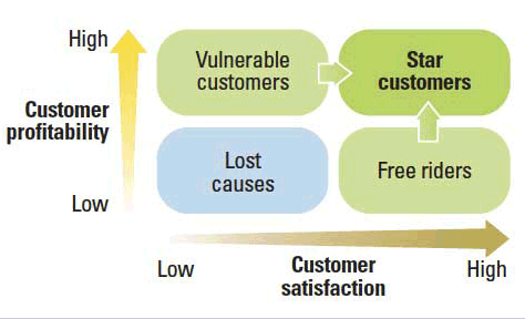
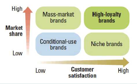
However, product designers should understand that seeking user satisfaction does not always lead to increased revenue and market share. You can see this in Bloomberg’s comparison of the Design Value Index and the American Customer Satisfaction Index, in Part 5.1. Surprisingly, it’s often the other way around. Not only can’t investments in increasing user loyalty and customer satisfaction give a predictable return, they can negatively affect a company’s market position, as shown in Figures 2 and 3. In a competitive struggle, a product can win with lower prices, a range of products, and other factors aside from product itself. Product designers must understand their company’s specific business rather than applying one-size-fits-all solutions.
Figure 2—Customer satisfaction versus customer profitability
There is a similar issue with the user delight that designers often rave about. Research by Matthew Dixon, Karen Freeman, and Nicholas Toman shows distressing results: Exceeding user expectations during service interactions—for example, by offering a refund, a free product, or a free service such as expedited shipping—makes customers only marginally more loyal than simply meeting their needs. Imagine two pies—one containing things that drive loyalty; the other containing things that drive disloyalty. The loyalty pie consists of large slices for product quality and brand, while the slice for service is quite small. However, service accounts for most of the disloyalty pie. I’ll discuss this topic further in relation to the next group of metrics.
3. Product Work-Quality Metrics
Internal measurements of the stability and quality of product work, including the implementation of features, marketing, and user support. All aspects of this work indirectly influence user attitudes toward a product and, eventually, impact money metrics.
technical stability—How often does a product fail and how many users are affected?
efficiency—How much time and effort does a user spend completing a specific task?
support quality and Customer Effort Score (CES)—How quickly does the Support solve user problems? Do users need to call Support more than once to resolve an issue?
number of bugs—How many bugs do users encounter while using a product?
standards accordance—Do design solutions deviate from best practices and/or usability or accessibility checklists?
System Usability Scale (SUS) and Standardized User Experience Percentile Rank Questionnaire (SUPR-Q)—These are standard methods of measuring usability by administering a 10-question survey on a product usage experience.
Single Usability Measure (SUM)—This measure combines the results of all the test sessions from a usability study to derive a usability rating.
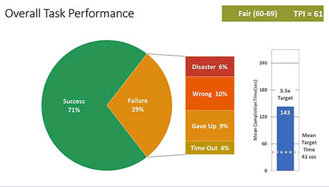
Integrated usability metrics based on several of these measurements are effective, whether standard metrics such as SUS, SUPR-Q, and SUM; or company-specific metrics such as Integral Criteria of Usability (ICU) from UIDG and Task Performance Indicator (TPI) from Cisco, shown in Figure 4. Gerry McGovern describes the TPI in his article “Task-Performance Indicator Management Metric for Customer Experience.” You can track these metrics dynamically to measure a product’s appeal to users or compare them with those of competitors to assess a product’s competitive edge. Designers can use the classic integral quality metric, RATER—Reliability, Assurance, Tangibles, Empathy, and Responsiveness—which was initially called SERVQUAL.
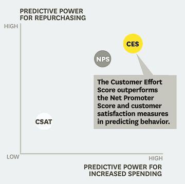
This group of metrics demonstrates that low quality of service can negatively impact user loyalty. Harvard Business Review published an article about Customer Effort Score (CES), a metric that predicts repurchases better than Customer Satisfaction (CSAT) and Net Promoter Score (NPS), as depicted in Figure 5. It indicates how easily users can solve their problems using a product. Designers should remember that there are other aspects of a product experience beyond its user interface, including user support and distribution, that influence business outcomes.
Figure 5—Customer Effort Score versus NPS and CSAT
The following metrics show a company’s long-term market outlook:
market capacity—This is an estimation of an audience’s willingness to pay.
competition—This includes competitors’ market shares, as well as their growth outlook.
market saturation—Whether the potential audience is using either a company’s or its competitors’ products.
If there is no room for growth in a market, a company must change its strategy. Otherwise, any product enhancements will fail to deliver value.
Startups often talk about product/market fit. Marc Andreesen believes that a great market—with lots of real, potential customers—pulls a product out of a startup. He divides the life of any startup into two phases:
before product/market fit—During this phase, a company pivots quickly and often, changing its product concept, people, and even the target market
after product/market fit—During this phase, a startup experiences growth more like a mature company.
According to Andy Rachleff, the biggest company killer is the lack of a market. When a great team meets a lousy market, the market wins. When a lousy team meets a great market, the market wins. When a great team meets a great market, something special happens.
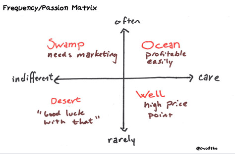
Market opportunity is important for mature companies, too. A market can collapse or become too competitive. Christina Wodtke’s Frequency/Passion Matrix, shown in Figure 6, categorizes product markets as follows:
Ocean—A product can easily become profitable, but must find its niche.
Swamp—There are lots of customers without strong preferences, so marketing is necessary.
Well—This market tolerates a high price point, but is small.
Designers should understand where their company fits and what problems they can solve to benefit the business.
5. Brand-Value Metrics
In addition to metrics, brand values—such as a company’s principles and mission—describe why a company exists. This is a high-level filter that a company can use to choose initiatives that match its values and expertise, then choose specific solutions from the available alternatives. Sometimes it’s too expensive and risky to enter a particular market.
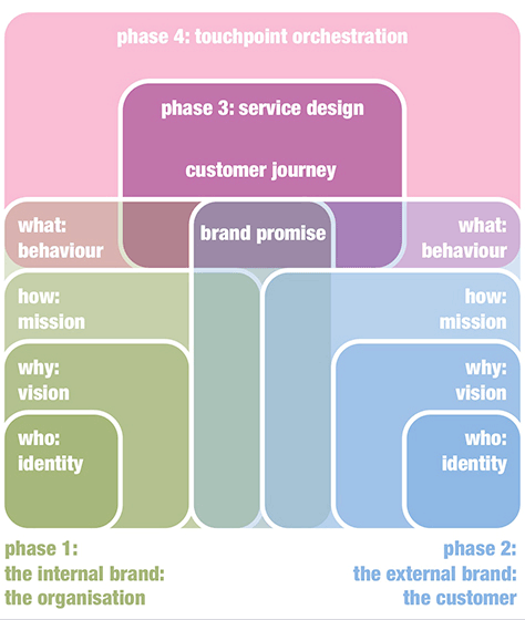
Erik Roscam Abbing and his company Zilver Innovation consider all initiatives and solutions from the brand point of view. Figure 7 shows his brand model. Figure 7—Erik Roscam Abbing’s brand model
For example, look at Google and Facebook. Which company is more successful at building devices; which in creating social networks?
How Metrics Interconnect
Figure 8 shows how these five groups of metrics interconnect.
Figure 8—How metrics interconnect
Designers can track changes in this sequence using the following:
health and growth indicators—How much do key metrics change during a particular time period? Set a period over which to monitor changes in a metric, then look at the effects of design changes. For example, has retention grown during the last month or have registrations increased in the last week? A decrease indicates problems, while an increase indicates that a company has successfully made changes to a product. These indicators are key tools in assessing a company’s competitive position in the market.
competitive benchmarks—Comparing indicators and absolute values can help a company to understand its competitive situation, assess the risk inherent in its current market position, and determine whether a product team should invest more effort in a product.
milestones—These are the desired absolute values of key metrics such as Monthly Active Users (MAU). Meeting or exceeding them shows that a business is scaling.
When you’re conducting experiments, products with a small audience need more time to reach statistical significance, while monsters like Whatsapp get about 700 new registrations per minute, so they can run experiments almost in real time. By the way, statistical significance is important for all measurements. You should be conservative in your estimation of metric-growth opportunities. Sometimes, even a 20% increase delivers no significant value, while in other cases, just a 2% increase will have a big effect on key product metrics.
It’s important to have counter-metrics for all measurements to ensure that you don’t harm your product. For example, the number of registrations might increase because of a new distribution channel. However, user engagement for these new users might be too low.
You should distinguish metrics from simple signals such as daily pageviews that you need to run experiments and solve specific problems. For example, have users started visiting a movie page more frequently since you added a link to that page in all news articles about the movie. A company can build a critical metric around such a signal. For example, earlier in this series, I mentioned an active user’s potentially adding ten friends in their first seven days on Facebook. But the main goal should be to increase a key metric, so a company may use different signals in various experiments. Therefore, avoid putting too much attention on signals. Otherwise, you may get buried in an endless flow of useless information or panic and start solving problems such as a high bounce rate instead of optimizing for long-term engagement.
Getting Design Ideas onto a Product Roadmap
At the end of the day, product designers want to get their design ideas onto a product roadmap. However, many of these product ideas will get one of the following reactions from a product manager:
This idea doesn’t address any of the problems I think are critical.
This idea isn’t among the possibilities I would have considered.
This isn’t one of the things I would have studied.
This isn’t an answer that’s compelling to me.
Having a shared language and visualizing problems are key ways of forestalling such objections, as is ensuring your ideas address product-development priorities on the product roadmap. Ideally, all members of a product team should understand the criteria for features to get on the roadmap. Then, designers have a way to determine whether their ideas have a chance of being implemented.
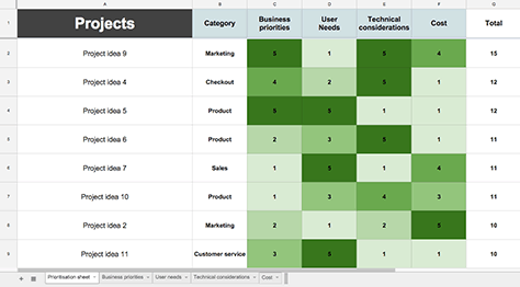
There is no single standard for product plans, but they often consist of two documents:
opportunity-assessment matrix—Use this matrix to valuate several criteria, including how to improve key metrics, technical complexity, time and money to implement, user appeal, number of potential users, and the competition. Each criterion has its own weight, and every opportunity gets a score. Sort the matrix by these scores.
product roadmap—This is a prioritized feature list that you’ve derived from the opportunity matrix. Depending on a company’s product-development process, this could be either a prioritized backlog—from which the team picks features to implement—or a releases-per-quarter plan. Once you’ve elaborated on ideas, add them to the backlog. However, many ideas will remain just ideas.
A mature company includes User Experience as a criterion in some form. There are several ways to consider the user’s point of view in a product plan.
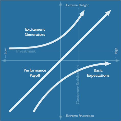
Kano Model
The Kano model, shown in Figure 9, helps you to divide product ideas into five categories: delightful, or exceeds expectations; performance payoff, or key features that you can compare across competitors; basic expectations, or things without which you cannot sell a product; indifferent, or features that don’t affect users’ preference for a product; and detractors, or things in the minus column. The most valuable ideas go into the upper-right corner. This model lets you assess ideas and put them into diagram. A team can also use this model in conducting a user survey.
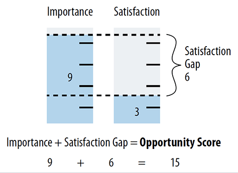
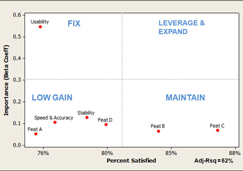
You can assess potential product ideas using Anthony Ulwick’s opportunity gap, which helps you to consider the difference between problem importance and current user satisfaction. Evaluate importance and satisfaction on a 9-point scale, then calculate the gap, using the formula: importance + (importance - satisfaction) = opportunity score. Figure 10 shows the opportunity score for unmet Jobs to Be Done.
Figure 10—Opportunity score for unmet Jobs to Be Done
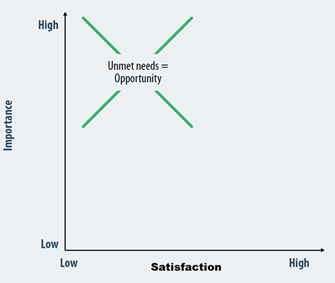
To get the necessary data for both the Kano and Opportunity Score models, you need to conduct a user survey, then visualize the results. It’s essential to consider the value of product ideas from the viewpoint of user value. In Figure 11, the most valuable solutions for users’ problems, according to their Opportunity Score, appear in the upper-left corner.
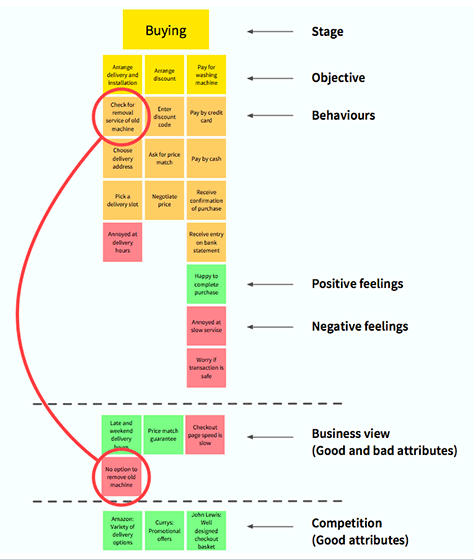
Niall O’Connor has provided a great visualization example, which progresses from finding problems to setting priorities. Figure 13 shows his business map of problems and opportunities; Figure 14, his experience map of problems and opportunities; and Figure 15, his opportunity-assessment matrix, which includes UX criteria.
Figure 13—Business map of problems and opportunities
The right set of key metrics depends on the product type, its lifecycle stage, and its market. It is useless to track all possible indicators. When a company is searching for product/market fit, customer retention is critical and demonstrates whether users see the product’s value. When a company’s user base or revenue are in a growth period, it is critical to decrease the churn rate by optimizing the whole customer-journey map. In a nutshell, the key metrics should help a designer to answer the right questions about the business’s current state, as well as its plans. One way to look at key metrics is as Minimum Viable Metrics. As shown in Figure 16, I think of these as a solution-evaluation prism, comprising: target business metrics → market opportunities—user problems or product shortcomings → solution → validation → business growth.
Figure 16—Solution-evaluation prism
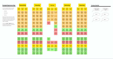
Customer-Journey Map
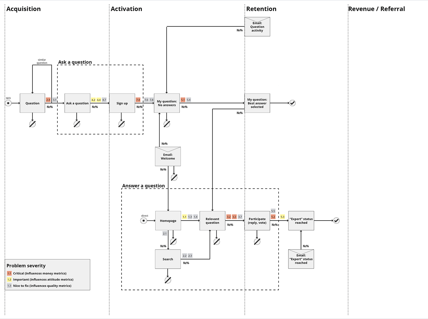
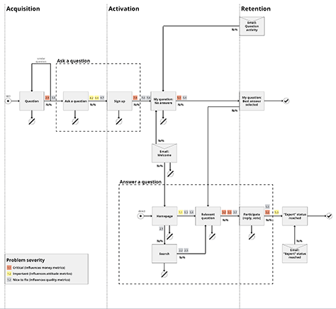
To make problem solving more systematic and visual, you can tie key metrics to a customer-journey map. The example shown in Figure 17 depicts the enhancements that result in the biggest outcomes.
Figure 17—Metrics on a customer-journey map
Jake Causby, from Westpac, describes a great example of a customer-journey map his company uses to choose the most valuable problems to solve. In the bank’s office, a wall-sized map visualizes business goals and highlights key metrics, which they can improve in different ways. Analytics data also appears on the map and helps the company to identify the best ideas to enhance the product. Plus, they show ideas and solutions from competing banks. They can also show new concepts and prototypes of problem solutions on the map. They’ve built a powerful tool that helps them to discover problems and choose where to invest their effort for maximal outcomes. The customer-journey map provides the big picture of customers’ interactions with the company.
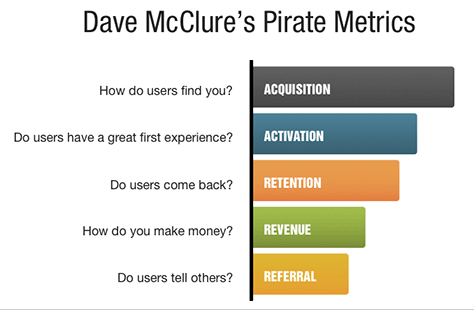
Pirate Metrics
You can use Dave McClure’s pirate metrics, AARRR, shown in Figure 18:
Acquisition—growth rate of new users and user attribution
Activation—total users, user-activation rate, and active users
Retention—churn, Net Promoter Score (NPS), and engagement
Revenue—Lifetime Value (LTV), Average Revenue Per User (ARPU), frequency of purchase per customer, and time to pay back customer-acquisition costs
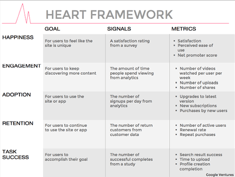
Another model for visualizing product health is Google Ventures’ HEART framework, shown in Figures 20 and 21, which considers Happiness, Engagement, Adoption, Retention, and Task Success for goals, signals, and metrics. This framework considers both revenue and users’ attitude toward a product.
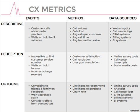
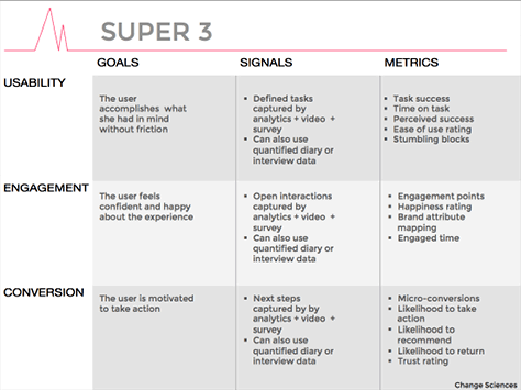
Pamela Pavliscak, in her workshop at UXSTRAT 2014, presented two additional models in a similar way: Forrester’s CX Metrics, shown in Figure 22, and Change Science’s Super 3 Metrics, shown in Figure 23. Daniel Brousseau proposed the Forrester model, which stresses the perception of a brand and the whole customer-journey map. Pamela presented this model as events, metrics, and data sources. While these metrics are more abstract, they can still be useful.
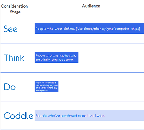
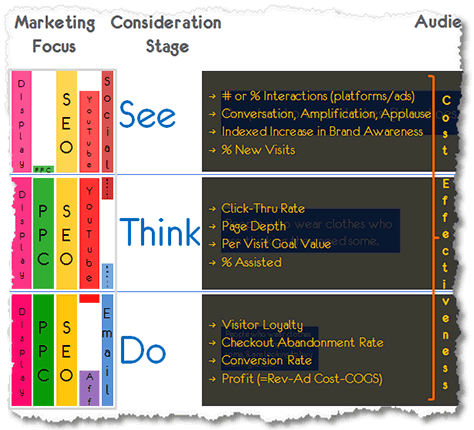
Figures 26 and 27 show Avinash Kaushik’s well-known See, Think, Do, Care framework, in which people are first potentially in your market, then considering products in the category, then either are purchasing or have just purchased the product, and finally, are loyal users. It comprises the following metrics:
See—conversation rate—that is, how much people are talking about a product—amplification rate, applause rate, and subscribers
Think—Click-Through Rate (CTR), page depth, micro-conversions, and percentage assisted
Do—visitor loyalty, checkout or abandonment rate, conversion, and profit
Care—repeat purchases, likelihood to recommend, and Lifetime Value (LTV)
Figure 26—Avinash Kaushik’s See, Think, Do, Care framework
AIDA and other models from the marketing and advertising worlds are rarely applied to user experience, but you should still be aware of these metrics:
AIDA—Attention or Awareness, Interest, Desire, and Action
CAB—Cognition, Affect, and Behavior
TIREA—Thought, Interest, Risk, Engagement, and Action
REAN—Reach, Engage, Activate, and Nurture
NAITDASE—Need, Attention, Interest, Trust, Desire, Action, Satisfaction, and Evaluation
Applying These Models
All of these various models can provide guidance to help you understand you product’s or company’s position in the marketplace. Designers need to understand the nature of their product. The product manager who is responsible for a product can choose either to use a ready-made model or create their own. But the Design team should also have a voice here. Designers should understand how metrics work and use them when working on designs. They function as product-health indicators.
However, it is important not to go overboard. Metrics can help you make decisions, but shouldn’t dictate your decisions. Data has its own limitations and can’t answer every question. Designers should always balance analytics, user research, and their own expert opinion. But creating metrics is an essential step for design to have a shared language with business.
Calculating the ROI of Design
One question many design managers think about: is there a way to show and prove the return on investment (ROI) of design? When discussing a design team’s work in general, I mentioned this problem in Part 4 of this series. ROI can be either a generic indicator of work quality and predictability—Are we staying within plans? Are there complaints about design quality?—or indicate the value Design has brought to the company—Are products getting better? Are users’ attitudes toward the brand improving? Which insights about users should we share with product managers?
Expressing the ROI of design for a specific product lets us use metrics from two groups: attitude—that is, retention and churn, satisfaction and Net Promoter Score (NPS), engagement, and brand awareness—and product quality—that is, accordance to standards, System Usability Scale (SUS), and integral metrics of usability. However, according to Mauro Porcini from PepsiCo, once you embed design across your organization and people start to experience it, they’ll stop asking you about the ROI for design because they’ll start to see its impact across all those variables.
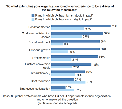
Leah Buley researched design teams, looking at the differences in their work at companies with varying levels of UX maturity. (She had previously done this at Forrester as well.) The diagram in Figure 28 shows that, initially, simple things like cost reduction and efficiency matter most to companies, but Design has the most strategic impact in companies where designers influence money and attitude metrics.
Figure 28—Data from Leah Buley’s State of UX survey
Stage 3: Moving from Problem Solving to Innovation
When you’ve already addressed all the low-hanging fruit, simple ideas can no longer help your company to differentiate itself from competitors, and standard UX patterns deliver diminishing impact, there is a need for innovation.
The mass perception is that an innovation is a huge technological breakthrough that has a big wow effect, even if it doesn’t achieve wide usage in the end. The myth of the lone-genius inventor strengthens this cliché. Designers who always seek this sort of innovation may be remiss in their critical thinking. Ironically, routine, not-so-impressive work that creates and enhances infrastructure usually provides much more benefit in people’s daily lives.
Real innovations are new solutions for complex problems that became commercially successful. They directly influence the lives of millions of people. First, look for incremental innovations. While massive leaps forward are rare, if we could create a constant flow of incremental enhancements, we could create mini-revolutions in our industry more often.
Innovations can happen in different aspects of a product: a new feature or technology, a groundbreaking user interface, unexpected distribution channels, a lower price and expenses, alternative monetization models, or new markets.
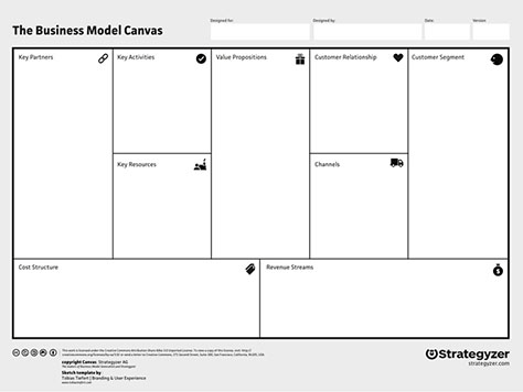
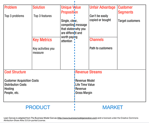
Business Model Canvas
You can spot potential breakthrough areas using Alexander Osterwalder’s Business Model Canvas, shown in Figure 29, or one its many variants such as Ash Maurya’s Lean canvas, shown in Figure 30. While Osterwalder created his Business Model Canvas for startups and new products, you can use it to analyze existing products, too.
Possible strategic opportunities for designers include the following:
technology or feature—Designers are good at humanizing new technologies, making features user friendly, and marrying users’ mental models with unconventional solutions. According to Don Norman, only after the first product implementations of new technologies that are disruptive innovations does design get involved to make the technology usable.
market—User researchers are good at figuring out how to tailor a product to users in a new market.
business model—The role of User Experience is less obvious here, but improving money metrics through user-interface optimizations is a strong point.
distribution—Designers can make marketing to a new target audience more efficient or better communicate product value to users. It’s a great challenge to work with new distribution channels and methods and connect them together.
price and expenses—User Experience has less impact here, but we can contribute better processes, design systems, and tools, saving resources and time on development, and shipping good designs faster and more cheaply.
Case Study: Analyzing the Opportunity Gap
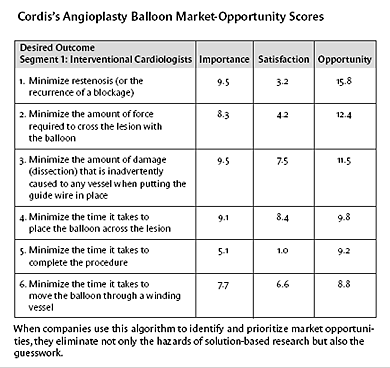
Earlier, when discussing setting priorities, I mentioned Anthony Ulwick’s opportunity gap. In his Harvard Business Review article, “Turn Customer Input into Innovation,” Ulwick shares a great case study about Cordis, a medical device manufacturer, whose innovative solutions have helped the company to significantly increase its market share. Figure 31 shows an example of an opportunity-gap analysis for Cordis.
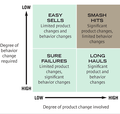
John T. Gourville proposed another interesting approach to assessing opportunities. He believes that the success of innovations often depends on the significance of the changes they require in current user behaviors. When correlating behavior changes and product changes, you can place all solutions in one of four categories, as shown in Figure 33.
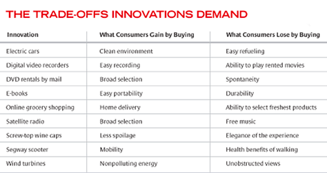
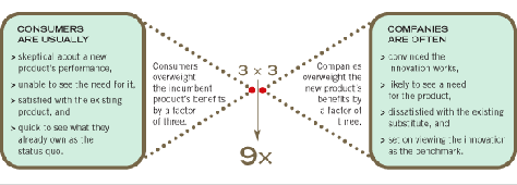
According to Gourville, users are willing to deal with a behavior change if a new solution is nine times better than their current solution, as shown in Figure 35. Consumers overvalue the existing benefits of an entrenched product by a factor of three, while developers overvalue the new benefits of their innovations—also by a factor of three.
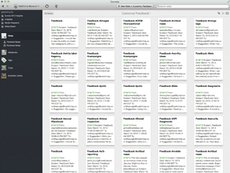
Product designers know a lot about users. By constantly providing valuable insights about users to the business people who make decisions, designers can help them to discover more opportunities and better assess their importance. MailChimp and Intuit provide great examples of how to do this. MailChimp designers built a powerful knowledge base, shown in Figure 36, that combines information about users from many sources, including user research, analytics, user feedback, and market and competitive research. This knowledge base allows all product-team members to get quick answers on many product questions. A new tool called NomNom can help teams to build such a knowledge base.
If a product team looks at these opportunities and insights not just through the frame of solving specific problems in the customer journey, but to make holistic enhancements across key usage scenarios, a company can go past just making incremental improvements. Cross-disciplinary and cross-department collaboration is critical here because potential growth areas may be tied to different parts of a product experience. In their Harvard Business Review article, “The Truth About Customer Experience,” Alex Rawson, Ewan Duncan, and Conor Jones provided great examples of such a systematic approach.
To make cross-disciplinary collaboration possible, some companies have invested in fostering a culture of innovation. Adobe, Intuit, and the CSAA Insurance Group have created innovation toolkits for their employees, which teach methods and best practices for creating incremental innovations, as well as more significant breakthroughs. Innovation is possible only in companies that have developed a suitable culture, in which people can experiment and fail without negative consequences for their career. There are lots of opportunities for designers in driving innovation—whether in applying user research and prototyping methods beyond the user interface or in helping to nurture an innovation culture.
Conclusion
User research and analytics are powerful tools for decision-making support. The more User Experience provides this support, the better a company’s products become and the more valuable product designers are. Thus, design language is getting closer to business language. When product teams have a shared language, it becomes possible to marry business and user goals. The language of product managers is key business metrics; of designers, customer-journey maps. Designers should
Be useful throughout the whole product-development lifecycle, not just during design and development.
Understand not only your users, but your business, too.
Look at design solutions through the prism of target business metrics → market opportunities—that is, user problem or product shortcomings → solution → validation → business growth.
Visualize product solutions for user problems using a customer-journey map.
Consider innovations more broadly—both disruptive and incremental innovations—so your company can innovate more often.
As product designers, you can make more users’ lives better when you choose design solutions not just by feeling empathy for users, but also by applying business-success metrics. People vote with their wallets, and a product’s commercial success is a good indicator of the value they’ve received from a business.
It’s important to stay with your roots, so don’t turn into a soulless metrics-optimization machine. If you focus too much on the numbers, the quality of your designs will eventually suffer. So maintain a healthy balance between business and user interests—commerce and aesthetics.
Yury leads a team comprising UX and visual designers at one of the largest Russian Internet companies, Mail.Ru, which is part of the Mail.Ru Group. His team works on communications, content-centric, and mobile products, as well as cross-portal user experiences. Both Yury and his team are doing a lot to grow their professional community in Russia. Read More