A common complaint about bringing UX designers onto a project team is that they waste time creating design artifacts. This is purportedly antithetical to modern development methodologies that value code over process.
However, this is not my experience at all. I’m not arguing that creating design artifacts is all that design is about. I default to fairly light documentation myself—and not one in 100 project teams or clients wants as little design documentation as I would typically provide by default.
One of my more common jobs is to improve or replace the design for an existing product for a client. All too often, these projects have no historical documentation of any value, which frequently causes projects to take months or even years longer to build.
Good documentation allows consistency in design and execution and serves as institutional knowledge for organizations. It enables us to remember what we’ve built and why, to check reported bugs and new feature requests against the documentation, and to more quickly react to necessary changes or updates.
Champion Advertisement
Continue Reading…
The Role of Prototyping in Design
While UX designers typically build prototypes, the reason we do this is much more often to demonstrate a design to clients or prospective customers or to perform a usability test than to serve as documentation for engineering teams. Again, this effort results from project-team requirements, not because of our own opinions and practices.
While I and my teams have made a fair number of prototypes for these purposes, I find that prototypes can be misleading as design documents. Often, by their very nature, they represent a single version of the final design, so do not tell engineers how to create a universal, flexible product.
Building entirely off a prototype is like reverse engineering a competitor’s product or trying to determine the functionality of a previous release just by looking at it.
What we need instead are clear UX specifications. Not just wireframes either, which like prototypes provide only one example visualization of the final product.
Designing Processes
As I discussed in my last column, “Design, Craft, and Manufacturing for Digital Products,” there are many project steps to complete before the first screen is drawn. And the results of some of these steps can find a home in the UX specifications. Especially if you don’t have a team room—or have a distributed team—the first few pages of a specification should provide the project fundamentals that remind everyone about
the product’s audience, or expected users
the users’ goals and how we expect they’ll typically use the product
organizational goals and objectives
success measures
whatever decisions the team has made—for example, likely platforms, data needs, and data sources
This information should comprise the first few pages of the specification.
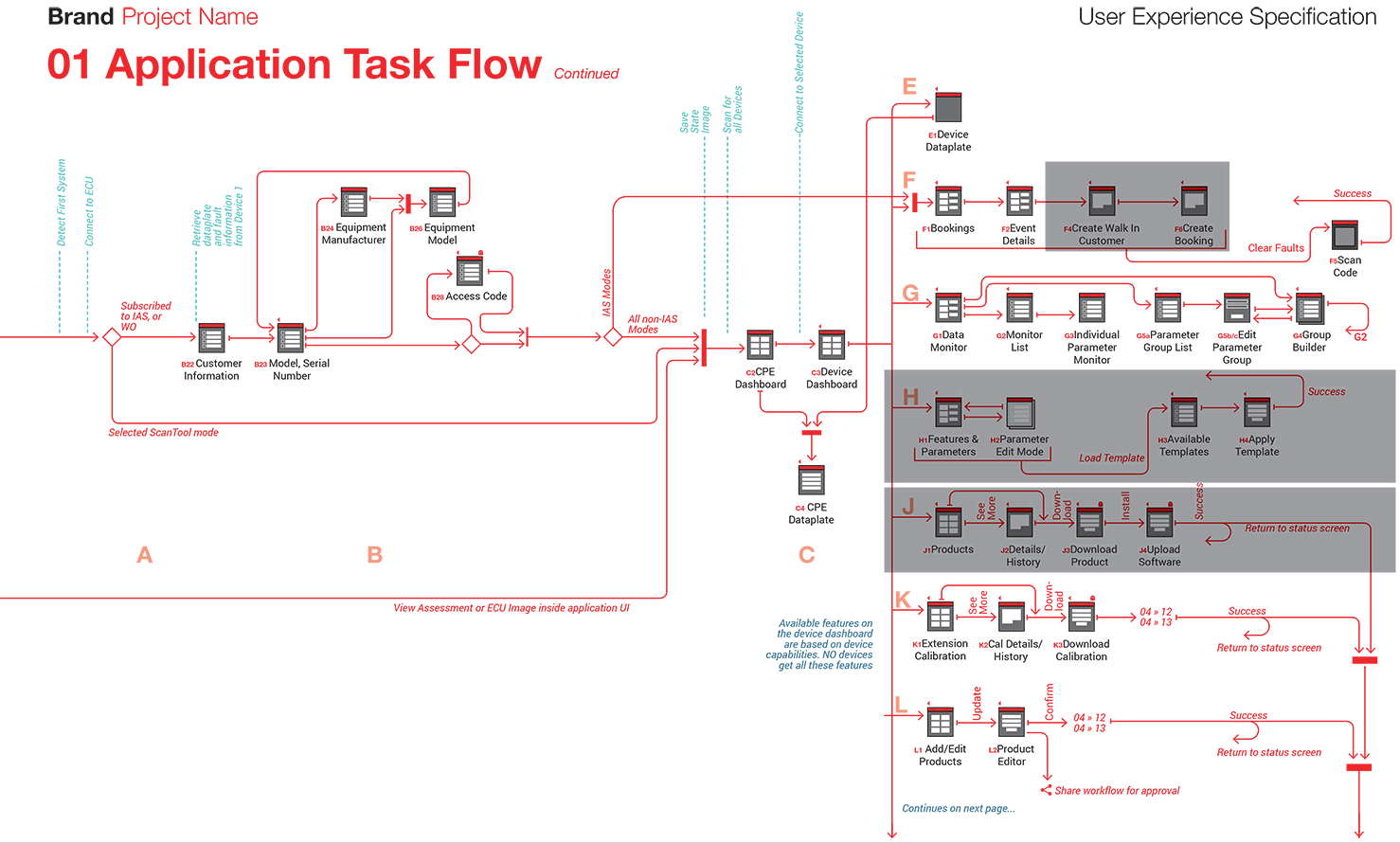
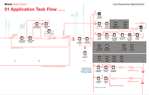
Next, the first actual drawing in the specification should not be a page design, but a representation of the information architecture for the entire product. There are any number of ways to represent this information architecture, but the final version I usually prefer is a task flow, in a style that is based largely on UML state-chart diagramming, as shown in Figure 1.
Figure 1—A page from a task flow
I use this method because it groups and labels elements, has clear start and end points, neatly organizes inputs and outputs of a state, and has clear and simple rules. However, this is just one approach—other flowcharting methods can work as well. Try to stick with one charting language, and include a guide or legend to define anything that may confuse the team consuming the diagram.
Just because you have a single, comprehensive task-flow diagram does not mean you cannot create alternative versions that show the way a process works from other points of view. For example, I often create some more tightly focused diagrams for each section of the specification as I build it out.
It is more important to ensure that the specification document meets the needs of the project team consuming it than it is to stick with any specific format, so you should always be willing to add pages, modify drawings, or change styles.
Drawing Specifications
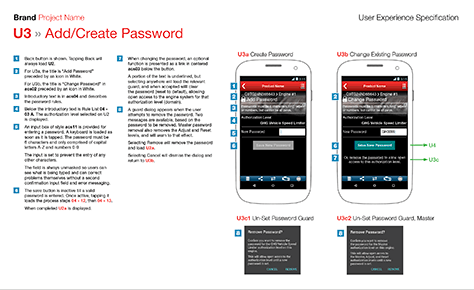
A UX specification is not just a set of wireframes. Because the part of a UX specification that is the most unambiguous and testable is its text, I often place the text on the left to lead the specification’s audience through the design. The specification’s text, or annotations, appear in numbered sections that correspond to numbers in the adjacent drawings.
The drawings of screens that illustrate the specifications are merely a guide to help the project team understand the specifications. These drawings usually appear on the right on a typical specification page. Figure 2 shows an example page of a specification for a mobile app, with images on the right, annotations on the left.
Figure 2—Page of a UX specification for a mobile app
You can create these drawings using any method and to any degree of fidelity—either drawing them directly in the application in which you’re writing your specifications or pasting them into the UX specifications. I create many of my specifications in Adobe InDesign, which provides enough text-formatting, page-control, and drawing tools to let you both write and organize your annotations and create your drawings in one document, but I have also worked in many, many other tools.
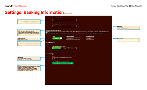
An alternative method of laying out your specifications is to surround your images with notes—doing away with the numbered references. This can sometimes work better for very large screen drawings that take much of the page, as was the case for the iPad app shown in Figure 3.
Figure 3—Tablet specification with annotations surrounding the drawing
While this style of specification is a bit quicker to create, it may be less effective in the long run because it can be hard to read the annotations. Plus, there is limited space for any other types of content.
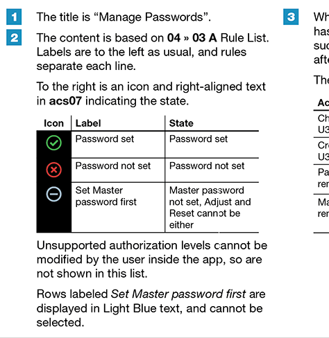
Often, there is enough variability in the display of options or conditions that it is necessary to explain them in detail, in bulleted lists or tables within your annotations. Ideally, you should simply place these inline within your annotations, as shown in Figure 4, so the team members who read your specifications won’t miss them—as they might if they appeared on some other page of the document.
Figure 4—Annotations detailing a table of conditions, display text, and display icon
Writing and Organizing Specifications
Specifications define a product so engineers can build it, then test the implementation against the specifications to ensure they have faithfully executed the design and that it works properly.
Good specification formats encourage this rigor, by assigning a unique code to each element. Your information-architecture diagram determines the count of pages or views. It also outlines the structure of the specification document by assigning uppercase letters to each section, numbers to each view, and lowercase letters for subsidiary views or variants. Thus, each page or view gets a code—for example, A1, D7, or K4b.
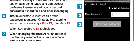
In a UX specification, you should number important elements or functions within each view, then describe them in their corresponding numbered annotations, as shown in Figure 5.
Figure 5—Numbered elements of views and their annotations
It is critical that all these letter and number codes be immutable. They must never, ever change. If you remove an element from a view, retire its code and never use it again. Add any new elements at the end of the list.
In this way, you can create a reliable schema for referring to components. B17a #6 is always B17a #6, so you can use that code to refer to a particular element in all past, current, and future documentation, stories, and bug reports, and the relationships between the information in those documents will always make sense. Of course, this is not to say that changes never occur. You’ll add, iterate, and remove elements over time. When you add new elements, just remember you’ll create new codes for them.
It’s important to maintain good change logs and handle versioning of documents carefully to support the development methodology you’re using. For example, agile stories refer not just to a specific coded section, but also to a specific dated version of the specification document. Therefore, both design and development can continue, each at their own pace.
The Cascade
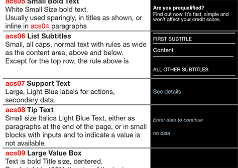
The cascade refers to a hierarchical set of guidelines, standards, and specifications that define what a product is and how to build it. This term is reminiscent of the first word in the term Cascading Style Sheet, or CSS, which uses the same principle of selective inheritance. This similarity serves teams well—from both a technical and a design perspective—allowing you to define standards and components that you can reuse. Look again at Figure 4, noting the reference to text in acs07, which appears partially in bold.
This reference is to an internal style guide for the project. Immediately following the project fundamentals and the information architecture in a specification, you should list things such as the typography styles an app uses. Figure 6 shows part of the section that defines the acs07 style.
Figure 6—Detail of the typography section of a project style guide
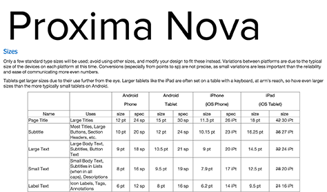
However, note that this table does not define colors in RGB codes or type sizes in pixels because a standards wiki includes the corporate style guide for the entire organization, which defines standards for typeface, type sizes, styles, colors, and more. Figure 7 shows part of a typography standards page that defines the type sizes for each platform.
Figure 7—Typography standards page defines font faces and type sizes
Define each of these things only once. Specification details should inherit standards from the corporate style guide and project-specific standards. Thus, you can keep everything in sync across the company and, because you’ve avoided any repetition of specifications, you can quickly change standards without encountering issues of conflicting standards or requirements. This will give you great flexibility in meeting project-specific needs.
Other items that I commonly include in a style guide or organization-level standards include the following:
margins
padding
spacing
alignment
responsive or adaptive behavior and orientation changes
forms and inputs
use of buttons and links
the masthead and, for the Web, the footer
menu behavior
other common elements such as drawers and chyrons
scrolling behavior and what items are in a fixed position within the viewport
terminology and writing style
icon, illustration, and photography design guidelines and styles
You may also choose to build an internal pattern library, defining in detail elements that you’ll reuse repeatedly. Most teams build apps from lists of specifications. Refer again to Figure 4, in which there is a reference to a 04 03 A Rule List. Instead of defining how lists look and behave in each and every specification that uses the list style, we refer to a standard, because all lists in the entire app work the same way.
It’s even better if you can work closely with an engineering team to ensure that cascading specifications not only reduce your design effort and increase the consistency of your specs, but also reduce implementation effort by defining variables and enabling the creation of reusable components.
For example, for one client, we added a set of short names for colors to the specifications, so developers could use these reference values for all colors in the actual application code. Now that they are part of the standards, every project team can use them, and they won’t vary from one project to another.
Distributing Documents
As I said earlier, screen drawings are guides, not the design itself. While my drawings are always very high fidelity, they are not pixel perfect. Often, they do not conform to any particular scale. I never, ever deliver my original drawings to the developers. Instead of giving developers Sketch or Photoshop image files to slice, I insist that they follow the specifications and build as many elements as possible in code.
Whenever it is necessary to insert graphics—whether raster or vector—into a page or view, the design team creates and optimizes them to ensure the smallest file size, the best quality, and their proper integration into the design. Sometimes the UX team creates these images; sometimes a dedicated Visual Design team; and sometimes graphic designers in Marketing. Whatever works for your organization should be your guide.
Other than supporting files such as individual images, you must distribute specification documents to everyone, at every stage of the project. There are many ways of doing this, but I prefer to send out a single file. While I have used systems such as corporate Wikis and tools for collaborative coding and review, and they can be very neat, they can also be impermanent, so risky. If you must use one, also distribute the document as a single file, and store it many places to ensure it never gets lost.
My favorite file format for this is PDF. While some think this format is too old school, it still has many good attributes:
It supports on-screen reading, browsing, and searching.
People can copy text from the document, then paste it into code or other systems.
PDFs print well, and many organizations and people prefer to print, then mark up specifications during design reviews.
All PDF viewers support markups and annotations on PDF documents, so reviewers can return specifications with their comments inline.
Their file sizes are relatively small, as long as you insert only vector images.
Conclusions
These days, discussions about design artifacts often revolve around how to reduce the need to create them at all. Discussions of design tools seem to focus entirely on pixel pushing, prototyping, or skipping design entirely by going straight to coding.
But a huge number of organizations create multiplatform products, require design approvals, take testing seriously, or use other processes that work best when there are well-defined design phases that result in the creation of good design documentation.
UX teams function best within such organizations when they create not just screen designs or wireframes, but UX design specifications that meet the needs of entire product teams and integrate well with their methods.
For his entire 15-year design career, Steven has been documenting design process. He started designing for mobile full time in 2007 when he joined Little Springs Design. Steven’s publications include Designing by Drawing: A Practical Guide to Creating Usable Interactive Design, the O’Reilly book Designing Mobile Interfaces, and an extensive Web site providing mobile design resources to support his book. Steven has led projects on security, account management, content distribution, and communications services for numerous products, in domains ranging from construction supplies to hospital record-keeping. His mobile work has included the design of browsers, ereaders, search, Near Field Communication (NFC), mobile banking, data communications, location services, and operating system overlays. Steven spent eight years with the US mobile operator Sprint and has also worked with AT&T, Qualcomm, Samsung, Skyfire, Bitstream, VivoTech, The Weather Channel, Bank Midwest, IGLTA, Lowe’s, and Hallmark Cards. He runs his own interactive design studio at 4ourth Mobile. Read More
