In Part 1 of this two-part series, I described the importance of prioritizing design critique. As UX designers, we often receive little support for cultivating our craft and the quality of our design deliverables, especially in enterprise environments where User Experience is often underfunded and poorly understood. If we, as UX designers, do not prioritize design critique, nobody else will.
I also explained the importance of having a shared understanding of what design critique means because people often confuse it with doing design reviews. I presented some ground rules for design-critique activities—similar to those my teammates and I at Rockwell Automation have instituted. Providing such guidance can help lower any barriers that would hinder your ability to conduct these activities. Further, I described a process you can follow when conducting design critique, because it is often best to assign tangible actions to rules and heuristics so people see how to carry out related activities. Finally, I presented some ideas for building accountability into the design-critique process, acknowledging that even the best rules and procedures won’t work unless people are committed to executing them.
Champion Advertisement
Continue Reading…
Now, in Part 2, I’ll present some design-critique methods that my teammates and I have found effective and explain how to conduct them effectively. Capturing what does and doesn’t work is part of the journey of instituting practices whose intent is to improve our craft and the quality of our deliverables. I’ll cover the following methods:
scenario
round-robin
voting gallery
review and reflect
asynchronous
Scenario
Presenting a specific scenario at the beginning of a design-critique session can help clarify the target user’s context and mindset, enabling critique participants to relate to them. Leading with a scenario also helps you tease out requirements and provides a convenient way of ensuring that participants don’t slip into focusing on feasibility concerns or solutions when assessing your in-progress designs.
The Process
Print out a concise usage scenario that is no more than a paragraph in length and supports the deliverable you’re showing. Whenever possible, send this scenario to participants in advance—or hand it out to participants at the beginning of a design-critique session. Throughout the design-critique session, you can continually refer back to the scenario as a means of refocusing participants’ feedback. Let’s look at an example of a design-critique scenario.
An Example: Energy Consumption Scenario for John the Engineer
John is an ACME Corporation engineer. ACME has just acquired ABC Solutions, in San Jose, California, so John has traveled to that site to meet his new colleagues, familiarize himself with the location, and begin onboarding the team to a new, energy-management software solution, [product name]. John’s boss, Jane, who is based in Cincinnati, Ohio, has requested that he use the software to set up a dashboard user interface. Since the facility is newer construction, she wants to see metrics that show how efficiently the building consumes power. In time, she wants to compare this building’s energy consumption to that of some of ACME’s older facilities across the continental United States. The Board of Directors is putting pressure on ACME to reduce its energy-consumption footprint, and they want to know what the company is doing to reduce its energy consumption.
As the preceding example illustrates, a scenario provides a convenient reference point for asking, “How does this help the user accomplish her goal in this scenario?” Scenarios are especially helpful in getting participants back on track if they veer off topic or the discussion gets side-tracked.
Round-Robin
If the intent of a design critique is to solicit feedback on multiple deliverables or screens, you might want to consider using the round-robin method, which is well suited to ensuring all deliverables get the appropriate level of feedback they need.
The Process
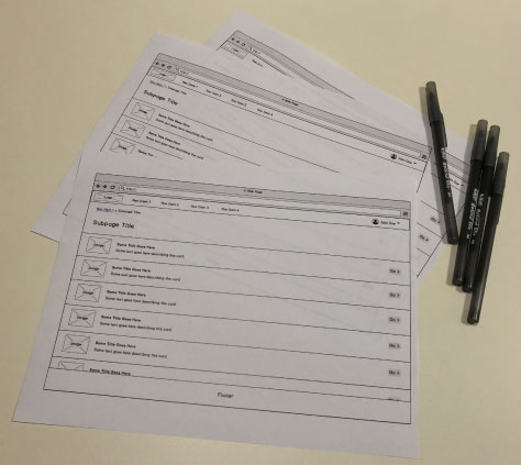
This method is highly interactive, so begin by reserving a meeting space that offers plenty of room for participants to move about. Print out multiple copies of each concept or deliverable you want participants to critique, as shown in Figure 1. Keep printouts of related screens together, placing them in different areas of the meeting space, creating stations—preferably at tables or around surfaces where participants can stand or sit. Provide plenty of pens at each station. Complete all of these preparations in advance of the meeting so participants can arrive and immediately contribute.
Figure 1—Multiple printouts of each mockup and pens at each station
The facilitator—who shouldn’t participate in the design critique—keeps track of time and informs participants when it is time to begin. Each participant begins at a different station of his or her choice. However, depending on the number of screens, multiple participants could begin at the same station. The facilitator then starts a timer, factoring in the time he is allotting for each station against the total number of screens to critique. The participants review the printouts at their station and write their feedback directly on them.
When the time runs out, the facilitator informs participants that it is time to move in either a clockwise or counterclockwise direction to provide feedback at the next station. The round-robin activity is complete when all participants have spent an equal amount of time at each station. The facilitator or the requesting designer then gathers all marked-up printouts and, later on, synthesizes the feedback.
While this method lends itself best to collocated participants, it can also work for remote participants, as long as you ensure that they have the materials they need in advance and can email their feedback to you.
Voting Gallery
If your project is at a stage when you have created multiple iterations of the same workflow design and you would like to solicit broad feedback on them, you could consider a voting gallery. While this activity might not match your vision of what a traditional design critique looks like, if you plan a voting gallery properly, it can be a highly effective way of exposing your work to many people and deriving meaningful insights in a short amount of time.
The Process
Schedule several hours in a dedicated meeting room or workspace that is large enough to give participants plenty of room to move about and compare the various design iterations side by side.
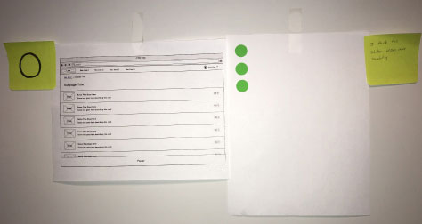
When setting up, tape printouts depicting each iteration of your mockups to the walls. Assign a color-keyed symbol to each of them—for example, a square, circle, diamond, or some other shape that participants can easily associate with design artifacts—placing it next to each printout. These symbols should be simple and memorable. Codifying each mockup with a colored symbol will be very helpful later on, when it’s time for you to synthesize the feedback. You’ll be more readily able to match specific comments to particular design iterations.
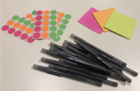
Place stacks of similarly color-keyed sticky notes and small, circle stickers on a central table, and be sure to provide plenty of pens, as shown in Figure 2.
Figure 2—Some materials for the voting-gallery method
Also, post instructions where participants can easily read them, because you might not always be present when participants arrive to inform them about the proper method of voting and providing feedback. Instruct participants to place a small circle sticker that matches the color of the sticky note containing the symbol, on a blank sheet of paper beside the design iteration they prefer and, optionally, to offer additional feedback on the supplied sticky notes, as shown in Figure 3. Participants should write only one thought or idea per sticky note, placing them next to the design iterations on which they have comments—not necessarily the iteration they voted for.
Figure 3—Participants’ votes and feedback on a single design iteration
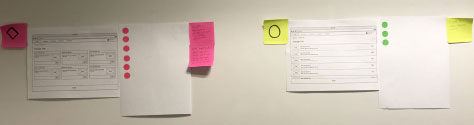
In advance of the voting-gallery activity, send an email invitation to everyone you would like to participate—which could be many people—and inform them about the design iterations you want them to vote on. Do not schedule a specific time for each participant. Instead, you should encourage participants to stop by at any time during the allotted block of time to offer their feedback. Include instructions on how to vote for the design iteration they prefer and how to provide feedback on any of the design iterations. As Figure 4 shows, it’s usually readily apparent which design iteration participants prefer.
Figure 4—Side-by-side iterations with participants’ votes and feedback
Are you concerned about bias? Perhaps you would prefer that participants not be able to see each other’s votes. If so, consider placing a private ballot box in proximity to each design iteration. Participants could then drop a vote sticker into the ballot box for the design they prefer. Alternatively, you could provide a central ballot box, and participants could write their preference or draw its associated symbol on a sticky note, then drop it into the box.
Review and Reflect
According to Robert Kreigh, Senior Lead User Experience Designer at Rockwell Automation, a tried-and-true design-critique approach is the review-and-reflect method.
The Process
“To conduct this critique,” advises Kreigh, “Write a short product description to provide participants who are unfamiliar with the application some background on the product and its intended workflow. Create a problem statement and write tasks for each scenario that you want to have critiqued. Include mockups or images of each screen with which the user would have to interact to complete the task.
“Walk the participants through the product description and the first task, then answer any preliminary questions. Provide participants with paper copies of all materials. Allow them some time—about five to ten minutes—to capture their questions and thoughts on their paper copies. Encourage participants to sketch any alternative ideas as well. Afterward, have a quick round of discussion, allowing participants to hear each other’s comments and add commentary of their own. Repeat this process for each task being critiqued, remembering to stay within your allotted time.”
Asynchronous
According to Matthew Shea, Senior User Interface Designer at Rockwell Automation, if you do not have a tight deadline and would like to include global participants, you might want to consider an asynchronous design critique. “This method does not add extra meetings to participants’ calendars and gives everyone, including remote members, an opportunity to contribute,” offers Shea. “Some additional benefits include providing extra time for participants to consider feedback and allowing new team members to review past feedback to help them when onboarding.”
The Process
“To conduct an asynchronous review, begin by creating and collecting all the materials you would like to have critiqued. Then write a short, specific description of what you want participants to critique—whether it is a section of a user interface or some intended interaction. This description should provide some context, including the requirements and the scope of the feedback you’re requesting. Also, set a deadline to let participants know how long they have to submit comments. Lastly, create a Design Critique team or channel, using a collaborative tool such as Slack or Microsoft Teams, and post all of your information, including the materials and the description. Use the appropriate handle when communicating with all members—for example, the @channel in Slack—and notify members when a review starts and when it has been completed.”
An Example of an Asynchronous Design-Critique Request
Feedback request: Diagnostic error messages for ABC application
Requirements: The ABC application needs to display diagnostic error messages for device-level conditions. This is Web-based user interface, so we cannot rely on established Windows iconography or styles. We need to create a new system that is agnostic to operating system and browser.
Scope of requested feedback: Please critique the proposed diagnostic error messages, including iconography, copy, and the delivery mechanism itself, which is an inline container. Also, am I relying too much on color?
Deadline: End of day, Monday, August 19, 2019.
Conclusion
As I described in Part 1 of this series, appropriately prioritizing design critique ensures that it becomes a more attainable team activity. However, your work is not complete once you’ve acknowledged the importance of design critique and simply created processes around it.
As you and your teammates endeavor to make design critique an integral part of your design culture, be sure to capture what has worked and what hasn’t worked. Continuous learning is a critical part of any UX professional’s career, and your learning opportunities extend to the methods and techniques you use to enhance your craft and improve your design deliverables. Over time, you’ll discover other methods of your own that work well, but you should continually tweak them to maximize their effectiveness. Eventually, having well-defined design-critique practices and activities lowers your team’s barriers to execution. Ultimately, design critique results in better design deliverables and, more importantly, better experiences for the people who use your products.
While the design-critique methods I have described in this column have been effective in my experience and that of my teammates, you may have thoughts about these methods or other methods that have worked well for you. If so, please share them in the comments.
Director of User Experience at Rockwell Automation
Cleveland, Ohio, USA
Jon has a degree in Visual Communication Design from the University of Dayton, as well as experience in Web development, interaction design, user interface design, user research, and copywriting. He spent eight years at Progressive Insurance, where his design and development skills helped shape the #1 insurance Web site in the country, progressive.com. Jon’s passion for user experience fueled his desire to make it his full-time profession. Jon joined Rockwell Automation in 2013, where he designs software products for some of the most challenging environments in the world. Jon became User Experience Team Lead at Rockwell in 2020, balancing design work with managing a cross-functional team of UX professionals, then became a full-time User Experience Manager in 2021. In 2022, Jon was promoted to Director of User Experience at Rockwell. Read More