In the last edition of Discovery, I explained how to collect data during your early-phase prototype research using tally sheets. If you missed that column, you might want to read it before reading this column to ensure you’ll get the most out of this one.
In this column, I’ll cover data analysis for a completed tally sheet, focusing on the following key areas:
findings versus insights—What’s the difference?
methods of analysis—We’ll look at grounded-theory techniques, using codes, and constant comparative analysis.
identifying themes in the data—These include the obvious, the less obvious, the not so obvious, and what didn’t happen.
Champion Advertisement
Continue Reading…
A Brief Recap of Data Collection Using Tally Sheets
Once you’ve collected all the data from your individual, annotated discussion guides and have added the data to a tally sheet, it is time to start analyzing the data for findings and insights. Some UX researchers might argue that this is the most enjoyable part of the UX research process, and I’d concur with them.
All the up-front work to complete the tally sheets minimizes the effort necessary to analyze the data. Unless you’ve left something off a tally sheet, there is little reason to go back and revisit an individual participant discussion guide for a finding. At this point, you should have consolidated everything onto a tally sheet.
To keep things consistent, I’ll continue using the same example Web site, Middlepacker.com, as for my previous column. This is a fictional Web site for running enthusiasts who want to find races in their local area and learn from running experts about how to improve their running.
Findings Versus Insights: What’s the Difference?
According to the authors of Observing the User Experience: A Practitioner’s Guide to User Research, when you’re conducting research you should “separate what you see and hear from your interpretations and analyses.” This lets you isolate your observations from your assumptions. During this stage of research, it’s important to be mindful of the difference between findings—those things you’ve observed during the research—and insights—your interpretation of what you’ve observed.
Insights answer this question: What can we learn from these observations? For example, if you observe many participants taking a long time to find the Search button on a site when performing a search task, that is a finding, not an insight. An example of an insight might be: It was not part of users’ mental models to look for the Search button in the lower-left corner of the Web site. This insight is an interpretation of the findings.
When gathering data from research sessions onto tally sheets, you might have a mixture of both findings and insights. This is completely normal. As UX researchers, we tend to want to analyze observations over the course of the research sessions. Ideally, findings will outnumber your insights. If you have more insights than findings, you’re most likely doing your analysis prematurely.
Be mindful of this distinction between findings and insights. Your stakeholders might question an insight when you present it in your final report. A skeptical stakeholder might ask: How do you know it wasn’t in their mental models to look in the lower-left corner to find the Search button? You must be able to assure that stakeholder that you’ve based your insights on findings, not pulled them out of thin air. You might say: Most participants initially looked for a Search button in the upper-right corner of the Web site.
Analysis Methods: Grounded-Theory Techniques
When you’re analyzing the data from a research study, it’s important to cast as wide a net as possible and analyze all the data you’ve collected. You don’t want to miss anything. UX researchers typically borrow research techniques from grounded theory—whether knowingly or not—when analyzing data from studies.
Glaser and Strauss originally created these grounded-theory techniques in 1967. The research methodology of grounded theory requires adhering to a set of principles that form the backbone of grounded theory. However, UX researchers use only what techniques they find helpful to their analysis.
For visual data collection (VDC), analysis techniques such as coding and comparative analysis are useful, while the principle of emergence may not play as well. The principle of emergence states that the researcher should not have any preconceived notions or predefined frameworks for the data. Instead, the theory and concepts should emerge from the data.
However, since VDC typically occurs at the design-concept phase of the product development lifecycle, teams might come to the table with lots of assumptions that researchers need to validate or refute. So researchers need to balance an emergent approach toward what they’re seeing with a more brute-force, less time-intensive approach to generating theory. Product teams have time-to-market pressures to deliver functionality. So collect your stakeholders’ hypotheses—that is, theories—up front, then use your research time to develop questions and apply research methods to refute or validate their hypotheses.
Analysis Method: Using Codes
Conducting analysis using the VDC method involves the use of grounded-theory data constructs called codes. These codes, or categories, can either be predefined—what grounded-theory researchers call selective codes, or annotations—or you can define them once the research has begun. The latter are called open codes. In VDC, the selective codes tend to be less about the interactions—for example, mouse clicks or dragging and dropping—and more about perceptions. Figure 1 shows some selective codes.
Figure 1—Common selective codes for studies using the VDC method
If you’ve read my earlier column “Sensemaking with Annotations,” you’ll recognize that annotations are essentially a set of selective codes for use in future analysis. The notetaker applies these codes during research sessions. Post-session open coding might also be warranted, especially if you’re trying to unravel a set of data that has multiple layers and derive insights from your findings.
Typically, UX researchers do post-session coding while listening to recordings. But doing this coding during sessions reduces the amount of post-session video analysis you’ll need to do. Of course, you still might need to go back and review a session—especially if something was unclear during the session and you didn’t have time to correct it.
Analysis Method: Constant Comparative Analysis
Gleaning insights from your research findings involves looking critically at all the relevant data available for a particular code or set of codes across participants. This is where using aspects of a grounded-theory technique called constant comparative analysis comes in handy.
While this technique involves multiple goals, the key goal for VDC is what researchers call generating theory. But, since we’re only using the technique—not adhering to the grounded-theory methodology—let’s call this generating relationships, which is the ultimate goal. This technique involves assessing various instances of data to identify their relationships to one another. Ultimately, the goal is to develop distinct categories, or codes, with different sets of common properties.
Let’s look at an example of generating relationships using constant comparative analysis.
Example of Constant Comparative Analysis: Factors for Adopting a Web Site
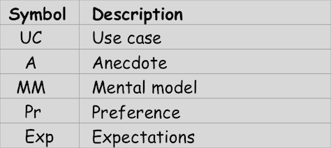
One research goal for Middlepacker.com was to identify the factors that would motivate users to adopt the Web site. When we asked participants to answer this question—which was especially difficult after their seeing the Web site for the first time and not being able to play with it over a longer period of time—they indicated an array of opinions and perspectives. See their responses in Figure 2.
Figure 2—Tally-sheet data for participant responses on site usage
Welcome to the wonderful, gray world of UX research! The first thing you may notice is that there is no clear response to the question: What are the driving factors for adopting this Web site? It would be necessary to sort out the reasons why a participant would adopt the site or would not adopt it. Within each set, look for factors that would motivate users to form an opinion about the site.
Then, compare each data point with the others and ask: Are these reasons the same or different from one another? Participants 2 and 3 indicated that they would use the site. In fact, one could interpret their response as a wholehearted Yes. Participant 2 said he’d use the site because of its unique focus on running expertise. Participant 3 emphasizes low cost: “As long as it’s free!” Are these reasons the same or different? These reasons seem quite different from one another. Therefore, you could say that cost and useful content on running are two factors that would drive people to use Middlepacker.com. You could then use these comments to generate an insight about factors for adoption, as follows:
Participant responses indicate the following potential factors for adopting Middlepacker.com: cost and the usefulness of running content.
You would perform the same recursive analysis for each set of data points to help answer the question about adoption.
Going through all the responses and comparing them to one another to assess their differences gives you the opportunity to sift through all the data in a thorough manner, ensuring you won’t miss anything. Think of this process as similar to the thoroughness with which a Zamboni machine resurfaces the ice between the periods of a hockey game. The entire rink gets resurfaced! Every iota of data must get some analysis love!
Identifying Themes in the Data
You’ll usually have a few layers of analysis to do when reviewing your tally sheets. Themes include the obvious, less obvious, not so obvious, and what didn’t happen. Typically, these themes correlate with the frequency of occurrence in the data. But don’t get bogged down trying to be precise about this. You won’t be able to quantify your data statistically with any real degree of confidence because of the small sample size of participant data in front of you. Just use frequency as a loose guide.
Identifying Themes: The Obvious
Looking at behaviors or outcomes that were fairly consistent across participants reveals the obvious themes. A classic example might be the one thing that all or mostparticipants did—or did not do.
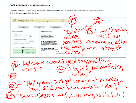
In a recent study that I conducted, most participants did not identify a particular element in the prototype. The theme was so obvious that it ended up being a key finding in my final report. See Figure 3 for an example of an obvious theme on a tally sheet. Can you guess what the theme was? (See the end of this article for the answer.)
Figure 3—Tally sheets make obvious themes more obvious
Identifying Themes: The Less Obvious
The next layer of findings includes things that seem fine on the surface, but when you re-examine them, are less obvious issues. These issues are more subtle—in part because only a small number of participants might have noticed these themes. Since your sample size is typically small when doing these kinds of studies, an issue might have been apparent in a few sessions, but not in others.
However, this doesn’t mean you can ignore the issue altogether. It’s important that you not ignore these less-obvious findings. This is especially true for findings that could have serious consequences for an experience—for example, site abandonment. You should view a feature that only a few prospective users do not understand or deem unusable as an opportunity to improve the experience for everyone—even those who didn’t encounter the issue!
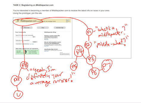
Figure 4 shows that a couple of participants, who noticed that the search box accepts only ZIP codes, indicated that they might not know the ZIP code so wouldn’t be able to find a race. One suggested searching for the name of a city instead of a ZIP code. Even though only a couple of participants mentioned this limitation of site search, that didn’t mean we could ignore this issue.
Figure 4—Do not ignore less-obvious findings
While one could argue that users could easily find the ZIP code by opening a new browser window and using Google to search for a city’s ZIP code, little inconveniences such as these can make or break a great design! A frustrated user might simply abandon your site for that of a competitor with a more effective site-search design that supports searching by city.
Do not ignore less-obvious findings that have serious consequences for your intended audience—consequences such as site abandonment. Instead, consider them key findings for your research report, especially if the opportunity cost is high.
Identifying Themes: The Not So Obvious
The not-so-obvious themes might emerge from only a small number of participants. The particular issues that arise could also vary greatly across participants, making them more challenging to analyze. A key question you should ask in these situations is: How important is this issue to the success of the product? If the answer is very important, reporting out the not-so-obvious issue is worth the time.
Let’s say the product stakeholders hypothesized that users would never want to save their credit-card information on Middlepacker.com because of the threat of hackers’ getting access to their valuable personal information. One of the tasks in our research sessions was for participants to go through the shopping-cart flow and, optionally, save their credit-card information. (You shouldn’t prompt the participants to save their credit-card information because you want to observe their behavior when they come across this option.) Some participants opted to save it, while others didn’t. So, when you’re conducting a comparative analysis, you’d be unable to find a consistent theme in the data regarding participants’ underlying motivations.
Perhaps you didn’t ask enough probing questions about why participants didn’t opt to save their credit-card information so you never got into the reasons for their decision-making. You can only guess based on your notes and what you observed. If you observed participant body language that suggested concerns about security—or the opposite, complete apathy—you could use this not-so-obvious data in your analysis—especially if an issue is important to the success of the product. Use these insights as an indicator you need to do more research to see whether the not-so-obvious issues become more obvious.
Identifying Themes: What Didn’t Happen
Can you guess what the what-didn’t-happen theme is? Your stakeholders might have had a hypothesis about something that simply never emerged during the research sessions. Do we call this a failure? Definitely not. Is something that participants didn’t even mention during your research worth mentioning in your final report? Absolutely! It is important that the stakeholders know that the issue never occurred; they can then try to figure out why. You could recommend a course correction based on the research findings. There might be some hidden gold in the dataset that suggests a next step.
Conclusion
Data analysis can be intensive and, at times, tedious work. Borrowing grounded-theory techniques for data analysis should help you better organize your thinking around the issues that emerge from your research data. Recognizing the different levels of themes can help you frame your approach to analysis. Always dig a little deeper until you get down to the essence of the experience.
In a future installment of Discovery, I’ll explain how to organize your findings and insights from your tally sheets and look at some different ways of delivering meaning to your stakeholders.
Answer to the question about Figure 3: Most participants were not sure what we meant by a middle-packer.
Matavire, Rangarirai, and Irwin Brown. “Investigating the Use of Grounded Theory in Information Systems Research.” Proceedings of the 2008 Annual Research Conference of the South African Institute of Computer Scientists and Information Technologists (SAICSIT), October 6–8, 2008.
Michael has worked in the field of IT (Information Technology) for more than 20 years—as an engineer, business analyst, and, for the last ten years, as a UX researcher. He has written on UX topics such as research methodology, UX strategy, and innovation for industry publications that include UXmatters, UX Mastery, Boxes and Arrows, UX Planet, and UX Collective. In Discovery, his quarterly column on UXmatters, Michael writes about the insights that derive from formative UX-research studies. He has a B.A. in Creative Writing from Binghamton University, an M.B.A. in Finance and Strategy from NYU Stern, and an M.S. in Human-Computer Interaction from Iowa State University. Read More