You’ve spent many hours conducting up-front research with your target users to understand their goals. You’ve solicited feedback from internal, subject-matter experts who are familiar with the business problem you’re collectively trying to solve. Finally, you’ve created design deliverables that represent what you believe are the most effective, efficient workflows for solving users’ problems. Now, you just have to get the product team and business stakeholders to buy into your solution.
Maybe you’re new to your product team and don’t feel that you have much influence capital. Perhaps you’re dealing with a product team that has never engaged the efforts of a UX designer in any official capacity—until now.
As someone who has often collaborated with multiple product teams at the same time—each of which might be in a different location, in a different phase of their product-delivery lifecycle, and using a different software-development methodology—I’ve concluded that there is no one method of delivering design work that guarantees its unquestioned adoption.
Champion Advertisement
Continue Reading…
However, over the years, I have identified a few effective tactics for winning the confidence of developers and stakeholders through the design deliverables that I produce, as follows:
knowing your audience
giving proper context and lead time
lowering barriers to comprehension
avoiding filler design options
Knowing Your Audience
A true story: I once designed a wireframe for a backup-and-restore experience, then handed it over to the development resources in Asia who had asked for design direction. A week after receiving my deliverable, the team had created a running build of the Backup and Restore utility. But guess what that experience looked like? Like a functional wireframe. I had to spend several days convincing the development team and the product owner that we could not ship a product looking like that, despite the project’s aggressive timeline. The result? I had to spend more than one late night creating high-fidelity designs, which, of course, ended up being flawed. It certainly didn’t help that the product was new and required its own branding and look and feel or that there was no established user-interface (UI) library—providing predefined styles, sizes, and states—from which developers could derive additional design direction.
What was my mistake? I had not clearly conveyed to the remote development team that the series of wireframes I had delivered was intended simply to give them a sense of users’ workflows and provide some hints about the layout and recommended components so they could begin scoping the UI design work and perhaps even rough in some basic elements of the design. I made the false assumption that developers are developers—regardless of their cultural, regional, or linguistic backgrounds. I assumed that the remote engineering team would simply get that a wireframe was an artifact for consensus-building and general direction that should be followed up by a high-fidelity design specification. This process had been my experience with dozens of other product teams. The remote engineering team assumed that my wireframe was the only—and final—directive for the product’s design.
I learned the hard way that any future engagements with teams—whether they are foreign or domestic—would require more earnest up-front communication, taking into account each product team’s unique culture and preferred methods of doing their work. These could vary even among colocated teams on a single campus. My false assumptions had resulted in unnecessary churn that we could have avoided.
Sometimes you’re not in a position to deliver your work in ideal ways—especially when you’re engaged on a project too late. But by endeavoring to understand the teams building your designs and ardently setting expectations for what you’ll deliver and when—even if doing so feels pedantic—you’ll use one another’s time, efforts, and talents more effectively.
Communicating the Proper Context and Giving Sufficient Lead Time
While we’re speaking of other people’s expectations: waiting too long to share your design deliverables—or doing so without sufficient preamble—seldom works for developers who routinely rely on having adequate planning and documentation for scoping their work. The solution? Share your work as soon as you feel confident that it supports the core user goals and tasks you’re trying to address—ideally after conducting critique sessions with peers and fully acknowledging that there might be minor changes and course corrections along the way.
As I mentioned earlier, you must clearly communicate the intention behind your work, whether you’re delivering a final specification for implementation or just a consensus-building artifact. Once a design has been implemented and the code has been committed, it is very difficult to convince teams to pivot or change a design. Regardless of your deliverable’s intent, I recommend taking the following communication approaches:
Use a familiar ecosystem. If your team uses a communication tool such as Slack for Teams or Microsoft Teams, share your work in the appropriate channel—where the team already communicates about UI-related topics—and follow it closely with a concisely written bulleted list that describes what your deliverable addresses and how it supports a product requirement. You can use the same tactic for email if that is the team’s communication channel of choice. Give people time to formulate their thoughts before an official review—using a channel that is comfortable and familiar for them and allowing them to give you better, more measured feedback. Nobody wants to fight with an unfamiliar tool or application. You should avoid making people open strange attachments or go to obscure, password-protected Web sites to view your deliverables. Resist raising another barrier to comprehension, which I’ll touch on further later.
Play the product-owner card. As I mentioned in my column, Educating Others on the Differences Between UX and UI, you can lend additional weight and credibility to your deliverables by pasting in the corresponding Kanban card or a snippet from the product owner’s written requirements that supports the user story behind your deliverable. Doing this further validates the why behind your design solution. Plus, when you invoke the product owner or a key stakeholder’s exact words, developers must acknowledge the perspective of that common authority, which helps negate false perceptions that your deliverable is subjective or ignores practical business realities.
Be precise. Not all product team members want to give feedback on your design deliverables. But some will and, in my experience, that feedback is often valuable. If you’re looking for specific feedback from particular product-team members before an official review is to occur, say so, informing those team membersabout the specificaspects of the deliverable on which you want their input. One thing most developers and engineers do have in common: they value precision and tend to be analytical. They will appreciate your specificity because it helps them to manage their time and attention, which are usually limited resources. Moreover, I’ve found that making vague requests often results in your receiving feedback that is just as vague.
Lowering Barriers to Comprehension
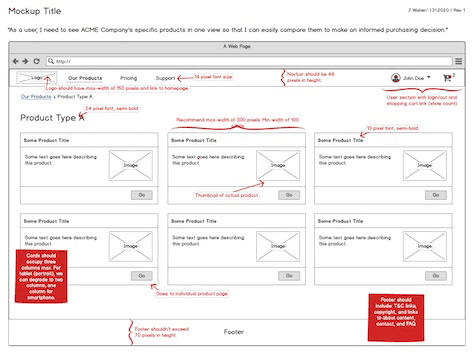
It can be tempting to redline every last pixel in your design deliverables to ensure that the developers do not experience any uncertainty—whether you’re delivering a high-fidelity mockup for implementation as functioning code or a wireframe that provides only a general sense of direction. However, being too verbose—whether visually or editorially—often results in uncertainty anyway. As Figure 1 shows, covering an entire wireframe or mockup with words, redlines, callouts, and measurements distracts reviewers and impairs their comprehension of the experience itself.
Figure 1—Example wireframe with distracting instructions and callouts
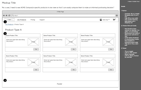
Despite their role in implementing designs, developers can still benefit from seeing an experience from its main actor’s point of view: that of the user. Help developers slip into the user’s skin by limiting the number of instructional overlays. As shown in Figure 2, using small, numbered circles to indicate which components or elements on a wireframe or mockup have additional commentary—in this case, in the sidebar at the right—sets that commentary apart from the work itself and makes the deliverable as clean and focused as possible. Therefore, reviewers won’t have as many visual hurdles to overcome in trying to understand the intention behind your design and its implied user interactions.
Figure 2—Example wireframe with less intrusive instructions
Also, the color red draws reviewers’ attention, so using a neutral color such as black or dark gray for the callout circles can further reduce the number of distracting elements that are not part of the design itself. Ensure that the callout circles clearly overlay the elements of the design, so reviewers can more readily discern that they are instructional elements and not actually part of the design.
Note—If I’m designing an interior page or workflow, I call out only those elements that are unique to that page. I’ve already addressed global elements such as the navigation bar or footer on preceding, general screens. There is usually no need to repeat such instructions.
Do you need to provide additional specifications, sizes, and desired states—perhaps some that apply to the application or Web site globally? If so, create an appendix at the end of your mockup deck. Giving detailed specifications their own real estate lets reviewers focus on that information later on rather than distracting them when they’re viewing the mockup in a purer form. Plus, if you use a UI library—either custom designed or derived from a popular specification such as Google Material—you can simply copy any applicable specifications and paste them into a final screen of your mockup deck to give reviewers a visual frame of reference.
I hesitate to rely solely on links. In my experience, a single additional abstraction layer is all someone needs to ignore such instructions. As the saying goes, “Out of sight, out of mind.” It’s better to give developers something visual up front, whenever possible, then disclose more information progressively by providing links to the specifications and briefly describing the kinds of information they’ll find in the specifications. Of course, it’s never advisable to attempt to reproduce an entire design specification or library when it’s already globally available and accessible. Save yourself the work!
Not all communication barriers are visual. Consider the words you use and how you use them. Are your design specifications or wireframe instructions laden with jargon and unfamiliar terms? If so, use common terms that are easy to understand instead to better facilitate reviewers’ comprehension. Remember, people in engineering and development roles tend to be analytical and shrewdly question and point out anything that seems infeasible or confusing. However, by augmenting your design deliverables by using plain, accessible language, you can better foster team members’ understanding. Ultimately, they’ll be more open minded about reviewing your deliverables going forward.
Avoiding Filler Design Options
Providing multiple options for a UX design solution demonstrates that you’ve done your homework and haven’t fallen head-over-heels in love with your first-and-only concept. However, it is essential that you resist the urge to provide filler design options just for the sake of looking productive. Never assume that providing more design options suggests a more impressive effort or greater depth of thought. Nothing could be further from the truth.
Early in my career, I made the mistake of presenting some concepts I wasn’t too excited about alongside those I desperately wanted to see implemented—knowing they were best for users—only to find out, to my horror, that the HiPPO (Highest Paid Person’s Opinion) dictated adoption of the least effective approach. Those feelings of shame and self-loathing are forever seared into my memory. So I now present only options that drive an optimal UX design solution, even if that means providing only a couple of concepts.
Less really is more in such cases. Presenting only one concept doesn’t have to be a zero-sum game. There are opportunities within that single concept for cutting features, deferring fringe capabilities, or tweaking workflows, as long as the ship is generally sailing in the right direction. It is critical that you let your product teams and stakeholders know that your goal for any design concept is to meet the wants and needs of users. Of course, to address business needs, they may recommend cuts or adjustments because of budgetary, technological, or timing constraints—or any combination of the three. Remember, part of your job is to advocate for the best user experience possible, which does not portend ignorance of business or technical realities. You can be both aspirational and realistic. In a deliverable, you can show a Good, Better, Best progression of options to convey to teams that you’re aware of such limitations and are willing to accommodate them.
Conclusion
UX designers in large enterprise environments tend to feel that they do not have a designated seat at their product teams’ table. That’s okay. Drag your own chair to the table. Your design deliverables are valuable because they’re tangible. You can quickly win product teams over when you speak clearly through your deliverables.
Start by getting to know your audience. Ask them questions. Many developers appreciate your soliciting their opinions. Once you get to know them and how they do their work, adapt to their process and integrate their knowledge into your work. Engage with developers as early as you can—setting proper expectations—and, because most developers favor precision, be very specific about what you want from them.
Lower any barriers that could negatively impact your product team members’ ability to comprehend your design deliverables, so they can benefit from seeing the user experience through users’ eyes. Finally, resist the urge to provide filler design options for the sake of looking productive. Only put forward concepts that make the user experiences as efficient, effective, and satisfying as possible. After all, less is often more—especially if you’ve done your homework, understand your target users, and have placed them front and center in your design process.
Director of User Experience at Rockwell Automation
Cleveland, Ohio, USA
Jon has a degree in Visual Communication Design from the University of Dayton, as well as experience in Web development, interaction design, user interface design, user research, and copywriting. He spent eight years at Progressive Insurance, where his design and development skills helped shape the #1 insurance Web site in the country, progressive.com. Jon’s passion for user experience fueled his desire to make it his full-time profession. Jon joined Rockwell Automation in 2013, where he designs software products for some of the most challenging environments in the world. Jon became User Experience Team Lead at Rockwell in 2020, balancing design work with managing a cross-functional team of UX professionals, then became a full-time User Experience Manager in 2021. In 2022, Jon was promoted to Director of User Experience at Rockwell. Read More