Has a developer or stakeholder ever informed you that your user-interface (UI) design deliverables were oversimplifying things or were portraying systems and workflows differently from the way they actually worked at a programmatic level? Perhaps they criticized you for creating order on top of the chaotic underpinnings of the systems or for willfully streamlining technical tasks whose completion they assumed to be the responsibility of users—who might not readily understand them. I’ve encountered such scenarios numerous times throughout my career. Often, the people offering such criticisms were correct: the user interfaces I had designed did not truly reflect the underlying system they represented. Of course, this was intentional on my part.
Human beings are hardwired to respond to stories—not complex systems. As I described in my column “Telling a Story Through Your UX Portfolio,” by building narrative into your portfolio, you can make a more resounding impact on interview teams than simply by reciting facts. Similarly, the people who use the user interfaces we design can better comprehend the workflows, interactive cues, and calls to action (CTAs) of those interfaces when we build narrative into them. Moreover, you can deliberately create narrative, which is beneficial to the people who use software systems because their perceptions of the systems often do not reflect the way the systems work.
Champion Advertisement
Continue Reading…
How can you build narrative into your user interfaces? In this column, which is Part 1 of a two-part series, I’ll describe the following techniques I’ve used in doing just that:
imposing sequence
using parallel structure
highlighting one-off elements
foreshadowing things to come
culling or relocating backstory
Imposing Sequence
If you consider any fictional book, its author has intentionally arranged the series of events that take place within its pages into parts, chapters, and scenes. Moreover, they number chapters and parts, giving readers a sense of sequence—a this-before-that construct that, in turn, helps them to orient themselves within that sequence.
A book would not captivate readers if it failed to impose a structured sequence. Nobody would want to read an endless, disorienting monolith of text. Nor are the products that people interact with daily immune to these principles. While I’ve designed configuration workflows that could technically let users do almost anything they wanted, in any order they wanted, giving users too great a scope within which to function, with no sequential through-line, often results in their feeling lost, frustrated, anxious, or confused.
One solution to this problem is to impose sequence—even if the underlying system does not actually require it—with the goal of reducing users’ cognitive load and giving them a clear sense of order. We’ve all used wizard workflows that break a large task into smaller steps, logically grouping tasks to help users experience momentum and prevent their becoming overwhelmed. You can apply this same principle to a single page or view of a user interface.
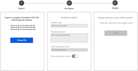
For example, the step-by-step workflow that is shown in Figure 1 breaks down what could be an overwhelming task into smaller boxes that represent a clear order of action. Even though users could complete parts of Step 2 without importing a file—the task introduced in Step 1—it helps users to know where to begin the workflow. Plus, by visually diminishing the affordance of certain steps in a sequence—for example, the controls that appear dimmed in Step 3—you can further reinforce the order of action, while also foreshadowing what is to come—a technique I’ll get to later in this column. Moreover, a user’s seeing the end of a sequence is similar to a reader’s knowing there is a final chapter in a book. When users understand that there is an attainable end in sight, they experience less anxiety and uncertainty and instead feel more motivated to complete a workflow.
Figure 1—An example of imposed steps
Using Parallel Structure
Parallel structure is a style that the literary world uses to create grammatical rhythm in subheadings, sentences, or bullet points that start in similar ways and have similar structures. Using this device helps propel readers through stories, leading to a more enjoyable reading experience. For example, here is a sentence that uses parallel structure: Jill runs down the street, hops in her car, and races down the road. This sentence has a rhythm because the placements of subjects and verbs in each clause mirror each other. Parallel structure gives momentum to a narrative, which is why similar principles work well in user interfaces.
Applying parallel structure can be simple, and you might often do it without being aware of it. In the step-by-step approach that I described in the previous section, the titles of steps shouldn’t be inconsistent, for example: Import, Configure the Dataset, Deploy. Instead, each of the step titles should consistently comprise a single verb—for example, Import, Configure, Deploy—or a brief phrase. Using a title that feels out of step with the rest disrupts rhythm, slowing users down as they try to parse disparate or inconsistent information.
However, opportunities to apply parallel structure aren’t always so obvious. For instance, if you’re using gerunds for subtitles on some pages, but not on others, are there ways to be consistent everywhere? Perhaps a global navigation bar uses nouns that represent the various parts of a Web site or application, but there might be a single item that consists of a verb or phrase. Can you make that item consistent with the others—or perhaps highlight it in some way, as I’ll describe in the next section, to more intentionally set it apart from the rest?
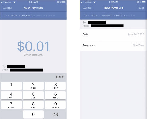
You can also apply parallel structure to the placement of similar elements on individual pages or views of a user interface—especially on sequential pages. Placing similar elements in the same location on every page gives the user a more consistently rhythmic experience. Conversely, placing similar elements in different locations on sequential pages disrupts the rhythm. For example, in the Fifth Third Bank mobile banking app in Figure 2, the position of the Next button shifts from screen to screen—and the button lacks affordance—making it a more difficult, unpredictable target to acquire, and thus, interrupting rhythm.
Figure 2—The Next button is a difficult target to acquire across screens
Of course, if an action is potentially destructive, it’s okay to make it more difficult for the user to acquire. For example, placing a Restore to Factory Defaults option multiple clicks away or in a password-protected workflow reduces the odds that users might accidentally click or tap it. However, in most cases, momentum and rhythm are good things because they help users to complete workflows and better anticipate what happens next.
Highlighting One-off Elements
As I mentioned earlier, when certain words, phrases, or UI elements are at odds with similar elements around them—especially elements that appear in a sequence—this disrupts users’ rhythm, creating a stilted experience at best; a destructive experience, at worst. However, a dissimilar, one-off element might be necessary in some cases, so it’s up to the UX designer to show that its difference is intentional.
In the literary world, there are scenarios in which a character’s action or some expositional detail draws undue attention to itself because it feels out of character or seems inaccurate. However, if authors intend readers to focus on that difference, they may highlight it in some way. Otherwise, a reader might think: Hey, wait a second! That’s not right! Anyone who drinks whiskey straight knows you don’t ask the bartender to serve it with an umbrella! But perhaps a character habitually chooses to drink straight whiskey that way because the umbrella reminds him of his deceased wife, who preferred fruity cocktails that bars often serve with umbrellas. In such a case, an author should hint at this detail of the character’s backstory to ensure that the character’s actions make sense to readers.
You can use this same technique to build narrative into your user interfaces. For example, in Figure 3, you can see that almost all the global navigation links use single nouns—except the verb phrase Request a Demo. Because all of the links have the same affordance and style, the Request a Demo link feels out of character with the rest because it represents an explicit action rather than being a noun that alludes to a section of content. Users might perceive this difference as an oversight, lazy design, or something that doesn’t merit their attention, but this would be problematic because the Request a Demo link represents a key CTA that drives conversions.
Figure 3—Global navigation bar doesn’t highlight a one-off element
The solution? Make the Request a Demo link obviously different, clearly setting it apart from the rest of the links. Visually exaggerating the link’s difference by making it a button, as shown in Figure 4, conveys to users that they should perceive this option differently. Ways of highlighting such differences include using a colored background, giving an element a more prominent placement, or perhaps both. Whatever technique you choose, users better trust a user interface that intentionally highlights one-off elements.
Figure 4—Global navigation bar draws attention to a one-off element
Foreshadowing Things to Come
Foreshadowing is a technique that authors use in literature to increase the readers’ anticipation of events to come and might manifest as an ominous metaphor or something a character says that has a deeper meaning than readers might immediately perceive. Wielding the foreshadowing technique effectively helps further pique readers’ interest and investment in a story, which keeps them turning pages. In user interfaces, foreshadowing is a great way of propelling users through workflows.
As I mentioned earlier, reducing the affordance of certain elements, by making them appear dimmed or inactive, signals to users that these elements could become active at some point, depending on where users are in a workflow.
You can take this technique further by using empty states, which are effective because they foreshadow the shape and size of certain elements on a page and hint at the content that eventually populates the elements so users know what to anticipate. Furthermore, you can use empty states to onboard users to a new context by giving them some knowledge of a system or workflow. Empty states are better alternatives than tutorial overlays that compel users to view swarms of pointing arrows and text all at once or forcing users to navigate to external Help pages, which requires users to leave the context in which they’re working.
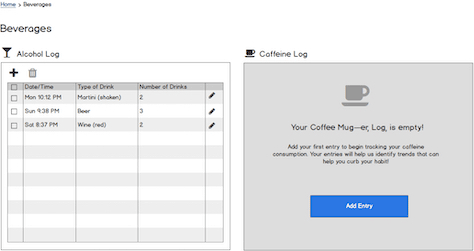
Finally, as Figure 5 shows, using empty states to foreshadow content provides additional opportunities to inject personality into an experience. Most people who read fiction do so because they want to have an emotional experience. Even though users don’t expect your application to offer content or transactions that deliver such intense experiences, you can still inject some personality, which gives emotional appeal to an experience and makes your Web site or application much more memorable and engaging.
Figure 5—Injecting personality into an empty state
Culling or Relocating Backstory
User-interface elements that have hints, or ToolTips, not only foreshadow deeper levels of information but also reduce the amount of extraneous information on a page, which would slow users down. In literature, a character’s backstory can be important at times. However, when an author gives backstory too much emphasis, it stifles the reader’s experience. Overemphasizing backstory is particularly bothersome if it doesn’t serve the greater story in any meaningful way.
Building narrative into a user interface does not mean using lots of text. Overloading user interfaces with blocks of inline text and sidebars of descriptive information often places seemingly insurmountable visual obstacles in the path of your users, reduces their momentum, increases their anxiety, and demotivates them from completing their work.
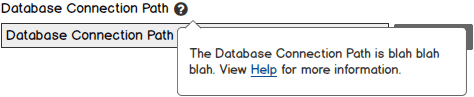
If you really need verbose instructional elements, perhaps you can move them off canvas or relocate them behind contextual hints within a user interface. For example, as Figure 6 shows, placing a small question-mark icon next to a field label that users might find confusing signals to users that they can find out more about the field—visually telling a story in an unobtrusive way. If users move their focus to the icon—either by hovering over it or clicking it—a ToolTip appears, providing access to more information and possibly disclosing even more information progressively via a hyperlink.
Figure 6—A contextual ToolTip
Often, teams assume the need for copious amounts of explanatory text because a user interface is less than optimal. As the legendary author Nathaniel Hawthorne once said, “Easy reading is damn hard writing.” Similarly, an easy-to-use user interface is damn hard designing. So consider where your user interfaces might be overly reliant on large blocks of text. Are you bogging users down with backstory because you haven’t put enough rigor into your UI design? If instructional text is necessary, what is the best visual affordance for progressively disclosing more information and avoiding its competing with users’ core workflows and tasks? Where could transient or interactive elements progressively disclose more information when users request it, then hide it again?
I’ve never had a usability participant beg me for more prominent text or instructions within a user interface. Often, participants click and navigate until they either find what they’re looking for or get stuck. Modern users who are accustomed to ordering items from Amazon with a single click or tap of a button or a shout out to Alexa are likely to find having to read verbose instructions exhausting and frustrating. We must design for people’s shorter attention spans.
Conclusion
Create narrative, which is beneficial to the people who use software user interfaces because human beings comprehend stories better than facts alone. UX designers can leverage many of the techniques that the literary world uses to create great reader experiences in creating great user experiences. Let’s quickly review some of these techniques.
Impose sequence to convey a clear order of action to users—even if doing so doesn’t reflect the underlying structure of a software system. This helps users to better orient themselves within a workflow and reduces their anxiety. Use parallel structure to create rhythm, make a workflow more seamless, and help propel users through its narrative. Highlight and clarify one-off elements that might otherwise confuse users by illuminating their importance or uniqueness. Foreshadow things to come by using empty states or visually diminishing the affordance of elements. Seeing the end of a workflow reduces users’ anxiety about what they need to accomplish and helps motivate them to complete it. Finally, similar to an author’s handling of backstory, you can cull extraneous information from your pages or relocate it, by making it available dynamically on demand and leveraging techniques such as progressive disclosure to let users request it.
In Part 2, I’ll provide some additional tips for building narrative into your user interfaces. If you have any tips to share, please offer them in the comments!
Director of User Experience at Rockwell Automation
Cleveland, Ohio, USA
Jon has a degree in Visual Communication Design from the University of Dayton, as well as experience in Web development, interaction design, user interface design, user research, and copywriting. He spent eight years at Progressive Insurance, where his design and development skills helped shape the #1 insurance Web site in the country, progressive.com. Jon’s passion for user experience fueled his desire to make it his full-time profession. Jon joined Rockwell Automation in 2013, where he designs software products for some of the most challenging environments in the world. Jon became User Experience Team Lead at Rockwell in 2020, balancing design work with managing a cross-functional team of UX professionals, then became a full-time User Experience Manager in 2021. In 2022, Jon was promoted to Director of User Experience at Rockwell. Read More

