Top

Mobile Inline Form Validation

Mobile Matters

Designing for every screen

A column by Steven Hoober
September 3, 2012

In my new column for UXmattersMobile Matters: Designing for every screen—I’ll discuss the conditions and considerations that are unique to designing user interfaces for mobile phones—the most successful, widespread technology on the planet—tablets, and all their offshoots.

In this first installment of my column, I’ll discuss inline form validation for mobile user interfaces and provide some guidelines for its use.

Error messages are bad. Users get annoyed when they encounter them. And when they do, they’re likely to drop off your site, perhaps never to visit it again. Whatever we can do to eliminate error messages is good for users, as well as our organizations or clients.

Champion Advertisement
Continue Reading…

Most errors result from assuming people are like computers and making them do work they shouldn’t have to do or to work the way a computer works. You can go a long way toward solving user’s input issues by using simple data formatting and restricting data entry. Modern mobile operating systems offer enhanced capabilities for data entry by providing

  • different, context-specific key layouts for virtual keyboard—for example, numeric entry for phone-number fields and the appropriate characters and strings for email-address fields
  • date pickers and other widgets that allow selection from a list of values, which are highly useful and now increasingly available even for Web forms

But many form fields still rely completely on users tapping characters on a virtual keyboard, so errors can occur. For example, a user might provide a phone number comprising too few characters—even if the field has the right data-entry format—or accidentally tap the @ symbol twice when inputting an email address. (For some reason, I do this a lot.)

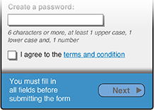
Most Web sites require users to completely fill out and submit a form before validating any data. Then, once the system processes the form, if any data-entry errors have occurred, it returns an error page. While this is common practice, I would argue that it approaches being a worst practice.

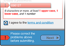
A better practice is to provide inline validation of fields in Web forms. Back in 2009, Luke Wroblewski wrote “Inline Validation in Web Forms,” a rather good article that described both the concept of and the principles behind inline validation. (If you don’t yet know what I am talking about, seriously, stop reading this column now, go read Luke’s article, then come back once you’ve read it.)

Guidelines for Inline Validation of Fields in Web Forms

To summarize Luke’s key inline validation guidelines:

  • When a user clicks or tabs to another field to select it—that is, on blur—the system should check whether the value the user typed in the previous field was valid. (You can achieve this validation either by using client scripting or Ajax methods to check the value on a remote service.)
  • Do not perform these checks as the user types. (A possible exception to this general rule is checking password strength, but that’s another discussion.)
  • Highlight the field that is in error—for example, by changing its color.
  • Indicate the error by persistently placing an icon adjacent to the field, not inside it. This icon should not fade away.
  • Explain errors in a helpful manner, so users can understand what they need to do correct them.
  • Make sure explanations of errors do not obscure other fields. Ideally, these explanations should also be persistent and should not require a user to click anything to view them.

Applying Inline Validation Guidelines to Web and Mobile Applications

When I read these inline validation guidelines, I believed in them 100 percent, because my own experience over the four years that preceded Luke’s article had corroborated them. (Unfortunately, I wasn’t allowed to talk or write about what I’d learned from user research in those days.)

At that time, I worked for the U.S. mobile telecom company Sprint, and one of my projects was designing a new registration form. We had to get every one of the existing 20 million customers to re-register, because of new CPNI (Customer Proprietary Network Information) regulations from the FCC (Federal Communications Commission). (I actually contributed to those CPNI regulations, but that's a long story and, though a rather good one, not relevant here.)

This form included the first robust and completely consistent use of inline validation that I am aware of. I made some guesses and took input from the rest of the product team, then tested the design. And revised it and tested again. It worked—and not only in the lab. We had great completion rates and low dropout rates, and participants reported no problems. We received weekly call driver reports from customer care, so knew what caused issues for users. Registration never even appeared in those reports.

I have used the same approach for the inline validation of Web forms since, with the same positive results. I am completely sure it works. In the last few years, I’ve been applying a similar approach to designing forms in mobile user interfaces. Recently, I realized that, to the best of my knowledge, no mobile-specific recommendations for inline validation have yet been published. So, I think it's time that I shared mine.

While I don’t have as much research to back the mobile variations of these recommendations as I have for inline form validation on the desktop, I do have some. The guidelines for inline validation on mobile devices derive from the same principles as those for the desktop, and they do not violate any other principles of good UX design for mobile. Both in the smaller-scale tests that I have observed and in production, this approach seems to work well. Anyway, these guidelines provide a good place to start the conversation. I encourage you to try applying them and report your results, and I’ll continue to try out and test new ideas whenever I can on my clients’ projects. If I discover important differences, I’ll tell you about them.

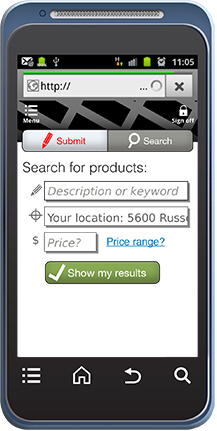
You can apply all of these principles and guidelines to both the mobile Web and mobile apps. While implementations may vary, the end result should be very similar.

My examples show handset-scale solutions, but for devices with larger screens, such as tablets, you may be able to use layouts from desktop Web form solutions—for example, adding explanations to the right of form fields. The appropriate layout depends on the space you actually have. But if a page has a multicolumn layout, you won’t have much room, so handset-scale solutions would still tend to apply, without any modification.

Visibility

When designing inline form validation for mobile devices, the key issue is making sure users notice the error messages. Here are my recommendations to ensure visibility.

Design for color-deficient vision.

Assume that everyone has color-deficient vision, follow design guidelines for the use of color, and use some of the available tools to ensure that your designs won’t present any problems to those who have a color deficit. Even disregarding the significant percentage of your users who actually have a color deficit, people’s ability to perceive color varies; there are many people who see colors slightly less intensely. On mobile devices, the screen may be dirty or under glare. Just changing a field’s black border to red may not be sufficiently visible.

Draw users’ attention to error messages.

On mobile devices, the typical behavior is to enter data in the first field, then select the next field—usually by using Next buttons, tab keys, down arrows, or just tapping the next field—at which point, any error message for the previous field appears.

Users’ attention is very focused on their current data-entry field. You’d be surprised by how little they notice changes just one line above the field in which they’re entering data. Their eyes flit between the field, the data-entry device—either a hardware or a virtual keyboard—and their surroundings. They do not pay much attention to the rest of the screen—unless you work very hard to get their attention.

You cannot evaluate your success in getting users’ attention in a vacuum—or by testing static screens you’ve created in Photoshop or Fireworks.

Employ motion, position, size, shape, contrast, and color.

To get users’ attention, you need to appeal to their eyeballs and their brains. Using an understanding of cognitive science and physiology, synthesized through principles of information design, we know that an alert outside a user’s area of focus must have one or several of the following characteristics of information visibility, in priority order:

  • motion—Think animation. Create motion by fading in, sliding, rotating, or otherwise moving or changing an element. At a minimum, you should animate icons for at least 500 milliseconds. For example, you might spin a processing icon while validating data, then change it to an icon that indicates an error or valid state.
  • position—In information design, the presence and relationships of objects communicate the priority of information. In hierarchical relationships, things higher in a view are more important. Adjacency also implies a relationship.
  • size—As a general rule, bigger things are more visible. However, size has only limited usefulness in the context of a form.
  • shape—Shapes can have implications. For example, the international warning triangle is not only a standard that people learn; the sharpness of its pointy shape communicates an inherent sense of dangerousness. You can create tension or communicate importance with shape. Circles, for example, don’t exactly scream error. In addition, changing shape clearly communicates that an event has occurred.
  • contrast—The relative brightness of adjacent items. To make an error message visible, inverting its text often helps. Instead of shading a field in pink, try making it red enough that text can change from black to white.
  • color—I’ve already talked about how the use of color doesn’t much help. (Other characteristics are even less visible, so we’ll set them aside.)

Error Messaging

It is essential to communicate an error clearly. No matter how simple an error may seem, what is wrong may not be clear to a user.

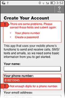
Take the example I discussed earlier: A user tries to enter a phone number, but accidentally enters only nine numbers. So instead of typing 816 210 0455, he actually typed 816 210 045. This is an obvious error, right? So, you might think you could just flag the field, as shown in Figure 1, and the user would notice it.

Figure 1—Flagged errors in fields
Flagged errors in fields

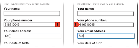
Well, this is harder than it seems. Using the principles I’ve outlined, evaluate the two designs in Figure 1. In the fairly common design solution at the left, the error flag isn’t large and doesn’t change the shape of the form field. The example on the right shows a better solution. The icon appears in the left margin where there is no other content, making it more prominent, and adds a shape, changing the overall shape of the field. The icon itself is a sharp shape, so implies problems, and helps guide the user’s eyes to the field.

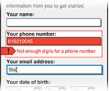
Assuming you use a solution like this, once you get users to notice the error condition, they can just read the entry and fix it, right?

Wrong. Because users have difficulty discovering their own errors. Users evaluate content like this based on what they believe they typed, or what they meant to type. It is very difficult for users to overcome this bias and read what they actually typed. This is an inherent aspect of human cognition and sensing.

So, if you cannot design around this, what should you do? Explain the error—as clearly and specifically as possible. Do not simply say, “Your entry is in error,” but provide an informative error message that is as specific as that shown in Figure 2.

Figure 2—A clear, specific error message
A clear, specific error message

Now that you’ve attracted the user’s attention, and he’s read the message text, he has a good chance of correcting the data.

To summarize these guidelines:

  • Guide the user’s eyes to the field that is in error.
  • Explain the user’s error.

Error Correction

Even when designs follow the visibility guidelines, users may still have some trouble seeing their errors, so a good percentage of the time, they might simply delete and retype an entire value.

Plus, even if users see their errors, they may have difficulty correcting them. Some mobile devices present problems because they don’t provide an easy means of selecting an individual character, making users rely on tapping behaviors. Though not all, about half of all Android devices have hardware keyboards, so don’t forget to support them, too.

The single most common observed behavior is users’ rather tediously backspacing through the entire value in a field. This is painful to watch in lab studies and cannot be easy on users.

Buttons that clear fields present too many risks to be useful in solving this problem. They are not well-enough understood among users—who either interpret them as having other meanings or, not knowing what they do, just carefully avoid them.

Another behavior some designers have tried is clearing the whole field when the user gives it focus again. This is not standard behavior, so is confusing, and violates the basic principle of not destroying user data. Plus, it means users who could have corrected the error now have no opportunity to do so.

In theory, it should be possible to detect the most likely issue much of the time and put the insertion point in the right place. However, practically, this is harder to accomplish than it might seem. Plus, users do not expect this, and clearly indicating the insertion point is more difficult than you might expect.

This issue of how best to facilitate error correction is worthy of further study and guidelines may change over time as either users change their habits and expectations or we find better technical or design solutions. For now, error correction is simply a pitfall users must overcome, so simply support refocusing on the field containing the error, and select an insertion point using a platform’s default behavior.

Error Message Placement

During design, the biggest argument—aside from developers not wanting to add validation features at all—regards the placement of error messages. Neither floating layers nor notes in a column to the right of fields are generally available on mobile devices. As I said earlier, even on tablets, forms often reside in columns or other areas without sufficient space for error messages to appear to the right of fields.

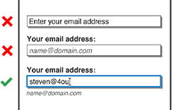
Instead, you need to make space for these messages. I suggest that you place error messages below fields, as shown in Figure 2. Regardless of their placement, showing the relationship between a field and a message is largely a matter of the use of color and spacing. However, these distinctions can very easily be lost on users, who sometimes become confused as to which field a message relates. To make their relationship clear, add visual grouping of some sort, as shown in Figure 3.

Figure 3—Visual grouping of a field and an error message
Visual grouping of a field and an error message

This design clearly begins to fulfill the guidelines for visibility, as follows:

  • position—The field in error expands to take up more space, moving other items further down the page. This demotes the importance of the other items and forces the user to note that a change has occurred.
  • size—The box around the field increases the size of the entire group, as well as its importance.
  • shape—There is an additional shape in the area.
  • contrast—The color of the type in the field is inverted, providing greater contrast.
  • color—Yes, the field can still turn red. But don’t forget that, if your brand’s color is red, that probably wouldn’t be a helpful color for errors. In that context, the color red would not scream error.

Motion

My static examples don’t show motion. If indications of errors appear instantly, they won’t be as visible. On the other hand, shifting items about on a page might be confusing and cause users to lose their place.

Instead, motion should occur in the primary available axis. The field in error should expand downward to accommodate the new information, and all other items below it—including the field now in focus—should slide down the page. This ensures users are aware that a change has happened, so they tend to reconsider the entire page and immediately notice the field that is in error.

Animations should usually take between 200 and 300 milliseconds, but their duration depends on the amount of movement that must occur.

Moving the Focus to the Next Field

It is difficult to discuss requirements for error messaging without coming back to overall form design. Here we encounter another requirement: The cleanest way to initiate inline validation is for the user to move the focus to another field, so don’t place a field that is likely to cause errors last in a form.

Once a user fills in the last field in a form, the user is likely to proceed immediately to the Submit button, regardless of whether the last field is likely to cause errors—for example, a password field. While you can still do inline validation in such a case, error correction will not have the same degree of seamlessness and will be more intrusive. Users may have greater difficulty noticing error messages, and they can correct issues only by reading the messages.

Plan your overall form design to work well and make sense regardless of whether users make errors.

Grouping Related Fields

If you’ve grouped a set of fields to order the entry of data, it may be more helpful to highlight and provide hint text for the entire group rather than for individual fields. Think of multipart phone-number fields or address groups in which Street address, City, State, Country, and Postal code are individual fields.

Not only is it sometimes hard to refer to a specific field in a group, users often conceive of the group as a single entity. In addition, errors may be the result of tabbing incorrectly or filling in fields out of order. Making corrections to just one field may not make sense, and multiple errors may conflict with each other or add confusion as a user attempts to interpret the actual error.

Also, think carefully about when you actually need to provide separate fields. Not doing so can be especially helpful in solving user-interface design issues in international products. I have gotten along pretty well with single fields for phone numbers and even for addresses. Add parsing rules that trigger on submission and check what a user has entered, then add the data to the database as appropriate.

Providing Hint Text

You didn't put your hint text—which tells users the rules for providing a value for a field—inside the field, did you? If you did, users can’t see the hint text once they’ve filled in the field. Instead, place any hint text below fields. Then, you can overwrite the hint text with error messages and economize on their use of space. But make sure that you restate any information users need to be aware of to correct an error condition in the error messages.

While we’re talking about the placement of hint text, the need for error correction is why you should never place field labels in fields either, as Figure 4 shows. While there are a few cases in which this can work, don’t let your quest for clean design or using space more efficiently get out of hand.

Figure 4—The placement of field labels
The placement of field labels

My recommendations for the design of Web forms for the desktop deviate from or perhaps supplement Luke’s by suggesting that you can highlight the applicable parts of the hint text to communicate an error. Password fields provide a good example:

  • Must be between 7 and 20 characters.
  • Cannot be your phone number, account number, or Social Security Number.
  • Cannot comprise only numbers.
  • Cannot contain any spaces or characters that are not on the keyboard.

While this works for the desktop Web, using bulleted lists for hint text is clearly space intensive—even without considering their use to communicate errors. For compactness, hint text on mobile devices tends to be in a sentence format, as shown in Figure 5.

Figure 5—Hint text on a mobile device
Hint text on a mobile device

However, as you can see, it is still possible to highlight parts of the hint text in the same way. Do everything you can to make the words stand out. In Figure 5, I’ve used not just color, but two style changes—the error text is bold and is not italicized.

Also, remember that, by using the right input widget for fields, you may obviate the need for hint text. For example, if a field allows only numeric input, there may be no need to say numbers only.

Setting User Expectations

When designing mobile forms, always communicate what users need to do and directly assist them in accomplishing their goals whenever possible.

Be sure to set user expectations—both when first presenting a form and for each change or additional component. Introductory copy may follow some of these guidelines, but it must often adhere to marketing requirements, so I am not going to talk about this specifically.

Avoiding Errors

I don’t claim to have invented this whole approach of inline validation, but the way I arrived at it during design may be enlightening.

My ultimate and achievable goal for designing Help systems is not to design them at all. But to make Help systems unnecessary, users must understand how a product works. Similarly, my goal for forms is to prevent all errors. But so far, I’ve never quite gotten there. There’s always at least the chance of a system outage. Nevertheless, this is a design objective that should drive your decisions.

The first thing I do when sketching a design—or scribbling over an existing screen to revise it—is to make the Submit button initially unavailable, as shown in Figure 6. Simply giving the button a dimmed appearance sets user expectations, and including hint text that explains why the button is not available prevents user confusion. If a user cannot submit a form until it is valid, there’s no need for an intrusive error message. Using inline validation and following the guidelines I’ve outlined so far supports this goal.

Figure 6—Initially making the Submit button unavailable prevents errors
Initially making the Submit button unavailable prevents errors
Figure 7—Messaging when some fields are in error
Messaging when some fields are in error

Once users have made errors, display the same error icon that you’ve used for inline validation—or, if not applicable, a similar one—to the left of the hint text and the unavailable Submit button, and change the hint text to an error message, stating specifically that the user must correct the errors before submitting the form.

Figure 8—Messaging that appears once the Submit button is available
Messaging that appears once the Submit button is available

Once the form is ready to submit—whether because a user has completed all required fields or corrected all errors—the Submit button becomes available, indicating that the form is complete.

If you have a sufficiently long form, especially when many fields are optional, you may want to add another Submit button at the top of the page, which is fine. Just make sure every instance of the Submit button conforms to the proper state, as I’ve described, and appears with the appropriate messaging. Both buttons should become available at the same time.

Using Application Buttons

The iOS Human Interface Guidelines suggest that designers place buttons on an application’s title bar. A lot of apps don’t follow this guideline, but native apps usually do, and so should you. You may already have noted that the behavior of giving a button a dimmed appearance until it is flagged as having a valid state is built in.

Of course, there really isn’t room for adding any commentary next to OS buttons that are unavailable, so that’s probably out. Android gives somewhat more room for placing and styling a button as you want, but also incorporates the behavior of making a button unavailable when form data is not acceptable.

It is my expectation that making Submit buttons unavailable until a form is complete will train users to expect forms to provide implicit validation and prevent errors on submission. In fact, we may soon be able to set aside the common practice of using static buttons that too many developers still espouse, and move universally to using the dynamic buttons of mobile devices.

I hope that, in just another year or two, we can get by with much less annotation of errors, and explanations of why a Submit button doesn’t currently work won’t any longer be required.

Exceptions: When Inline Validation Is Not Enough

There are, of course, exceptions to all guidelines. Sometimes, you simply cannot check a value inline. In such cases, users must submit the form, then view the errors once the screen has refreshed. This need may arise because of technical constraints or for security purposes such as authentication. Or a two-tier system may be necessary, where you can do inline validation to check that values have met basic constraints—for example, are in the proper format—but the actual validity of the form requires submission. Do not give in too easily to such technical constraints.

In any case, when redisplaying the form with errors, you should follow all of the guidelines I’ve presented in this column. Display a summary of the errors above the form, note errors for individual fields, and again make the Submit button unavailable, as shown in Figure 9. However, if it’s still impossible to detect whether a particular value is valid, make the Submit button available as soon as the user changes the field in any way.

Figure 9—Displaying errors detected on the submission of a form
Displaying errors detected on the submission of a form

If submitting a form generates errors, be sure to provide an error message beneath the page title that informs the user what has happened. (Depending on your standards for contextual titling, the page title may or may not change.). The error message should comprise an error icon—similar to the field error icons—and a clear message that indicates the form has errors.

If a form is too long to fit in the viewport without scrolling, in either orientation, some fields won’t be visible when the form loads. In this case, a list of the fields that are in error should follow the error message. On the desktop, I’ve always gotten good results from indicating the field and the error. However, on mobile devices there simply isn’t room to do this without the whole viewport’s displaying nothing but an error message, so just list the fields. Use the fields’ actual labels in the error message, so users don’t have to interpret that Phone means Your phone number when scanning the form to find the fields that are in error.

Inline Saves

The unique constraints of mobile devices include their small size and the relative difficulty of inputting data, but more importantly, issues regarding distractions and connectivity. Users may become distracted by notifications on their device or happenings in the real world. When users are on the move, they may lose network connectivity. You must prevent users’ losing their data in both of these cases.

Similar to the way you check data inline, you should automatically save the data that users provide, field by field. In this way, you can eliminate any worries about session timeouts or loss of connectivity. Once users get back online and return to a form, the system should ensure that their information is still there, so users can resume their work without any problems.

Native mobile apps can easily be built to resume in the same state after they are suspended or even quit. Hybrid apps and the Web provide additional technical challenges, but can also be built to support this concept. Users are becoming accustomed to task switching, so may be annoyed if they lose their data as a result.

Technical or security concerns can also come into play. In a registration form, for example, a system generally reserves user names after a valid inline check. But if a user doesn’t complete a registration form, the system should not hold the user name forever. Decide whether you should save reserved user names for an hour, a day, or a week. You should consider setting other limits to prevent excessive use of resources for session preservation, as well. Discuss implementation strategies early on to ensure your design principles present no issues and, if necessary, modify them to yield the best overall product.

Because of the variations in products and platforms, there can be no hard-and-fast rules, just guidelines. Even with technical issues set aside, an implementation depends on the needs, goals, and capabilities of the underlying business processes and systems, as well as your user interface design.

And there may, of course, be exceptions. For example, I generally insist that users be able to enter passwords without masking. This is perfectly safe in most scenarios, but do ensure that passwords get wiped if users leave a page—even though the page should retain other data that they’ve provided.

Using Analytics

Gathering analytics data is a great thing, which I encourage. But following rules too strictly or using excessive, out-of-the-box implementations can lead to a page-centric mentality, which assumes that every condition—including error and success states—must be a page, so it can be tracked as a unique object. This is a greater problem for the Web or when applications use Web-centric implementations.

Specific workarounds depend on your system, but be aware that these are not strict limits. They can be somewhat flexible. For example, some major tools require that there should be only one instance of a clear pixel or tracking pixel per page. But it’s all about how the analysis server processes the data, so it’s possible to either tag states differently and run reports on state changes or just report total pages viewed. Analytics experts can work with you to implement good designs if you explain your reasons for a design.

Error-Free Forms

In practice, I use the principles of inline validation when designing perhaps half to two-thirds of the forms I work on. For the rest, I have a free enough reign to apply the even more stringent standards of error-free forms. Figure 10 shows a good example that is not yet in production. I’ve sanitized it a bit because it’s still in stealth-startup mode.

Figure 10—An error-free form
An error-free form

(In this design, I’m experimenting with using iconography for field labels, then letting the hint text get overwritten. I know. I said not to do that earlier. But, this is just one example, and experimentation is how we learn.)

In Figure 10, the form fields are for keyword search, a location constraint, and a price constraint. If a user skips the keyword search field, tapping Show my results loads all search results—by default, in order by recency. Location is generally prepopulated, but can be vague, and a user can overwrite or clear the location. If a user provides no information, a search displays all results for all keywords, at all prices, everywhere. (It is, of course, easy to eliminate price as a constraint. And it turned out to be easy to make sure that none of the fields are required.) In this case, the results are simply a list of recent activity. Displaying this list was already a requirement, and it’s not difficult to search the database for recent activity.

You may think your registration form could not be this easy. But why not? Lazy registration—gathering one or two pieces of information at a time, as people use your product—can make a registration form optional and prevent data-entry error for almost every field. This is also an excellent way to ensure that automatically saved data is put to good use. If users don’t complete a form after a certain amount of time, remind them to come back and finish it.

As a general rule, you can solve technical constraints by using different technology, business constraints by changing business rules, and even change your design practices a bit. However, users won’t change their behavior for a single unique form. Do whatever you can to make sure you are building user interfaces and interactions for people. 

President of 4ourth Mobile

Mission, Kansas, USA

Steven HooberFor his entire 15-year design career, Steven has been documenting design process. He started designing for mobile full time in 2007 when he joined Little Springs Design. Steven’s publications include Designing by Drawing: A Practical Guide to Creating Usable Interactive Design, the O’Reilly book Designing Mobile Interfaces, and an extensive Web site providing mobile design resources to support his book. Steven has led projects on security, account management, content distribution, and communications services for numerous products, in domains ranging from construction supplies to hospital record-keeping. His mobile work has included the design of browsers, ereaders, search, Near Field Communication (NFC), mobile banking, data communications, location services, and operating system overlays. Steven spent eight years with the US mobile operator Sprint and has also worked with AT&T, Qualcomm, Samsung, Skyfire, Bitstream, VivoTech, The Weather Channel, Bank Midwest, IGLTA, Lowe’s, and Hallmark Cards. He runs his own interactive design studio at 4ourth Mobile.  Read More

Other Columns by Steven Hoober

Other Articles on Mobile UX Design

New on UXmatters