Wearables are becoming increasingly pervasive devices with a growing array of apps available—yet, somehow, the user experience on many of these devices is lacking. What is the best way to design for this new class of devices? In this interview, I’ll have a conversation with Greg Nudelman—a mobile and tablet experience strategist and a leader in the emerging wearables design arena—about a better approach to design for wearables. Greg is a Fortune-500 advisor, author, speaker, CEO of Design Caffeine, Inc., and has also authored four UX books:
The $1 Prototype: A Modern Approach to Mobile UX Design and Rapid Innovation—See my review for more information about this approach.
Android Design Patterns: Interaction Design Solutions for Developers
Smashing Mobile Book, with co-authors
Designing Search: UX Strategies for eCommerce Success, a UXmatters book, with Contributing Editor Pabini Gabriel-Petit
Champion Advertisement
Continue Reading…
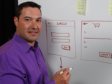
Greg, who is shown in Figure 1, is also the author of the popular UXmatters column Search Matters.
Figure 1—Greg Nudelman
The Impact of Wearables on Our Lives and Fitness
Janet: How do you see wearables changing society?
Greg: This is akin to what is possibly an urban legend, in which a government dignitary asked Michael Faraday—after observing his electromagnetic demonstration—“What good is it to make a light bulb glow dimly in this way?” and Faraday replied, “What good is a newborn child?” We are just at the beginning of an explosion of devices that exist in and around the spaces in which we live and work and assist us in satisfying all our different needs—including those we haven’t yet discovered. We’re just scratching the surface. This new class of devices has changed quite a lot.
From the perspective of many people, the killer app for wearables is the fitness app. People who have a Fitbit have changed their behavior for the better: First, they’ve made a commitment to purchase this gadget, set it up, and wear it. When they’re wearing it on their wrist, it acts as a reminder to exercise. It’s always there in a tangible, very measurable way, telling them exactly how little or how much exercise they’re getting. For example, I was quite amazed that I was not actually meeting my goal of 10,000 steps per day at least three or four days in a week. I thought I walked quite a bit more than that. This was quite interesting. I do believe these devices have the potential to increase our awareness in the midst of our busy lives. We need that additional reminder.
Janet: Are you wearing both a Fitbit and an Apple Watch all the time?
Greg: No, not all the time. I try to compare different devices just to see how they’re tracking things, because fitness is such an important aspect of the wearable experience for many clients. In fact, I just finished a big assignment for a major hardware manufacturer, creating an app to compete with some of the leading apps on the market in the fitness category. So it was very interesting to see the different types of tracking and the reminders that come up.
One interesting thing I’ve discovered, from the steps I’ve measured, is that the Fitbit measures distance very differently from Apple Watch, but the number of steps was almost exactly the same—down to just one or two steps. However, the numbers for the calories I burned were actually quite different. So, for example, Apple Watch needs you to start a workout to accurately track how much effort you’re expending, while other devices—like Fitbit—are more attuned to normal, ambient monitoring. I think that will be the big divide between these wearables.
I believe that Fitbit has gotten it right: People do want effortless monitoring. They don’t want to have to start a workout every single time. So there is an interesting divide. But really dedicated athletes who use the Nike+ Fuelband might disagree. They actually have specific goals for their workouts and are much more dedicated. They run and want to track their performance against their goal. On the other hand, someone like myself is a much more casual exerciser, just trying to stay in shape, so it’s much more about just tracking your daily numbers.
Design Goals for Wearables Versus the Apple Design Aesthetic
Janet: Do you think there is a mentality of one solution fits all because wearables are so new?
Greg: I think to some extent, yes. There are some very capable devices out there like Apple Watch. Depending on which app you’re running, Apple Watch is capable of supporting a lot of different behaviors. As a platform, it’s opened up a lot of possibilities. But, unfortunately, from what I’ve seen, some of the stock apps, for example, are not implemented according to the best design principles. Plus, to answer the phone, you have to use these little buttons, and there are much better ways to answer the phone on your wearable when you’re in your car. People have started getting much publicized tickets in the US and Canada just for using their wearable to answer the phone. Supposedly wearables are hands-free devices, but they’re not actually hands free because of those buttons.
So I think what Apple has done inadvertently is to introduce a design aesthetic that is contrary to the spirit of the design goals for wearable devices. While this has been inadvertent, it’s both good and bad. Apple has created a really great platform, and we can use it to create amazing experiences if we do it right. Unfortunately, the example apps that Apple has provided are not great. For example, online music players use the same aesthetic as Apple: they create apps that use a bunch of buttons in their wearable’s user interface, thinking that is the right way to do it. But, they’re creating sub-par experiences that are actually dangerous to use when you’re driving. So using these apps is detrimental to the state of your wallet, because you end up getting a ticket for playing with your Apple Watch while you’re driving.
Janet: Are user interactions with wearables significantly different from those for other types of technology? Is this truly a new paradigm—just as the iPod and iPhone were?
Greg: Absolutely! I definitely believe so. And I think Apple and Android Wear have created great platforms. I don’t bash either one. They open the way for us to explore the space. And, yes, they provide a completely different way to interact with our digital world and connect digitally with real life because their capabilities include things like capturing natural gestures and being with you 24/7. In fact, Fitbit encourages people to wear their devices while they sleep. So they truly intended 24/7 wear and that’s something they envision going forward. Of course, some of the more sophisticated devices are still struggling with battery-life issues and such. But, at the same time, once companies resolve those issues, they intend for you to have this device on 24/7 to collect all sorts of information about you and your behaviors and make you conscious of them.
The other reason why wearables present a completely different paradigm is that the small buttons on small screens are a hack. Nowhere are buttons more of a hack than on wearable devices. A lot of times interactions with Apple Watch or Android Wear are a lot like those we had with the old watch calculators of the 1980s. Those were touted as a novelty, and some people actually got pretty good at using them, but for most people, they were a gimmick—a toy. I think there is so much more we can do with wearable devices than just have a wristwatch calculator. The watch calculators were quite cool, but they didn’t quite work.
That is the problem people are running into now: wearables are cool, but they’re not really working as people had expected. Part of the reason is the application of old interaction models to a completely new class of device and design paradigm. This is a lot like my first mobile designs, which weren’t great because I was trying to take a Web page and shrink it to fit a mobile screen. This is not an effective approach. Instead of designing for the desktop, then shrinking a user interface down to fit a mobile screen, we have learned to take a different approach: mobile-first design, which Luke Wroblewski popularized. Now, we think about most design challenges in a different way. We approach our designs from a mobile-first perspective.
Today, we have the opportunity to think of wearables first. I don’t think it will be long before we’re doing this for many of our tasks. For example, things like answering our phone, wayfinding, or playing an online music player. And these are just some of the use cases I’ve included in my course “Practical Lean UX for Wearables.” These are just a few of the use cases we’ve identified that we really should think of as wearable first. When we do this, new horizons open up. We can capture natural gestures, ambient sounds, and natural behaviors like dancing and moving along with a beat, for example. There are still many things we haven’t yet thought of. This is a completely different paradigm and very few apps on the market right now take advantage of that.
Improving the Wearable User Experience
Janet: How do current designs for wearables fall short?
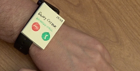
Greg: Let’s look at one example from my “Practical Lean UX for Wearables” course. One of the sample videos explores how to create a wearable prototype very quickly using a pack of sticky notes. In under five minutes, you can have your very own wearable prototype and, in the process of creating it, jump right into testing with a minimum of work. (See Figure 2 for an example.) But it also moves the focus away from the beauty of the user interface to the user’s actual interactions with a device and that device’s different sensors that actually facilitate those interactions.
Figure 2—A wearables prototype made from sticky notes
So, if the use case is answering your phone while driving, it’s very obvious that the current Apple Watch user interaction of tapping a button does not always answer the phone. I show that very clearly in the video. You have to tap it in a certain way: a very quick tap. Taps any longer than a millisecond don’t register, so don’t answer the phone. The attention of the driver may already be distracted. Maybe he’s listening to music, using his wearable to track traffic, or looking for directions on his phone or wearable device. So answering the phone just adds to the distractions. And not being able to simply answer the phone by tapping the button—having to use a very specific type of tap—is extremely aggravating. I have seen people get completely bent out of shape about this. “Answer!” “Why won’t it answer?!” I think Apple’s insistence on a very specific type of tap is a big mistake! An API could improve that interaction instantly. An 80% improvement.
Consider the Apple Watch’s On button. The first thing you do when you try to answer the phone is the very simple act of picking up the phone and saying “Hello.” It’s one of the most natural things we do. Most of us have been doing this since about the age of two. What Apple does is to intercept this behavior with a button push—which is almost completely unnecessary. So let’s imagine that, instead of two buttons—one red; the other, green—you had one big button in the middle of the screen. And any tap—on the button or anywhere else on the screen—would let answer a call. To hang up, you could push the button on the side of the watch. This basic approach could resolve some of the issues. You wouldn’t have to take your attention away from the road. You could simply tap anywhere on the screen.
With the current Apple Watch’s small buttons, you have to look at the screen to see what you’re tapping, then tap the button in a very specific way. If the entire surface of the watch’s face were one big Answer button, you wouldn’t have this problem. Alternatively, any tap on the phone could answer a call, while a shake of the wrist—similar to shaking your head No—could hang up the call and send it to voicemail. The watch’s current set of on-board sensors could capture these very simple behaviors.
Now, let’s consider yet another design solution that my students have come up with. If you simply raised your wrist to see who is calling you—or Siri tells you, “Call from Danny Coster,” when you’re driving and don’t want to look at the screen—then simply say “Hello,” that could answer the phone. This is one of the most natural behaviors, and I see the current interaction as an opportunity lost. Apple has lost the opportunity to go back to the experience of simply picking up the phone and seeing who is calling me. Picking up the phone, saying “Hello,” and just answering. Doing this is totally doable. You could easily have a controlled vocabulary, including things like “Send to phone,” “Answer,” “Send to voicemail,” “Text my ETA,” or text anything at all, for example. But instead, inexplicably, the Apple Watch’s designers have gone with two buttons to answer and hang up the phone.
This opportunity lost also demonstrates to all of us how not to design a wearable user interface. We can use the Apple Watch experience as a learning experience and create something different that’s really fantastic. In my “Practical Lean UX for Wearables” course, I explore this and many similar use cases to show how to think through specific sets of user goals and circumstances to design an experience that fits them. I teach designers how to create a delightful experience outcome, by creating a solution that is both safe and fully satisfying and takes full advantage of every capability a smart wearable offers. Watch my “How to Design Wearable UX Like Tony Stark” video, which makes a quick Apple-Watch-versus-Iron-Man design comparison.
Recovering from Errors on Wearables
Janet: It seems to me that performing an undo action on a wearable device is much harder than on a computer. Our interactions with wearables seem more permanent. Any thoughts on this?
Greg: Absolutely. There’s no way to undo many things—like sending a text. I find this quite interesting. On the other hand, undo might not be necessary. A lot of interactions currently have confirmation points that feel like obstacles. For example, to answer the phone, if before you could say, “Hello,” you needed to confirm that you actually wanted to pick up the phone that would be an example of an unnecessary confirmation that would be both distracting and disruptive. Of course, it would also generate ticketing opportunities for the police and trouble for you. This is just one example. Any time you require a button push or a spin of the wheel, it’s an unnecessary step. The undo action could happen on the phone itself. This would be a solid interaction model. I’d prefer an approach that errs on the side of begging for forgiveness rather than asking for permission.
Janet: I love the idea of shaking your wrist to say, “No, I do not want to answer this call.” However, let’s say you were driving down the road and hit a pothole at that moment, and you really didn’t want to answer that call. Could there be a kind of grace period to recover from unintended actions that could happen with this type of interaction? Or to recover from any error? For example, what if, when playing a song, you accidentally hit the wrong button on the screen? How easy would it be to fix that type of error?
Greg: Well, most of the time, the consequences are not particularly severe. But, when driving a car, you should first take into account your safety and that of your passengers and surrounding vehicles. So, rather than worrying too much about refusing a call, remember that it just went to voicemail. It’s not like you’ve really lost a call. It still shows up in your contacts, and you can call someone back almost immediately once you pull over. So it’s not really a problem.
The same thing is true when playing a song. For actions that a device could easily misinterpret—particularly, those that involve the accelerometer or any form of movement tracking—it should be fairly easy to say “Undo” to Siri or any system for voice interaction. In fact, I don’t know why a wearable device couldn’t just keep tracking pretty much everything you’ve said and done in the last 20 seconds or so. That could provide a very nice grace period to undo. This is an intriguing concept, and it’s definitely something we could and should explore.
There is currently no way to undo such actions, and one of the most frustrating things to me is that we cannot undo or edit certain things once the wearable has captured them and sent them to a mobile app.
Let me give you an example: Fitbit really is not great for biking. One of the features they say is coming—but that Fitbit doesn’t capture at all now—is tracking distance when biking. When you go for a bike ride, Fitbit doesn’t record the distance you’re covering. They use steps as the primary determinant of distance. So, unless you’re actually wearing your wearable on your ankle—as some people have advised me to do—you cannot record your biking distance. Unfortunately, my Fitbit does not go around my ankle, even though it is pretty large. Anyway, I can’t really picture myself doing that. But once the Fitbit captures my workout, there’s no way to go on the mobile device and edit that workout to say, “No, I really biked 12 miles, and my Fitfit only registered that I went 50 steps.” This is really quite irritating because I know exactly what distance I’ve covered because I mapped it. And on top of that, Fitbit should do a better job of mapping it because I carry my phone the whole time, and there is Bluetooth connectivity, so my phone knows exactly how far I went.
I also told Fitbit to start the workout, so it knew to track my GPS location. But this entire experience was highly dissatisfying because, not only did it not track how many miles I biked, it also did not understand that I was biking, and it did not allow me to change any of that on my mobile device. I think that part is most annoying.
Now, I understand that hitting a pothole and accidentally hanging up is much less of an issue than not being able to go back and undo a complex action or manually fix something on your mobile device. As designers, we are still struggling to fix these problems with wearables. I think we’ll resolve such problems in the next three to five years. Maybe even sooner as these things become so prevalent in our lives.
This is very similar to having a Nest thermostat and trying to control it in some way—for example, telling it, “No, I really don’t want 65 degrees right now. It’s finally warmer in California, and I don’t want to freeze myself to death.” Yet somehow, Nest decides what it thinks you want. Of course, it’s going to turn up the temperature or down. So there is also a lot of that sort of thing going on with Internet of Things (IoT) devices, which suffer from the same types of problems as wearables do. There is not a specific user-interface paradigm for controlling these things.
The Mysteries of Machine Logic and Human Frustration
Greg: There’s no easy way to tell why these devices are doing what they’re doing, and there is no inherent logic behind what they do. There’s just a training algorithm that may or may not work for your specific use case—as in the case of Nest not being able to predict the desired temperature every single time. Most of these devices do pretty well, but sometimes you get a nasty outlier and you cannot understand why it did what it did.
If we cannot understand the machine’s logic—why it does a certain thing—our confidence that it is going to perform its duty evaporates and trust goes away. So that is why I think not being able to answer the phone by tapping the buttons on Apple Watch is so frustrating. You know, it has to be that specific tap. Our confidence that this watch is going to perform the function it is supposed to perform just disappears, and people get extremely frustrated. You really feel out of control. This thing is buzzing on your wrist or pumping cold air into the room or something else of that nature, and there is nothing you can do about it, so you feel out of control and frustrated. And that is where our natural tendency toward conservatism wins out over our best interest and our curiosity about the unknown. We get really upset by our devices.
I recently wrote an article about UX synesthesia, titled “What Does Your Wearable UX Sound Like?” In that article, I posited that a lot of our devices sound like something, and if we were able to understand the rhythm of interaction with them as a piece of music, it would help us to design a more perfect union of man and machine. Although, this could perhaps be a crazy idea from too many late nights and too much caffeine, I feel very strongly that we need to listen to these rhythms. More and more of these things are with us 24/7—both wearable devices and IoT devices. We need to listen to the rhythm, and they need to listen to our rhythm. Perhaps we need to hear and interact with them on a higher level. This is not a question of creating a static wireframe or a prototype that you can take into some Lean usability testing, but of doing a higher level of user experience analysis than we may have yet invented.
We should recognize that wearables and IoT devices are not mere toys. They are tools for life. As we use these devices, they, in turn, are transforming us into the cyborgs we read about in science-fiction stories. So we urgently need new interaction-design principles, paradigms, and patterns to design user interfaces that enable people to better integrate these devices into their lives. We also need to keep working on discovering new ways to study, analyze, and understand the unique aspects of the user experience of wearing these intelligent devices on our bodies and having them with us 24/7. It’s up to us whether these devices will create the dystopian future of Neuromancer or fill us with power and wonder—like Tony Stark’s transforming into Iron Man.
You can find out more about Greg’s “Practical Lean UX for Wearables” course by visiting the Lean UX Academy.
Dr. Janet M. Six helps companies design easier-to-use products within their financial, time, and technical constraints. For her research in information visualization, Janet was awarded the University of Texas at Dallas Jonsson School of Engineering Computer Science Dissertation of the Year Award. She was also awarded the prestigious IEEE Dallas Section 2003 Outstanding Young Engineer Award. Her work has appeared in the Journal of Graph Algorithms and Applications and the Kluwer International Series in Engineering and Computer Science. The proceedings of conferences on Graph Drawing, Information Visualization, and Algorithm Engineering and Experiments have also included the results of her research. Read More