As I’ve noted many times before, people do not necessarily read left to right—and certainly, not in anything that is reliably like an F-pattern. However, once people find your content, they do reliably read it from top to bottom.
Wrapping text to the next line, continuing line after line, and presenting lists of discrete items of information are the two safe, reliable ways of designing digital content, especially for small mobile devices.
But what about when your content goes on and on? While there’s great concern about the right way of displaying arbitrary amounts of information, people make a lot of design decisions on the basis of hearsay, opinion, fear, or inertia. Plus, they assess existing design patterns based on incomplete data or bad implementations.
Champion Advertisement
Continue Reading…
People Scroll
The first corollary of people reading from top to bottom is that people scroll. Designers don’t need to worry about scroll-bar visibility or providing little animations that tell users to scroll. People already know they need to scroll, and they generally scroll to explore the content on any page you offer to them.
Of course, it is possible to inadvertently create a false bottom for a page, where the user interface makes it look like the page ends, discouraging the user from trying to scroll any further. But it’s not hard to avoid this problem, so it’s not something we typically encounter anymore.
More common is the opposite situation, where people wonder whether they have reached the end of a page. So always provide plenty of extra space beneath the end of the content to make this clear—and to encourage people to scroll the content to the middle of the screen where they can read it more easily.
When a Page Doesn’t Work
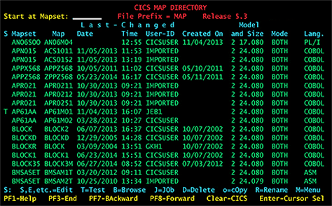
The earliest useful microcomputers mapped the display of content to the dimensions of the screen. The page size was the same as the size of the monitor’s viewport. If you needed to display more information than would fit on the screen, the user would have to issue a command to view the next page of content. Figure 1 shows a database with controls at the bottom for viewing the previous or next page of records.
Figure 1—A terminal display of a database with pagination controls
However, since at least the mid ’80s, computers have had windowing systems. So, by the time the Web came about, computers could already load arbitrary amounts of data into a page that is larger than the viewport, allowing users to just scroll, and this was the obvious way to build almost every digital system.
Designers could create a page that was full of all sorts of information and just assume that everyone would scroll down to see more. This has worked great. Today, most news articles and other content comprises just one page.
You can use clever design and code to sidestep issues with loading performance. For example, Amazon product-detail pages are very long, but users think they load quickly because what is visible at the top of the page loads immediately while the rest of the content on the page loads as it can—that is, employs a lazy loading design pattern.
Nevertheless, it is sometimes impractical to load all search results or other long lists of data on just one page. What should you do then? There are three design options in this case:
Paging
Automatic infinite scroll
Manual infinite scroll
Paging
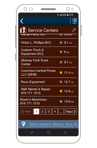
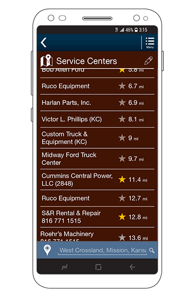
Paging simply means displaying and enabling users to navigate a series of pages that contain contiguous chunks of content. A specific number of items in a list, rows of a table, or lines of another type of content load on each page. A set of pagination controls appears on the page, usually right after the content itself, indicating the current page and enabling users to access other pages, as shown in Figure 2.
Figure 2—A list with pagination controls
Pagination controls can vary almost infinitely. You can list the other pages, provide Previous and Next buttons, allow jumping to specific pages, and combine these elements in various ways. You can also duplicate these controls at the top of each content area to help orient the user, but this can sometimes be counterproductive. However, paging is all too often the default design choice—maybe because a lot of development practices are stuck in the past. However, just because this is the traditional design option that doesn’t make it safe, and in many cases, its problems outweigh its benefits.
Benefits of Paging
Paging may be the default approach. Paging is built into a lot of frameworks, so developers assume this behavior is optimal. Unless you want to argue with them, you’ll get lots of paging.
Paging limits user choice. This can be a good thing. Google, for one, uses paging to make people focus on the top few search results because they know almost all good results are there. You can reduce the paradox of choice simply by restricting easy access to options.
Marketing can easily measure clicks. Measuring scrolls is harder—though not impossible. Marketing is happy counting clicks. This is why some news sources make you click to read more. They can measure each click, thinking they’ll have a better engagement number to tell their bosses and investors.
Problems with Paging
Users still have to scroll. Unlike early computers, page boundaries never line up with the viewport, so the user has to scroll by some amount to read the content, then press a button to see more, and so on.
Pagination controls vary widely in their form and function. Therefore, every user must learn their position and modes of interaction for every new site and app.
Having too many controls can be confusing. They don’t give users more actual choices, but add complexity, so discourage users from interacting at all.
Users perceive page loading as slow and burdensome. This can discourage interaction with pagination controls. Having to click something further limits users’ desire to view anything beyond the first page of content.
Users may not notice the pagination controls. They might assume that the content that is currently visible is all that is available.
Page loading tends to be slow. This is especially true when loading entire pages from scratch rather than refreshing only the content area. If users typically display multiple pages, it is much less efficient to load entire pages.
Multiple selection, or batch selection, has insurmountable issues. Users cannot tell whether selection applies per page or for the whole list of results. I have worked on solving this problem for 20 years and nothing has helped much.
Automatic Infinite Scroll
Before bound books with pages existed, there were scrolls. The natural way to get more content is just to read more content. Remember, people scroll.
Infinite scroll pretends to display all the content in a single list on a single page, but it’s faking this. It actually breaks the content into little chunks. Really, automatic infinite scroll is just paging with the automatic display of the next page of content, whose content it adds to the current page.
To avoid users’ perceiving any delay, any infinite-scroll system should prefetch the next most likely content users would see when scrolling. The amount of content it loads and prefetches must be calculated based on both the type of content and the expected—or observed—user behavior. Optimized prefetching can actually involve less data transfer than a paging system.
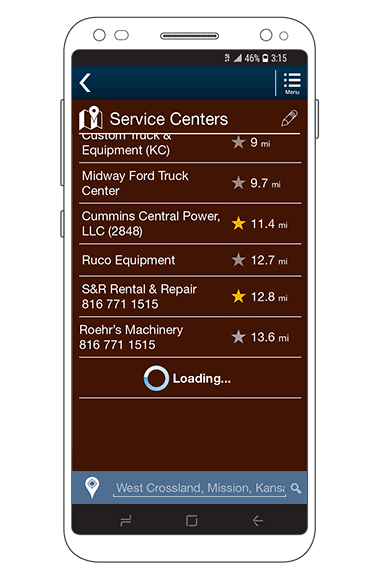
If the user scrolls too far or the network is slower than expected, a delay indicator may appear, as shown in Figure 3.
Figure 3—Infinite scroll loading indicator
There has been a lot of badmouthing of infinite scroll, but these negative perceptions are all based on bad implementations. Losing the position of an item the user tapped or clicked when the user returns to an infinite scroll list is a result of bad design and coding choices, not an issue that is intrinsic to this pattern.
Benefits of Automatic Infinite Scroll
It provides entirely natural browsing of content. The user need only scroll.
Batch selection is clear to users. All selections are from a single list.
It provides the best possible performance. This is especially important for displaying large amounts of information
Mobile apps can support alternative scrolling functions. These include indexed fast user scrolling.
Problems with Automatic Infinite Scroll
It can result in unnatural, frustrating behaviors. These occur if automatic infinite scroll is not implemented correctly.
Its proper function adds implementation complexity. Automatic infinite scroll requires significant coordination between the presentation-layer code, APIs or Web services, and data storage.
You must design entire page templates to support infinite scroll. Otherwise, an implementation can prevent users from accessing the bottom of a page, slow access to the top of the page, and cause users to become disoriented.
Scroll-bar size and position reflect only what content has loaded. Since the scroll-bar size and position don’t reflect the length of the entire list, users may become confused about where they are in a list.
Manual Infinite Scroll
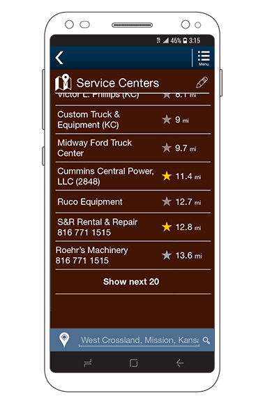
One simple change to infinite scroll can make a lot of things easier and alleviate a lot of the concerns product teams and developers have about it: making it manual. Manual infinite scroll simply removes the automatic function, making the user click or tap a button or link to load the next chunk of data, as shown in Figure 4.
Figure 4—Show next 20 button
Although automatic infinite scroll usually works fine, it does take some effort to implement it correctly. Therefore, it has a bad reputation that is unfounded. Acknowledging this can help you persuade everyone on your project to get 90% of the way to a good design solution.
Because a button or link to load more content is so important to this function, you must design it well. The best solution on a mobile device seems to be for it to take up an entire row below the content or at the end of a list, clearly affording a tappable target.
For example, in a list view or table, this affordance might say something such as “Show next 20.” I prefer show instead of load or anything else because it’s a user-facing control. The system loads content so it can show that content to the user. These subtle wording distinctions help more than you might think.
This function should communicate exactly how many more items or rows will load, but make sure this is not hard coded to ensure it always provides an accurate value, not just the typical page size.
Benefits of Manual Infinite Scroll
Scrolling through content provides quite a natural browsing experience. The user can scroll through all available content on the page.
Batch selection is clear to users. All selections are from a single list.
It is conceptually similar to paging. Therefore, manual infinite scroll is an easy sale to database and software-development engineers.
Problems with Manual Infinite Scroll
The user must press a button to load content. Thus, manual infinite scroll is more labor intensive than automatic infinite scroll.
It can result in unnatural, frustrating behaviors. These occur if manual infinite scroll is not implemented correctly.
Its proper function adds implementation complexity. Manual infinite scroll requires significant coordination between the presentation-layer code, APIs or Web services, and data storage.
You must design entire page templates to support infinite scroll. Otherwise, an implementation can prevent users from accessing the bottom of a page, slow access to the top of the page, and cause users to become disoriented.
It does not work well with indexed scrolling functions. Such alternative scrolling functions are not supported adequately.
Floating Controls
A valid concern for many long pages, especially those with infinite scroll, is the disappearance of key content or functionality. What if scrolling makes the use lose context because the header is outside the viewport? What if a user doesn’t notice a button way down at the bottom of the page so doesn’t submit a form?
The answer isn’t shorter pages, but a floating masthead and chyron. These floating elements have a fixed position in the viewport, and the page content visible in the middle of the screen moves beneath them.
The masthead is at the top of the screen. It need not be just the branding and app name, but can extend to include page titles, tabs, and other information that is important to maintain context.
The chyron is a footer for an app or site. However, it should never include the normal elements of a traditional Web-site footer. A chyron should remain at the bottom of the viewport only if it provides status, buttons, or control functions. See Figure 5 for an example of a floating masthead and chyron in use.
Figure 5—Masthead and chyron floating above scrolling content
Design Rather Than Just Choose Your Solution
So which solution is best? I really can’t tell you. Your app or Web site is not like any other. For example, Google has its own unique requirements, and studies of user behaviors on sales sites are not especially relevant to the design of other types of sites.
Always design a solution. Don’t just choose a solution from the two options the framework provides. While this article details the three key scrolling options, there are variations and other ways of designing them. Occasionally, variants such as side-to-side scrolling are appropriate. Plus, there may be entirely different solutions.
Don’t judge a solution just because you love or hate it personally. Look deeper and discover the best solution for a particular app or site. Work with your whole team to define requirements and understand constraints.
Do not assume that anything about technology constraints is true. Look harder. I recently worked on a control panel with a 1-bit, or black-and-white, screen. Everyone assumed it would have to be characters only and not scrollable, but as cheap as the screen was, it had a modern technology core and could both display graphics and scroll windows. So, even for that screen, we could make the design follow modern principles.
I have included some pragmatic issues in the lists of pros and cons for these solutions. You must also be aware of how others may perceive your design decisions and whether getting your best design option implemented might be an uphill battle. Always design the right solution for your organization, your users, and the context of the information or function you’re presenting.
Just because people know to scroll does not necessarily mean that they want to. Long pages can be a pain. Apart from the extra work, it become harder to remember where items of interest were—back up this over-long page.
Infinite scroll takes this excessive work, impairs orientation and navigability, and adds lag and has no positives—not even on social media.
Load More is little better. It just creates uncertainty about how much content is available and how much time the task will take.
Seriously, what is wrong with numbered pages? They allow the visitor to plan or time their exploration, and navigate back to previously seen items of interest.
Just because people know to scroll does not necessarily mean that they want to. Long pages can be a pain. Apart from the extra work, it becomes harder to remember where items of interest were—back up this over-long page.
Infinite Scroll takes this excessive work, impairs orientation and navigability, and adds lag. It has no positives—not even on social media.
Load More is little better. It just creates uncertainty about how much content is available and how much time the task will take.
Seriously, what is wrong with numbered pages?
They allow the visitor to plan / time their exploration and navigate back to previously seen items of interest.
For his entire 15-year design career, Steven has been documenting design process. He started designing for mobile full time in 2007 when he joined Little Springs Design. Steven’s publications include Designing by Drawing: A Practical Guide to Creating Usable Interactive Design, the O’Reilly book Designing Mobile Interfaces, and an extensive Web site providing mobile design resources to support his book. Steven has led projects on security, account management, content distribution, and communications services for numerous products, in domains ranging from construction supplies to hospital record-keeping. His mobile work has included the design of browsers, ereaders, search, Near Field Communication (NFC), mobile banking, data communications, location services, and operating system overlays. Steven spent eight years with the US mobile operator Sprint and has also worked with AT&T, Qualcomm, Samsung, Skyfire, Bitstream, VivoTech, The Weather Channel, Bank Midwest, IGLTA, Lowe’s, and Hallmark Cards. He runs his own interactive design studio at 4ourth Mobile. Read More