In the design community at large, we frequently derive amusement from mocking product-assembly instructions—especially those for flat-pack products from Ikea. But I’ve recently experienced a bit of a revelation regarding instructions and product design.
When I finally got a plumber to replace a dripping faucet in our upstairs tub, I took the opportunity to upgrade some of the other fittings, including a new shower / sprayer with a hose. When the package arrived in the mail, I took it up to the bathroom, opened the box without any trouble at all, and found all the product’s parts grouped in little bags.
Typically, products that we have to assemble come the way the factory thinks about them: with all the small hardware bits together in a bag or two and, at best, a sheet of instructions that helps us to understand which type of screw is which.
Champion Advertisement
Continue Reading…
But not this product. Instead, each bag included just the pieces that belonged with a particular hardware part. For example, the washers that went on each end of a hose were in the hose bag. Easy!
The manufacturer had designed the product to be easy to assemble. While I had to connect the hose to both the supply bracket and the wand, there was no need to look at any instructions. It wasn’t even possible to assemble this wrong because the threads at either end were very different. There was no second guessing.
Aside from a little trial and error to match the threads though, how could I tell which end of the hose went where? The connection at the wall matched the bracket that it fit into and had a chunky nut that required a wrench to tighten it. A tapered piece that was part of the wand end had the same finish as the shower head and matched the angle of the wand.
This product was designed to ensure the user’s intrinsic understanding of its assembly. I successfully assembled the whole thing, without reading the instruction sheet at all.
What’s Wrong with Instructions?
Intrinsic understanding is important because no one really reads instructions. It’s not just an idle lament that nobody reads instruction books. We all know well that the typical user skims and skips a huge percentage of the digital content we think they should want to read—such as that on product detail pages.
Users read labels and error messages so rarely that, when I’m designing a user interface, I always start designing with the assumption that the user should be able to understand the user interface if there were no text. Why? These are typically interactive systems, by which I mean users are expecting to scroll, gesture, make selections, and tap or press buttons.
Users expect to interact, and instructions are not the item, object, or control with which they’ll interact. So why make them use their brain power to understand instructions and associate them with the proper elements in the user interface?
For example, there are app onboarding tours that prevent the user’s continuing to the next step before tapping the function they’re describing. These are trying to connect the instructions to the corresponding actions, but instead just highlight the dissonance between these two modes of understanding.
Making UI Text Useful, Contextual, and Relevant
When testing new apps or Web sites, we can trace many usability problems to the system behavior’s not matching the user’s mental model. All too often this occurs because we’ve made decisions about the structure and behavior of a digital system that don’t match the way a data structure or background process actually works.
We try to explain away such differences, but explanations don’t work in this case. Not just because people don’t read, but because product teams are too close to their product so default to using jargon. Users often misunderstand or dismiss labels and instructions that are not closely coupled to functionality.
Nevertheless, labels and simple explanations such as hint text can fill any gaps in users’ understanding, reinforce their expectations, and reassure users that they’re taking the right action. The hamburger menu icon works when we use it properly. Similarly, when users have questions, they’ll look for more information. So give them useful, easy-to-consume, easy-to-understand information.
While I always try to design systems that simply work, without requiring information in Help topics, you simply cannot address certain things in your design for a digital experience. The user has to push buttons, work on other systems, pay for things, update, and upgrade.
Let’s consider another physical household product. Not too long ago, the Shop-Vac® in my workshop got full, and I needed a new bag. The vacuum is covered in labels, but they all tout its features and the brand, provide some specifications, and offer a number of warnings. Not one of these labels tells the user what type of replacement bag to purchase.
You must explain anything that is not integral to the product, making sure that you do so in a way that ensures people seeking the information can find it. Such information should be contextual and immediately adjacent to the functionality. Help sections are not contextual, so are ineffective. FAQs are worse than useless.
OK or Cancel?
What disconnects instructions from a Web site or mobile app? How can you fix such problems? Let’s start with a very simple example.
Dialog boxes are a notoriously terrible way of displaying information, but despite at least a decade at the top of lists of lessons on what designers should not to do, we still see bad examples all over.
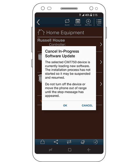
Figure 1 shows a prototypically bad confirmation dialog box, in which the title describes the condition that the content explains in somewhat greater detail, then the action buttons present the user with two choices.
Figure 1—A typically bad confirmation dialog box
Typical problems that users encounter with confirmation dialog boxes include the following:
jargon in the title
repetition of the title text at the beginning of the description, so users glancing at it don’t realize it provides different data and stop reading
inconsistent terminology that prevents the user’s relating the content to the process and context
excessively long titles and descriptions
vague messages such as “The file will be deleted” rather than including the filename, so those who do read can get the information they need
generic button labels that do not relate to the current task or condition, so require the user to read and interpret the detailed description
button labels that conflict with the overall task—for example, using the default button labels OK and Cancel in a confirmation dialog box that lets the user cancel an ongoing process, where the OK button—not the Cancel button—performs the cancel function
button placement that doesn’t reflect user expectations or is inconsistent with the rest of the application—for example, putting OK first, on the left, once the user has become familiar with tapping the button on the right to continue
Remember, people rely on kinesthetic memory and don’t read, so they’re most likely to tap buttons that are in their expected location without reading their label.
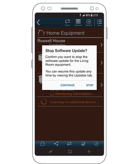
Despite the fact that the use of confirmation dialog boxes is generally inappropriate, it’s very easy to design good ones. Just be sure to follow these guidelines:
Make the title a question, ending in a question mark, which the user can answer by tapping clearly labeled buttons that correspond to specific actions. You are inviting the user to make a decision, not just informing or scolding the user. Questions invite greater scrutiny so the user is more likely to read the message.
Keep phrases short and lead with the key information. People scan more than read, so are much more likely to read the first few words of any phrase.
Use plain phrasing. However, if you do use branded or technical text, use the same terminology as the rest of the product.
Be specific and provide context. Users who are unsure of or worried about a process often do read message text, so provide specific information such as filenames, locations, or sources and destinations, and always provide clear descriptions of results or consequences.
Avoid ambiguity. If users can misread text, they will. Adding instructions never fixes ambiguous button labels, so remedy the core problem and revise the label text instead.
Make sure the button order is consistent with that throughout the app.
Figure 2—A better confirmation dialog box design
Showing Rather Than Telling
A lot of processes that are implemented in software adhere to bad, old, or opaque methods. For example, in the paper era, someone submitted a form at a window or through the mail. Then, he just waited and hoped it all worked out. Good interactive systems should not leave users in doubt. When users are confident about the way a process works, they’ll be happier, and you’ll get greater usage with fewer customer-care calls and lower costs.
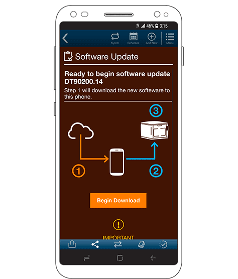
When a user is loading a new software update or syncing configuration backups with a Bluetooth connected IoT (Internet of Things) device, lots of terms that should be simple and clear such as upload and download can become ambiguous. Actually, even basic terms such as device can become troublesome pretty quickly. So, instead of explaining or assuming that users will get training or read the Help, depict what will happen, as shown in Figure 3.
Figure 3—A diagram explaining a process
The user can see everything that will happen. This diagram shows the steps along the way, so the user doesn’t get delay indicators. Thus, the user can tell exactly what the system is doing and better understand the consequences of things such as moving out of range or losing power.
There could be multiple versions of such processes, using the same style of diagram, but with steps, directions, and other details that reflect the actual process taking place.
Designing Tabs
Especially when I’m designing apps, I use operating system or framework defaults whenever possible—both for ease of development and to achieve consistency. However, designing tabs often gives me heartburn—not because the concept of the tab is in itself problematic, but because this interface design solution has often failed us of late.
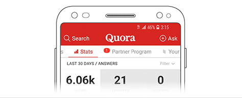
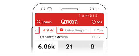
People often more readily understand high-level concept sketches of a system than their final coded versions because tabs can be ambiguous. Figuring out what tabs mean requires too much thinking. Figure 4 shows a typical modern example.
Figure 4—Tabs in the Quora app for Android
Bold labels, highlighting, and underlining are all good ways of differentiating the content of the current tab, but tab labels still do require interpretation. Having only two tabs can be problematic. How do you tell which tab is the highlighted tab?
The traditional way of showing tabs copies actual, physical, file-folder tabs. This is the reason we call them tabs. This is one case where skeuomorphism isn’t bad because it’s not an ornamental style, but leverages a core organizing principle.
Good tab designs work well because the tab label is contiguous with the tab’s content, just as a card-stock tab sticks up above a physical tab’s content. The label is actually on the tab. The background of the selected tab continues into the content area below, as shown in Figure 5, with no color change or divider line.
Figure 5—Tabs that are contiguous with their content
A tab that is contiguous with its content area is intrinsically easy to understand because of our long-held mental model of how folder tabs work. People understand that the tab and the content area are a single thing. Users expect physical laws to remain in force in apps. Thus, they assume that all tabs are attached to their content, which appears below, so tapping a tab that’s in the background brings that tab to the fore and exposes its content.
Avoiding Confounding Your Design
There are many more such examples that I considered providing, but I’ll wrap up with a tangential risk: employing excessively easy-to-use elements that conflict with users’ other expectations.
I once worked on a Web site with a one-step signup form in the sidebar, near the top of the page. Users could simply type their email address into a field and press a button and would be signed up to receive notices of deals and tips and stuff.
But my team got brought in to fix this form because a large percentage of the results— which the engineers had deliberately not validated—were gibberish, not email addresses. Pretty quickly we figured out that they were actually search terms.
Search should consist of an input box, not a link—nor just a magnifying glass icon that users could misinterpret. Users like search a lot, expect to find it near the top of a page, and gravitate toward input boxes, so they’ll use search more if they see a search input box near the top of the page.
Consequently, if you place any input box near the top of a page, users will assume it’s a search input box, regardless of what any labels for the field or the submit button actually say.
People don’t read—especially if there’s no obvious reason for doing so. If an interactive element seems to meet their expectations, there’s no reason for them to bother to read the labels or interpret icons. So don’t make something so prominent or easy to use that it overwhelms users’ other expectations—or conflicts with the core functionality of your Web site or app.
Conclusion
This column has not presented a checklist or style guide, but communicates a philosophy or concept for approaching design in a truly human-centered way. Unfortunately, a lot of product development essentially converts a PowerPoint training deck or Excel file that has been in use for years to a customer-facing digital product. I am not being hyperbolic. This has actually happened too many times to count.
However, we can create better, more satisfying, more efficient products by designing them to reflect the way people really work and the way people actually consume and understand information. Keep these goals in mind across the whole product-development lifecycle, not just when you’re designing a single happy path.
Resources
Fu, Wai-Tat, and Wayne D. Gray. “Resolving the Paradox of the Active User: Stable Suboptimal Performance in Interactive Tasks.” Cognitive Science, November–December 2004.
Nielsen, Jakob. “How Little Do Users Read?” Nielsen Norman Group, May 6, 2008. Retrieved February 16, 2019.
Novick, David G., and Karen Ward. “Why Don’t People Read the Manual?” (PDF) In Proceedings of the 24th Annual ACM International Conference on Design and Communication, October 18–20, 2006.
For his entire 15-year design career, Steven has been documenting design process. He started designing for mobile full time in 2007 when he joined Little Springs Design. Steven’s publications include Designing by Drawing: A Practical Guide to Creating Usable Interactive Design, the O’Reilly book Designing Mobile Interfaces, and an extensive Web site providing mobile design resources to support his book. Steven has led projects on security, account management, content distribution, and communications services for numerous products, in domains ranging from construction supplies to hospital record-keeping. His mobile work has included the design of browsers, ereaders, search, Near Field Communication (NFC), mobile banking, data communications, location services, and operating system overlays. Steven spent eight years with the US mobile operator Sprint and has also worked with AT&T, Qualcomm, Samsung, Skyfire, Bitstream, VivoTech, The Weather Channel, Bank Midwest, IGLTA, Lowe’s, and Hallmark Cards. He runs his own interactive design studio at 4ourth Mobile. Read More
