Last week, on one of my client projects, I was uninvited to a sprint demo at the last minute because all of the features the development team had completed that week were technical, so they assumed there was no need for User Experience. This sort of thing happens a lot, even on teams and projects for clients with whom I’ve worked for years. They’ll say, “Do the UX design later.” Or “We don’t need any UX design because it’s an off-the-shelf component.”
This is clearly a case of misunderstanding the difference between UX design versus user-interface (UI) design—even among people with whom I’ve worked for a long time—and all too often, even among other UX design professionals.
Champion Advertisement
Continue Reading…
Both Look and Feel
For much of the 1990s, I was a graphic designer. That’s similar to a UI designer, but for print. One day, I was at the printer and they showed me a job from another agency that was causing them no end of heartburn. It was a lawnmower catalog, and on several pages, the graphic designer had placed the handles of lawnmowers so they extended across the fold, at an angle.
The problem was: it wasn’t the fold. In a multipage document, the pages get cut, then bound together. The fold lines up more or less across pages, but not perfectly. Things not being quite aligned occurs in all manufacturing. It’s expected and manufacturers plan for it. Except this designer who created the mower catalog. He assumed that what he had drawn would get reproduced perfectly—without thinking about the technology, the context.
Why was I there to hear this story? Because I had a possibly difficult print job that I was thinking about. So before drawing anything more than a sketch on paper, I went to chat with the printer to see what they thought. I recognized that, in the readers’ hands, the final printed piece would not be exactly what I had designed, but instead, whatever survived the printing, trimming, binding, and mailing process.
Today, most of my work in the digital world involves deeply functional products—mobile, desktop, or Web applications in which people tap or click, drag, and type instead of mostly reading or watching.
Another word for functionality is technology. It takes software code to make it happen. And, for me, one thing hasn’t changed in the last 30 years: understanding, specifying, and working on technical solutions with the whole project team is at least as important to the user experience as specifying the size, shape, position, labels, and colors.
Message Boxes
Lots of functional products have lists the user can manage. One key function for managing lists is deleting items.
Early in my career—which was also early in interactive design, before we were even aware of lots of design options—I started out with the default “Are you sure?” message box. Most of my early computer experience was on the first couple generations of the Macintosh, when popups abounded—especially in the era before hard disks.
This sort of dialog box is called a guard, or confirmation message box, because it protects the user from making a mistake. Similar to a gate at the top of a steep staircase, such a message box prevents people from wandering over the edge, but lets them pass if they choose to do so.
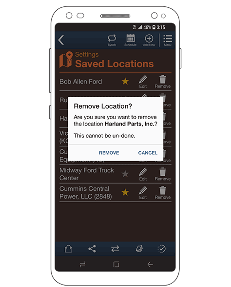
I am sure my early message-box designs were terrible, but over the years, we’ve all come to understand how to design them well. Today, a delete guard for a list view might look like that shown in Figure 1.
Figure 1—A delete-guard message box
Of course, even without confusing labels, message boxes don’t work well. There are simply too many message boxes in the world. People don’t read their text and too often automatically agree to or just dismiss them. This means the user either has to try the function again or loses the safety of the guard condition. So the app is dangerous and destroys data without true user consent.
In general, when I propose the use of a message box, it is because of their ability to preserve context. A message box is always on top of a page of other content or functionality, which is great. But it’s not a universal solution for preserving context.
In Figure 1, the message box is on top of the whole page or the whole list. But it is a guard for just one row. Which one? Well, who knows? The message box is in the way. On mobile devices especially, users change contexts often. They look up and talk to others. They get distracted, so come back to the screen and think, “What was I doing?” Sometimes, they lose confidence and abandon a process altogether.
While I always make sure to add informative details to message boxes—in Figure 1, which item would be deleted—this doesn’t solve all of the issues of clarity, effectiveness, safety, confidence, and trust.
Inline Guards
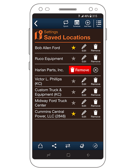
Later, I tried to solve this problem by simply making the guard more contextual. Once the user taps Remove, the guard condition just takes over the row, as shown in Figure 2.
Figure 2—An inline guard condition
That certainly solves the context issues. Even when the user needs to refocus after a distraction, this solution is fairly clear, but not completely clear. The Remove button is not as noticeable as it might be. Users might tap Remove, then proceed to another task, missing the step of agreeing to the guard first. Later, they might become confused because they haven’t executed the command as they intended.
Through usability testing, I discovered that more prominent changes such as adding backgrounds or buttons helped. Animated transitions helped even more—although they have their own issues for certain types of users and don’t work on all devices or in all environments.
Especially on mobile devices, space is at a premium, so this solution doesn’t leave a lot of room for explanations. The icons and the single word remove are doing a lot of work here.
Another issue from which smaller screens suffer is the reuse of space. Accidental second taps are even more common than second clicks. It took me a while to realize that this was happening, but now I always make sure, after a condition change, to move buttons away from the initiating action. Well, usually. As shown in Figure 2, there’s not always room, so the button that replaces Remove is just the Cancel button, so the system fails safe.
I looked into how clicks work to understand this problem better, then started blocking second clicks or taps. When the user first taps Remove, ignoring another tap on that same row for even a tenth of a second prevents the most likely accidents.
Since I worked out the interactive issues, this solution seems good. It’s a slick, clever solution. It looks good on screen and in the PowerPoints you project in a meeting room to get design approval. It even tests well when you ask people about it. But this solution was never really great. Even with all these clever mitigating strategies, there were always users who accidentally deleted a list item or failed to complete a remove task.
Undo
I’m sure I borrowed my first use of undo from some other product, but I don’t recall which one. Full credit to someone clever, but not me.
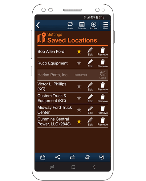
At the user-interface level, undo is very similar to an inline guard. The whole row changes to indicate that the item has been deleted. Ideally, the entire row should animate and the color change. Most or all of the functions and text should appear dimmed to make it more obvious at a glance that the user has removed the row, as shown in Figure 3.
Figure 3—An undo row
This works well because, in much the same way users anthropomorphize complex systems, they internalize the perception that objects in complex digital systems are physical objects.
Engineers have long made fun of the trash can on a computer, but it is a very sensible metaphor. If the user doesn’t want something, he throws it away. If the user makes a mistake, maybe grabbing up something important with a pile of discarded files, he can go into the trash to retrieve it. Emptying the trash is a second, deliberate action—or at least a time-delayed one that gives the user a chance to recover from mistakes.
Communicating Design Intent
As a UX designer, I don’t just draw. I specify. In a specifications document, the words beside a drawing are, if anything, even more the specification than the drawings are. I am sure of this not just because I have been refining my deliverable style over the decades, but because I was once able to do research on this. Some years back, I built a very large set of design guides—what we’d now call a design system—to help phone manufacturers comply with the standards of various mobile providers.
I got the contract for this work because manufacturers were not adhering to the current set of design documents. It was easy to conclude that the documents weren’t just out of date and full of duplication and contradictions, but were inherently confusing. They weren’t designed for their audience. You must design everything for its consumer, and that means designing specifications documents to be understandable by engineers, developers, analysts, project managers, and software testers.
Doing this is still a struggle because there’s not just one sort of person reading them. Because of this and other research, I have long believed that people are normally variable across a whole range of capabilities. For example, people might orient graphically or textually. Some people simply can’t read a map or follow turn-by-turn directions, but most are in the middle.
Therefore, the developer’s first instinct is very often to hate the concept of undo, estimate its effort very high, or even reject it out of hand. They probably just looked at the pictures at first. But then, when we walk through the design together, or I just tell them to read the specification as though they were building it, everything is fine. No problem. It would be easy to build.
User Experience Is Not Just the User Interface
Undo is hard to build. I know that. I have been a database designer and developer in the past. I strongly believe that UX designers need to understand a product’s underlying technology, so they can create design solutions that are quick, effective, predictable, reasonably easy, and cheap to build.
The user interface that I designed, which is shown in Figure 3, doesn’t actually undo at all. Instead, it just marks a row for deletion. Then, when the user finishes his tasks and exits the page—or for single-page apps, the user completes tasks in some other way—the items the user has flagged for deletion are truly deleted. If the user taps the Undo button, this simply removes the to-be-deleted flag.
If the app or Web site crashes or the phone loses its connection, the session-based to-be-deleted flag is lost, so the item is not deleted. The system fails to safety, preserving the data.
Tricking Technology, Not Users
These days, there’s a lot of misuse of technology for evil. It’s ruining choice, democracy, and the natural world. I, for one, have really been thinking harder about the ethical choices we make in design. People might see even things such as autocorrecting typing as computers changing their input without their explicit consent.
Is it okay to have systems do things that aren’t exactly what people intend or have agreed to? Let’s back up a step or three: What is the point of pretty much all technical systems? They do work for humans. The entire point is for them to be useful and usable for humans.
So things such as my undo design not really being undo are not there to trick people, but to trick the technology into being more human centered.
This is very much why I have long fallen on the side of believing UX designers need to understand code and, more generally, the technology we work with, but not actually do the coding. To come to the best overall solution, we need to design feasible solutions, keeping technical constraints in mind, but also talk to the developers who will implement our designs. Then, we’re all empowered to come up with the best answer together, at the intersection of customer wants, user needs, and our technical capabilities.
For his entire 15-year design career, Steven has been documenting design process. He started designing for mobile full time in 2007 when he joined Little Springs Design. Steven’s publications include Designing by Drawing: A Practical Guide to Creating Usable Interactive Design, the O’Reilly book Designing Mobile Interfaces, and an extensive Web site providing mobile design resources to support his book. Steven has led projects on security, account management, content distribution, and communications services for numerous products, in domains ranging from construction supplies to hospital record-keeping. His mobile work has included the design of browsers, ereaders, search, Near Field Communication (NFC), mobile banking, data communications, location services, and operating system overlays. Steven spent eight years with the US mobile operator Sprint and has also worked with AT&T, Qualcomm, Samsung, Skyfire, Bitstream, VivoTech, The Weather Channel, Bank Midwest, IGLTA, Lowe’s, and Hallmark Cards. He runs his own interactive design studio at 4ourth Mobile. Read More
